
Born in Russia and based in Paris, Ilya Naumoff is an Art Director and Type Designer enamoured with minimal, structured and impactful design – and with a stunning portfolio to prove it. Beginning his creative journey in the world of music – dedicating all his free time to playing and composing – Ilya was inspired by a friend who, playing in similar circles, would frequently design promotional content (posters, flyers) for his own band. This struck a chord with Ilya, who decided to start playing with design tools himself; spending almost all his time during his university years playing music and designing posters.
Though for several years music continued to be his main focus, Ilya explains, ‘a few friends noticed my design work and asked me to design flyers and logos for them… little by little, the word spread and my focus gradually began to shift.’ Going through the motions, Ilya began working with different design agencies in ‘branding, advertising, environmental graphics and even a bit of motion,’ before eventually homing in on typographic design; where he felt most passionate.
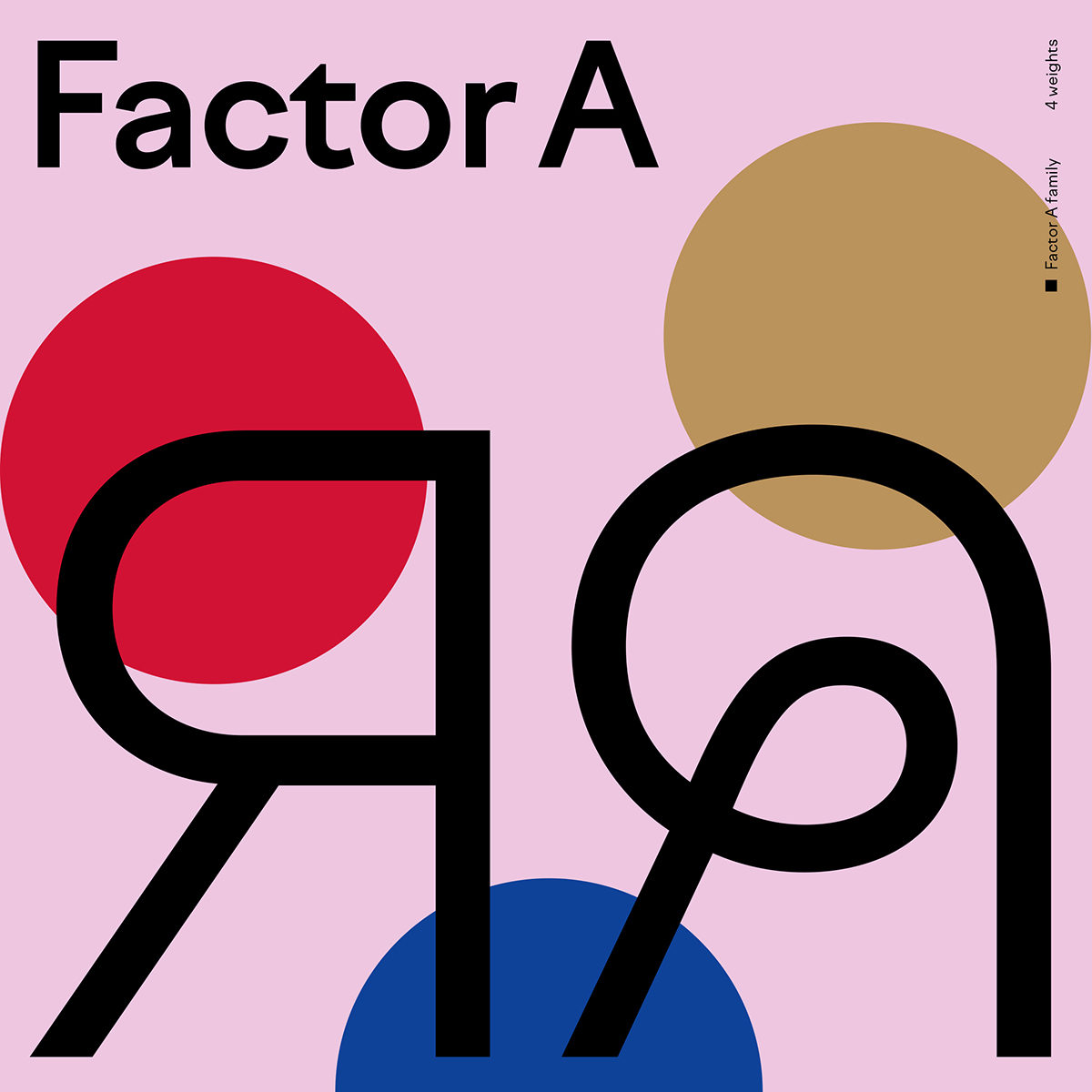
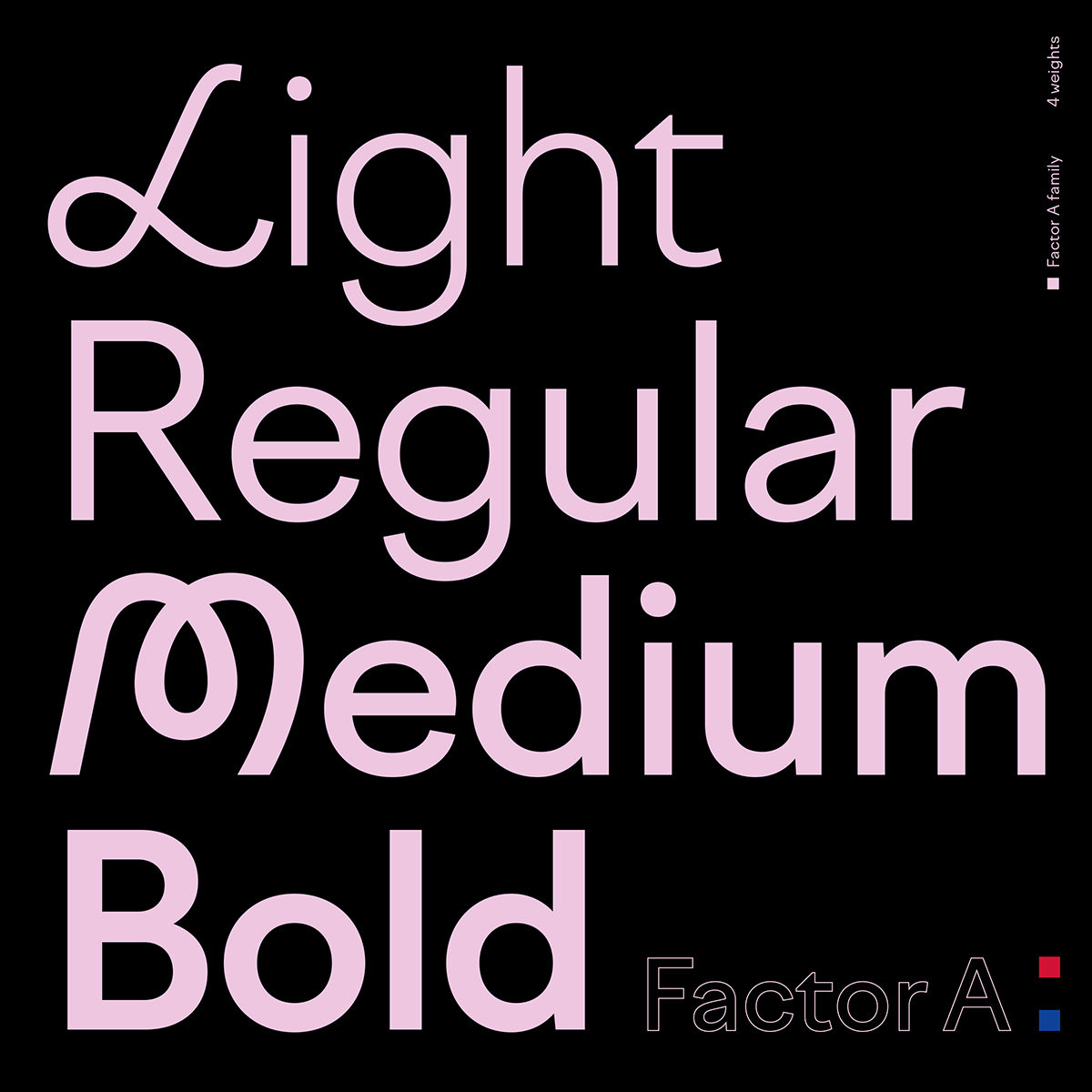
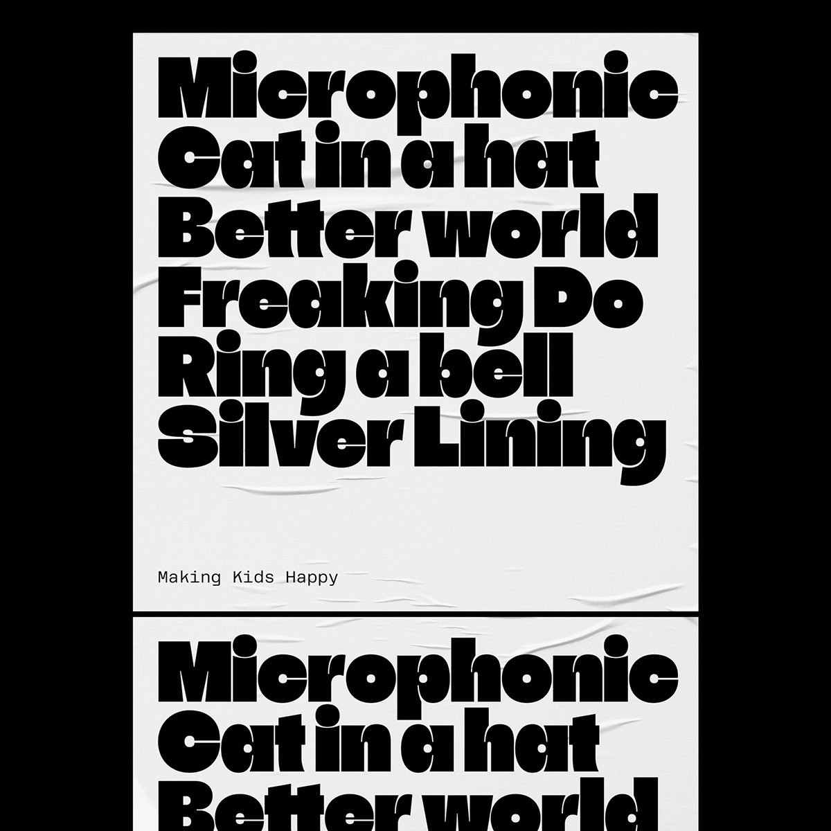
It is work which meets its goal without having to shout about it too explicitly, Ilya explains, which inspires him most and which he strives towards. ‘As Einstein once said,’ he ponders, ‘the challenge here is to create something as simple as possible but no simpler.’ This intention feels pretty perfectly aligned with the visual impact of his design work. It bears a certain clarity and concise quality which condenses an abundance of aesthetic and communicative sensibilities into sharp, playful and inspiring pieces. Although, as the designer notes, each new project is an accomplishment in its own right, Ilya draws out attention specifically to one of his latest type design feats: Grtsk.
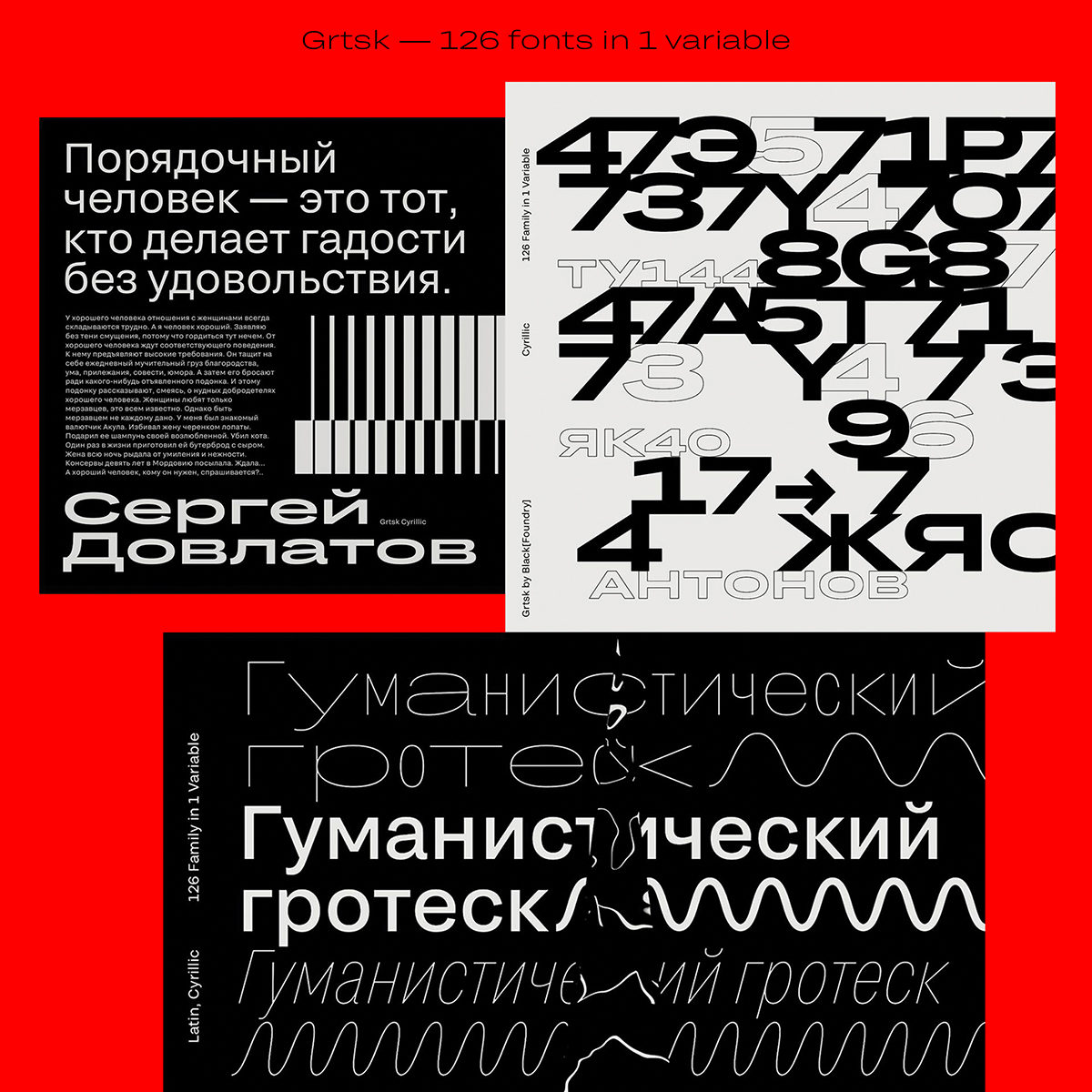
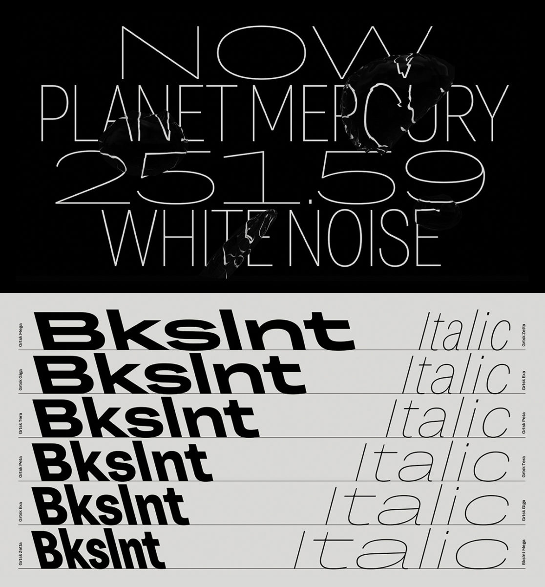
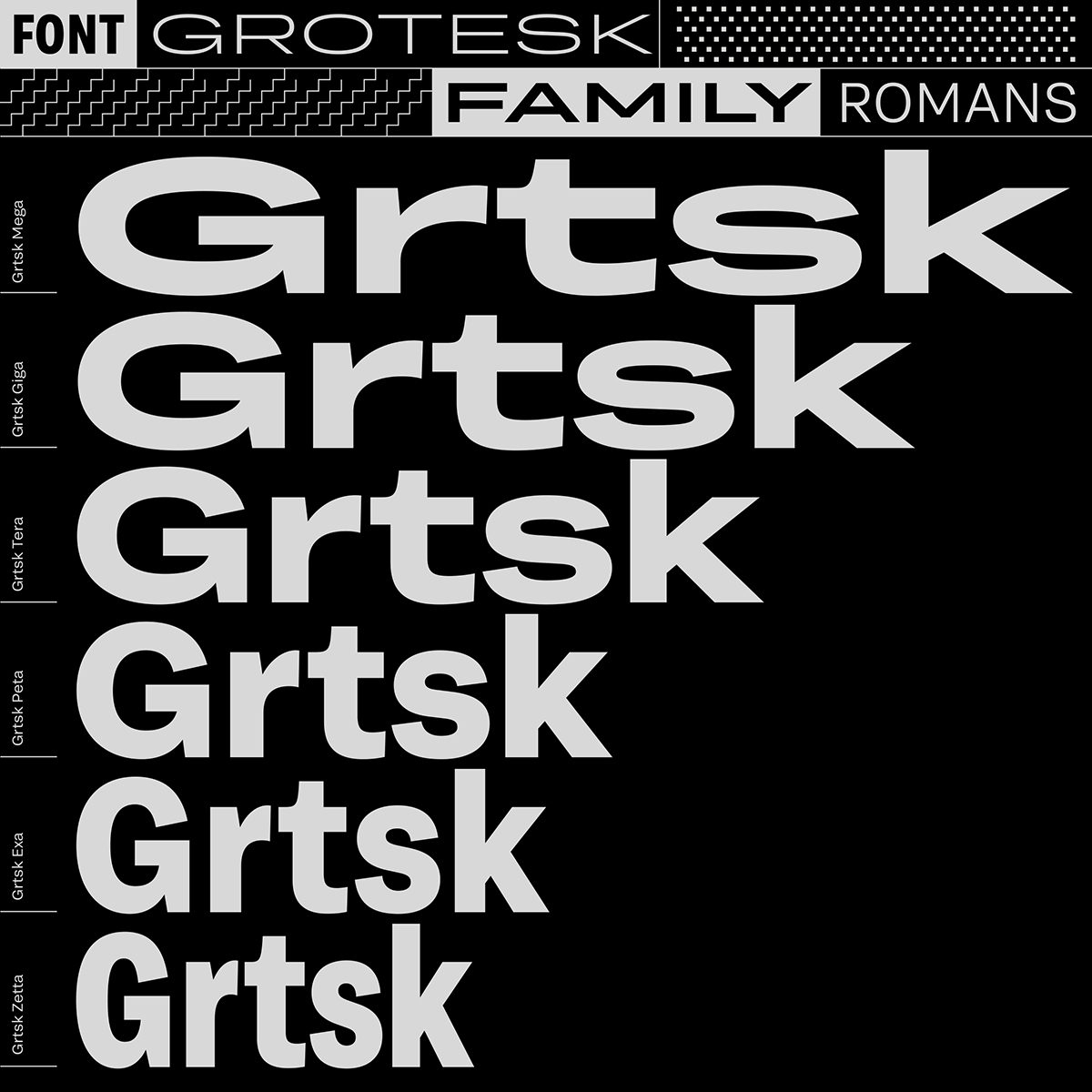
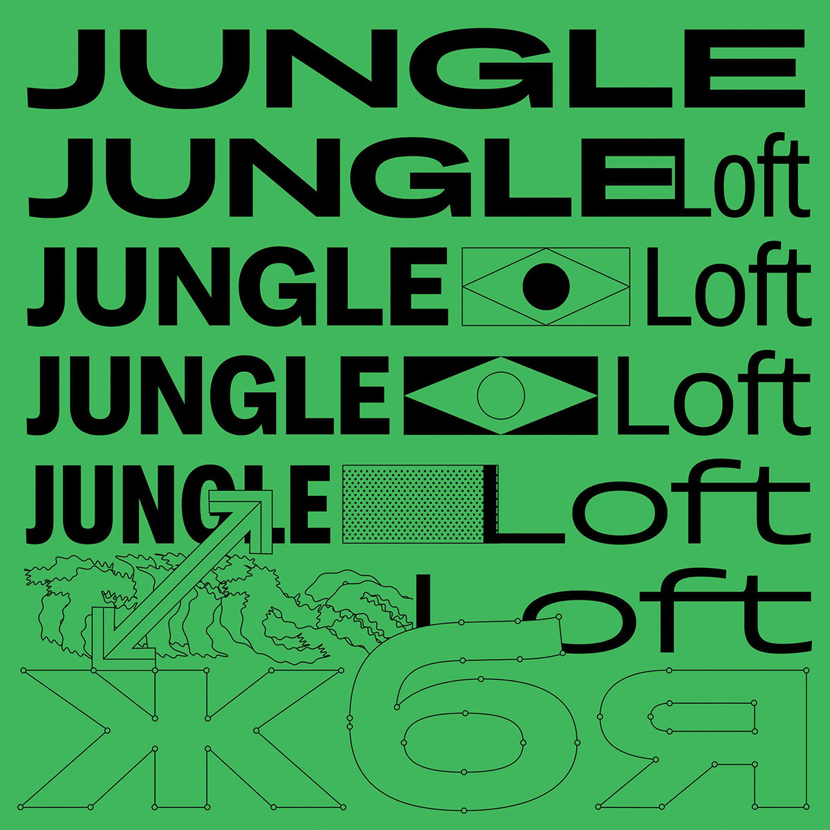
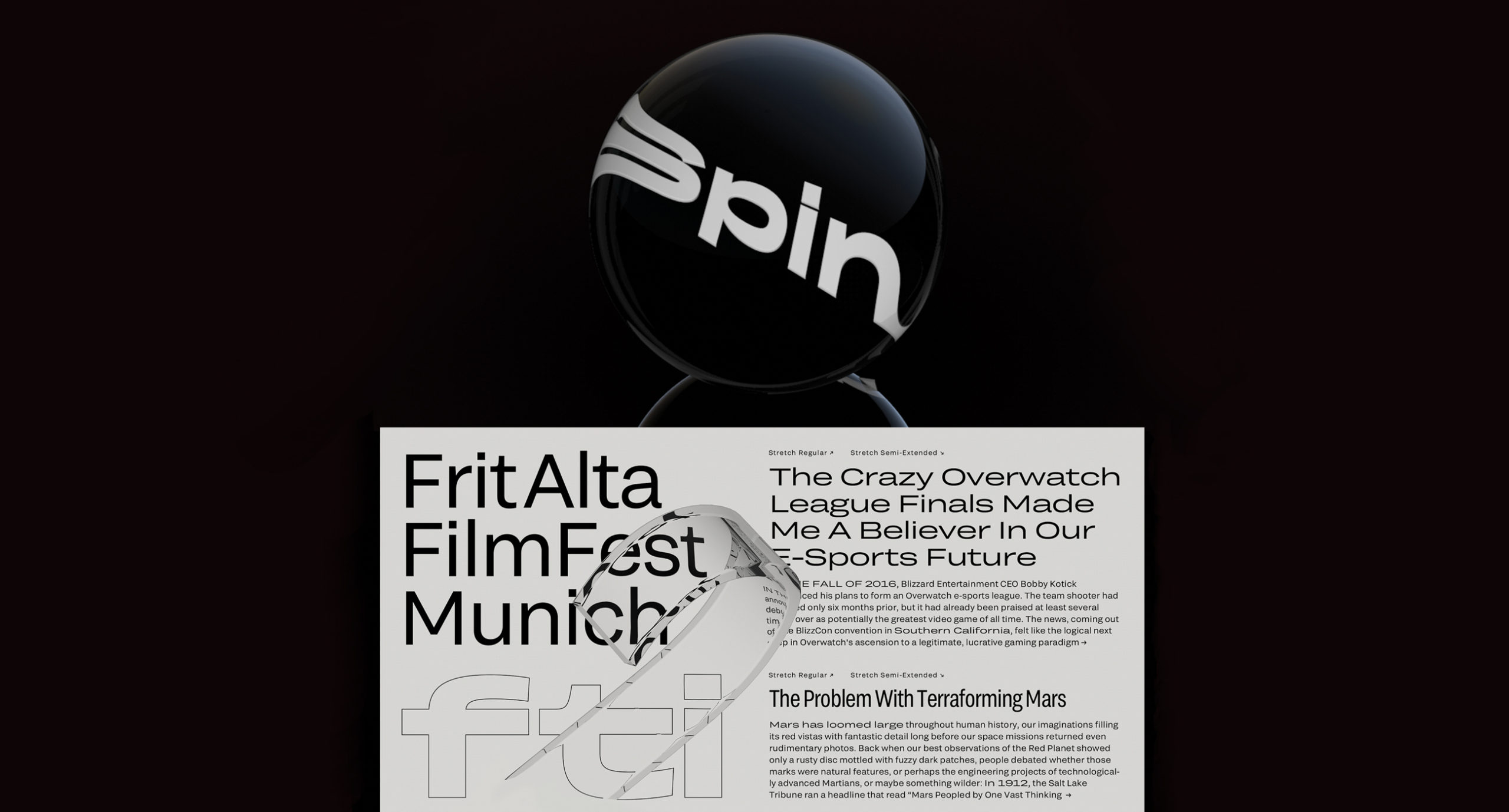
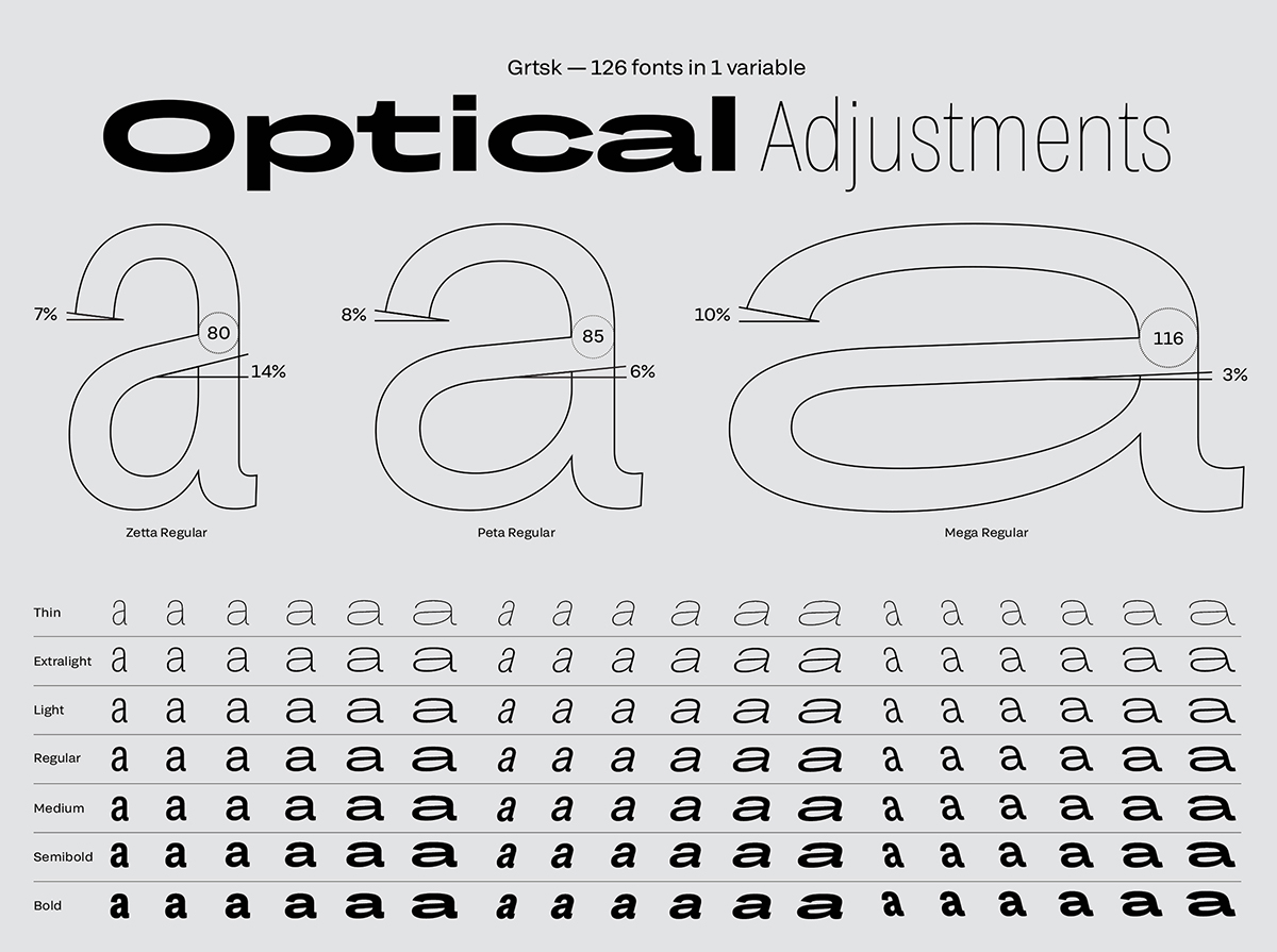
The 2019 project – completed in collaboration with Black[Foundry] – is a giant type family, which, at the time of release, ‘was the only variable font family that could stretch in so many ways and directions: 126 individual fonts all combined into one variable font.’ After spending two years on the project, as well as designing all the promo for the typeface as well – including designing a weather forecast website (wthr.live) which showcases the versatility of Grtsk – Ilya reflects, ‘all this was fun but it was also a challenge… I’m super happy that all the designs are out in the wild now and I can move onto something else.’
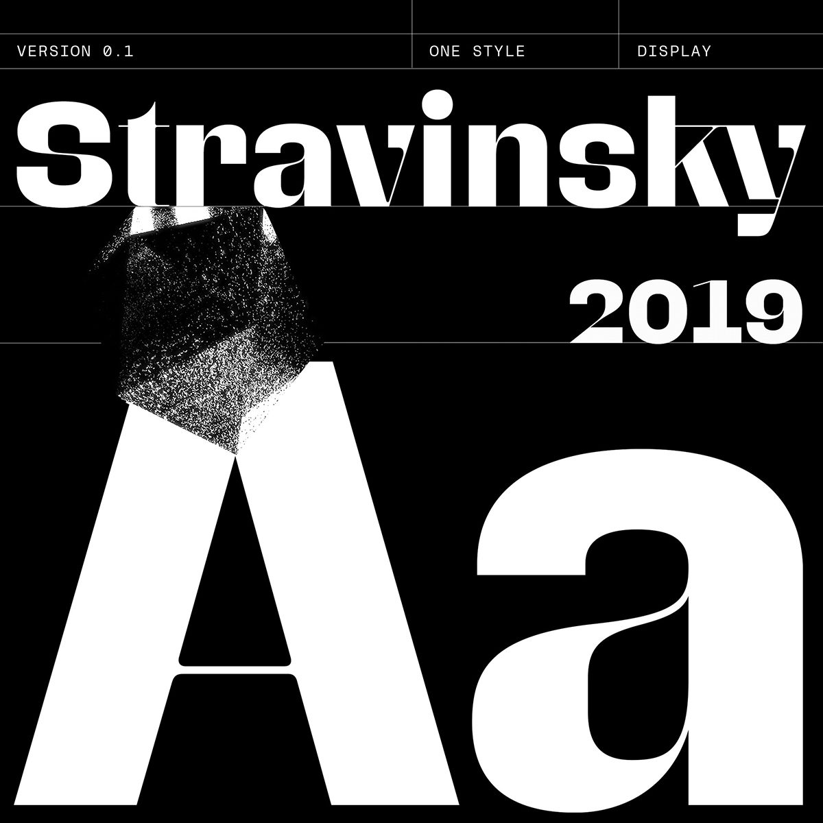
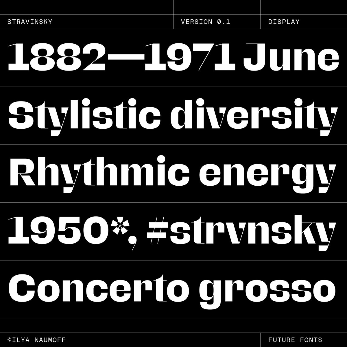
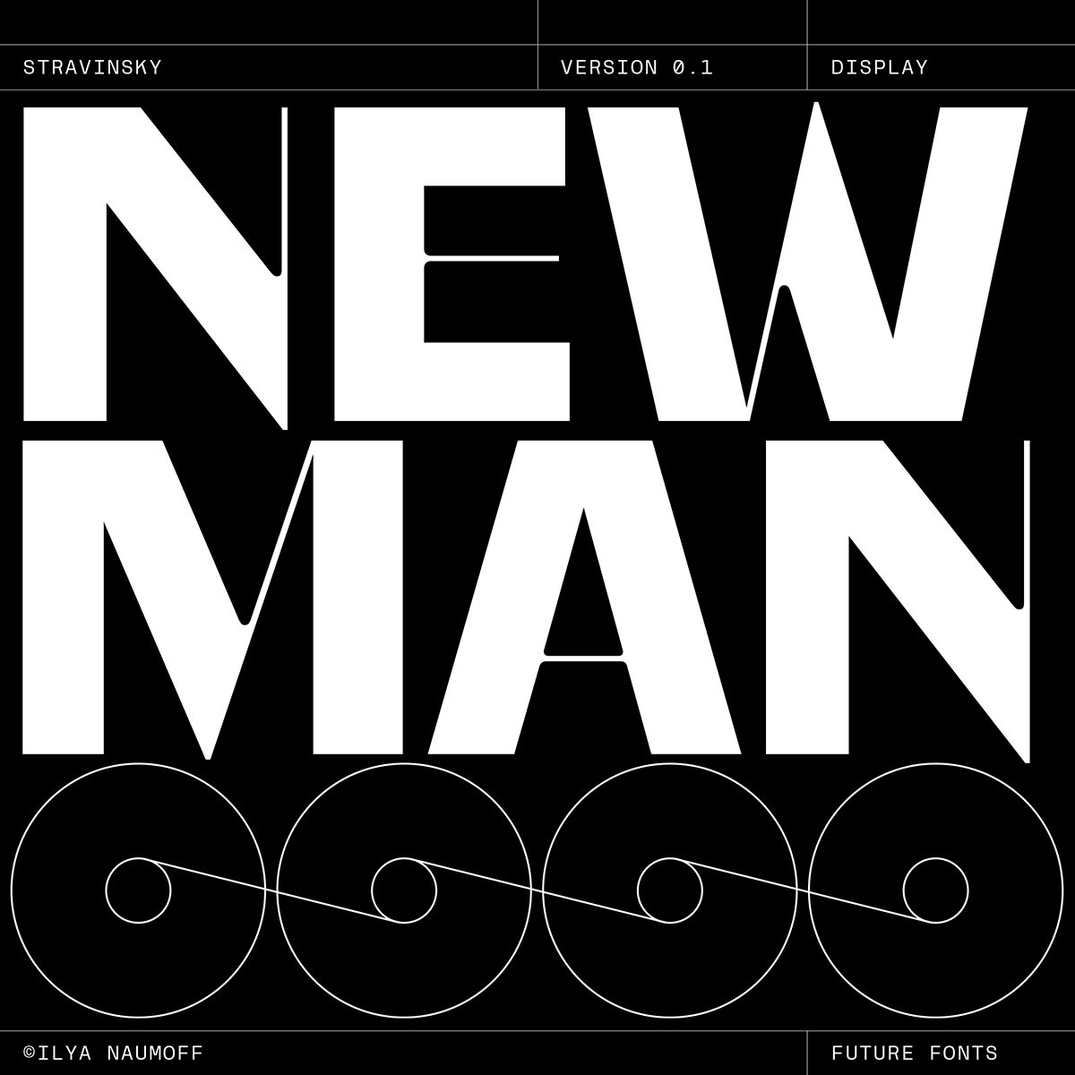
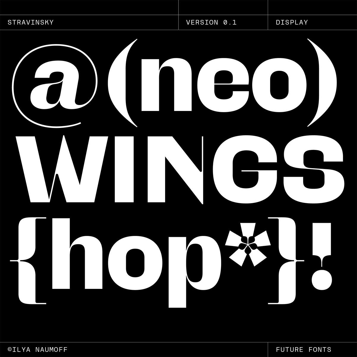
Another particularly striking body of work, is Ilya’s WIP logotype, visual identity and typeface design for an electronic music composer. Aptly named, the idea of Stravinsky Disaster ‘is to fuse modern electro sound with the classical progressions.’ This playful fusion of tradition doesn’t stop with the audio. As Ilya explains, ‘the logotype reflects this concept visually fusing classical contrasted (didot) letter shapes with the modern grotesk forms… The visual identity is currently being expanded using the idea of contrasting colours and geometry.’
Ilya’s work – aside from being masterfully researched and impeccably executed – is, put simply, extremely cool. It’s the kind of addictive design that just leaves you wanting more. And luckily, with future plans to follow his own instincts and produce more self-initiated design work at his own pace, Ilya is going to be delivering just that.


