
Based in Dessau, Germany, Martin Naumann (@mnaumanndesign) is a freelance graphic designer whose type ventures cannot be ignored. His portfolio is laced with an intelligent and unique visual language; aesthetically drawing from the scientific and natural worlds, as well as technological, digital realms; with an experimental and futuristic feel.
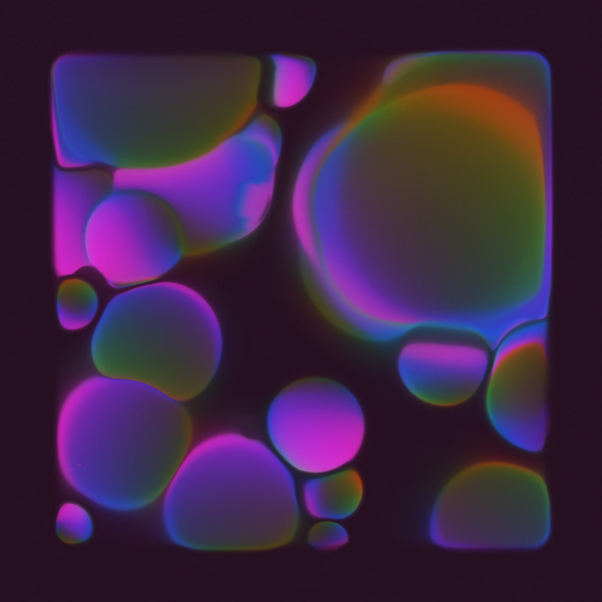
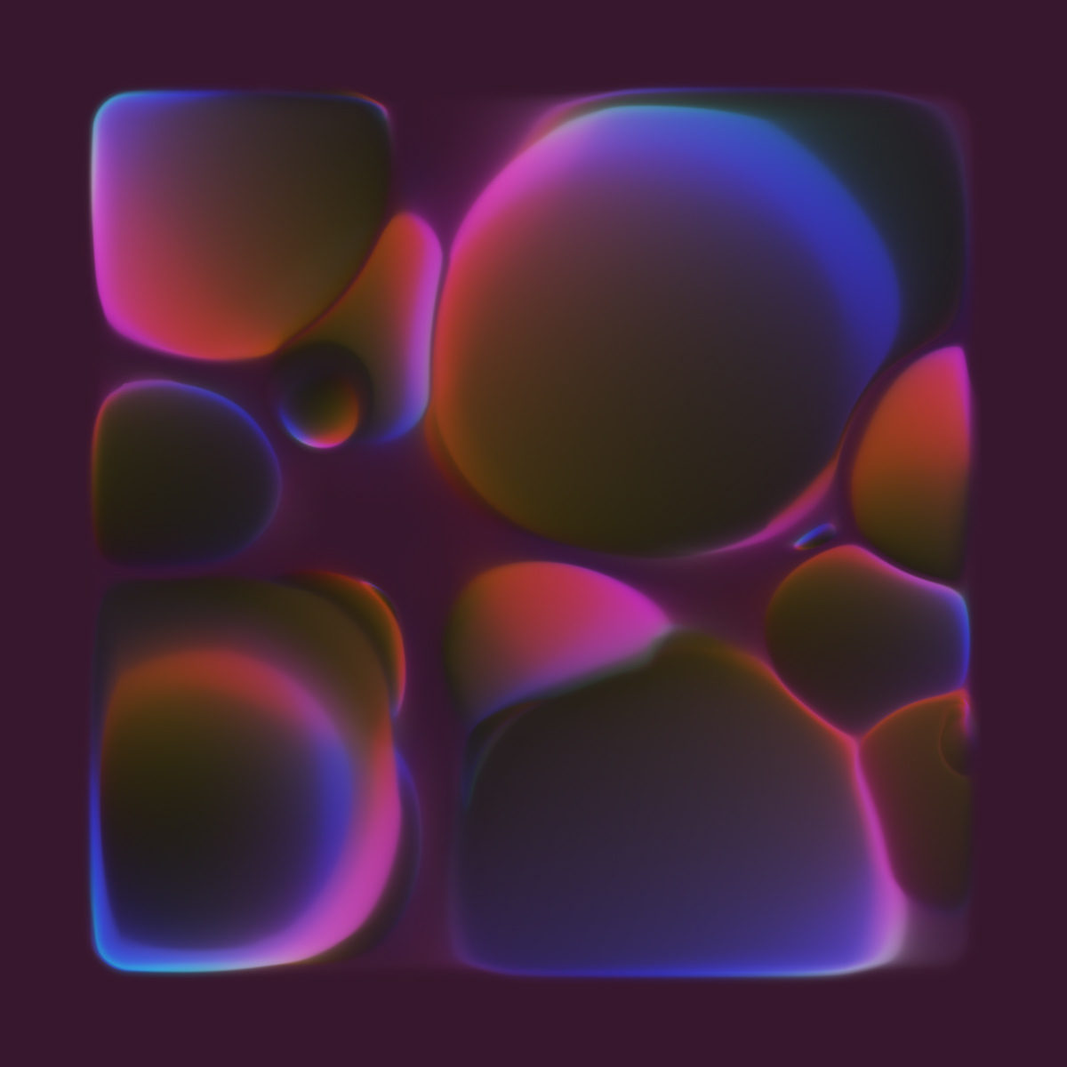
Currently studying Integrated Design at Anhalt University of Applied Sciences, many of Naumann’s visual pieces feel rhythmically patterned; reminiscent of natural phenomena, like the delicate refraction of light, or miscellaneous cells growing in a petri dish. With an extensive and varied portfolio of professional work for a number of clients (predominantly in the music business on album artwork and related work) these references feel particularly present in Naumann’s 36 days of type challenge.
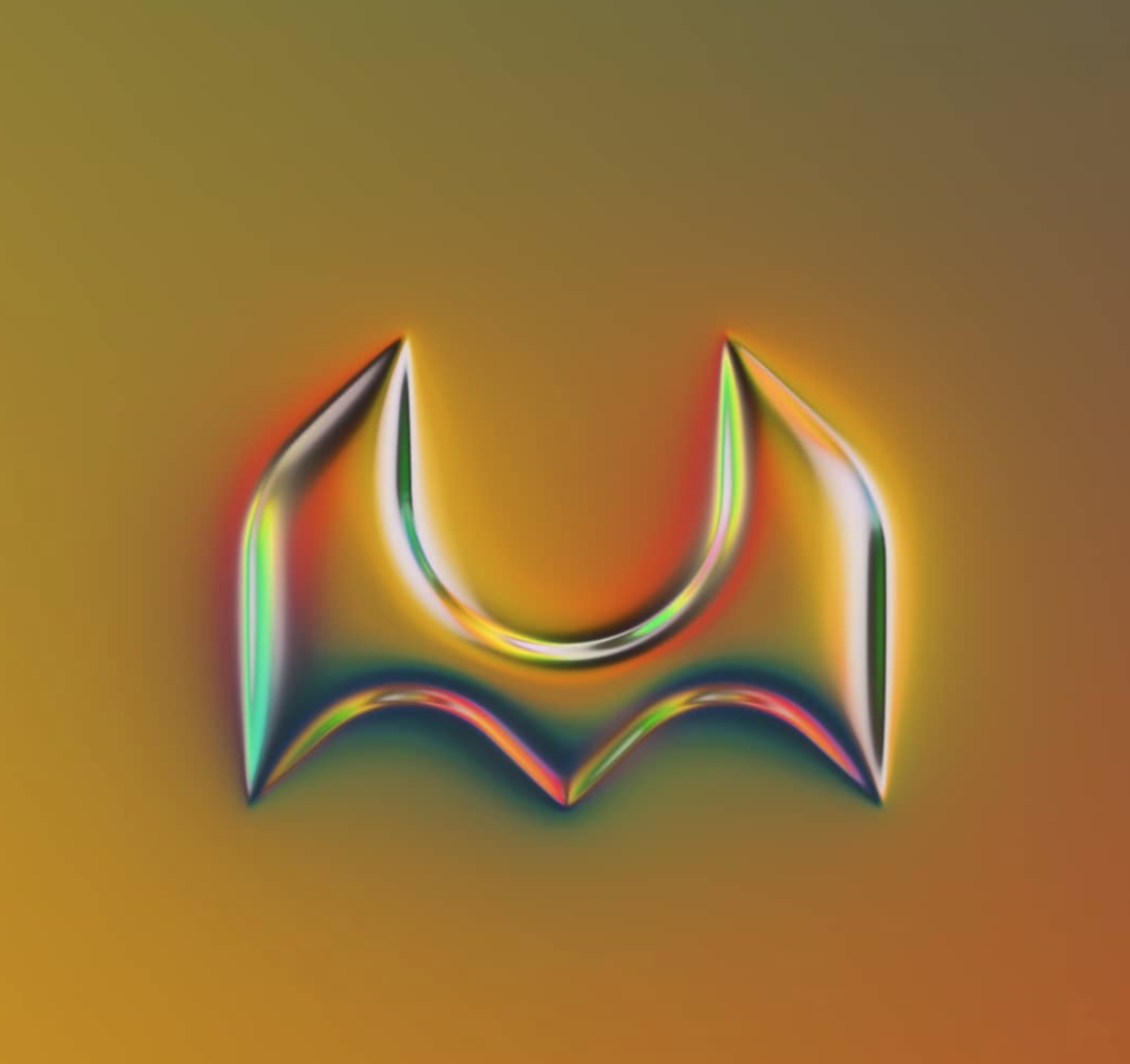
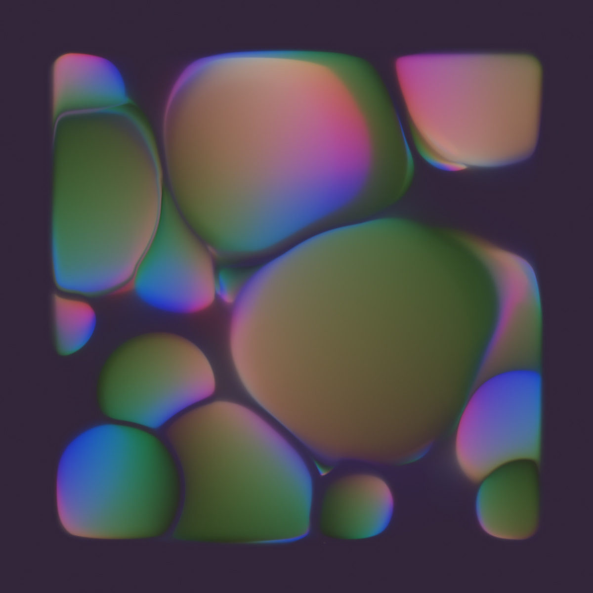
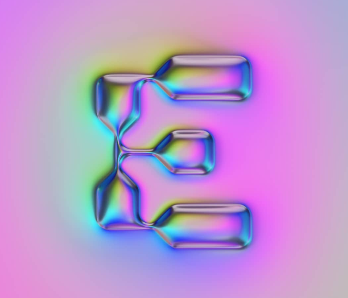
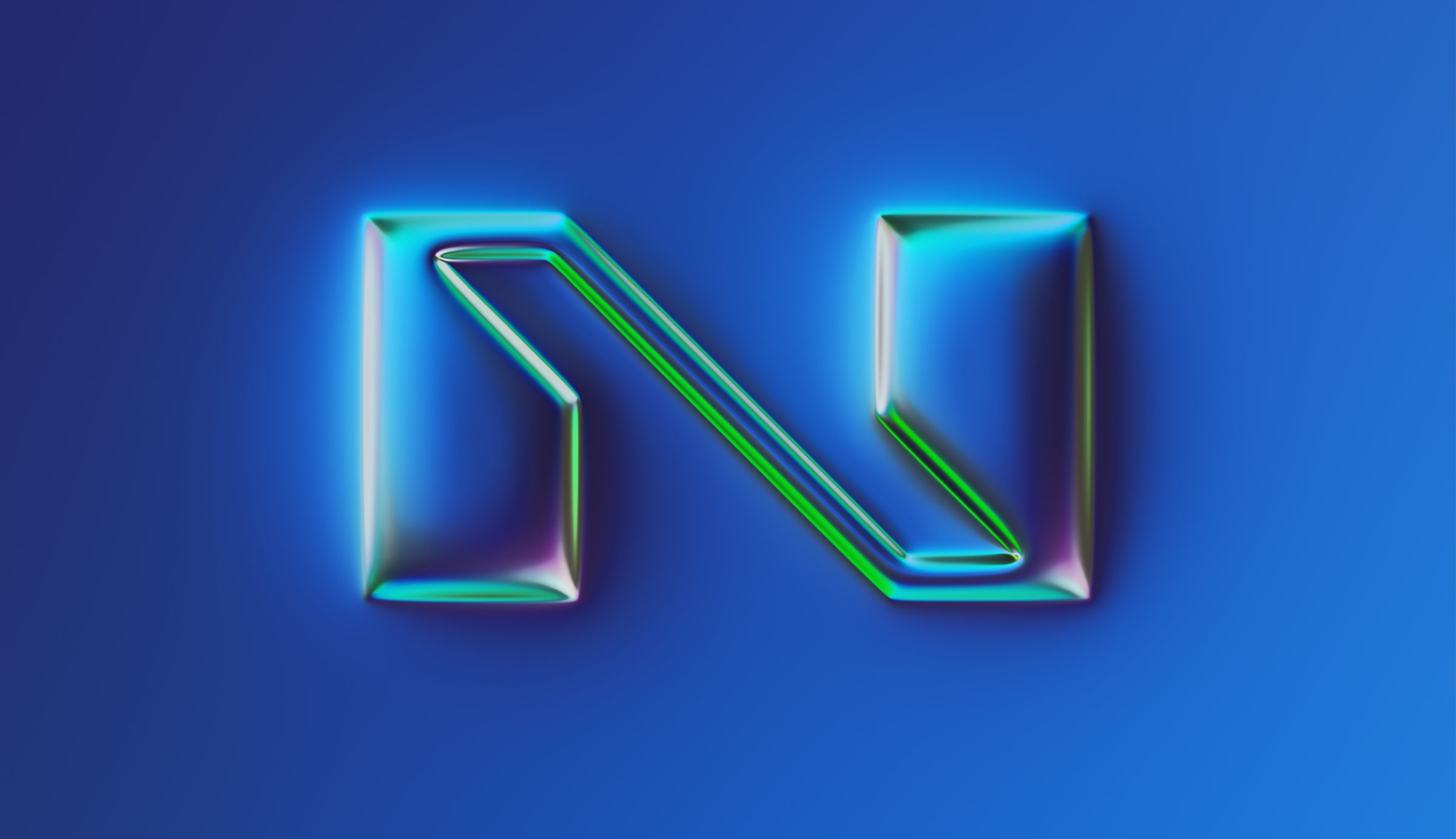
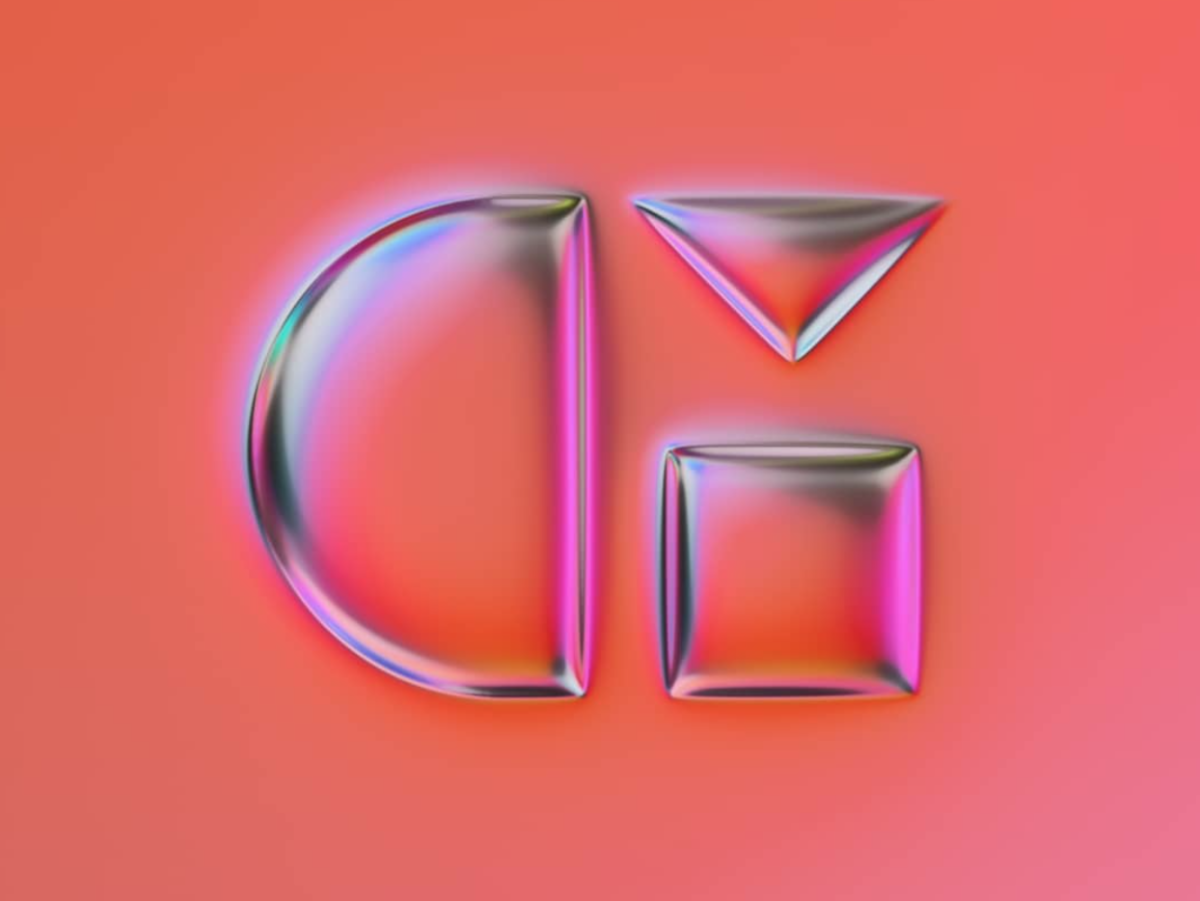
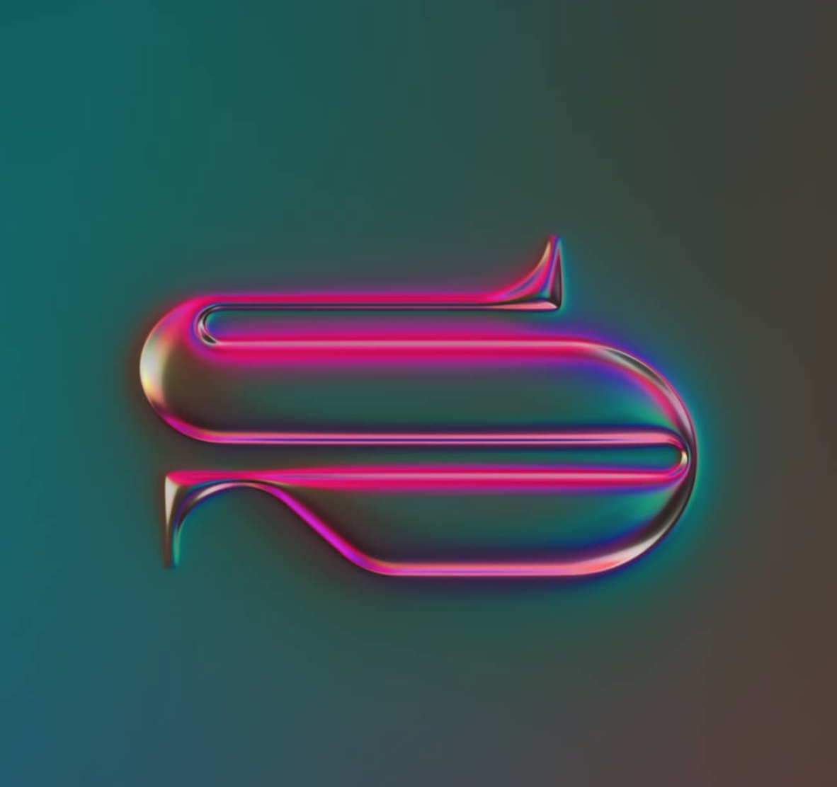
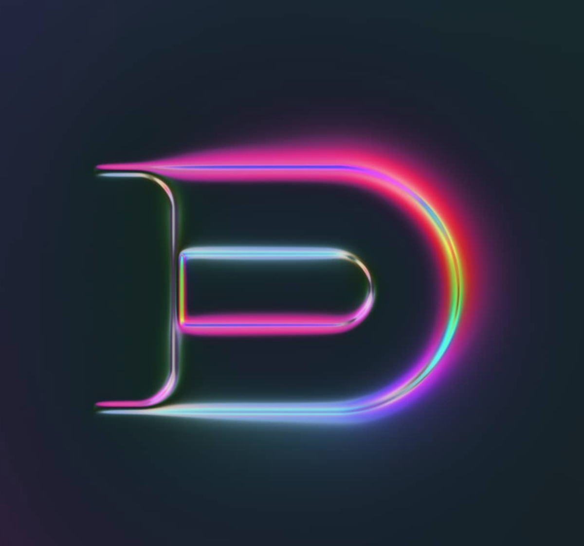
Alongside many other designers, Naumann has taken the 36 days of type challenge as an opportunity to explore his creativity without bounds – and making it very much is own in the process. With a vibrant collection of metallic, eighties-feel, ultra chrome-effect letterforms, Naumann’s heavy, cubic depiction of the Latin character set is vastly intriguing. The shapes underlying each of the letterforms play with contrasting qualities of digitised, computer-generated, man-made structures and fluid, organic growths of biologic matter.
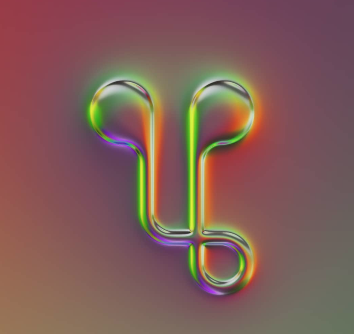
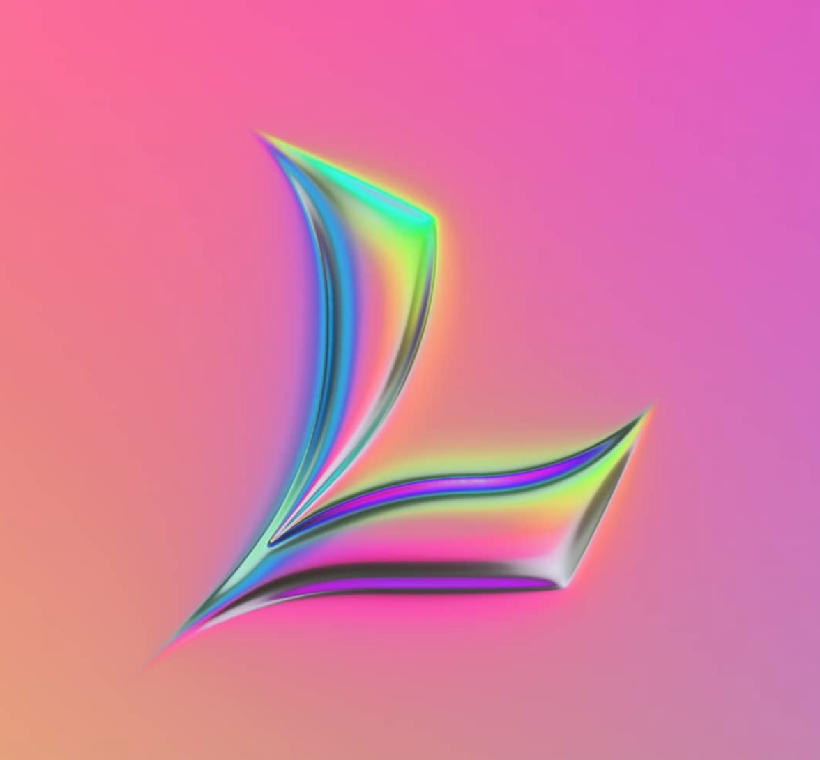
This aesthetic meeting of artistic and scientific practices is interesting considering Naumann’s use of an RGB colour scheme throughout the type challenge. A colour model being an abstract mathematical model used to describe the way colours can be described through numbers, the RGB colour model is an additive model through which the mixing of light frequencies and their consequent colours can be numerically predicted. The use of the RGB colour scheme here forms a direct current between scientific, natural phenomena and the creative practice of design in a way which is both intellectually and aesthetically fascinating – an abstract reference to Naumann’s cross-disciplinary influences exhibited beautifully through his treatment of type.
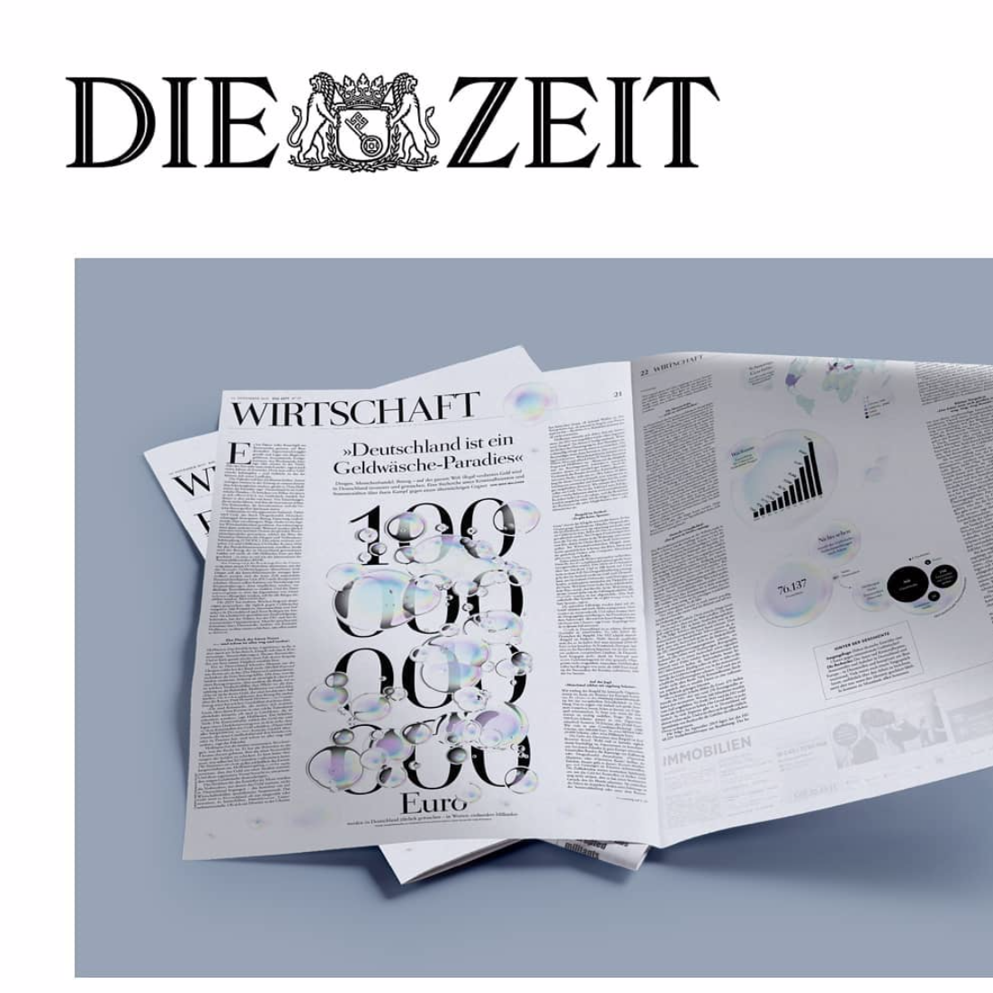
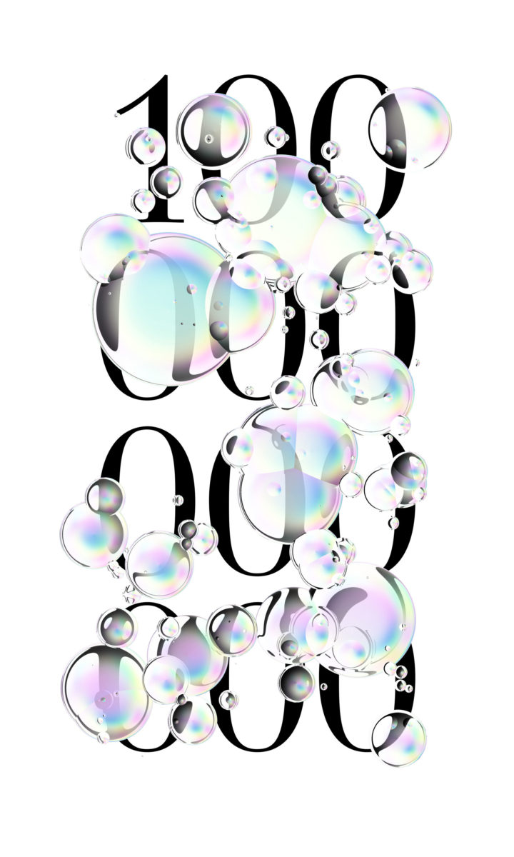
Whilst Naumann’s 36 days of type pieces uniformly string together, his portfolio undeniably showcases great versatility. In particular, his editorial work for German newspaper, DIE ZEIT, is massively compelling. One of these features heavy-yet-minimal sans serif numerical characters overlaid by globular, viscous, metallic-looking soap bubbles, organically doused across the spread. These designs feel more commercially oriented and showcase Naumann’s masterful meeting of experimentation and functional clarity.
Overall Naumann’s work is as aesthetically exciting as it is challenging and fascinating. A master at meeting abstraction with clear, concise design, his work is thoughtful, potent and enchanting.


