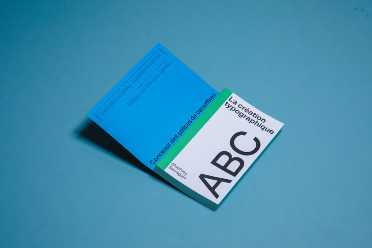
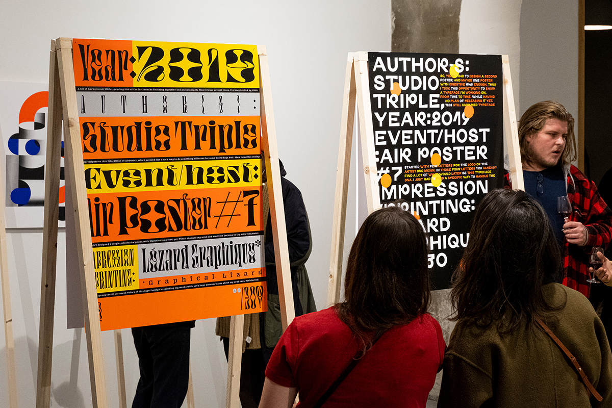
You can easily recognise Studio Triple’s dramatic type work from a mile away. We caught up with founder Jérémy Landes who’s also an important part of Velvetyne foundry to find about how he runs his studio and how he creates his beautiful, original typefaces and other works.
Amber: Hi Jérémy, so before you founded Studio Triple, what is your design background? How did you get into Type Design?
Jérémy: Originally, I wanted to be an architect. But my attempts into thinking space in 3D while I was in a design-focused high school proved to be a failure. I had to accept that I was better in (and enjoying more) creating flat images. Then, during my graphic design studies, I had the chance to be introduced to type super early. We were already asked to sketch a lot of type as the first semester of my graphic design school was just starting. I discovered that I liked it and specialized in type design when I had to choose a master degree. I ended in the historical École Estienne in Paris, being in the same class than the already super talented Hélène Marian and Julien Priez.
I keep a super vivid memory of my time in this (public) design school and I think that this broad introduction to all the fields of design made me curious and have a large horizon in my references and interests.
A: Amazing, so tell us about your day to day running of your studio?
J: My activities are divided between graphic design and type design. Then, my time is shared between commissioned work, self-initiated projects and non-profit. I tried, since the creation of this studio, to have a lot of time available for self-initiated projects and non-profit. My balance is always shifting, but I would say that at least 30% of my time is dedicated to those, tending to 60% during some periods.
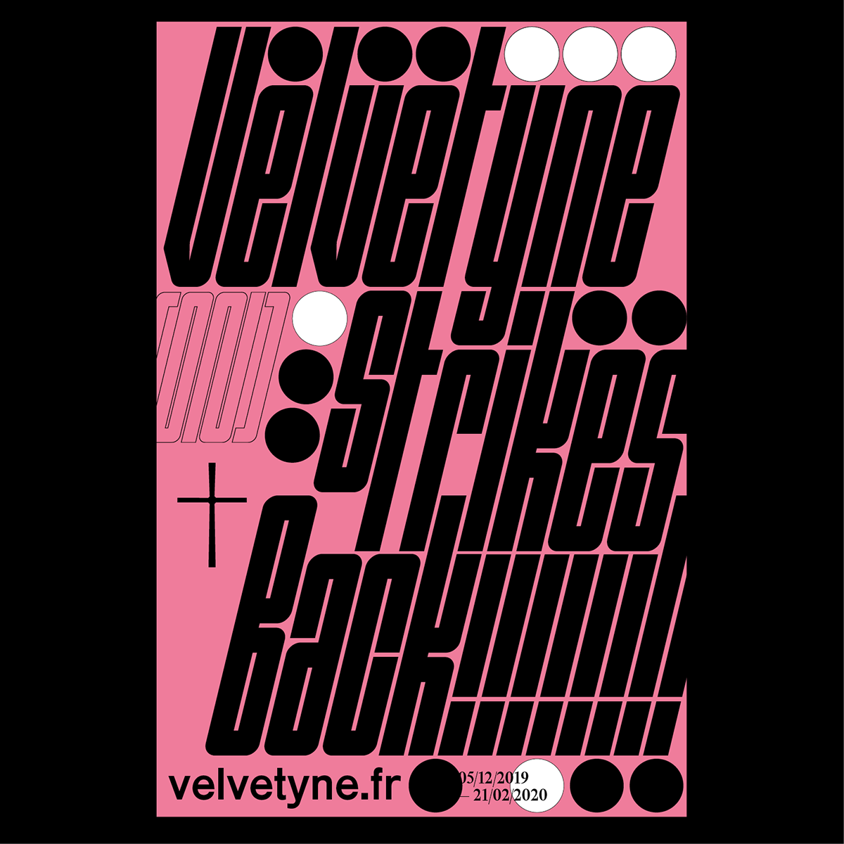
The collective open-source foundry Velvetyne can take a big share of this *free* time. I’ve been involved in it for about 9 years now and it’s grown a lovely team of people that I enjoy to collaborate with.
I like diversity and I think that each project is getting nourished by the different types of activities I’m involved in. I get bored when I do only graphic or type design, and I’m often getting involved in new kinds of creations to challenge myself and learn new things.
A: Where do you think innovation in type lies? Is it the shape of the letter, format, or functions perhaps?
J: In type like any other fields, innovation can and is coming from a lot of different places. In fact, innovation can’t be predicted and that’s what’s nice and exciting about it. You need to open yourself to mistakes, useless job and lost time to welcome innovation. I think that to innovate, we need to know and to reflect on the rules we are playing by. Knowing these rules can allow us to break or tweak some of them to arrive into unexpected places.
Today, innovation in shapes comes from an incredible synergy between the graphic design and typed design fields, graphic designers thriving for original fonts and encouraging the type designers to create unexpected shapes. Without the graphic designers using our fonts and asking for novelty, I’m not sure that we would be as motivated as now to always create new shapes.
A: What’s been your favourite type project you’ve worked on/created?
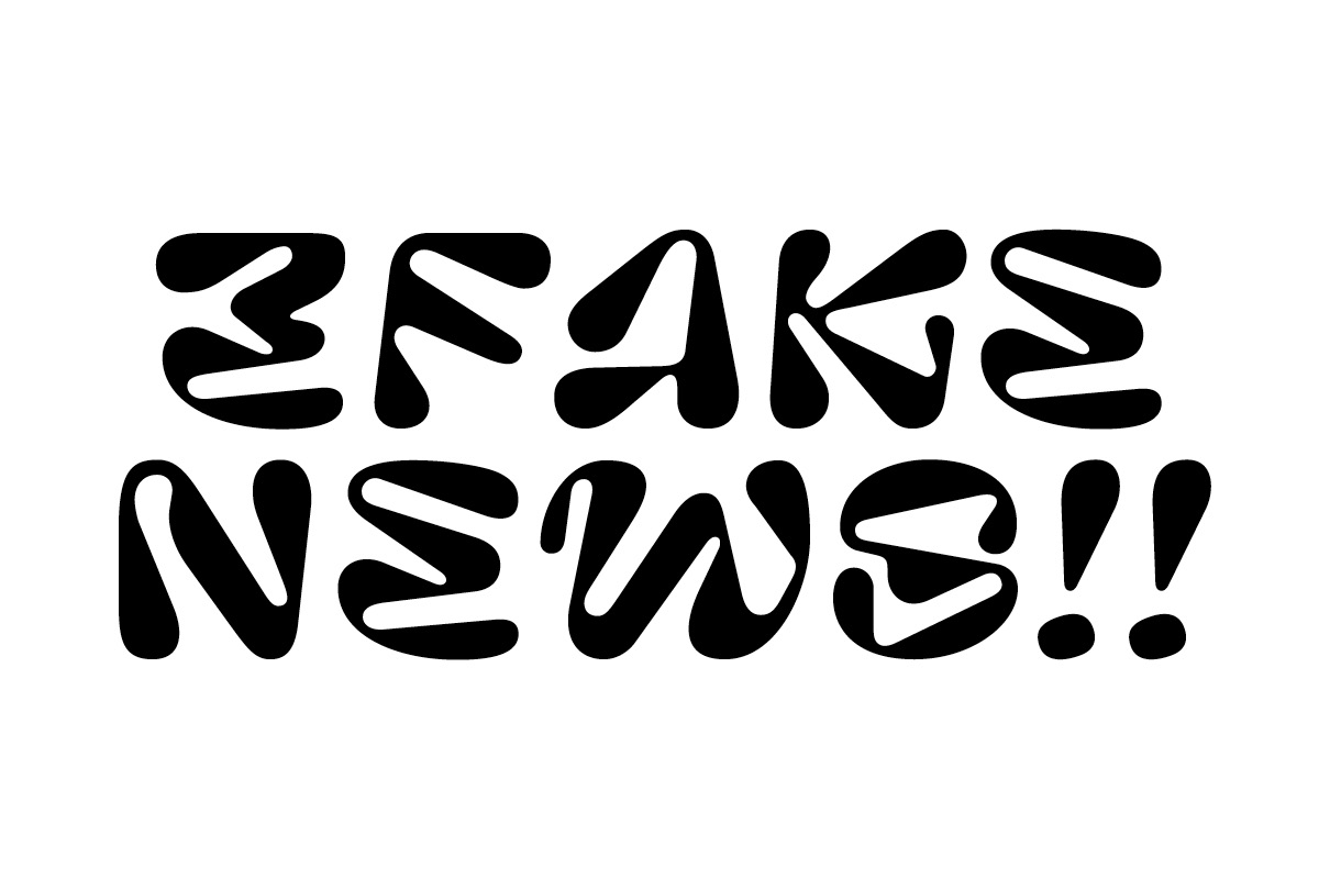
J: This is such a difficult question! I love most of my fonts and it’s super hard to choose any favourites. But I can say that working on some was harder than on some others. For instance, Digestive was finished after a long and tedious process, full of amusement but also of doubts. Custom works, in another hand, force you to work faster and make quick decisions. When they go well, they can lead to great creations in a short amount of time. Le Murmure and my still unreleased project codename Systemiik are of this kind. They are the fruit of collaborations with amazing art directors (Agence Murmure and Leslie David) who were allowing me to work in a great creative frame. I would never have drawn these fonts without these projects. And I wouldn’t have finished them so fast. For these reasons, these fonts can be some of my favourites ones.
A: Where can you see Type Design moving to in the future?
J: We are in a time where type design is cool again. Graphic designers love fonts, they use some as pillars for their creations and encourage the creation of new ones. Trends are faster than ever and freshly baked fonts can have a lot of success. But this was not always the case and I clearly recall that it was a really nerdy and boring choice to specialise in type design in my time. I also have the feeling that art directors were tending to less original and safer choices by then (10 years ago). This creative golden era we are in allows me and many others to create, release and make some money with innovative fonts.
This could have an end. People could be bored with these incessant trends in type design and we could fall again in a period of type dryness. I’m not saying that to be alarmist, I know nothing about the future. I’m just saying that I know how lucky I am and that I’m trying to enjoy it as long as it lasts. That being said, I think that the future of type is laying in the ends of the end-users. Will variable fonts be something? This is in their hands.
A: What advice would you give to a type designer today?
J: It has never been so easy to create and to publish fonts, and nothing could be better. But this easiness and the rhythm of our contemporary world could lead us to follow the flow and release fonts as fast as concert posters. But we should maybe sometimes take two steps back to think about what we do and be more selective about the projects we work on. We should, when drawing a typeface, ask ourselves why we do it and what could be made to be closer to the best version of this typeface.
Sometimes the best version of a project is no project, or a not finished one. For instance, drawing a typeface too close to another one (because of too much inspiration or too fewer luck) is not a problem. But then spending energy into finishing this typeface and releasing it might be meaningless. As authors, we should thrive for originality and we should think about what we publish. We won’t have the time in our lives to draw all the typefaces, so better spend time and energy into the most original, interesting, meaningful or fun ones.
A: Finally, any exciting future projects we can expect?
J: I’ve just started working on a super exciting custom font with my friends of AAAAA Atelier. This will be a big project related to the food business and it’s already looking super good. The schedule is tight and the fist results will be visible in summer, I can’t wait to work on it and to see these crazy variable fonts live in concrete, ceramics, paper, wood, posters, mobile app…
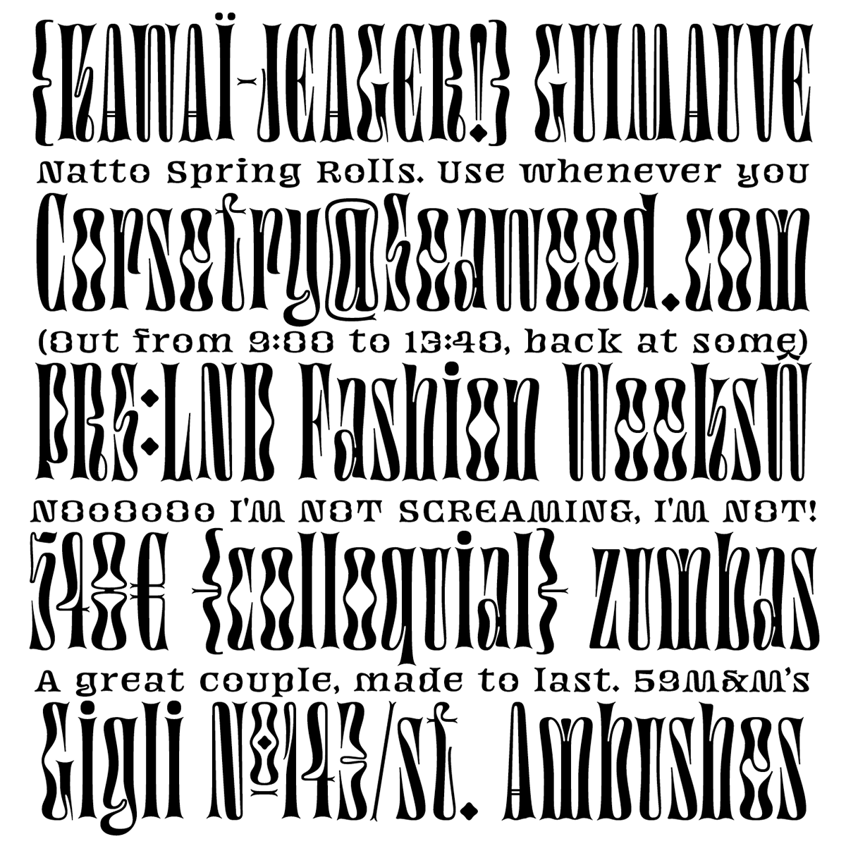
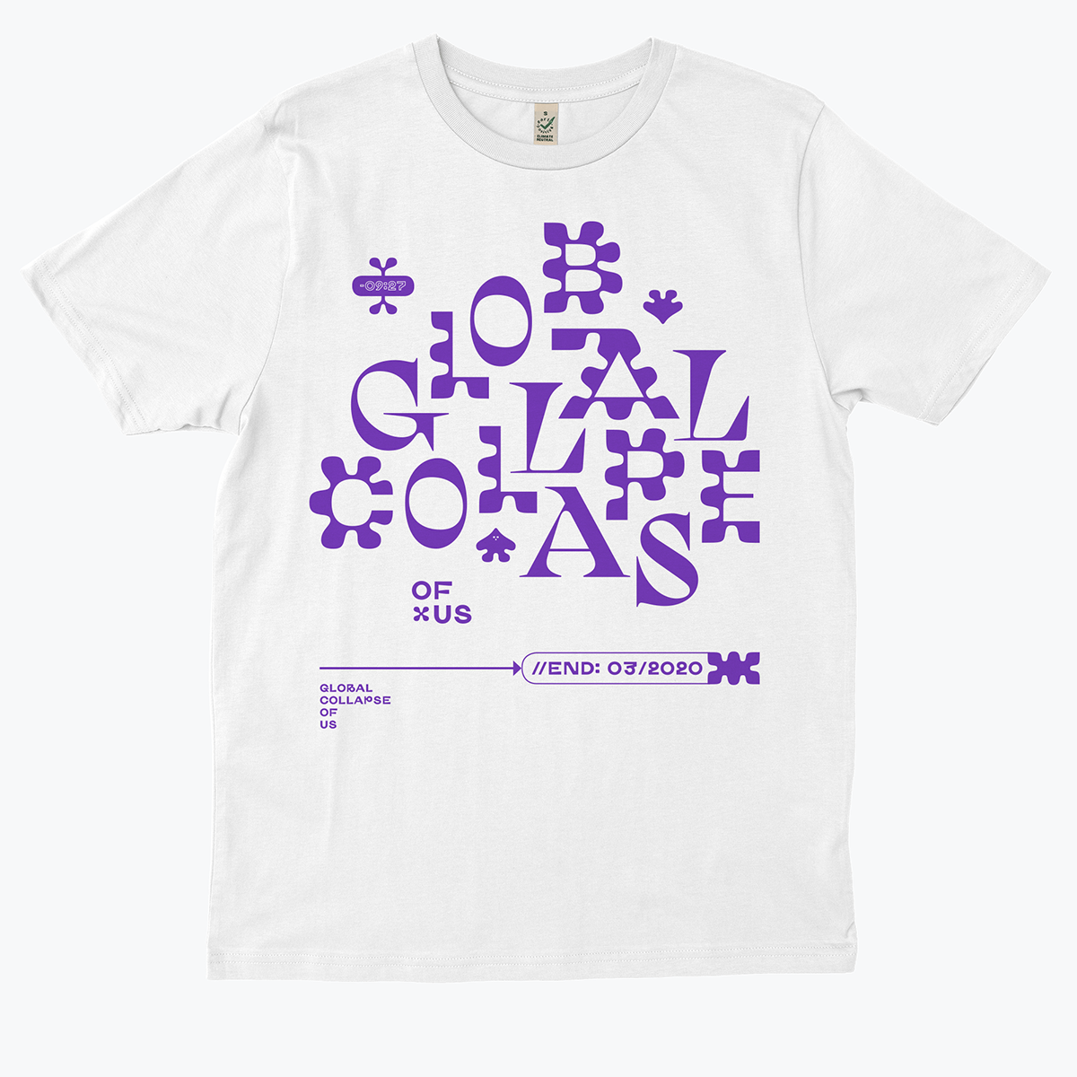
Beside that, I’m working on updating my Jaune typeface which is already available on Future Fonts. The lonely display black weight will see its family grow with the addition of new weights up to some extra light and also some quieter styles for longer texts. I have good hope that this family can be a consistent and interesting grotesque to use. Oh and I almost forgot, I just made a T-shirt for Everpress that you can pre-order till the end of March. It’s a shirt about love, mental breakdown and our present times. Uplifting!