Oxfordshire-based design duo, Sara Lundqvist and Sam Dallyn, make up the small, independent design studio, Lundqvist & Dallyn (@typo72typo). The two’s visual inclinations meld into an aesthetic and typographic sensibility which forefronts geometry, graphic typography and Scandinavian design influence. Drawn in by their ongoing, exploratory series, Typo72Typo, we got in touch to discuss their reflections on the project so far, as well as their future ambitions.
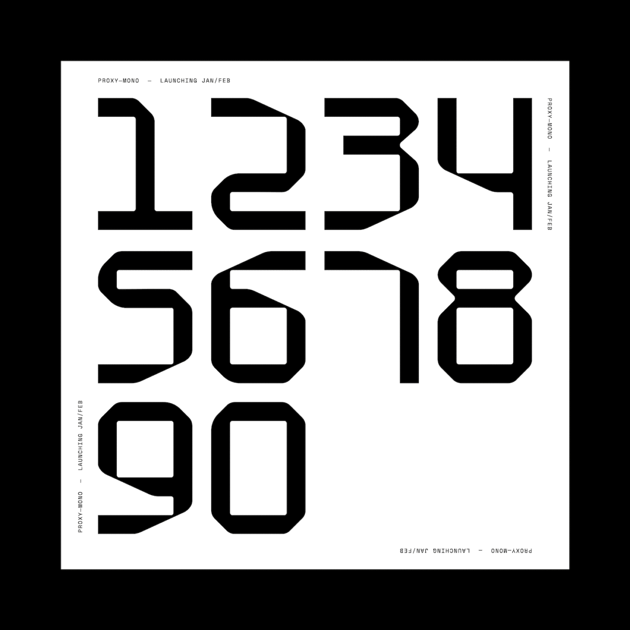
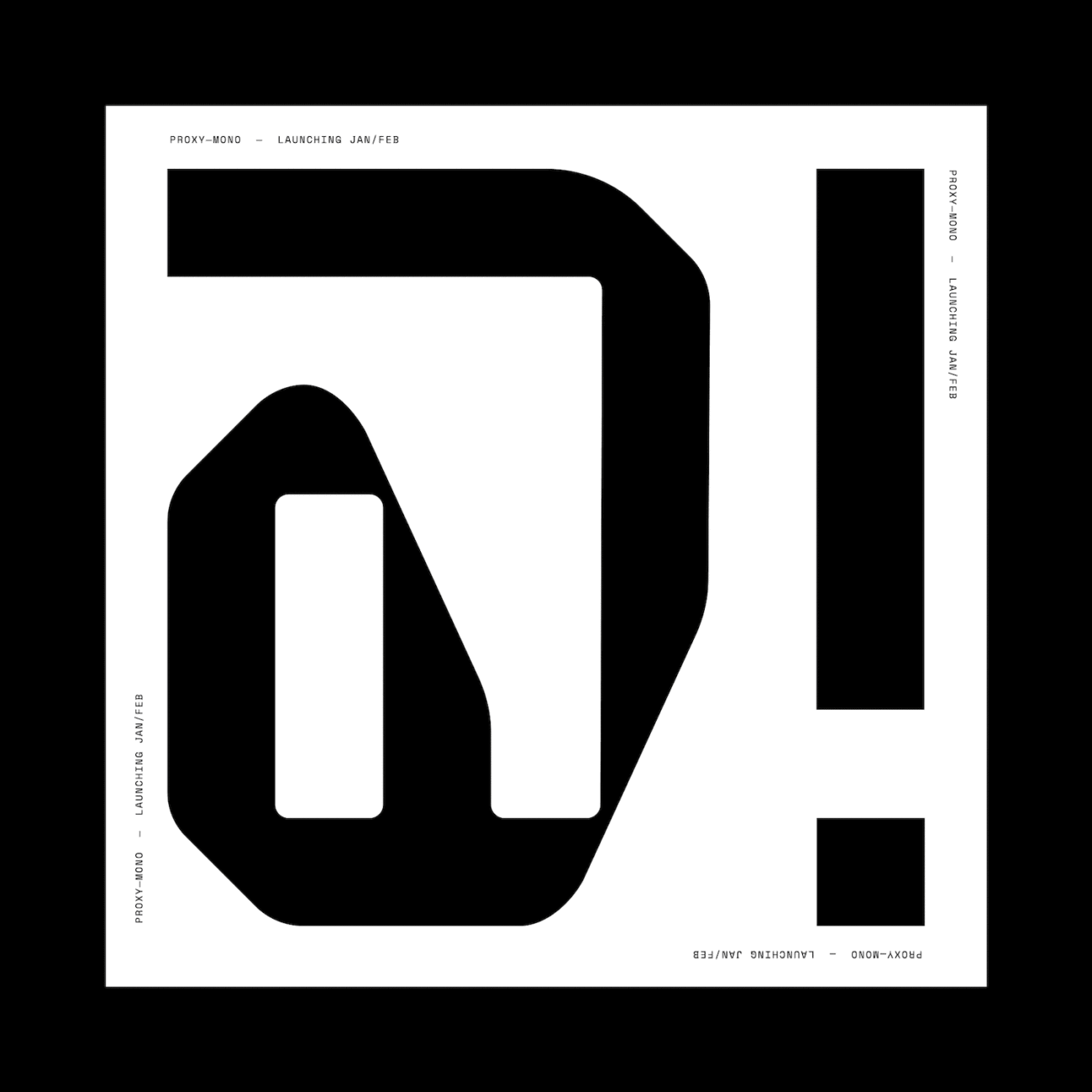
‘We started [Lundqvist & Dallyn] because we wanted a flexible life where we could spend more time with our kids’, Sam explains, adding, ‘Sara’s Swedish heritage has brought a love of Scandinavia into our work, partnered with my love of typography.’ Though working more broadly in graphic and type design for their considerable client base, Sara and Sam decided to start up Typo72Typo as an experiential project – given a platform through Instagram – to act as a creative outlet without restrictions, and through which they could explore their love for type (and more specifically, numbers) in their own, liberated way.
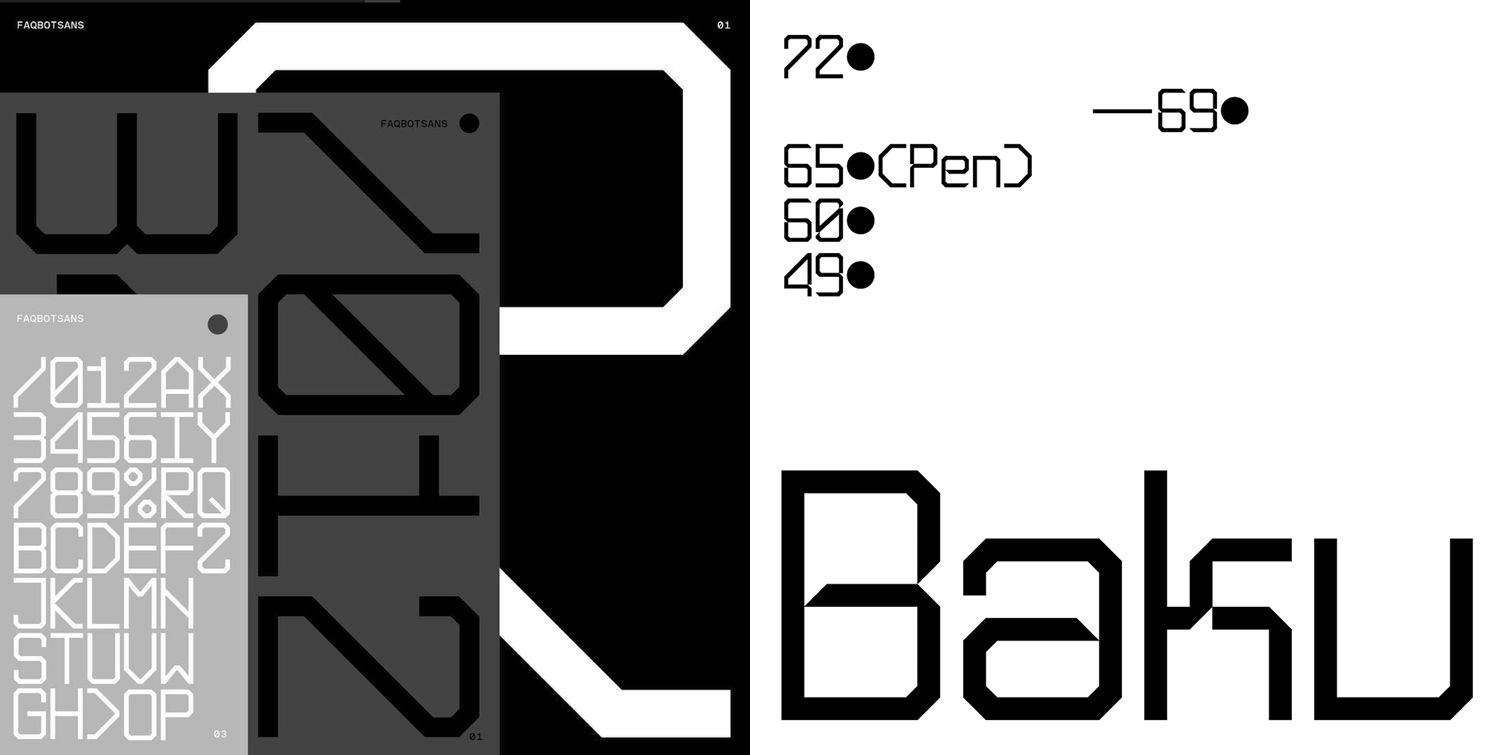
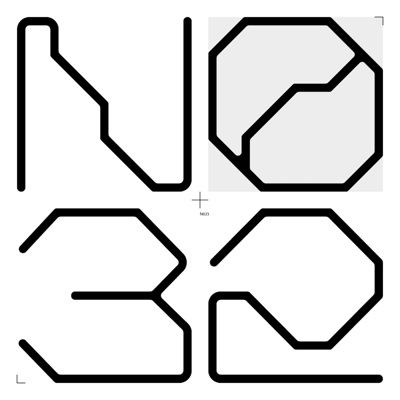
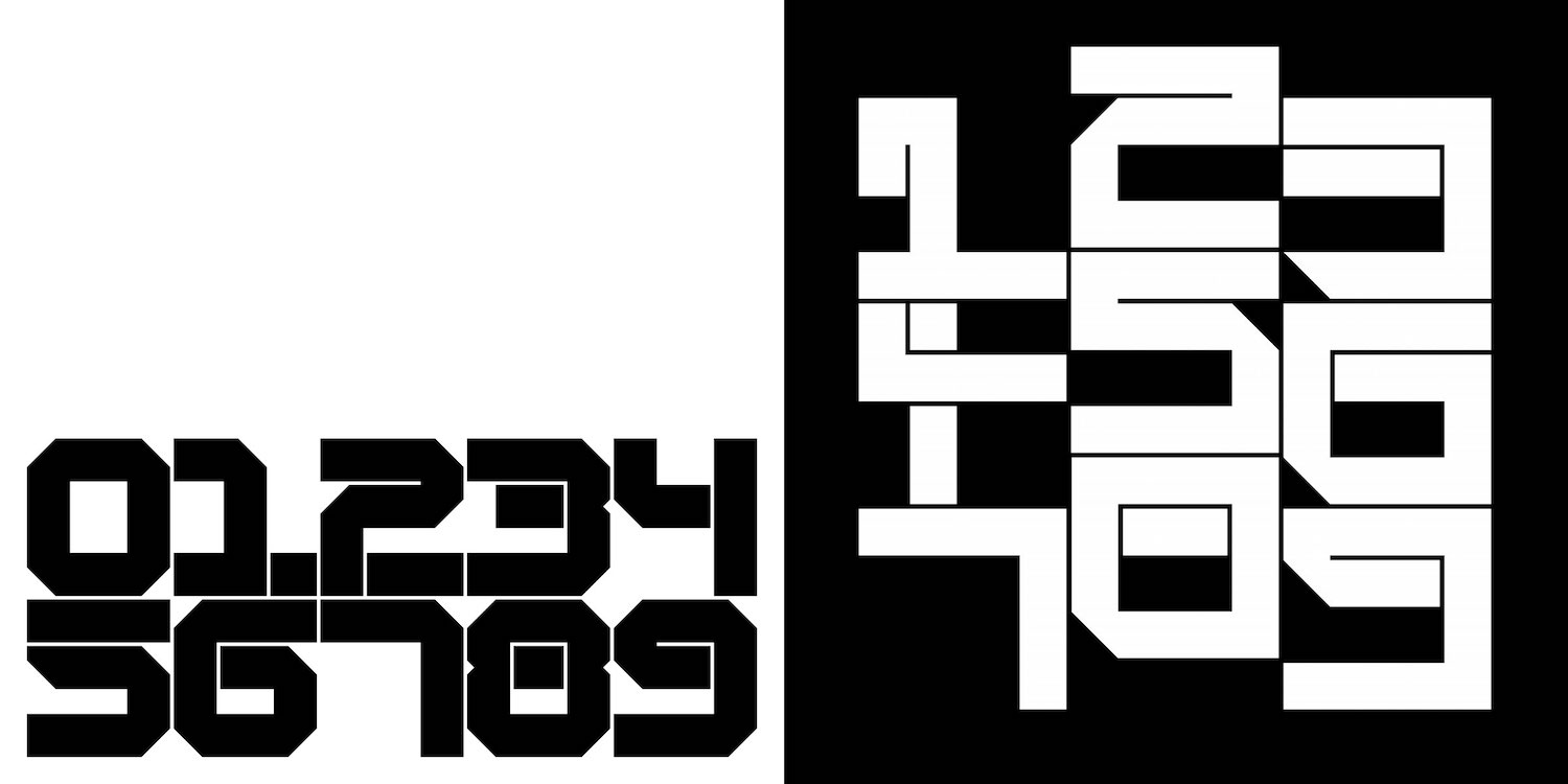
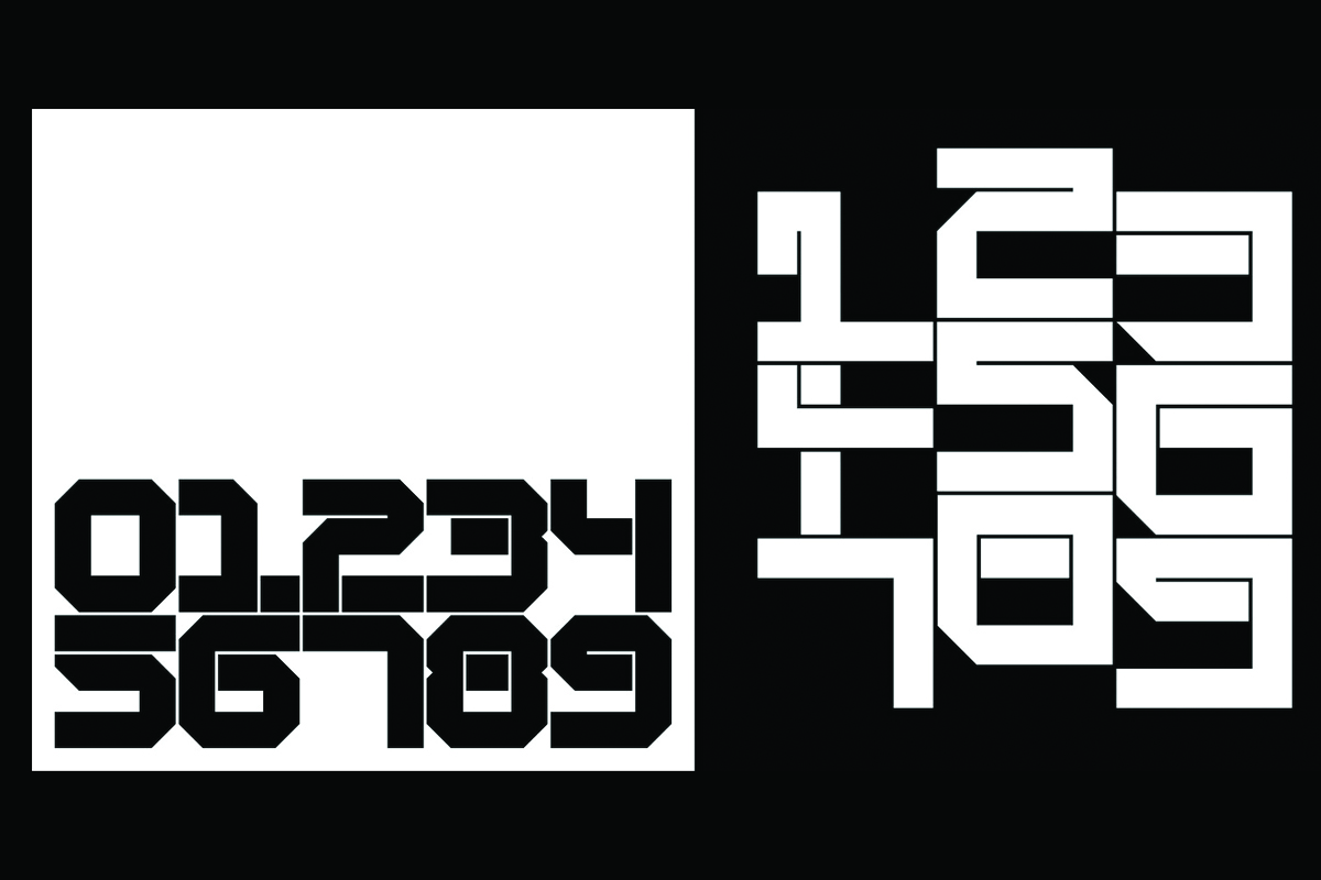
‘Our Instagram account started merely as an outlet for our love of all things typographic’, Sam tells us, ‘We started experimenting with custom type with a few projects and thought, let’s have some fun and create something with no restraints. The account has one simple rule – create glyphs we like, nothing too involved’. The pair’s playful, light approach to this series definitely shines through in the work. Experimenting with moving image through gifs, as well as geometric, exploratory glyphs, Typo72Typo behaves like a breeding ground for new ideas, without the need to fit into the boxes and restrictions of functionality and/or usability.
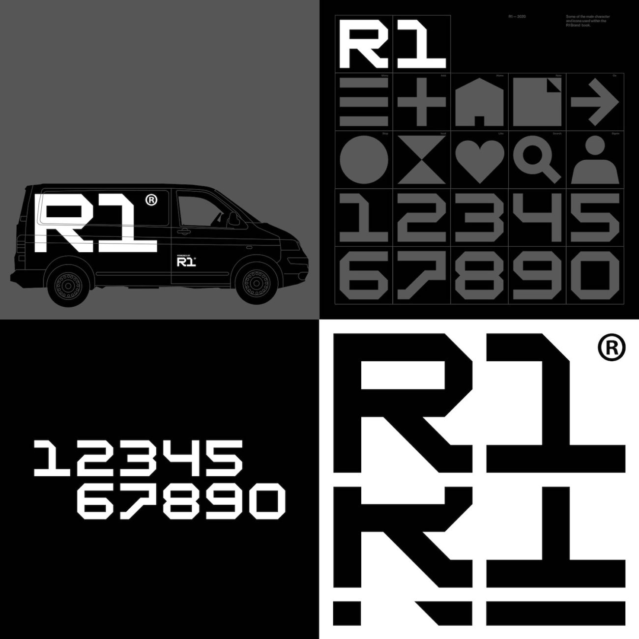
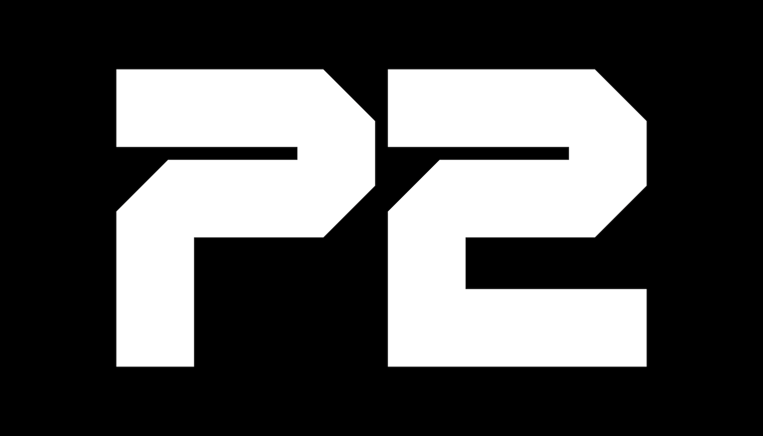
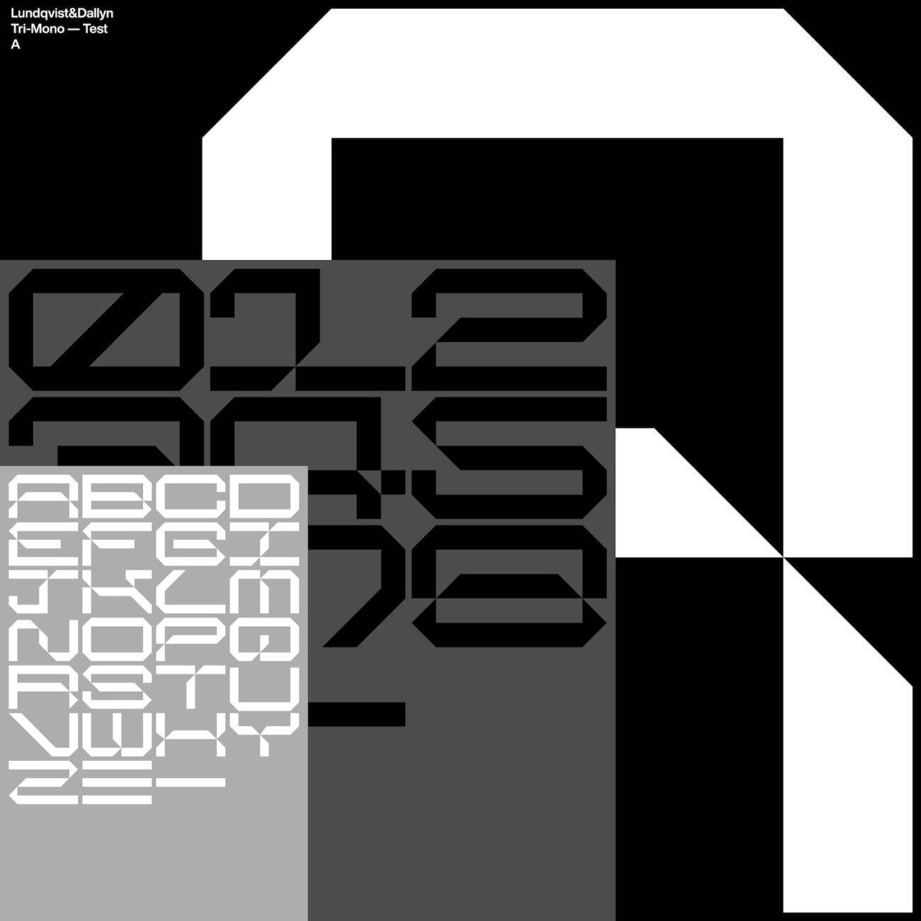
The result, then, is an incredibly engaging series of design snapshots – of glyphs which explore composition, shape and counter-space. One of the elements of Typo72Typo we love, is the way each piece allows you to look at these isolated glyphs – or particular selection of glyphs – with a different, up-close, high definition lens. Through each typographic piece, the compositions highlight the various interactions between glyphs as well as the positive/negative space of the shapes – an exercise which never fails to inspire, and which means that there is always more to discover in each design. Generally created in monochrome schemes, the series feels really grounded in exploring typographic shapes and construction.
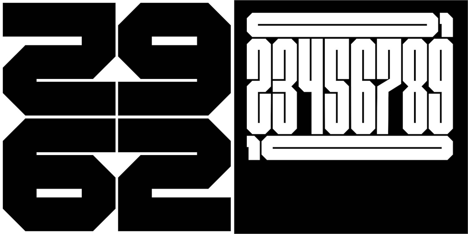
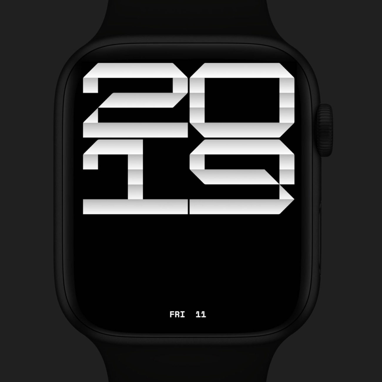
Looking to the future, Sam continues, ‘Something we are longing to create is a legible book typeface… but we know how time-consuming and involved this is.’ Although this may be on the cards soon, the duo seem pretty happy with their current balance, adding that ‘at the moment, everything revolves around things we enjoy… some of the typefaces we’ve spent more time building on we’ve added to our shop: Alterra, Proxy-Mono, NeonTube and N032.’
Thank you so much to Sam and Sara for chatting with us about Typo72Typo! We highly suggest that all type-lovers take a deeper look at Typo72Typo on Instagram, and that you check out their website to see more of Lundqvist & Dallyn’s work.

