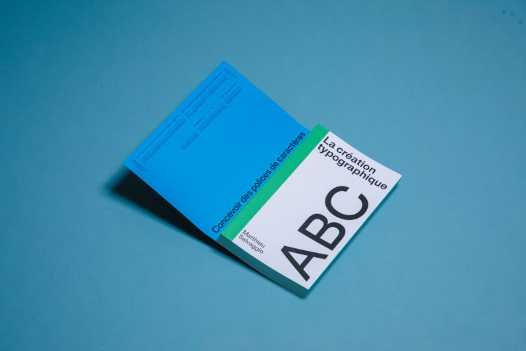
Founded in 2016 by Martin Vácha, Displaay (@xyz.displaay) is an independent type foundry and design studio based in Prague. Martin is graphic designer specialising in an array of practices; from type design to logos; visual identities to editorial design; art direction to book and magazine design. Initiated as a final MA project at UPRUM, Prague in 2014, Displaay has now developed into a broad, distinctive type and graphic design studio. So, we decided to delve deeper into the studio’s stunning typographic sensibilities.
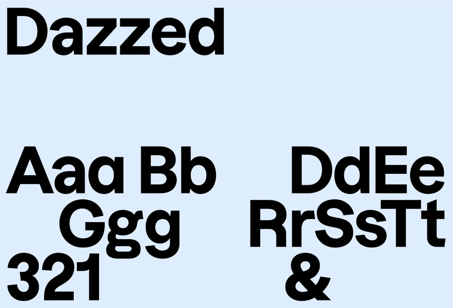
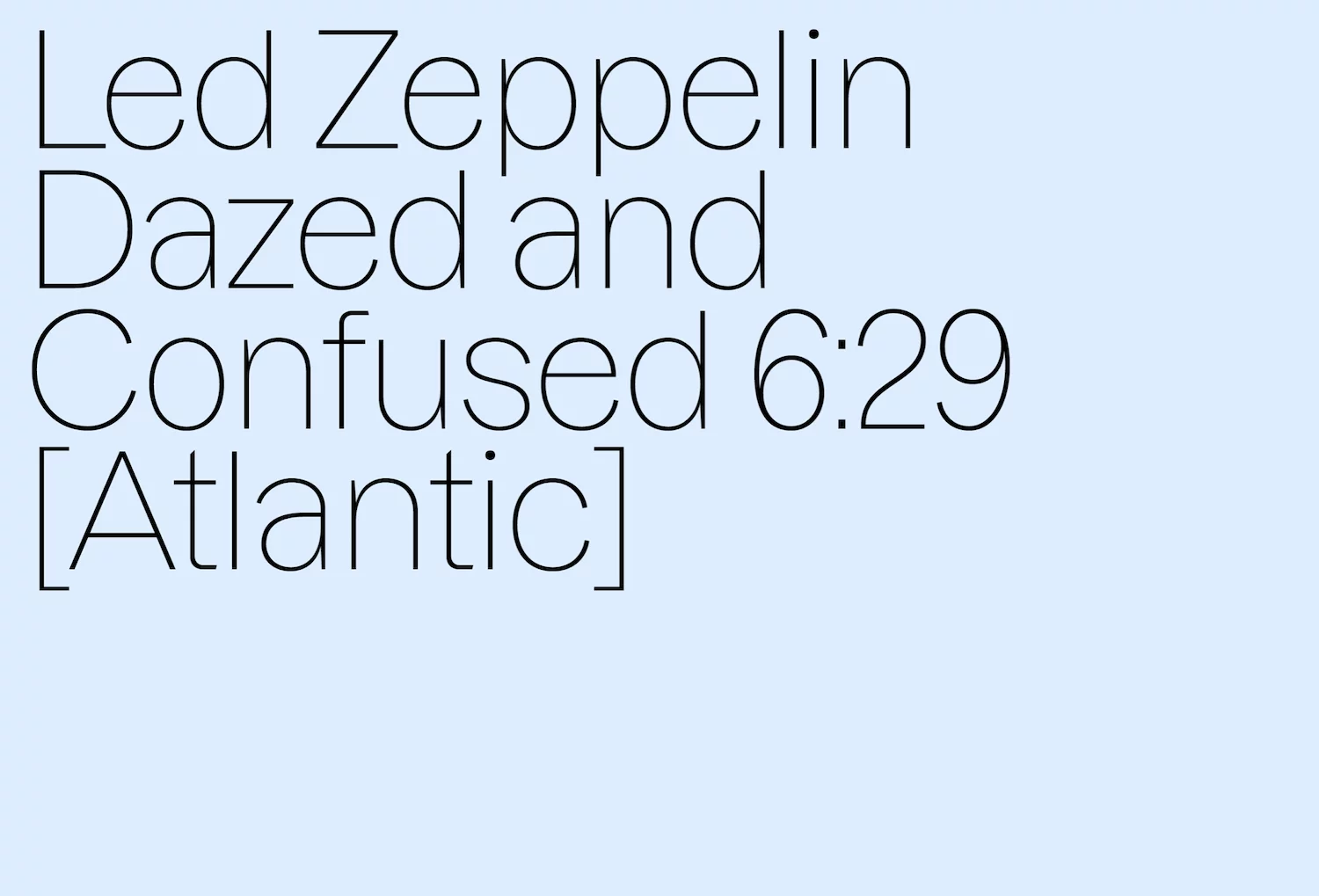
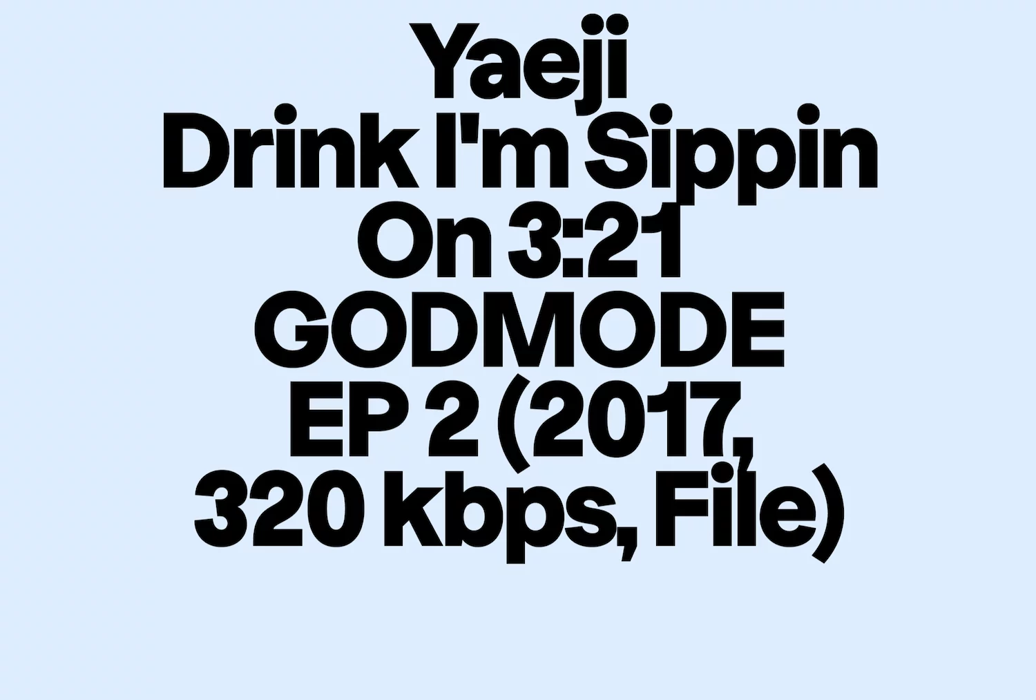
Displaay’s typefaces are vast and varied, but their overarching feel is sleek, minimal and functional – with a touch of the unexpected. A great place to start when getting a feel for Displaay’s output is Dazzed, a sans serif with narrow proportions and subtly unusual details. The reaching extension of finials (note the lower case ‘a’, ‘c’, and ‘e’) create an unusual distribution of tension and weight between the glyphs; giving Dazzled a unique kind of slant and a visible, vibrating energy between text.
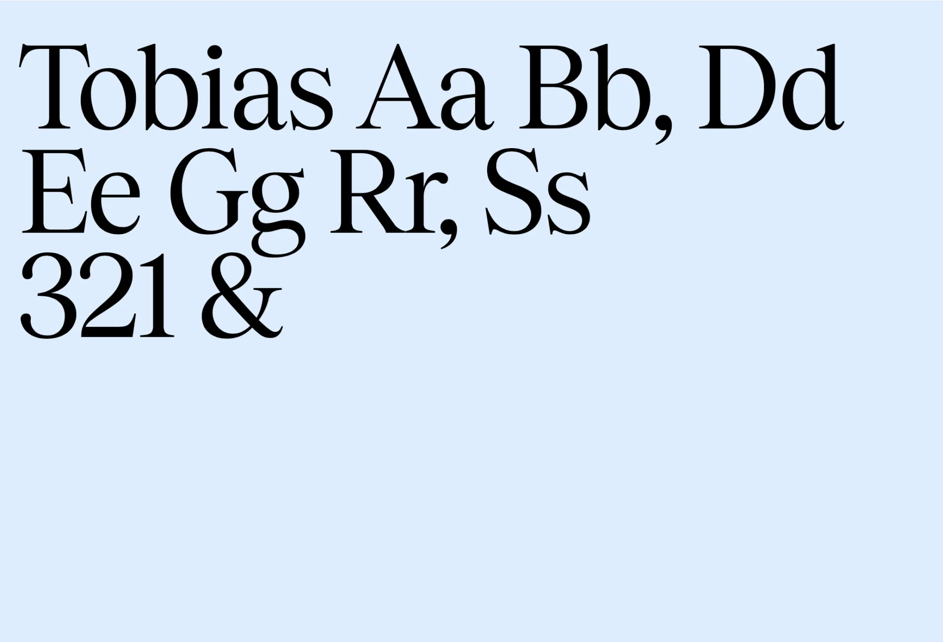
Beginning as a bespoke typeface for a cinematic project proposal, Dazzed aims to amalgamate the feeling of all the different kinds of cinema through its aesthetic, emulating contrasting genres and conventions visually; ‘You can see comic, grotesque, dramatic and quirky moments in “a, e, C, G” meeting technical, steel cold, action, crime and sci-fi shapes in “t, f, r” where the terminals are cut-off.’ Additionally, another favourite of ours is Tobias. A serif typeface with an Old-Style Renaissance feel (achieved through its diagonal stresses) it also has a baroque and transitional appearance – definitely worth a closer look.
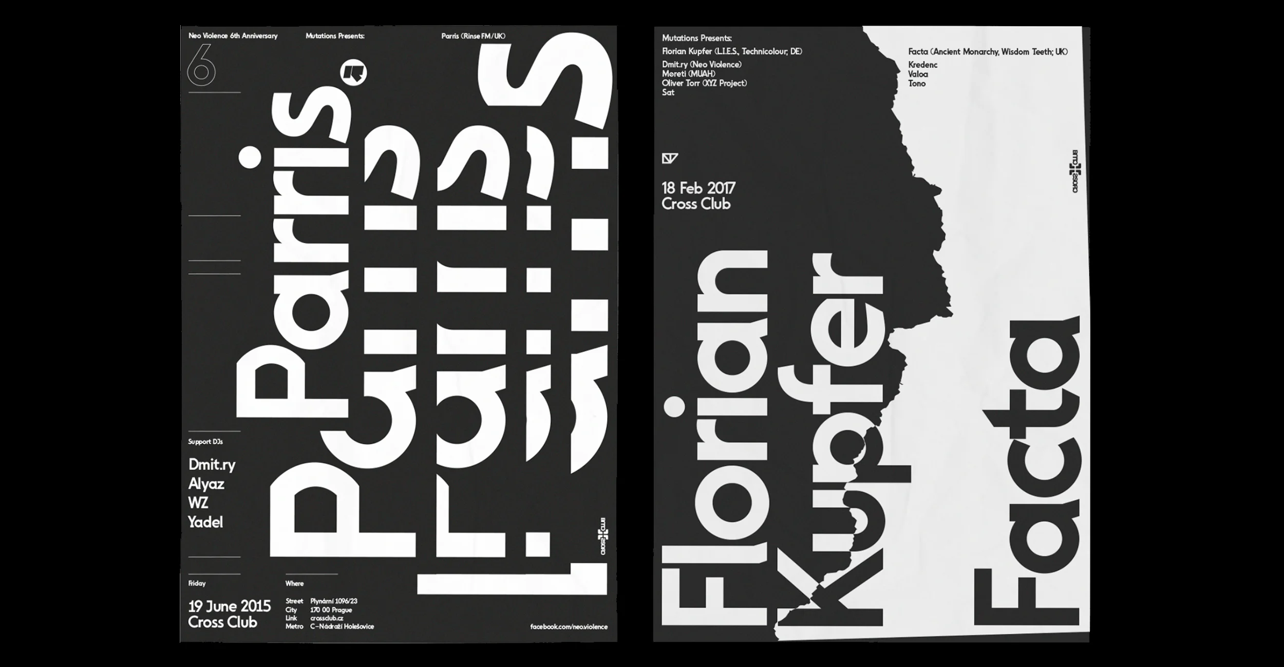
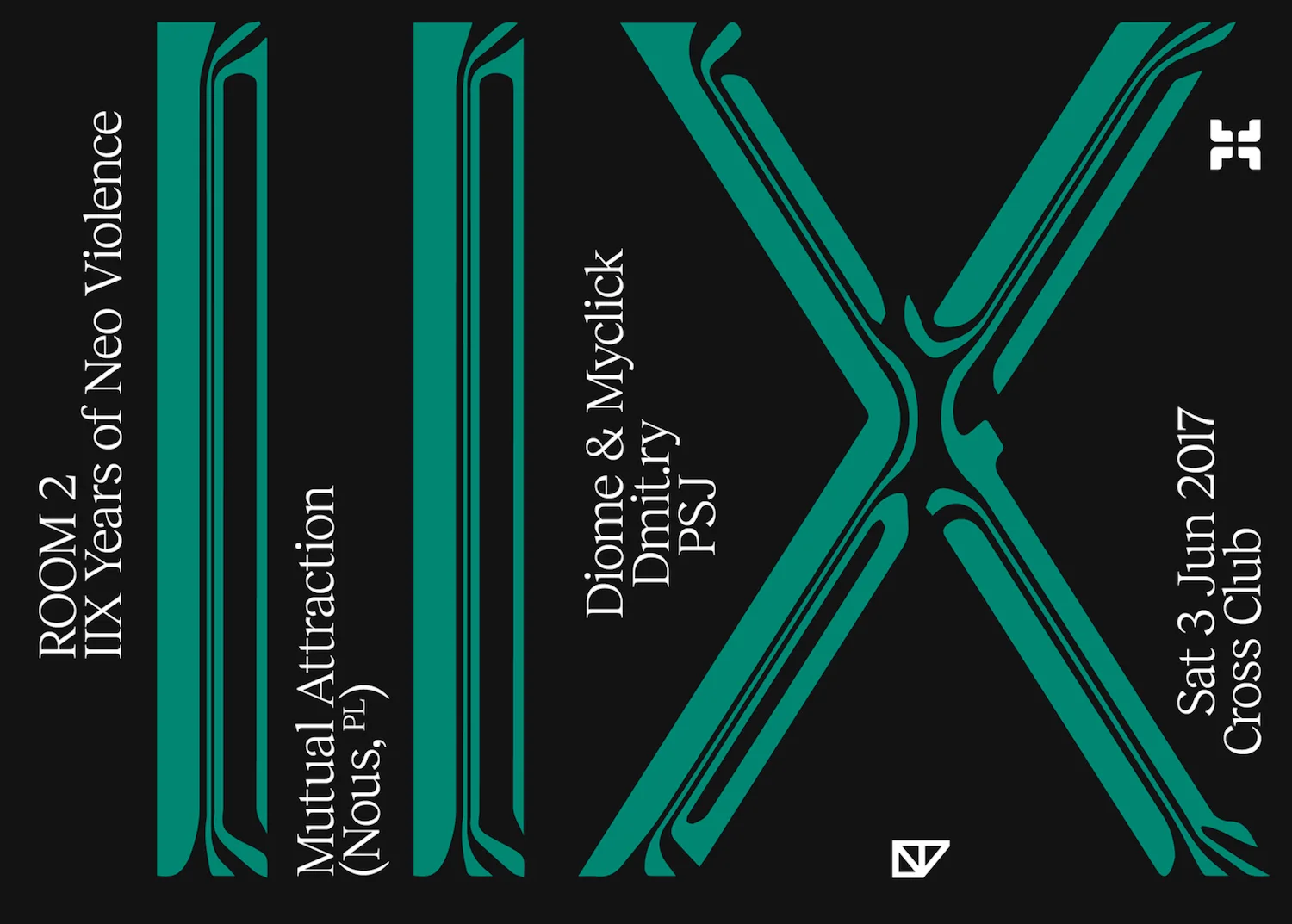
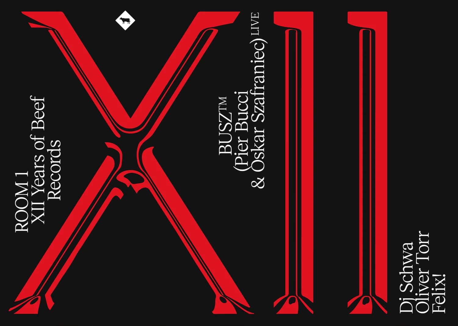
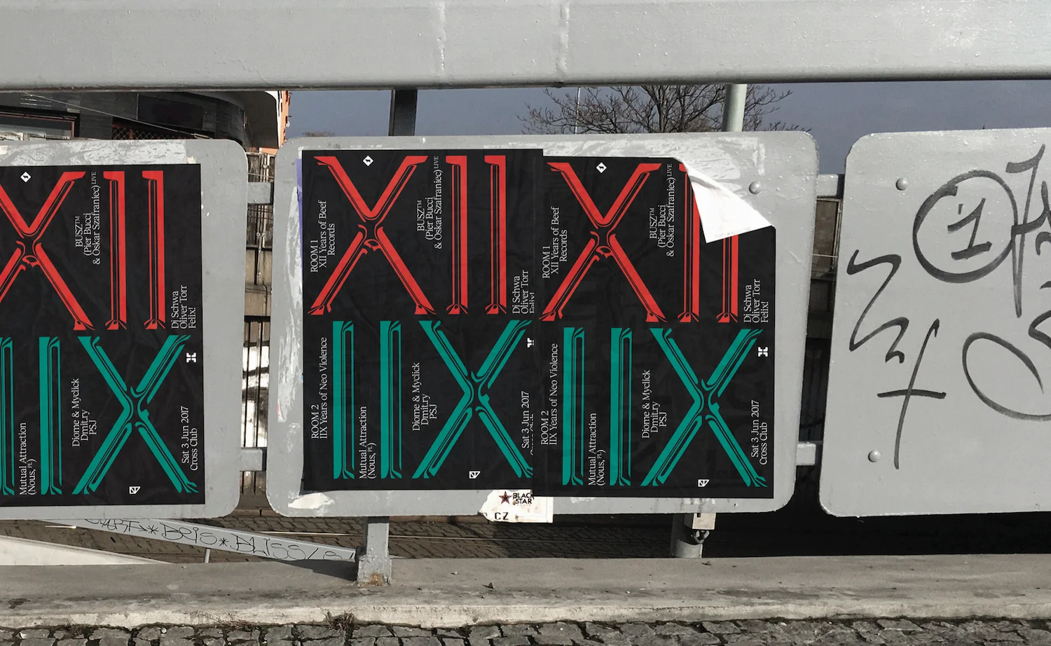
We also think that their typographic work is worth highlighting; particularly their posters for Neo Violence & Beef Records. The series Mutations was created to promote gigs in Cross Club, Prague (presented by Violence & Beef Records). The posters are monochrome and extremely textural, featuring type which is spliced and layered over on itself; showcasing Displaay’s eye for meeting minimal functionality with a unique visuality and intriguing tone.
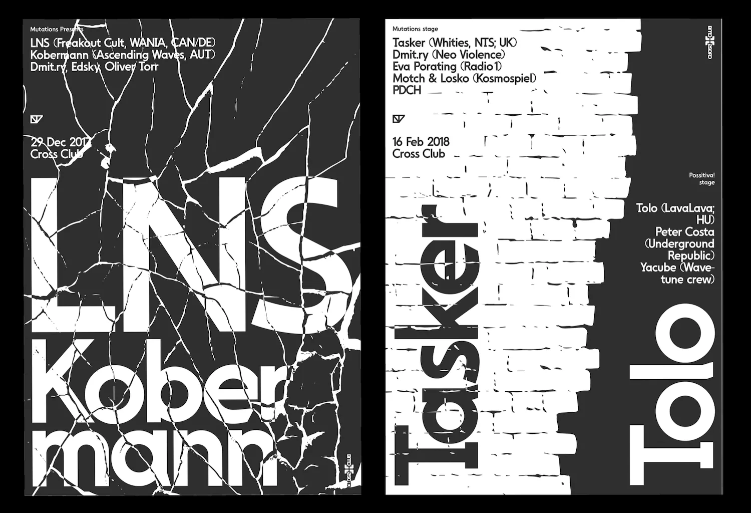
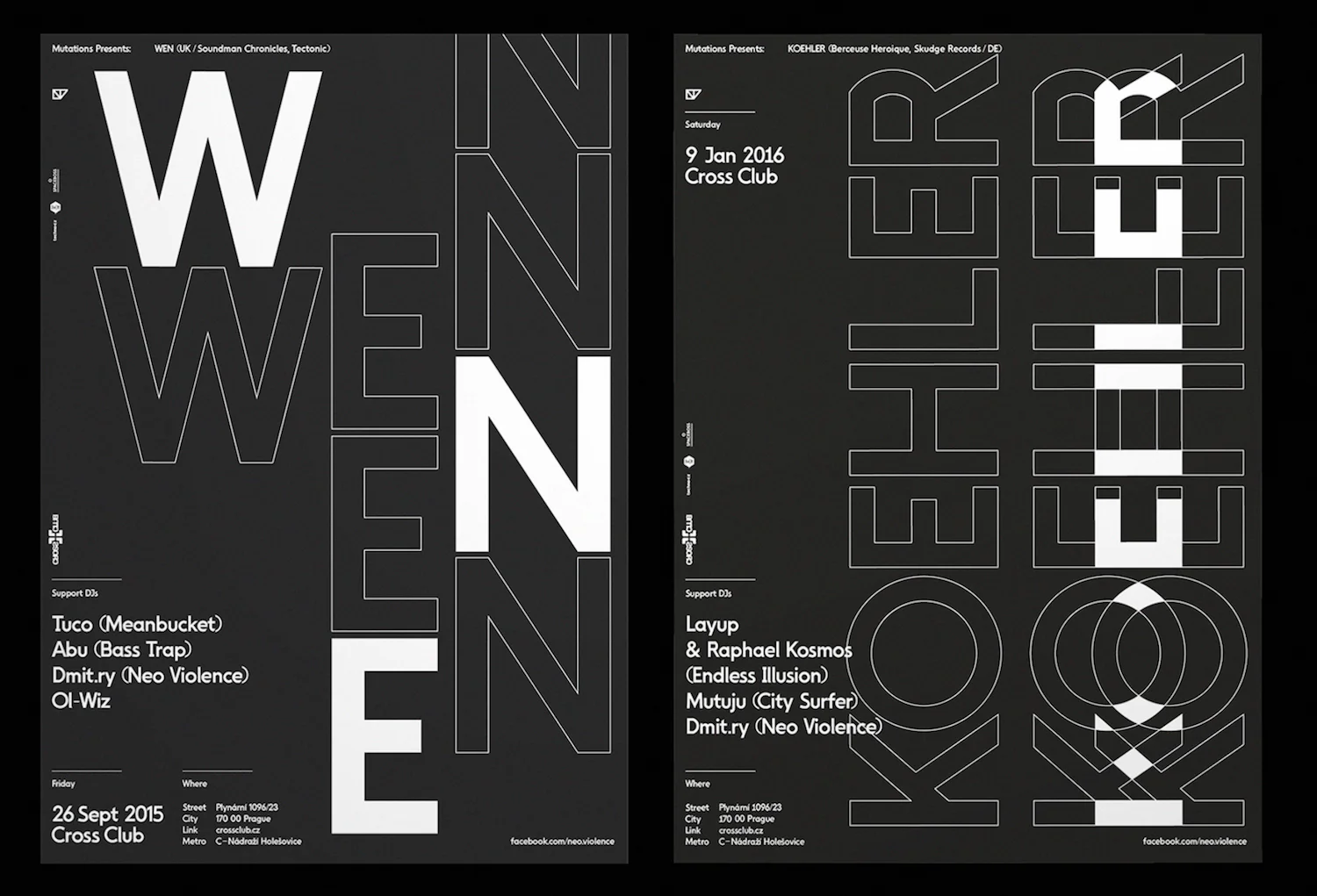
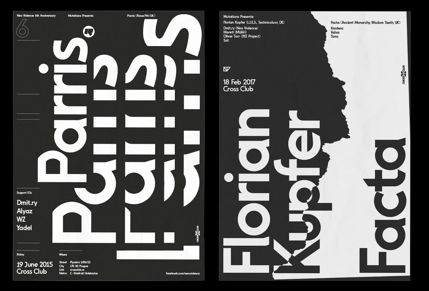
The limited colour palette of the black, green and red typographic Neo Violence & Beef Records posters melds stunningly with the glossy, seemingly malleable-yet-metallic roman numeral type work; which sits in stunning contrast with the concrete of Prague.
There is so much more exciting work to see from Displaay – take a look at their Instagram and website for more.