
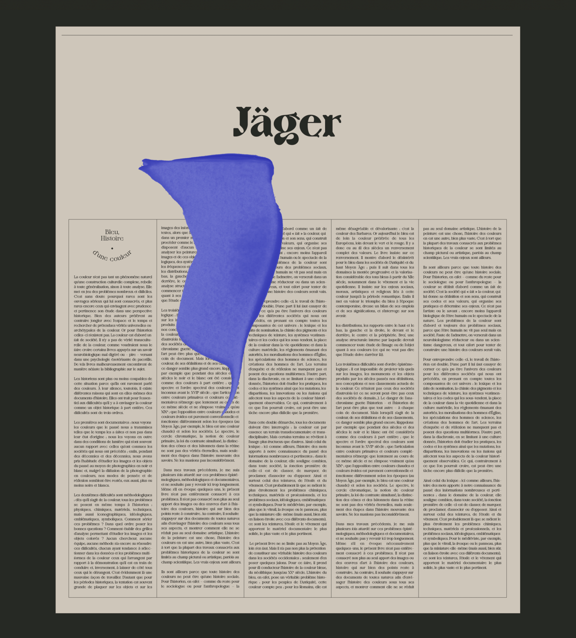
Violaine & Jérémy (V & J) Foundry (@violaineetjeremy) is a multidisciplinary creative studio which holds refinement, beauty, delicacy and timelessness at its core. Focussing on graphic design, typography and illustration, the studio works to harness their expertise to deliver beautiful, insightful visual messages. Being huge fans of their work, we got in touch with the founders, Jérémy Schneider and Violaine Orsoni, to discuss the studio’s newly released display typeface, Jäger.
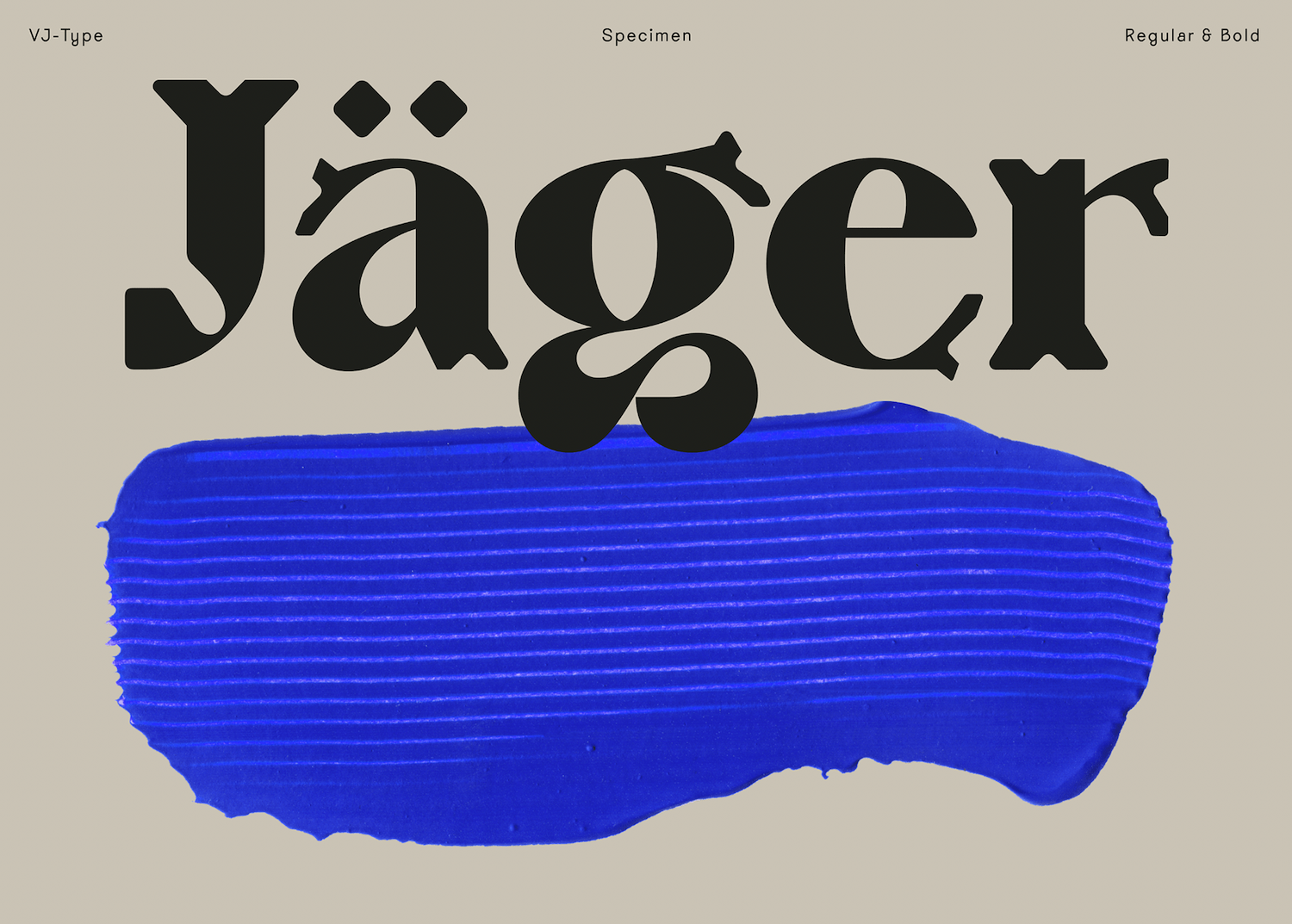
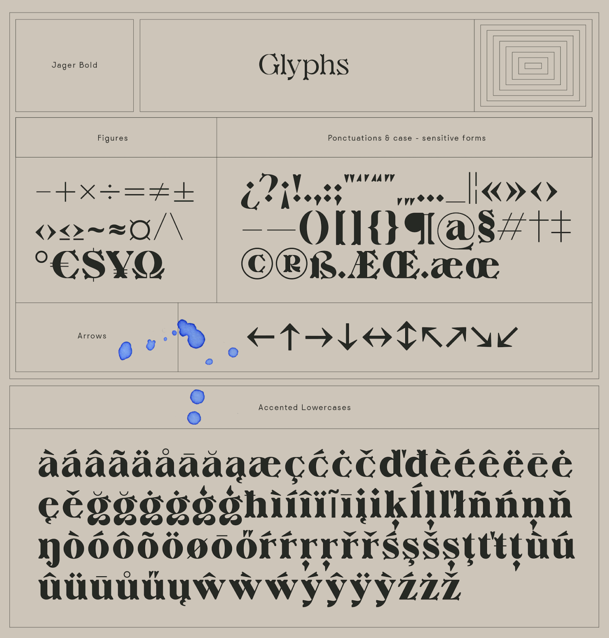
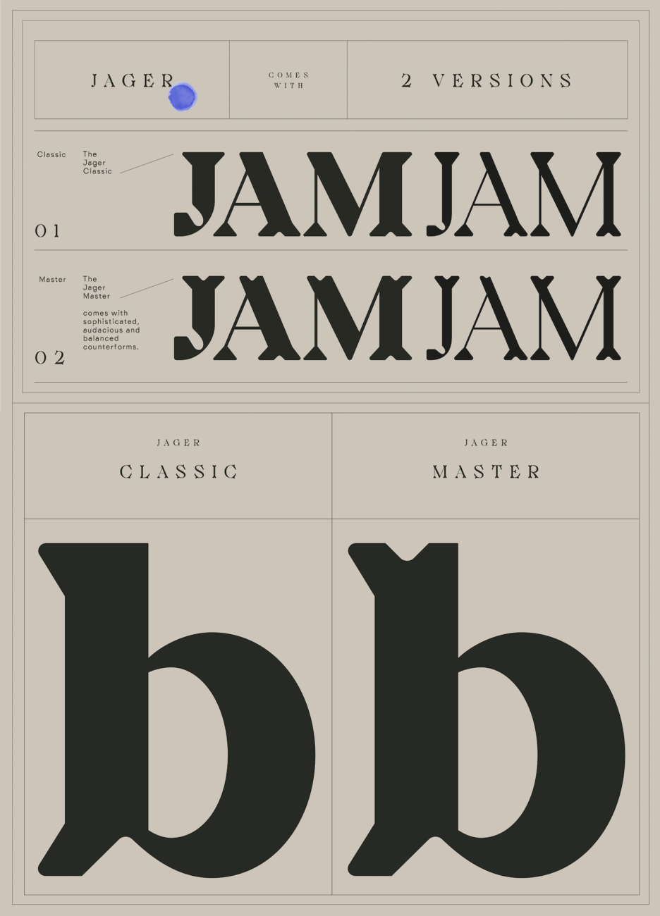
Available in two weights and four styles, Jäger is suitable for titling, headlines and short-to-medium length texts. Five years in the making, this typeface was designed by Jérémy as a tribute to fine craftsmanship and stemmed from drawings initially made for an exhibition at Musées des Arts Décoratifs in Paris, which explored the landscape and practices of contemporary crafts. Although a study of traditional fine crafts, Jäger doesn’t lean into a retro-style aesthetic or simply mirror the past. Rather, through the visual tools available in the construction of type, it enlivens and celebrates these ancient techniques whilst emerging as bold, original and one-hundred percent contemporary.
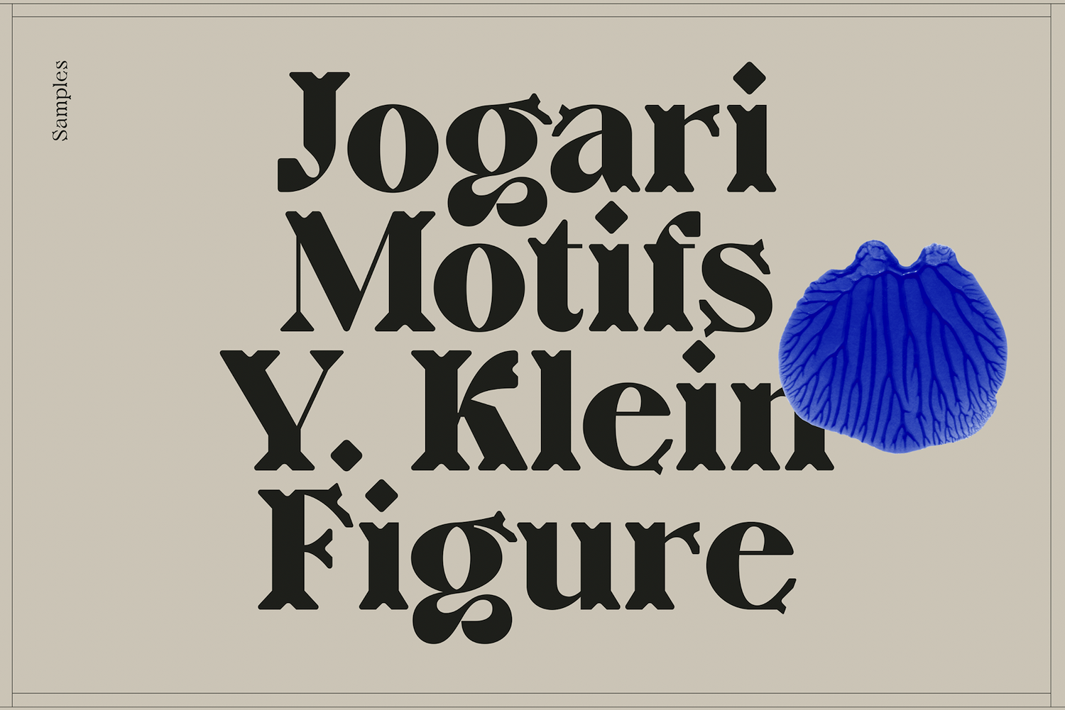
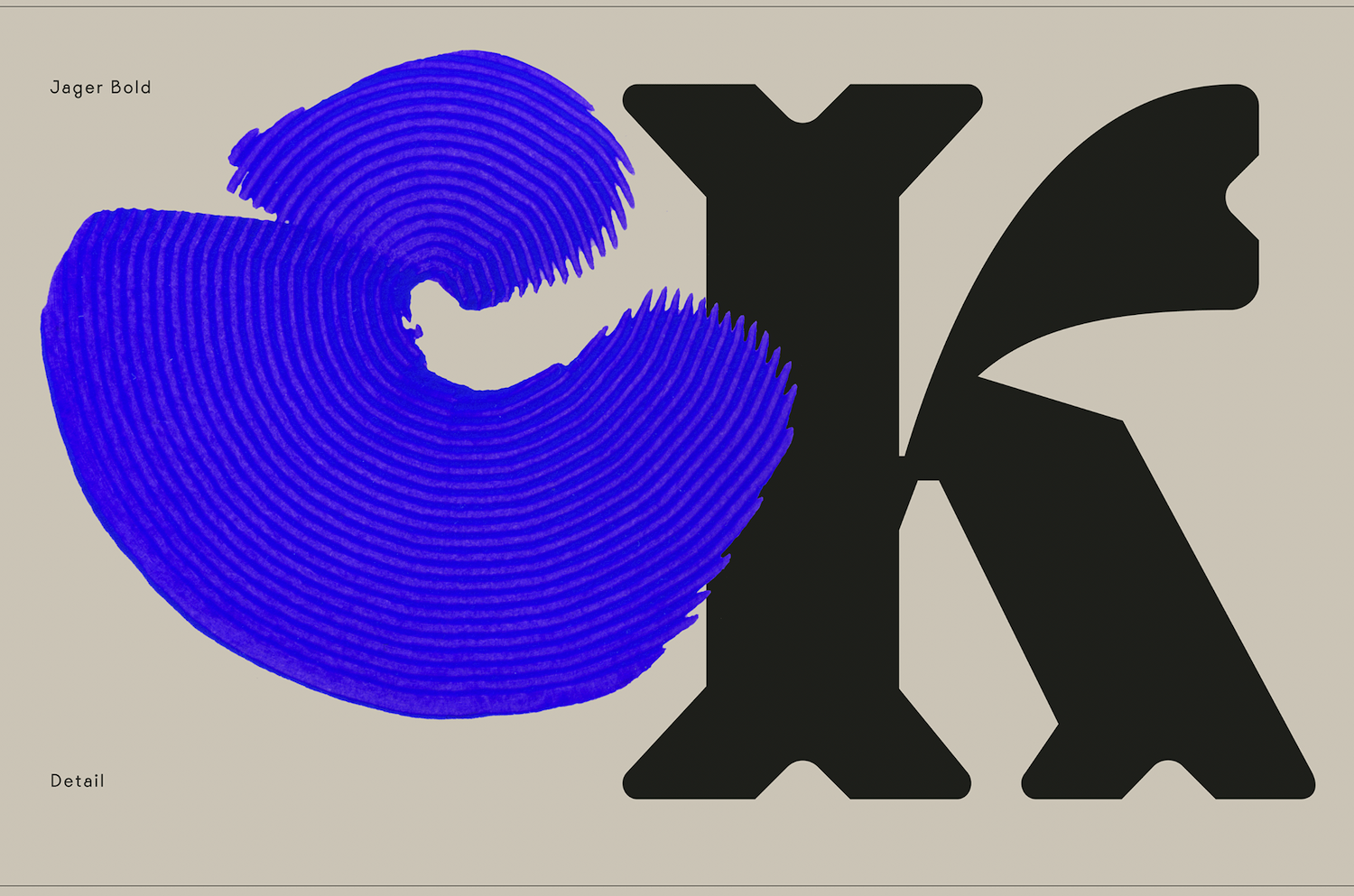
Certainly, the feel of the characters is incredibly tactile and gentle, but the overall effect and the interaction between the glyphs feels sharp, engaging and fresh. Its decorativiaty is super interesting, as the typeface is actually built from relatively simple-looking shapes; however, the impeccable compositional judgement and productive use of counter-space renders Jäger juxtapositional of ornate detail and contemporary simplicity.
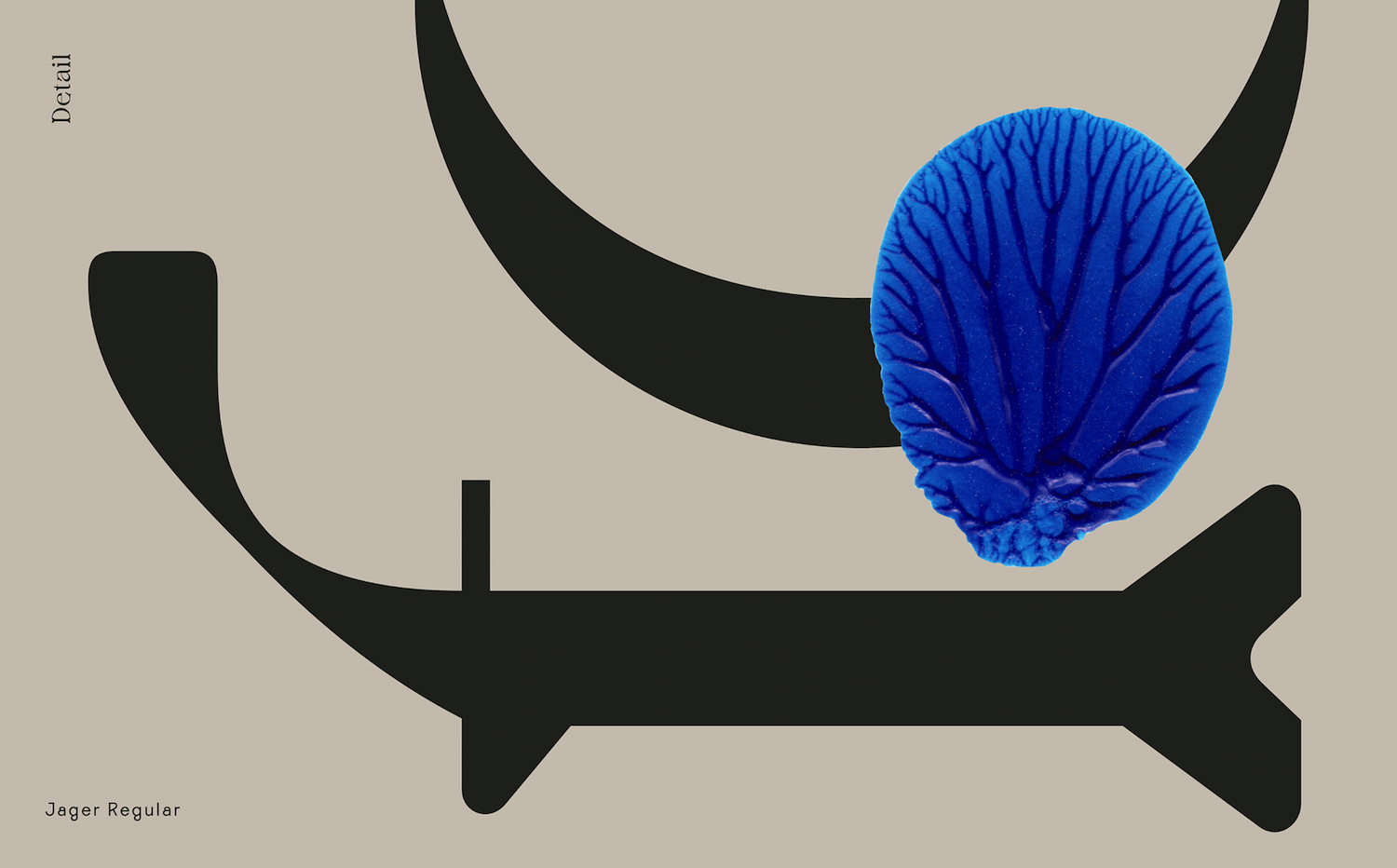
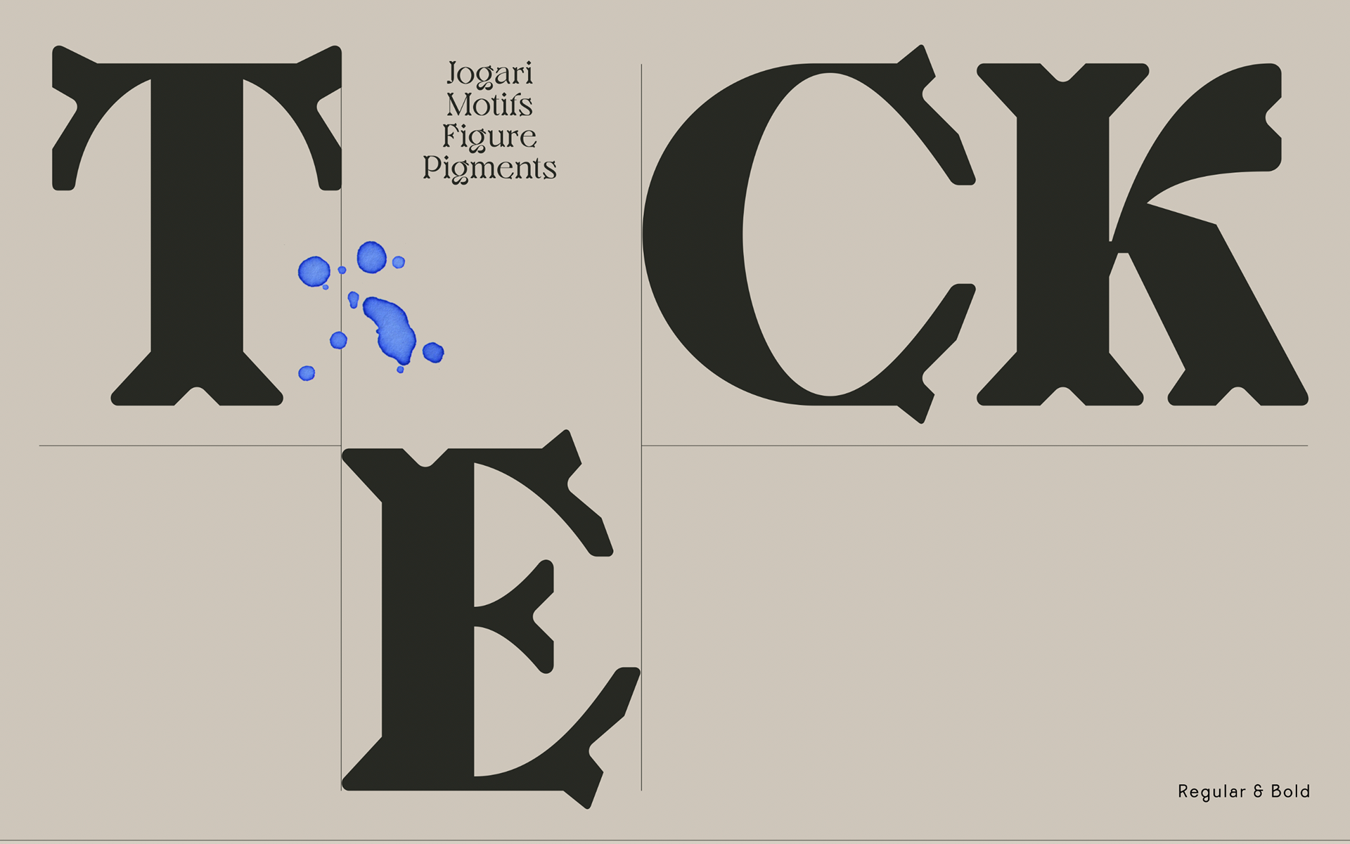
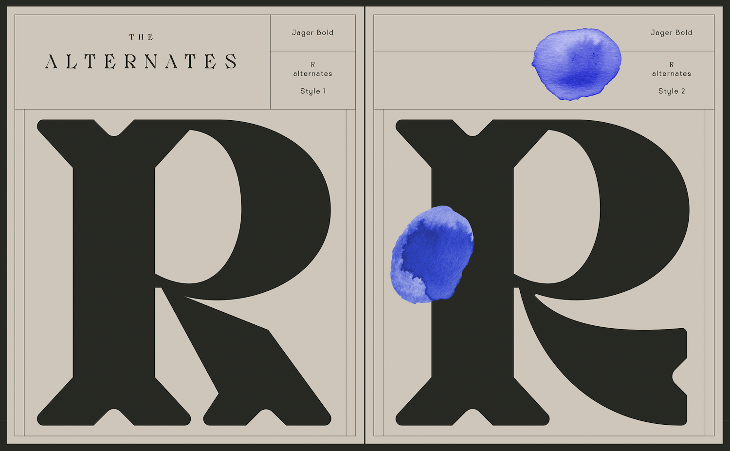
The close attention to the angles within the glyphs and the soft, rounded contours give Jäger the impression of having been carved into wood, whilst the hollowing out of the counter-forms harkens back to the shapes made in engravings and sculptures, or even the physical flow of chisel-work. These shapes are intended to reflect the skills and practices of fine craftsmanship and in this way, the typeface is just so impressive. It is visually iterative and articulate – not only in the visual references it makes shape-wise, but in the flow of the text and the interaction between glyphs; which feels full of movement and the history and feel of the physical motions of fine craftsmanship practices.
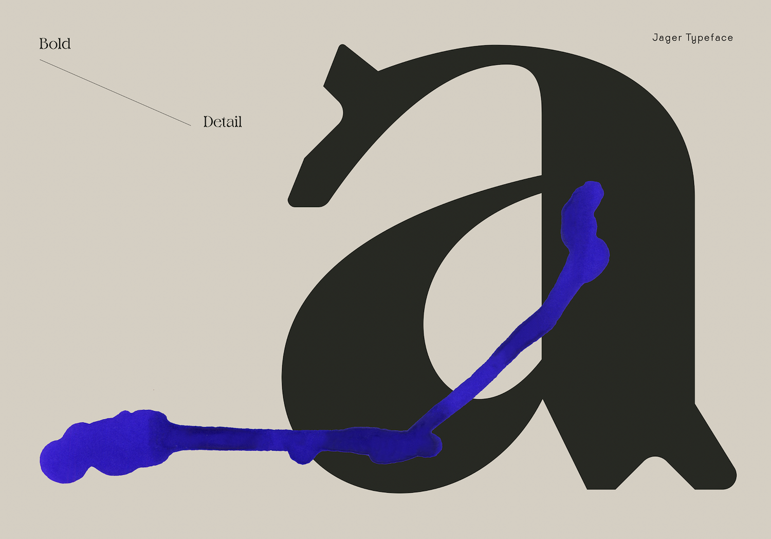
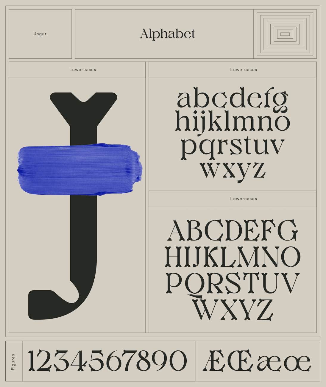
Jäger also takes influence from the typography craftsman, Johann Michael Fleischamann; whose work is reinterpreted through the ‘E,’ ‘L’ and ‘F.’ By beginning with hand-drawings, the typeface is intended to embody a tactile, artisanal feel and to connect the digitised finished outcome with the hand of the designer. The finished aesthetic feels connected also to traditional blackletter type, as well as organic shapes from nature; particularly in the hollowed out counter-space which interacts in negative space in ways which reflect oak tree leaves and the contours of wooden grain.
This typeface is a stunning new release from J&V and certainly not one to pass over. To see more of their work, check out their Instagram. Jäger is available for purchase on their website.


