Non Foundry (@nonfoundry) was founded in 2018 by Jonathan Saucedo in Monterrey, Mexico, and now stands as the creative expression of both Jonathan and Rodrigo Véjar; who joined as a parter, director and type designer in 2019. Exclusively releasing fonts made by the two designers, Non Foundry is an independent type foundry offering custom fonts, retail fonts, research and consulting. With a knack for meeting functionality with minimal-yet-impactful nuances of character, we decided to take a closer look at one of our favourite typefaces of theirs: Non Natural Grotesk.
Non’s stylistic characteristics are varied; offering explorative type-based design in collaboration with agencies, designers and brands. Including work ranging from individual logotypes all the way through to full font families, Non’s output aims to be versatile – for their fonts to fit a wide variety of purposes stretching between functionality and decorativiaty. In our opinion, Non Natural Grotesk epitomises these aims.
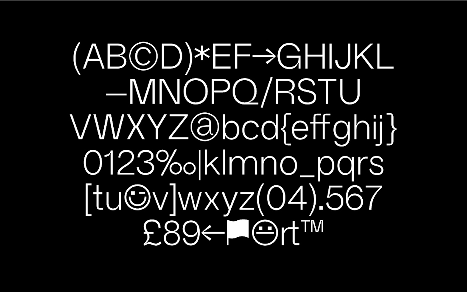
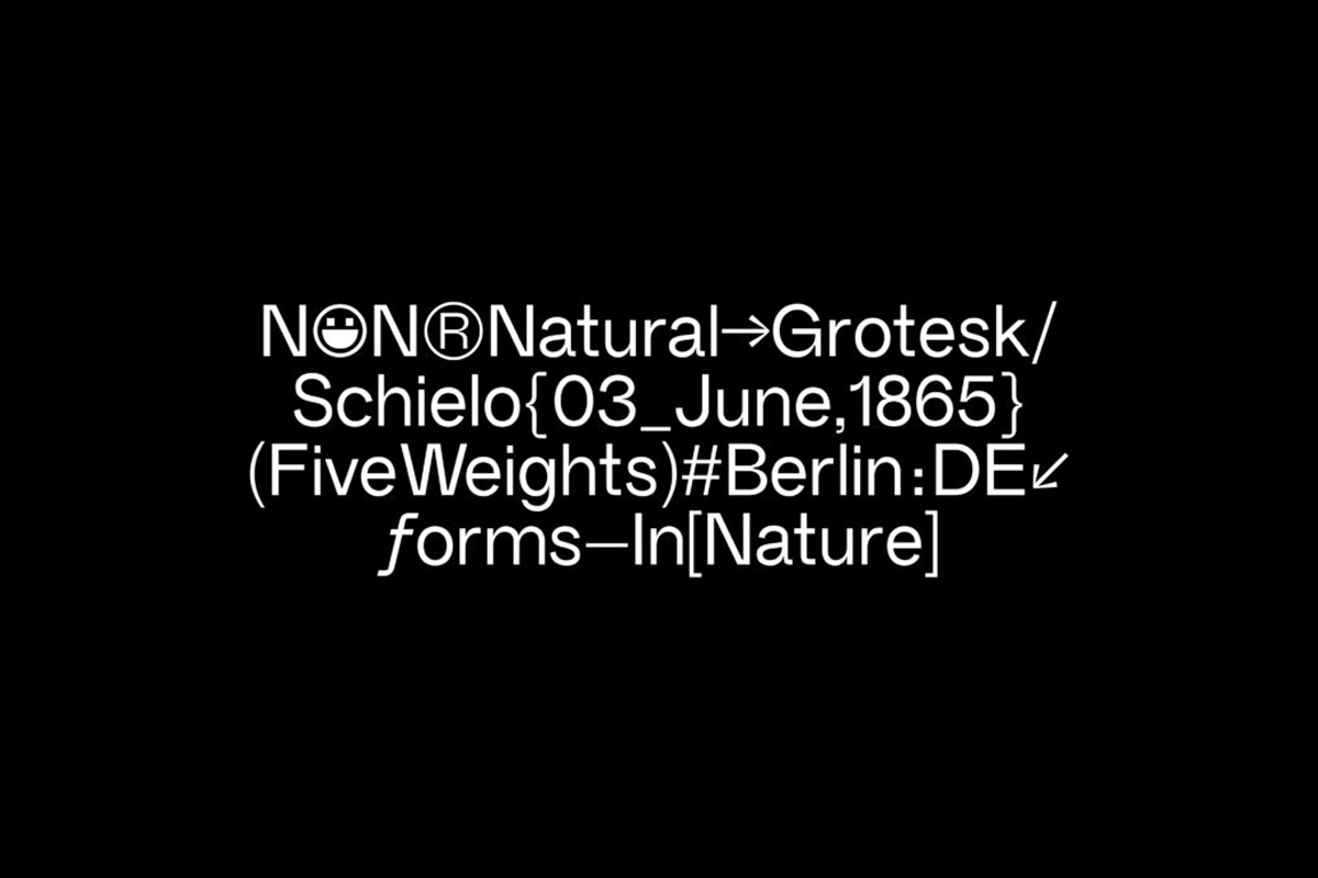
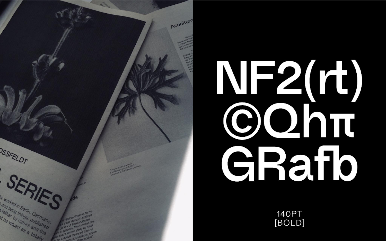
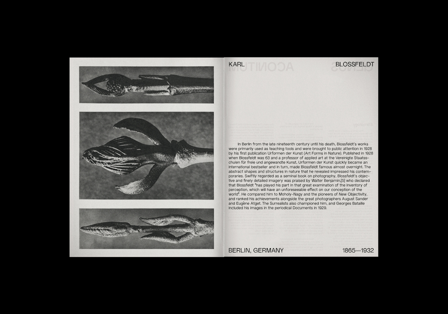
Meeting functionality with subtle, purposeful quirks, Non Natural Grotesk first presents as straightforward and kind of utilitarian… But, what’s so compelling about the typeface is that it only takes a millisecond and you’re drawn in to its fascinating details and its deviations from conformity. In Non’s words, ‘The geometric shapes and structure reflect the inspiration and influences of mid century Swiss Typography. Non Natural moves among the vast historical material that shaped modern typography, combining contemporary details with classic styles.’
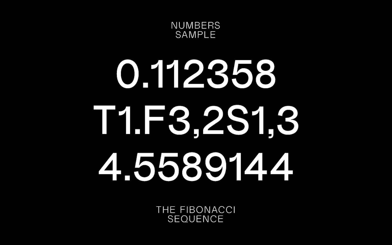
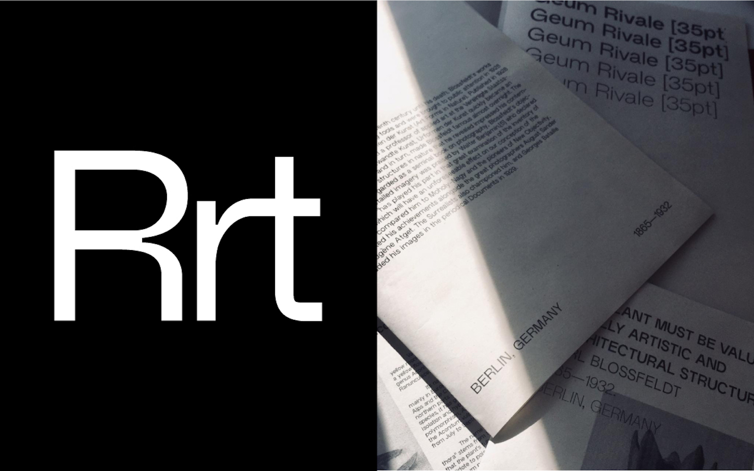
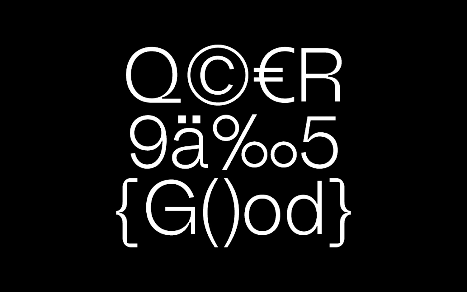
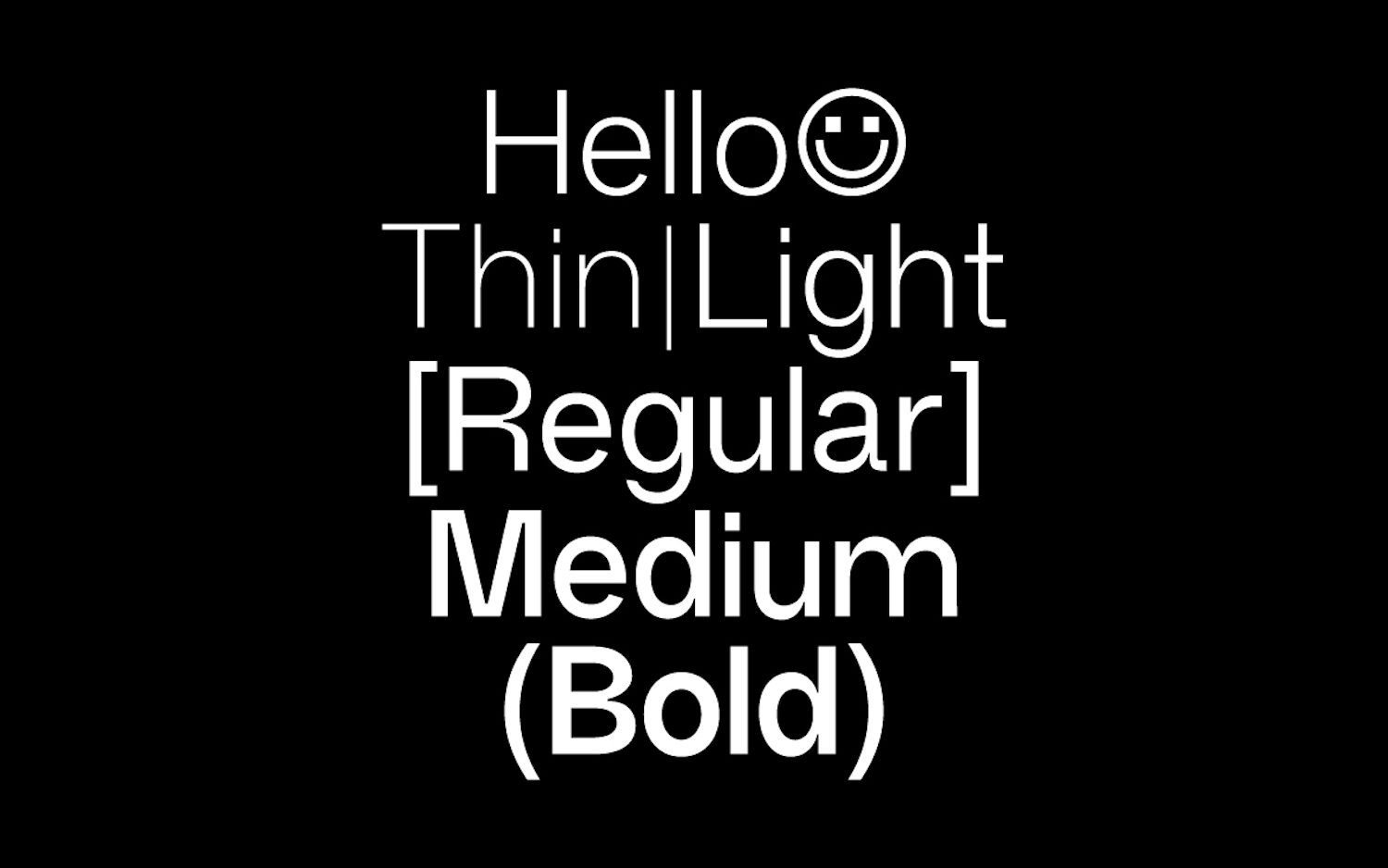
Details such as the ever so slightly discontinuous and contrasting axis stresses, as well as exquisitely deliberate ink trap sizes, mean that the typeface works beautifully in a variety of sizes; whilst continuing to be embedded with a distinctive an unique character. Its intricate and subtle touches, such as the width of the counter-spaces and comfortable, breathable apertures, mean that throughout weights and sizes, Non Natural Grotesk sits calmly; comfortable and composed. This cultivates a feeling of stability and balance, whilst the finer details pick up on interesting and characterful notes; meaning that typeface is both intriguing and well-rounded.
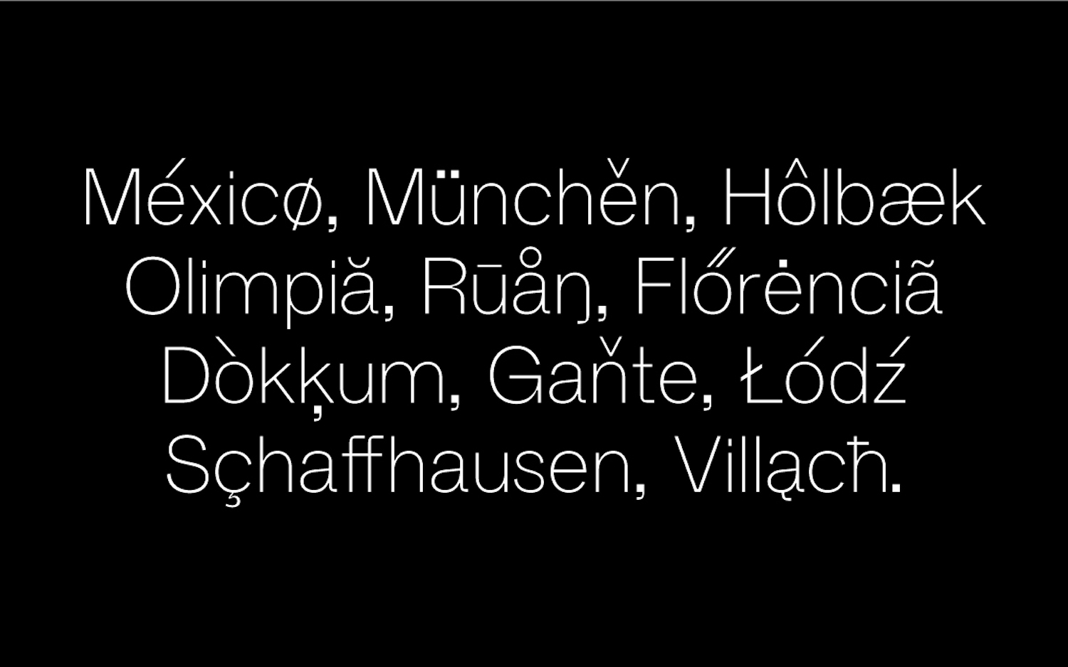
Currently supporting Basic Latin, Western European, Central European, South Eastern European, Mac Roman and Windows 1252, Non are also working to expand the family with its mono version. Balancing legibility and character through stringent attention to detail, this typeface is as distinctive as it is functional. To see more from Non Foundry, and to browse the rest of their amazing work, be sure to follow their Instagram and check out their portfolio on their website; through which all of their typefaces are available with print and web licences. Thanks, Non!