
World of Type (@wolrdoftype) is a professional gathering of the world’s leading type designers, with 71 members across 12 countries. Through their socials, they create a platform to showcase typographic design from the world’s best designers. So, we’ve teamed up with them to deliver a guest spot feature, showcasing their top 20 type designers, studios, creative projects and collectives.
First up, it’s Fatih Hardal. As the founder of Hardal Studio (@hardal_studio) and a multidisciplinary designer, Fatih’s portfolio is extensive and fascinating. Collaborating with huge brands such as Adobe, Adidas, Sony Music and many more, Fatih is also currently continuing his graduate studies at MUFFA, whilst working on branding and type-based ventures. World of Type highlighted Hardal’s incredible Ampersand typeface – and we also suggest taking a look at his experimental lettering for 36 Days of Type.
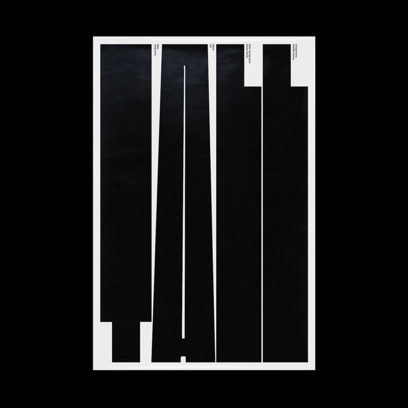
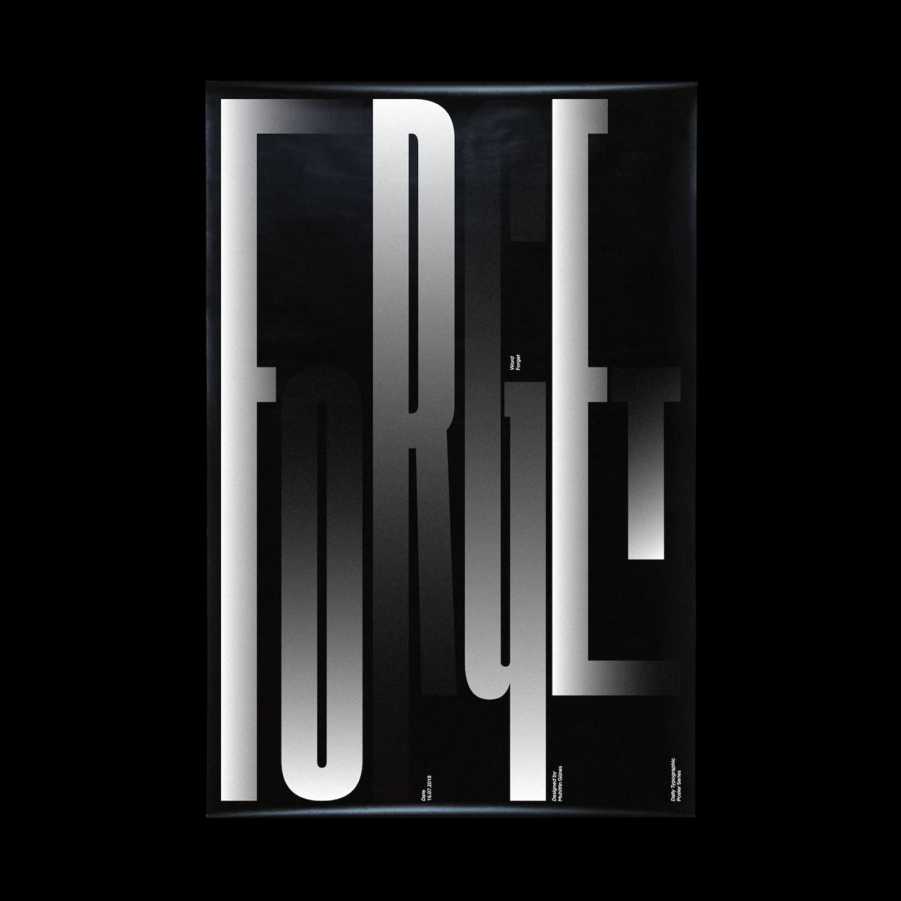
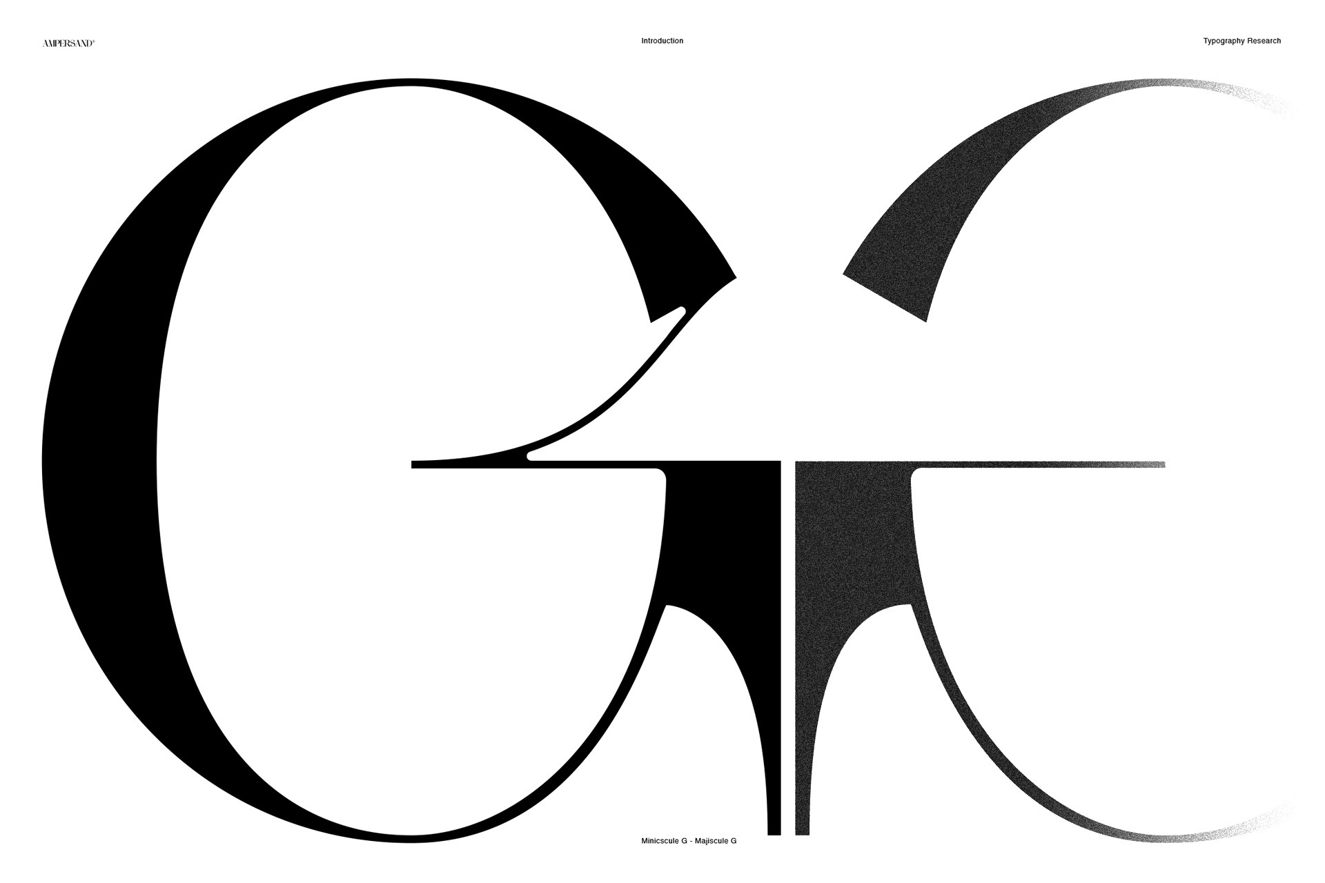
Muhittin Güneş’ typographic work is sublime; his aesthetic sensibility balances perfectly between experimental, exciting, sophisticated and refined. Based in Istanbul, he works independently as a graphic and type designer, and aims to work collaboratively with artists, curators and cultural institutions. The creator of tonnes of exciting retail typefaces, his artful and compelling typographic posters have been highlighted as some of Wold of Type’s favourite pieces.
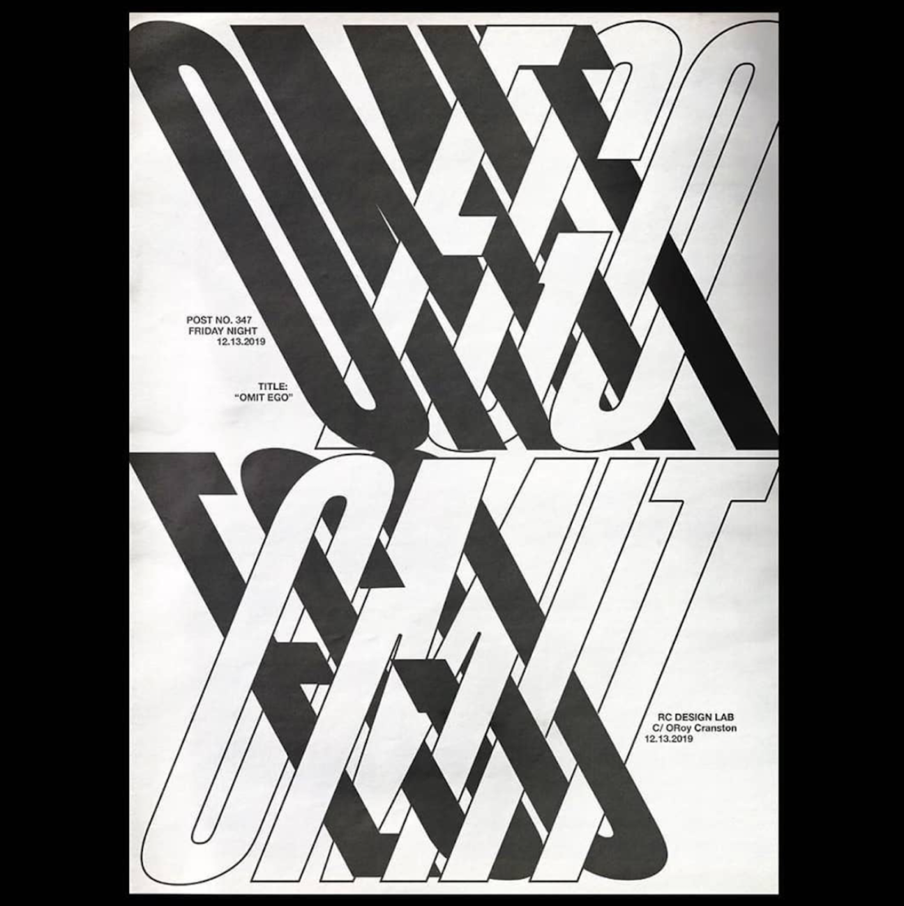
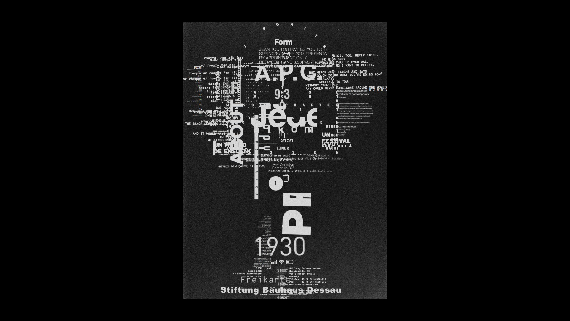
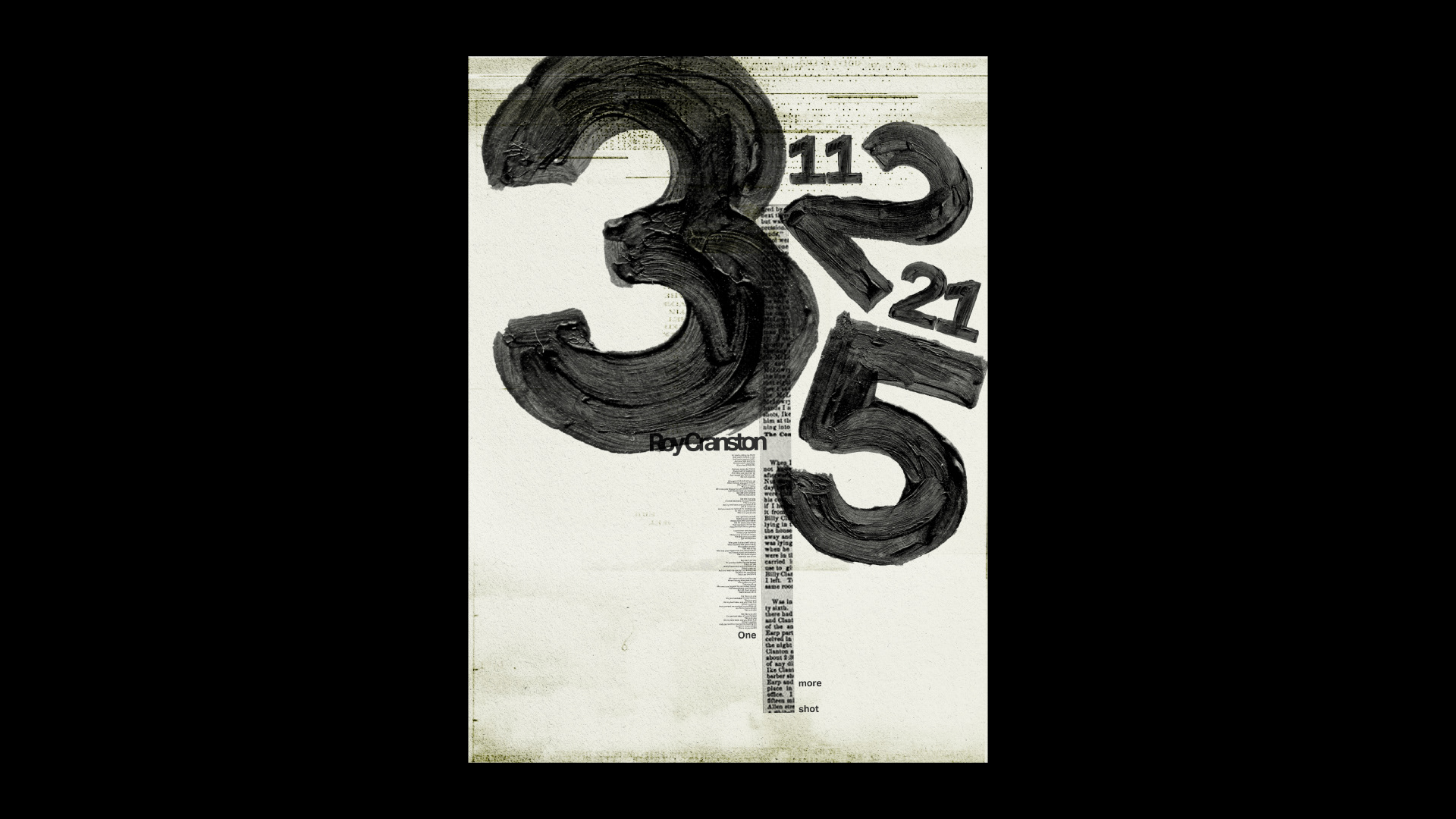
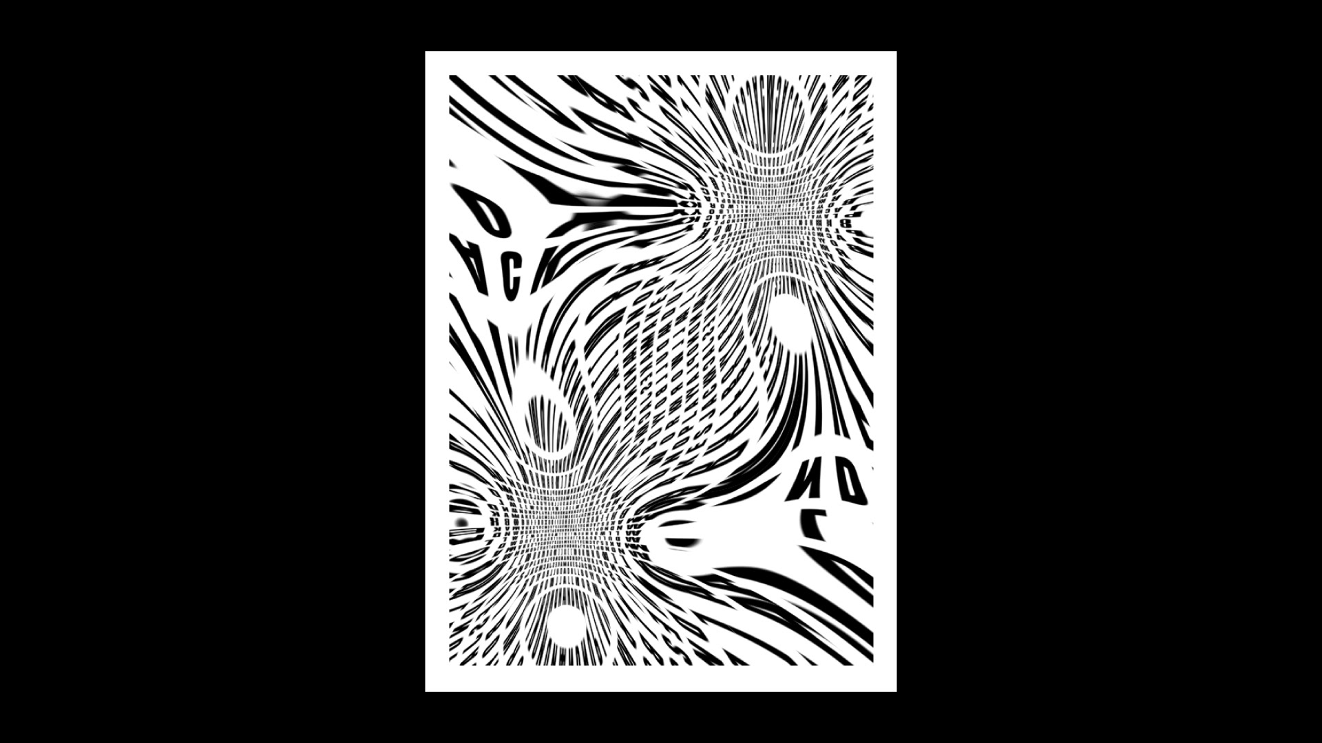
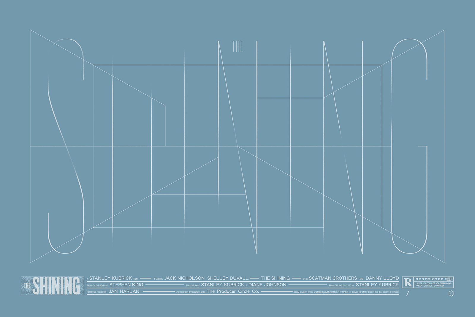
Currently employed at WØRKS (@works.studio) Roy Cranston’s type work is utterly addictive. His experimental manipulation of typographic shapes in his predominantly monochrome poster designs is reminiscent of protest art and cut-and-paste modern art, whilst his warped of letterforms and compositional choices touch visually on something between digital glitch art and mechanical processes of collage and print.. His type work is outspoken, powerful and timeless.
Alexis Mark | @office.alexismark
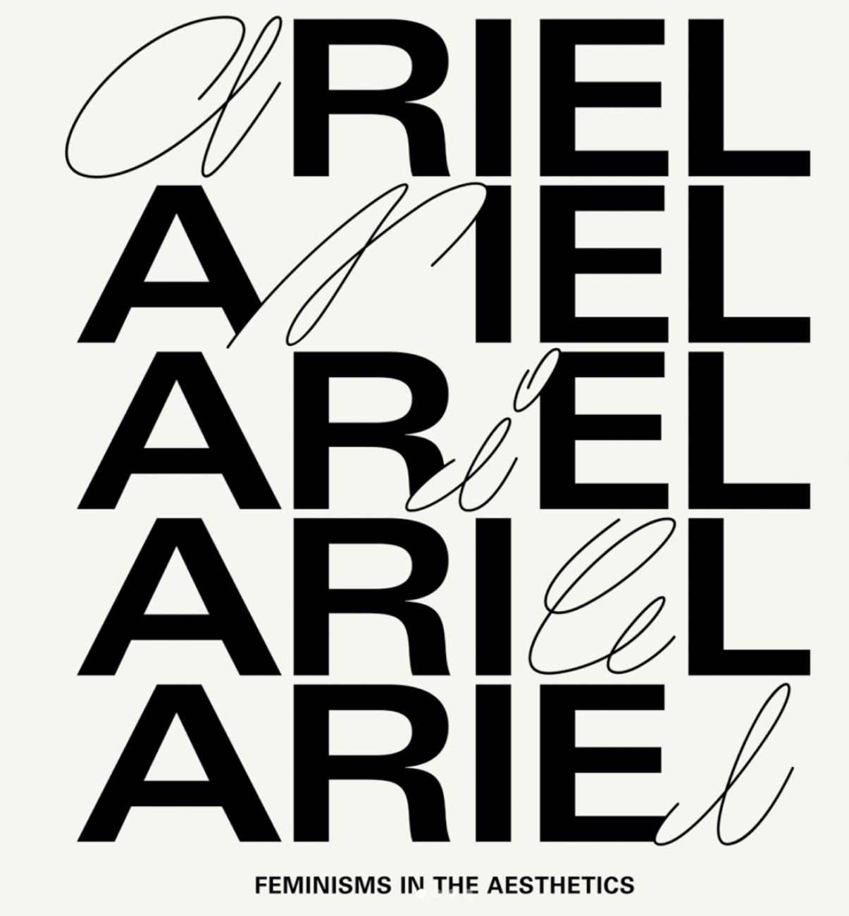
The shared pseudonym of Marie Grønkær, Kristoffer Li and Martin Bek, Alexis Mark is a collaborative office working in graphic design, creative direction and communication strategies. Based in Copenhagen, Alexis Mark also curate Annual Reportt (@annualreportt) which is a platform which explores the overlaps of various artistic disciplines. World of Type highlighted specifically the gorgeous type-based visual identity Alexis Mark deigned for Ariel Feminisms (@ariel_feminisms) – a new exhibition platform for feminists in the aesthetics.
Krzysztof Domaradzki | @krzysztof_domaradzki
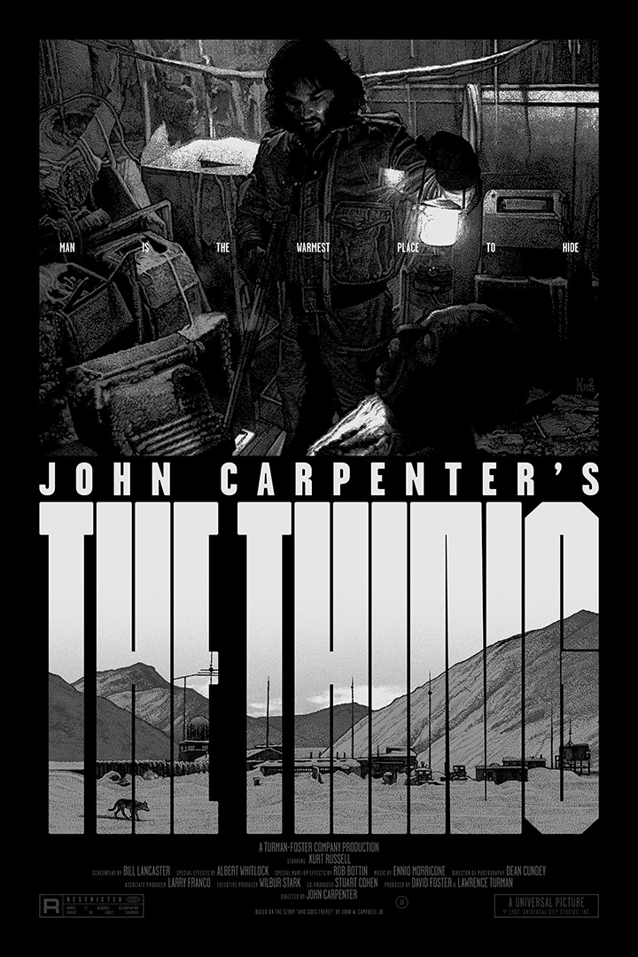
Krzysztof Domaradzki is an artist, graphic designer, illustrator and founder of StudioKxx. Combining masterful drawing and etching with a love for typography and film, Krzysztof’s typographic film posters are stunningly well executed and play with composing exquisitely detailed drawing work between graphic, typographic shapes. World of Type mentioned his film based posters in particular, of which there are so many exciting pieces to look at.
Jordan Metcalf | @jordan_metcaf
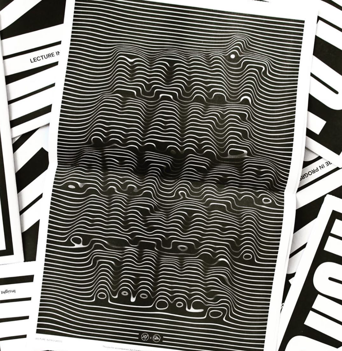
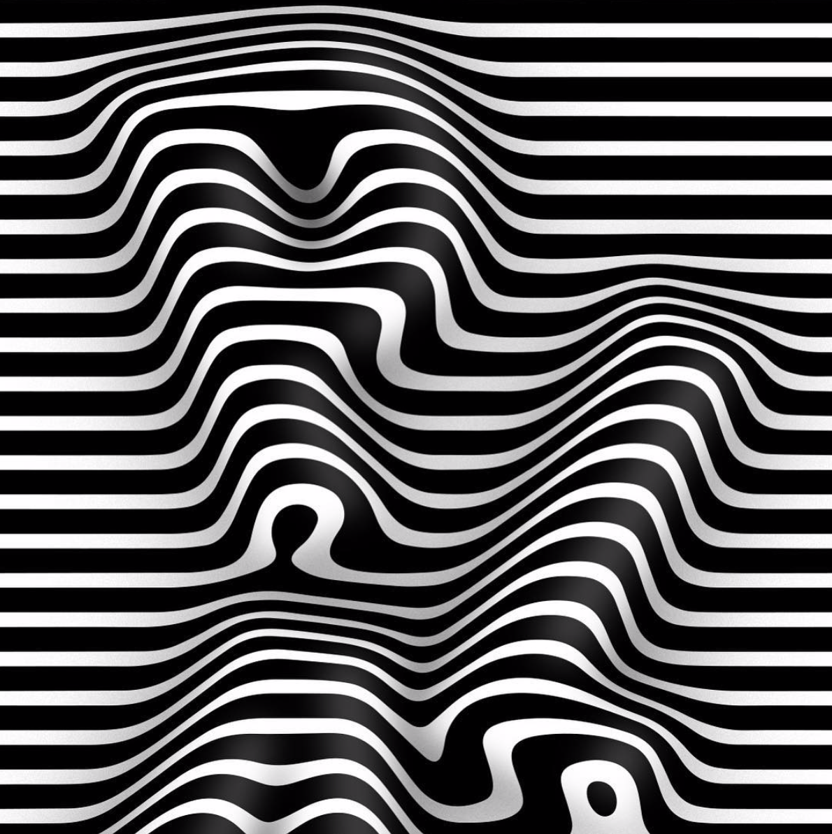
Jordan Metcalf, designer and creative director at OMFGCO (@omfgco) in Portland, creates gorgeous, dimensional type-based pieces as solo projects. His print work for the Lecture in Progress newspaper features an oily, viscous rendering of type pushing itself through a monochrome striped texture. With contours building up the letterforms, it piece takes on an optical illusion-like and sculptural feel.
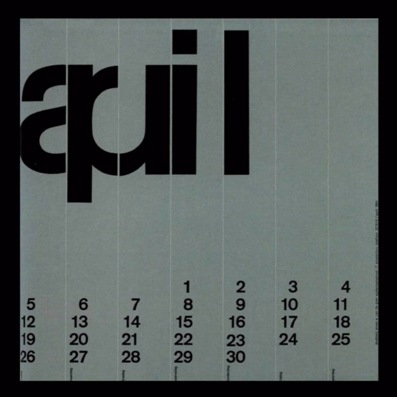
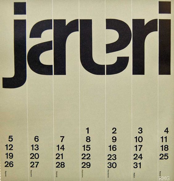
Wim Crouwel
Moving away from the current scene and looking back to some great past typographic influences, World of Type highlighted Crouwel’s calendar series. The Dutch graphic designer, type designer and typographer’s career also spanned across teaching and museum curation, and his iconic calendar designs from 1964 still hold resonance today.
Kris Andrew Small | @krisandrewsmall
Based in Sydney, Kris Andrew Small utilises a radical, psychedelic and distinctive approach to type. His kaleidoscopic designs have a dramatic, loud impact and harken back to traditions of radical protest art. Working with a high-contrast, varying widths of heavy sans display style lettering, Kris’ work is impossible not to enjoy.
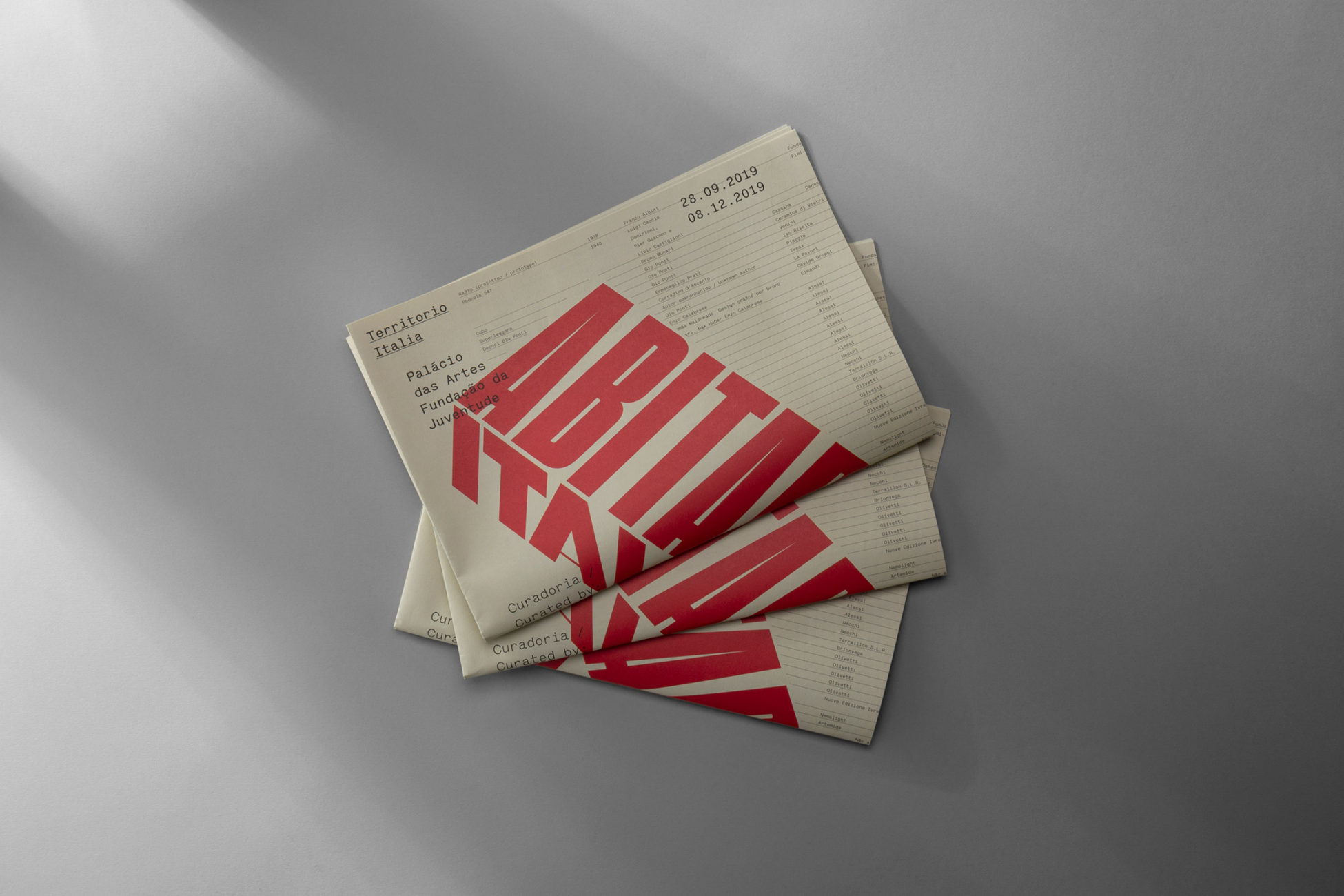
Another Collective | @another_collective
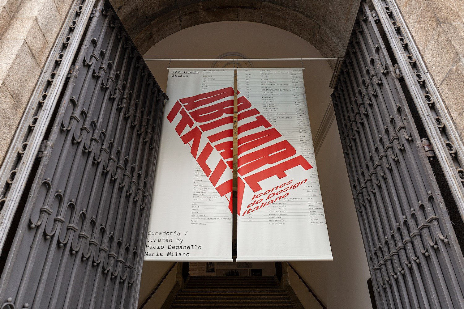
A design agency which works to create contemporary, well-crafted brand identities, Another Collective is motivated by big ideas, and finding the means to explore them through practices of design. World of Type highlighted in particular their stunning identity design for the exhibition, Abitare Italia – Icons of Italian Design.
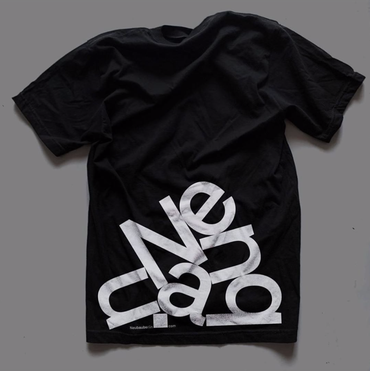
Based in Berlin, Neubau is an independent design studio based in Berlin working on a range of projects through from books and publications, to apparel and exhibitions; all within the discipline and focus of type. The studio was formed by Berlin-based designer, Stefan Gandl and has released bestselling books as well as created channels for the retail of their own typefaces.
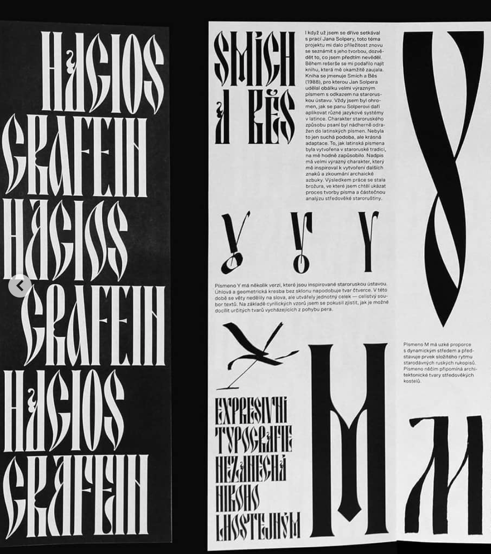
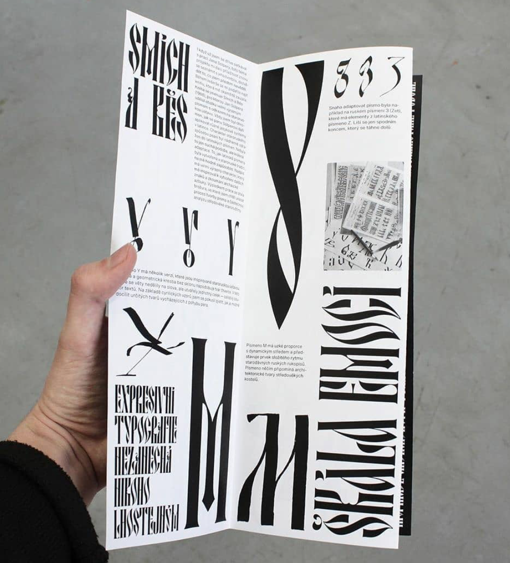
Artist and graphic designer, Ilya Bazhanov is the designer of some gorgeous fonts, working in both Latin and Cryllic alphabets. Based in Prague, Ilya’s work is wide-spanning, working with typographic poster designs, typefaces and fonts, as well as painting and printmaking explorations. World of Type were drawn to the project in which Ilya created a brochure with experiments and digitisation of an old Slavonic calligraphic work inspired by the 1988 book, Smích a běs; which was created by the great Czech typographer, Jan Solpera.
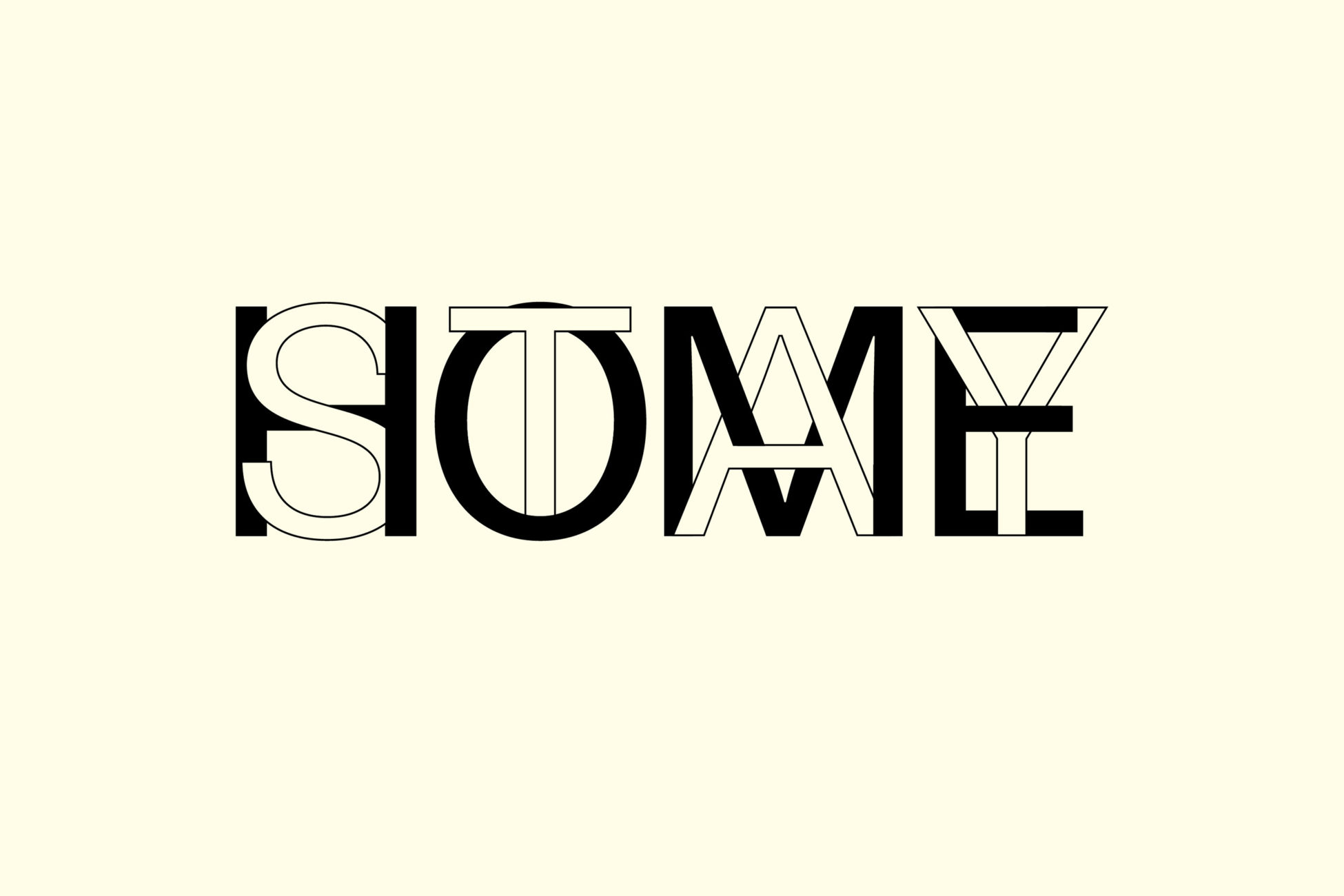
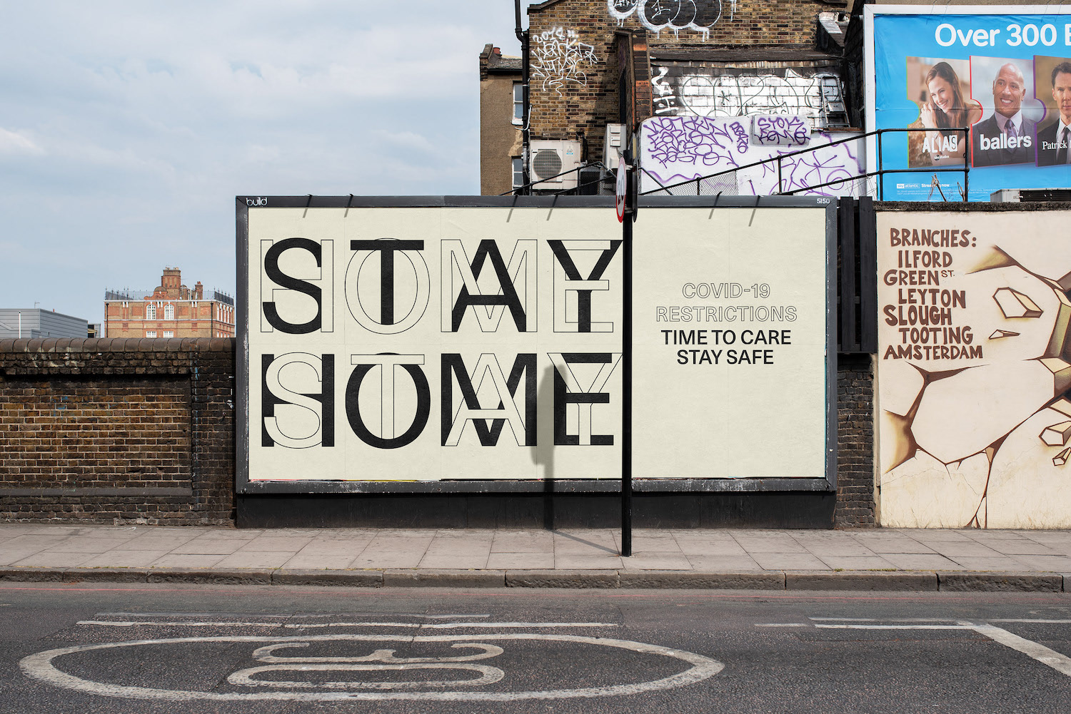
Aris Zenone is an award-winning graphic designer and art director based in Switzerland. World of Type have been particularly enjoying the designer’s work they’ve been making from home during lockdown, which features an interweaving sans serif layering the words ‘Stay At Home.’
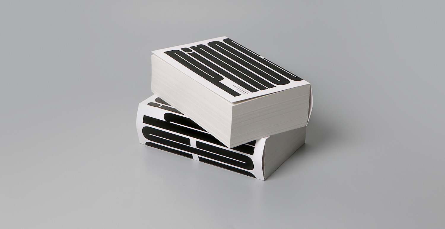
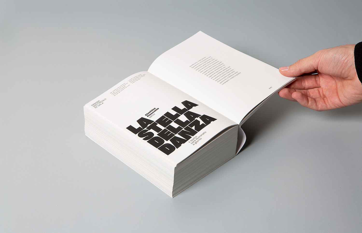
Alessandro Latela + Luca Longobardi | @alessandro_latela + @lucalongobardi2
Based in Italy, Alessandro Latela and Luca Longobardi are both students at ISIA U, and have drawn attention from World of Type for their fake paperback book design of Pinocchio. The book is incredibly well crafted and the design impeccable; filled with contrasting typesetting, sizes and weights.
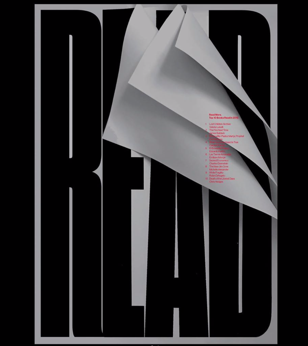
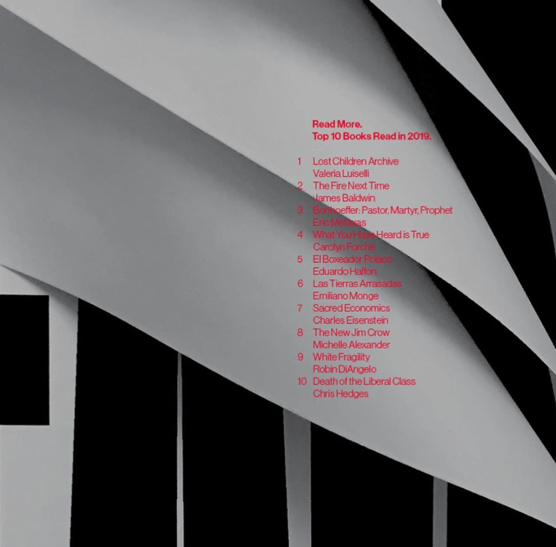
Fidel Peña | @fidelunderline
This book cover design caught World of Type’s eye, and due to its innovative composition it’s easy to see why. Created by Fidel Peña – graphic designer and co-founder of Underline Studio, Toronto – the type takes on a structural, architectural feel, atop of a playful design exploring the book as an object.
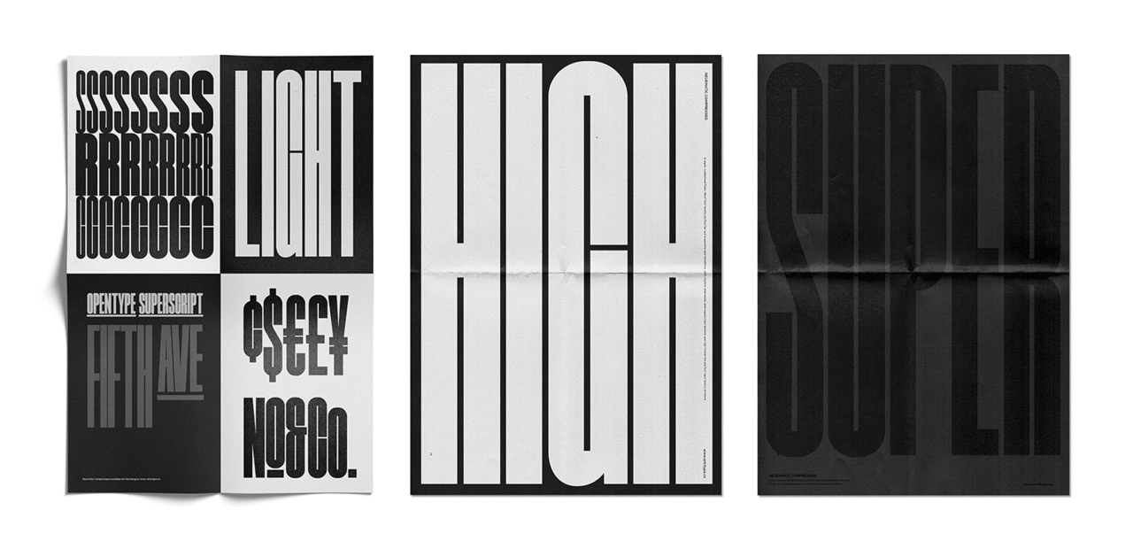
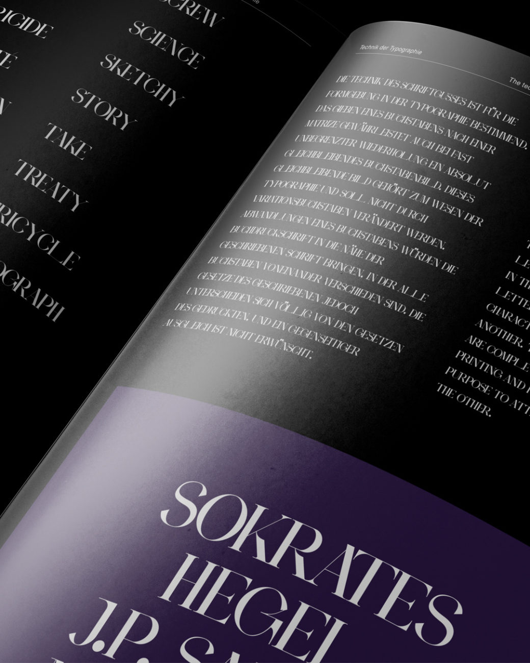
Neumatic Compressed is the new font family from typographer, graphic designer, and founder of Arkitype foundry, Andrew Footit. The super compressed font family is perfect for display purposes; taking up maximum positive space, with minimal counter-space and tight kerning; giving it powerful impact.
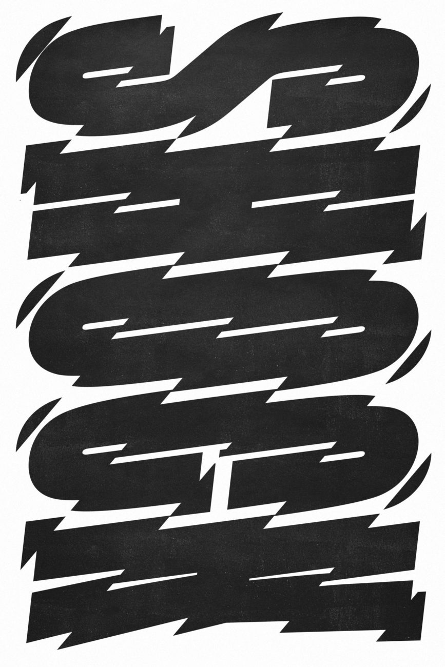
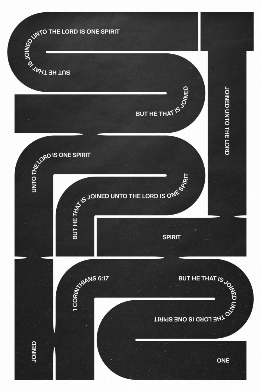
Xtian Miller’s growing collection of typographic posters, Signal A, is filled with fascinating designs inspired by influences such as industrial signage, street art and Swiss modernism. World of type were particularly drawn to the striking design ‘Shock,’ and there are so many more pieces well worth a closer look.
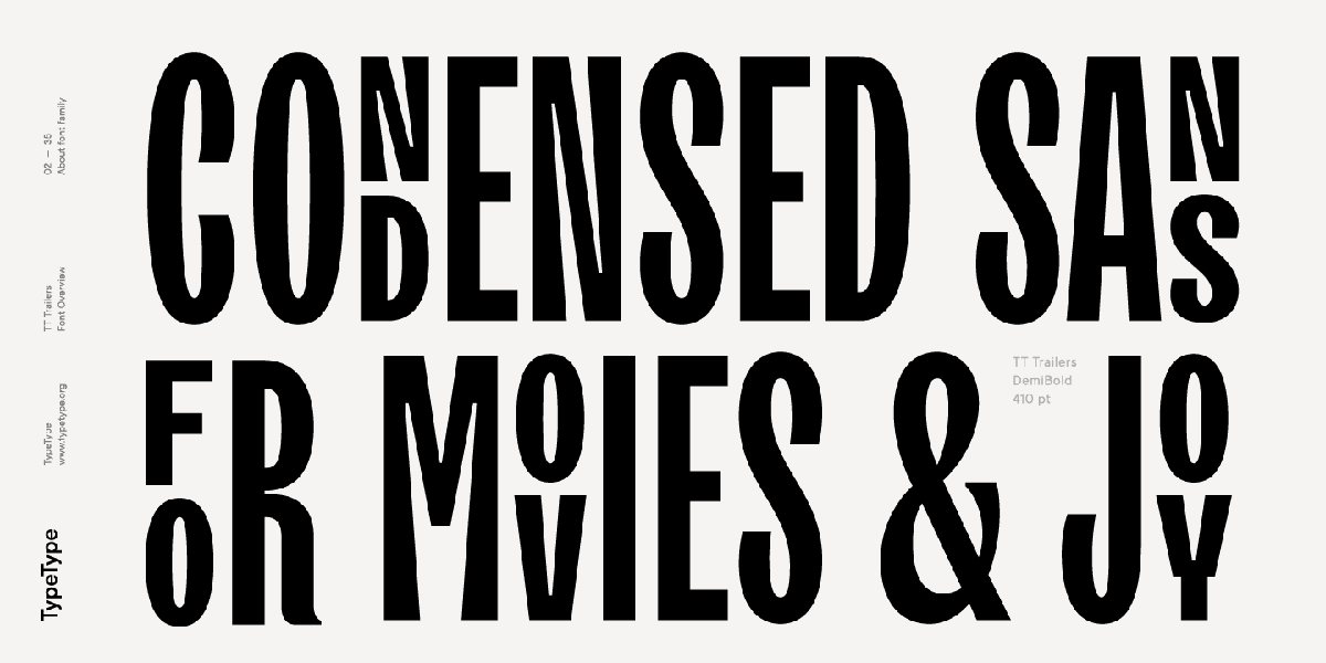
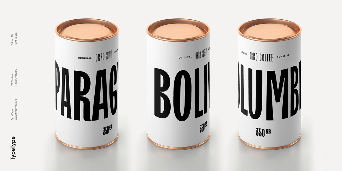
Vika Usmanova works both independently as a type designer and at type design studio, TypeType (@typetype.foundry). Her recent font, TT Trailers, has OpenType features and elegant, slender, humanistic shapes; lending it stunningly to unique display purposes.
Leo Burnett Design | @leoburnettdesign
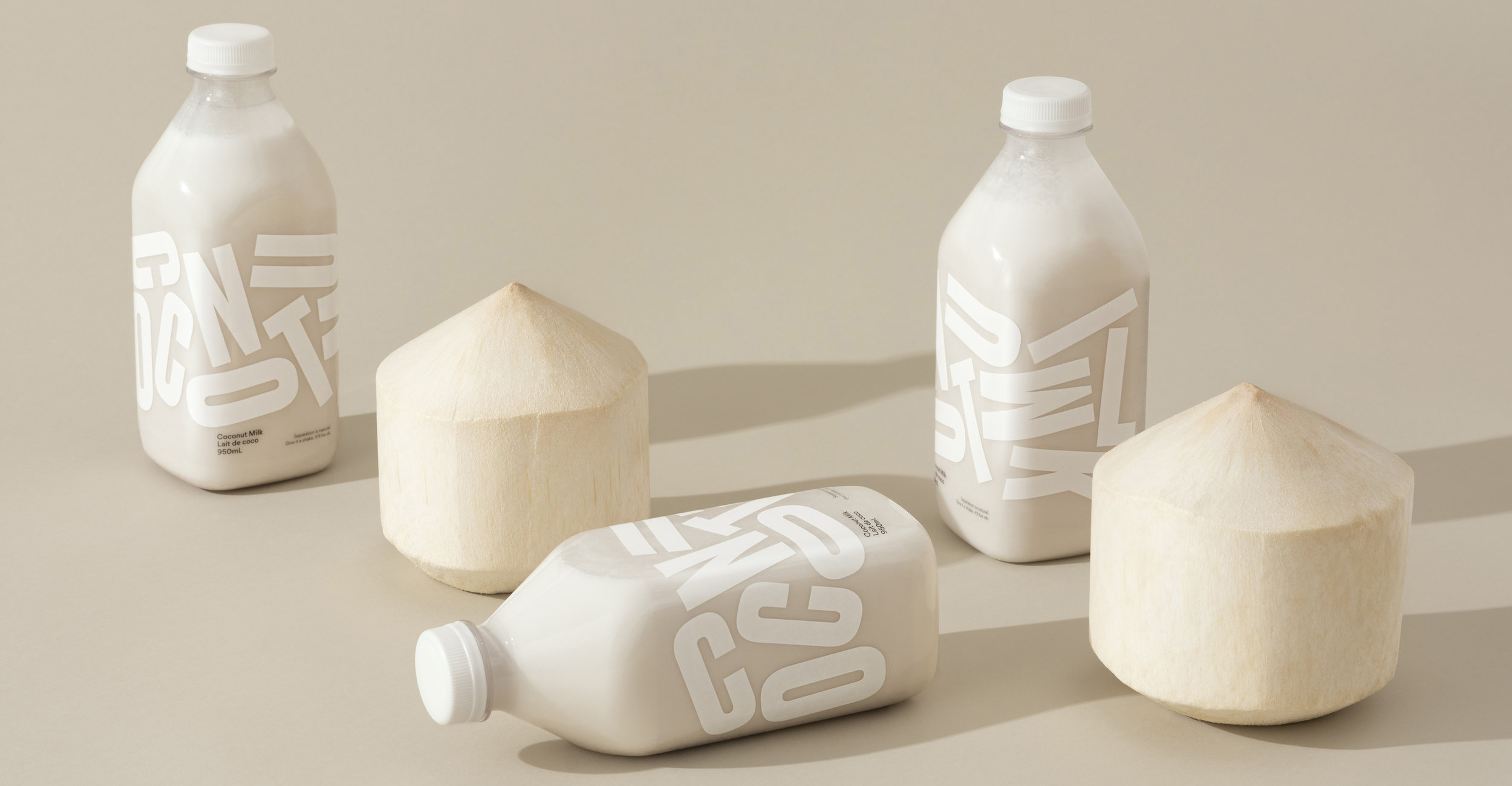
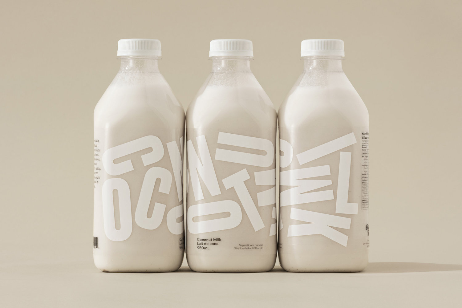
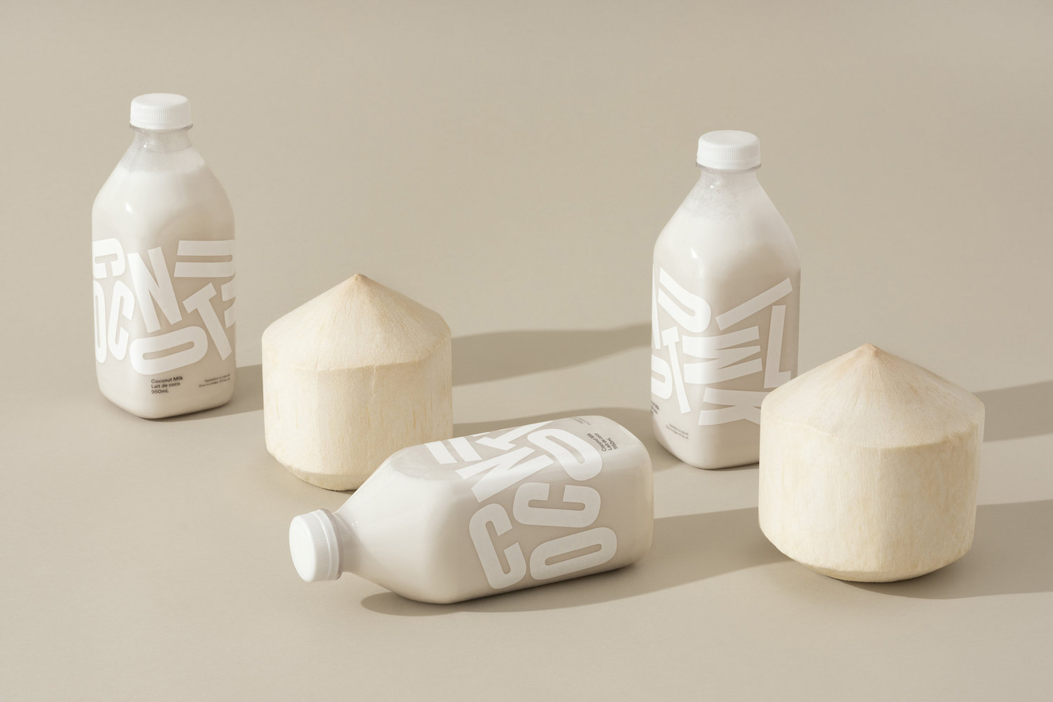
Leo Burnett Design is a full-service Design and Branding Agency with a deep understanding of typographic significance. They marry craft, conceptual thought and impactful design to create flawless design solutions – and their Grinning Face Coconut Milk packaging design is no exception. Featuring stunning tumbling letterforms alongside their instruction to ‘shake it up,’ this type-led design is full of vibrancy and energy.
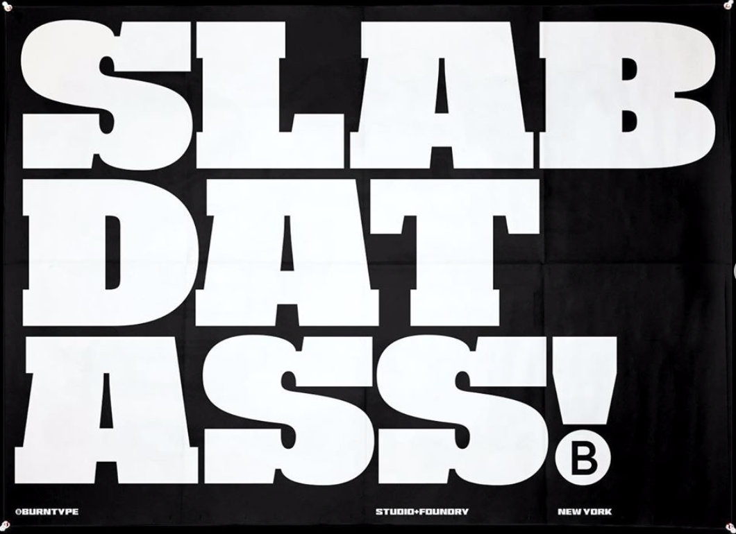
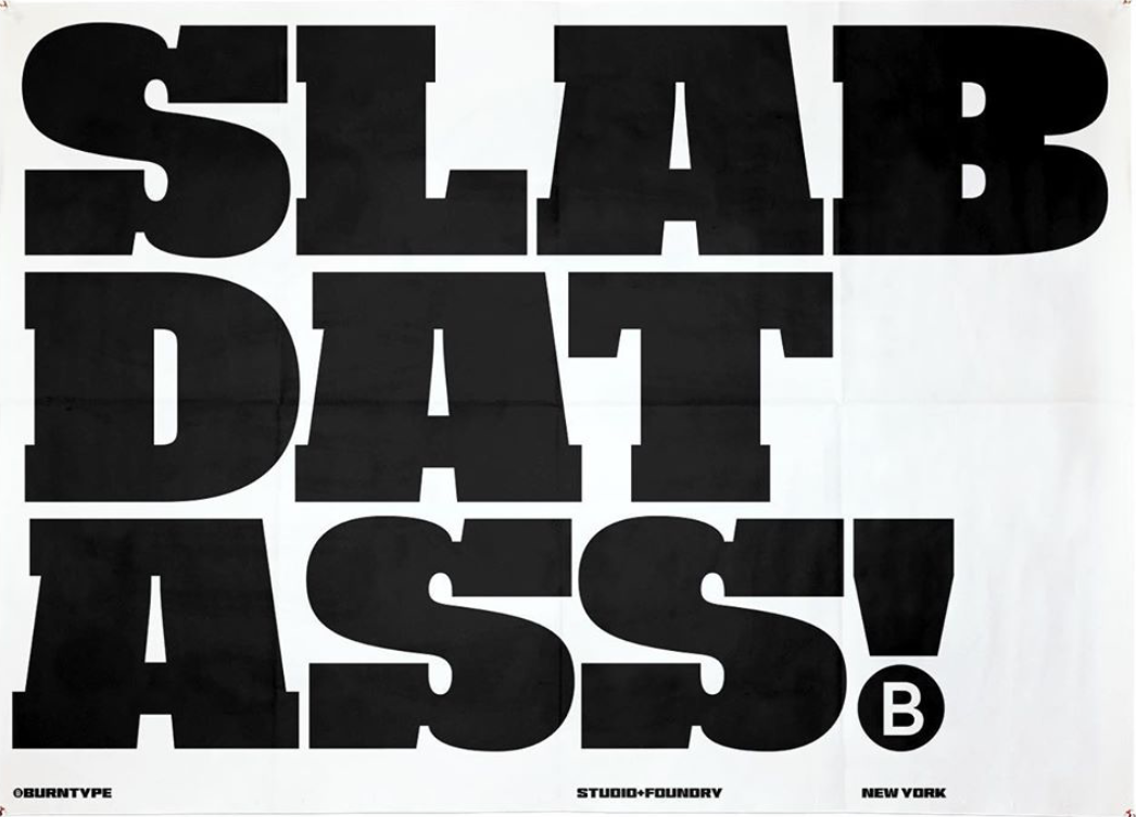
BurnType, the small independent type studio ‘with a crude attitude’ focus on building high impact typefaces which balance expression with functionality. World of Type selected their playful slab serif display piece ‘Slab Dat Ass!’ – which makes a bold, playful statement and shows up with maximum attitude.
Thank you so much to World of Type for your time and contribution! To see more from them, be sure to follow their Instagram.


