
Hi Anagha! It’s great to meet you, thanks for speaking with us today. First off, could you introduce yourself a bit to our readers and explain what it is you do?
Thank you so much for chatting with me, Zoë! It’s great to be featured by Type 01. I’m Anagha Narayanan from Hyderabad, a historic city in south India. I am 23 years old and graduated from my undergraduate college in 2018, where I studied communication design for four years. I am a practising type designer and I deal with the production and design of various Indic scripts.
Also, I’m excited to say I’ve recently been chosen as the recipient for the SOTA Catalyst award this year, which you can find more details of here, and I’ve been listed by Sharp Type for typographic excellence, which you can read about in an article here.
Congrats! We’re interested to know a little more about your journey into type. Where did it all begin, what attracted you to letters, and how have you ended up where you are today?
My father owned an offset printing press whilst also typesetting publications so I grew up with print, paper and type throughout my childhood. I vividly remember at one point, when the press was under renovation, we had stacks of paper from roof to ceiling like walls in my house – now that I look back I think that’s so cool! Sometime in middle school, I used an online font creator where I printed glyphs sheets, drew my letters, scanned them in and the software auto-traced and spaced my letters. A few years after that, I got into the hobby of post crossing, where I collected a huge number of postcards. I used to love observing the typography in the stamps, looking at the handwriting of people I’d never met, and trying to imagine what they were like in real life. Art and Design was something I was clear about pursuing, so I decided to study design for my undergraduate program.
My four year course was structured in a way that involved short modules of varied subjects which fell under the overarching field of Communication Design. This way, I could study a little bit about everything. I was always naturally inclined to courses that dealt with type and typography and used to spend hours on type foundries’ websites, downloading their specimens and observing the letter shapes. My seniors at college were practising type designers and this made information about type design more accessible to me.
My professional journey into type began with an internship as part of my final year diploma project at Black[Foundry] in Paris. This was my initiation into the type design field. Though this, I learned the basics of font software and got the chance to work on a Devanagari script project. I was lucky to be mentored by all my generous colleagues at Black[Foundry], especially Jérémie Hornus, Julie Soudanne and Jean-Baptiste Morizot. This internship helped me incredibly in working with type design closely and helped me to make the informed decision of continuing with type design. Having enjoyed the process a lot, I decided to continue working with type while I was still at it. Then, I joined Universal Thirst in October 2018, where I continue to work contributing to the design and production of Indic typefaces.
We’ve been following the development of your WIP typeface, Ilai – which I believe will be your first full typeface (congrats!) – Can you explain how the idea for the typeface first came to you and what your initial inspiration or intentions were?
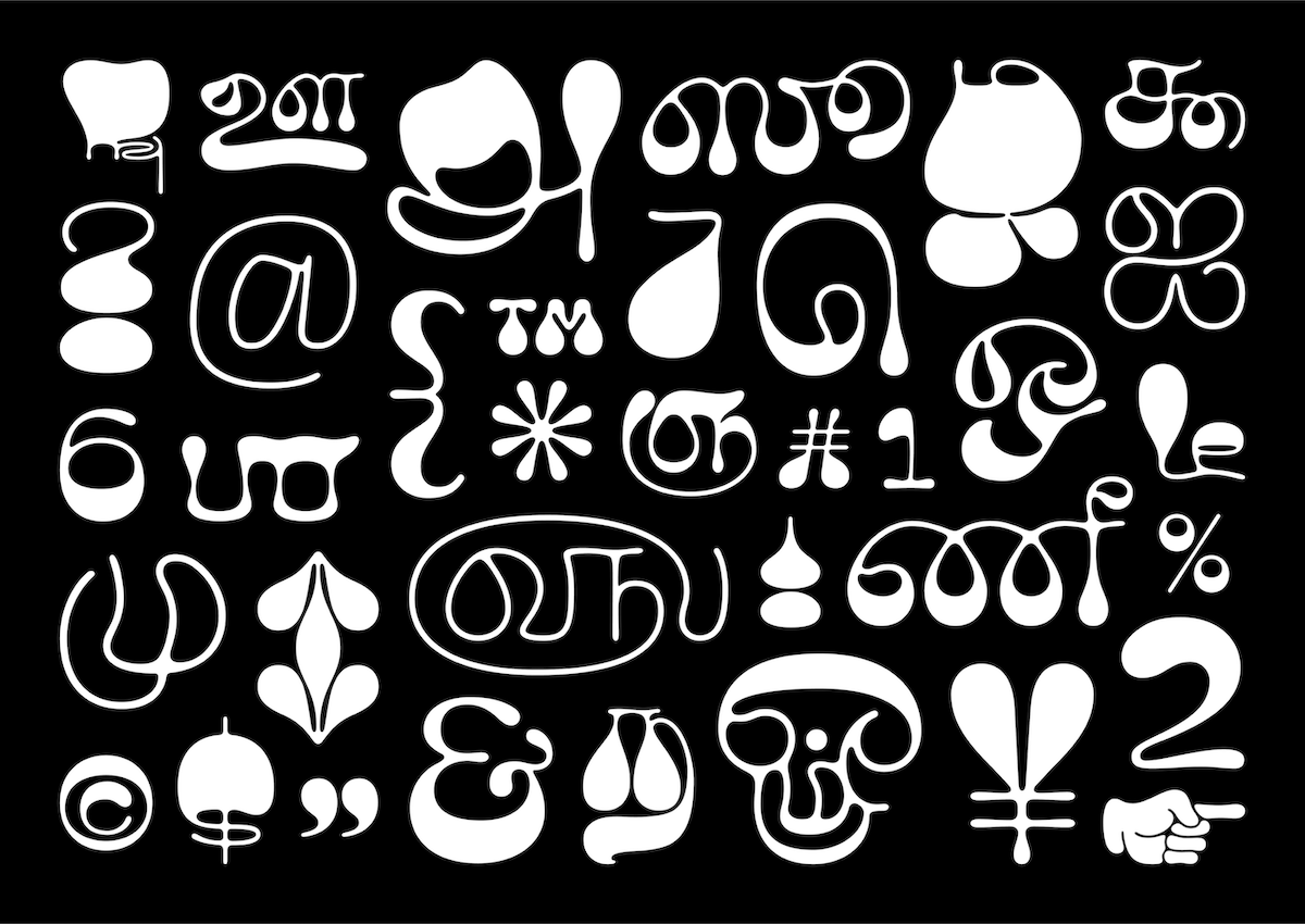
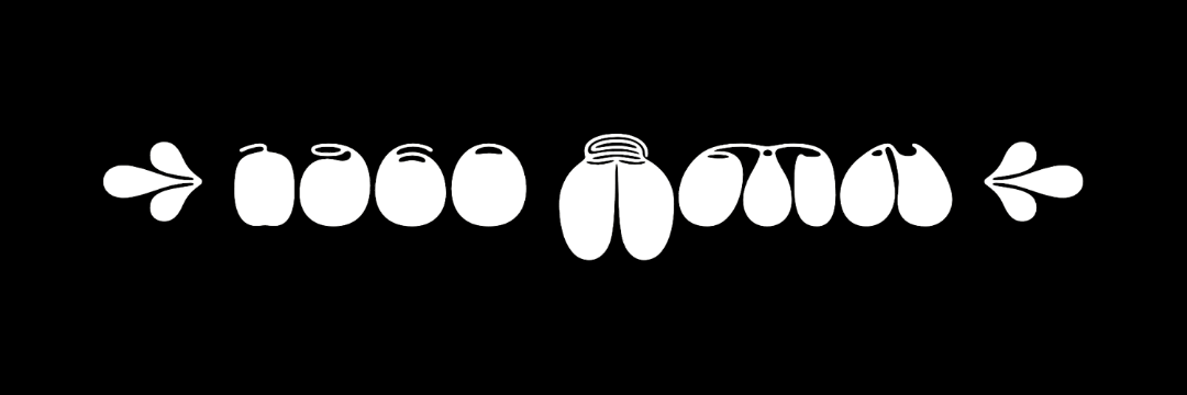
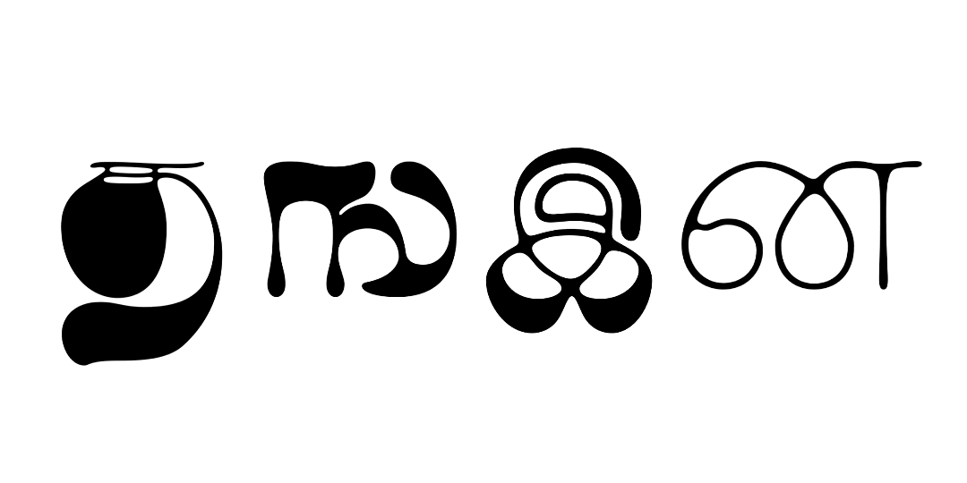
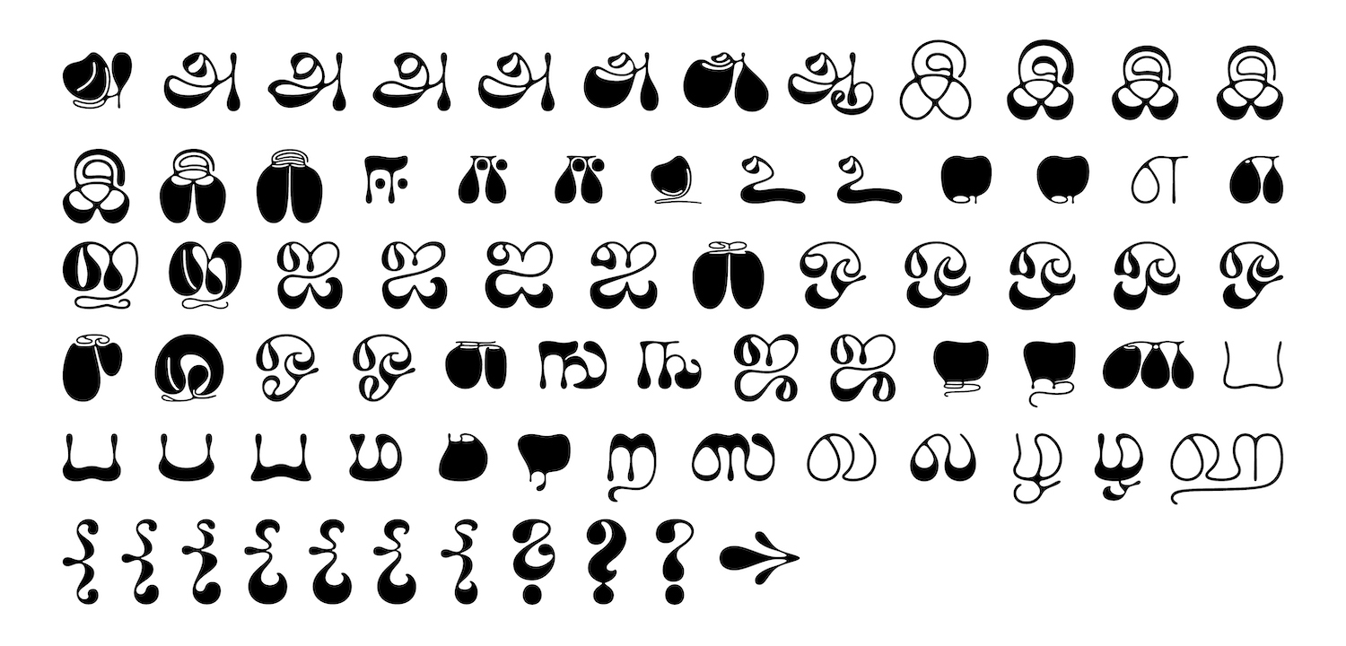
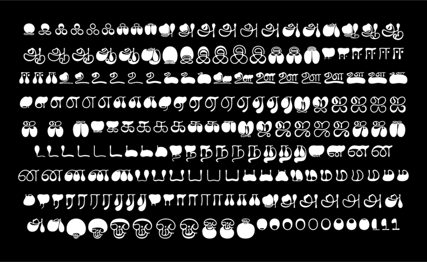
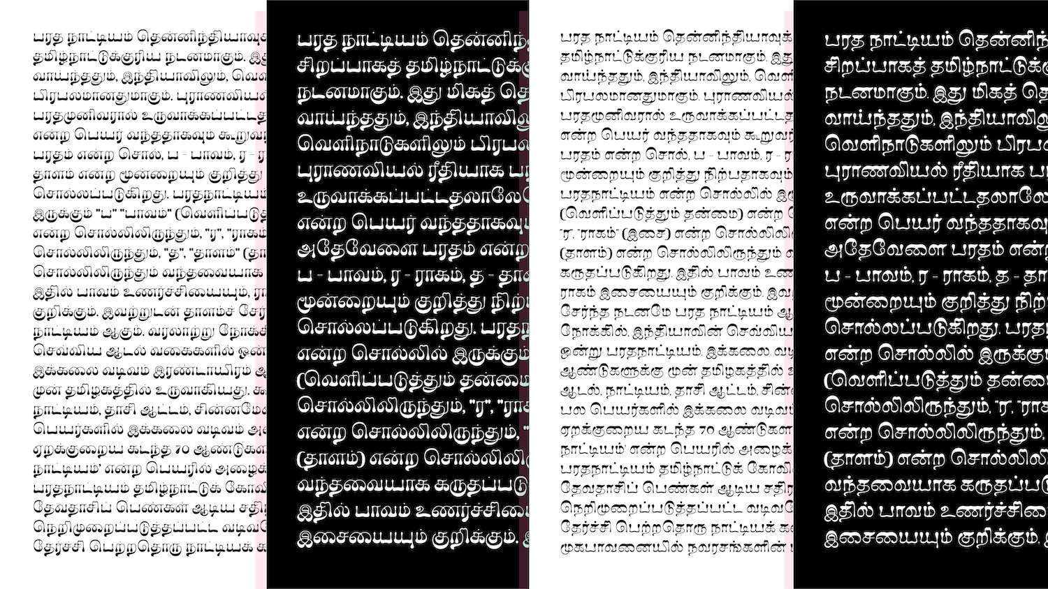
Thank you! It indeed is my first typeface release (also the first Tamil variable typeface!) and I’m really excited about it. It will soon be released with Universal Thirst and I’m grateful to Kalapi and Gunnar for giving me the opportunity to develop Ilai as my personal project with them. Ilai started off with the verbal brief ‘Psychedelic Tamil Typeface’. I was always intrigued by the lettering in graphic design from the 1960’s and 1970’s, where type acted as images and the text fits itself to any form and path it may be on. I started out drawing a few sketches to see how Tamil could fit into this style. The typeface, Ilai, doesn’t really draw inspiration from a single piece, but more from the idea of distortion, unconventional weight distribution, text as image and experimental works.
It’s incredible to learn that whilst you’re a native Tamil speaker, you’ve actually been learning the script alongside designing the typeface. What made you take on this challenge, and how do you feel that learning the script alongside creating Ilai has impacted your design process?
I am a native Tamil speaker, but I’m born and brought up in Hyderabad where Telugu is the state official language. I can therefore speak four languages — English, Hindi, Telugu and Tamil — and I can read and write in all of them, with Tamil as the latest addition. While I learned Hindi and Telugu in school and saw the scripts in use around me, I spoke Tamil at home. I’d like to add some interesting trivia here — Metro signage in Hyderabad uses four languages — English, Hindi, Telugu and Urdu. The population in Hyderabad has a large number of Urdu speakers, this is owing to the Nizam rule of Hyderabad state from 18th through 20th century. I’ve had fusion of cross-cultural references all through my life. I studied for four years at Coimbatore in Tamil Nadu where I was exposed to Tamil script and culture more closely. I think these two reasons is what made me pick Tamil. Also given the glyphset size of Tamil, which is significantly smaller than other Indic scripts, made this crazy design achievable and worked in my favour. Learning the script while designing the typeface enabled me to take bold choices whilst not being restricted to any previous learnings that I may have been ingrained in me.
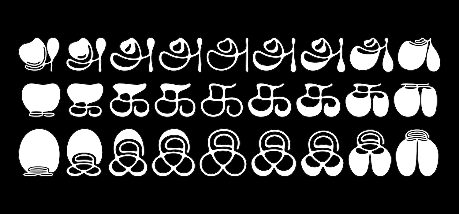
One of the things we really love about the typeface is the fluidity of all the shapes – it’s almost like liquid! This definitely feels enhanced by the fact its a variable typeface too, with so much variety between weights. How did this design choice grow or come about?
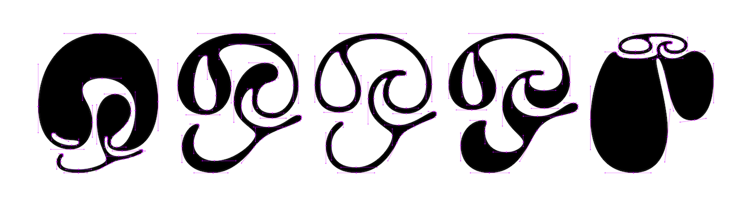
My first sketch was a ‘க’, which had most weight on the bottom, and some on the top as well. This interested me, and I then built on this by slowly adding more weight on the bottom. This was followed by a monolinear and a weight axis which gradually became heavy on the bottom. I then took a step back and questioned, what if there is a similar progression on the top as well? And the idea came to me, after a prompt from Kalapi, that if I pushed the design on both the extremes — top and bottom — as much as I could, it would give rise to a wider variety of in-between shapes and weights.
We’re curious about how the design process and aesthetics of the typeface might relate to Tamil art/culture? Whilst making the typeface, have you felt that there have been design choices made which relate to, or have been informed by, Tamil art/culture?
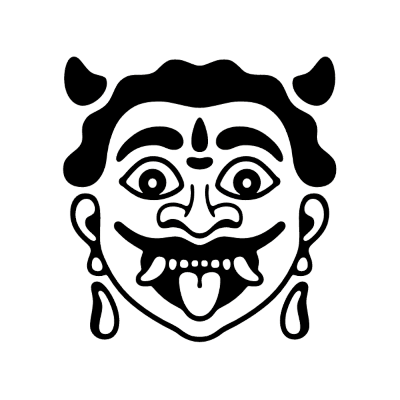
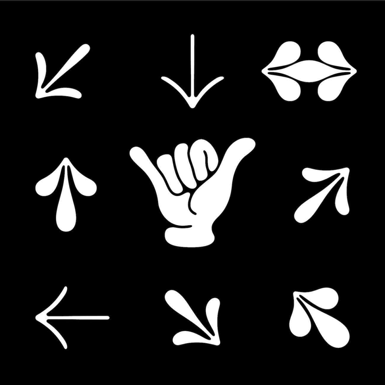
In spite of Ilai being a fun and more experimental typeface, the glyph set includes Tamil numerals, signs like debit, credit, year etc which are not frequently used in the present day. I think it’s decisions like these, where the glyphset is more inclusive without narrowing down the audience, which make a typeface holistic in all senses… Even though these might not ever be used, it makes me happy to know that if someday someone would like to use it, it is readily available for them. In addition, the typeface in addition comes with symbols and icons that are more locally drawn, such as the rakshasa face and a shaka hand symbol.
What have been the most challenging, or the most enjoyable, aspects of creating Ilai so far? Any particular challenges in creating the typeface or certain glyphs? Or any favourite parts?
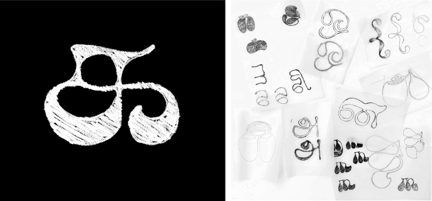
My process involved a lot of sketching on paper because I felt it was better to create and explore organic shapes on paper first. One of the most enjoyable parts was drawing the glyphs in different weights. It was particularly special, since I dealt with each weight in a fresh manner where the two extremes are so drastic in some cases. I’ve also really been enjoying drawing and interpolating symbols.
Because of the drastic change in design between the extremes, getting a smooth interpolation has been a challenge and I’ve had to make some compromises in some of the unique shapes I had previously. Another challenge is that since Ilai is the first Tamil Variable typeface, which also is very experimental, I didn’t have any precedents to refer to, therefore having to figure out a lot of solutions from the ground up.
Type Design, in my opinion, is rather a mundane activity and takes a lot of patience and resilience to keep at it. This is still something I am still figuring out… I would also like to give a shout out to Rocky (Hitesh Malaviya) who have helped me through some of these challenges in the production of Ilai.
What makes you feel excited about type design now and about the future prospects of type design (for yourself and in the industry more broadly)?
One of my favourite parts about type design is the industry itself — how it’s so welcoming, giving and approachable. I’m really excited to see how the variable font industry takes off in India, and I’m hoping to see more Indians involved in type design. India is so rich in cultures and scripts, but there aren’t enough people working in this space, so I really hope to see more contribution to the Indic scene. I am excited for the future and to contribute to this growing industry with fresh, well-crafted typefaces.
How do you envision Ilai being used? How would you love to see it in use?
I would love to see a dynamic, animated branding project that uses Ilai. Ilai would work really well for branding & identity, posters, headings and subheadings. It would also be really cool to see Ilai in a spiritual use case.
What’s on the cards for you in the future, and what advice might you give to people wanting to start out in type design?
As of now, I’m looking forward to completing Ilai soon and preparing it for release. I am also really keen on pursuing my masters in Type Design, hopefully next year, when things in the world get better.
Advice wise, I strongly advise anyone who is interested in type design to look at the specimens of type foundries, to try to redraw some classic typefaces, to open up some of your favourite typefaces on a font software and study the outlines and to start drawing on a font software instead of Adobe Illustrator.

Thank you, Anagha! It’s been a pleasure. To see more of Anagha’s work, check out her Instagram and be sure to keep your eyes peeled for the release of IIai!


