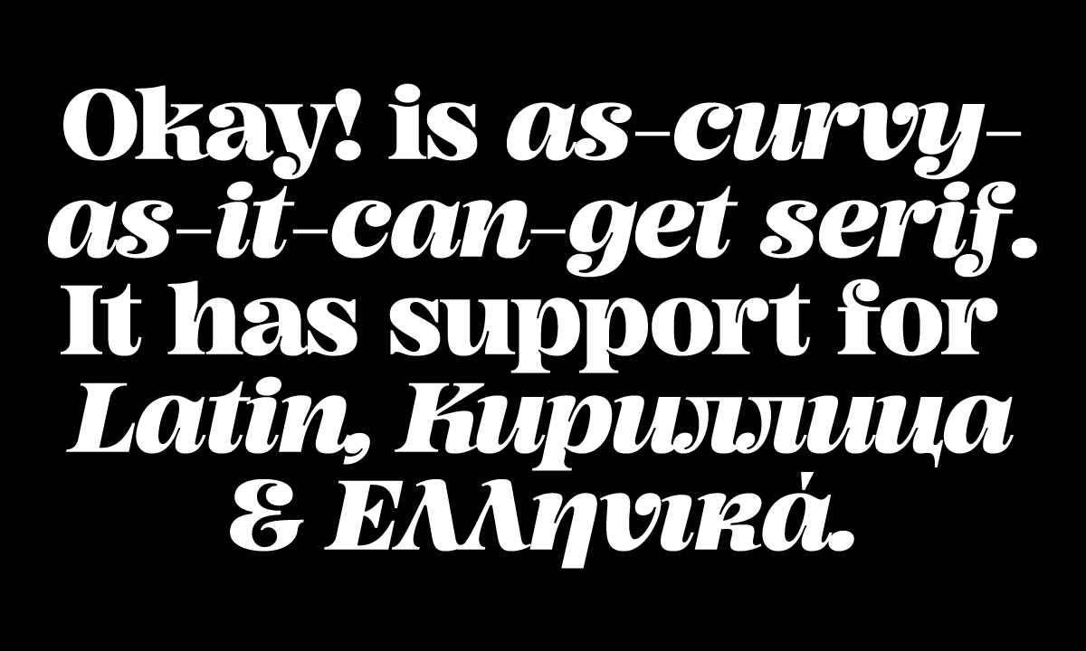
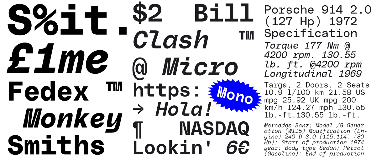
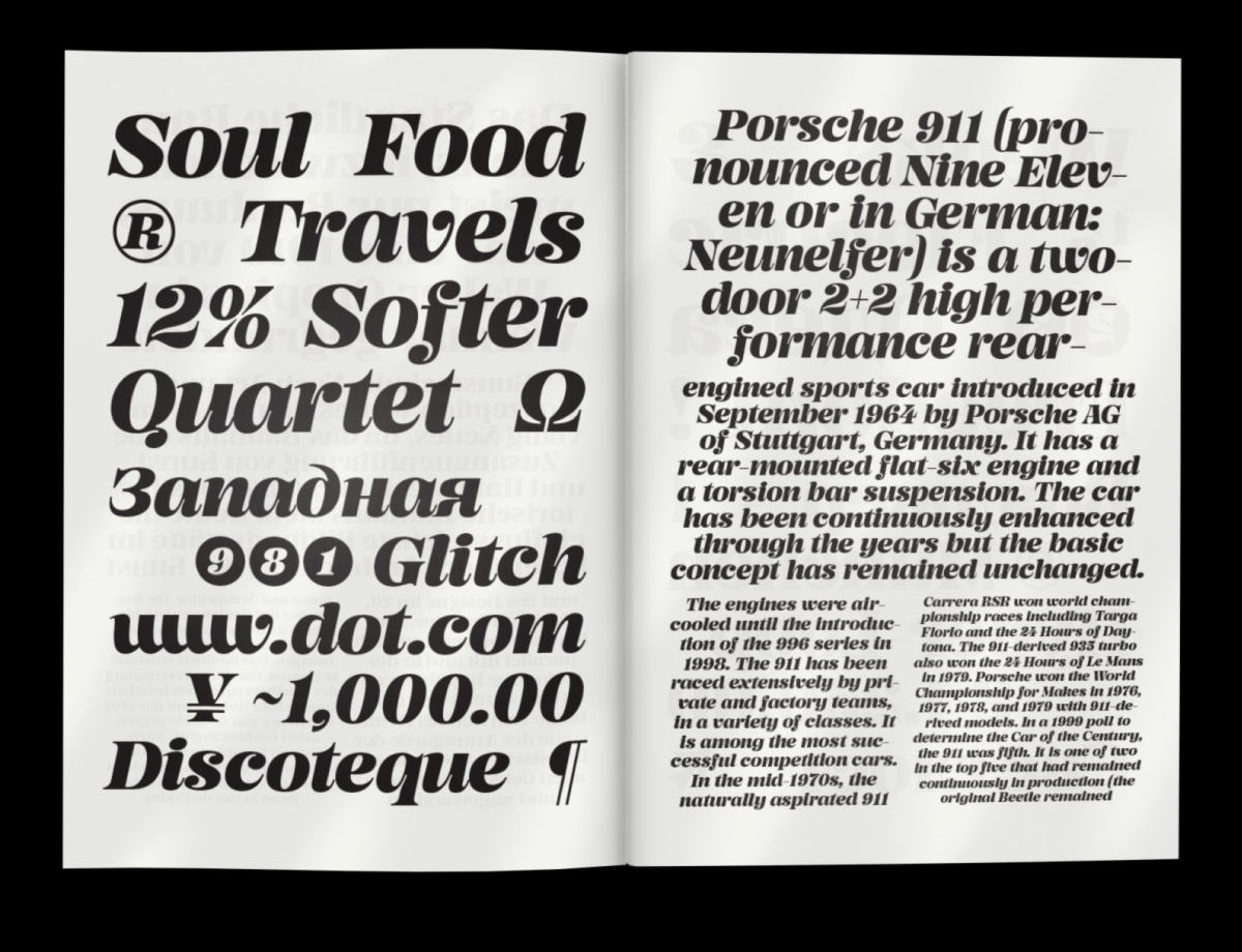
Gradient is a small independent type foundry based in Bergen, Norway, taking the stance that the deconstruction of traditional typography combined with various type experiments can re-imagine the future of contemporary typography. Their latest type offering, Okay! Serif, plays on this idea—it takes the rules of type and shifts them around to create a fresh response to the modern serif. Coming in one weight, Bold, the typeface reflects their mission as a studio: to create the fonts they want to see on the market, going on gut feeling to distinguish what feels right and what doesn’t. Designed using ink traps as an aesthetic rather than functional feature, Okay! Serif is unconventional, eye-catching and exciting.
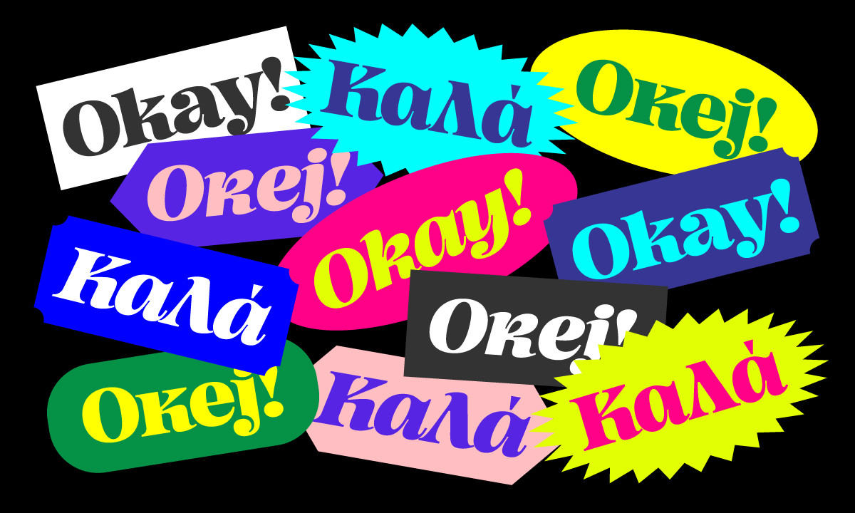
Featuring a series of unusual characters in its glyph set, Gradient’s founder, Milos Mitrovic, explains that when the idea for Okay! Serif first came to mind, it became clear it would be a love/hate endeavour. This quickly became something the team embraced; their dream setting for Okay! Serif, Milos notes, would be in an atypical environment—“we would really like to see someone dare using it in an atypical scenario,” he says, “like in the tech or car industry.”
The creative process at Gradient is one marked by freedom of thought and keeping options open. “Making a typeface was never a big deal to Gradient, as this is the part where creativity is unleashed, and in this process there is no right or wrong answer,” Milos explains. “Marketing it, though, that’s the painful part; we’re creative folk, not salesman.” It’s a comment you tend to hear time and time again, especially from creative freelancers and small studios across the board: creativity and making things comes naturally, but the business side often takes a bit of a push. “We always sleep on the premise that whoever is going to like it will get it one way or another, whether we put effort in marketing it or not,” says Milos. “Sometimes people ask us why we keep so mysterious about our typefaces,” he laughs, “and I don’t have the heart to tell them the truth!”
In fact (and perhaps because their function serves to tame a creative project into a practical, marketable tool), Milos says his least favourite aspect of creating a typeface is putting together the specimen. “They’re my least favourite part in the entire process,” he says, “it’s usually in my ‘to do’ list at the time when I’m too exhausted from engineering fonts. Most of the time I like to keep it simple. Traditional 100+ pages long specimens are thing of the past in my opinion, I think people would rather test fonts using either trial versions or type sampler.”
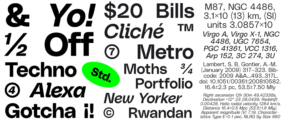
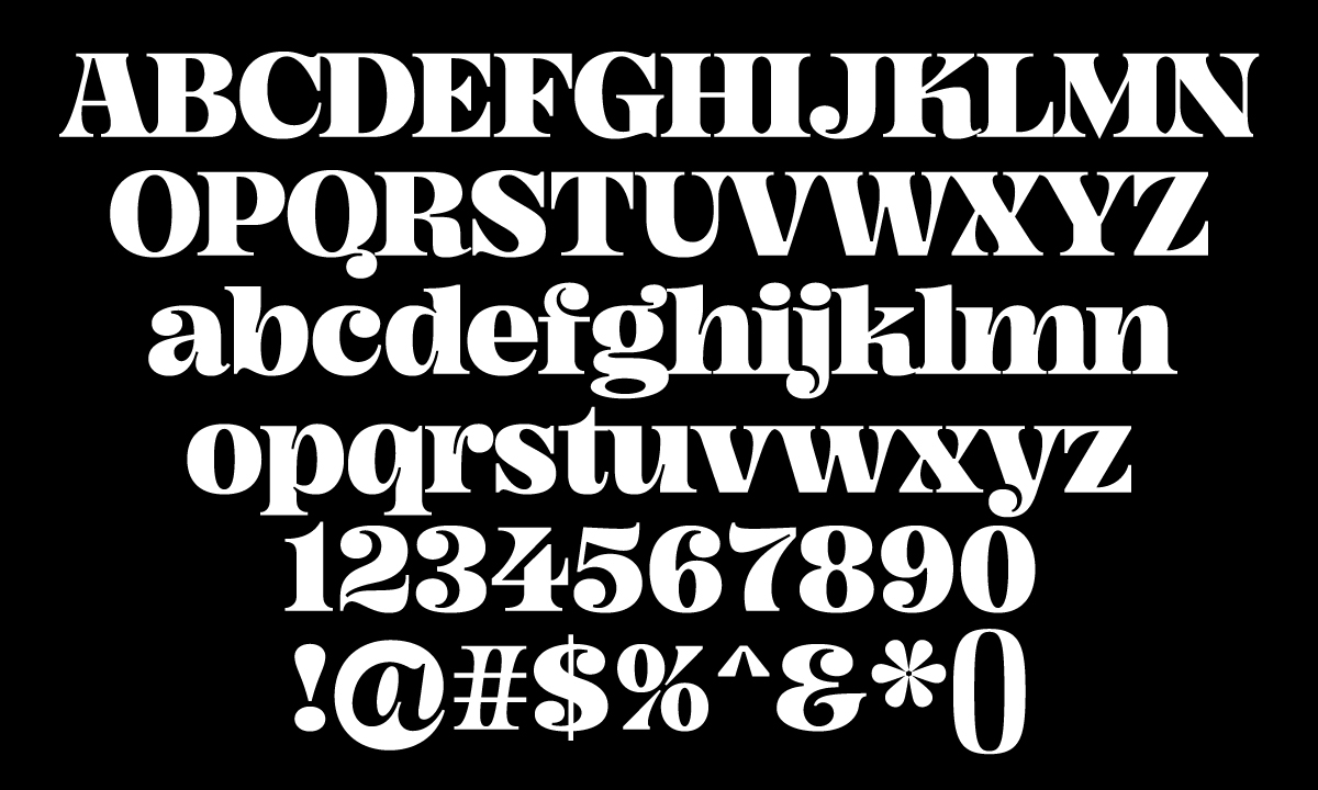
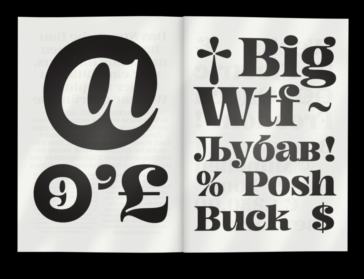
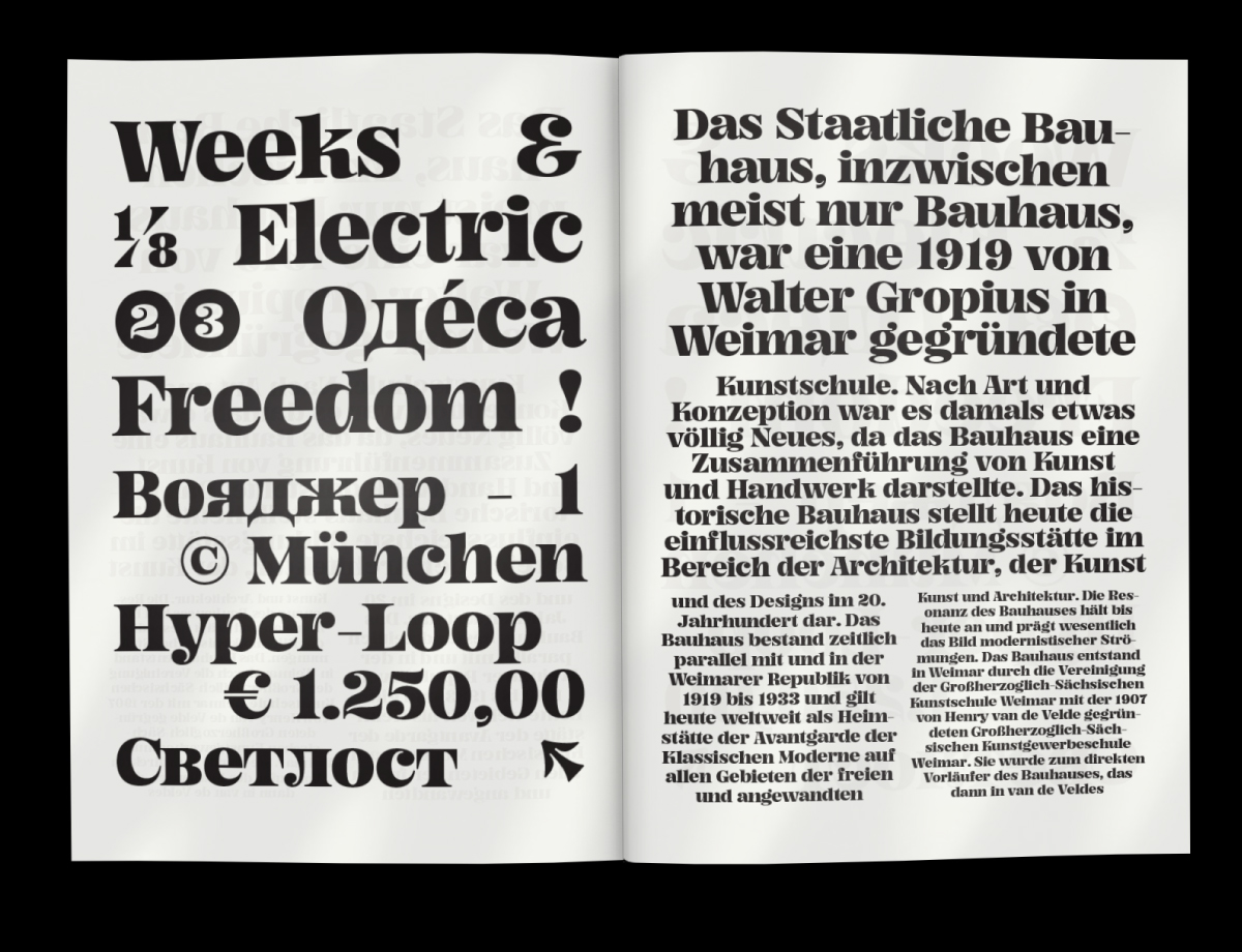
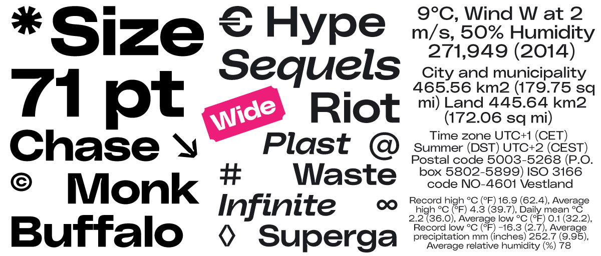
Filled with unusual features—check out the ‘@‘ sign built in negative counter-space, or the unusually delicate ink traps framed in chunky exteriors—Okay! Serif feels at home in both print and web based projects, without following over-used trends. The studio are used to seeing their projects evolve beyond their imaginings; PolySans, for example, was intended to be Gradient’s corporate typeface, but it’s now blown up into their best seller by far. “I didn’t see that coming at all,” Milos adds. “Each concept for each typeface is different,” he continues. “They usually have different backgrounds—sometimes it’s about doing our own take in the field of traditional typography, sometimes we take experimental path. It all depends on the current area of interest. Whatever the concept is, we always try to add our own ‘signature’ to it.”
Thank you to Milos for sharing more with us today! You can check out Okay! Serif on Gradient’s website, and stay up to date on their socials.