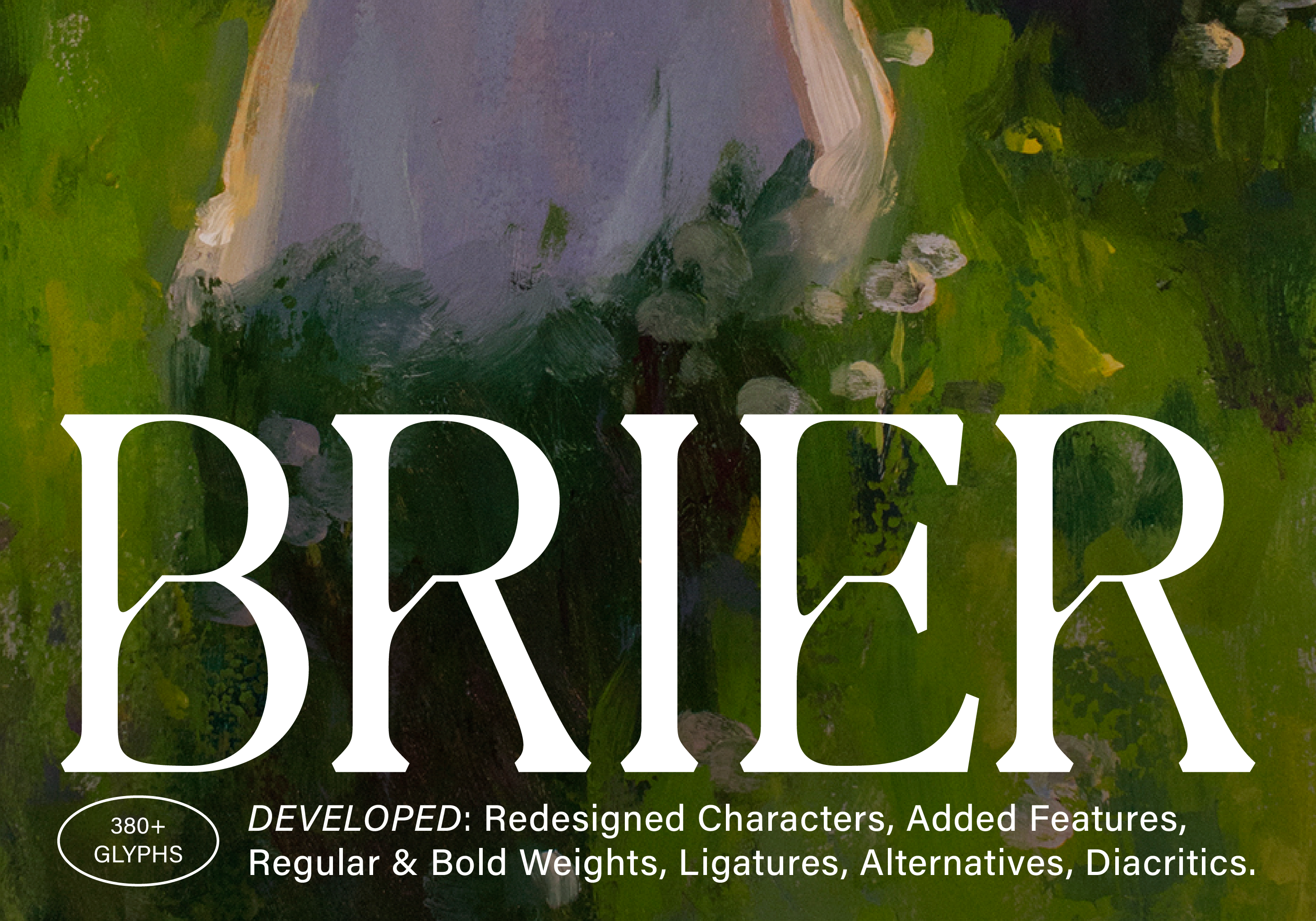
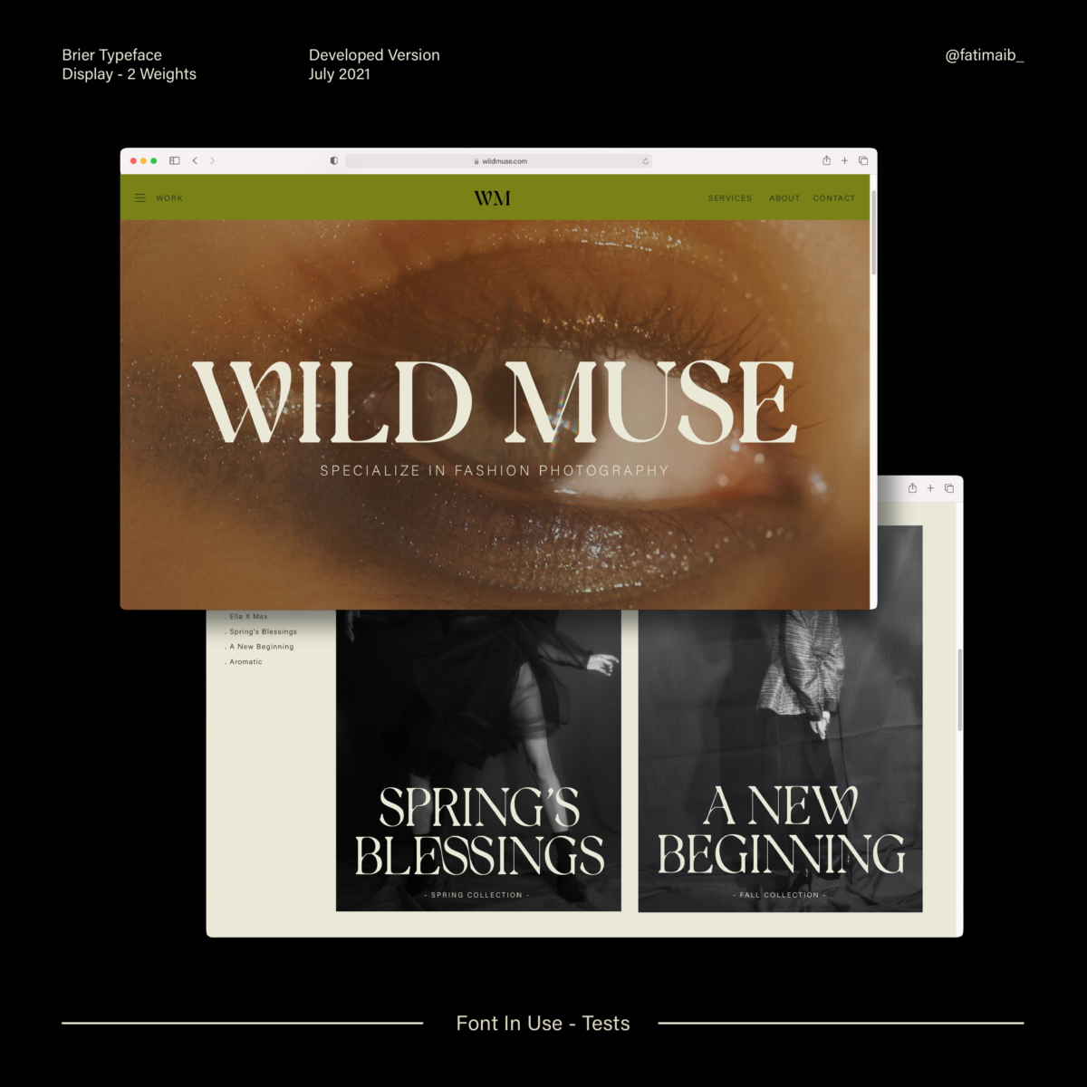
The first typeface created by Fatima Abbas (@fatimaib_), Brier, is a sensitively crafted display with unique design features that positions it perfectly for use in artful identities, branding and more.
Currently a graphic design student at Virginia Commonwealth University School of Arts in Qatar, Fatima’s type design practice is currently focussed around mastering the fundamentals; studying existing typefaces by looking at the unity of their features, and practising drawing letterforms and exploring their various features before digitisation.
In the initial stages of Brier, Fatima was working in response to a university brief exploring typeface design. Essentially, the typeface started out as an investigation into drawing letterforms that embodied various aspects of nature; particularly looking at working botanical shapes and details into letterforms. Moving the typeface towards its final form, Fatima focussed on developing the letterforms into more humanist styles while preserving its original botanical features.
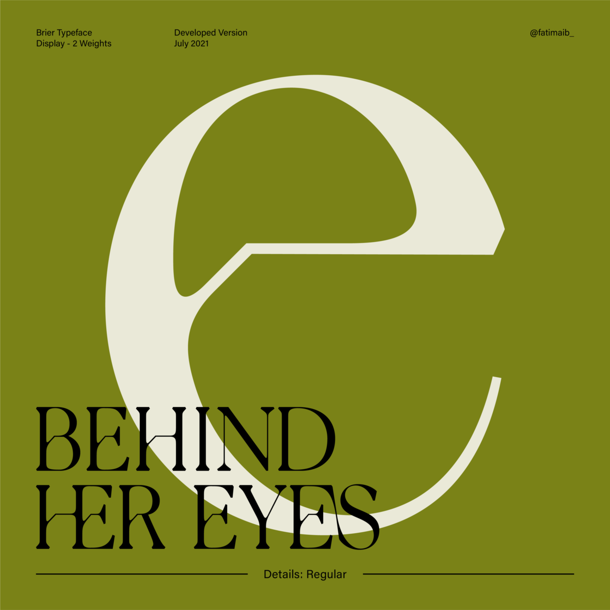
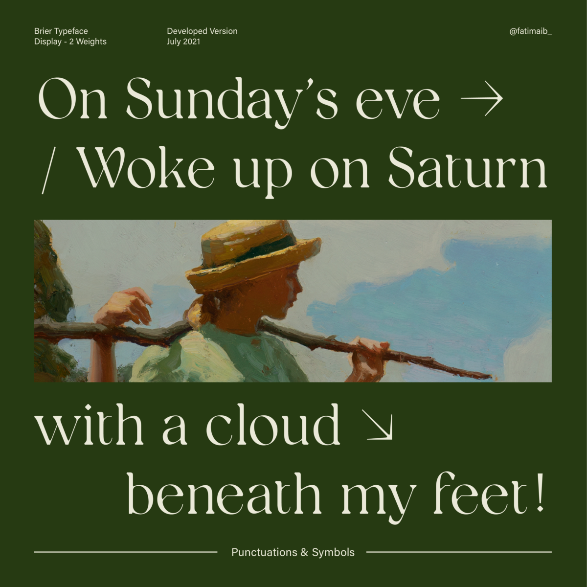
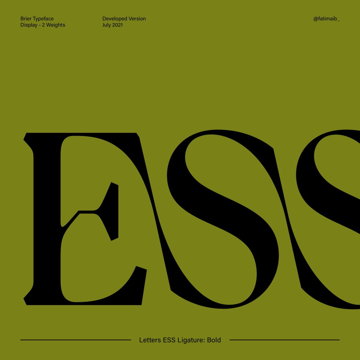
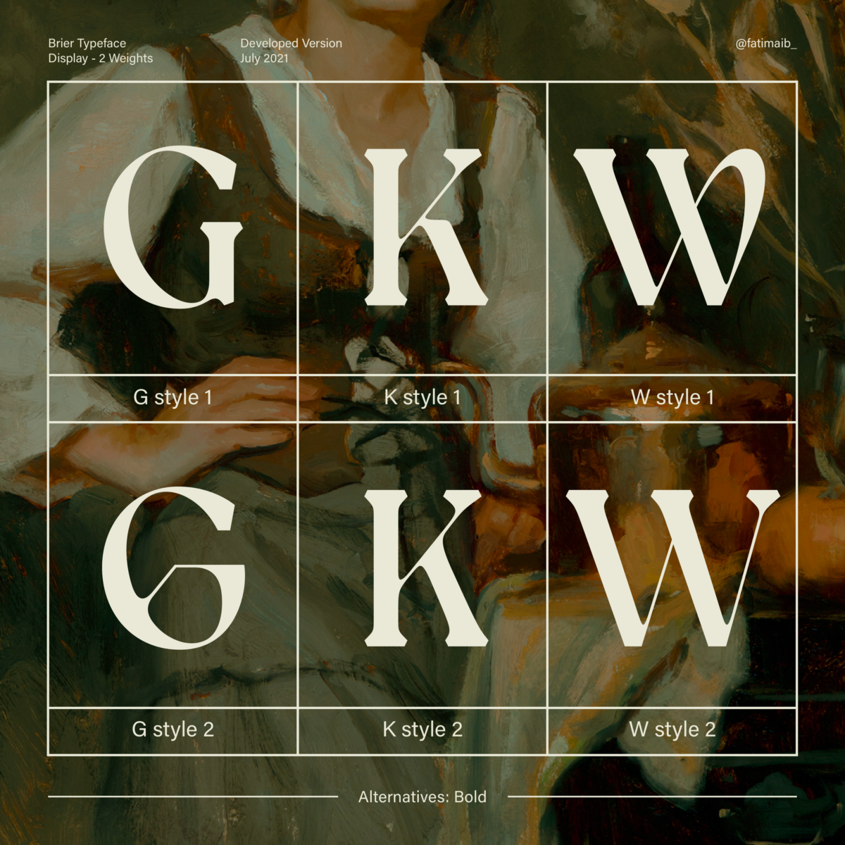
Now a fully fledged display typeface available in Bold and Regular weights, or as a font family, its stand-out design features include a sensitive approach to the crafting of each letterform. Features such as the intricately formed letter ‘e’ show up stunningly in the Regular weight, while the high stroke contrast creates impact in the Bold. It’s best suited to larger point sizes, where details such as the small broken strokes in the crossbars show up best.
Complete with ligatures, alternates, punctuation & symbols, diacritics and more, Brier provides the sharp, delicate edges popular in many current contemporary serif displays, paired with softer overall shapes and a humanist feel; perfect for branding, portfolios, publication design and broadcasting—think movie posters and album covers.
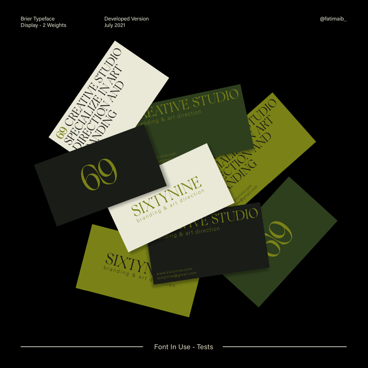
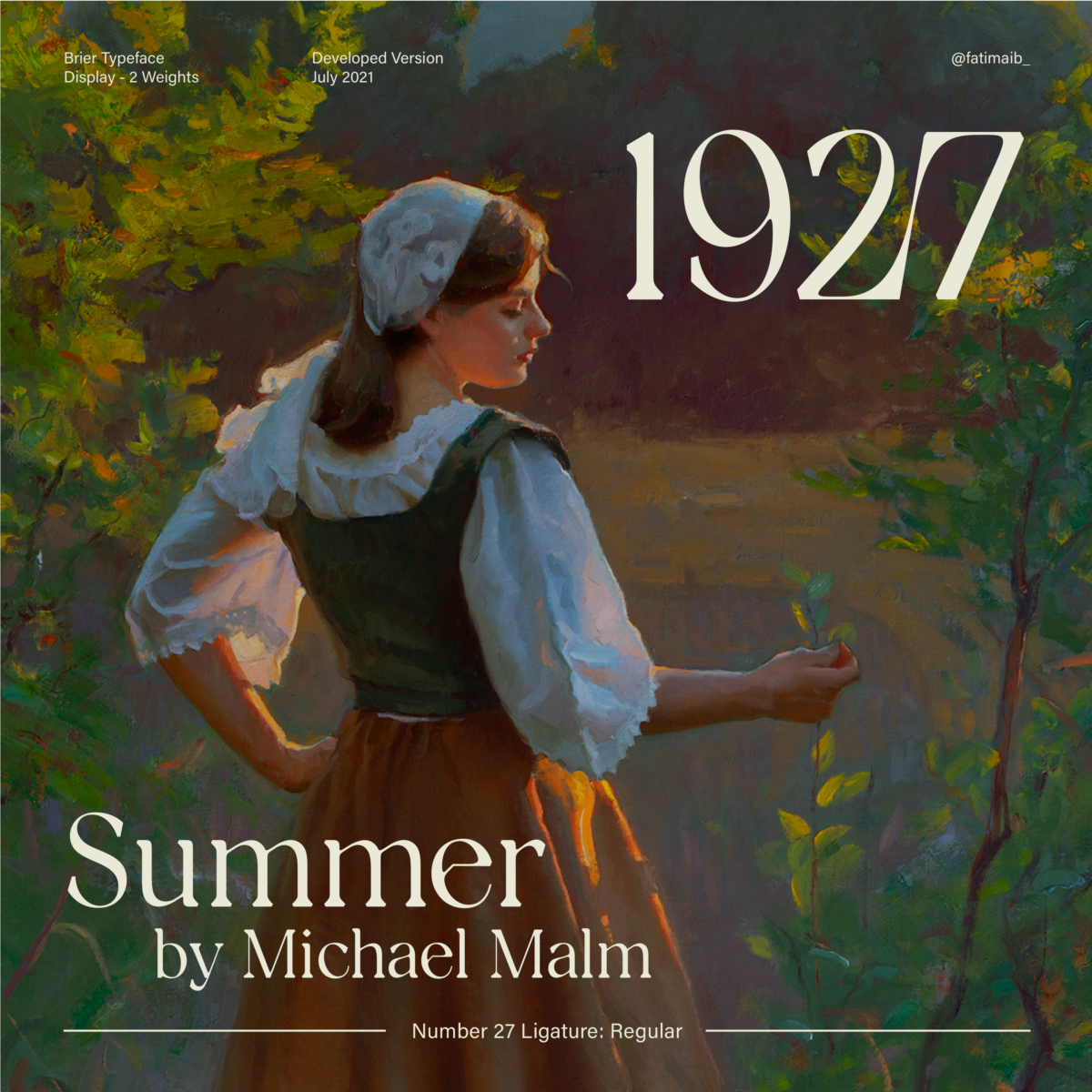
This stunning debut easily places Fatima as one to watch in coming years. Brier is now available on Type Department.

