
A combination of publisher, type foundry and design studio, the focus at Formist primarily centres around publishing and type design, accompanied by a few projects for cultural clients. The folks at Formist are all about being culturally expressive; their work is led by feeling and everything they do is embedded with intuitive understanding. “Our publications are created to be tactile experiences that are combinations of content and expression,” Formist’s Director Mark Gowing says, adding, “our typefaces are created around concepts that tie language with physical and cultural meanings.”
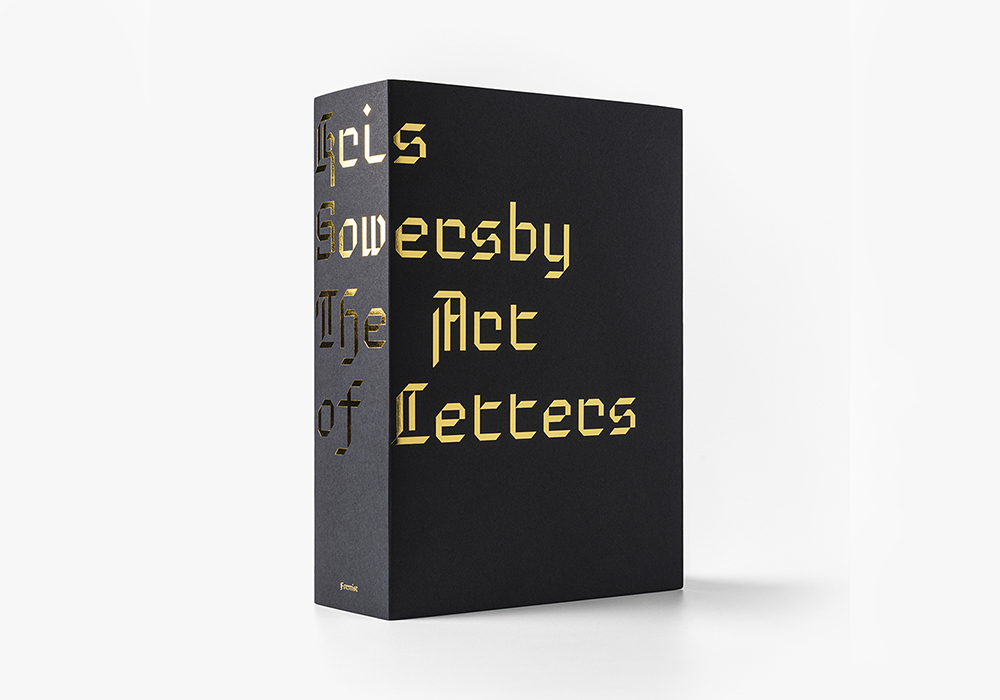
In their new type design book, Kris Sowersby: The Art of Letters, Formist present an examination of the type design practice of the Klim Type Foundry founder, uncovering fascinating intersections of art, function and form within type design, and considering the characters as independent works of art across the book’s stunning 800 pages. We speak with Mark to hear more about the making of the book, following some of the themes its content presents and discussing the custom typeface that delivered them.

Firstly, please tell us a bit about how this project came about.
Dave Forster (of Fostertype) and I were talking one day about work and type and practice, as we often do. Somewhere in the conversation we began talking about how wonderfully absurd a type designer’s body of work can be. We were talking about the process of drawing thousands of letters and accents and commas, and inevitably began discussing Kris Sowersby’s vast output as a great example of that beautiful absurdity. By the end of that conversation we had the basic premise for the book.
What ideas did you want to express on the intersection of art, form and function in type design, and how did you explore these through the publication?
I am personally very interested in the blurry line between art and design and how these practices can be compared. Despite the obvious technical requirements, I find type design to be an incredibly artistic pursuit and I think it is very interesting to discuss it in this context.
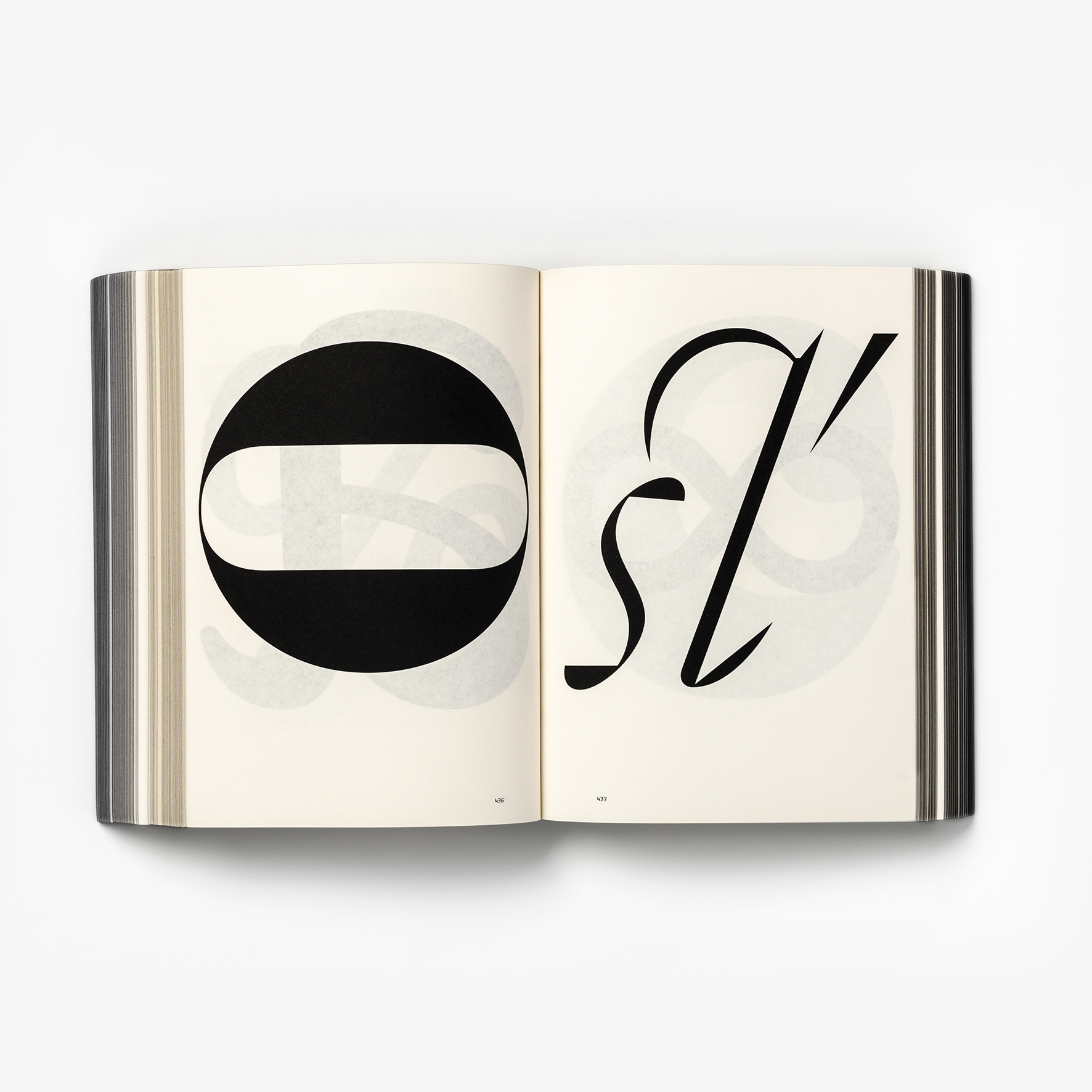
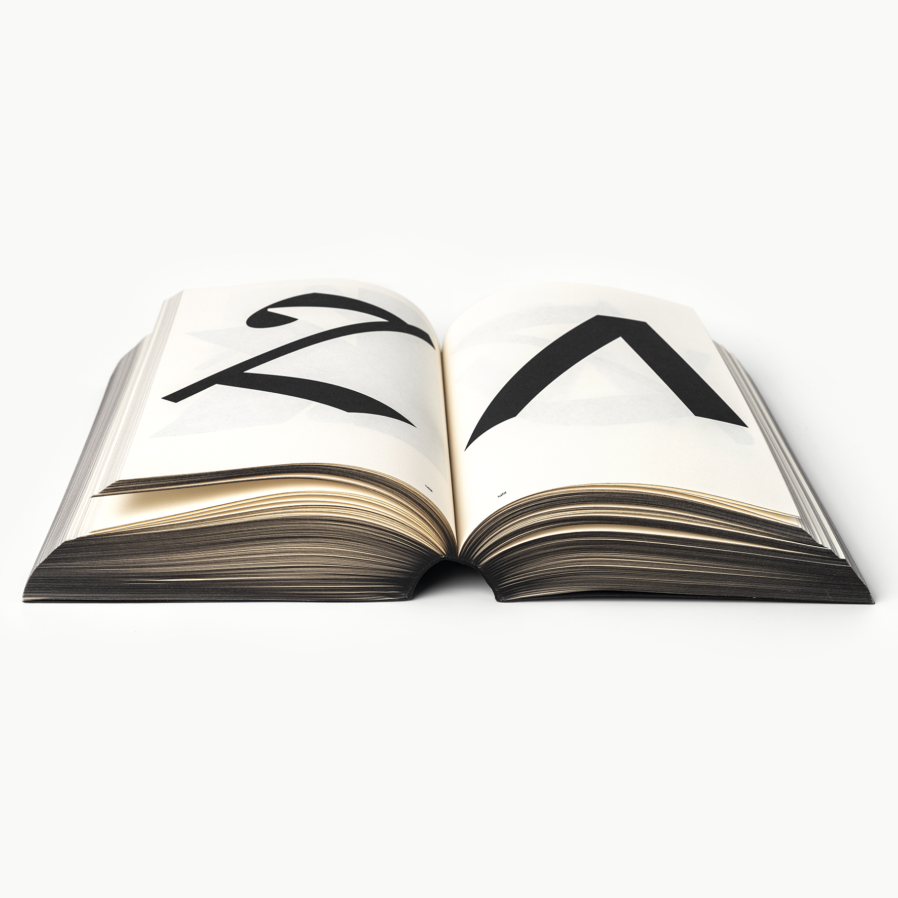
What type designers do is often discussed as a kind of science. But the process of type design is also highly creative and involves an intuitive artistry. The letters type designers draw are all individual works of art – each one an abstract form that somehow has meaning in a certain context. I want readers to see beyond the function of type and realise the beautiful artform within the system. Type is an expressive art that can embody complex concepts and social meanings.
What is something you think people need to know or learn about typefaces and letterforms in general? Do you think there are misconceptions around the practice?
Not so much misconceptions, but I do think that our written languages are often taken for granted. Type is at the core of human interaction. Type is the tone and the voice, so type has inherent meanings that are imparted when read. I think this natural transmission of cultural meaning is an extremely powerful art moment and is often under-utilised by designers, and as a result, overlooked by readers.
Can you run us through the creation process – how did your design decisions in terms of the book design intersect with the content?
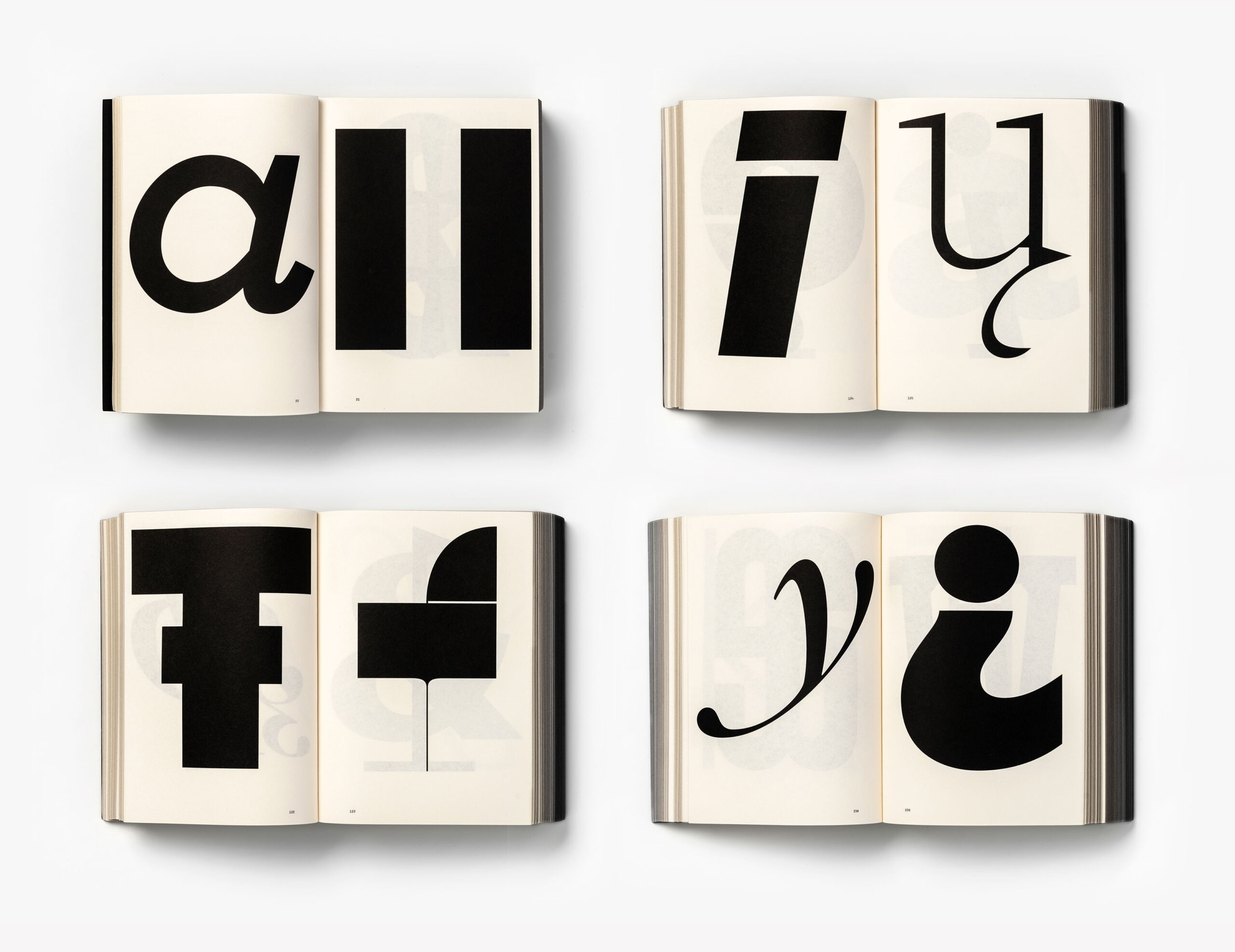
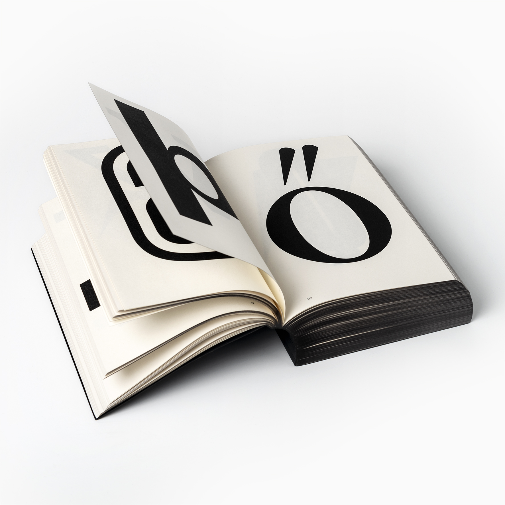
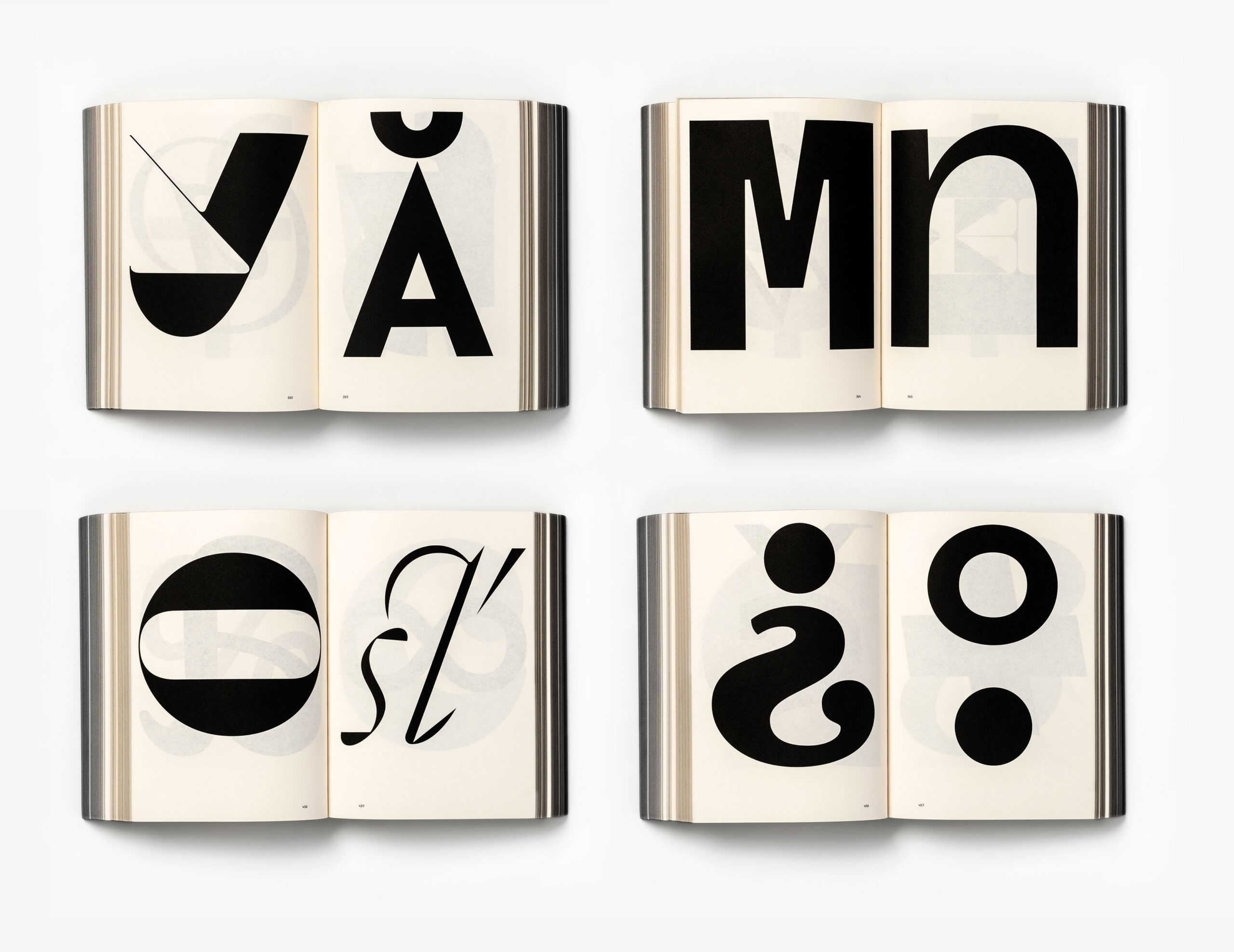
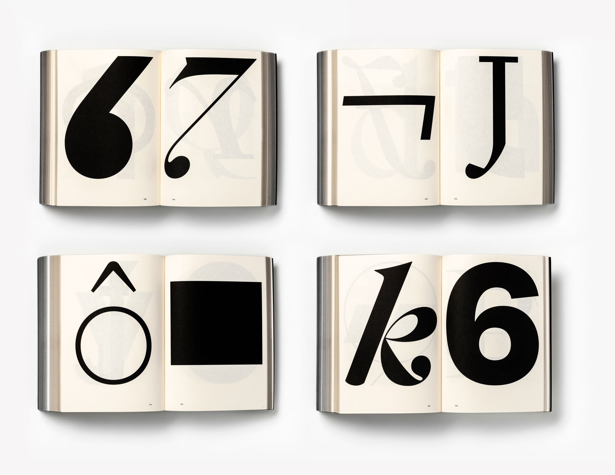
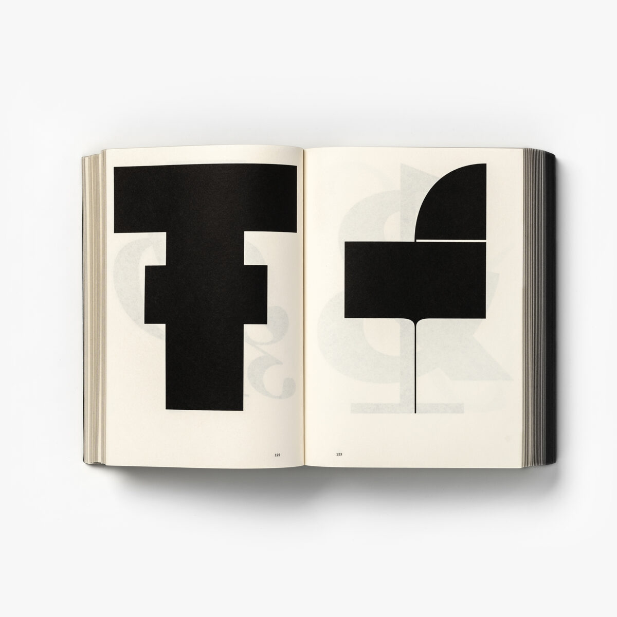
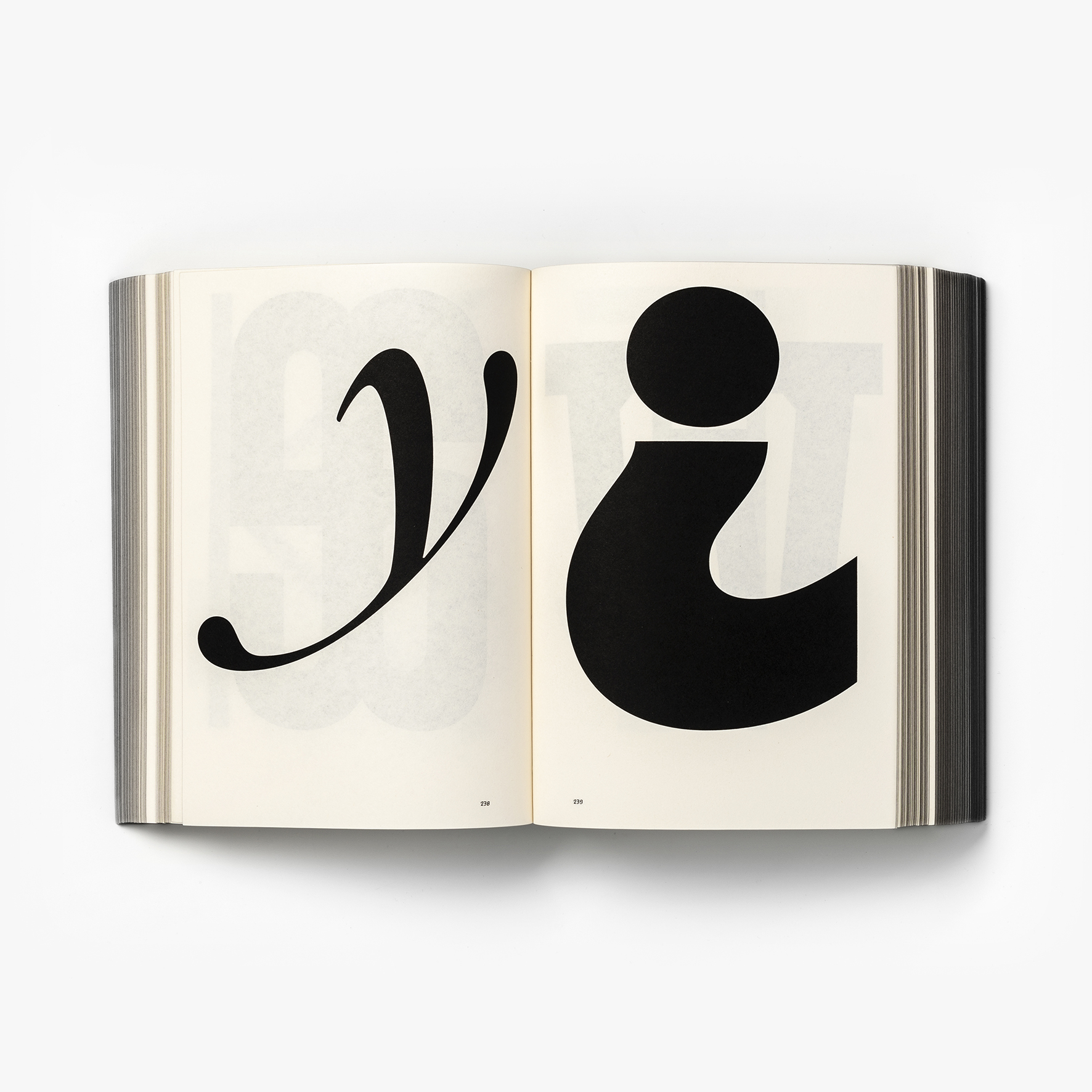
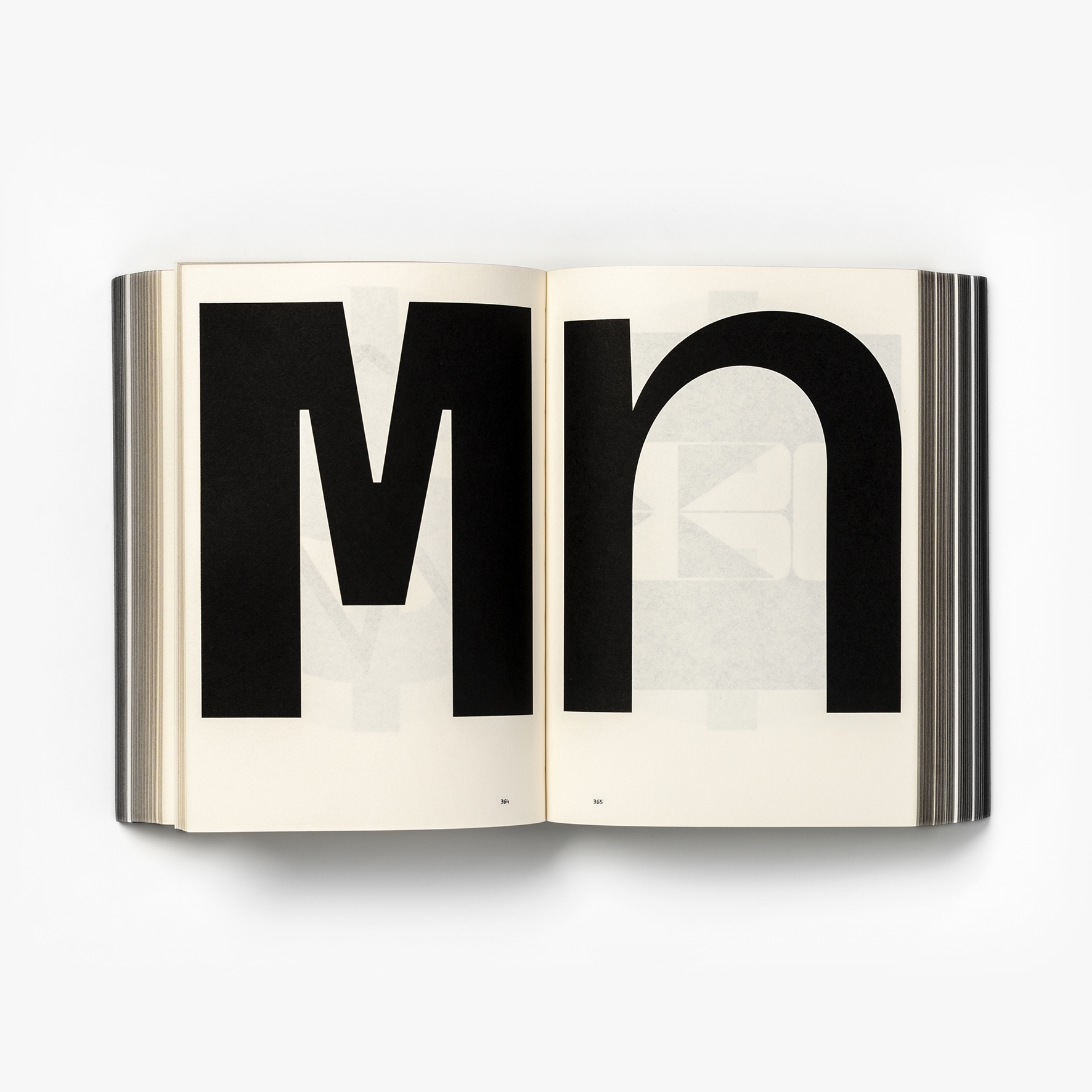
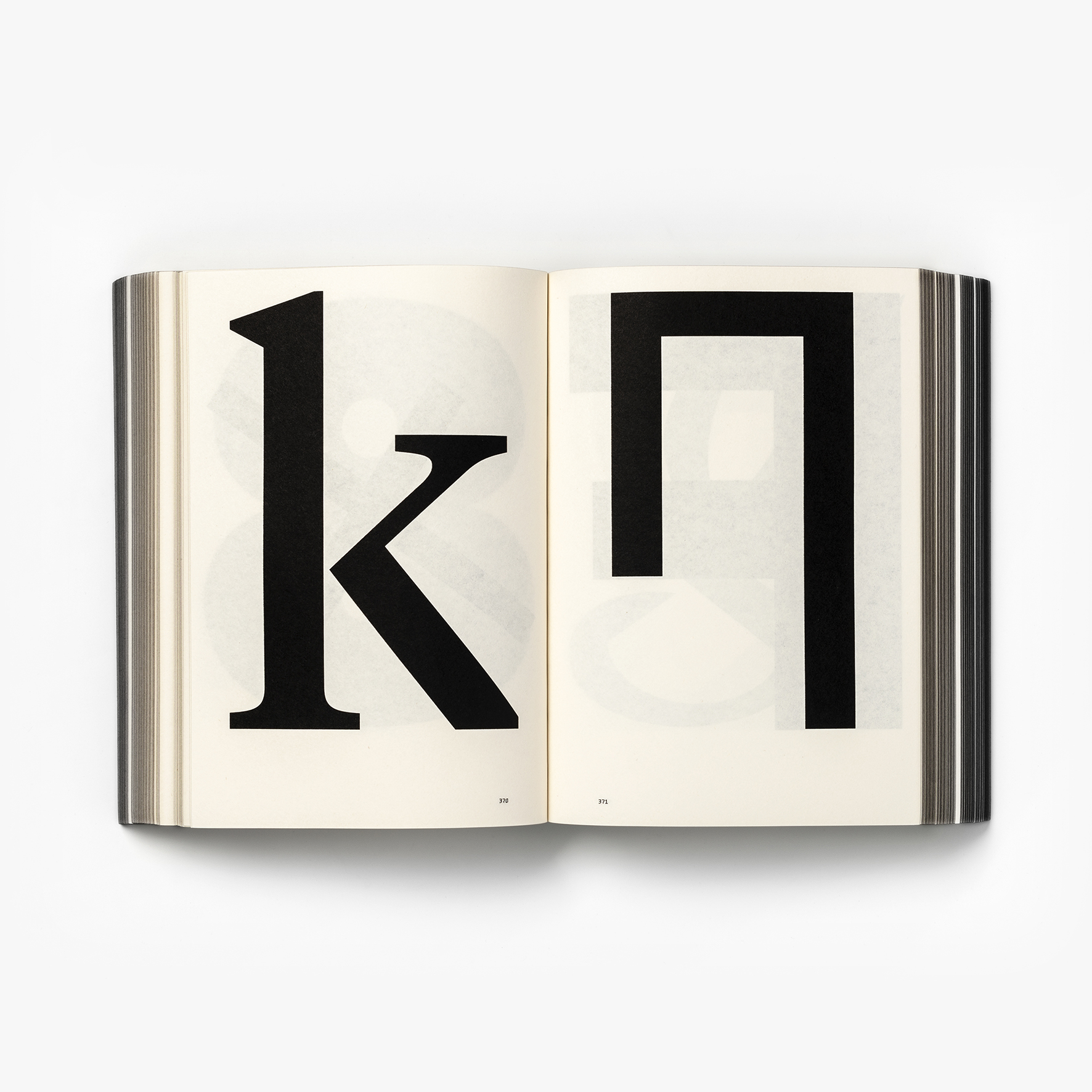
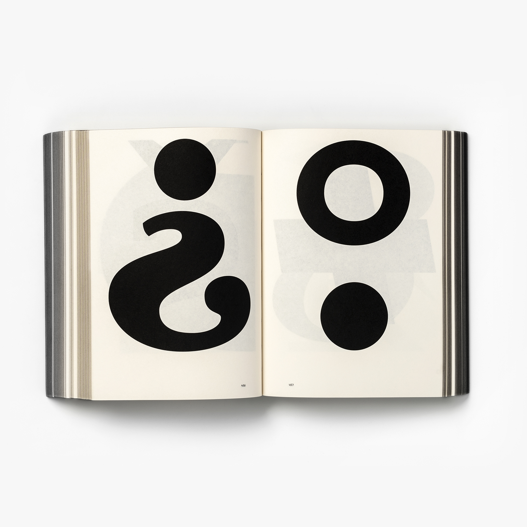
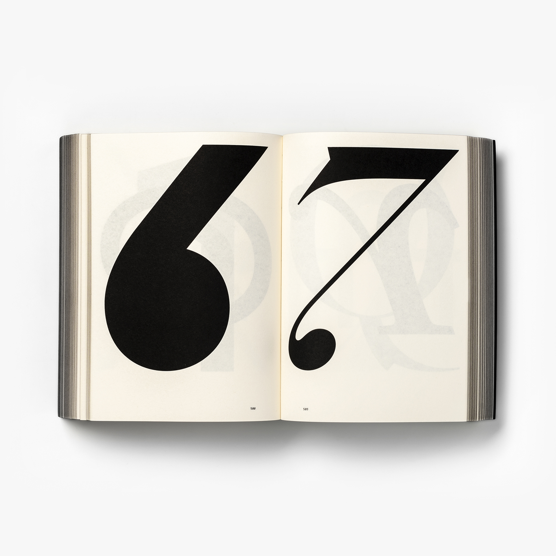
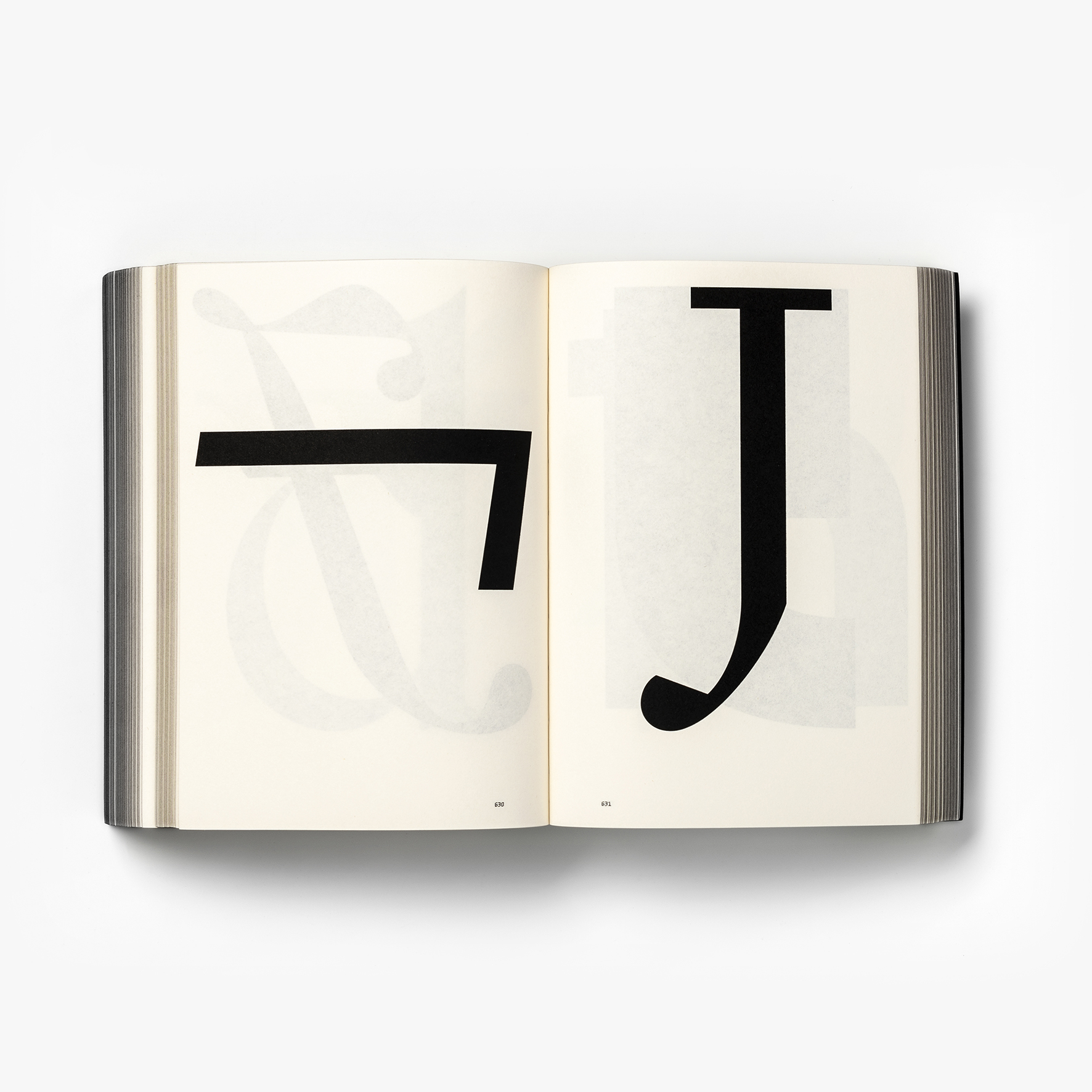
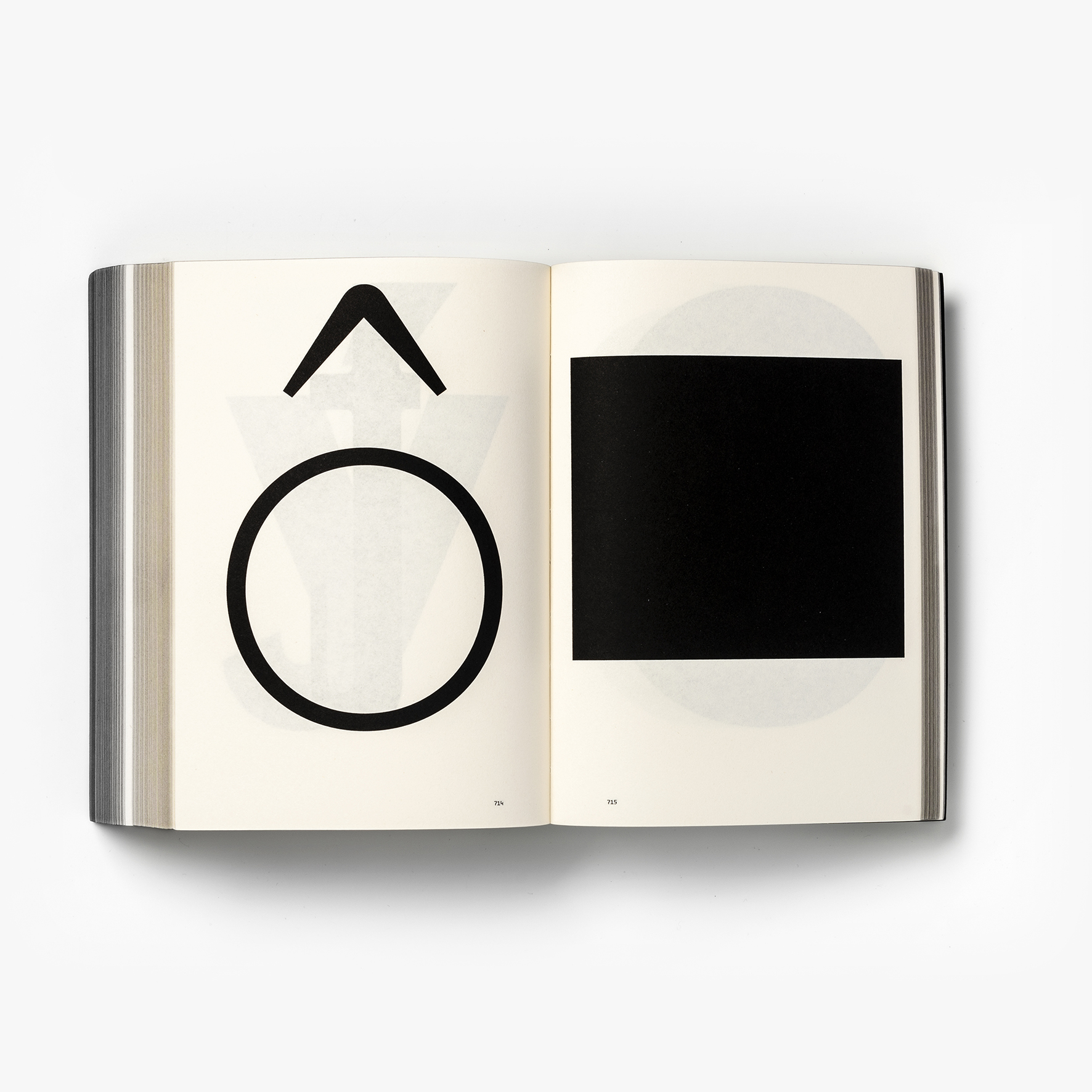
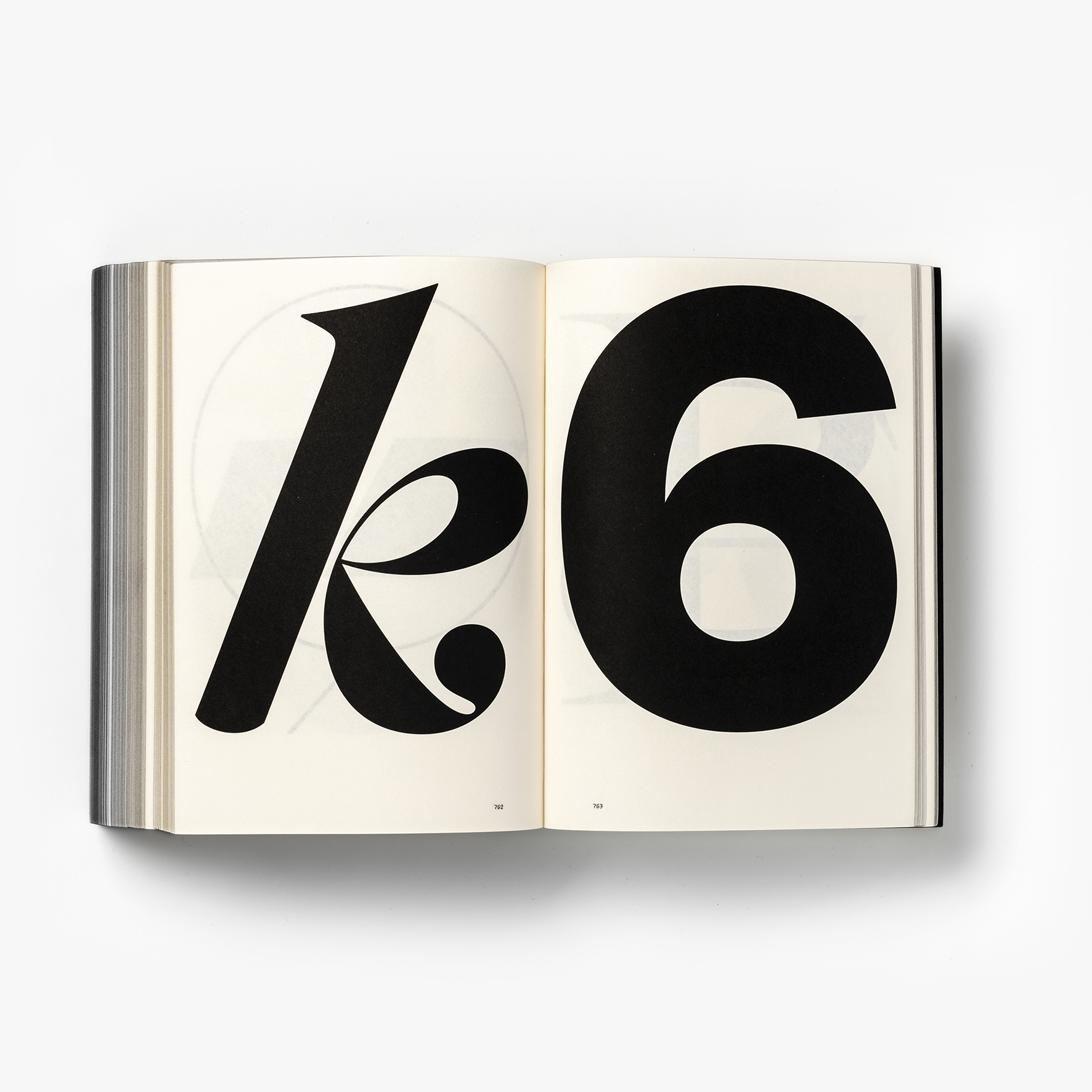
To begin with Dave and I needed to curate a concise set of glyphs from a body of about 250,000. We printed out all of the Klim glyphs on A3 paper at 30 glyphs per page (a 50cm stack printed double-sided) and painstakingly surveyed the entire set, using our instinct and experience to choose an indicative selection. Our first pass created a shortlist of about 1,400 glyphs that was then shortened to the final 756. Kris was extremely generous with his cannon and allowed Dave and I to curate the set without being involved – I think this external perspective is a large part of what makes the publication work.
After the survey was done, the book creation could begin. I began to discuss potential authors with Kris, settling on Paul McNeil. Paul has a unique combination of experimental and traditional experience and so was a perfect choice to express these difficult boundaries between artistry and utility. Kris and I also began working on a custom typeface for the book as a very natural way of connecting the book design with the content.


Do you think it’s important for the discipline of type, as well as the education around it and the industry as a whole, that people understand it as an art? Why so?
In certain contexts, yes. We all know that there is huge potential for type and writing to combine with meaningful outcomes. In the digital age, this dynamic is often reduced to the practice of ‘choosing a font’. A strong understanding of what typefaces mean and where they come from will always make reading experiences more meaningful and experiential.
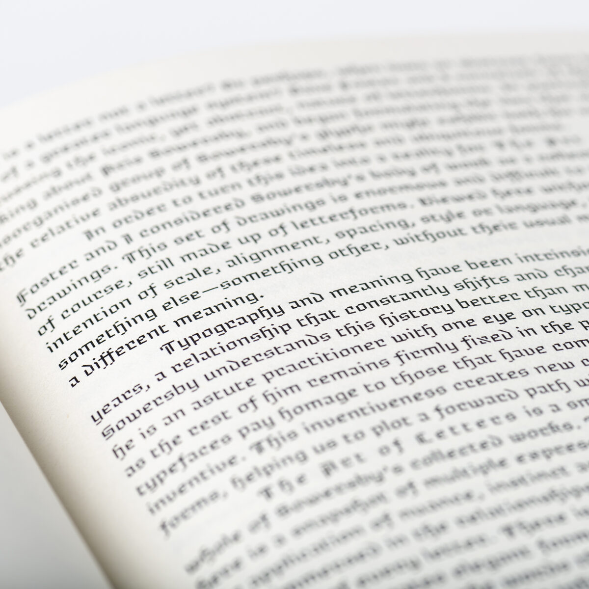
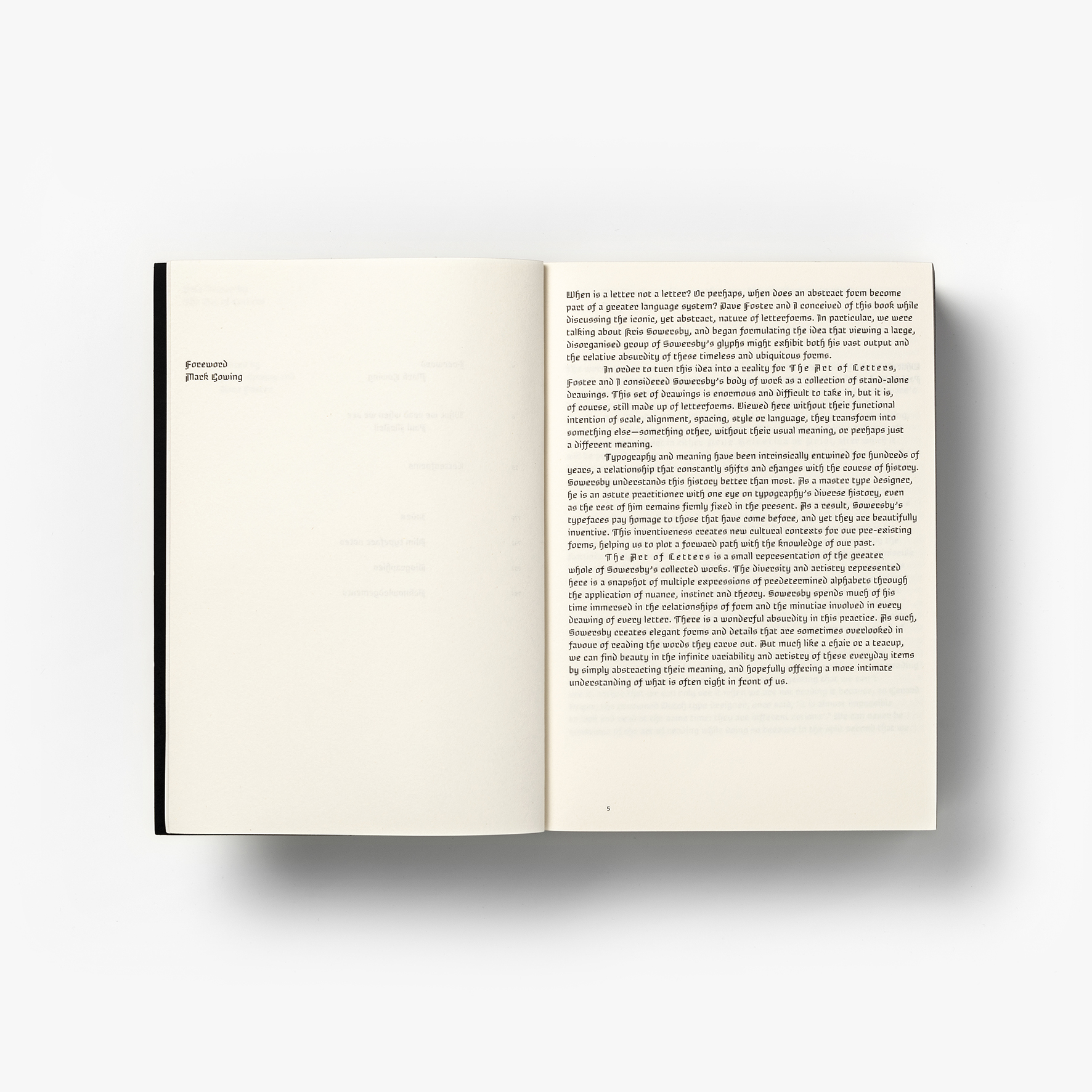
Can you tell us about the process of creating Brotunda, the book’s custom typeface, as well as why you decided a custom typeface was the way to go?
I often create custom typefaces for Formist publications. For me it is a matter of practice and process. I like to construct the entire output, from the writing, to the visual language, to the material experience. I also feel that creating type around specific ideas can help to bind the visual and written content together. Kris knew this and asked what I would make for his book. Daunted by the prospect, I told him I wouldn’t be making a typeface for his book, so Kris suggested that we collaborate on something.
I knew Kris was a fan of blackletter, so we got talking about rotundas and quickly decided to make our version of a contemporary rotunda. Kris and I swapped drawings for a while in a call-and-response kind of method. We made a few versions that we weren’t terribly happy with. Once I began to test the typefaces on the page, we began to refine the overall tone of how we wanted the pages to feel. We talked about monospace type and its rhythms and finally decided to deconstruct the forms as much as possible to achieve a monospace kind of rawness. In a moment of inspiration Kris took the impetus of channeling my grid-based process and removed all the curves to achieve the tone we were looking for.
In the end Brotunda is based on very curvy rotunda proportions, but reinvents the forms to behave similarly to their blackletter predecessors.
Lastly, what kind of innovations would you like to see in typeface design in the future? What do you think type designers have to contribute to the world?
I think type designers have the potential to be social commentators in their own subtle way. Most of the older typefaces popular today are historical examples of this – they were usually created for a specific expression within a specific cultural setting. In future I would like to see type designers invested in conceptual outcomes – this is nothing new of course and I think it is becoming more prevalent. I am all for a neutral typesetting in the right context, but I hope that in future we will see more and more typefaces that express values around social and cultural issues as well.
Thank you, Mark!


