
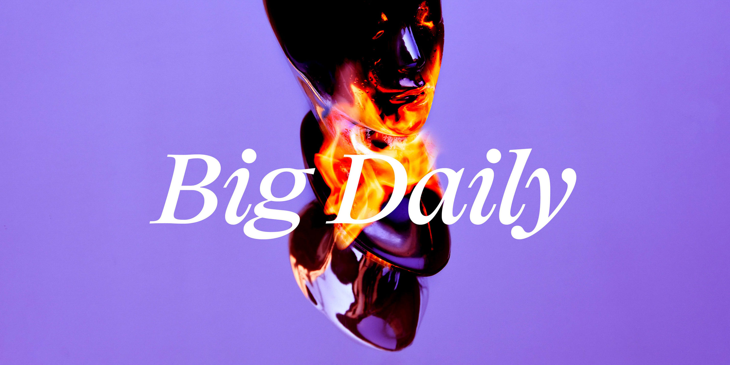
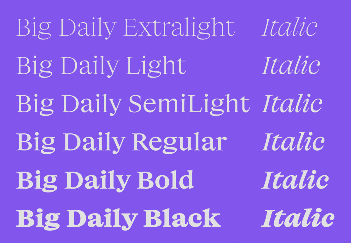
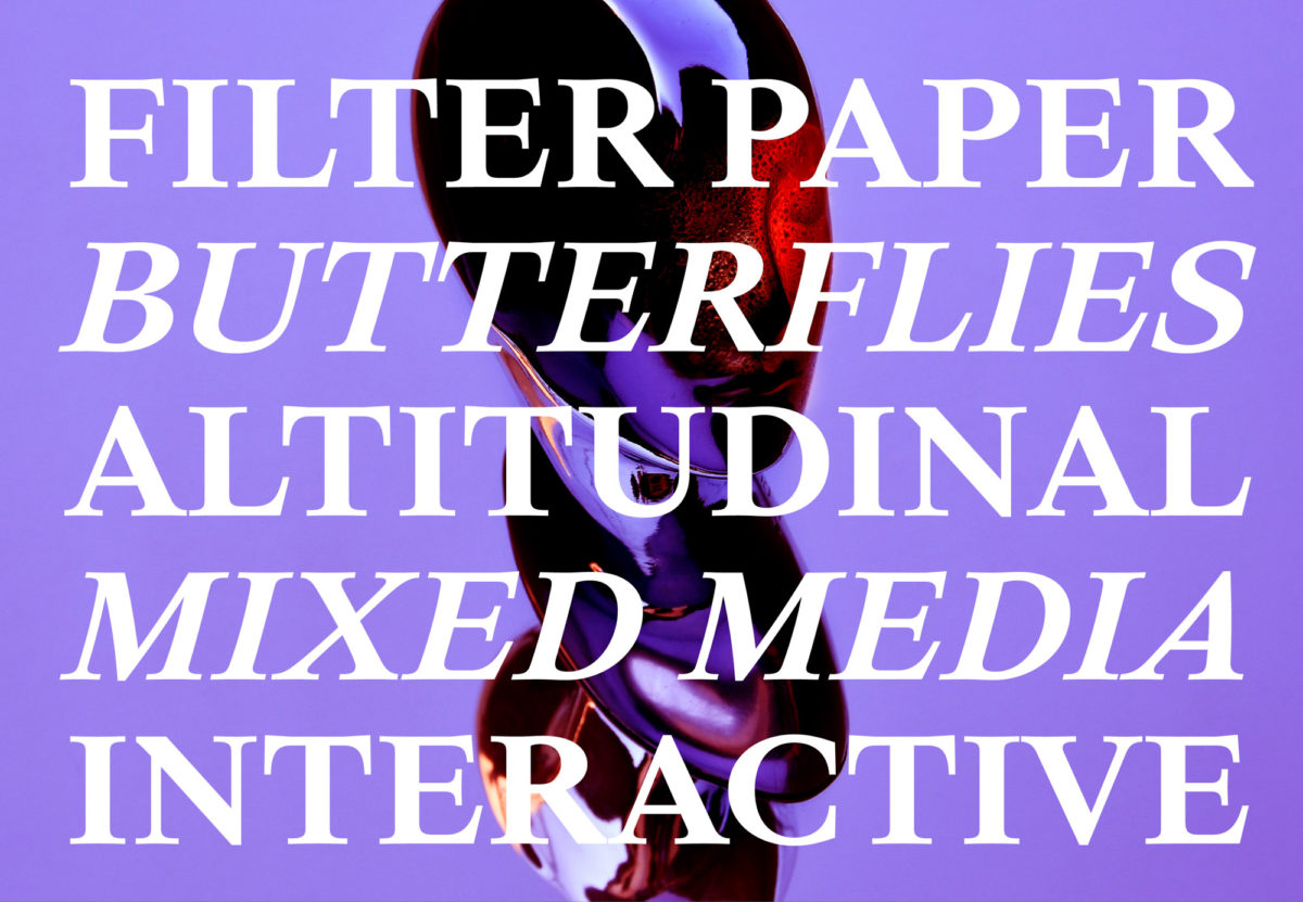
Paris and Shanghai based digital type design agency, Production Type, distributes its retail type design to design professionals, alongside creating custom typefaces for a plethora of sectors; including luxury, industrial and media. Their latest release, Big Daily, arrives in the form of Big Daily Short; later to be accompanied in its completion of the full family with both a Tall and a Mono. Designed by Alaric Garnier (@alaricgarnier) the typeface is inspired by the small copy of daily newspapers.
Alaric Garnier works professionally across sign painting, type design and book design. His sensitivity towards the nuances and details of type design and type setting is, then, obviously very well informed. Birthed from an expansive understanding of letterforms and type design in their many different habitats, Big Daily is no exception when it comes to Garnier’s knack of melding a meticulous, mindful eye with fresh, gestural expression.
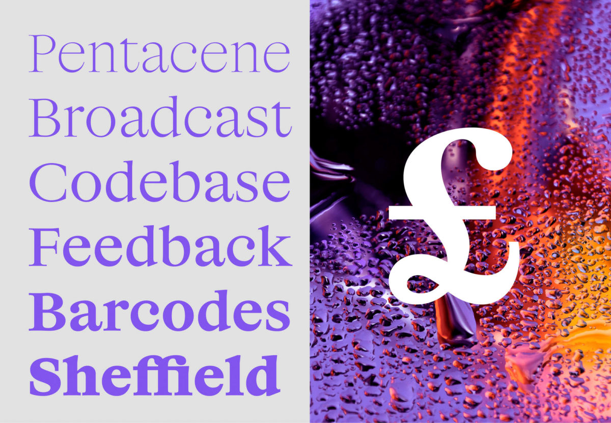
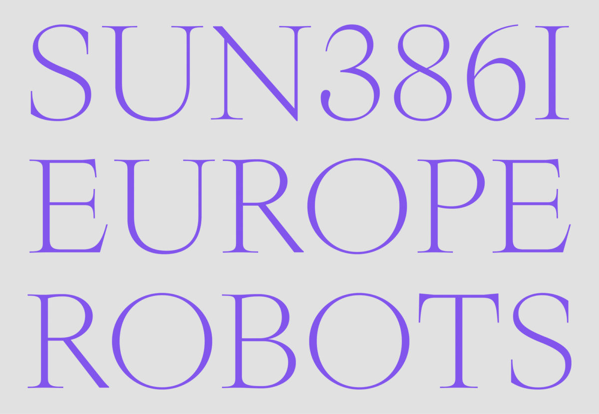
With nods to Claritas – a distant ancestor and sibling of the omnipresent Times New Roman – Garnier celebrates the everyday and its history; highlighting the easily missed presence of the fonts and typefaces which quietly drench our collective aesthetic sensibilities. Another visual influence feeding into Big Daily includes the 1930’s Legibility Group fonts. Originally designed in opposition with the spindly Didone typefaces previously prevalent in newspaper printing, the Legibility Group fonts aimed to print newspapers with fonts which had more body; adorning them with wide, open counters, low contrast stroke weights and ball terminals.
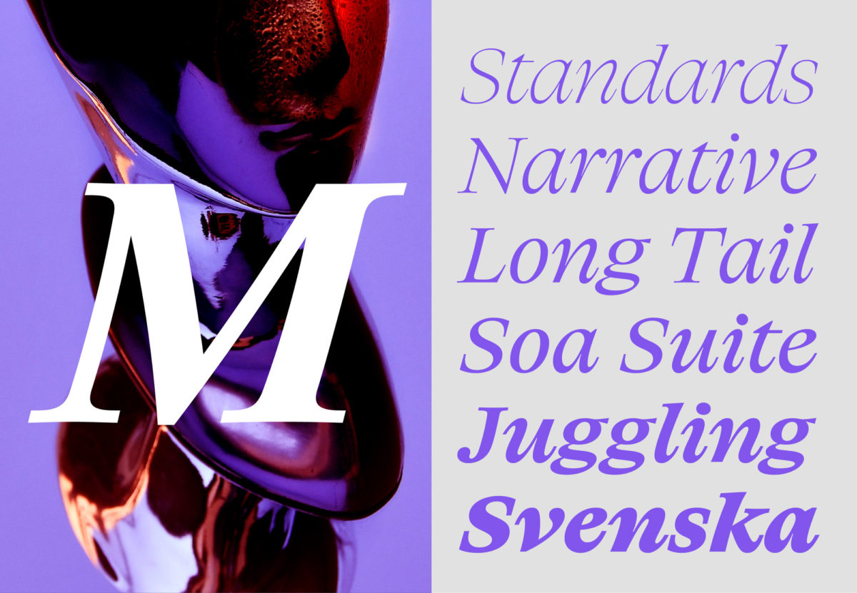
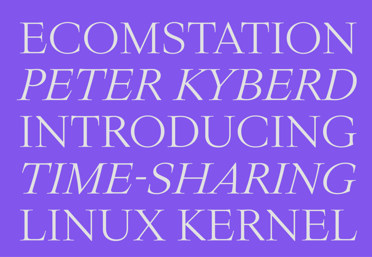
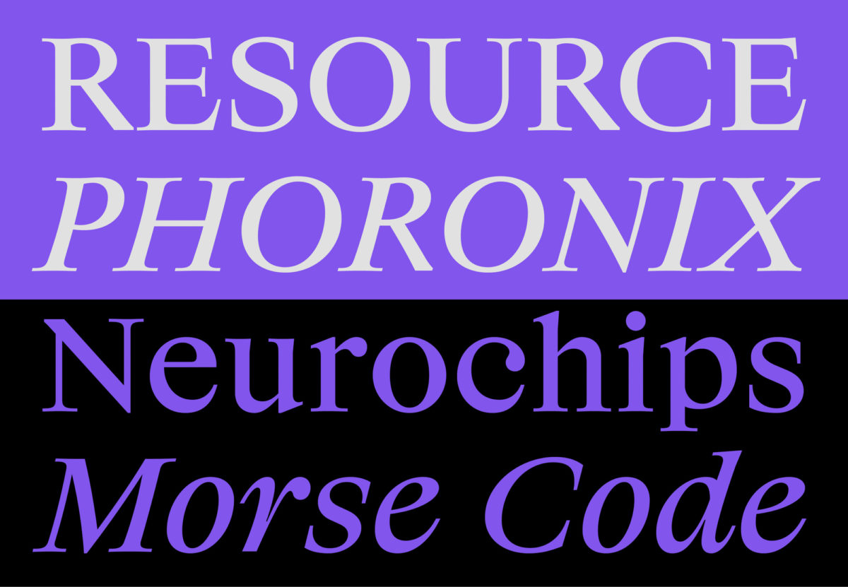
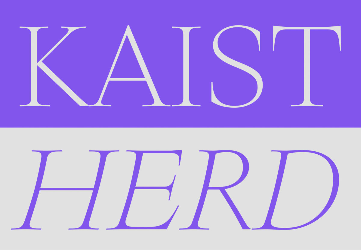
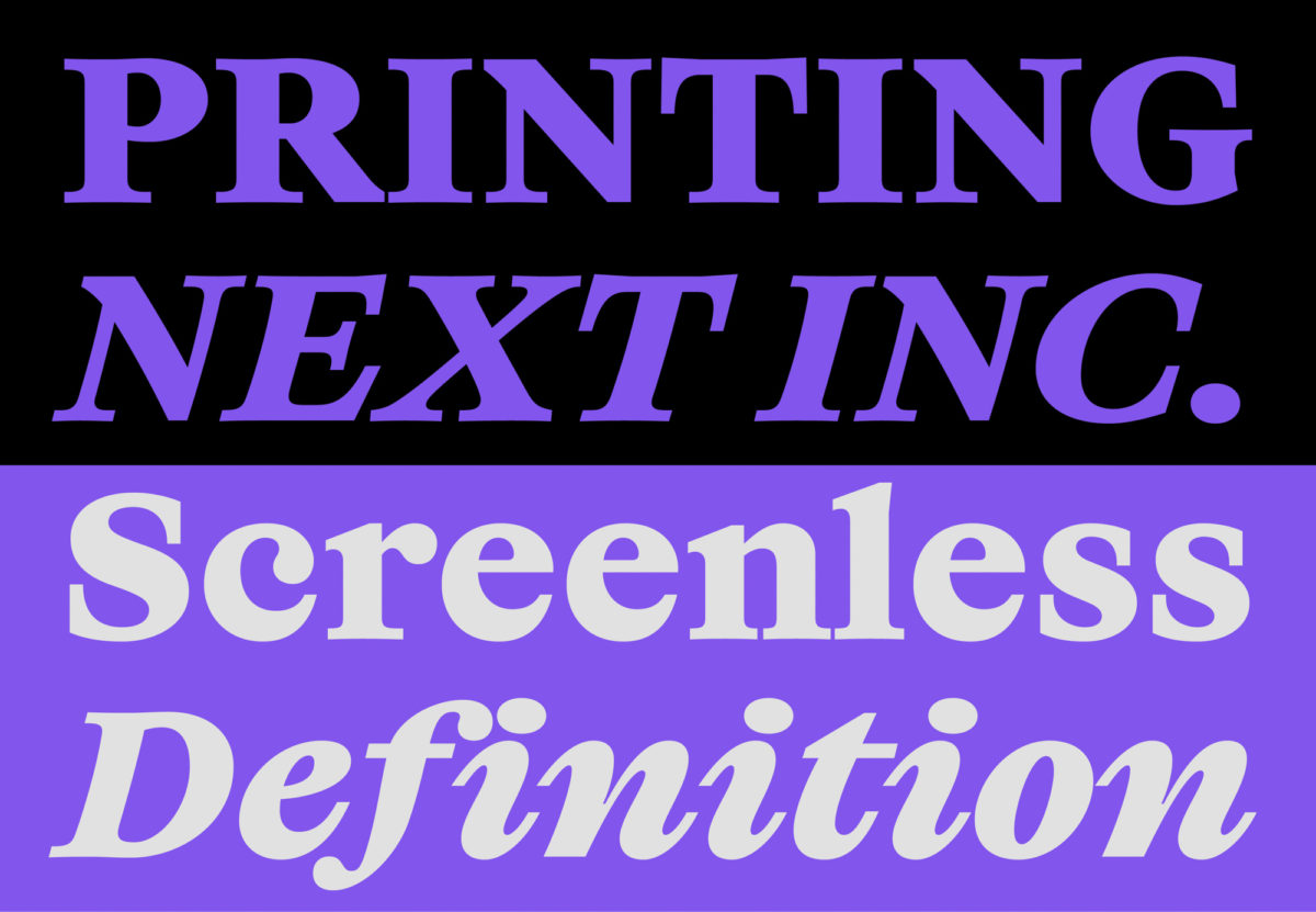
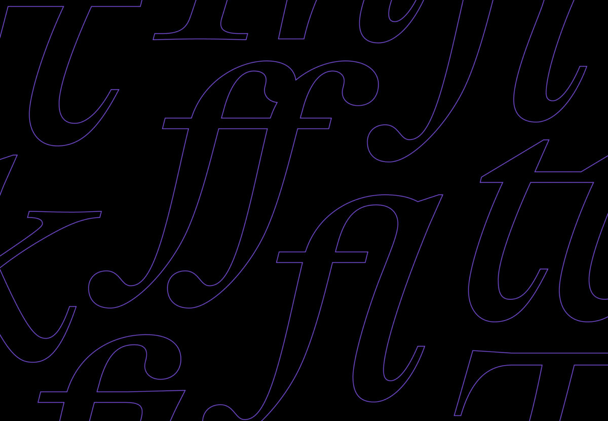
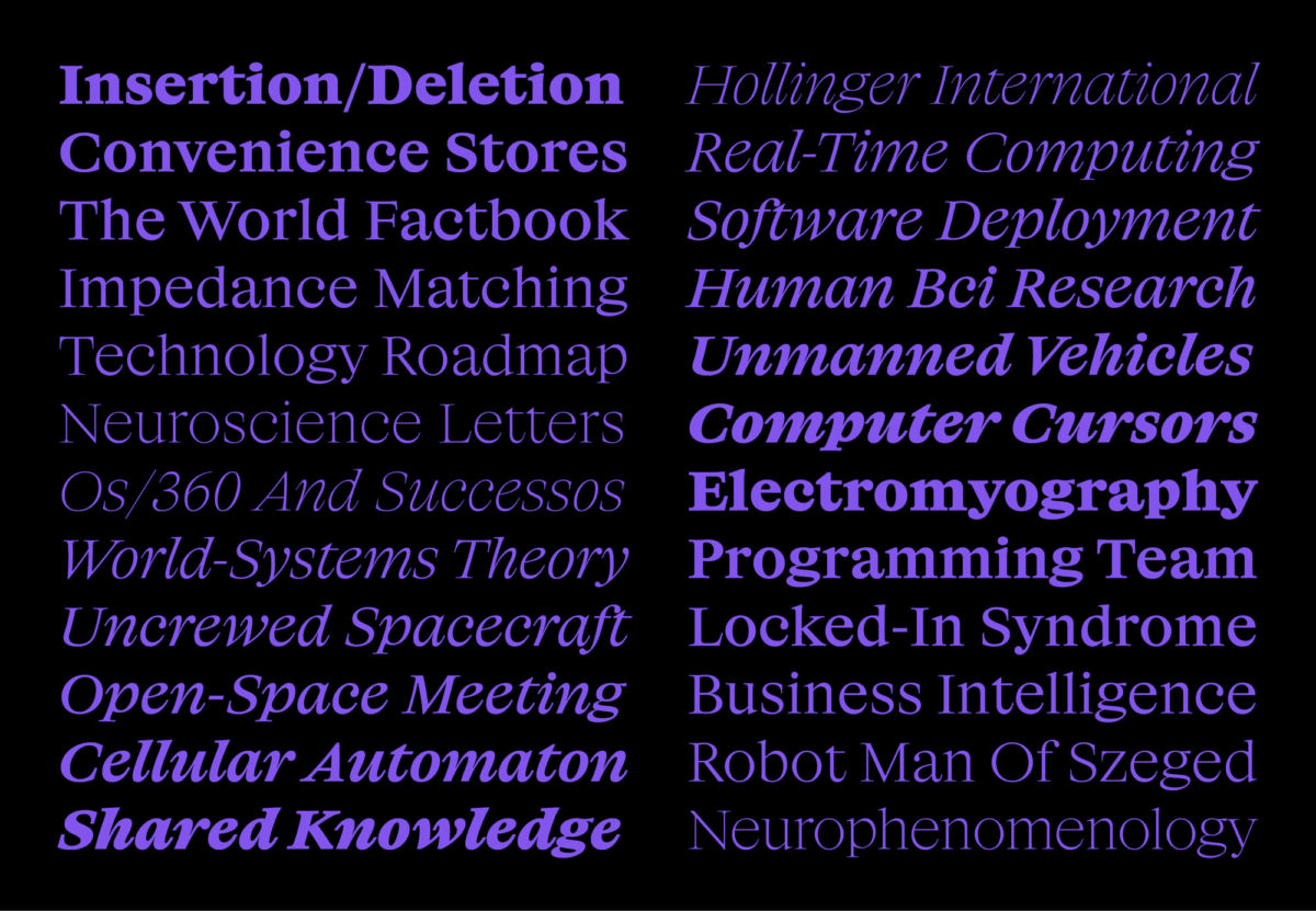
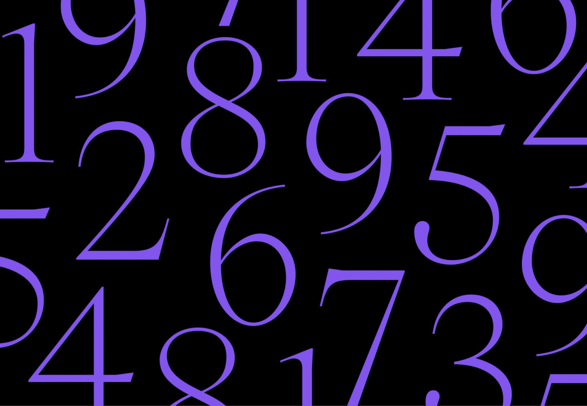
Best suited to small point sizes, 6pt – 12pt, Big Daily is full of strong, sturdy contrast; allowing it deep clarity and visual integrity. The italic is beautifully fluid and organic and, although rendered – of course – in pixels, you can almost feel the tactile quality of the ink seeping into the terminals. The overall visual presence of the typeface is cool, calm, comfortable and collected. Through its sharp, piercing serifs and confident flow of motion, Big Daily feels both refined, minimal and elegant whilst incorporating subtle, ornate touches. The light and extra light styles are ever so slightly sharper and more angular in feeling, whilst the heavier weights have a tactile, undulating energy.
Garnier’s design picks at the tensions between classic terms of journalism and the ever-digitalising characteristics of the near-future. In visually deciphering these peripheries, Big Daily successfully renders a near-impossible task: imbuing cold pixels with the visceral, humane feel of ink-on-paper print. We implore you to take a look at the rest of Production Type’s fascinating and exciting output!


