
The characterising feature of István Fazekas’ work has to be its irresistible visual magnetism. A Hungarian Graphic Designer based in Budapest, István is currently studying at Moholy-Nagy University of Art and Design. Although early on in his career, István’s work is incredibly innovative and refined. You only need to take a quick look over his Instagram (@_fazekas_istvan) to get a taste for his definitive creativity. From shape inspiration derived from cellular structures, to his stunning display work for The International Day of Epilepsy 2017, there is so much to be excited about… including, not least, our latest release on Type Department, Sonic.
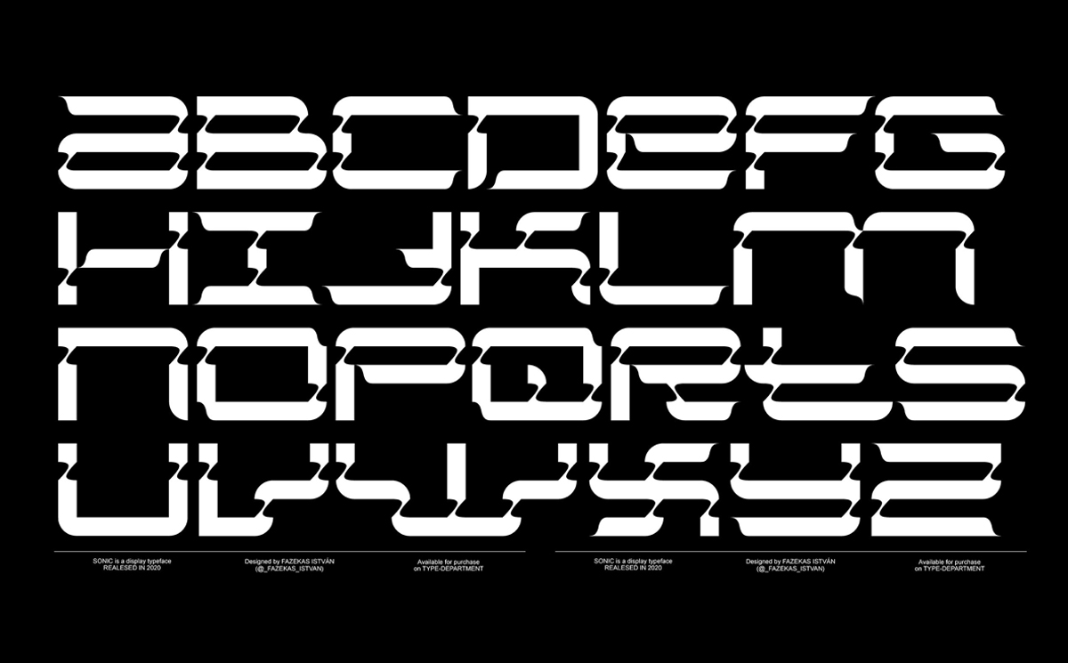
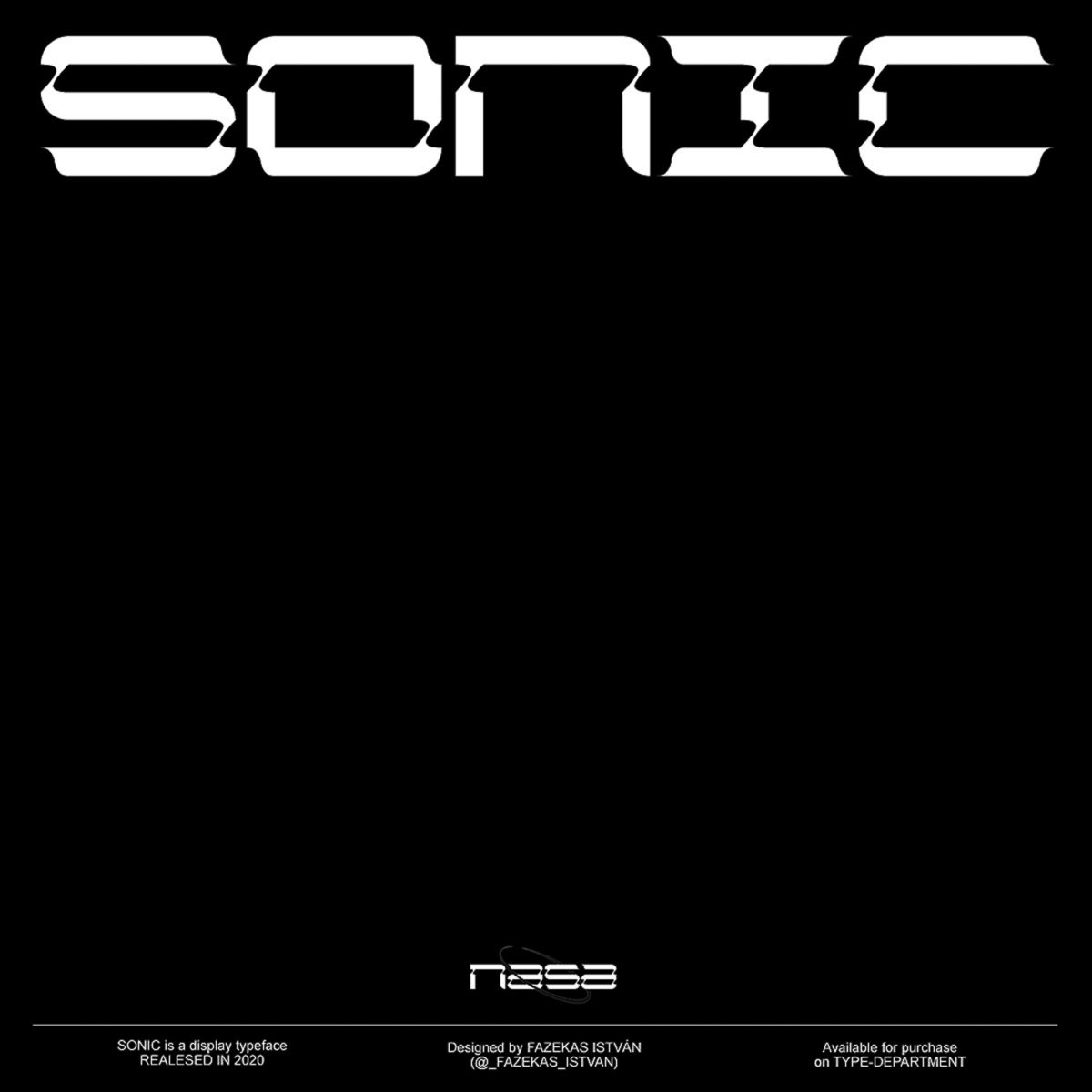
Fascinated by the endless possibilities of type design and experimentation with letters and shape, István explains that Sonic ‘started as a late night experimentation with grid-based letters,’ and quickly became one of his favourite projects to work on. The expressive display typeface pulls together a medley of different visual references in a super-interesting way; toying with the aesthetics of early sci-fi films and melding them with the fluctuating landscape of contemporary typographic design.
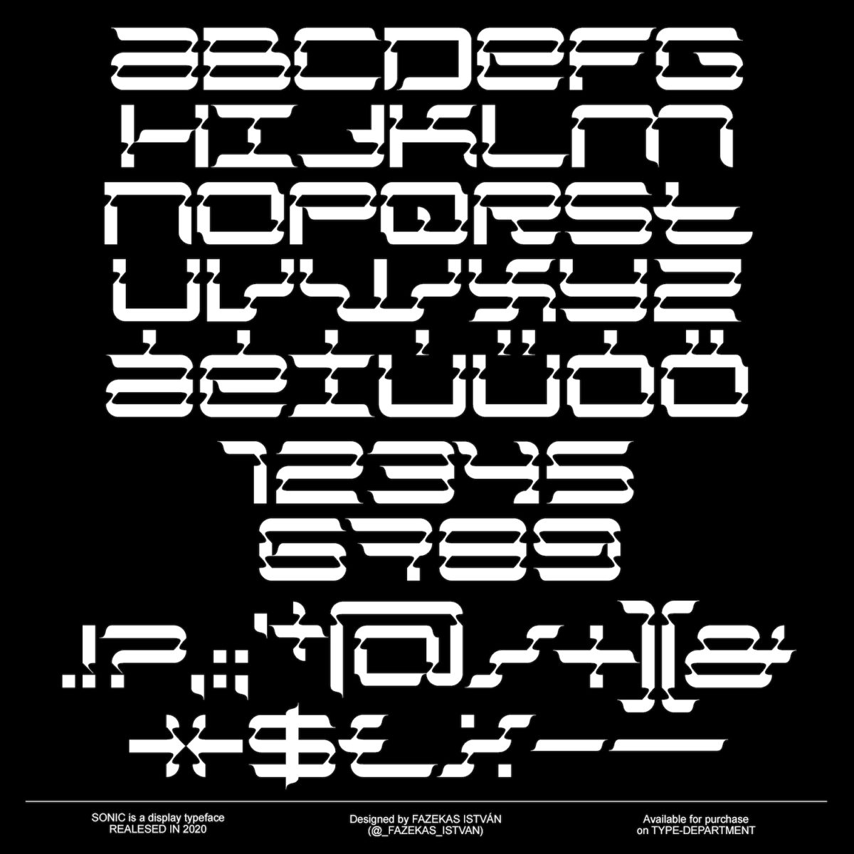
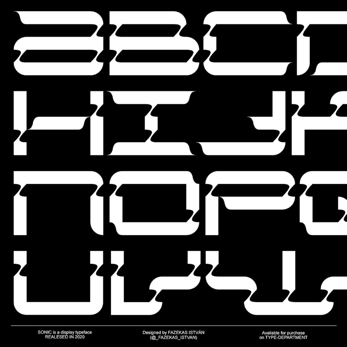
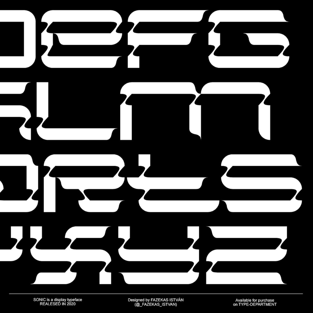
Sonic’s extended, ergonomic shapes give it the impression of accelerated motion and the curved detailing throughout the anatomy of the glyphs gives it a certain sensitivity and delicacy; amidst its prominent, impactful presence. Despite its expressive feel and uniquely graphic aesthetic, Sonic is both versatile and extremely legible. However, we’d definitely say it’s best suited to larger display purposes, so that the unique and unusual detailing isn’t lost or overwhelmed.
With consistently equal character heights and tightly arranged spacing, Sonic slots together visually like an intricately structured pattern. The thick, angular bodies of glyphs are punctuated by fluid, almost liquified detailing on the shallow ascenders, legs and descenders; whilst the counter-space – aligned with the consistent shape work in the typeface – takes up extended horizontal space and is contrasted with minimal height.
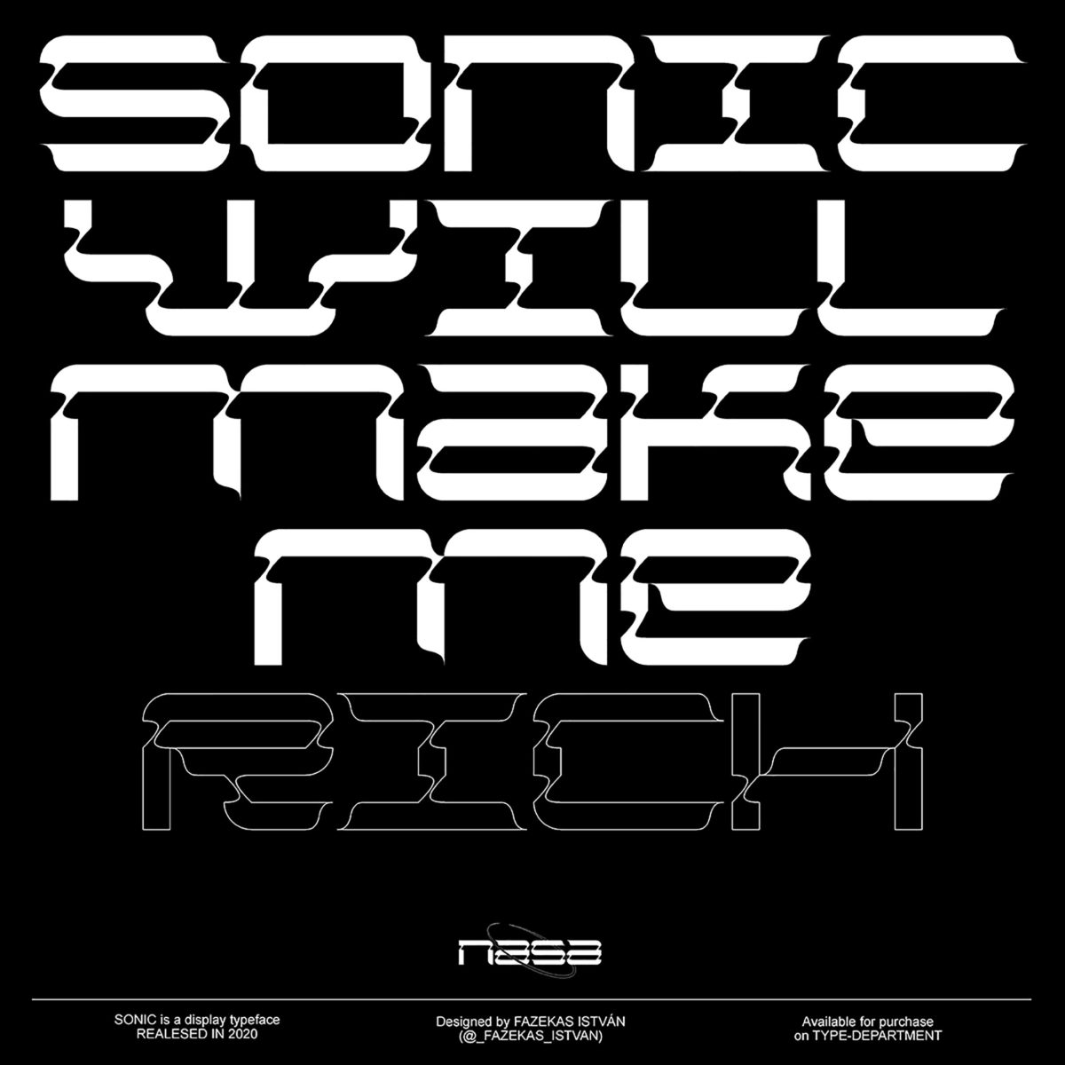
The mixture of fluid, almost calligraphic line-work and formulaic, pattern-like structure feels incandescent with the nostalgia of futuristic excitement. Although drawing aesthetic inspiration from early sci-fi films, and integrating visual nods to mechanical, handmade crafts, the overall effect of the typeface still feels intrinsic to contemporary technology.
Looking at the typeface as a finished body of work, this sensitive thread between past and future seems to tell a very human story. The blending of poignant nostalgia and exploration of where we are technologically -echoed with ideas of where we thought we might be – delves into our collective memories and creates a stunning reflection on cultural and technological shifts… both what they mean for us currently, and what they might mean looking forward to the future of design. Both optimistic and sceptical, so much good stuff is woven together in this gorgeous and imaginative display of type design – Sonic, we love you!


