
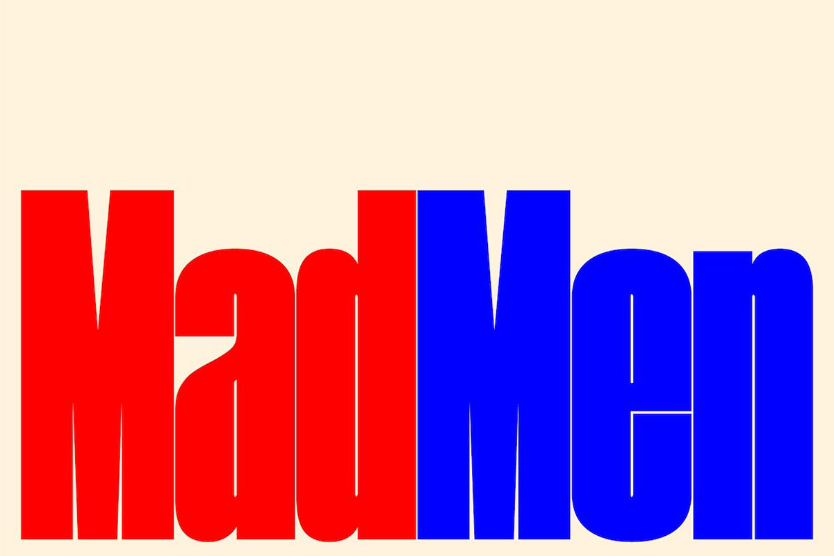
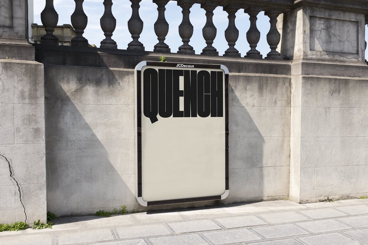
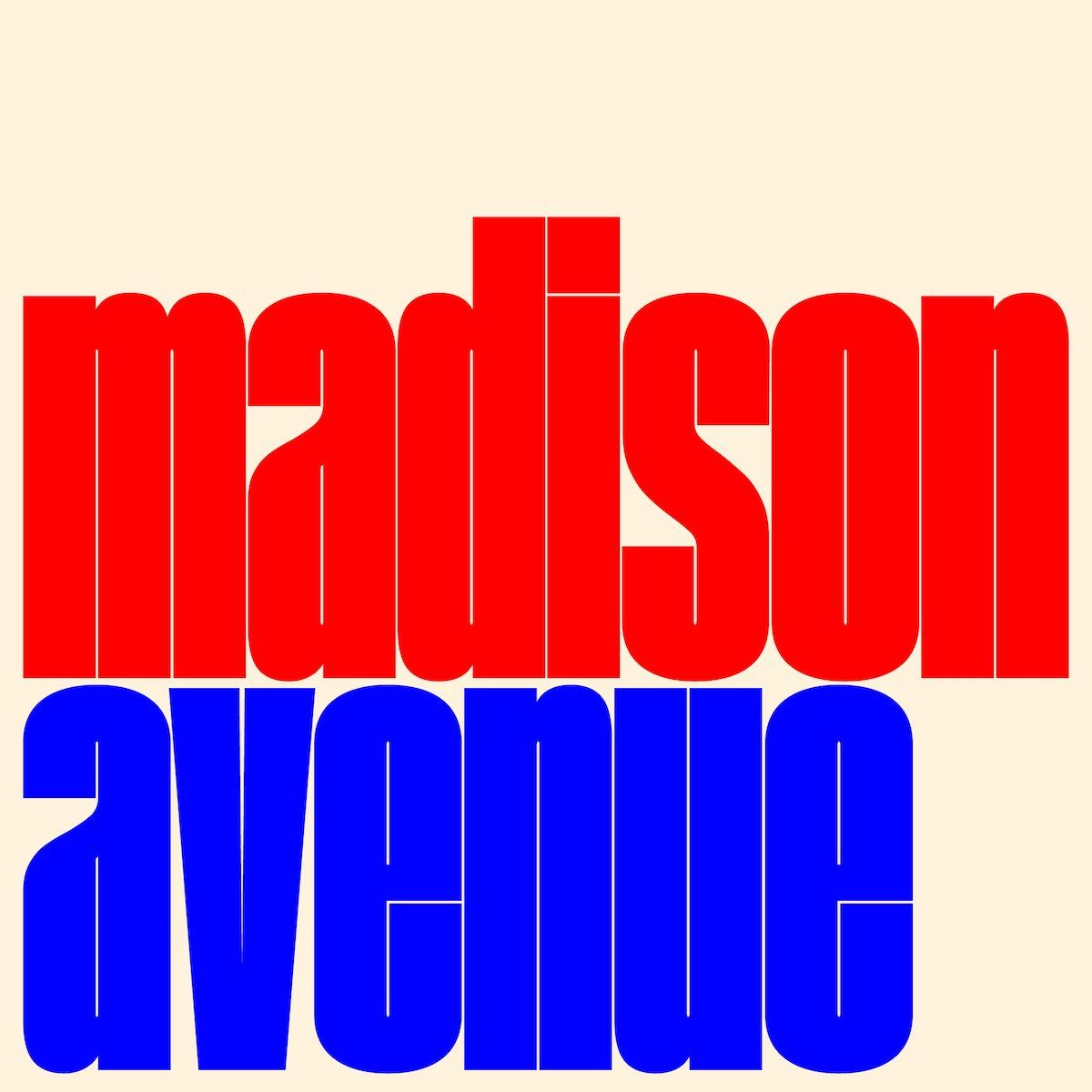
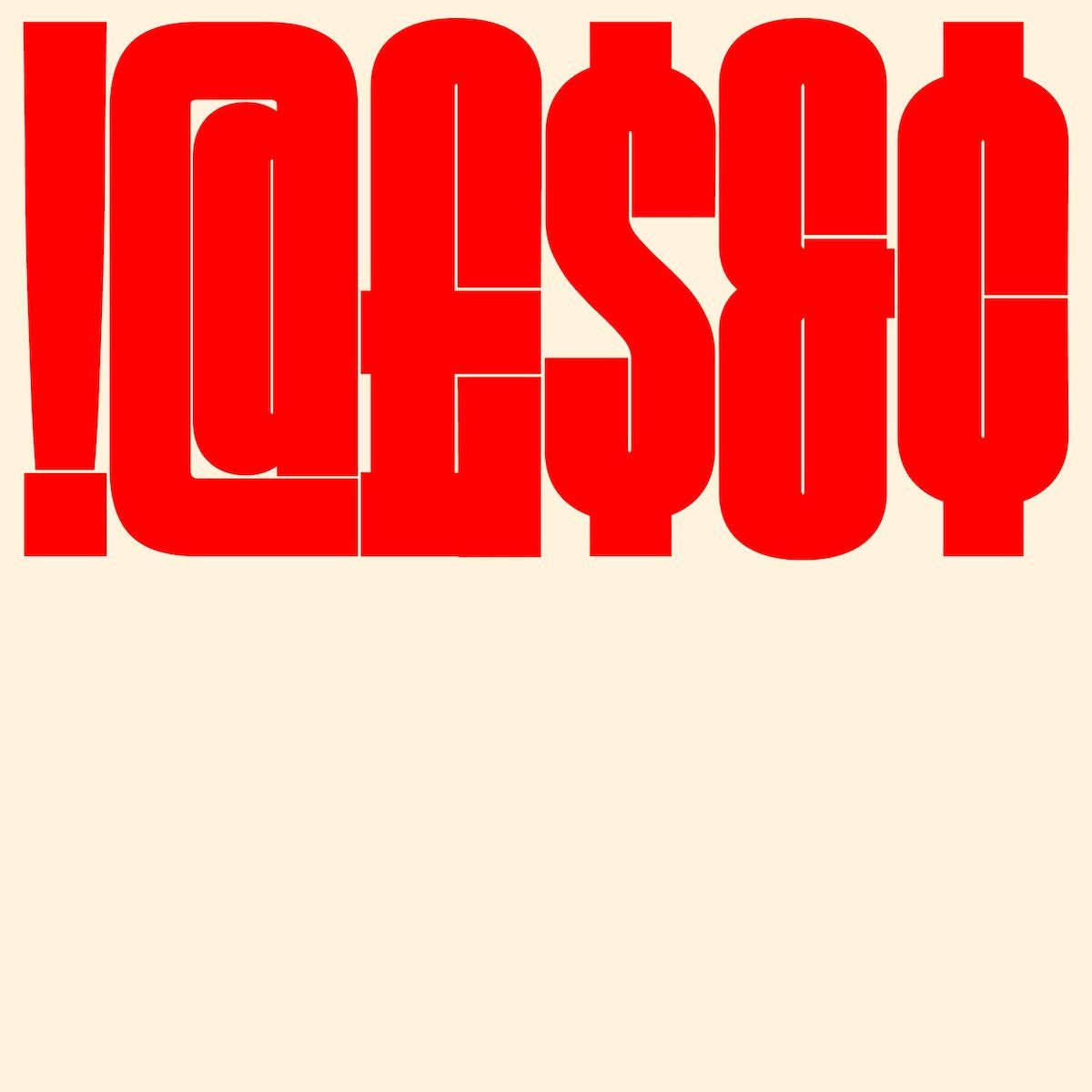
Quench Variable has got to be one of the most exciting new fonts right now. The super condensed font is the work of Manchester-based MyType Foundry and is one of the most impactful sans displays we’ve seen around.
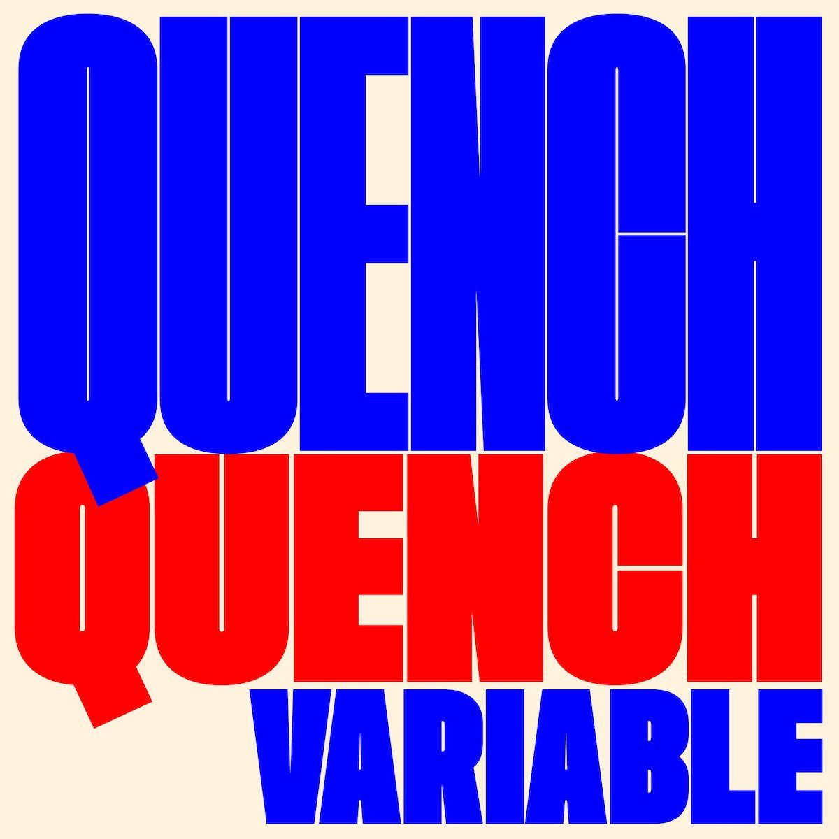
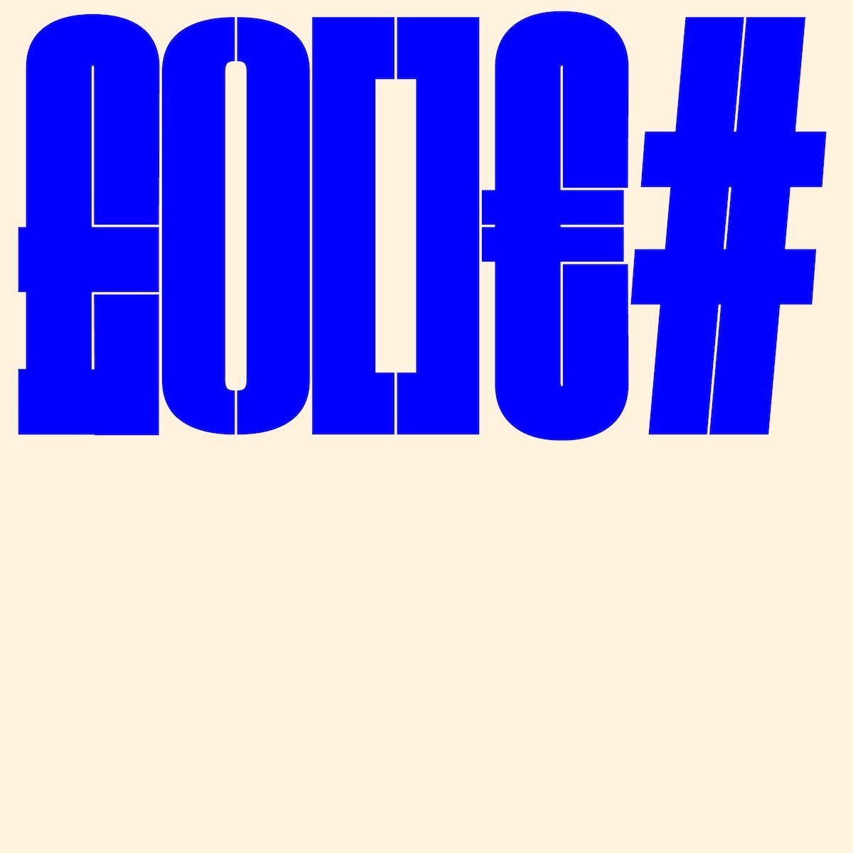
Quench’s tight kerning and near nonexistent counters mean its graphic impact is distinctly loud. The tightness of the glyphs complements the minimal-yet-strong shapes to create comfortable legibility, alongside a strong, daring typographic statement.
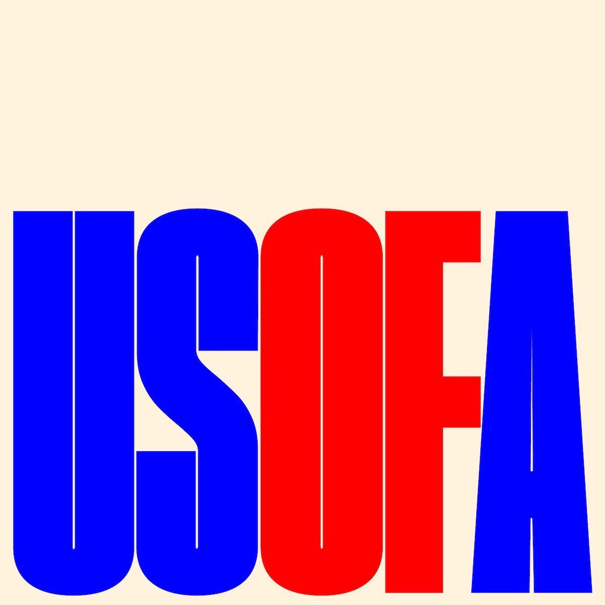
With Quench being a variable font, there’s also tons of opportunities to play around and find the right tone to suit your project. With the ability to flex between being incredibly condensed to slightly more spaced out, Quench allows users to inject movement and energy into bold headlines and mid-length texts.
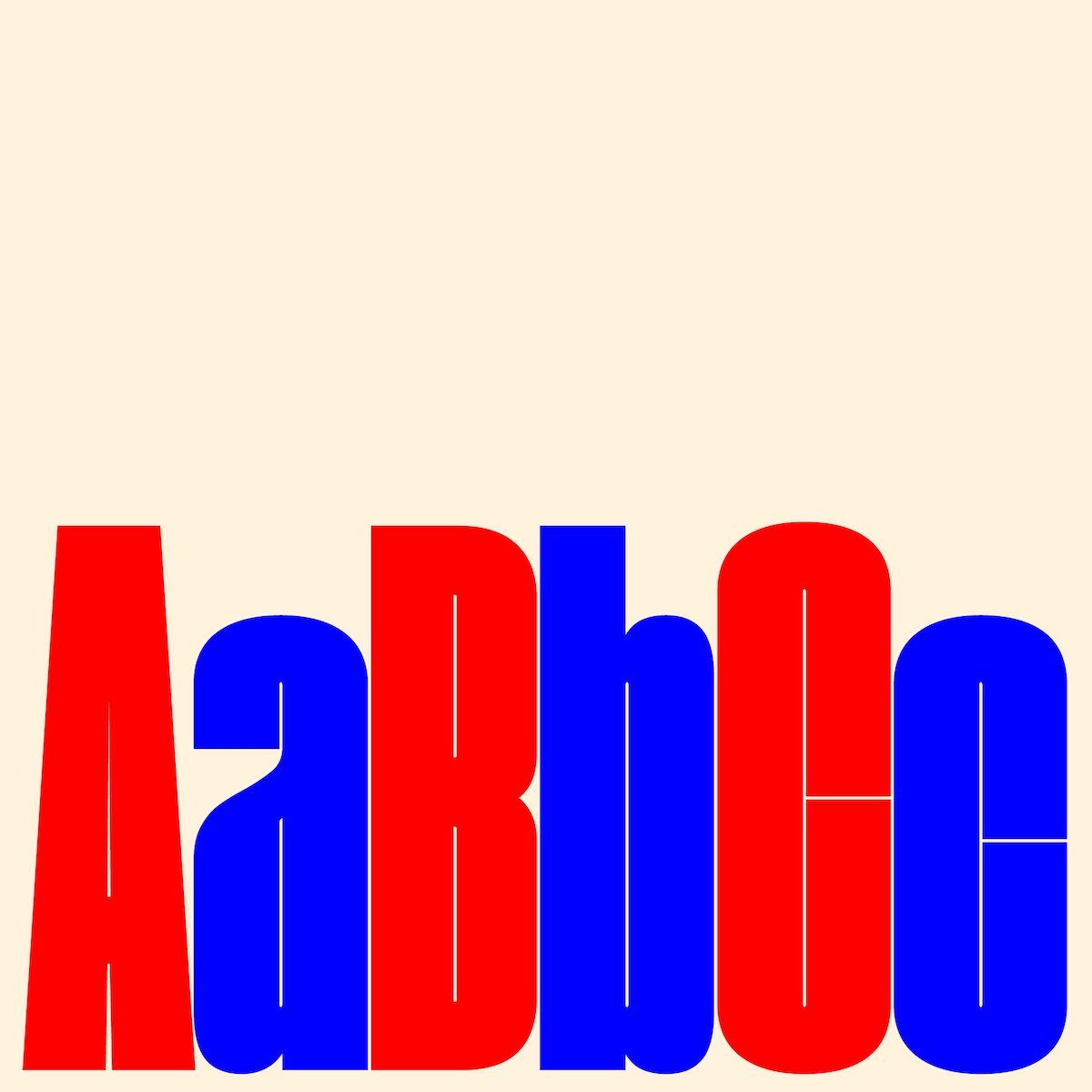
We think Quench would be most at home in bold editorial settings, as well as branding and logotypes. This is also just a great font for playing around and having fun with, while its variable features elevate its versatile nature. Check out Type Department for more.


