
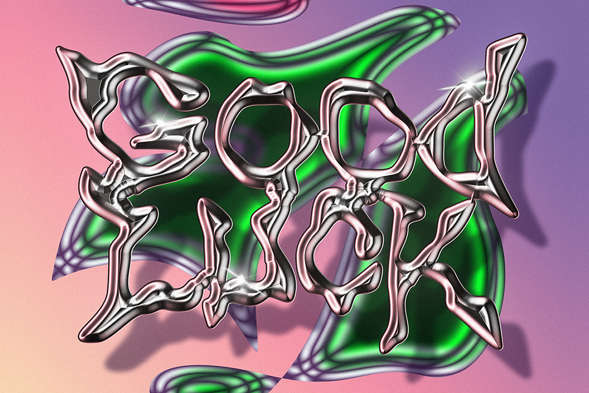
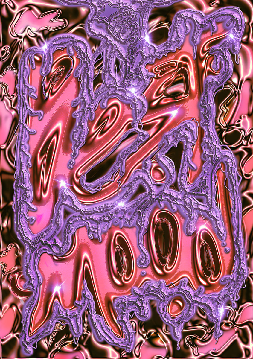
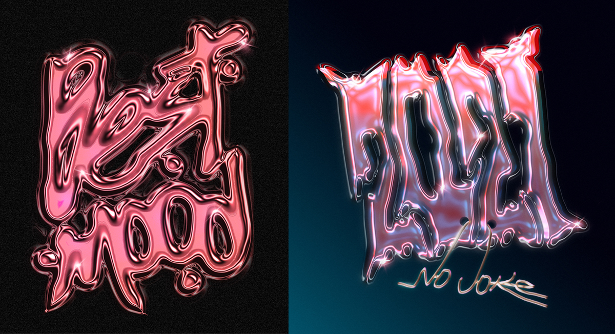
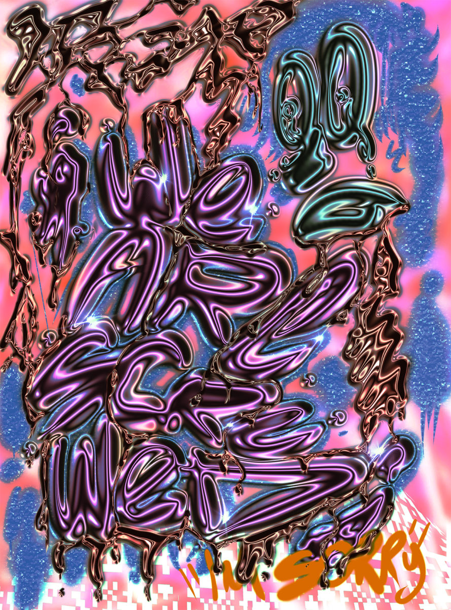
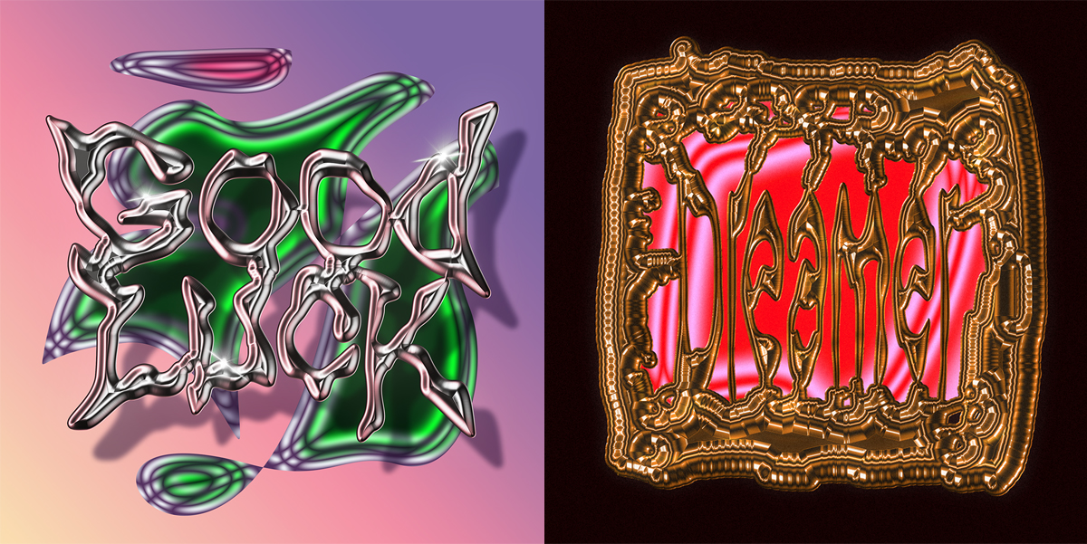
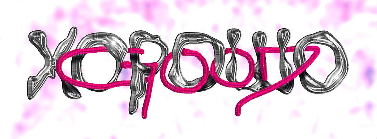
Delving into the work of Dominican Republic-based Graphic Designer and Art Director Wallen Diaz is like entering a dreamscape of nostalgic textures, experimental forms and abstract takes on type. In his recent experimental posters, he’s been merging these qualities with chrome effect typography to create the perfect balm for battling the boredom in quarantine… So naturally, we couldn’t resist taking a closer look.
Starting out in 2004 studying plastic arts, Wallen later changed direction to focus on graphic design and art direction, in a move he now describes as a ‘matter of survival’. Considering his design practice a way of expressing encounters with different shapes and forms, Wallen’s recent works have documented moods surrounding the pandemic, and have resulted in a stunning array of nostalgic typographic works.
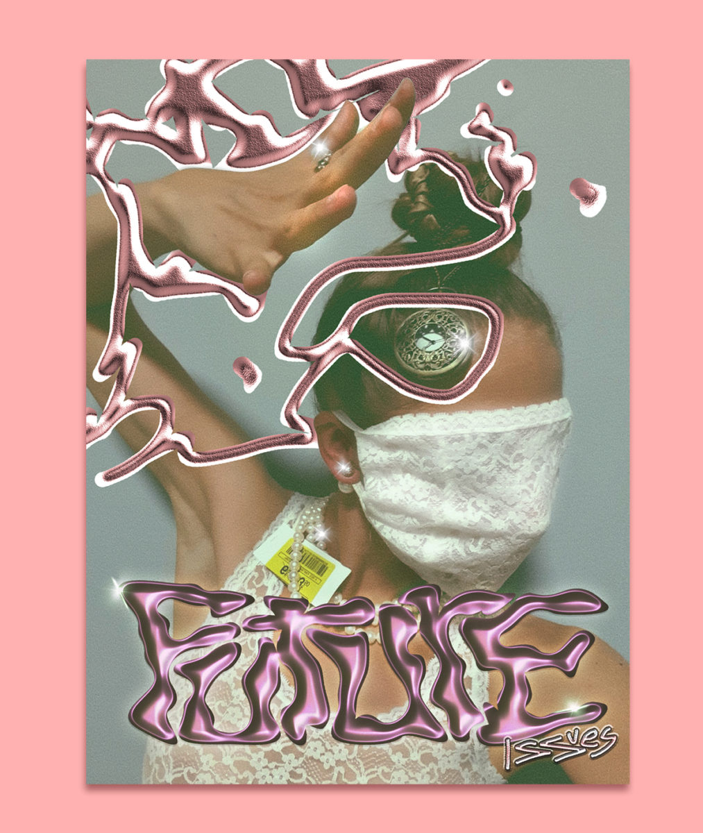
‘I think that my artistic persuasion eats up the graphic designer inside of me, since most of my works try not to follow certain rules of traditional graphic design’, Wallen tells us. Developing a unique visual language through different influences in his life – namely everything from his emotions, experiences, mental states and rebellion to rap music, art movements, fashion and technology – Wallen’s style pulls together nostalgic, other-worldly atmospheres alongside a unique, evocative approach to letterforms.
Between 2016-2018, the designer spent time developing a style he calls ‘NeoDigitalism’; from which he was given the chance to develop work for Adobe MAX 2020‘s CoCreate Campaign. Resulting in work inspired by technological circuits, geometry and vector glitches, it seems Wallen’s NeoDigitalism style has in many ways set the scene for his latest creative direction.
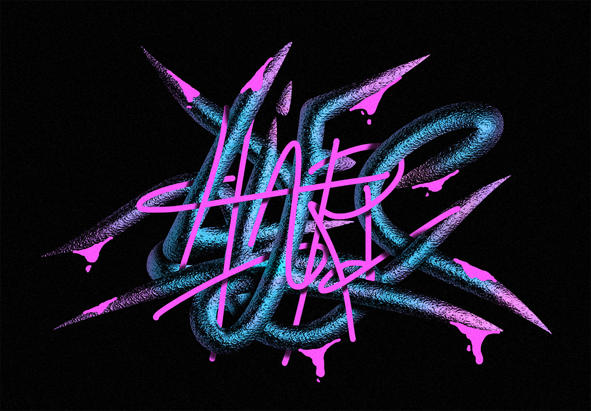
Wallen’s recent typographic posters, created throughout the pandemic, are a fascinating display of his knack for fusing textures with type. ‘The phrases used in those posters are basically phrases from conversations I had with friends related to the pandemic and quarantine’, he explains. ‘The posters were designed with a digital technique that I started experimenting with in Photoshop when the pandemic began. It’s basically a hack that allows me to use certain textures I created as if they were a brush (but which normally can’t be uploaded as a brush in Photoshop). It’s interesting because sometimes it looks like a 3D render…I started experimenting with abstract shapes until I was able to apply it to typography.’
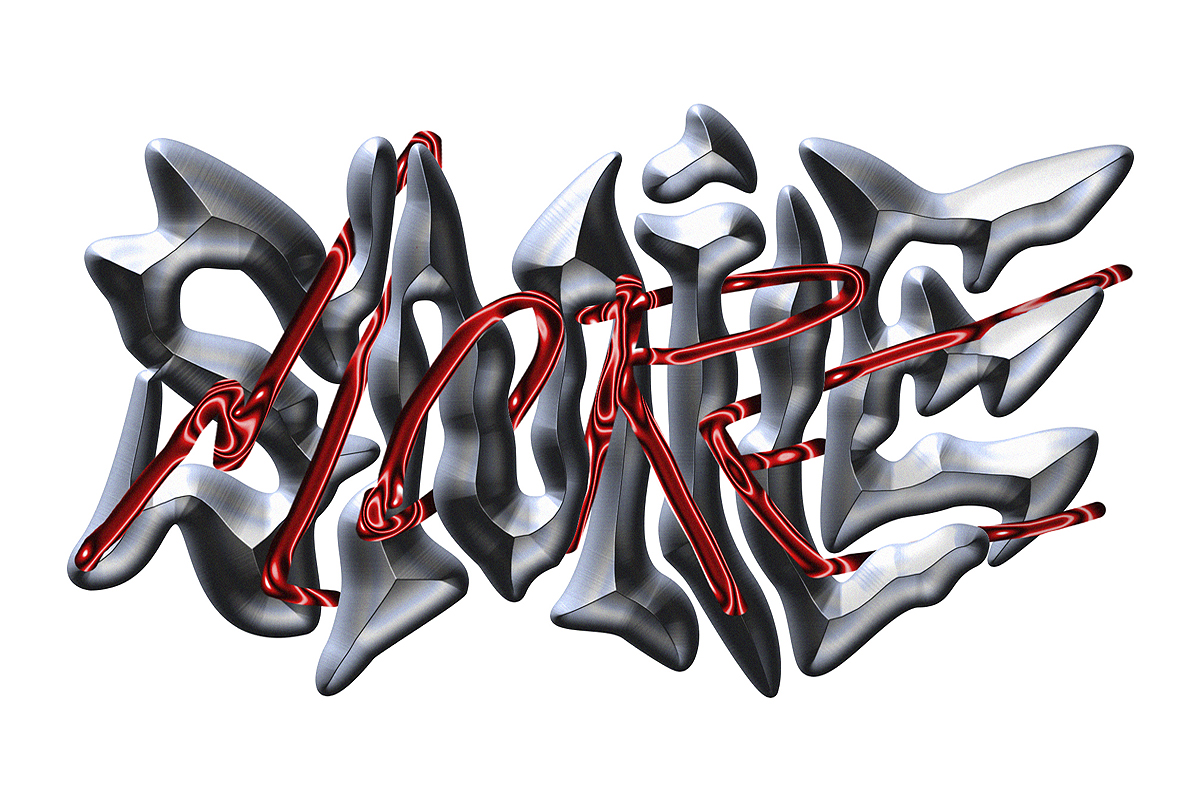
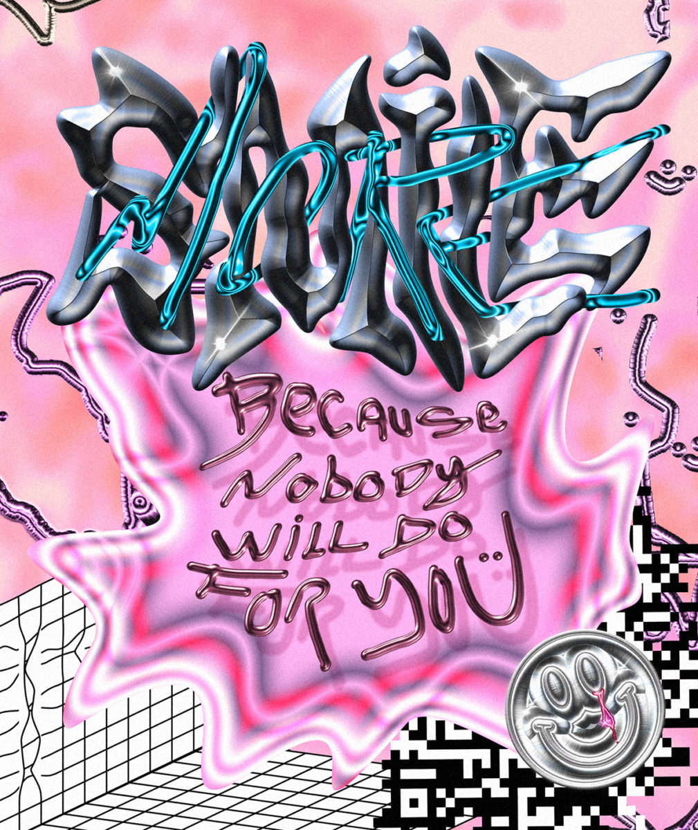
Wallen’s recent freedom to explore this style seems to be serving him well. ‘I worked for more than 10 years in various advertising agencies in my country, and often in these places designers can never develop their own visual language…because each brand has its own graphic language, everything becomes very mechanical and exhausting after a while’. Finding a sudden surplus of time at home in quarantine, Wallen began reminiscing over some much-loved ‘90s & ’00s nostalgia. Looking at No Limit Records CD covers, he tells us he was led to remembering the glossy, chrome-filled aesthetics of the year 2000, and began working these nostalgic textures into his visual documentation of conversations around the pandemic.
‘I believe that the artist who does not keep creating or investigating dies’ Wallen adds, leaving us with a fitting sentiment considering the explorative feel of his work. A massive thank you to Wallen for sharing more on his unique, experimental approach with us – we can’t wait to see what direction his work moves in next.


