
Can you introduce The Counter Press and tell us a bit about how it’s grown to where you are today + some background on your aims, ethos and aesthetics as an organisation?
The Counter Press (@thecounterpress) started as a bit of a creative escape, which began 10 or so years ago. David and I were both working at a small branding agency in London, creating and developing brands for some great clients. But we were finding that we’d work for 6 months to a year on an identity project, creating a lot of design work, but having very little physically to show for it at the end. We realised that we missed creating actual things… Then the credit crunch hit and we both got made redundant. On the same day.
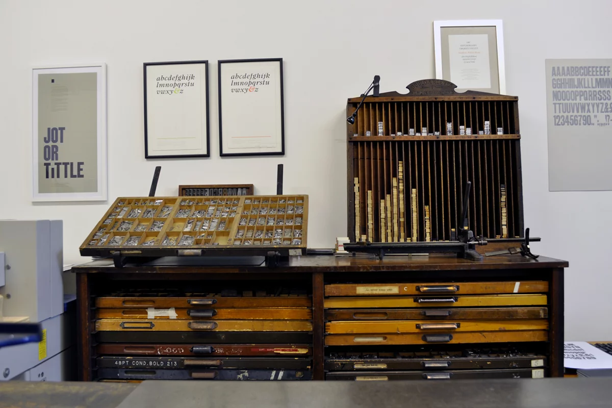
It turned out to be a bit of gift really, and forced us to rethink what we were doing. So we took some of our newly found spare time to explore letterpress and get back to making printed work. After a short course with Kelvyn Smith, we ended up buying a small (still 10-stone of cast iron!) Victorian platen printing press and some type to start us off, and from there, it grew a bit out of control… We now have 6 presses, racks and cases for all sorts, and a growing collection of wood and metal type – some of the type is brand new, freshly cast for us, and some are old, well-used and un-digitised fonts.
In the spirit of the private press tradition, we mostly print for our own pleasure. We work on computers for clients at Counter Studio all day, so in contrast all our letterpress work is done for ourselves in the traditional way — all hand set movable type, layouts meticulously crafted on the composing stone in the middle of the workshop and then inked and printed, again by hand. It’s slow and it’s messy, and we wouldn’t have it any other way.
The overarching ethos at the press is to create something new using old techniques and equipment — this creates a nice challenge for us: we don’t want to use this antique technology and type to create pastiches or replicas of the past… We’re more interested in mixing contemporary design aesthetics with classic typographic principles, using only traditional methods.
What draws you in about the letterpress? What processes/qualities of using the letterpress do you think are special or distinct?
As designers, I think we always been drawn to letterpress — it’s the foundation of the early history of graphic design, so if you love type and print it’s hard not to interested its origins.

For us, letterpress is an interesting combination of aesthetics and process. The type itself is full of so much character: it can be beautifully drawn and made, but more often than not it has signs of its past lives; it’s worn and aged, especially the wood type. No two characters in a font are exactly the same — they all have their own stories, nicks and bumps making them entirely individual. And this can never be replicated digitally.
Beyond the type itself, the process of making something by hand is hugely rewarding: the building of layouts with 3D objects, and the restrictions and challenges that brings; the trial and error that leads you to unexpected places; the physical act of printing, feeling the paper touch the inked type and reveal the final print… Everything is very tactile in letterpress, which makes a change from pixels on a screen.
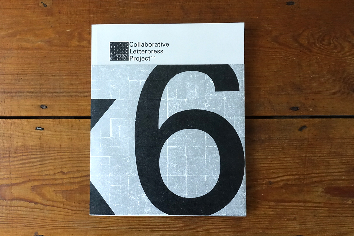
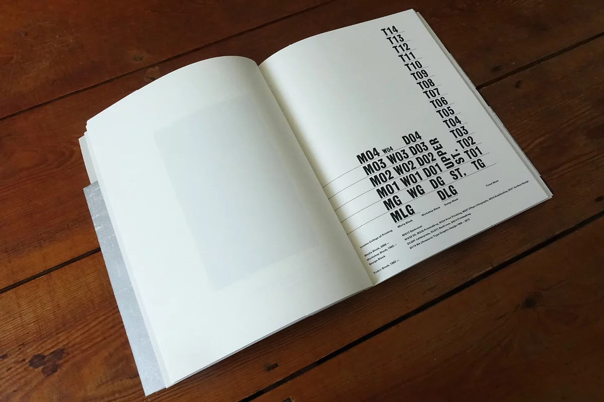
‘This was a great project initiated by Rose Gridneff, Alex Cooper and Andrew Haslam, which brought together six leading UK based Higher Education design schools (five of which had letterpress workshops at the time), to produce a collaborative letterpress research project. There’s a real variety to the work, fresh eyes and fresh minds. And the wrap around cover is a lovely touch’.
Of what value is the letterpress to you in relation to contemporary design practice? Or what do you think we can learn about contemporary design by returning to older practices?
From an educational perspective, letterpress teaches us so much about typography that is directly transferable to working in a contemporary design studio. As part of my degree at Edinburgh College of Art, I was lucky enough to have access to a letterpress workshop, and it taught me the basics of understanding and using type, and where a lot of the language comes from at we still use in design programs on our computers. Holding a 10pt piece of metal type in your hands gives you a real appreciation of how big (or small) type really is.
By Alan Bartram and James Sutton
‘From 1968, and produced by Lund-Humphries, this oversized book barely fits on our bookcase. It’s a history of type, which is interesting in itself, but the design and format make it more so. The large, atlas-sized pages hold equally large reproductions of other books and examples of type, which combine beautifully with the simple and restrained layout. It’s something you can only pour over’. – Image from Eye Magazine
Once we started The Counter Press we found a new appreciation of the beauty of good typographic practices, and it’s given us a much deeper understanding of how to use type well (and how and when to break the rules too).
Of course, letterpress is not all about the type. You have to use leading and furniture (spacing material) to build ‘white space’ around your type and to hold it solidly in place. This makes you think about the space on the page in a very different way — the time and effort it takes to create the areas around the type means that you need to really plan your layout to make it work in reality on press. The understanding of space and how it works with type when using letterpress has brought much more care and craft to the work we do digitally and commercially.
Designed by Astrid Stavro / Atlas
‘For issues 20—29, Elephant magazine was designed by Astrid Stavro and the team at Atlas, and it’s a wonderful collection. There is calm, elegant structure that runs through each issue, but the type and imagery are allowed to play and interact to create smart and witty layouts. You can keep dipping into them and always find something joyful. And envy inducing’.
Can you tell us about some of your favourite projects you’ve worked on at The Counter Press? Why did these stand out?
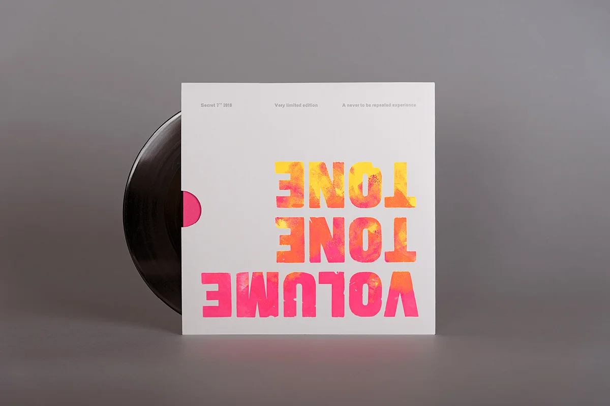
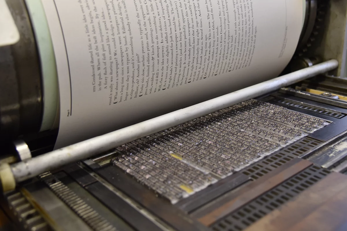
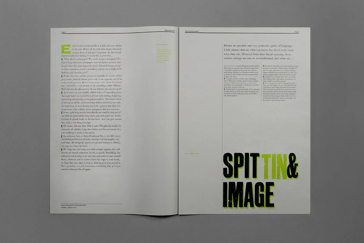
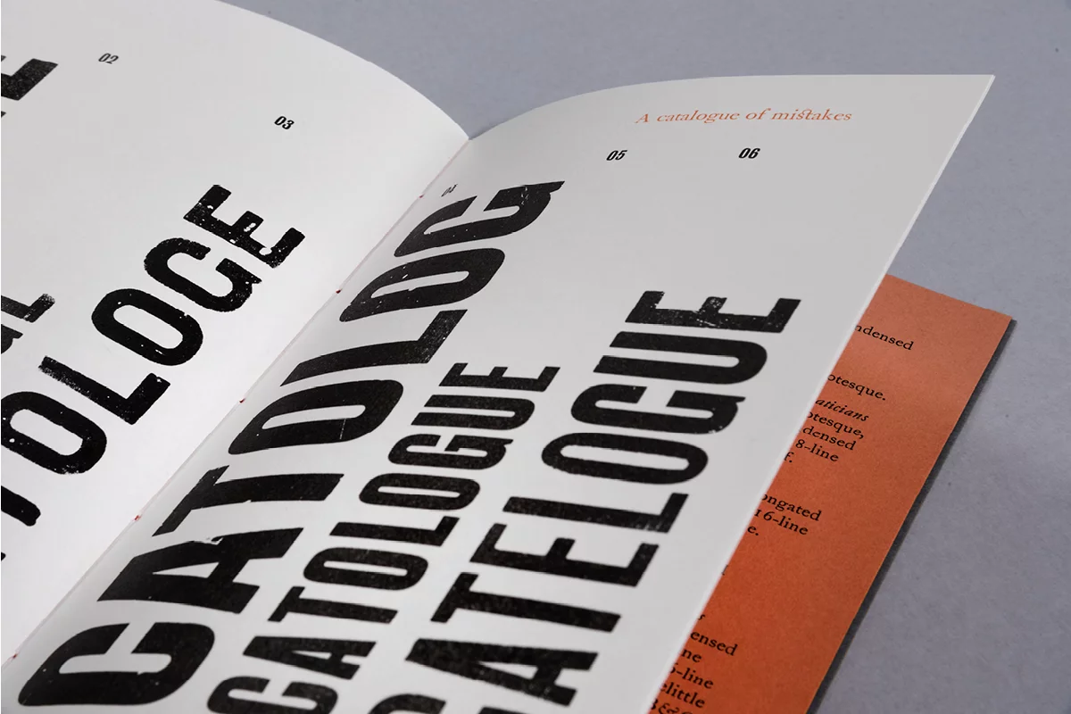
Our favourite, and ongoing project, is our letterpress newspaper — Extra Condensed. We wanted to create a letterpress publication that didn’t cost the earth (unlike a lot of letterpress printed private press works), so we challenged ourselves to write, design, hand-typeset and print a two colour, 8-page newspaper in an edition of 150… This seemed like a good idea at the time, but 8 months and hundreds and hundreds of impressions later, it occurred to us it was a bigger undertaking than we anticipated… Anyway, we still made a second and we are even more slowly working on the third.
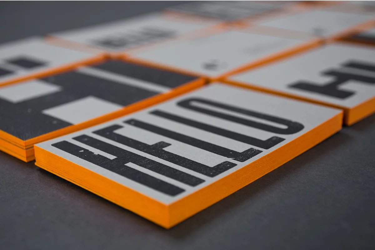
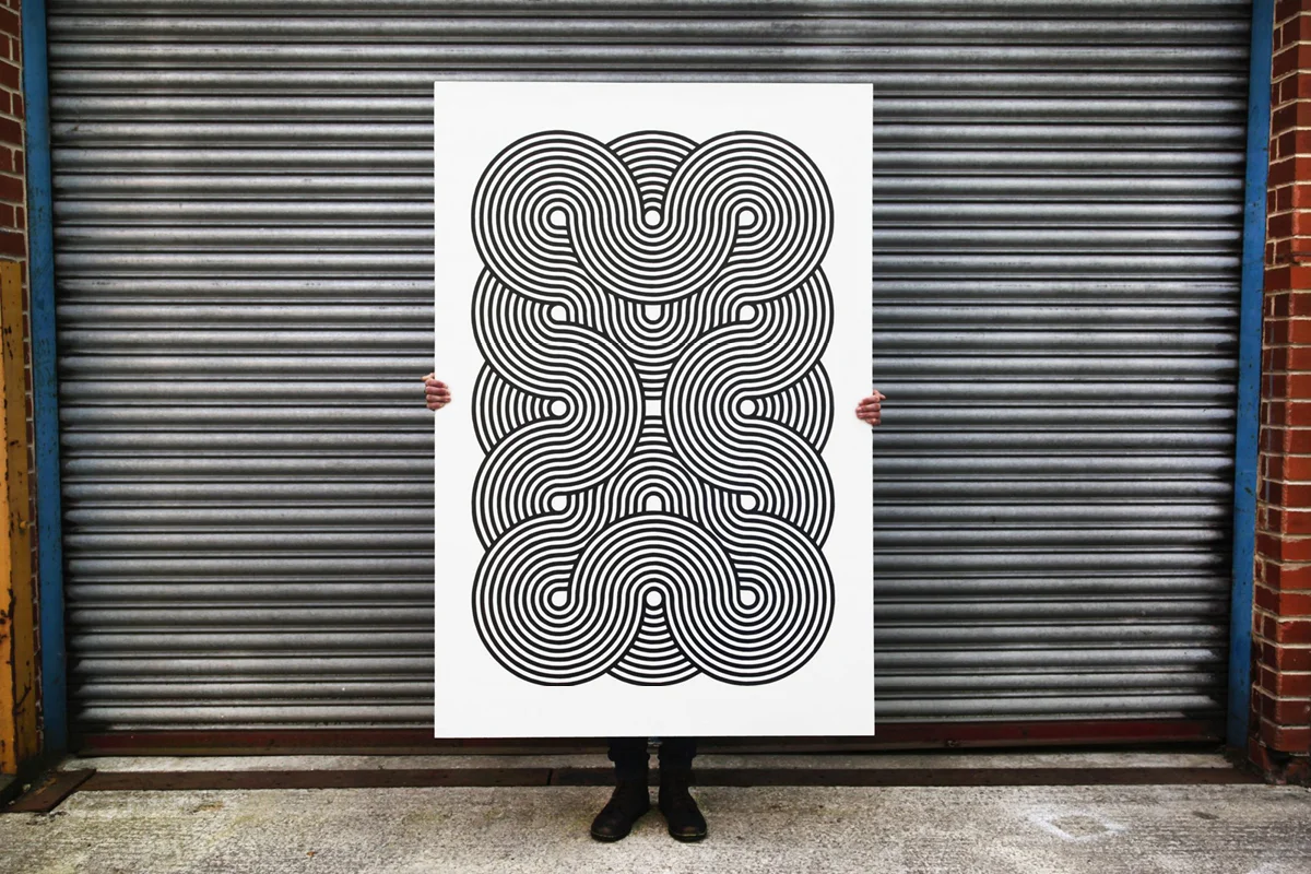
We also enjoy creating broadsides and posters—these start off as an idea for quick thing to print in and around any longer publishing projects we have on. Inevitably they turn out taking longer than expected.
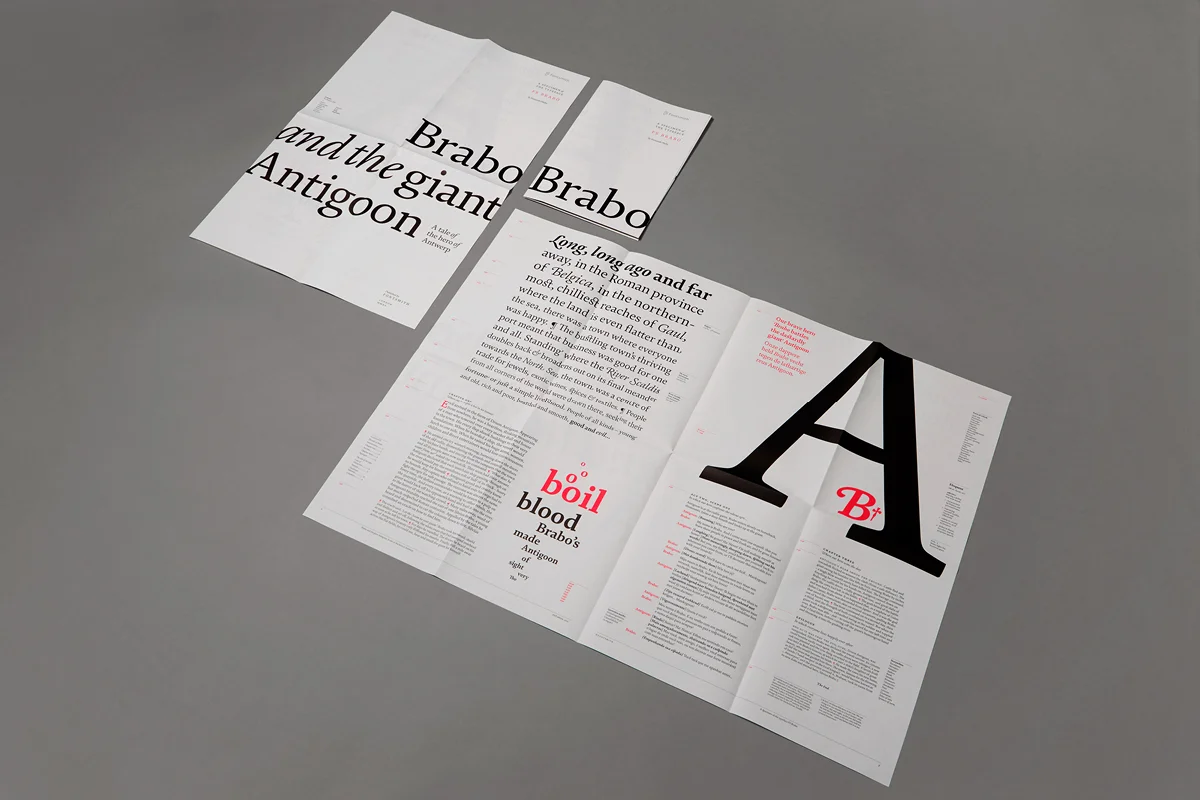
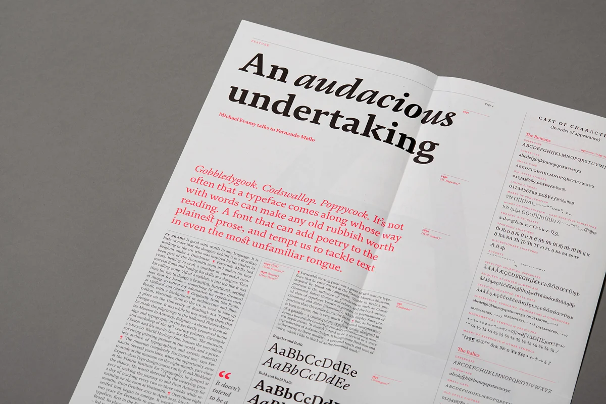
‘This was the project that really kick started Counter Studio as a full time studio. Jason Smith at Fontsmith saw our letterpress newspaper Extra Condensed No.1 and asked if we could create something similar (not using letterpress) for the launch of their typeface FS Brabo. Taking its cue from the font’s letterpress leanings, the large newspaper format incorporates a number of different typographic formats, including book title page, chapter openings, a play manuscript, and an editorial piece (all written by wordsmith Michael Evamy): the perfect way to show a typeface intended primarily for books, magazines and newspapers’.
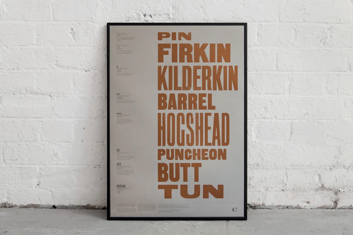
A favourite ‘quick print’ of ours combines language, print and beer… It turns out that not only do old brewery casks have wonderful names, but the amount of pints they hold relates rather nicely to traditional type sizes: 36, 72, 144… And so we created an A2 print using wood type for the cask names, and added a key on the left hand side which proportionally represents pints as typographic points for each cask. For example; a 6pt square ‘em’ (6pts x 6pts = 36pts) represents a Pin cask (36 pints), whereas three 24pt ems show the not insubstantial 1728 p(o)ints found in a Tun.
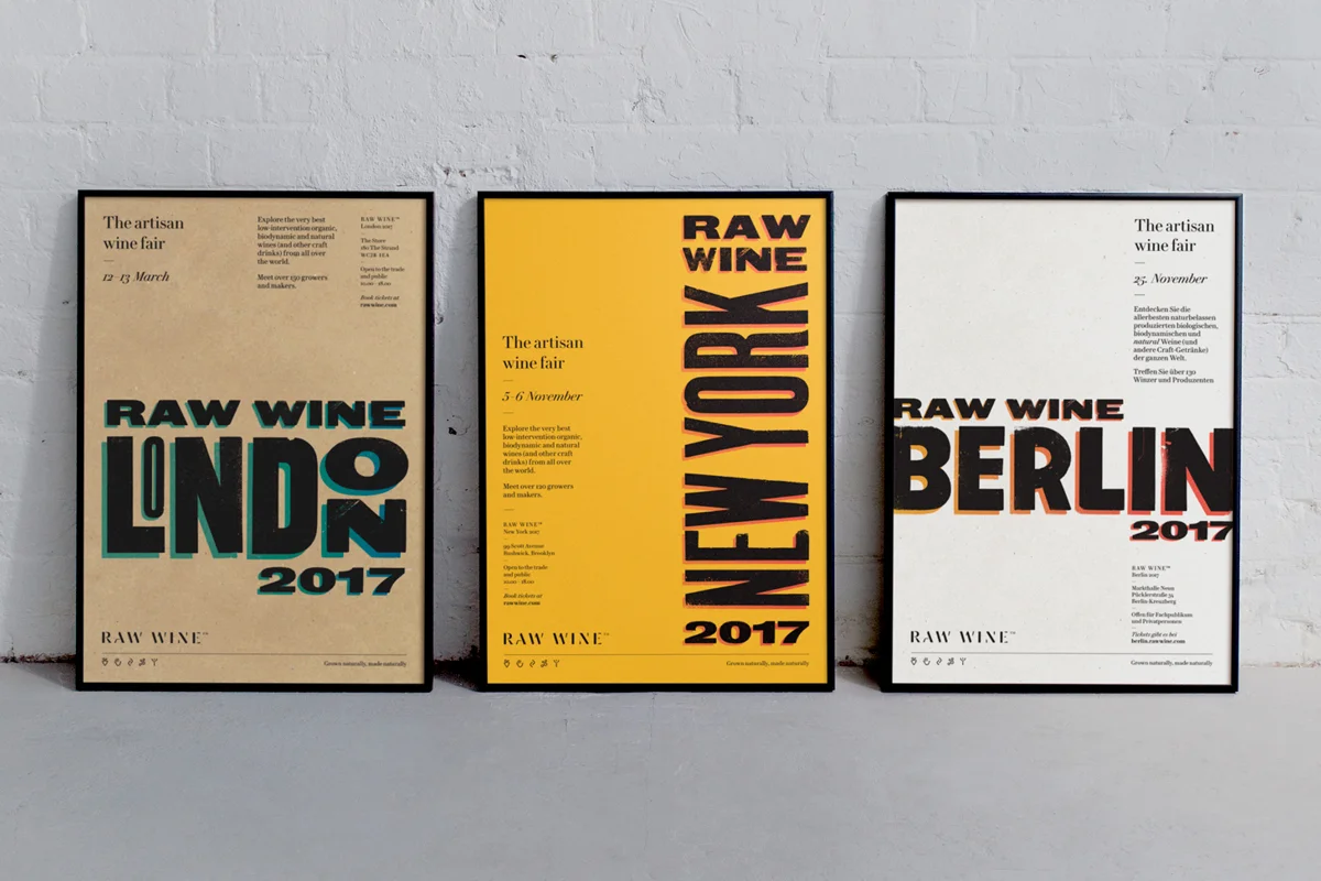
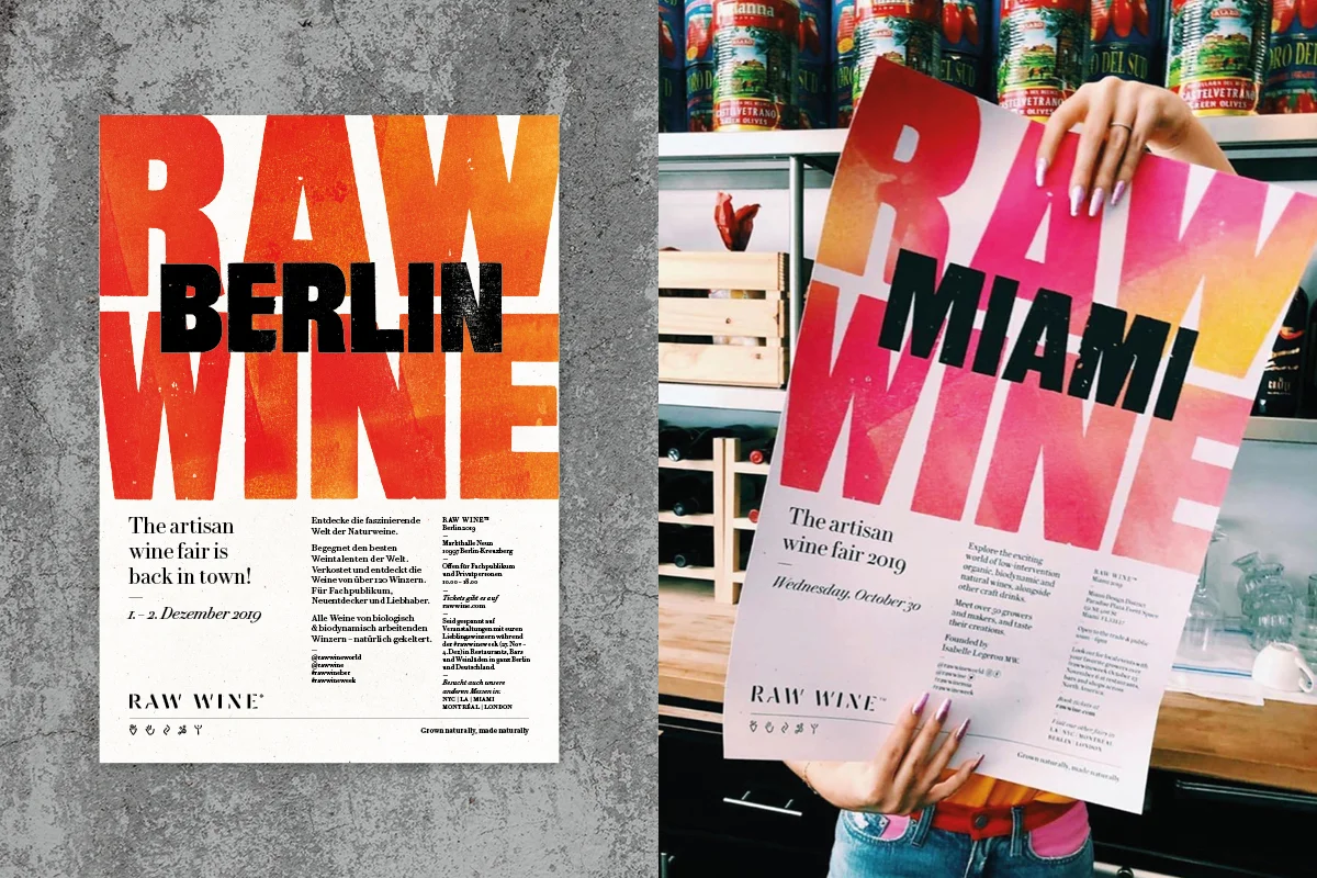
Beyond private press projects, we do sometimes have the opportunity to combine letterpress with the brand work we do at Counter Studio. For instance, we have a long-standing relationship with Raw Wine: we created their original brand and continue to work with them on creating a letterpress-led identities for their wine fairs around the world each year. The individual characteristics of wood type pair perfectly with the idiosyncrasies of biodynamic and natural wines.
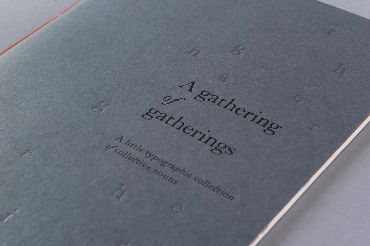
‘This was one of our first books so we have a real soft spot for this piece, although it was more of a booklet if truth be told. Designed, printed and bound by hand in a limited edition of 30, it was a playful typographic exploration of peculiar English collective nouns. From the subtle debossed cover to the simple two colour design and minimal layouts, it was a real exercise in economy of design’.
How does using mechanical processes such as the letterpress change or define the way you might approach a creative brief?
A big thing designing with letterpress has taught us is how important giving yourself time is. No matter how good you are at typesetting and printing, letterpress is a slow process (which is one of the main reasons for its commercial demise in the 60s and 70s…).
‘Letterpress has a nice little community and everybody sort of knows everyone else, by way of this obscure and largely obsolete process we’ve all fallen in love with. We met Nick of The Print Project probably 10 years ago, and his work is so distinctive and fresh – unlike our very luddite typographic approach, he uses laser-cutting and modern technology to create these wonderful graphic abstract designs, all printed on old presses’.
When we first started the press, we would spend a weekend setting type and then not be able to get back to the workshop for another week. And so we would live with our proofs, spotting mistakes, experimenting and rearranging designs until the next time we could get back to the press. Then we’d tweak and rework designs where needed before we went to print. This could take weeks, but it gave us a chance to really make sure what we were doing was right.

Created by Eye Magazine for Fedrigoni
‘I don’t know how often Pulp comes out, but it’s always a joy when it arrives. Although small in format, Pulp still manages to effortlessly fit in articles written in English and Italian comfortably into it thanks to some careful editing and design by the Eye team. It’s a great reference for how print works on different paper stocks too. Plus it comes in a great envelope’.
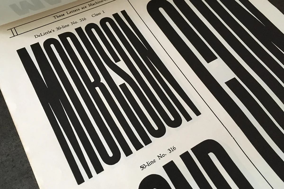
‘This example is from our DeLittle’s Wood Type Specimens, it’s undated but we think probably from the late 19th Century.
One thing having the press has done is make us look backwards, a lot. Trying to track down what type you’ve ended up with, or what might still be available, inevitably sends you searching for old type specimens – these tended to be really utilitarian pieces, made in a time before ‘graphic design’ existed and aimed squarely at printers, they were functional catalogues of typefaces. But they also have this wonderful mix of great old type, incredibly vivid colours (thanks to the highly toxic inks used at the time!) and beautifully rational and very unselfconscious design’.
We have now taken this approach into our work with clients at Counter Studio—we build in time to each project to give ourselves space to develop ideas and designs, we actively put breaks into the time we spend on each project. By approaching creative briefs in a slower fashion, it means we don’t miss things and thoughts percolate more: we might not be working on the project all the time, but our minds are working through things in the background. It’s amazing what coming back to something after a few days away from it will do.


Edited by Sandro Berra, Leonardo Facchin – Designed by Simon Esterson
Tipoteca in Italy is a treasure trove of letterpress and it’s somewhere we have on our must visit list. Until then we have this book. It’s 320 pages of pure print delight: beautifully bound and housed in a slip case, the book has nine different paper stocks, at least three letterpress printed sections—using wood and metal types—not to mention the silver arrows on the black endpapers… And of course there are pictures a plenty. It’s a masterclass in print.
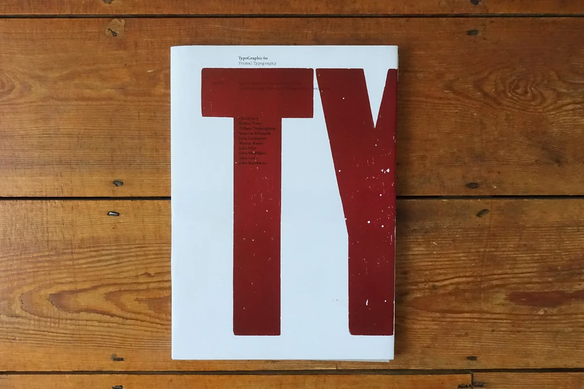
Published by the ISTD – Designed by A2-Graphics/SW/HK
‘I think this was one of the first times we’d seen very traditional letterpress used in such a contemporary and functional way—it wasn’t a decorative poster or an exclusive fine press book, it was a modern journal for a modern audience, made to be held and read. It’s an approach that underpins what we try to do with The Counter Press’.
Thank you so much to The Counter Press for chatting with us today and sharing so much inspirational work! We hope you find Counter’s approach to design as refreshing and exciting as we do. To see more from The Counter Press and their incredible mission in print, check out their website and Instagram.


