
We caught up with Martin Lorenz, director of TwoPoints.Net Hamburg (@twopointsnet), about their brand new, super exciting project with Nike Europe. As well as three different bespoke fonts, moving image displays and some amazing 3D specimens, TwoPoints.Net designed proposals for the retail design and campaign for the new Nike shop at Chelsea FC Stadium. Founded in 2007, TwoPoints.Net is an independent design studio with locations in Hamburg, Berlin and Barcelona. With a heavy focus on exciting solutions carefully tailored to each, individual client, their Nike project is no exception.
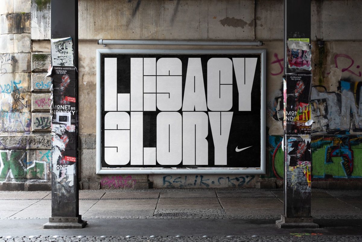
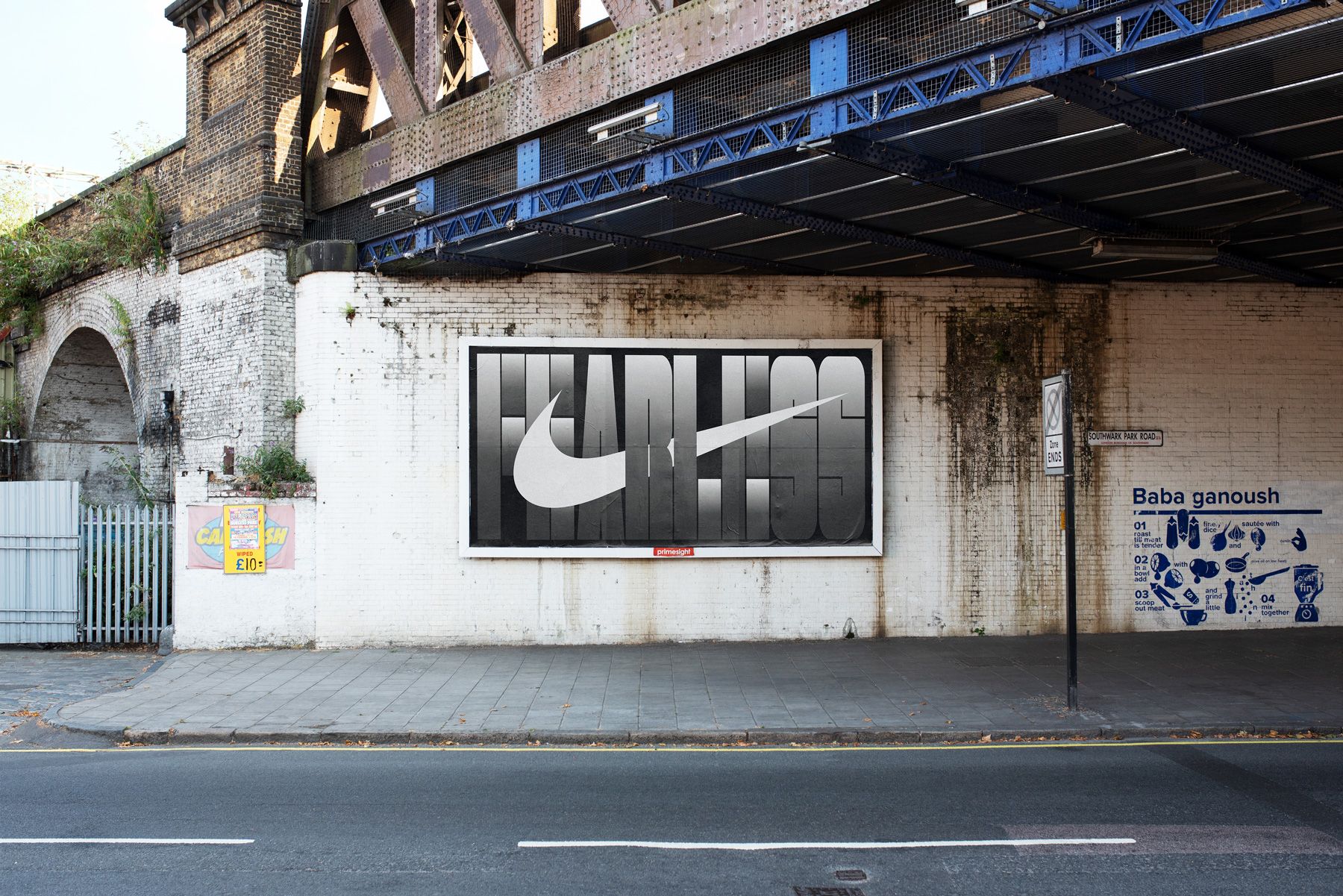
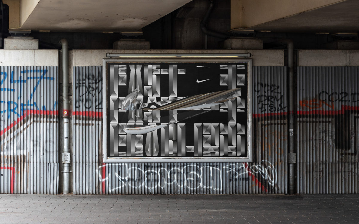
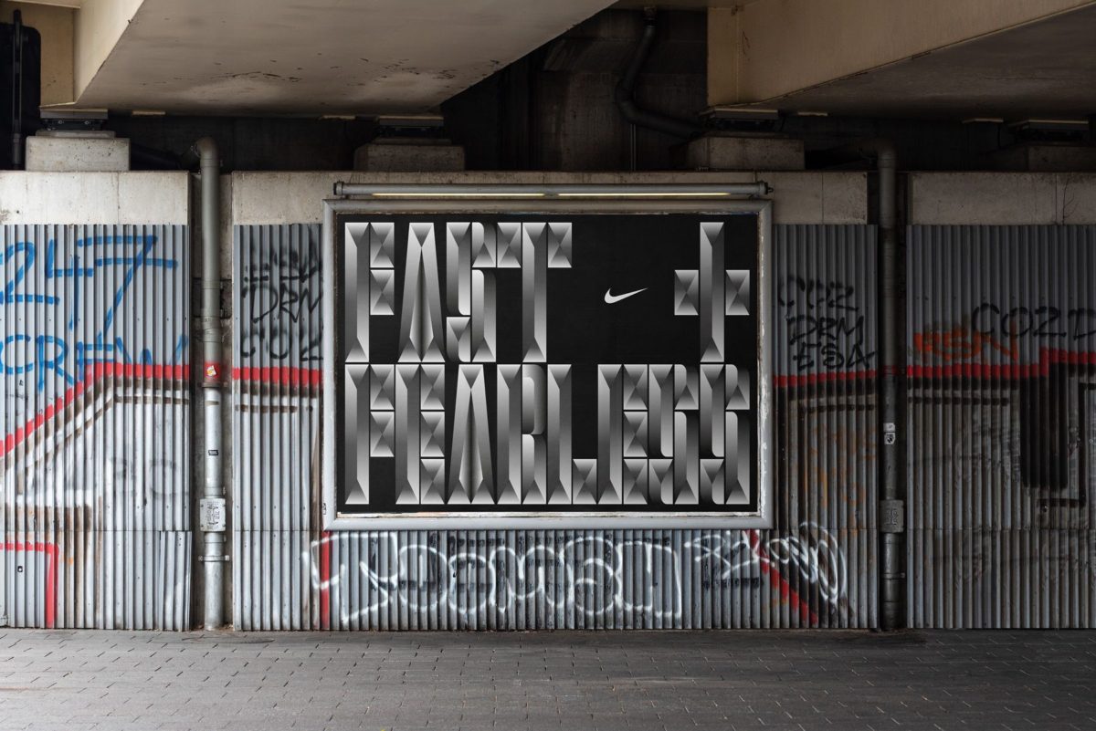
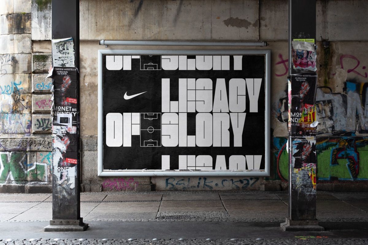
Taking on a client with such a recognisable visual identity is a challenging task. Taking it on and returning with something this inventive is an impressive feat; you need to be able to adhere to their global well-known visual language, whilst also bringing something truly new and exciting. The Nike Swoosh is probably one of the most universally recognisable logos out there, and their minimal, bold and super heavy visual language/typographic presence is injected with movement and intense energy. Their visual identity is defined by taking up maximum space and is laden with fluid, slanting shapes; which act to carry and expand the weight of that intense energy and movement. So, let’s take a look at TwoPoints’ take.
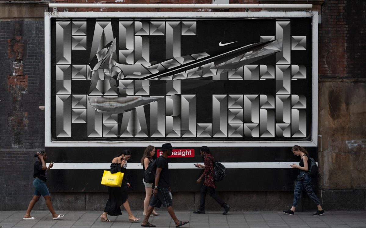
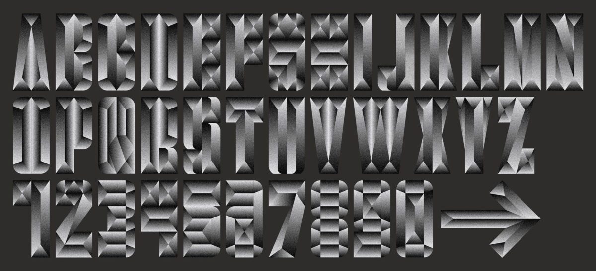
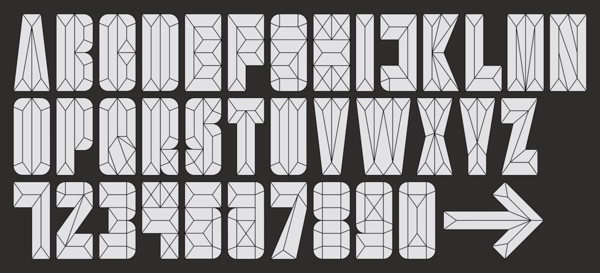
The three bespoke fonts take on a geometric, heavy sans display form with connective line work sculpting the shape work and detail in almost crystalline fashion. The three varying display fonts interact with each other like an anatomic, bodily breakdown of lettering with tight, stretching tension; one exuding muscular, rippling form with a strong, metallic-grey gradient, another stripped back to tugging, minimal line details which elucidate to multiple, variant ways and dimensions of interpretation and, lastly, a softer edged, flatly filled mosaic form with a mechanical feel which again, formulates different modes of interpreting the letterforms – a kind of smooth, building block approach – yet all with solid coherence and variable applications.
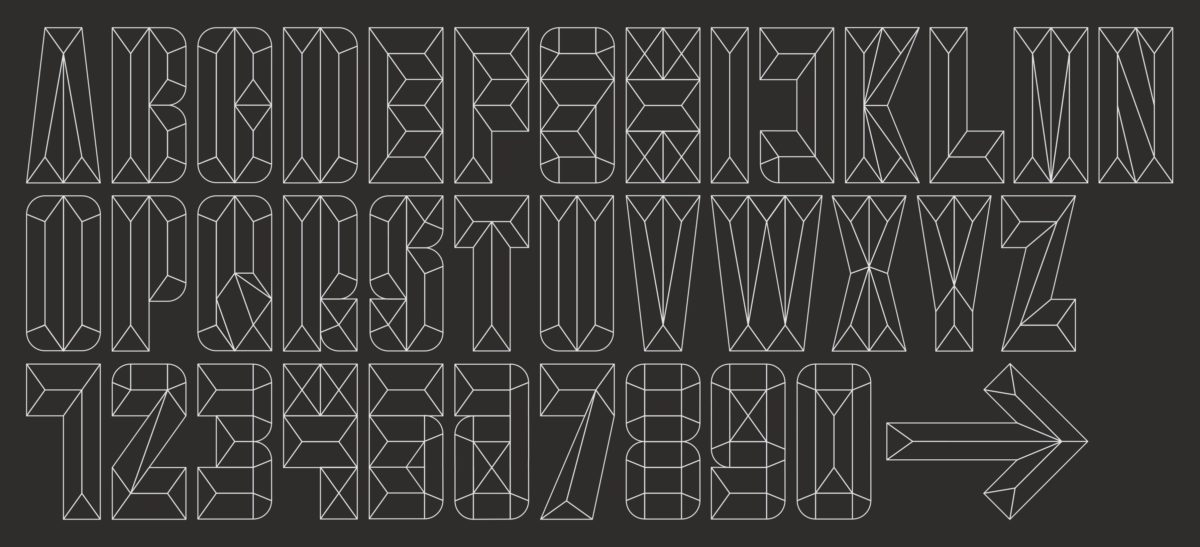
The commitment to slight, yet starkly visible variation and diverging possibilities within and between the three fonts – which appear to have been built on similar or the same grids, but with entirely different accentuations – feels congruent with Nike’s appeal towards inspiring inclusivity in sport and activity, their encouragement of fitness practice taking on diverse forms with wide-spread, diverse participation and the idea of making your movement yours. TwoPoints have extended their fonts into varying 3D and moving image displays for the application to billboards and campaign materials.
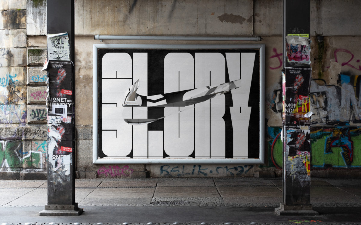
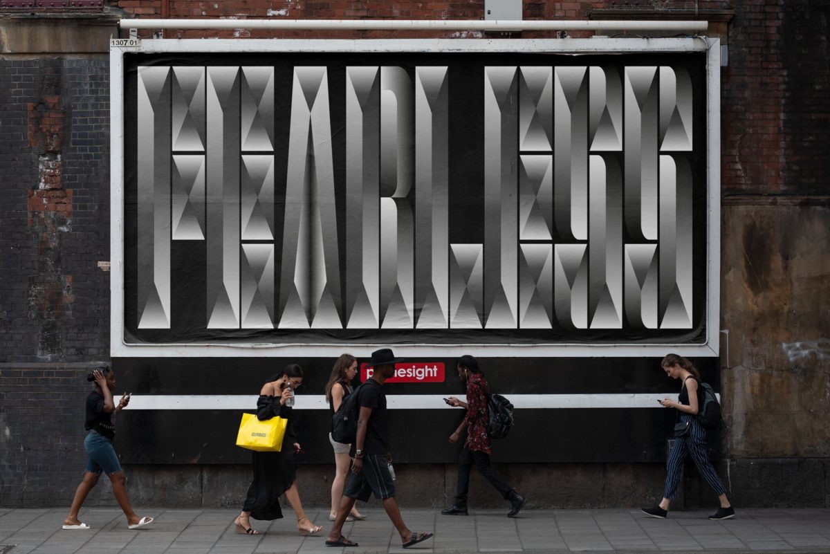
The animation pieces and 3D specimens are rippling and aquatic, creating a stark contrast with the geometric, cubic lettering and flooding the visuals with viscous, washing liquid energy and a glossy finish. The visual contrast brings forward the tight mechanics of the body and the peace of mind which comes with the release induced by sport and exercise in stunning unison.
There is a real wholeness and feeling of deep understanding and sensitivity in TwoPoints’ body of work here. Through their fonts and overall graphic design they have managed to embody both Nike’s visuality as a brand, and the real nitty-gritty the materiality of our bodies in sport, movement and exercise. They have distilled both Nike’s visual identity and our senses movement and energy as they grounded in our bodies into a genius body of design; and in a way which really connects – both intellectually and viscerally. We applaud them.


