
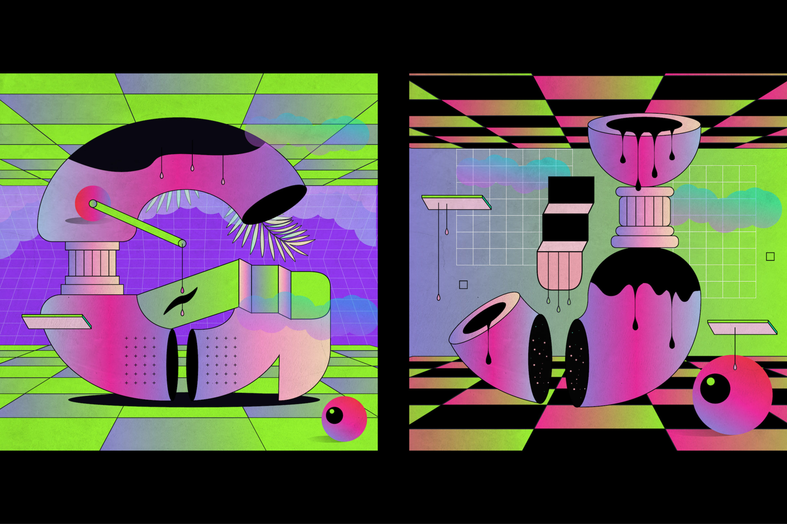
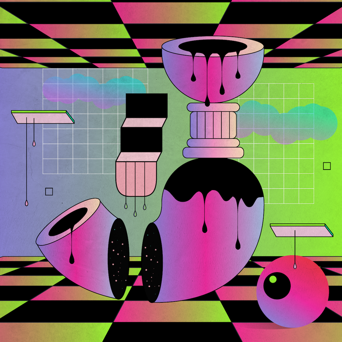
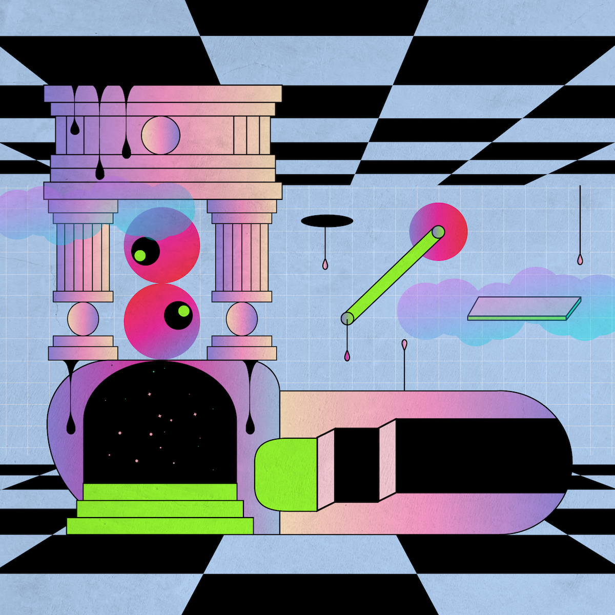
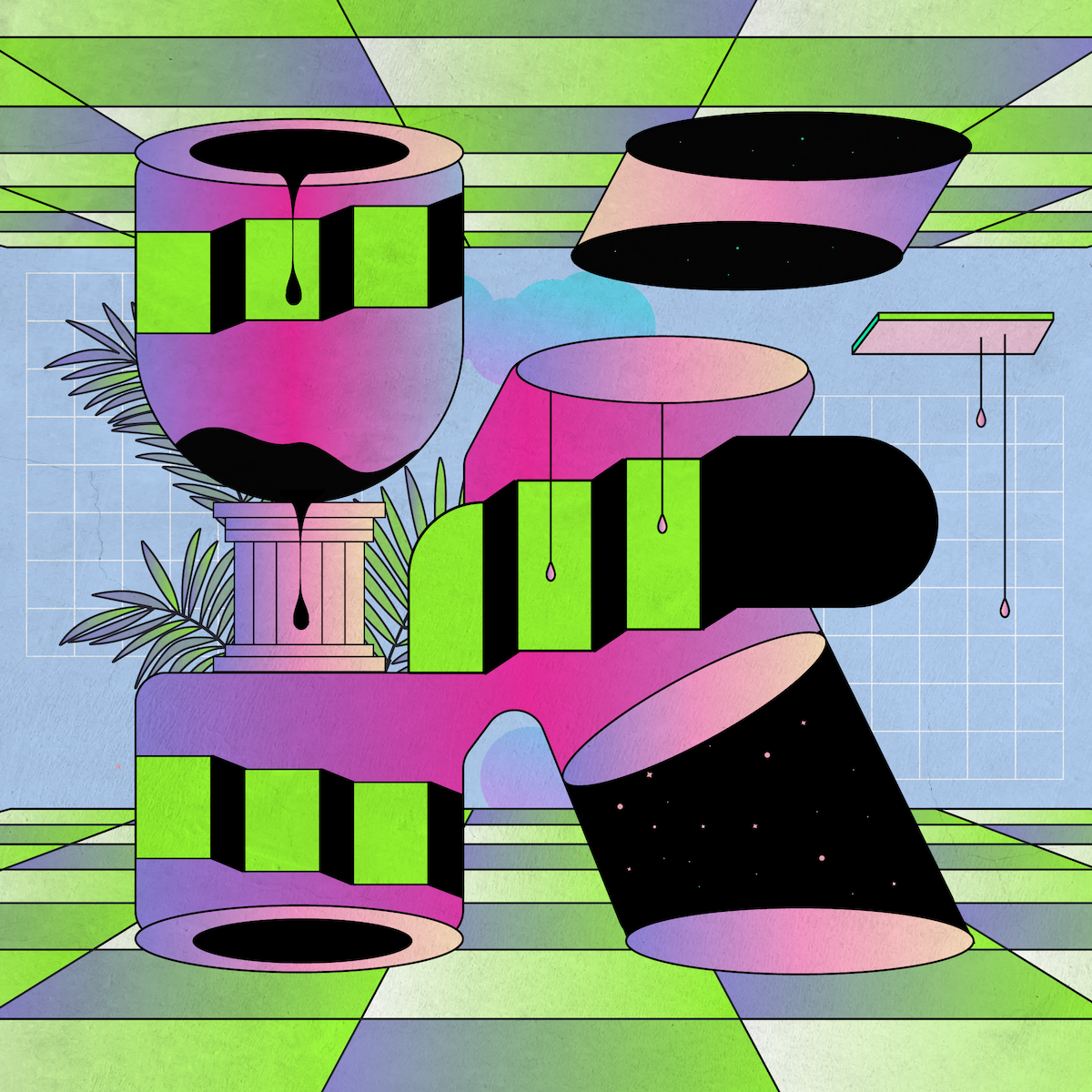
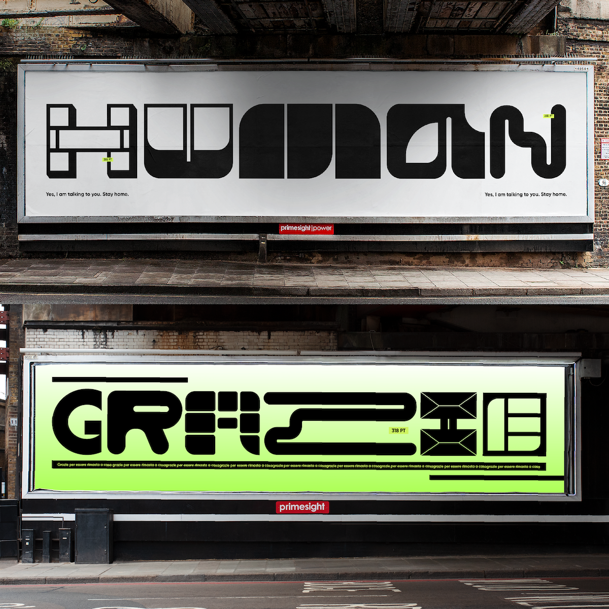
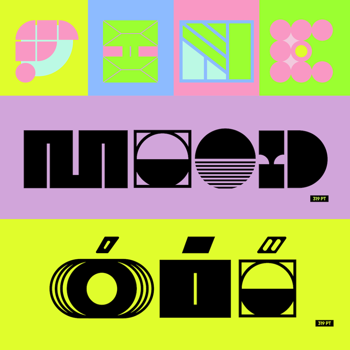
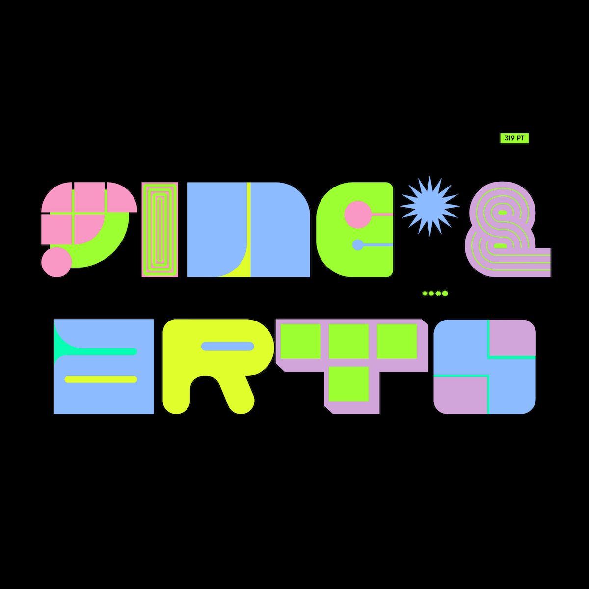
Yai Salinas‘ (@yaisalinas) latest font, Cleo, is a mixture of Vaporwave aesthetics and modern and retro letterforms. A microgenre of electronic music, Vaporwave emerged as an internet-born aesthetic subculture in the early 2010s, and has since built itself a tongue-in-cheek, surrealist, meme-occupied world. Filled with weird liminal spaces, warped perspectives and uncomfortable dimensions, it’s been said that the Vaporwave aesthetic comments on “modern consumerism and the soulless glamour of late capitalism” (Aesthetics Wiki).

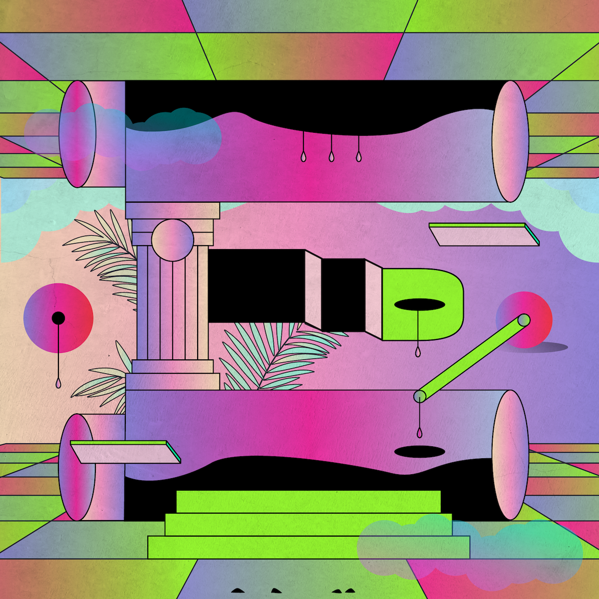

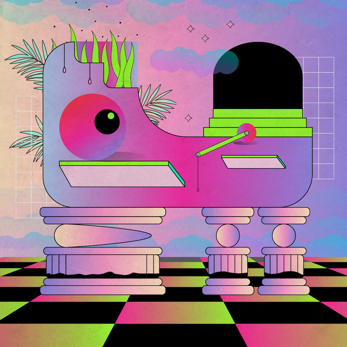
Yai’s most recent explorations of Vaporwave aesthetics have been showing up in the form of a glowing 36 Days of Type series. “I always try to escape from the letters that I usually make, and in 36 Days of Type, I wanted to play with letter shapes and the universes that contain those letters,” she tells us. Filled with strong, high contrast colour palettes and surreal illustrative qualities, Yai explains that during her creative processes for these pieces she’s been imagining herself as “very small and inside the letters, as if they were their own universes and planets,” adding, “that’s why I enjoy playing with stairs, doors and dimensions.”

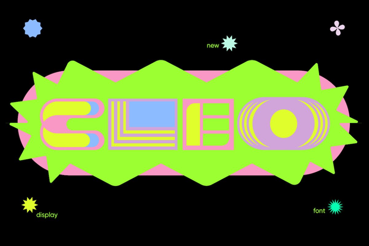
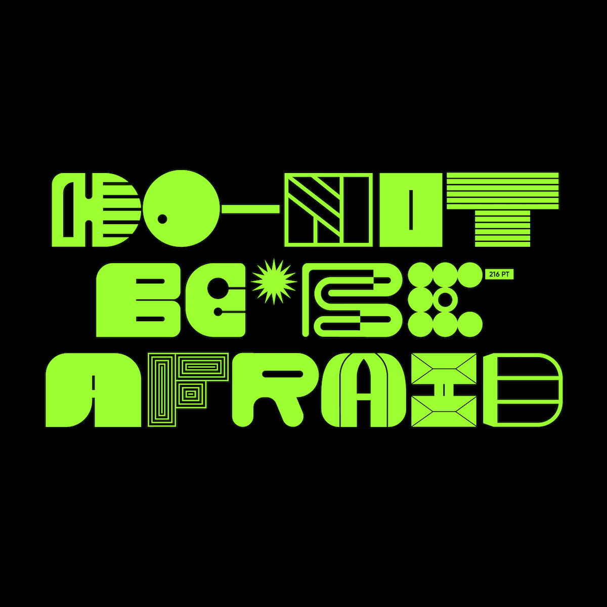
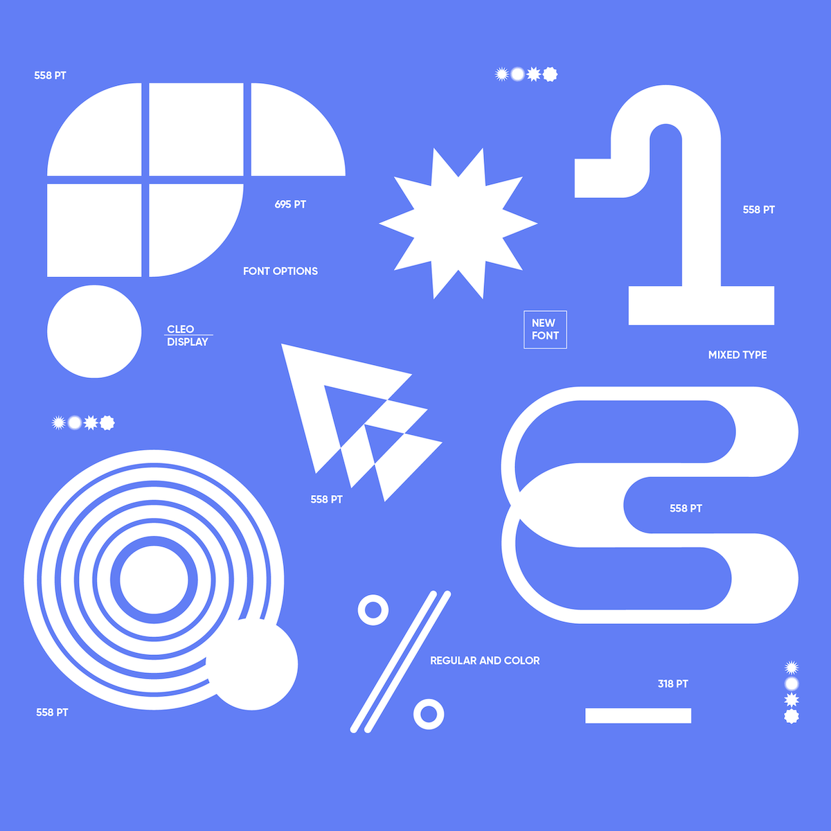
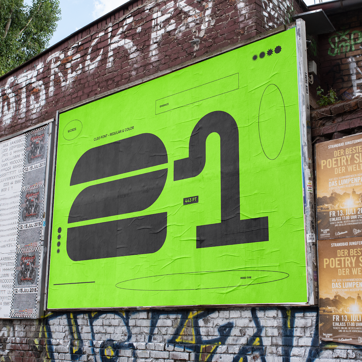
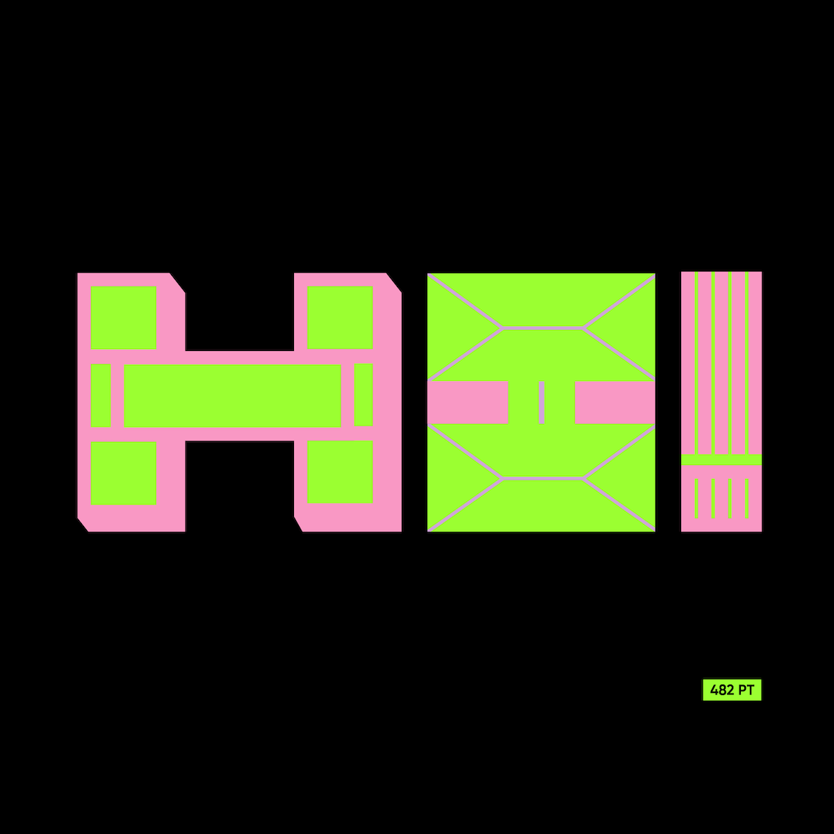
Closely tied with her 36 Days of Type series, Cleo is Yai’s newest font, and one which proudly wears versatility as its standout feature. In the early stages, the Argentina-based designer says she wanted Cleo to be suited to larger point sizes, and mix various styles into one coherent yet changeable typographic system. Saying she conceived the idea for Cleo based on the challenge of mixing modern and retro forms, Yai notes, “I wanted to design a display font that did not have specific uppercase and lowercase structures, but where both would have the same text box such as: uppercase/lowercase/descending and ascending. Therefore, Cleo is designed to be used in short paragraphs and/or a few lines of text.”
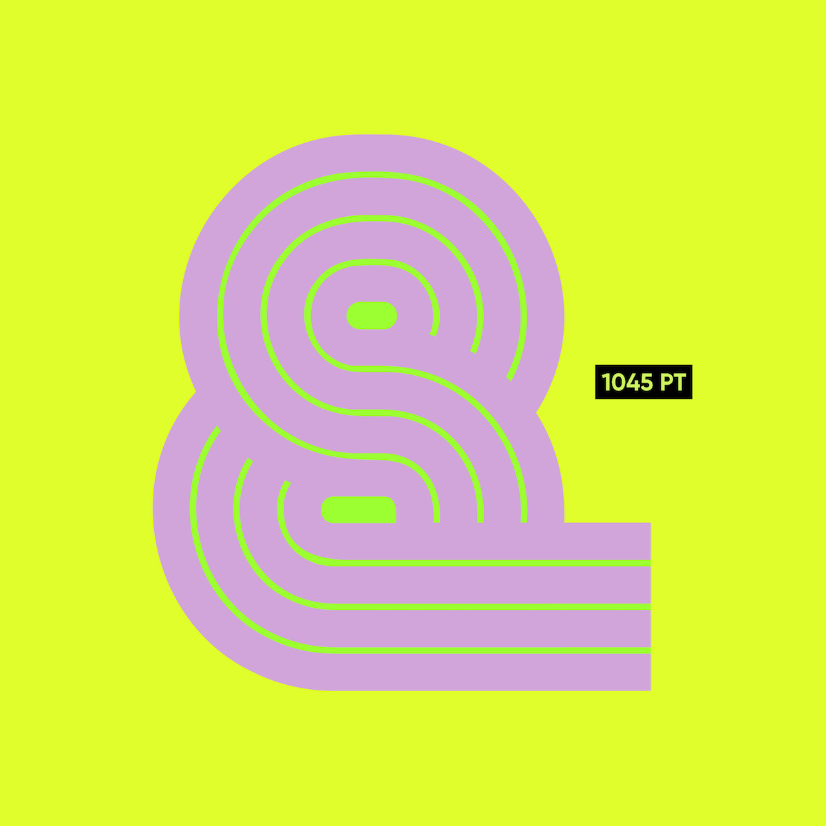
“When designers work on different projects at the same time, it always happens that in one way or another they are related. The way these projects relate the most is that both are personal (not meant for a client). I feel very comfortable working with a colour palette, and that is precisely the similarity between my 36 Days of Type series and Cleo Font. Those colours characterise me at the moment, however, they are not the only ones. Cleo can work with different palettes and in different styles, and that’s why it is so versatile,” she continues.
Captivating and fresh, Cleo has clearly benefitted from Yai’s immersion in her current aesthetics and a thoroughly open creative process. “My design process takes a long time,” she explains, “sometimes I design 6 or 7 alternatives for a single letter. I don’t rule any out until I see the whole system and I am able to visualise the different combinations of letters when writing real words.”
Thank you so much to Yai for telling us more about these stunning projects, we can’t wait to see more of Cleo in-use!


