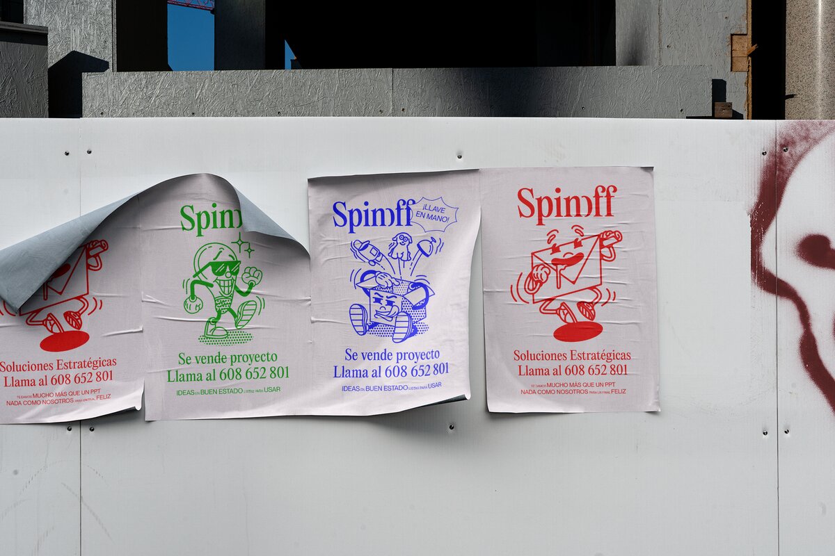
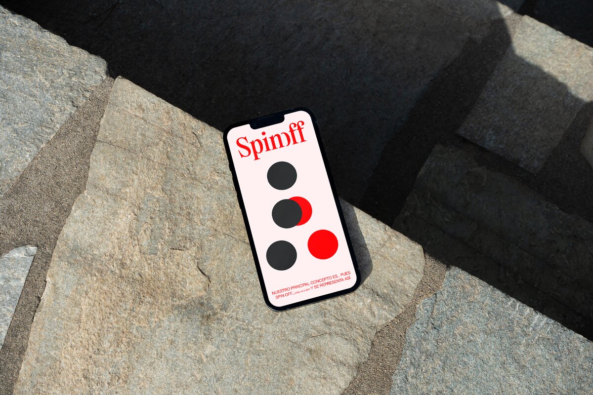
Spin-off, a strategic solutions studio based in Madrid released its rebrand in 2022, and it has an intriguing mix of Arnold Schwarzenegger, the functionality of a locksmith, and a strong deja vu personified with a vintage typography touch.
The rebrand’s concept was envisioned and put into practice by the fellow Madrid-based creative studio, Relajaelcoco. Founded in 2008 by Pablo Galeano and Francesco Furno, the studio believes typography is the element that transforms verbal language into visual. “All written messages have a tone and a voice, Typography is an essential pillar when visualizing messages – it is the most relevant element of all visual identities and visual communication.” The word Relajaelcoco is actually a full sentence in Spanish: Relaja el coco, and it means “relax your coconut (brain)”.
The starting point for Relajaelcoco was to understand what Spin-off had to offer, and what could be used to highlight their highest Studio functionalities. “They operate in a sector where PowerPoints are sold for an absurd amount. If in the past that used to make sense, now it’s becoming a problem. They have detected that fellow Innovational and Strategic Studios were selling their diagnoses on such large versions that would say a lot, but in the end, turn out to be just empty words – it’s just smoke!”, affirms Pablo Galeano, Relajaelcoco’s Founder.
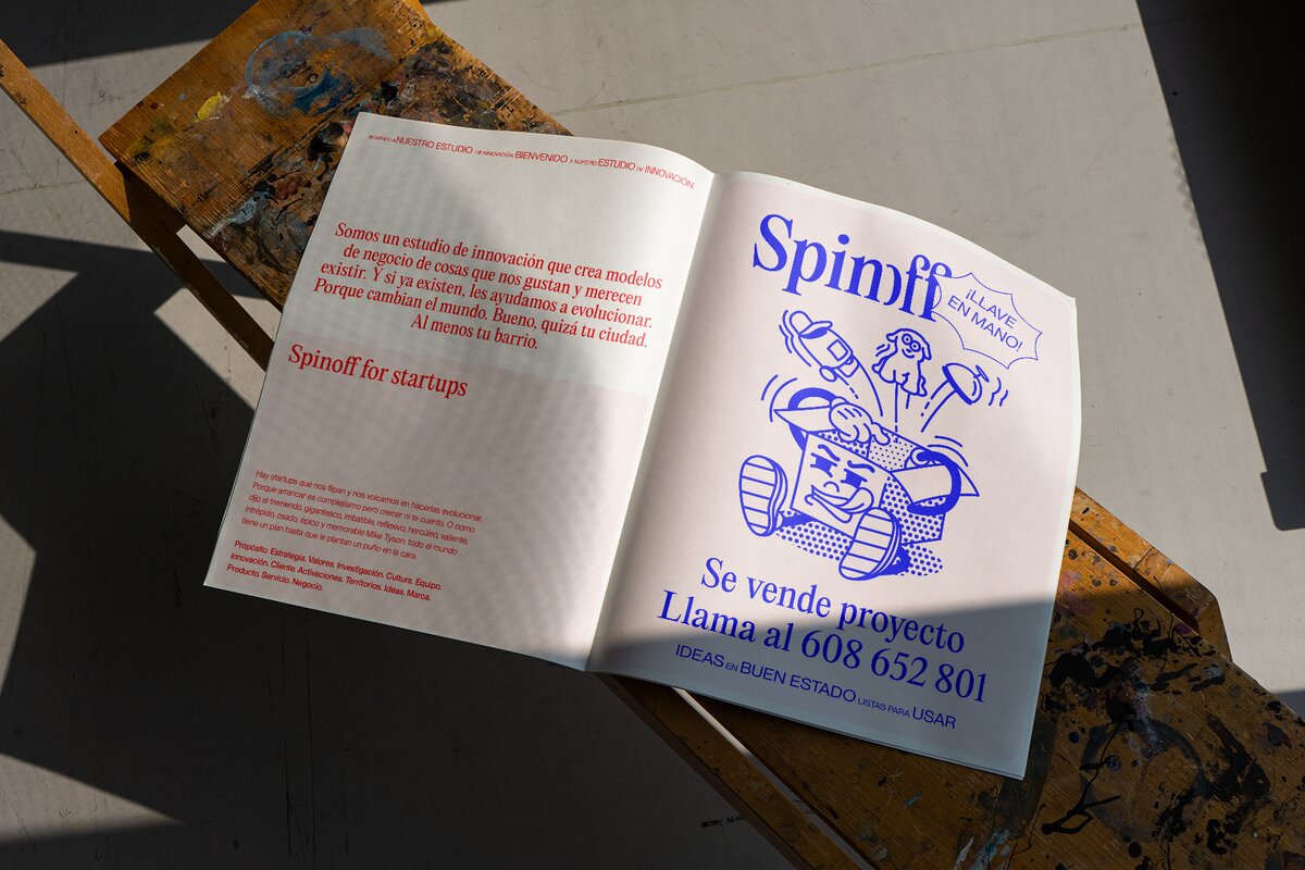
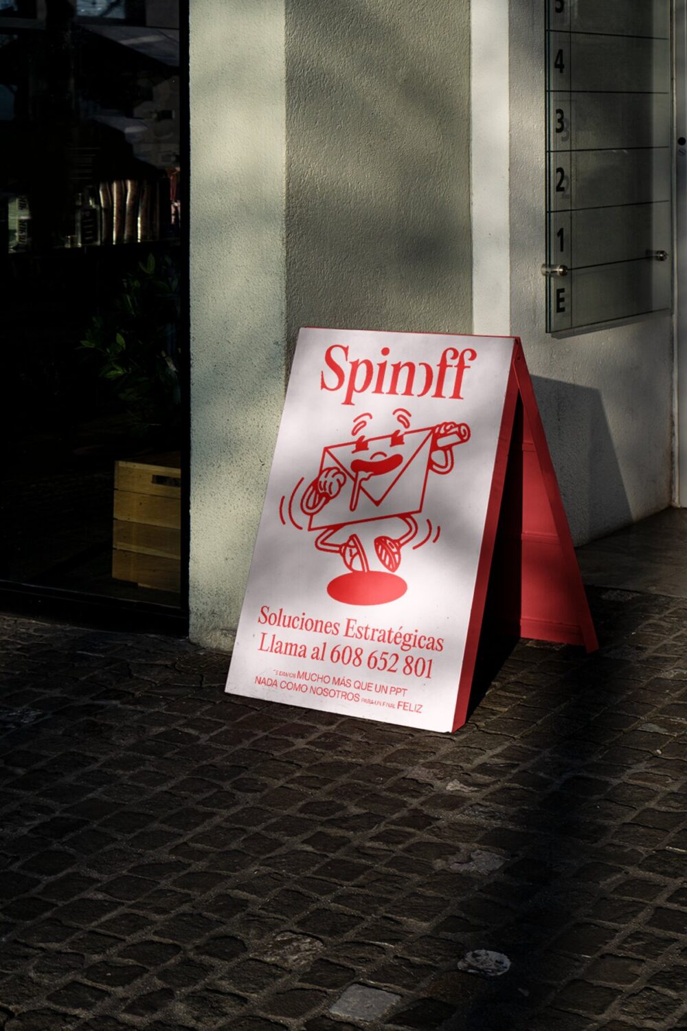
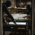
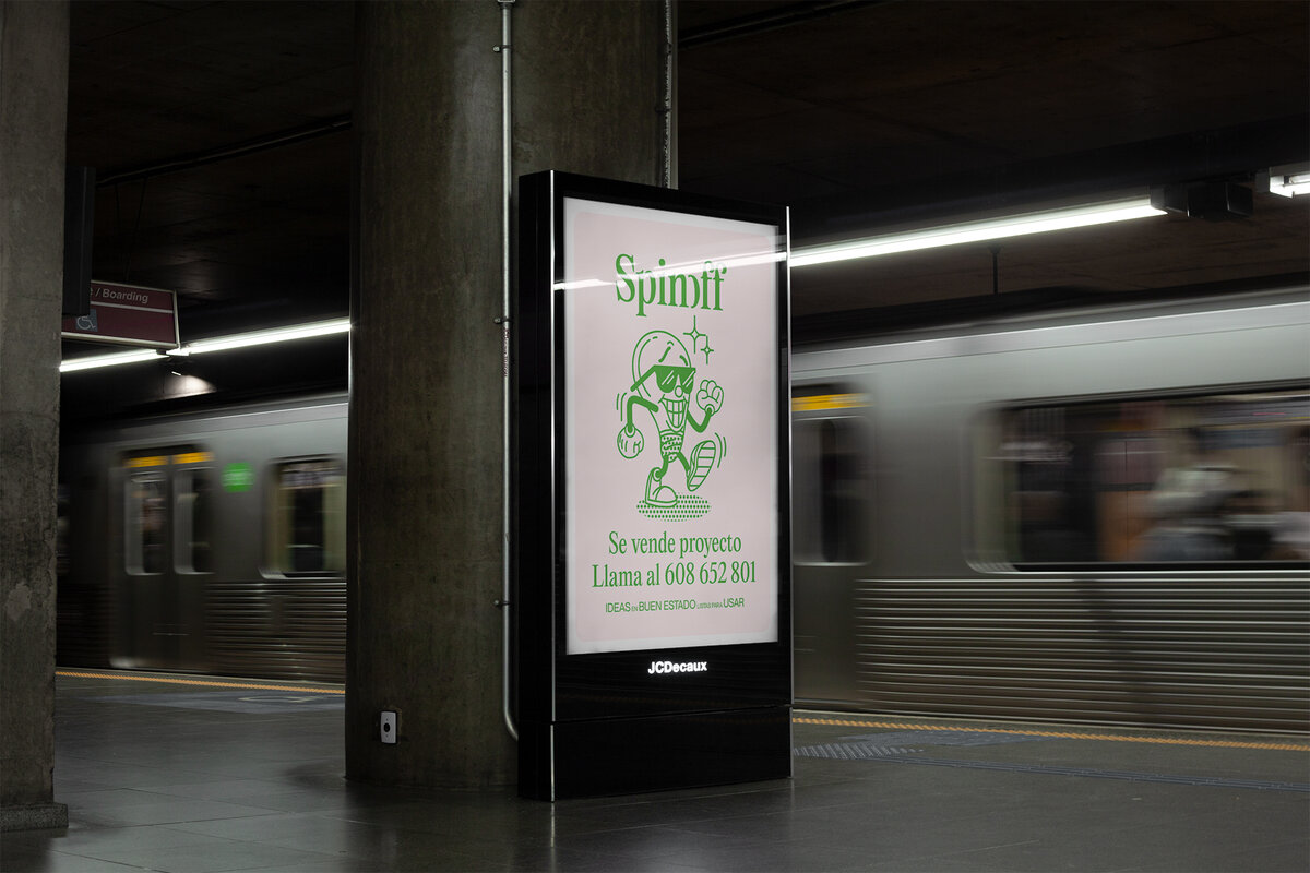
How then, does Spin-Off stand out against the crowd? Bring back that 60s old feeling of fast-paced services, such as plumbers and locksmiths being advertised: a monochromatic tone applied on flyers and stickers that would be around light poles and traffic lights around, well, pretty much every city in the world. “It’s the visual language of the doers back in that time. We wanted to express that in a straightforward way, something like ‘call me and I will solve your problems’ feeling”, continues Pablo.
To consolidate that grotesque and narrow combination they were willing to explore, Relajaelcoco chose Naue Montreal and Editorial New as the best fusion for this rebrand. “The font pair shapes the Spin-off personality, merging a retro style with a snarky touch, along together with an elegant essence communicating professionalism.”
“We chose retro typefaces because we thought combining a grotesque font together with a narrow one could be a great option to outline the main values of the brand. On one side the alternative vibe while on the other, a representation of professionalism and elegance, altogether in a very bold essence.”
Adding to the retro tone, Spin-off’s Founders Carolina Rodríguez and Carlos Murillo are pretty obsessed with Arnold Schwarzenegger – so naturally, he would add to the campaign’s visual personality. A fun fact about the Founders Duo is that they love Arnold so much, they even have the quote “Arnold is número uno”, (Arnold is number one) tattooed.
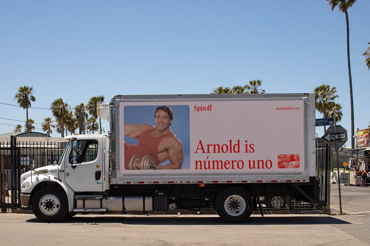
“The sentence represents a famous photo in which we see him after winning a world tournament of bodybuilding, smoking a cigar, drinking wine, and eating fried chicken. That attitude reflects much the attitude of Carolina and Carlos showing it both in the visual identity and the verbal tone of the brand. Also, all their presentations are full of photos of Arnold doing things”, tells Pablo.
In an industry that doesn’t explore bold visual language very often, Spin-off comes with a tone and personality very challenging and subversive – almost provocative. “They want to break with the established and put an end to the tyranny of empty PowerPoints.”
Going against that “empty service” offer, Spin-off defines themselves as makers who offer comprehensive and meaningful studies about a business outlining a series of innovative solutions, doubling down on the extensive use of explanations, and cutting straight to the point.
Relaja-el-coco
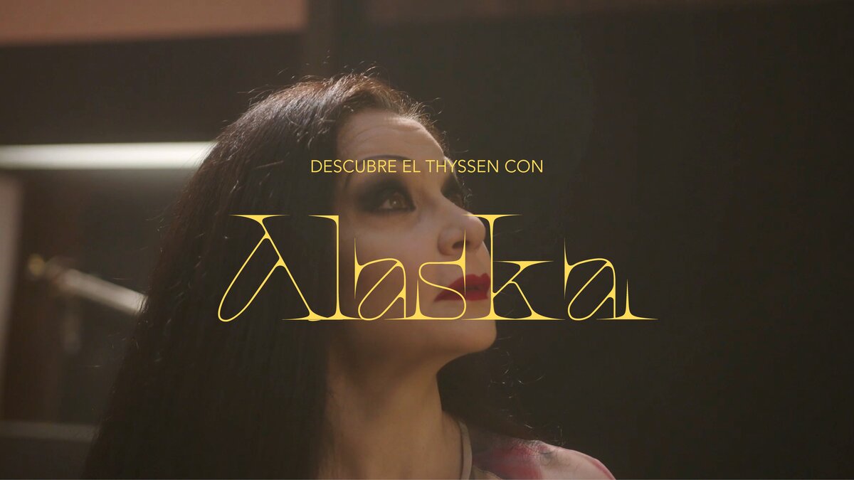
Expanding outside of the Spin-off rebrand, Relaja-el-coco has a large list of projects where typography is the key element, such as the identity of Socialmood, a Spanish creative agency. The visual identity of Ayuda en Acción, an NGO that operates in 22 countries and whose identity is strongly marked by the use of typeface and illustrations; Museo Thyssen-Bornemisza’s campaign, and more.
“When we founded the Studio 15 years ago, we thought we would like to work in a place where we enjoy designing, where we could develop creative proposals for clients who were not afraid to trust the unknown, who were brave, capable of betting on innovation while relaxing. Our attitude is to look for relaxation and no pressure, otherwise, the creative process is interrupted in a long-term perception.”
If you would like to reach out for a prospective project, contact Relajaelcoco through their website. To follow up with their new releases, follow their page on Instagram.