Home of contemporary typefaces that build on top of historical models and cultural legacy – Hot Type, founded by Marko Hrastovec based in Croatia’s capital Zagreb, is a Foundry and Design Studio equipped with typefaces that explore novelty and history alike.
Type Designer and Art Director Marko, who designed typefaces for the likes of the Louvre Museum, Nike, and L’Oreal – to name a few – felt the need to create a dedicated environment where he could share stories.
“I can share stories about which typeface design inspired by a single letter, or why this contemporary version of it makes more sense in 2022”, says Marko. “If I’d publish the same typefaces with different foundries, the overall connecting thread gets lost. So, from the get-go, it was important to build the entire visual system around them with words, images, artwork, promo material, and whatever helps to keep telling the story.”
Described by its founder as “a collaborative effort, where typefaces are an essential product”, Hot Type was founded in 2021 and so far presents five fonts: Crumbs, Hot Sans, Punta, Stroy Grotesk, and Stroy Mono – all released between 2021 and 2022, and available for a free trial before purchasing the full license.
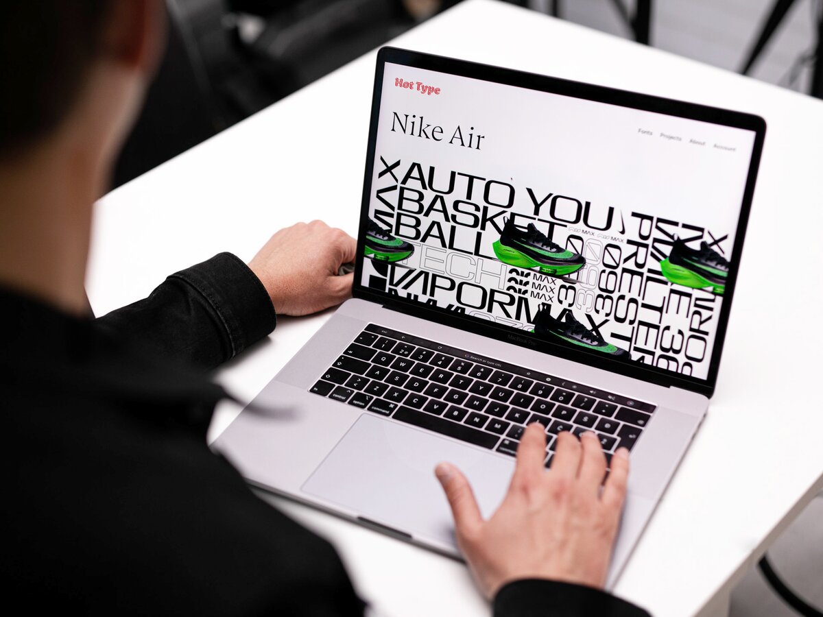
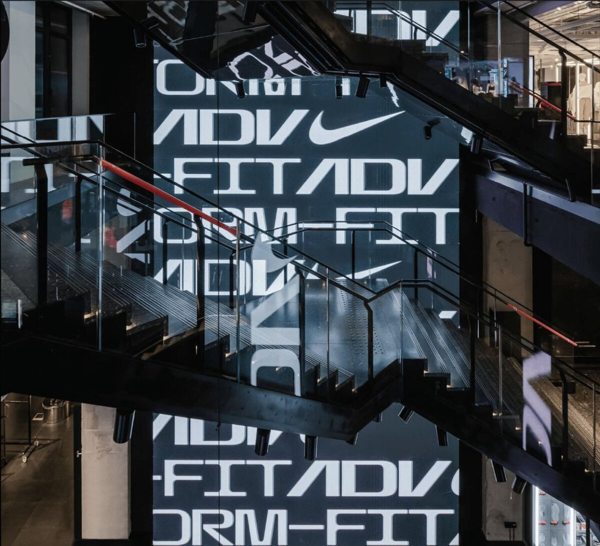
Bespoke Typeface for Nike AIR Products
Hot Type partnered with the Nike in-house team led by Nemanja Jehlicka in 2019 to design and develop a typeface that would speak about their famous innovation technologies, and ever since they’ve been applying it to their gear. “I still get goosebumps when Nike launches new AIR products – which means millions of people globally use items with our typeface on them. It’s fascinating how positively unpredictable usage had become compared to when we envisioned it”, confesses Marko.
Nemanja Jehlicka had a strong type-oriented approach while being Nike’s art director, and then invited Hrastovec to partner in developing a bespoke typeface to be used as part of the Nike Air rebranding. The brainstorm requested the rebrand to work together with the new AIR logo – and that was the very start of the process.
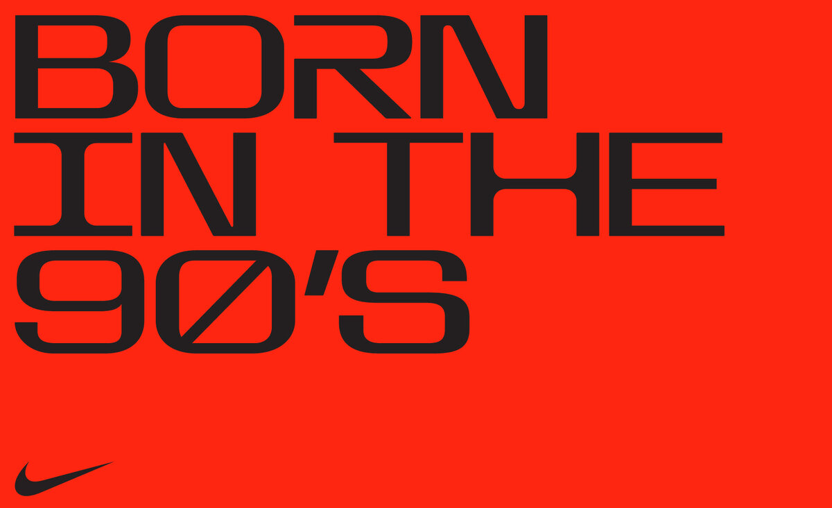
“Exaggerated straight lines contrast the curves of a circular logo, giving the type a machined precision, while the tight but rounded corners draw the two together. The result is a futuristic typeface that represents innovation and technology”, explains Marko.
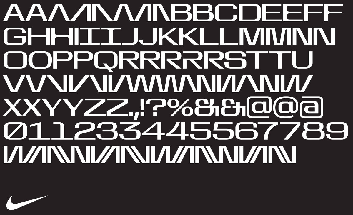
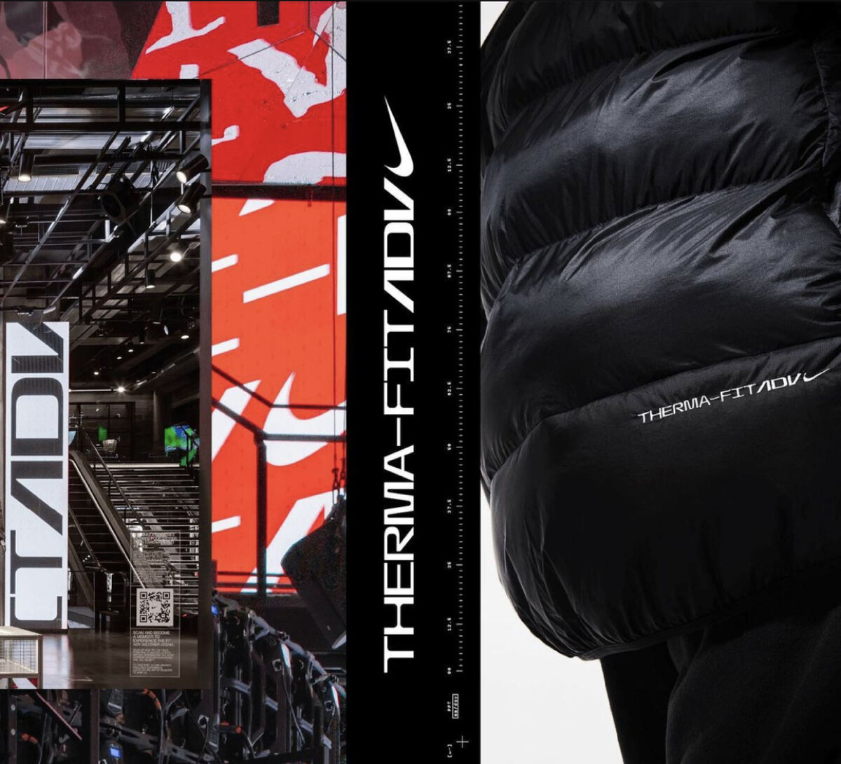
Later on, Nike started using it more and more, and so the bespoke typeface started to be used as a default for all innovation technology gear, such as FIT-ADV. “Most recently and most excitingly, usage of the font is on football boots and national kits for the 2022 World Cup”, he completes.
Big projects are a stand-up point for any solo designer, and consequently also help a lot in expanding your own personal brand, or platform associated with your name. For Marko, it was crucial to have had such clients to help financially afford to design typefaces and launch the Foundry website — designed by Fran Mubrin, developed by Zoran Završki, and texts edited by Krešimir Bobaš – all put together by Guido Ferreyra from Argentina. “It’s a tool to build community, it’s a webshop to license our type creations, it’s a shopfront for whatever we’re into”, says Marko.
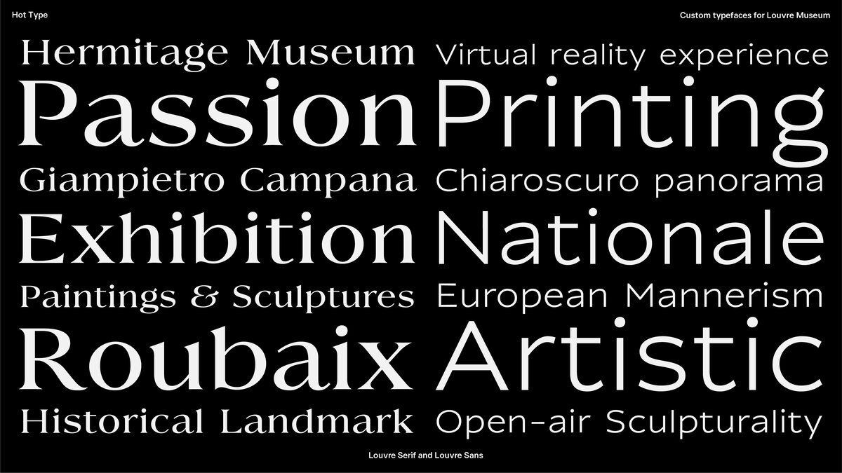
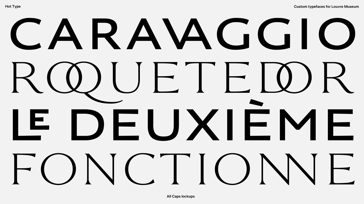
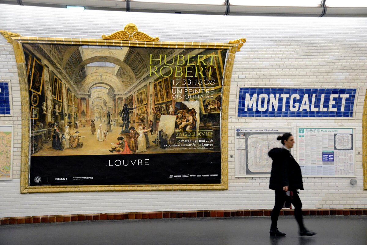
Another big project on the type designer’s portfolio is a bespoke typeface for the Louvre Museum, in Paris. Marko developed the Louvre Serif and Louvre Sans, both of which are now applied to printed posters, advertisements, and everything surrounding the Louvre.
“Typefaces are essential to pretty much any visual communication that exists, and for me, it’s the relationship between word and image that is most fascinating. The letter attributes can already communicate so much – the same word can look silent, loud, subtle, dominant, you name it – it’s all about picking the right style.”
Hot Type’s Font Catalogue
“Each of our type families has its own point of reference, be it a specimen of a typeface previously made, a single letter that sparks the idea, or a piece of lettering that calls to be reimagined as a full alphabet.”
That approach brings a solid historical and cultural foundation, whlist brings a contemporary touch.
“I’d say connecting thread of our catalog is a fact that there’s always something that happened before that inspired the work. And instead of neglecting what inspired a specific design, we’re very clear about it and make an extra effort to write the story and show a collection of images from ‘Inspiration’ folder. There must be some kind of a story and development process behind each new typeface.”
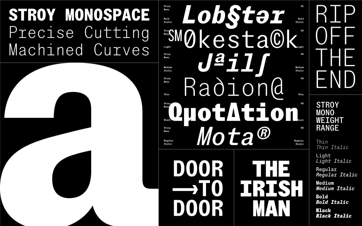
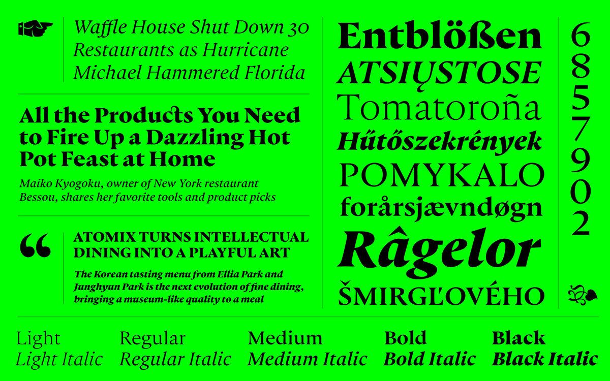
Punta, Stroy Grotesk, and Stroy Mono were Hot Type’s inaugural releases in 2021. This year they released what it’s described as “an instant classic” Hot Sans, and Crumbs, a variable Sans-to-Serif concept. “With each new typeface we try to blend functionality with interesting shapes, ones you like to both look at and read.”
Typeface names often happen to describe the design itself, so Punta is Hot Type’s pointy Garamond-inspired serif is translated as small headland or cape from the southern Croatian dialect – described as an elegantly dramatic creature sculpted to perform. Hot Sans is about straightforward communication with ease. “Hot Sans is a genre of typefaces each type publishing house seemed to offer historically, and very often such typefaces were named after the publisher, so that’s a nod to tradition”, he explains.
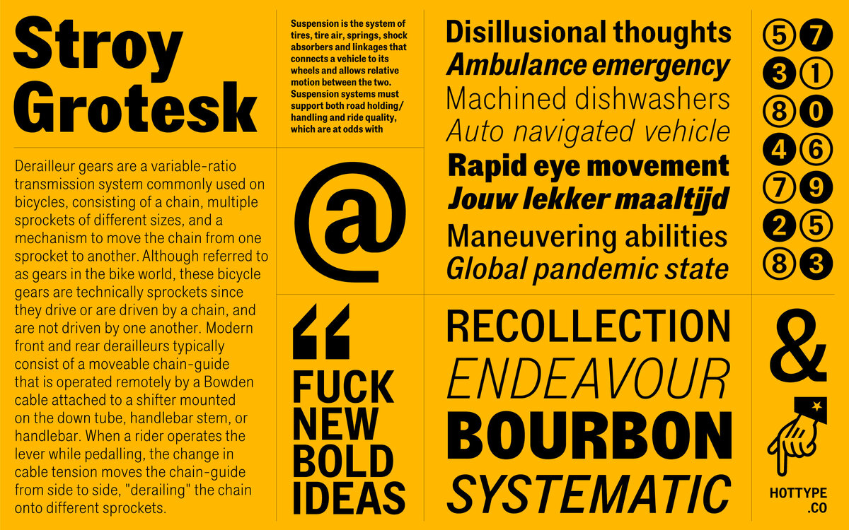
Stroy Grotesk is a contemporary interpretation of nostalgia, while Stroy Mono delivers intense raw goodness. “Stroy is a little twist on the word ‘stroj’ that literally means machine, as shapes, there tend to look machine-cut.”

Crumbs carry the most personal meaning to Marko. The font started out as a lettering project – a logo for a small business. His girlfriend then pointed to De Vinne and thought that was a good starting point. “The logo came out great, something I might’ve never done otherwise if it weren’t for her—plus, the business side was on the up and up as well. Besides, we’re still together, so you can add that to the plethora of good news.”
For the next year that is approaching, the plan is to expand their catalog adding one Sans Serif and one Serif font to the mix. “Nyck is already published at Future Fonts, and now it’s being expanded into a massive family for different sizes – Small, Medium, and Large. Really looking forward to that one!”
All these fonts are available for one free trial before purchasing the final license. “It’s important that designers have access to the fonts in the first place to be able to use them in designs they’re about to sell. The idea is to be present in the designer’s toolbox, and be part of the type choice discussion as often as possible. That ultimately leads to more licensing in the long run, hopefully.”
Fun fact about Hot Type! They share a studio space with the artist and designer Appear Offline, who if you remember did the issue #03 cover of our TYPEONE Magazine publication.
“Just recently expanded by 100% by hiring an account manager, juggling with 3 new upcoming font families, and working on a powerful case study for custom typefaces we designed in partnership with London’s Design Studio for another exciting client”, he says.
Clearly, there are lots of exciting things going on at Hot Type! Check out their platform and Instagram account to keep up with the Hot releases. You can download all their test fonts for free here, including Crumbs, Hot Sans, Punta, Stroy Grotesk, and Stroy Mono.