
Many of David Rindlisbacher’s favourite visual projects are those which spring from a combination of typographic elements and type design within a graphic system. The Swiss/Portuguese graphic designer is based in Lisbon and, between his Swiss approach to graphic design/typography and his love for exploring different design systems, his work showcases an exquisitely deep understanding of the interplay between type design, typography and graphic design… As David puts it, what’s most important to him is is ‘avoiding randomness’, and ensuring each design decision is ‘informed by the underlying concept of the project’ while consistently working within the system he creates for it.
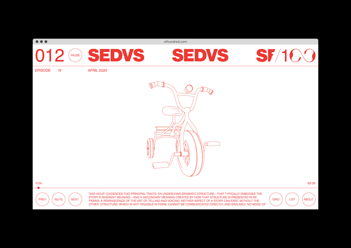
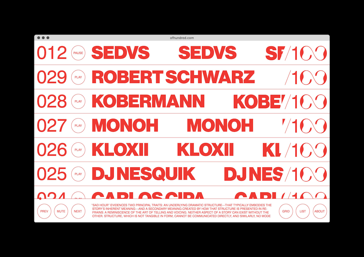
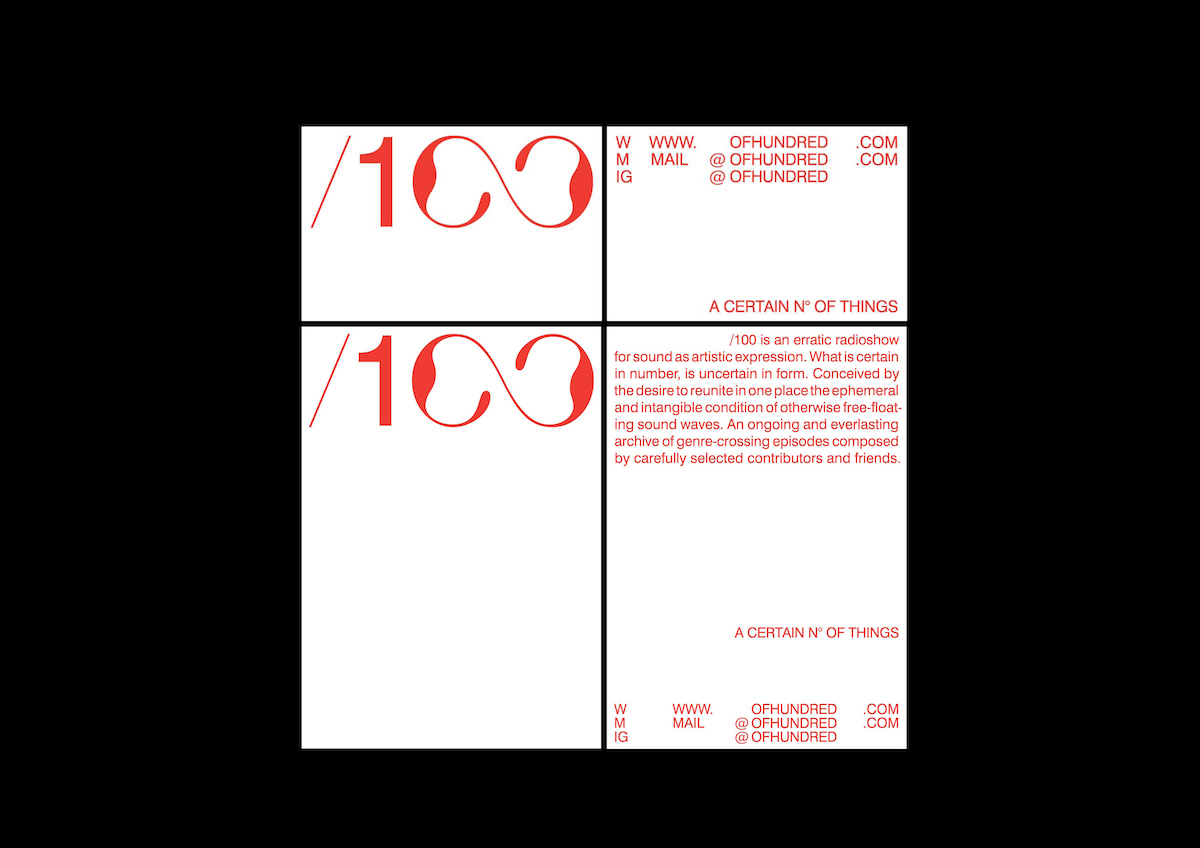
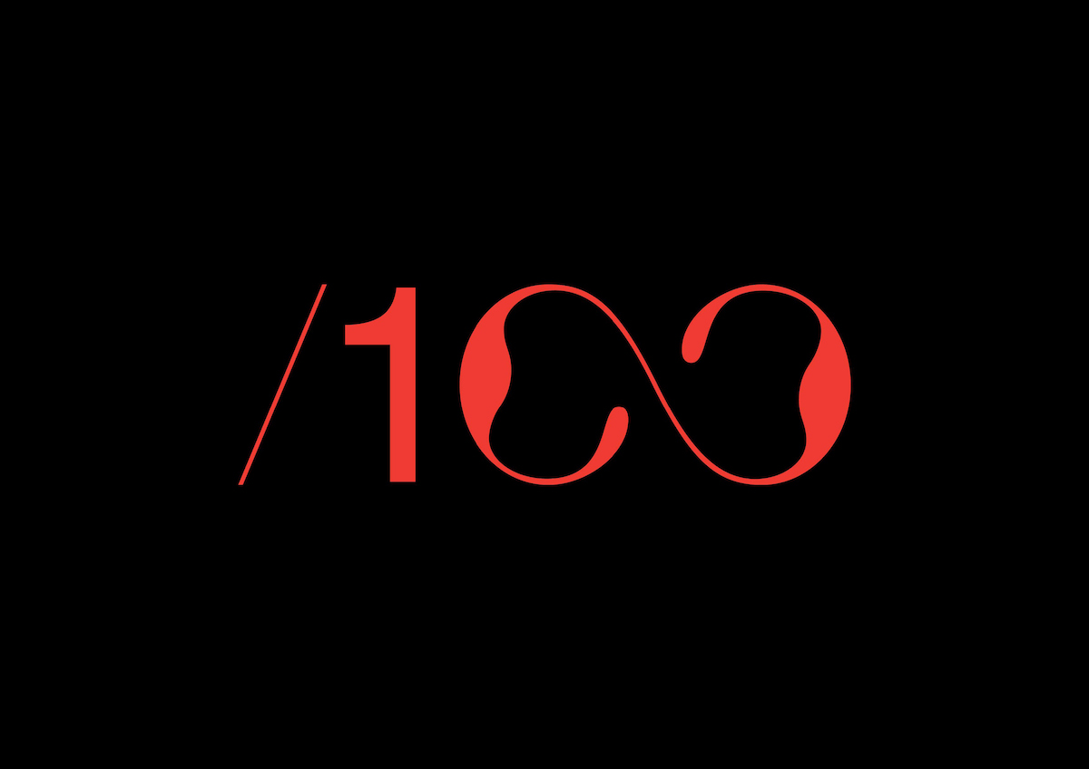
Co-created alongside Maximilian Mauracher, David’s identity and web design for /100 – a radio platform for selected artists to showcase their experiments with sound – is one such project. Through a graphic system based on ‘the mixing of grotesque typefaces with the custom lettering of the numbers “00”’, David tells us the design alludes loosely to the mechanisms of a cassette; allowing the letterforms bleed out of their original forms into more illustrative functions. Alongside the typography, 3D line-art illustrations of different objects enhance the graphic system and tie the elements together through their line thickness which, David explains, ‘is proportional to the thinnest typeface weight used in the website’.
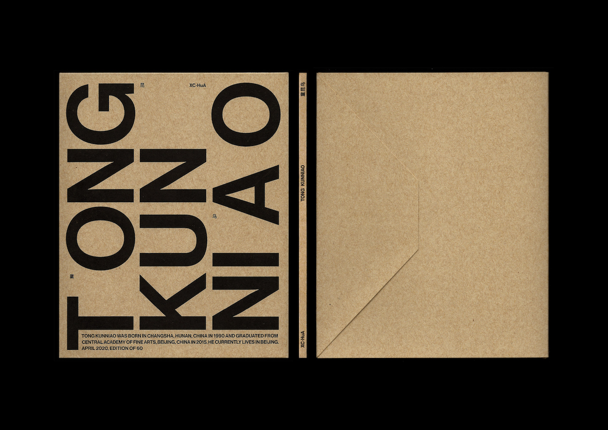
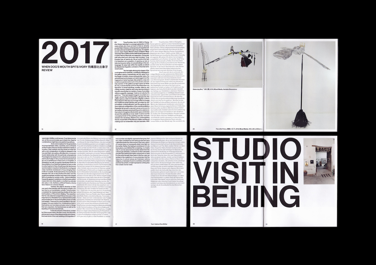
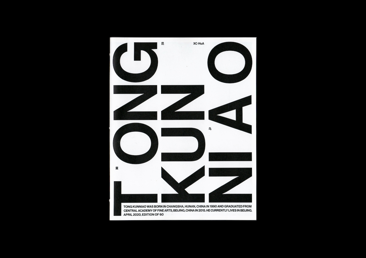
Also co-created with Maximilian Mauracher, David’s booklet and screen-printed envelope for the Berlin/Beijing-based art gallery XC.HuA (now Hua International) shows a similar level of fluidity; the typography again taking a strong compositional role within the graphic system. As David explains, ‘The cover design of the booklet/envelope is based on a typographic composition that lays out the name of the artist that is being promoted by the gallery. The aligning of stems of the T, K, and N creates a gap, which was filled with a short biography of the artist, the date, and the edition information…The rest of the letters were specifically aligned to each other and to the edges of the page, creating other gaps that were filled with the Chinese characters that spell out the artist’s name, as well as the name of the gallery. The big type is used as a headline style and the small type as the body style throughout the booklet.’
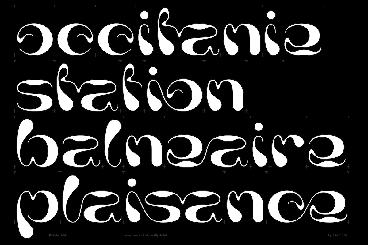
David’s graphic design work always comes out uniquely well-crafted and, shaped by his curious and attentive attitude, pretty visually addictive. But his recent WIP venture into more hardcore type design, entitled Balladur, is perhaps most exciting. ‘Whether I’m designing a typeface from scratch, modifying a few glyphs in an existing one, or drawing lettering, [typeface design] tends to be less cerebral and more intuitive, at least in the beginning stages; where I can let my sketching hand lead and in a way surprise me with what it produces. The hard part is what comes after the sketch, as I consider that an exercise in finesse and precision, which I’d be happy to one day even halfway master’, he says.
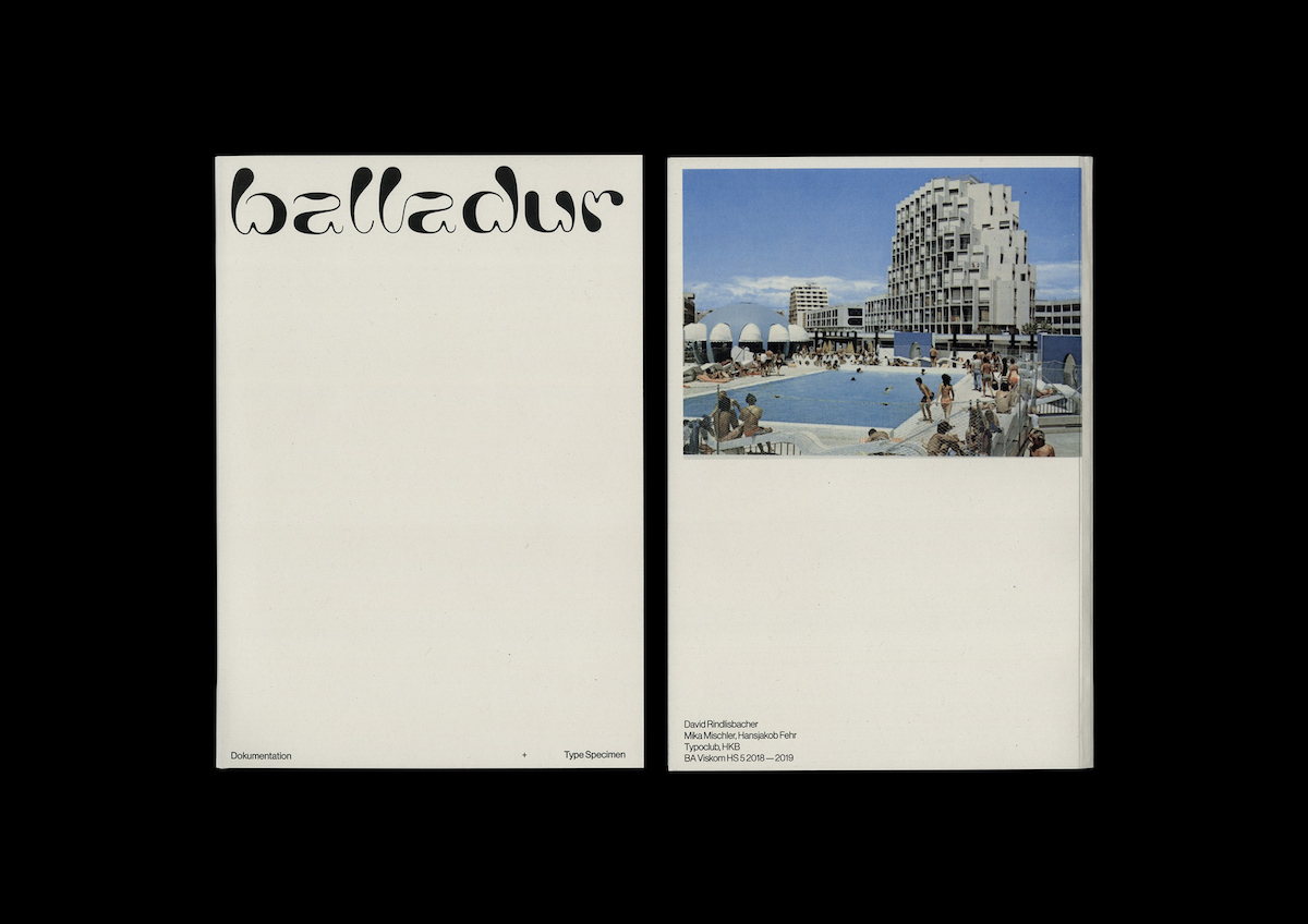
David’s inspiration for Balladur came to him as he looked through a book and ‘stumbled upon an image of a building in La Grande Motte, a seaside resort town in the south of France’. Drawn in by the aesthetics of the architecture, David researched the town further and looked into the architect behind its conception. ‘Soon after I started making sketches, which later turned into the typeface as it exists today’, he explains.‘Right now, I have only been able to work on it whenever I have a lull in between projects, so it’s a very slow-moving process. I’m hoping to release the first version of it, as soon as I’m done working on numbers, diacritics, and punctuation. Once that is done, I can fully focus on the capital letters of the typeface.’
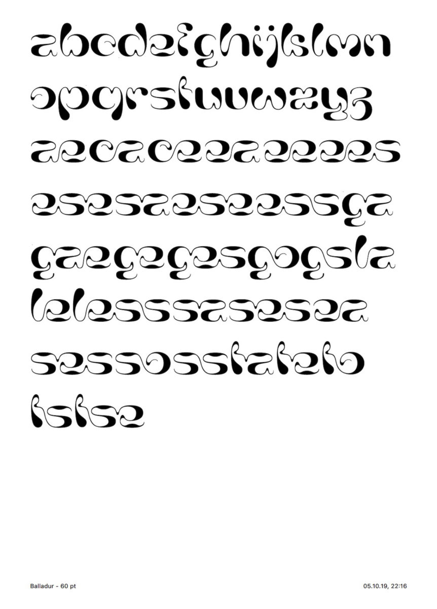

Balladur’s forms are so, so beautiful – it’s already easy to envision it set with smaller body copy in visual identities, editorials or book design, for example.‘Typography plays an integral role in my visual language, as my first instinct tends to be to regard it as the bones of a design system’, David adds. ‘If for example, I’m working with a title of a book, brand, or event, I like to mess with the placement and order of its words/letters and look for interesting and harmonious visuals I can anchor the design to. Do two letters’ stems align if I juxtapose two words in a specific way? Are there two (or more) glyphs next to each other I can turn into ligatures? How do these decisions interfere with the overlying message of the project? These are the sort of questions I ask myself during the creative process.’
It seems these questions pretty much sum up why we find David’s work to be so successful. By understanding typography as the bones of a successful graphical system and remaining open to new ideas, he manages to consistently create concise, well crafted design solutions and compositions which just make sense – without falling into any boring or overused tropes. Thank you so much to David for sharing his fascinating approach with us…we can’t wait to see Balladur in its fully fledged form!


