
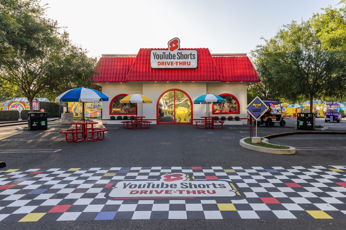
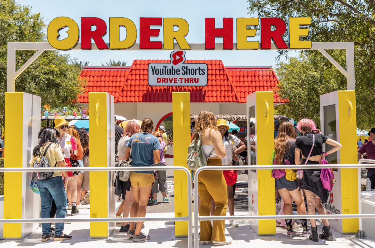
To market YouTube shorts, YouTube’s answer to TikTok and Instagram reels, Saint-Urbain created drive-thru snacks inspired by iconic YouTube creators.
In collaboration with YouTube’s internal creative team, the NYC/LA-based design and branding agency worked on the design for this innovative campaign created in honour of YouTube Shorts. With the help of bespoke experience agency MAS, who created everything from the physical Drive-Thru to all the actual snacks themselves, the designs came alive at VidCon 2022. I spoke to Jack Colley and Kittaya Treseangrat of the Events and Experiences team at YouTube, alongside Saint-Urbain‘s creative director Alex Ostroff, to catch a glimpse behind the scenes and hear about their font selections.
ZLM: What were you looking to achieve with this project? And how did the type become a vehicle for this?
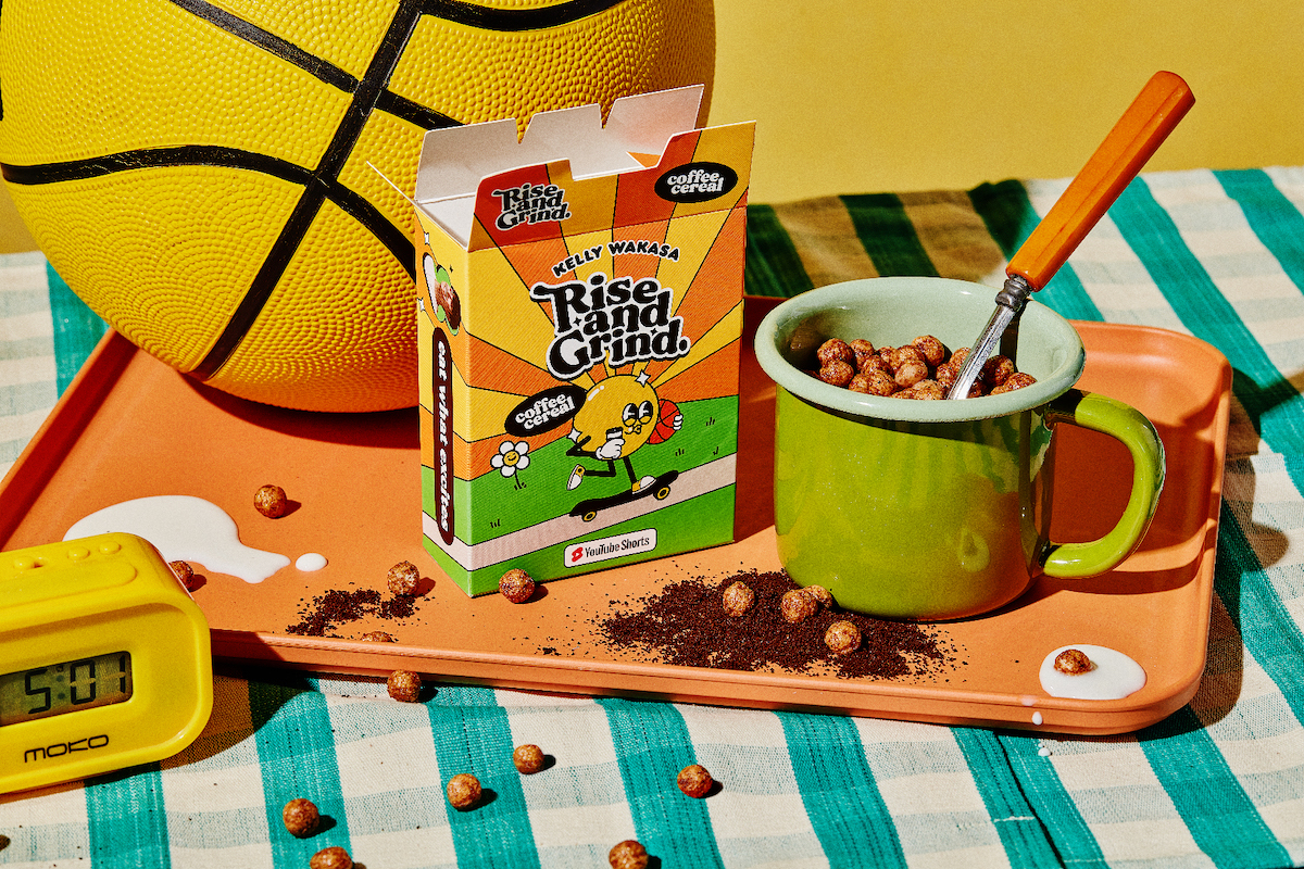
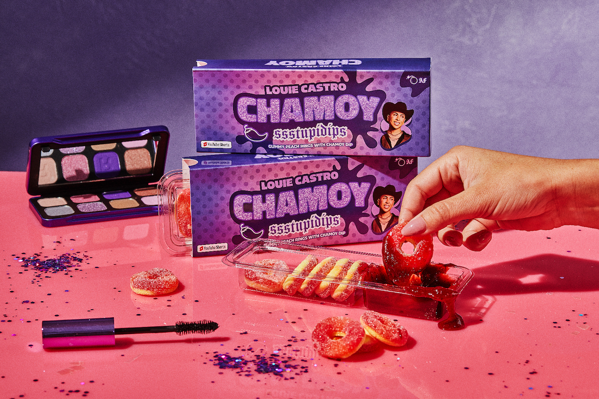
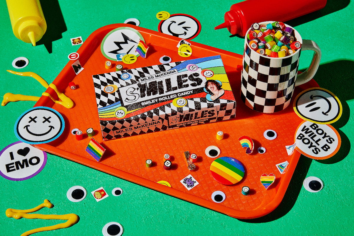
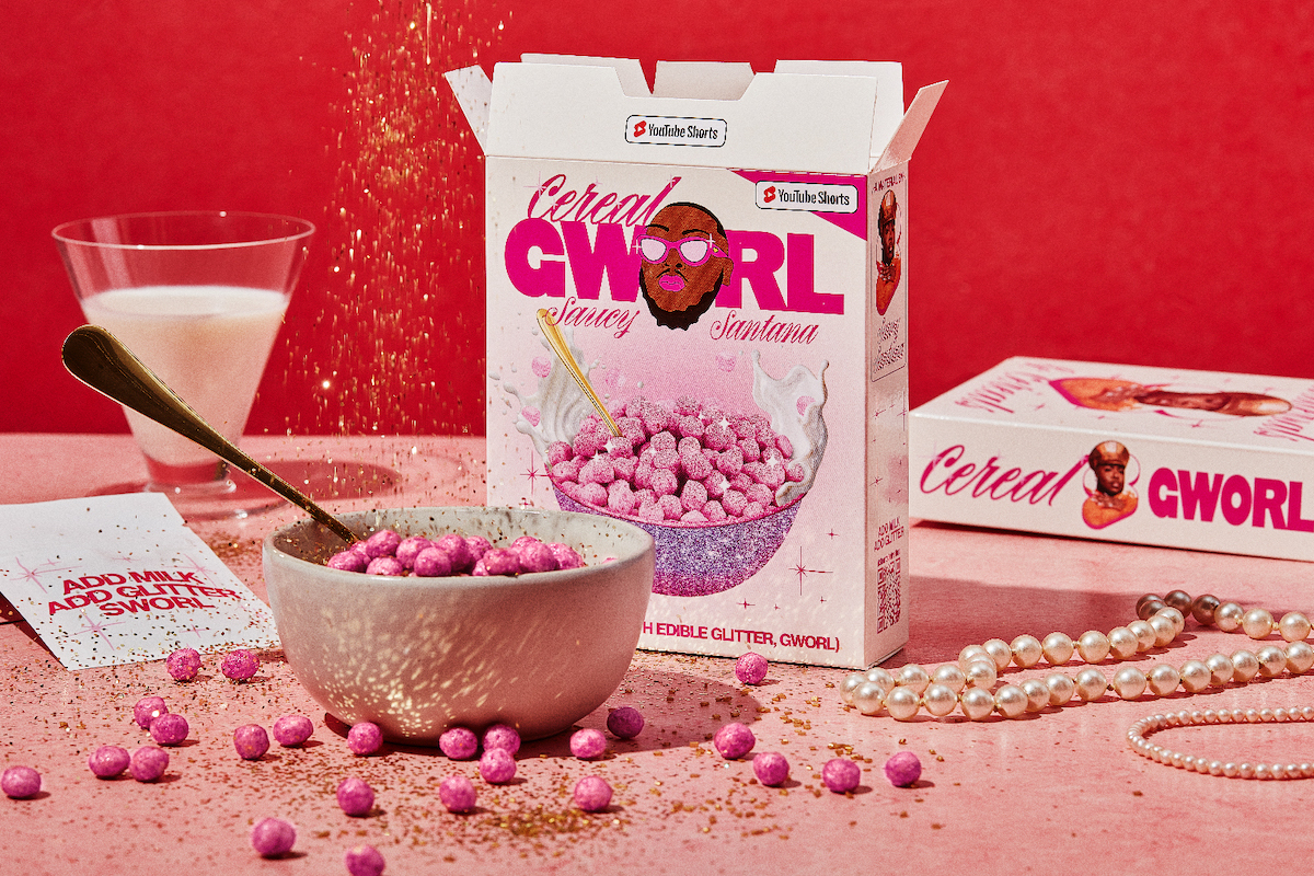
JC: YouTube Shorts is YouTube’s new short-form video product. All the fun of YouTube, now in a new bite-sized, snackable format. To celebrate, we went to VidCon and built a bonkers 90’s inspired Drive-Thru serving custom Creator snacks (bite-sized YouTube… get it?). All the 18 snacks were completely unique and based on something that makes each Creator iconic; an in-joke or reference that only their fans would understand.
KT: With Gen-Z being the audience, naturally we chose to use bold, idiosyncratic typography and colourful graphics that played into the maximalist trend. For the Creator snacks, we just let loose and experimented with eclectic font styles that not only suited each Creator but also looked good as a group.
For the Drive-Thru brand, our core font was Obviously Variable which is a super eye-catching sans that comes in a wild range of widths and boldness. This font allowed for application flexibility from trading cards to huge signages and also worked well alongside our 18 unique snack brands.
ZLM: How did you translate the DNA of each creator into your branding, particularly in terms of the typographic choices?
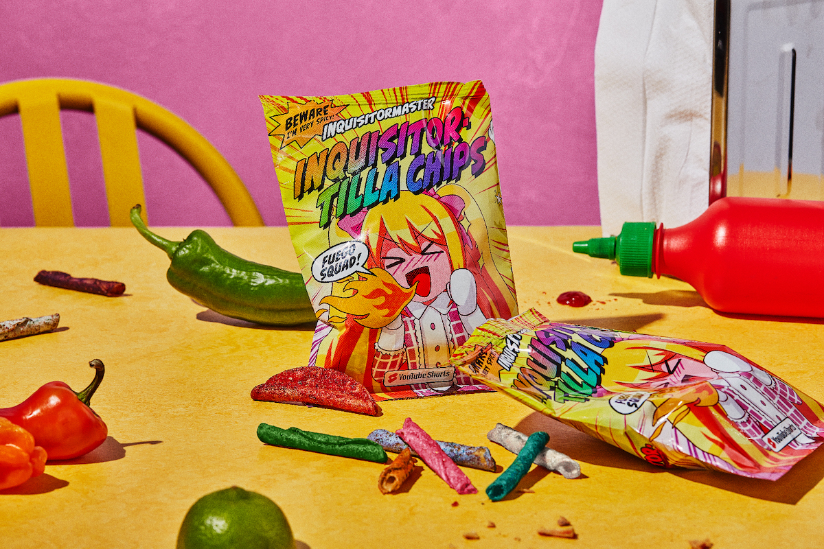
KT: We would watch a bunch of the Creators’ videos to get a sense of their personality and take notes of the typography styles that they used on their channels. We also looked at their merch for design inspiration to make sure that the packaging felt on-brand for them and their fans. Then we gathered a ton of font options and explored different treatments and effects. For example, for InquisitorMaster we found an awesome comic book font called Biff Bam Boom and applied halftone dots and rainbow effects to go with her cute anime character.
AO: We spent a pretty good amount of hours going through these creators’ content to know and understand their personalities and internet personas. For each of the creators, we generated pieces that contained specific elements that would connect directly with their audiences, whether it be phrases that they have positioned as their brand or graphic elements that bring a sense of collectivity to each package. Sort of like a baseball card, where each card contained the statistics and achievements of each player. It’s something similar, only here the stats become iconic phrases, personal gestures, jokes, etc. This naturally lent itself to type as well, as type is so expressive. These choices really helped channel so much of the brand personality.
ZLM: Any highs and lows of the creative process?
JC: The whole project (snacks, drive-thru, interactive website, at-home competition…) took 3 months from kickoff to execution. To do it, our diverse global team of designers each took on a few of the snacks to make sure we had a variety of styles represented.
The process was pretty wild given that timeline. Essentially we would sign up a Creator, do a very quick (2-3 day) creative sprint generating a few snack ideas and going through design explorations. We would then present back, incorporate any feedback, and move straight into production. The team was split across 3 continents, which actually helped massively since we had this great 24 hour work day and could hand the work back and forth.
When it comes to highs & lows… all highs. The collaborative energy between our internal creative team and this band of brilliant misfits was phenomenally fun and productive. I am so proud of it.
ZLM: These are such vibrant, energetic pieces. Can you tell me a bit more about the visual storytelling and type in some of your favourites?
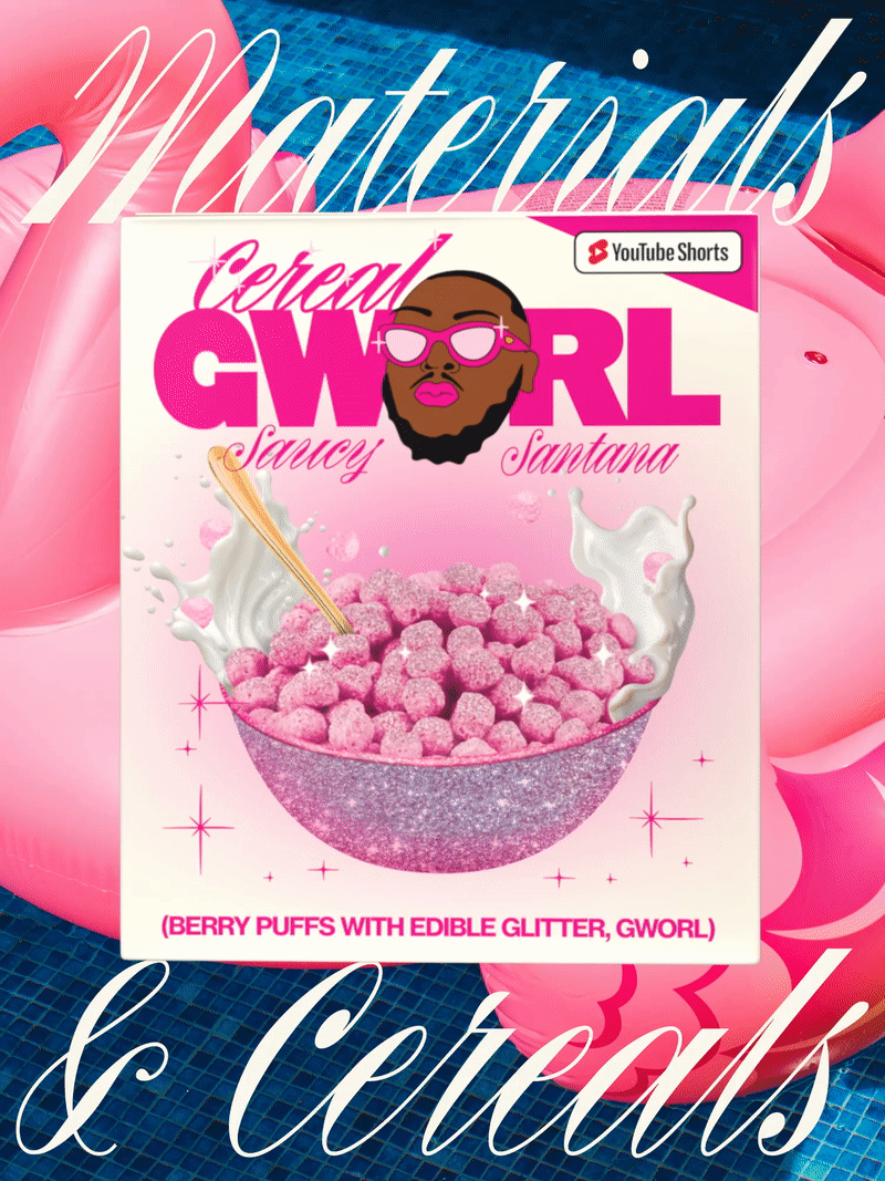
AO: For Saucy Santana, he’s very bold, sassy, powerful, and loves fashion. We wanted to go with something that had the classy edge that he likes to portray. For this combo, we went for Linotype’s Neue Haas Grotesk, Rizado from Kostic Type Foundry and Commercial Classic’s Original Sans.
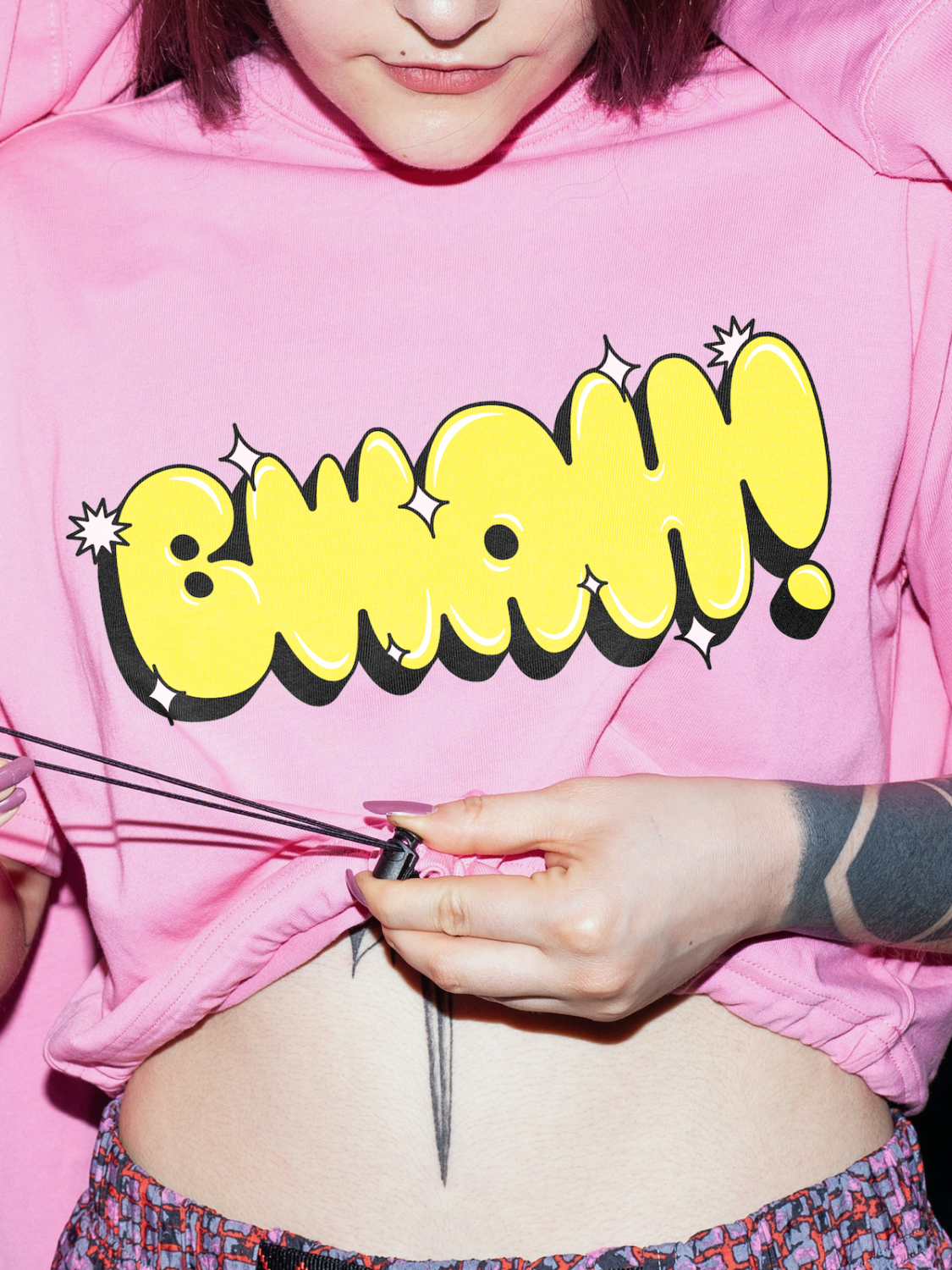
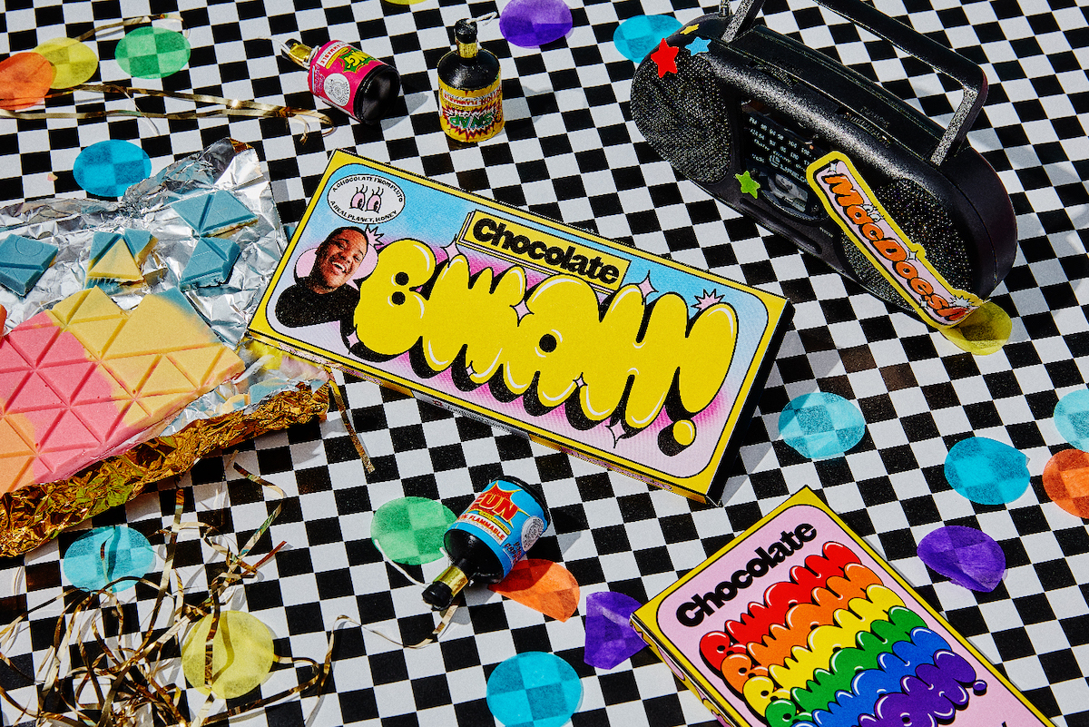
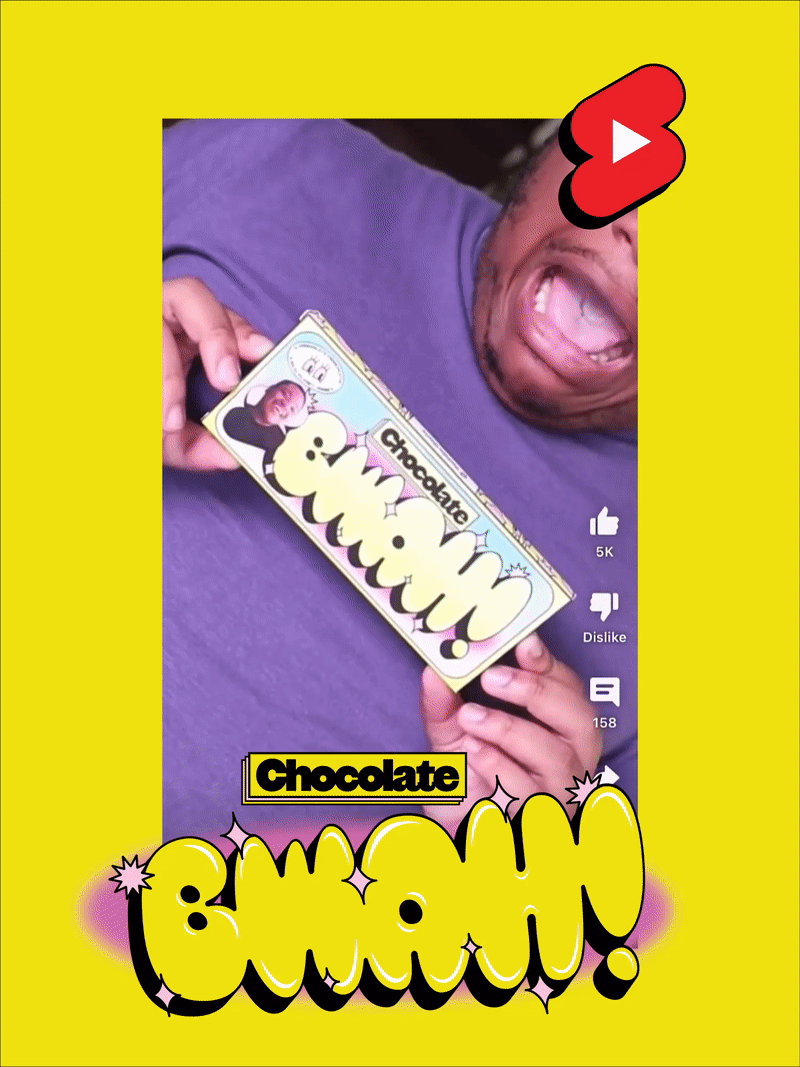
For Mac Does It / Chocolate Bwah, it came easy. His catchphrase is BWAH! It’s super juvenile, but also flat out hilarious. It’s loud and colorful and playful, so we wanted something that was just a burst of fun. He’s goofy and bright and silly, so we wanted a font and illustration system to match. For this we went with Original Sans, alongside a bespoke cut of Blow Up by HvD Fonts.
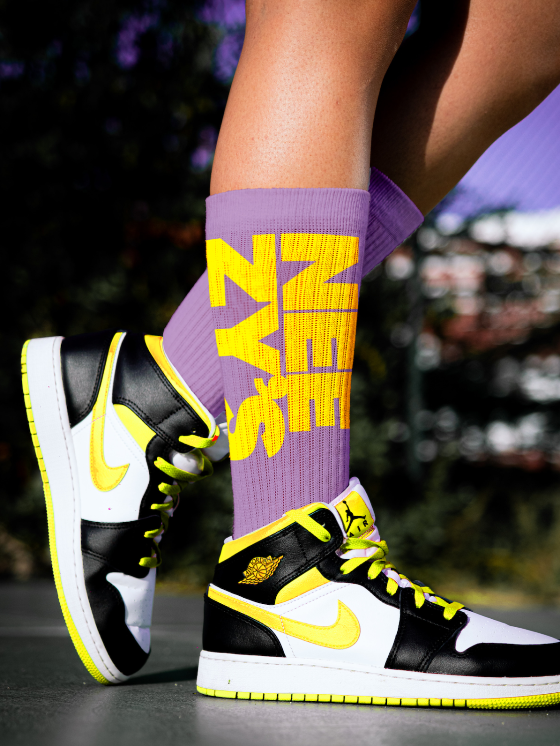
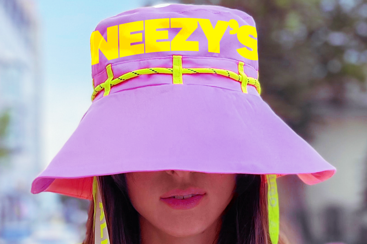
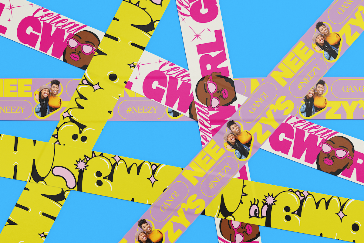
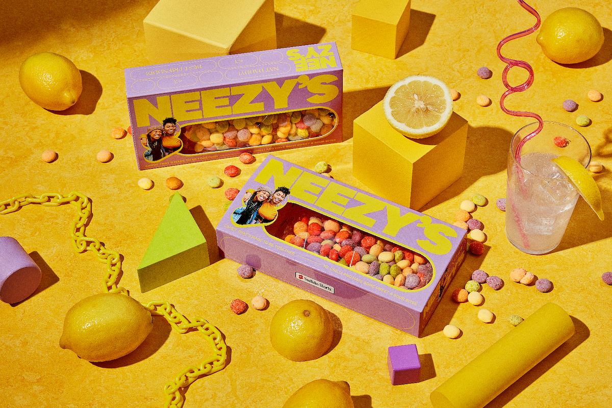
NEEZYS – matches the founders energy. They’re really into sneaker culture and always talk about drops, so we wanted a brand that felt very HYPE, which is reflected in Klim Type Foundry’s National 2 and Theophile Beaudoire’s classic Romana.
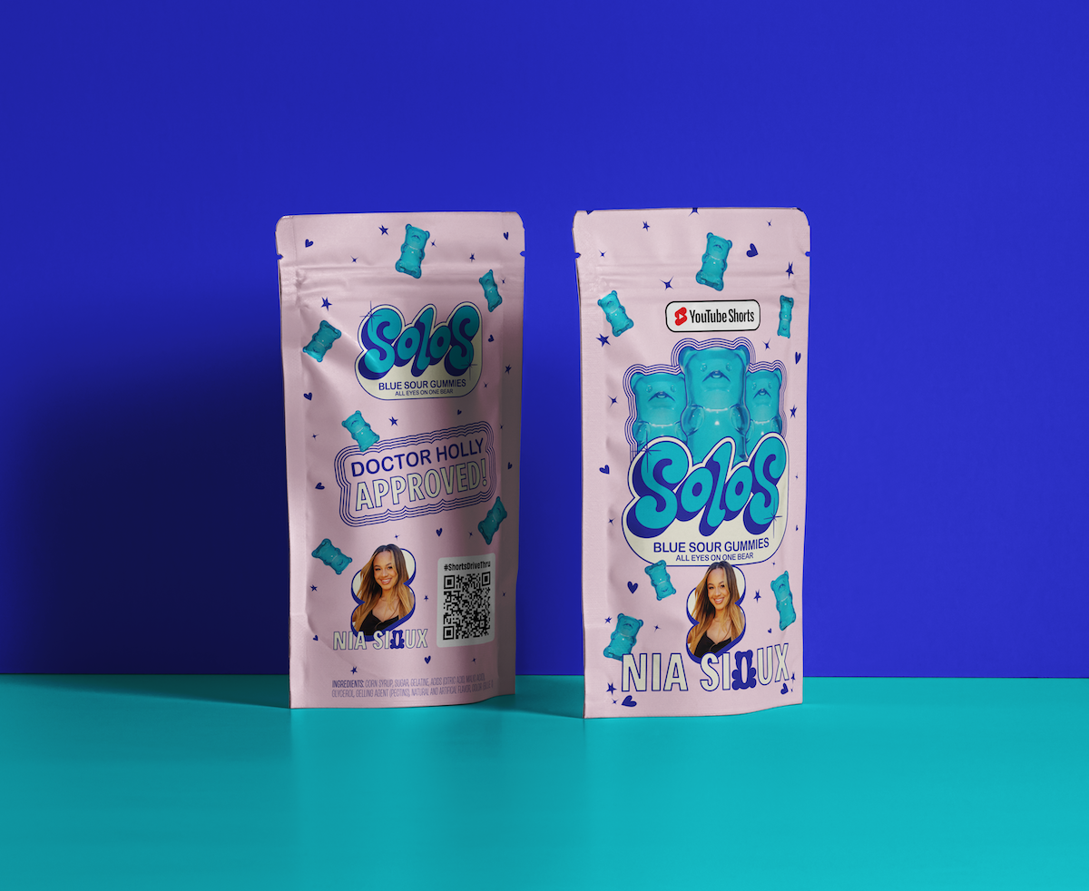
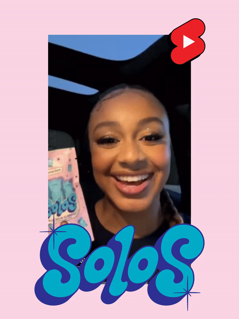
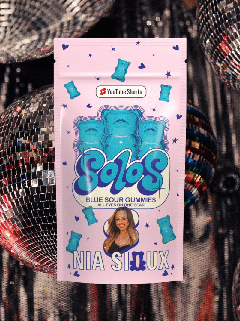
Solos – Nia Sioux is the most girly / light of the brands. She’s a dancer and loves music, so we wanted to create something fun that has this playful energy. We went light and punchy here with Agipo Bold Condensed + Arial Rounded + Lazy Bones (Customized).
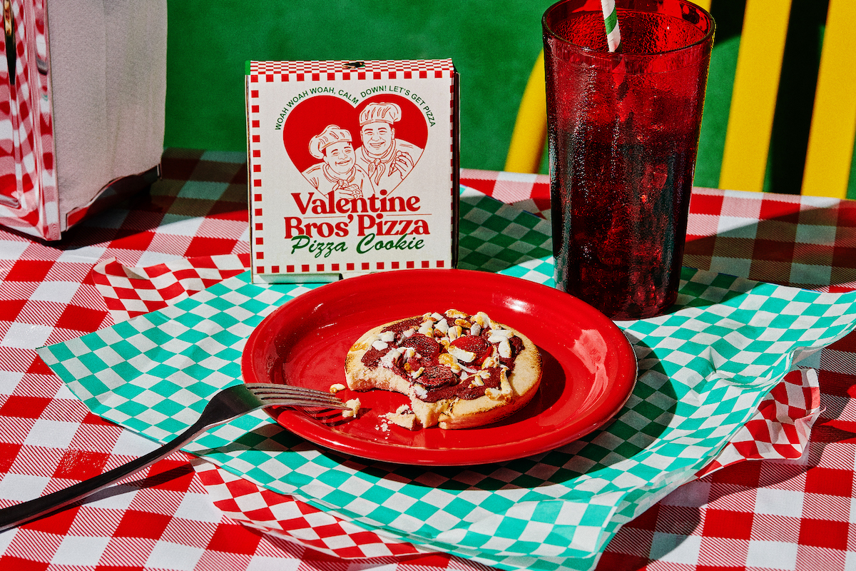
Valentine Brothers – Combining their favorite food (cookies + pizza), this snack came together really easily. We wanted to do something classic, so we followed vintage pizza box / italian restaurant codes, but also made it a bit modern to match the gen z vibe. The best friends / brothers are so warm, kind, and their name is Valentine, so a heart really fit the bill. We went big on having their faces on the front of the box, because we knew how much they’d appreciate it too. We wanted to be really classic here, so we harnessed these core fonts to get our message across: Recoleta Bold + Brush Script Medium + Arial Bold.
ZLM: Thank you!
Discover more about this project via Saint-Urbain, or the project’s interactive website.


