
In this interview, Sarah Bourge, the founder of a Paris-based branding studio, touches upon intuitive design, serif fonts, and elevating brands through typography.
Romantic – that’s the word Sarah Bourge, the Franco-American founder of branding studio French Bre(a)d, resonates with the most after a friend once used it to describe her work. “In a way, branding is a romanticized version of your business,” explains the creative who finds beauty in all forms and romanticises most things. Right from the start, Bourge’s path aligned naturally with the arts. Though she was fond of photography and interior design, graphic design wasn’t initially on her radar. Then again, that by itself helped her gravitate and understand composition, balance, and contrast, which are essential elements of graphic design.
In pursuit of an Art Direction degree, she developed a passion for graphic design, which eventually led to French Bre(a)d. “As a true introvert and empath, I wanted to ensure that my studio projects aligned with my values,” shares Bourge. “I strive to work on design-centric and meaningful projects, establish clear and respectful communication with my clients, and pay meticulous attention to detail (a trait of my perfectionism!)”
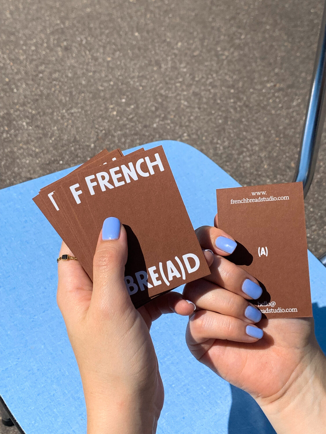
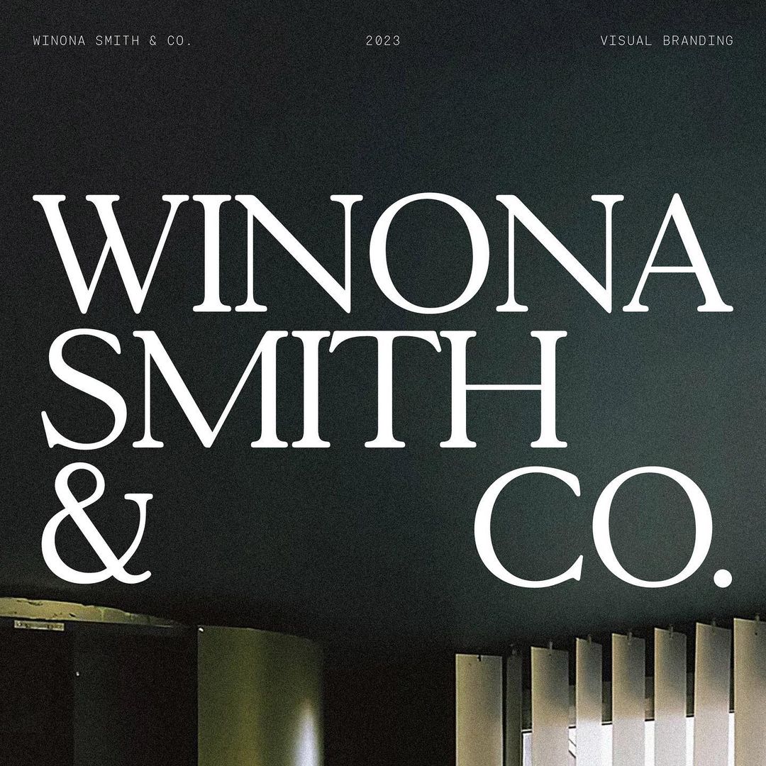
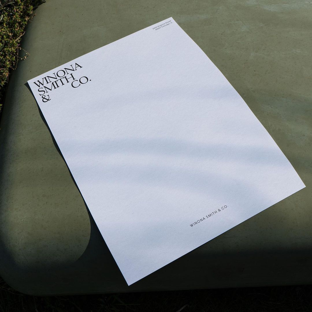
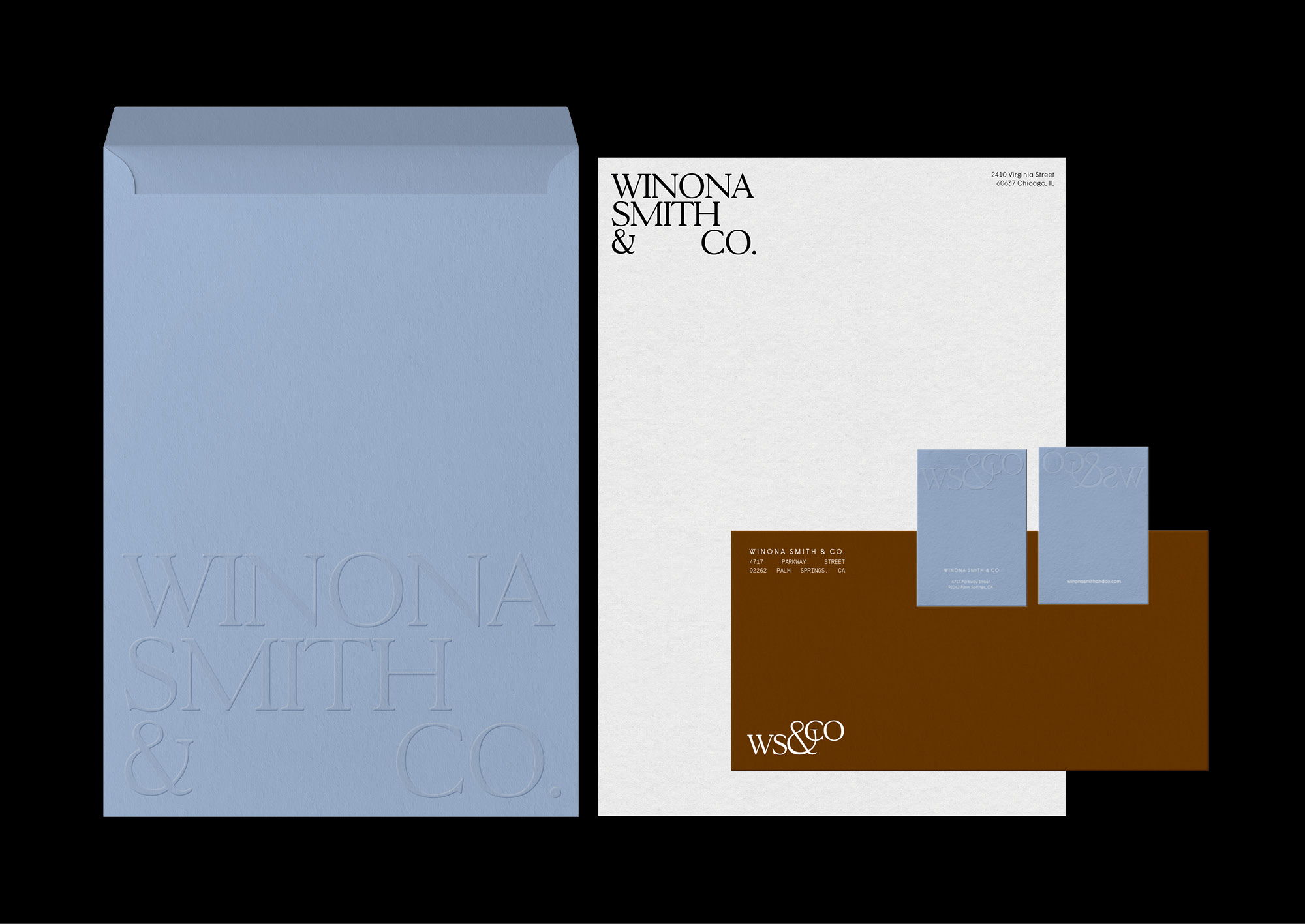
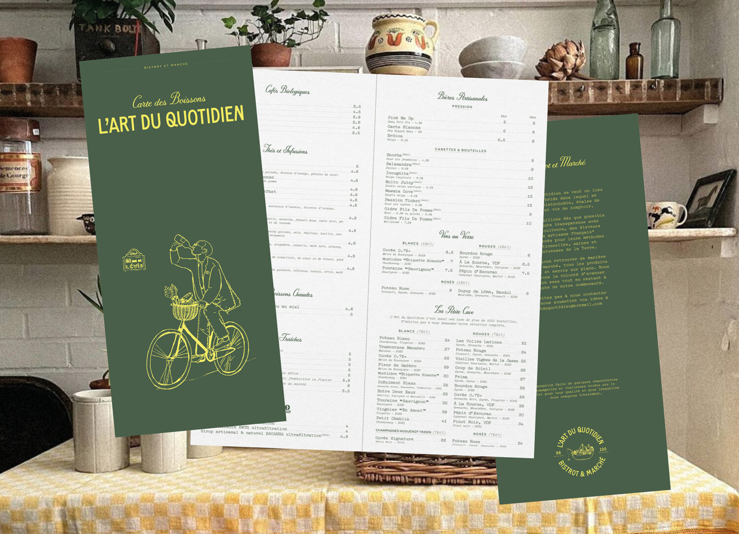
But what sets French Bre(a)d apart isn’t just Bourge’s inherent creativity; it’s her massive affinity for a bygone era, namely the ’50s, ’60s, and ’70s and their serif fonts. “Classic design will always resonate with me, but I enjoy infusing touches of modernity through colour, font combinations, or the use of fun imagery.”
Among the works Bourge holds in high esteem is Margot Lévêque’s, which she describes as possessing an elusive “romantic quality.” The font Kalice, created by Lévêque, is one of the French Bre(a)d’s signature fonts. “Some people were actually surprised that I used a sans-serif typeface for my logo, but it just felt right to me,” shares Bourge. “I’m an intuitive person, and there are things that can’t always be explained in words.”
Classic and traditional fonts like serifs can get a lot of heat for being “old-school,” but when they’re used well, they’re anything but boring. Bourge is drawn to the typeface’s elegance and depth of emotion, which enriches her work. “I have a soft spot for beautiful serif display fonts,“ she says. “That being said, when creating brand identities, I always test various options, and sometimes sans-serif fonts are the best choice for certain projects. I often mix serif and sans-serif fonts to establish hierarchy.”
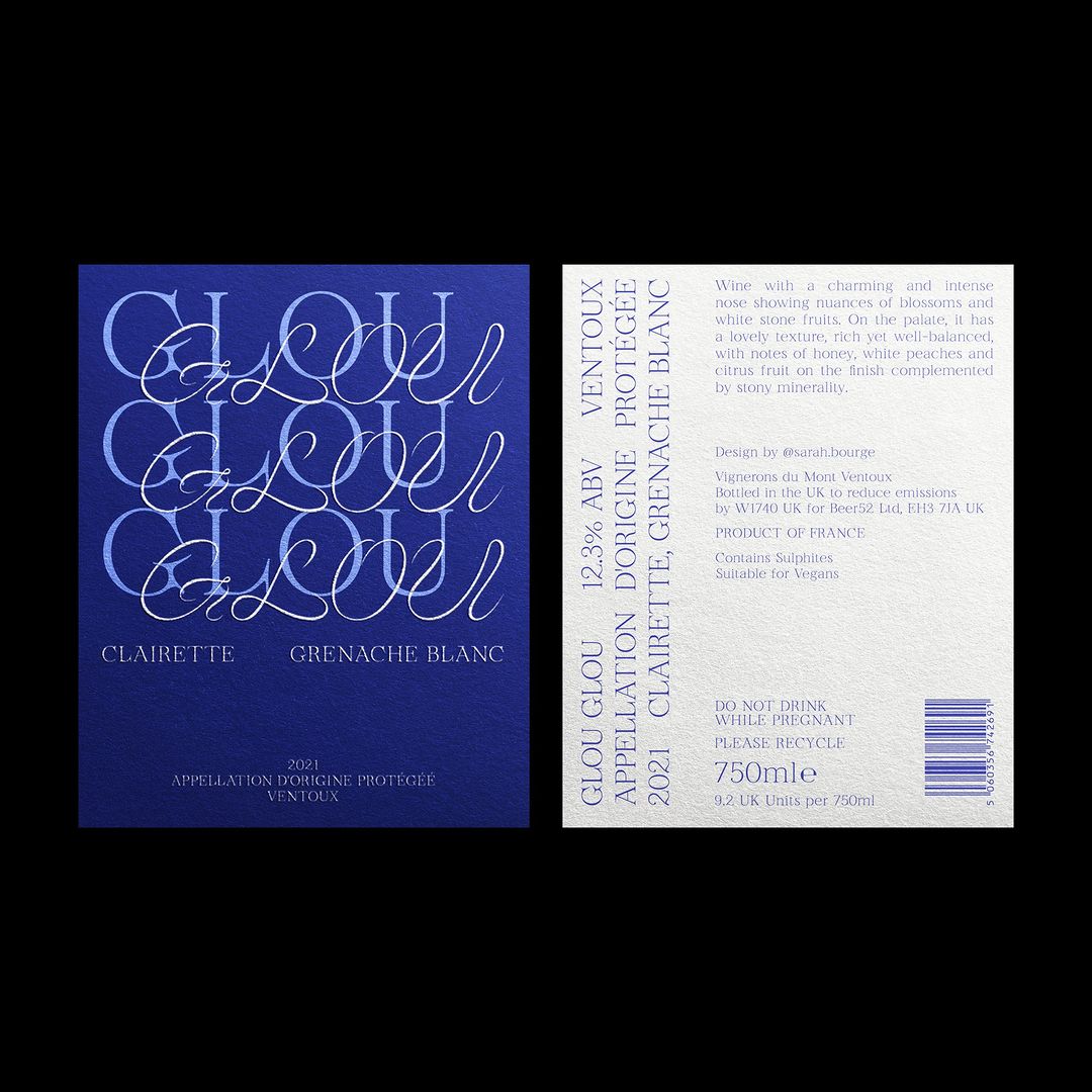
Within the French Bre(a)d branding bakery, typography is a “core ingredient in conveying emotional expression.” Ultimately, well-crafted branding understands emotional connection as an essential commodity. The studio’s portfolio engages with a contemporary yet refreshingly classical aesthetic, highlighting Bourge’s appreciation for fonts’ profound impact on brand identity. “Whether it’s conveying a specific personality or ensuring coherence throughout your brand, selecting the right fonts can significantly reinforce brand recognition,” says Bourge. “Finding the perfect pairing is also crucial, and we’ve noticed a trend on Instagram for about a year now, with designers recommending font pairings. I’m particularly discerning with fonts and sometimes spend hours searching for the ideal match.”
One of the studio’s defining characteristics is its consistency of style across various projects, regardless of their aesthetics. Due to her detailed approach to visuals, Bourge’s typographical choices always complement minimal and crowded imagery. During her font research phase, Bourge examines how a specific typeface interacts with elements such as colour, photography, and scale. For editorial projects, she prints out test samples to check the legibility of the typography; however, choosing a font size becomes more of a stylistic decision than a practical consideration.
The essence of Bourge’s approach is often intuitive. However, that intuition is also cultivated through “years of daily exposure.” Choosing the right font is quite an exciting moment, and font licensing is crucial. “When I present fonts to my clients that I’ve selected for a project, I make sure to check their license usage,” says Bourge. “Sometimes I will take care of purchasing the font licenses for them because they’re not sure how it works, and add it to their final invoice.”
But no matter how limited her client’s typography knowledge is, Bourge always makes sure to clarify most details to them, such as mentioning in contracts that they need to pay for the license to use it themselves, as well as additionally explaining how “purchase and install the fonts on their personal computers.”
This attention to detail ensures legal compliance as well as improves the client’s understanding of font usage. Building on this thorough approach to font usage, Bourge extends her meticulousness to every aspect of her projects.As part of her methodology, she tests fonts on various scales, layouts, and collateral materials to determine which fonts add the most effective touch to branding- whether she is creating a brand from scratch, building social branding, or designing websites. Bourge ends it with, “If I find something that’s just ‘okay,’ I’ll continue testing until I discover a combination that truly resonates with my eye.”
Thank you Sarah for your insights! You can follow her studio on Instagram here.
Liked this feature? Read more graphic design studio insights here.


