
Curated by our TYPE01 team and featuring typefaces designed by a diverse group of global creatives, Type Department offers a wide selection of typefaces to meet every design need and preference. As our catalogue continues to grow each day, we want to highlight some of the fantastic fonts that we have recently added. These fonts range from playful and experimental (taking inspiration from dominoes, eggs, and spaghetti) to sleek and modern. Without further ado, here are 12 of the newest additions to our collection.
Classic and Contemporary Typefaces
From AcidType, a British digital type foundry, we have two new additions.
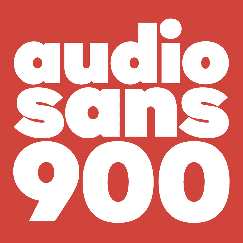
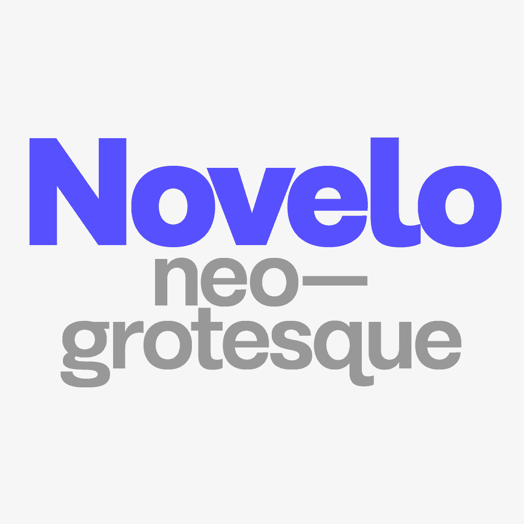
Audio Sans: a six weight geometric sans-serif typeface inspired by vintage album covers and mid-20th century design. Despite its retro influences, Audio Sans feels fresh and contemporary, making it the perfect choice for applications across editorial and branding. Novelo: a neo-Grotesk typeface designed with everything a designer could ask for. With its comprehensive language support, alternate characters, and nine weights, Novelo offers flexibility and modern aesthetics.
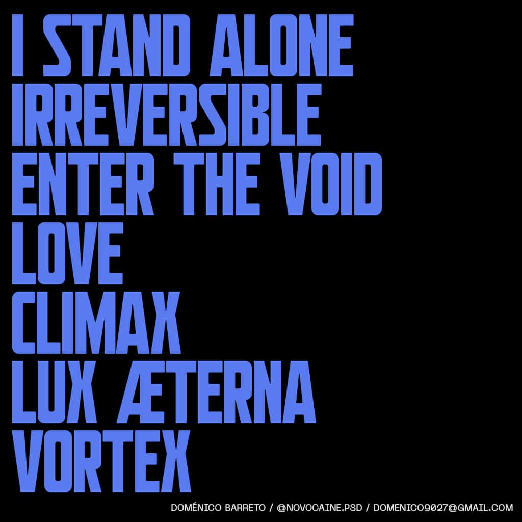
Next, we have Kontinent, a powerful sans serif display uppercase typeface by Doménico Barreto. With slightly heavier horizontal strokes and clean, simplified shapes, Kontinent delivers plenty of impact, making it perfect for headlines and titles.
Historically Influenced Typefaces
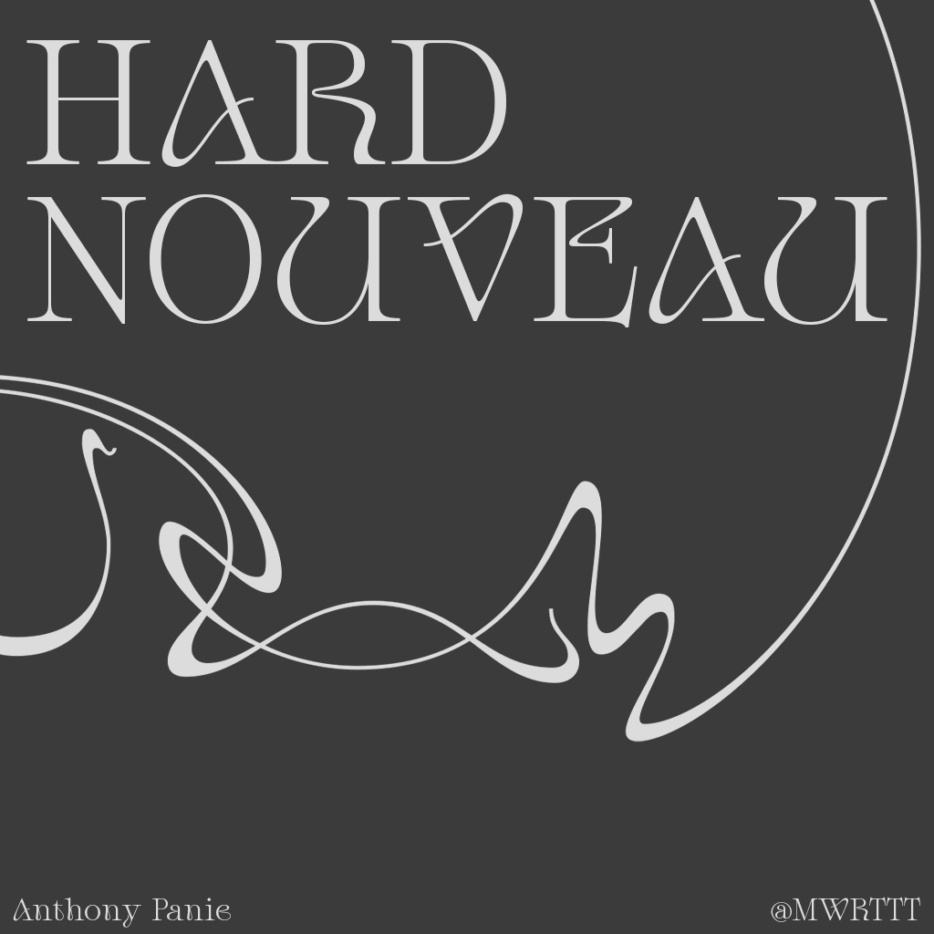
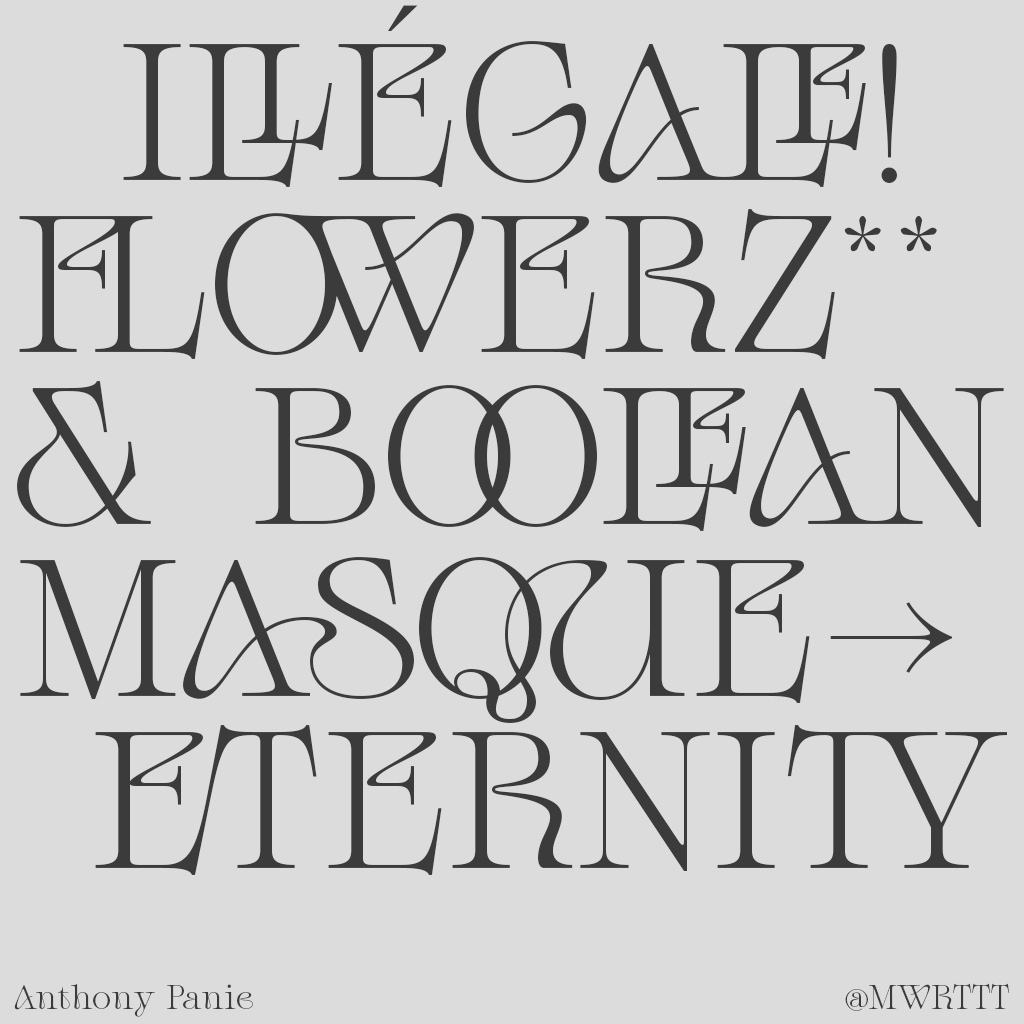
Anthony Panie’s Hard Nouveau is a display typeface also inspired by Art Nouveau’s paintings and architectural shapes, blended with modern serif designs. Thanks to its swirling forms (including 51 ligatures) it proves an exciting option for decorative purposes.
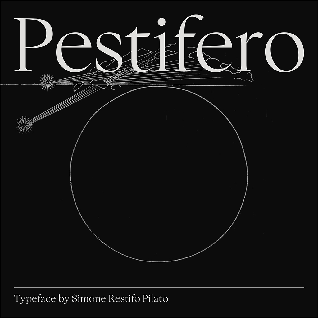
Simone Restifo Pilato brings us Pestifero, a wonderfully sophisticated contemporary humanist serif typeface. It blends nostalgia and beauty, taking inspiration from Renaissance works and the book ‘Informatione del pestifero et contagioso morbo’, printed in 1576. Pestifero aims to create a contemporary font while following the aesthetic values of classical typography. With 434 Glyphs that include old-style figures, proportional lining figures, standard ligatures and discretionary ligatures, Pestifero excels in editorial applications.
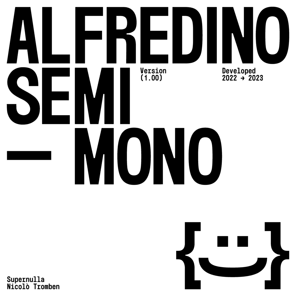
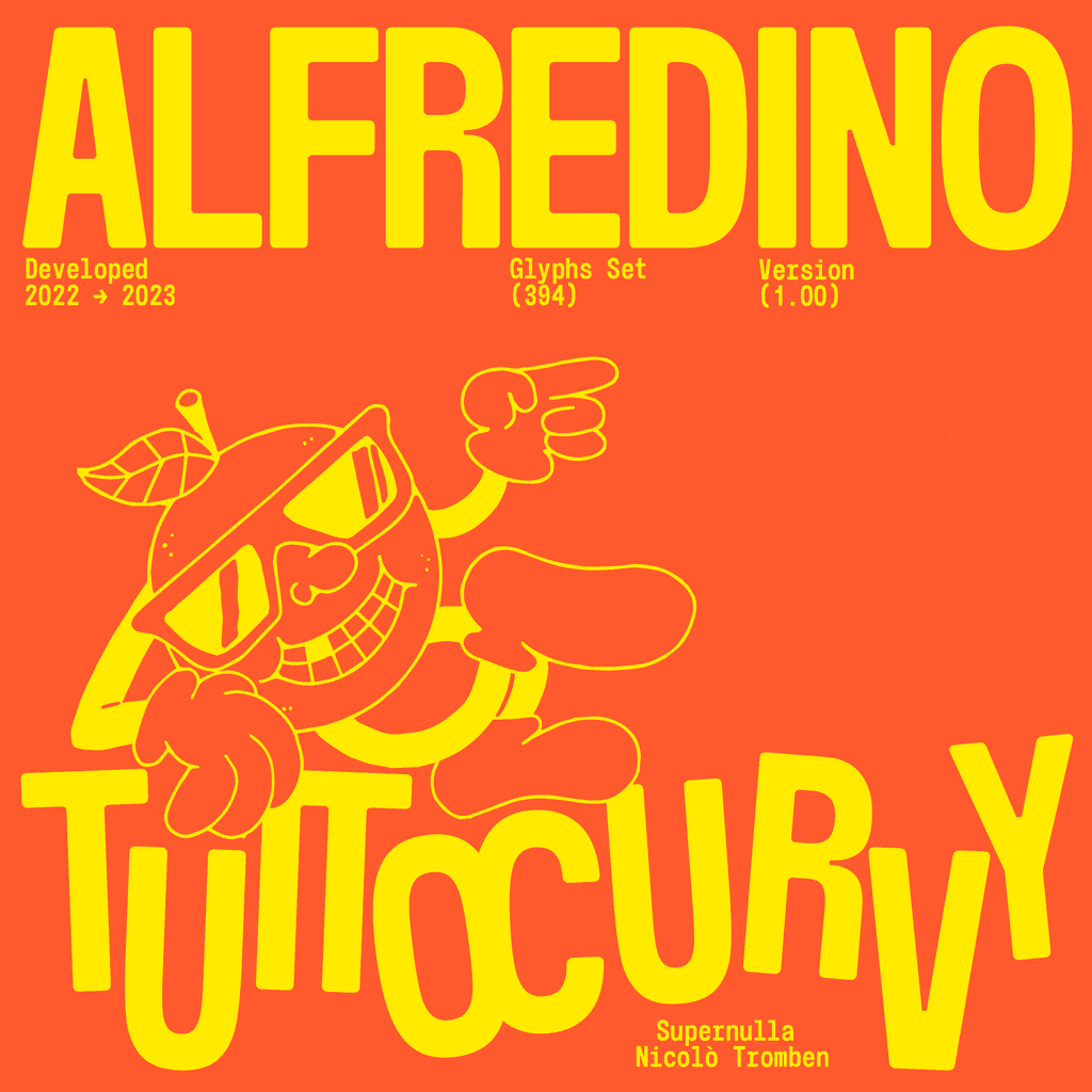
Supernulla, a creative studio based in Italy, introduces Alfredino Semimono to their collection of typefaces on Type Department. This typography project embodies a dynamic and slightly vintage aesthetic while maintaining a clean and contemporary look. It’s robust, it’s fun, and it packs plenty of character. Equipped with three distinct styles – Semimono, Semirounded, and Tuttocurvy – Alfredino Semimono guarantees versatility for different design projects.
Playful, Exploratory, and Fun Typefaces
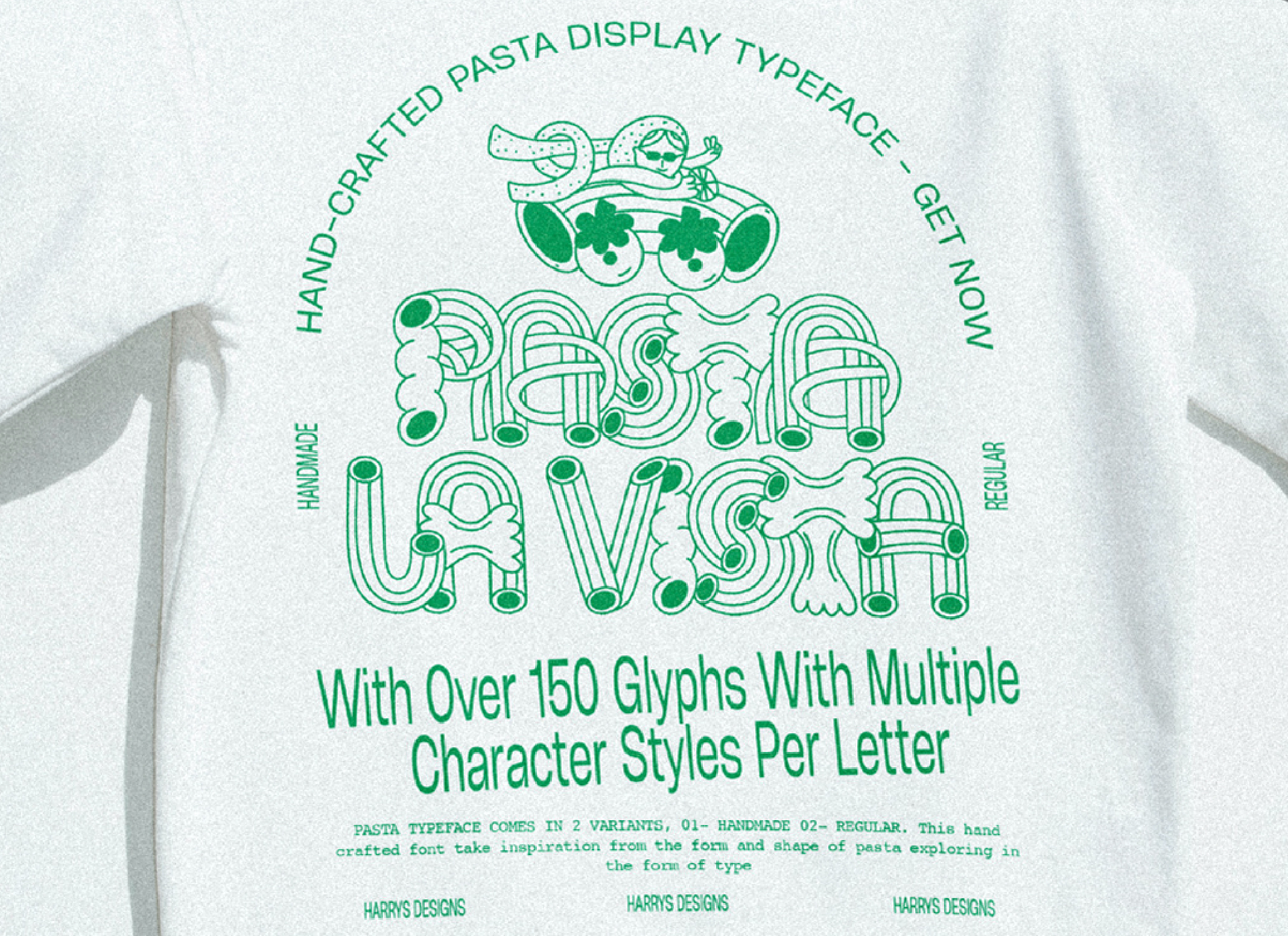
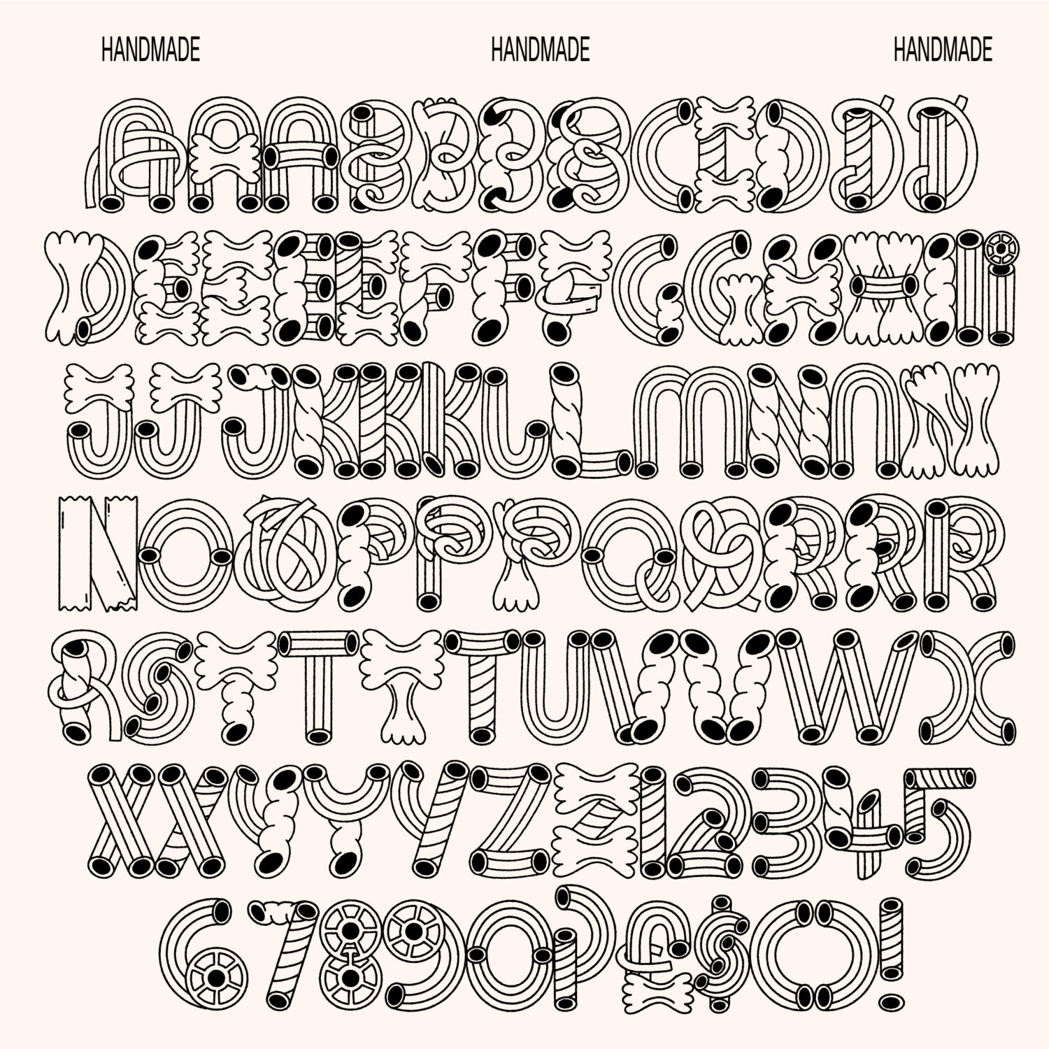
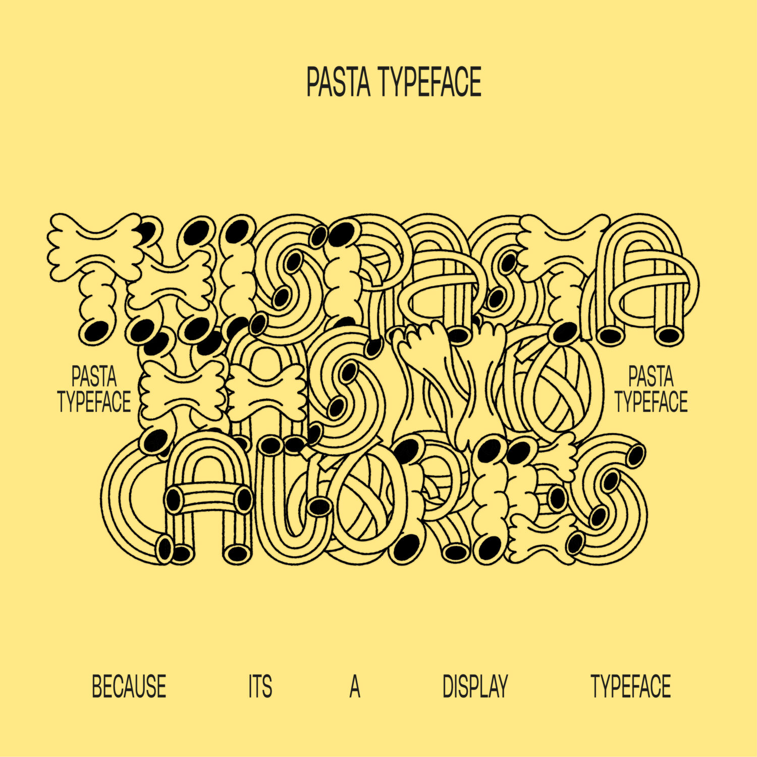
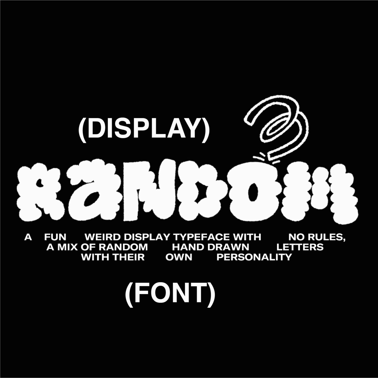
Looking for something with a playful, illustrative flair? We’re delighted to now be hosting several typefaces of Sheffield-based designer Harry Wright. Random, as the name implies, is constructed from an eclectic mix of hand-drawn letters. Thanks to its wild personality, it is well suited for boldly experimental and playful design works. Likewise, Pasta speaks for itself: a delicious linear typeface inspired by the beloved carbohydrate.
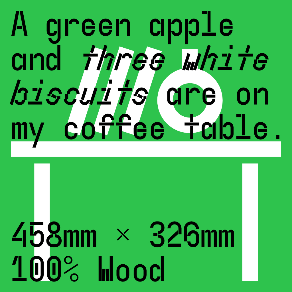
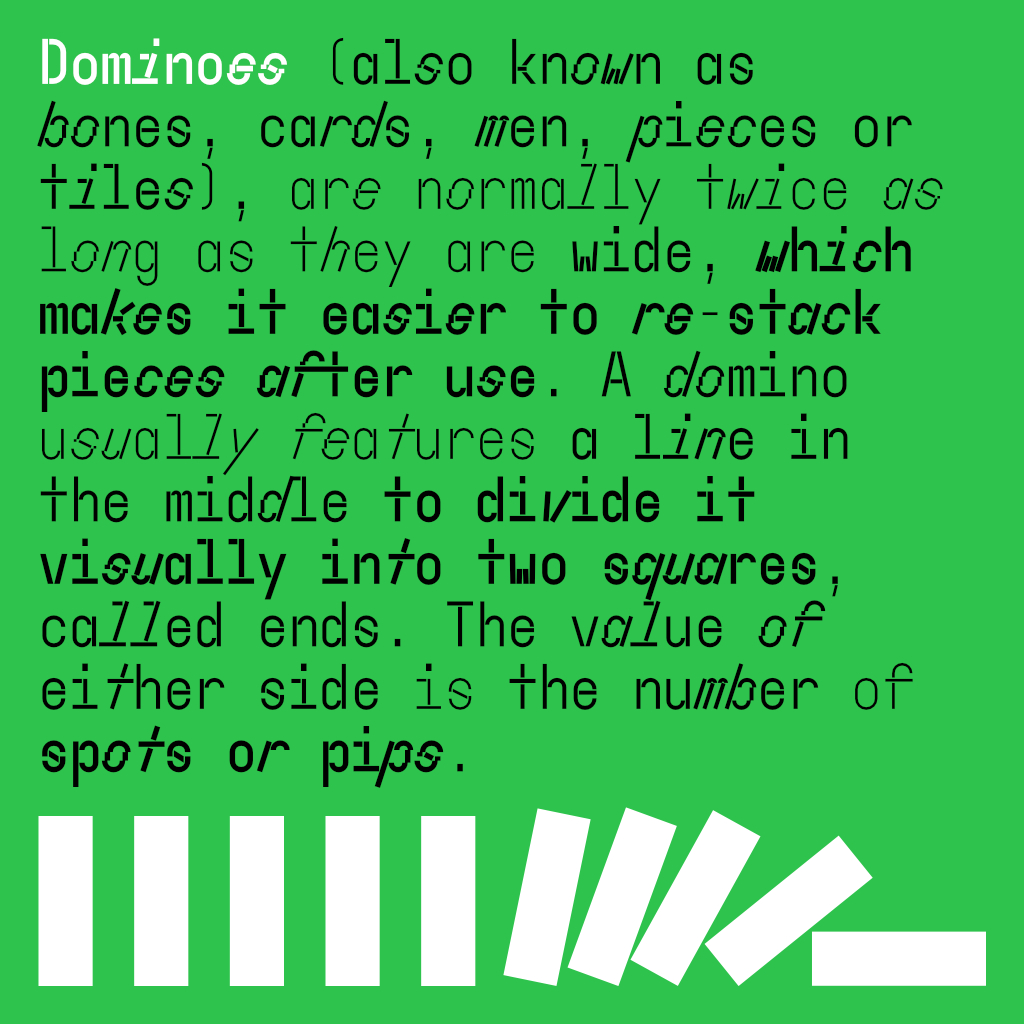
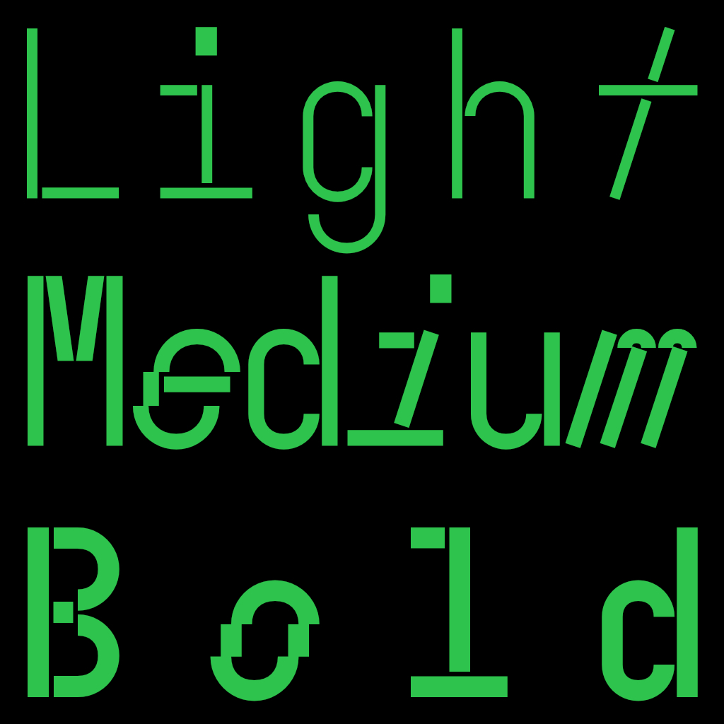
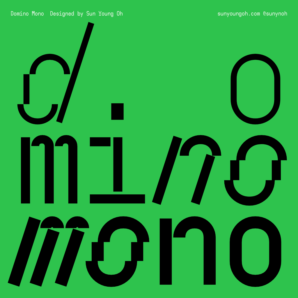
For something a bit more geometric, Sun Young Oh, an independent type and graphic designer currently based in South Korea, presents Domino Mono, an experimental monospaced variable typeface inspired by the movement of toppling dominoes. Domino Mono offers users the ability to play with both weight and angle axis to achieve their desired look. It maintains the same letter width throughout the entire font family, ensuring legibility and rhythm in long paragraphs.
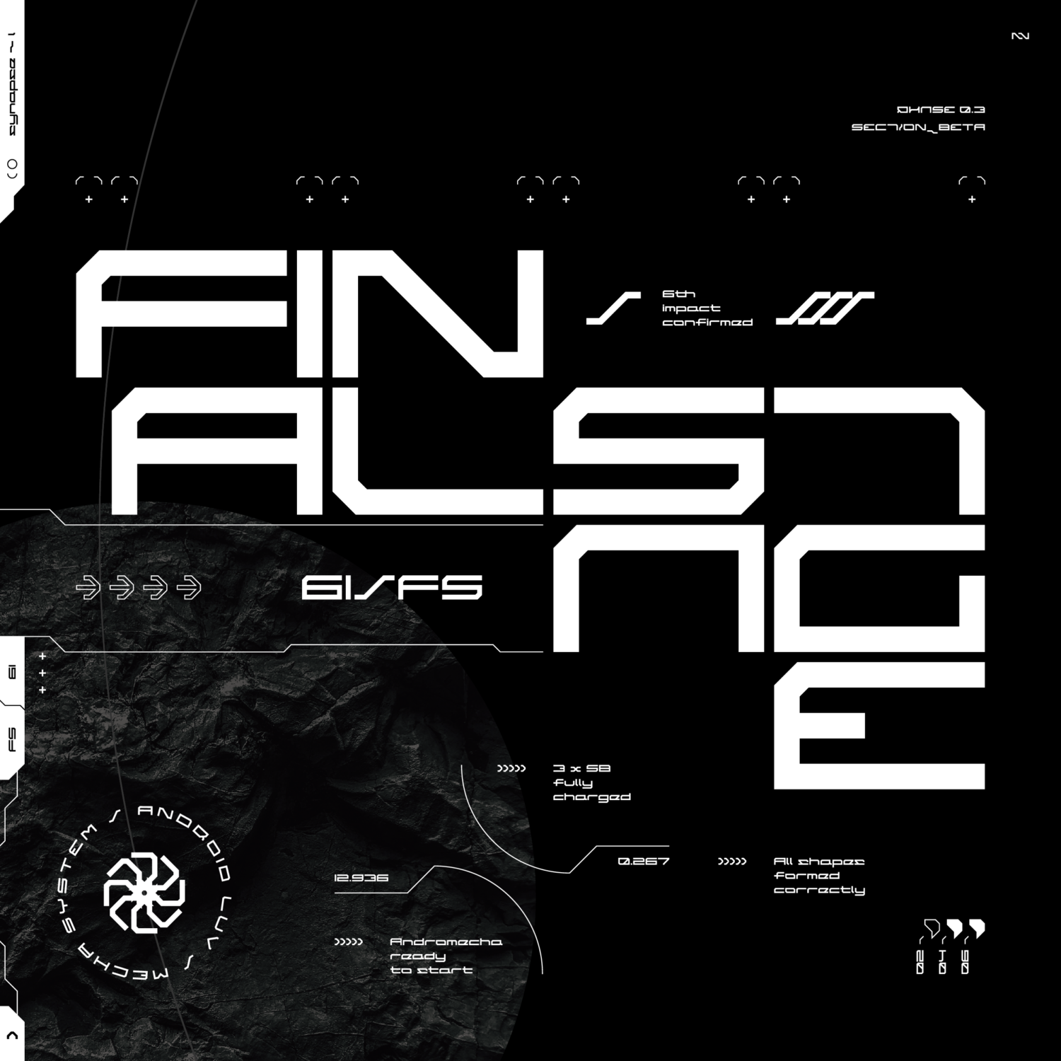
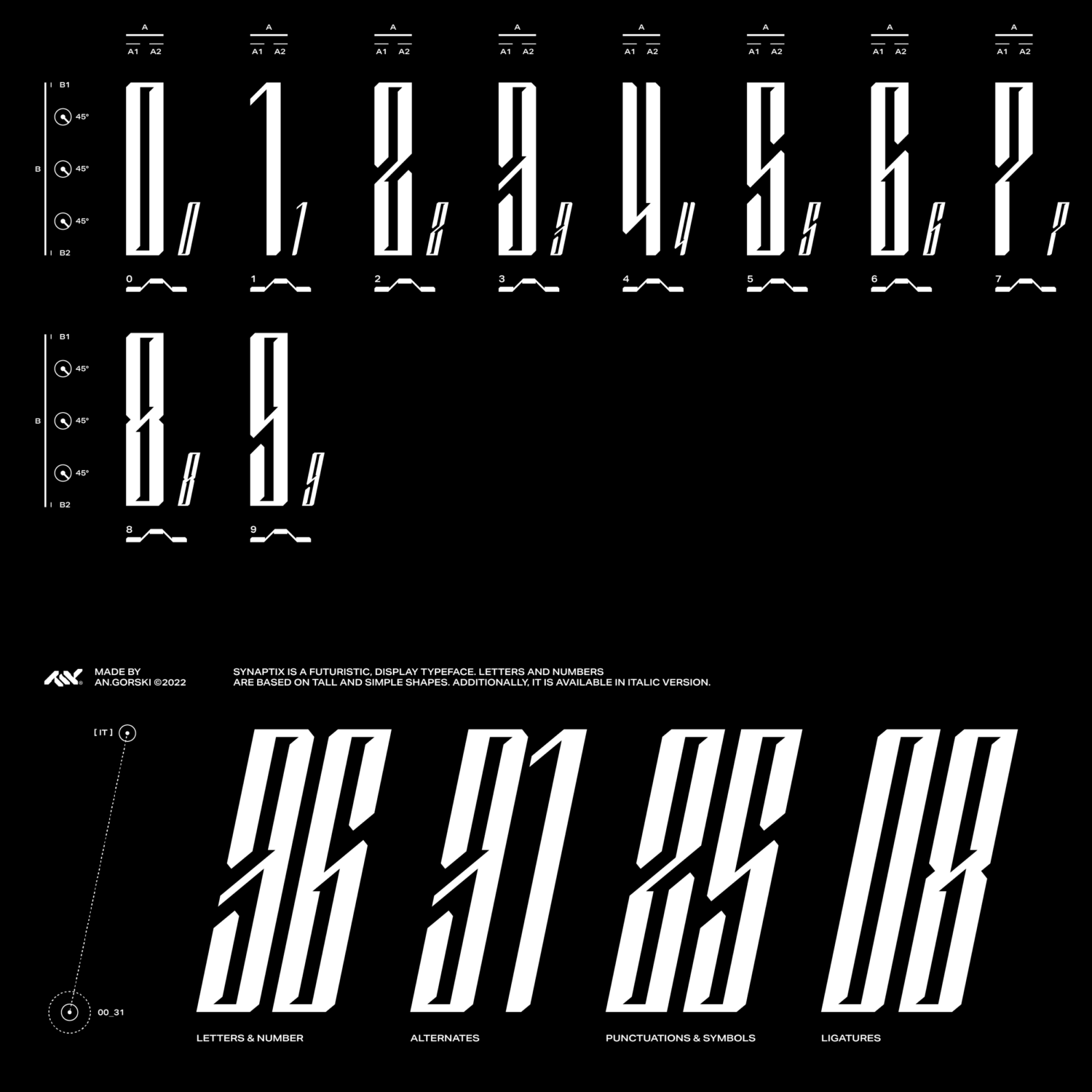
Poland-based graphic and digital designer Max Górski, taps into cyber/tech aesthetics, with his range of typefaces. Best exemplified by the highly-acclaimed Andromecha, a widely structured and square with 45 ° cuts that captures the “androids and mecha vibe.” Another of his creations, Synaptix, is an impactful futuristic display typeface, featuring sharp shoulders and tall and slender forms.
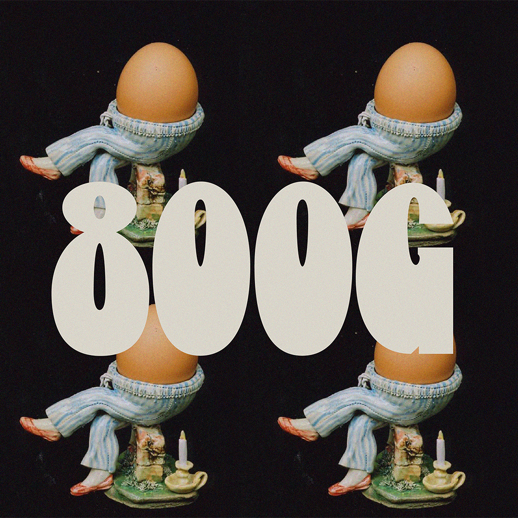
Lastly, we highlight 800G by type designer Jazlyn Heiman. Round, thick, and heavy, the idea for this typeface was sparked when Heiman was looking to satiate a craving for a simple boiled egg as a late-night snack. It’s no surprise that the defining characteristics of this typeface are completely informed by the shape of eggs! As part of the 130 glyph set, this typeface also has the unique offering of ‘double yolk characters’.
—-
With these additions, we continue to provide a wide selection of typefaces, and will continue to deliver many more! If your curiosity is piqued, be sure to check out these and more.
Browse Type Department’s font catalogue.
Browse more fonts that we’ve spotlighted on Type Department here.


