
Hansol.park is a Seoul-based Graphic & Type Designer currently working at Leedotype, producing Hangul fonts and graphic design. Coming across Hansol’s fonts Sum (숨) and Bomsori (봄소리), we couldn’t help but notice the stark contrast between his gentle font styles and his vibrant, busy typographic posters. Wanting to know more about the designer, we got in touch to discuss his wide-spanning typographic styles.
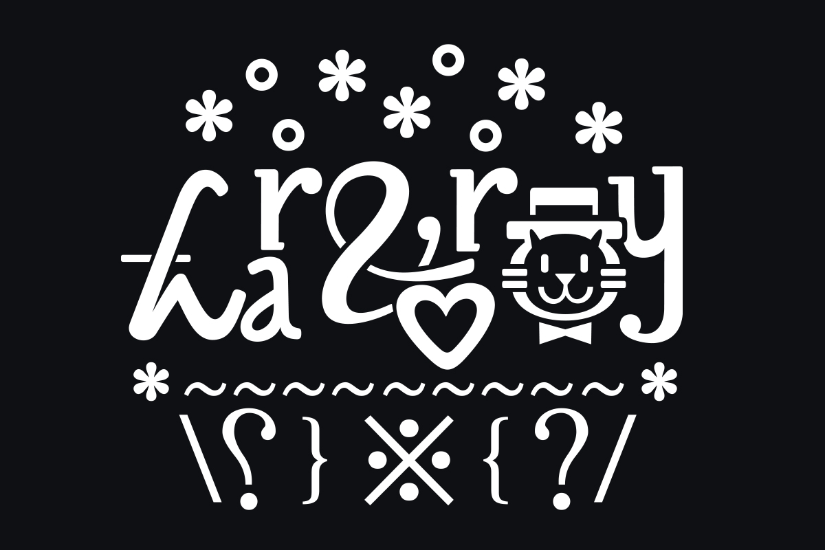
Inspired by fonts which ‘boldly break the conventional form or have overly decorative characters’, Hansol tells us these can be hard to find when it comes to Hangul fonts. ‘Hangul fonts do not have many such characters yet because Hangul has much more strokes than the alphabet’, the designer explains. ‘In addition, there are difficult conditions for all of them to harmonise with at least 2,000 characters… Minju Ham created a very decorative Hangul font called “Blazeface Hangeul“, which was so good. I hope there will be more of these typefaces.’
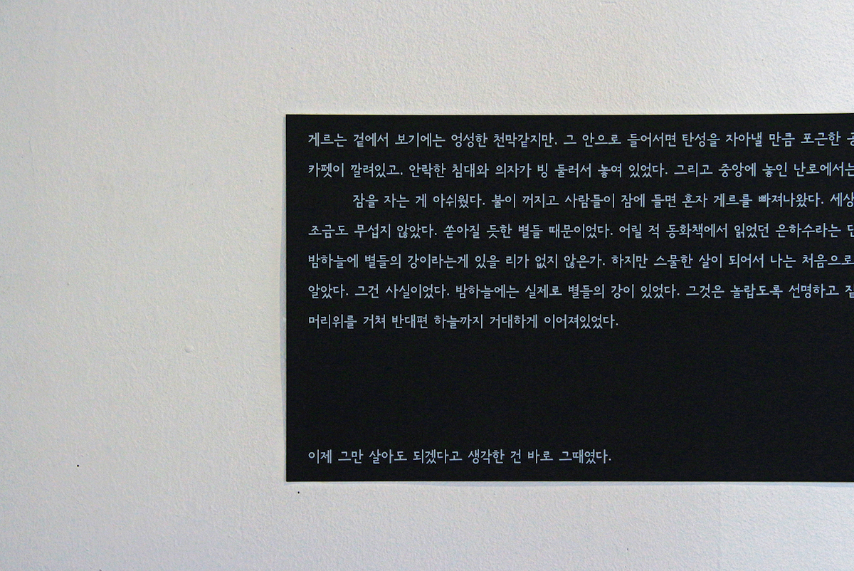
Hansol seems to have knack for translating rich, powerful concepts into the way his fonts affect readers. Sum, for example, has the rhythm of a calm, gentle breath running between the glyphs. Explaining that Sum is great in settings where reading and slow breathing can go together to create calm, trance-like atmospheres, Hansol says the font is perfect for poetry or essays. ‘The font ‘Sum (숨) [meaning ‘breath’] is Humanist Sans Serif Hangul font’, he explains. ‘Sum/숨 is a slow and thoughtful letter written with a blunt pencil. We sometimes use the expression “quiet enough to hear the sound of breathing” when describing a quiet situation. I got the idea here and used it as the name of the typeface’.
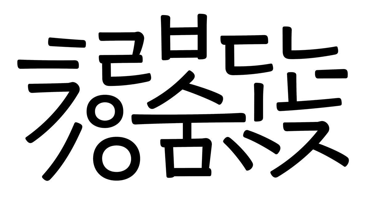
‘I had to observe what it looked like to write with a pencil, so I literally slowly wrote the letters myself and observed their characteristics’, Hansol continues. ‘This is why the angle of the stroke is not steep and the thickness difference is minimal. The case of hastily written handwriting is quite the opposite. Making fonts for small sizes was quite a difficult task for me. Something wasn’t satisfactory, so there were two big changes in the middle and I’ve been working on it for nearly three years.’
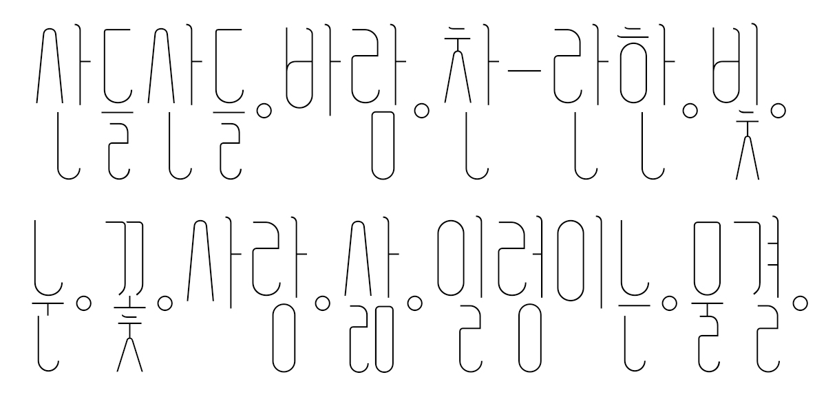
Similarly, Hansol’s first ever font Bomsori (봄소리) is a powerful manifestation of its concept. Translating as ‘sound of spring’, Bomsori was initiated from work created in a lettering class and, unlike the final result, the designer tells us it began as extremely complex and decorative; heavily adorned with the shapes of leaves and vines. Based on a circular grid, Hansol explains that ‘all the decorative elements were removed and completed in a simple form’, adding ‘Bomsori is meaningful to me, because I probably would not have continued to study typeface design if this project had not progressed well’.
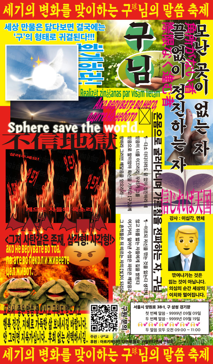
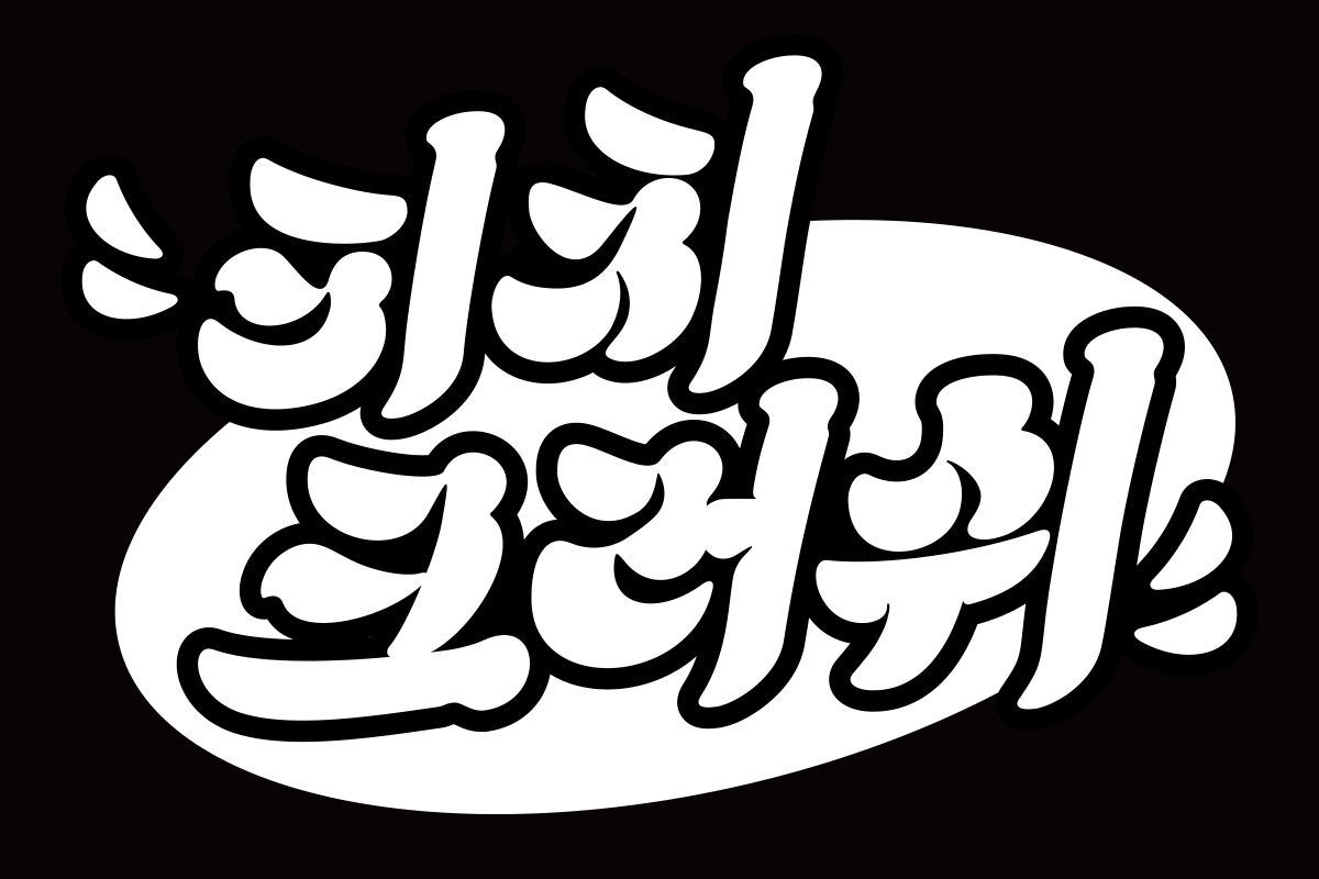
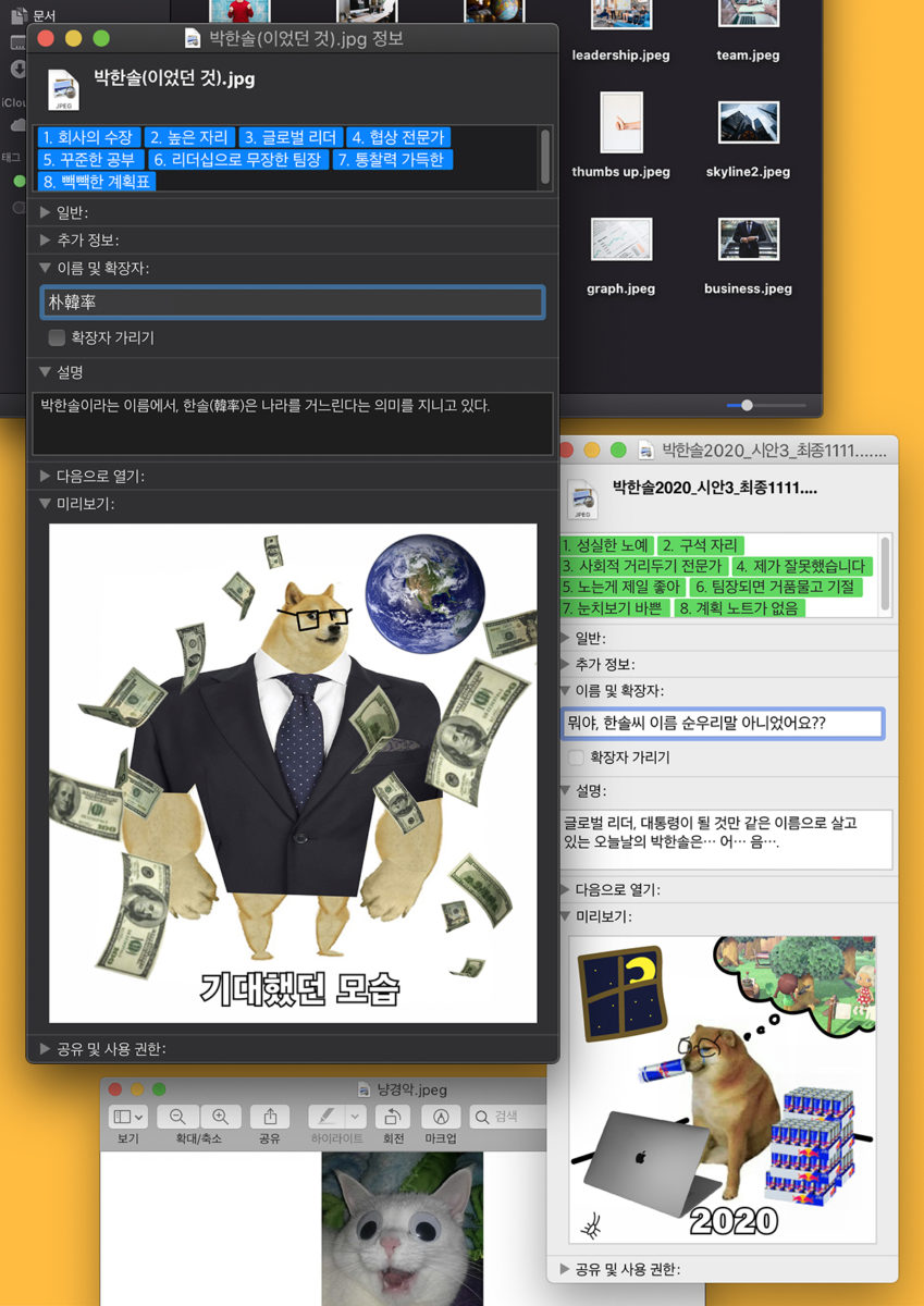
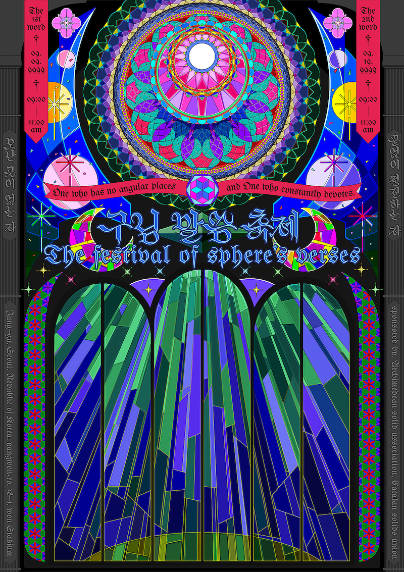
Despite Hansol’s gentle, refined, serene fonts, his graphic design and typographic posters are pretty much the complete opposite. As Hansol expands, ‘I am influenced by rough and fun things that are not made by graphic designers. Things like silly flyers and someone’s insincere pictures or Internet memes… I enjoy the process of trimming the unsophisticated visual elements. In my recent work, I’ve been making graphic posters using Internet memes as visual elements and working on them under the influence of banners of Korean fanatics’.
We’ve loved hearing more about Hansol’s work and, luckily for us, he assures us there’s going to be lots more exciting projects coming soon!


