
Amber: Hi Erik. So, tell us a bit about what you do. What is your design and career background?
Erik: Originally from Sweden, I’m a designer based in New York City with a focus on branding and graphic design. On a daily basis, I work as a Brand Design Director in Spotify’s global brand and design team. Prior to Spotify, I worked at R/GA and Stink Studios with brands such as Nike, Google, Samsung, Facebook, Twitter and Beats by Dre. And before coming to New York I studied at Hyper Island in Sweden and took on my first design jobs.
Outside of my day-to-day job, I from time-to-time take on projects as an independent designer, and the two branding projects here for Sony Music Norway are examples of that.
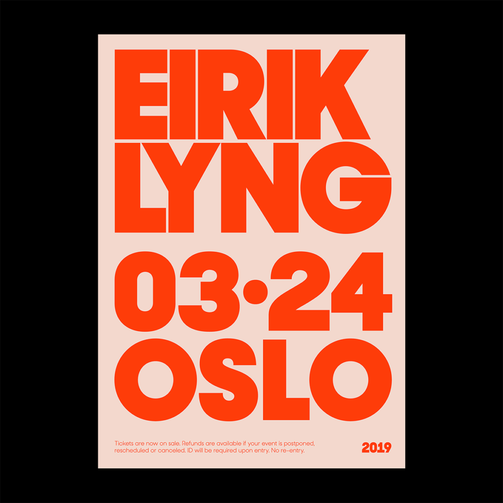
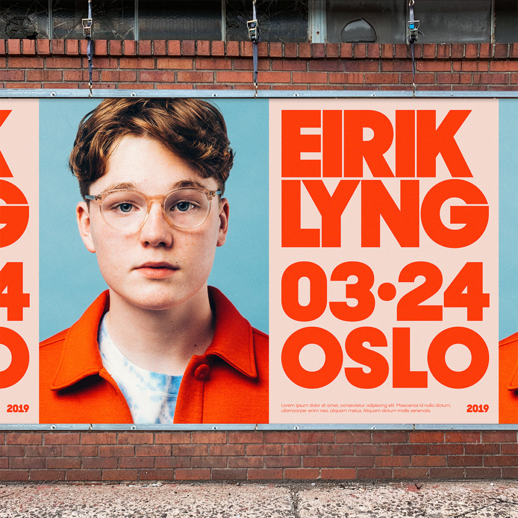
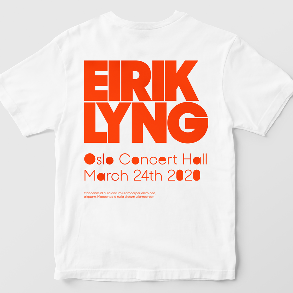
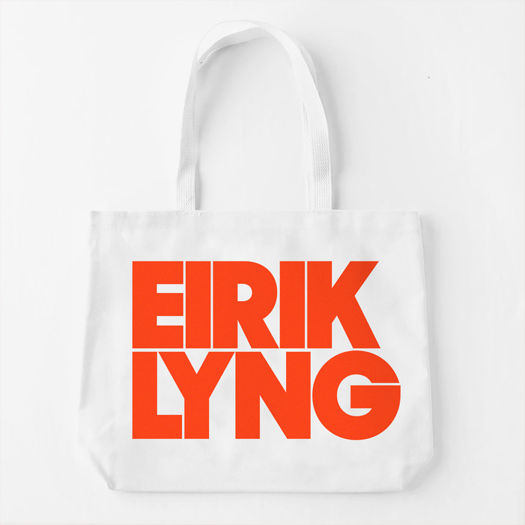
A: Can you tell us about your Eirik Lyng project? How did type act as the main component and why did you choose that typeface?
E: I was briefed by Sony Music Norway’s Creative Director Christin Malén Andreassen and team to create a visual identity and branding for the 16-year-old pop singer Eirik Lyng, and his debut single “En Som Dæ”. They had set off to go for a retro look with the photography (shot by Jonathan Vivaas Kise) and I wanted to create an identity in the same vein. Since this was his debut single we wanted something that really stood out, felt bold and could live together with the imagery, but also look striking by itself. I specifically looked for super-bold typefaces and landed on Sharp Type’s Sharp Sans Display No 2.
The logo and general graphic approach will live on, but for this first single we used colours that were inspired by the final photo we ended up using.
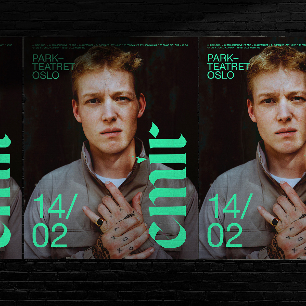
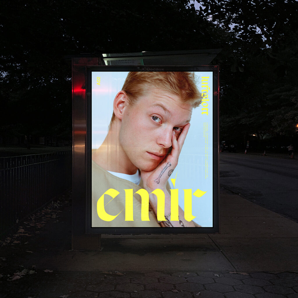
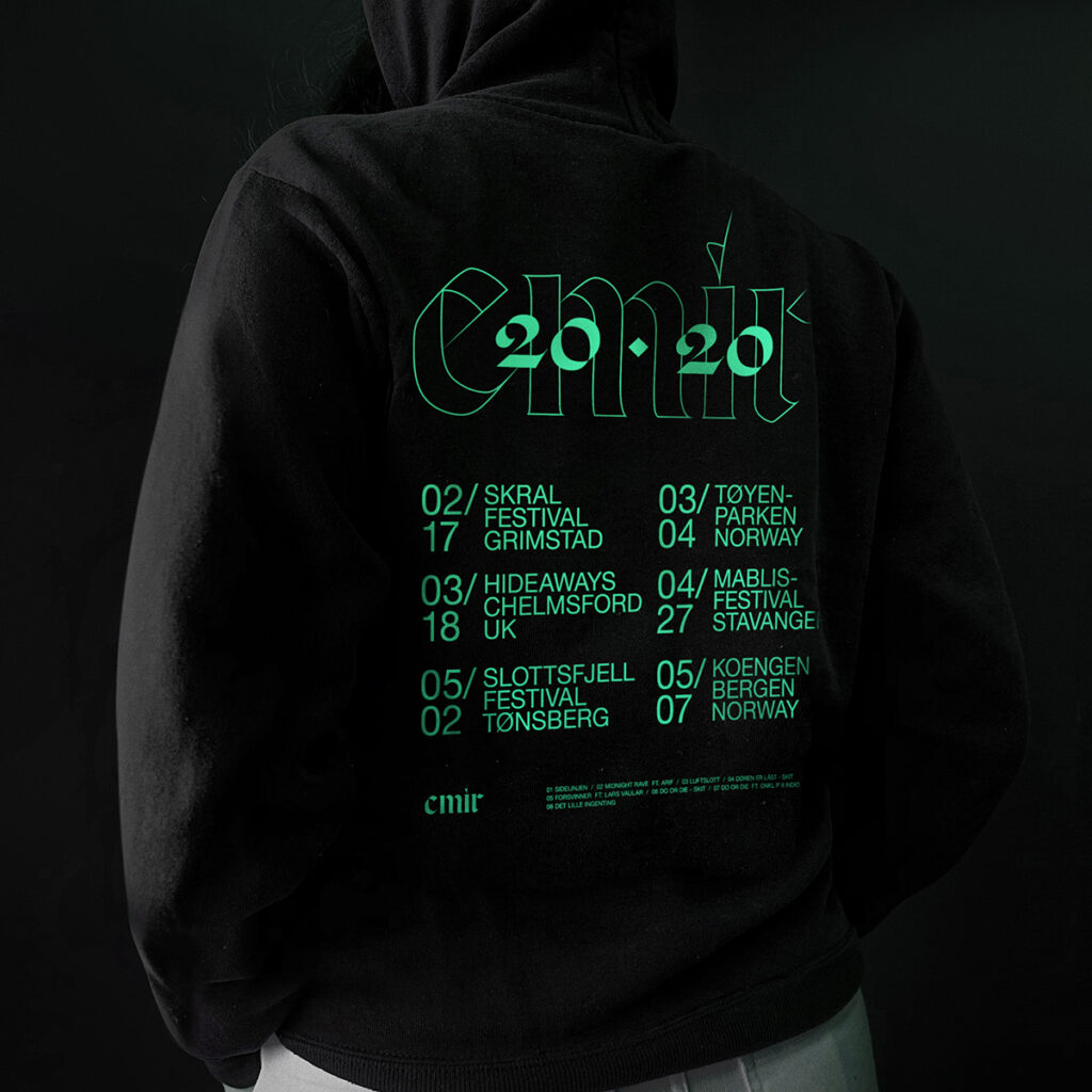
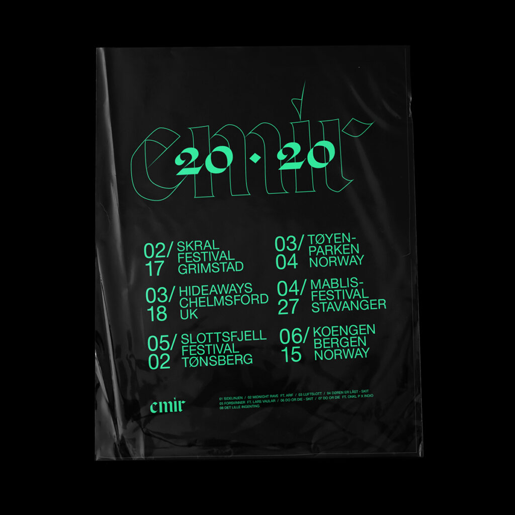
A: Good stuff. What about your EMIR project? Why did you choose a blackletter type in this scenario?
E: EMIR is a Norwegian Grammy Award winner in the category Urban in 2019 and is known for his solo act but also has several well-known acts on the side. EMIR was signed to Sony Music Norway from the very beginning of his career and after being recognized in the Grammy Awards he needed an identity to communicate the essence of his new chapter.
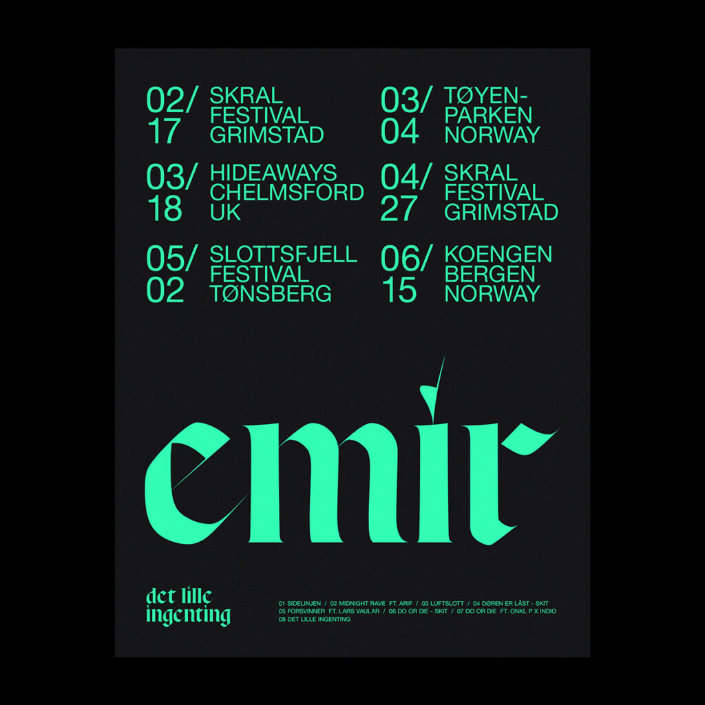
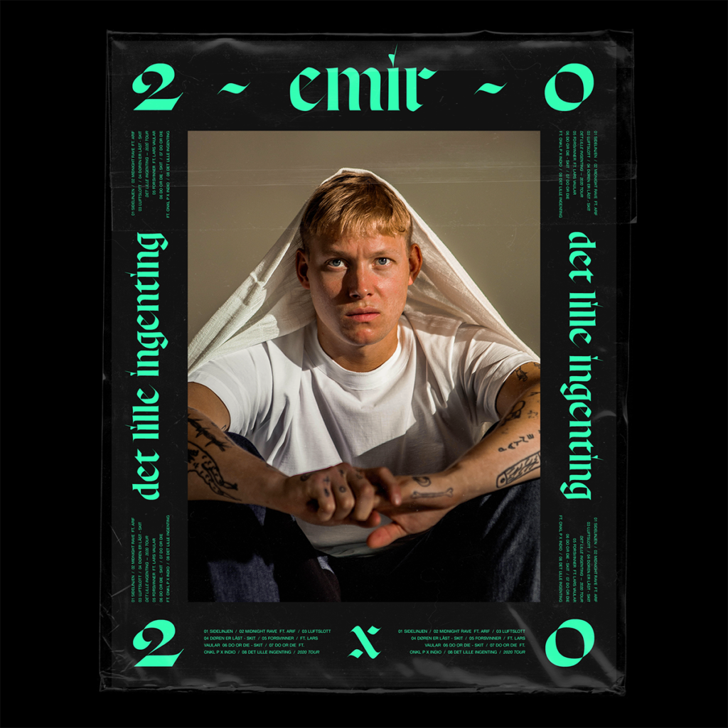
I collaborated with Sony Music Norway’s Creative Director Christin Malén Andreassen to create the identity that is based around the contemporary blackletter typeface Respira Black from Sharp Type. It’s used in combination with minimalistic details in Helvetica Neue in order to strike a comfortable balance. The gothic typography is set entirely in lowercase, adding a slightly more human feel to a typeface from a category that typically has a more aggressive tone. The idea of using blackletter typography originated from something EMIR had mentioned in early conversations. The new identity launched together with EMIR’s new album, Det Lille Ingenting, in the fall of 2019.
A: Where do you mostly shop for the typefaces that you work with?
E: I tend to follow many type foundries of all sizes and save quite a lot of references and then visit the foundries from time-to-time. I appreciate how transparent many designers are these days with who’s typefaces they’ve been using. There is so much good work out there.
A: Coming from your perspective as a Design Director, what new things would you like to see in the type industry? Is there a particular style of type you particularly enjoy or style that needs more attention?
E: I think it’s very exciting to see the diversity of typefaces out there and as much as I fall in love with certain specific styles it’s important to say that I’m very pleased with what there is to be found. I really appreciate that so many type designers keep on going back in time and bring their findings to the public with contemporary typefaces. There is so much to take from.
A: And finally, can you predict how type will be used in campaigns in the future?
E: I think type is playing a way bigger role in brand campaigns these days than a few years ago. I hope and think that brands will invest more into custom typefaces going forward. Variable fonts excite me a lot too and I’m really looking forward to seeing how these will evolve in the next years.
erikherrstrom.com / instagram.com/herrstrom
Credits: EMIR
Client: Sony Music Norway
Creative Direction: Christin Malén Andreassen
Photography: Morgan Norman, Also Known As, Ridwaan Gossarad
Type foundry: Sharp Type Co
Disclaimer: All tour dates in this work is for branding purposes only.


