Emerging Art Director/Designer, Jack Ames (@jackaames) is currently in his final year studying Design for Publishing at NUA (Norwich University of Arts) and has already landed some impressive work; in particular producing design work for local music festivals and events. ‘My interest in design is pretty deep rooted in my childhood,’ he explains, ‘… both my folks worked in a theatre when I was a kid, so I grew up around a lot of designers, carpenters and general creatives from a really young age.’ Jack’s early inclination toward creativity and design appears to have lead him to accomplishing quite a variety of work early on in his career; exploring not only editorial design, but more recently, brand identity and advertising projects.
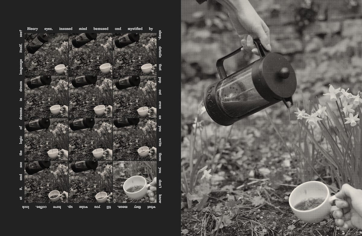
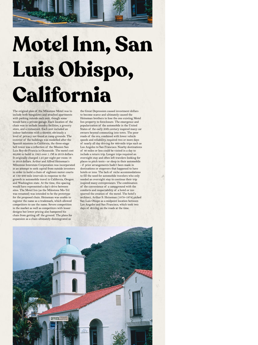
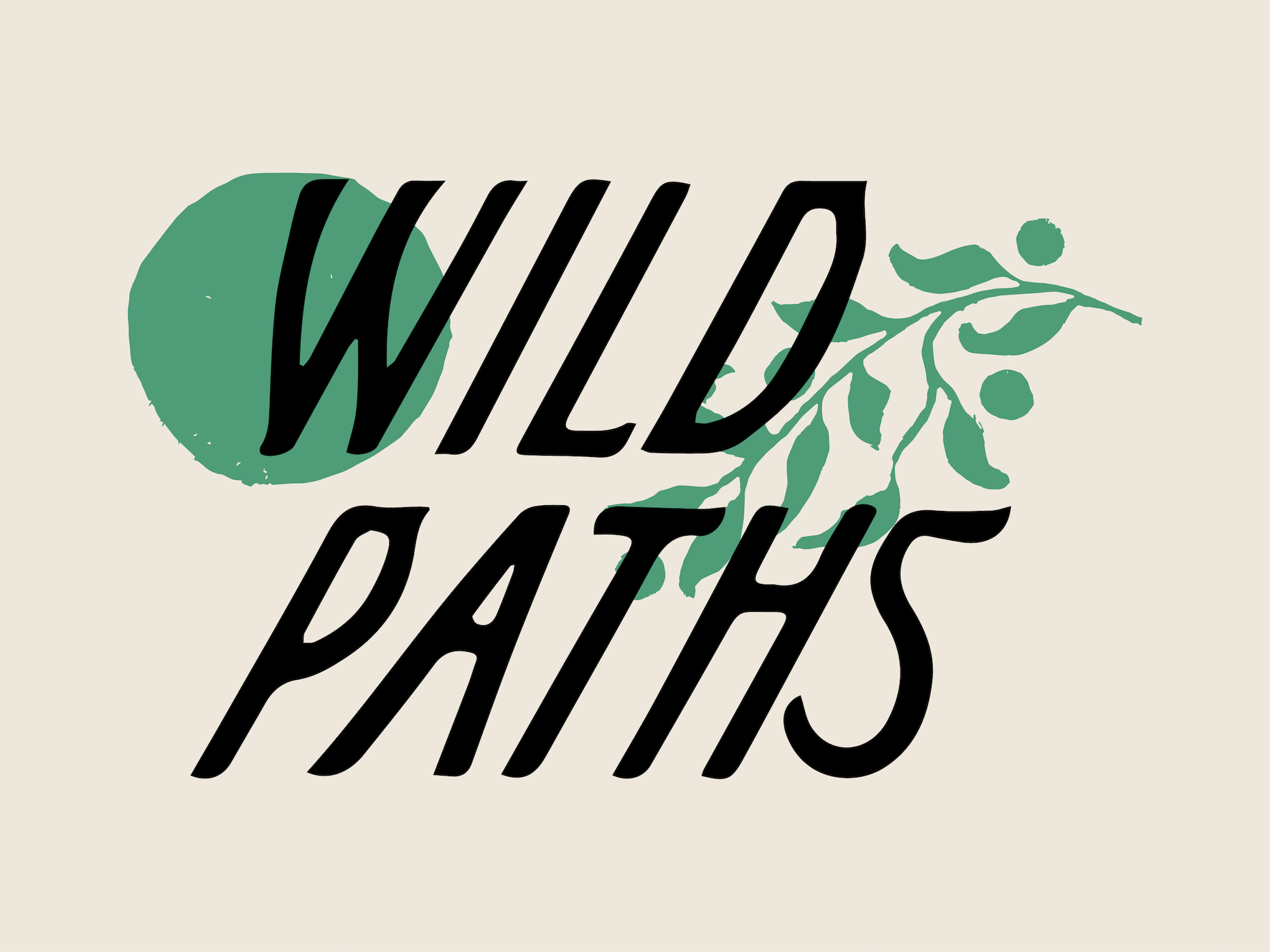
Jack’s most significant project in the last couple of years has been the brand identity for Wild Paths Festival (@wildpathsfestival); a multi-venue music and arts festival which sprawls across Norwich for a weekend in October. The festival is pretty new (2019 was its first year) and Jack was hired to create the entire visual identity for the festival, as well as all the advertising in the lead-up and some branding for a variety of exclusive Wild Paths products and merch – even including a craft beer brewed in collaboration with Redwell Brewery (@redwellbrewing).
This role seems particularly fitting for Jack as both a designer and an individual, as he reflects upon the development of his aesthetics and visual language: ‘I grew up listening to a real varied mix of music and went from being really into jazz and the whole blue note thing, to being really into the DIY punk and hardcore music that was coming out of the US… I think that’s worked its way into my designs over time.’
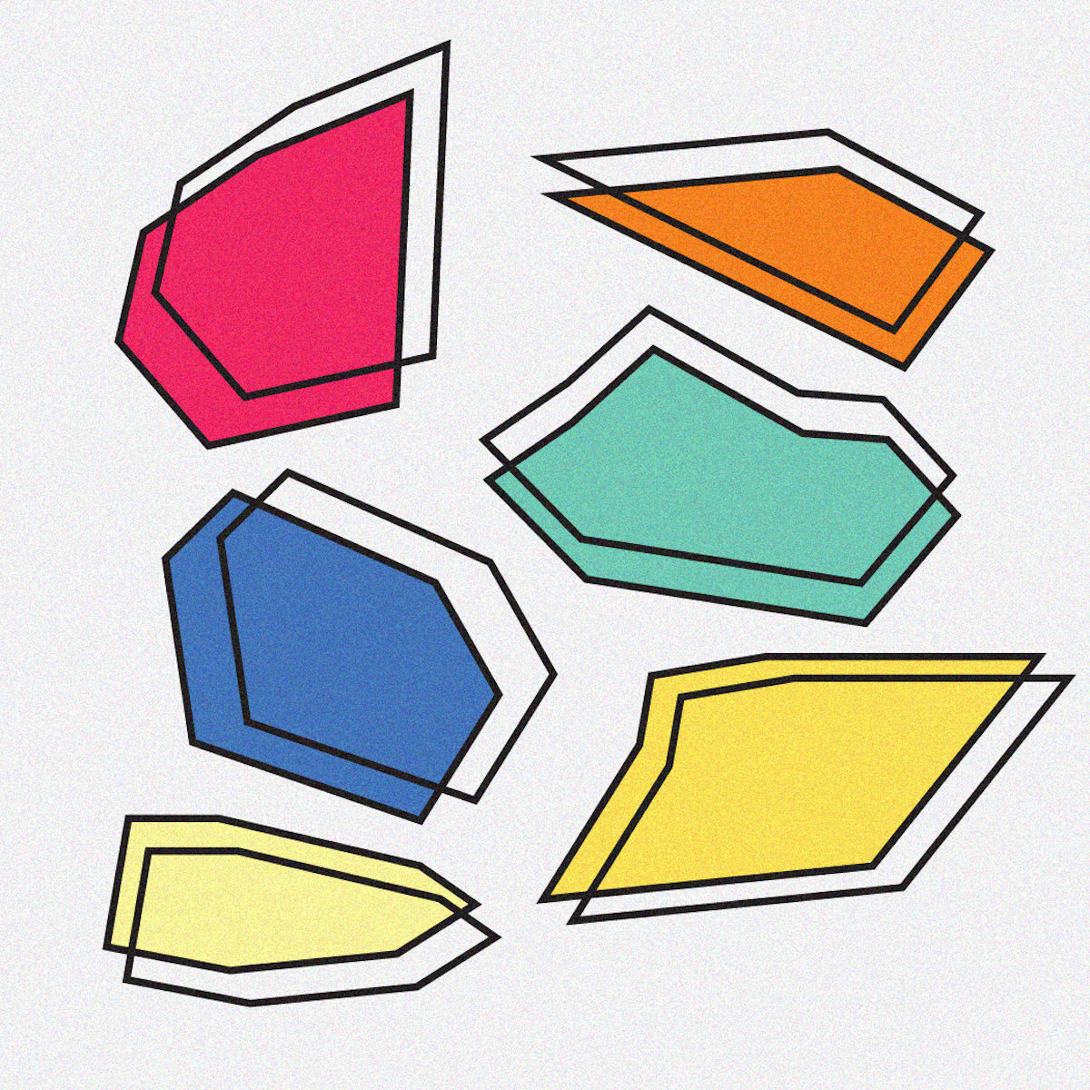
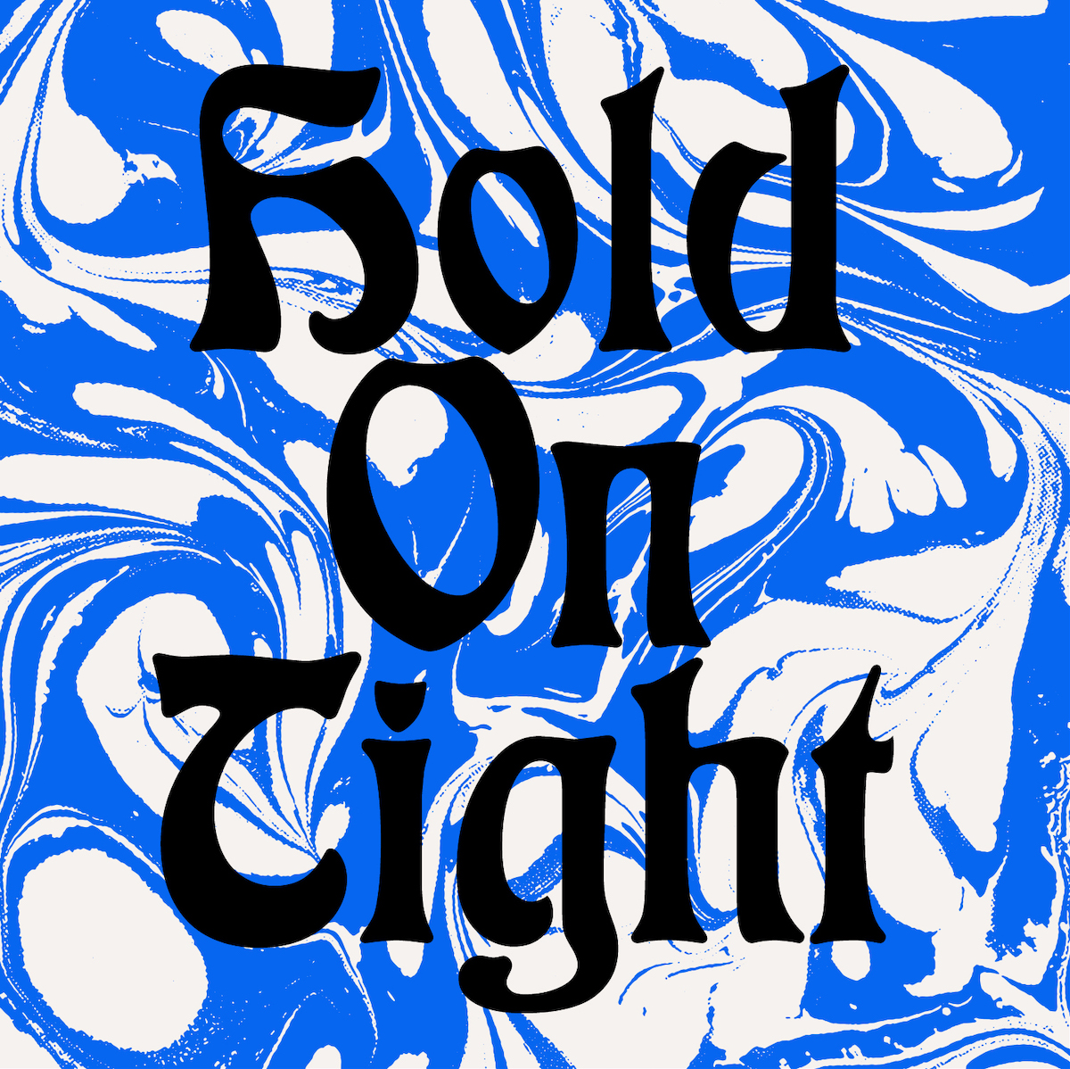
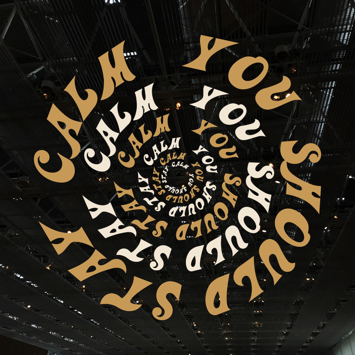
It’s easy to see how these wide-spread influences have fed into Jack’s succinct and tactile brand identity for Wild Paths. Presenting as minimally illustrative, with gentle, autumnal colours and a contrasting balance between both sharp and handmade, painterly qualities, the branding is direct, innovative and effective. Featuring a bespoke, sans serif display font, the type design includes subtle hints at blackletter and script influences; meaning the visual identity is beautifully pulled together by its distinct typographic design.
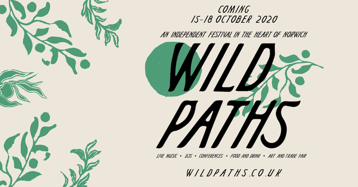
The designer elaborates: ‘The creative process started really with understanding what the festival was aiming to bring to Norwich and what would it look like if a festival embodied the city’s spirit. I came away from those initial concept meetings really trying to work out how we could bring a sense of nature and a very contemporary city together; and that’s where the branding started. I brought on 5 other folks to help me on that project and they all worked real hard for us to get to where we needed to be by the festival weekend.’
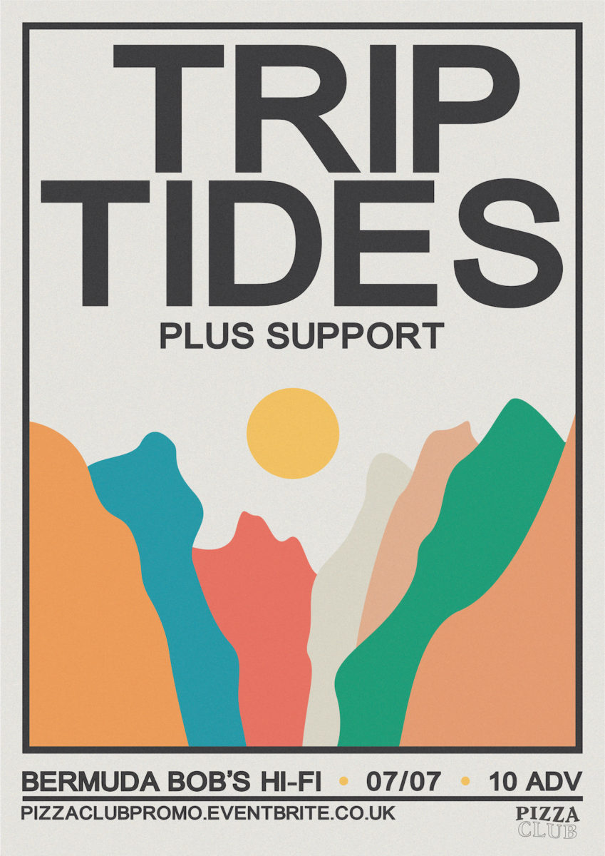
With the importance of community and the local arts and music scene at heart, Jack has been rehired for the 2020 edition of Wild Paths and is currently working on refining the design to really capture the feel of Norwich life. Jack’s other projects include designing for Pizza Club (@pizzaclubpromo) ‘lovers of live music and pizza’ (who isn’t?) as well as many more personal graphic design projects. And finally, it feels important, dare I say it, during these *PLEASE insert synonym for unprecedented* times, to remember the significant power of design to bring communities together through events, collaborations and a collective feeling of identity. We hope to see more from Jack soon!

