Independent type collective and self-publisher of typefaces, Camelot (@camelot_type) is the joint venture of designers and academic professionals, Maurice Göldner, Katharina Köhler and Wolfgang Schwärzler. The Leipzig based foundry thrives as a place where inspiration is drawn from the historical meeting the contemporary. Many of their typefaces find their roots in the past before becoming entwined with contemporary life, technological advancements and the aesthetic movements they’ve entailed.


Göldner, Köhler and Schwärzler’s backgrounds are all equally laced with deep enquiry into the history and practice of design – and, of course, type design specifically. Göldner’s work has focussed on typographic research – including the history of Dresden’s Brüder Butter foundry – and Köhler’s practice emphasises the power and importance of collaborative approaches to design, whilst Schwärzler focuses on the design of books and catalogues, custom typefaces and visual identities. Together, through Camelot, their breadth of knowledge and understanding is evident in their unique, sensitive and fascinating portfolio.
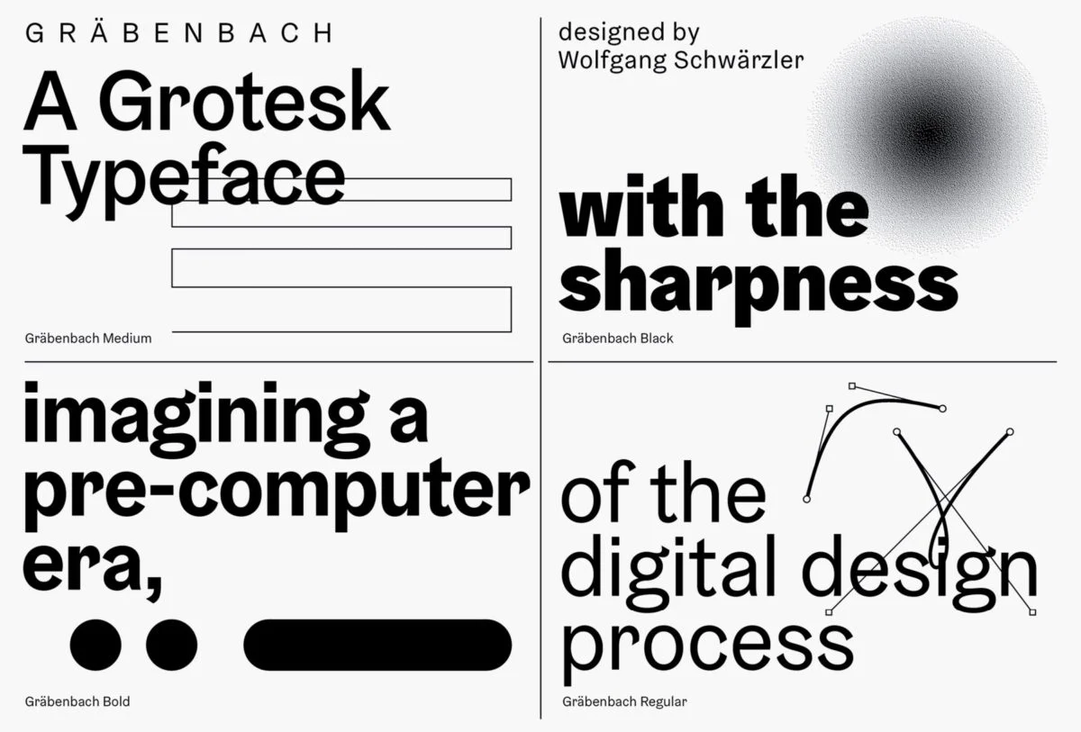
Inspired by early grotesque typefaces, Gräenbach is a melody of digital type design practices and brush-painted lettering. These qualities of sharp and soft manifest as a minimal sans serif, with a playful, softening edge; displayed beautifully through the contrast of sharp, straight edges and the tactile, gentle warmth of hand drawn work. Available in four weights in roman and italic, Gräenbach is also accompanied by five monospaced weights.
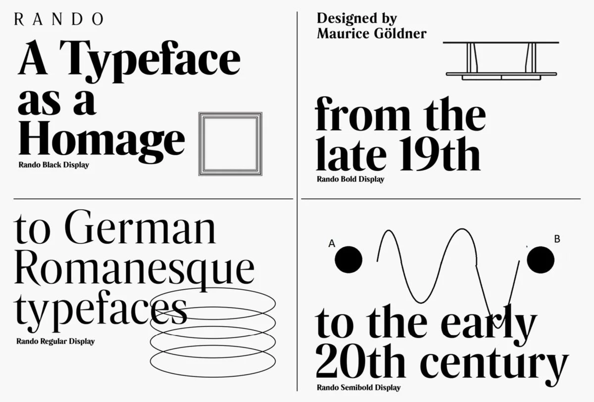
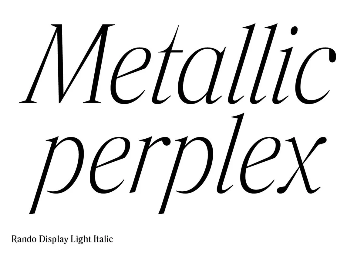
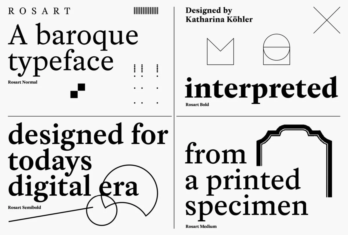
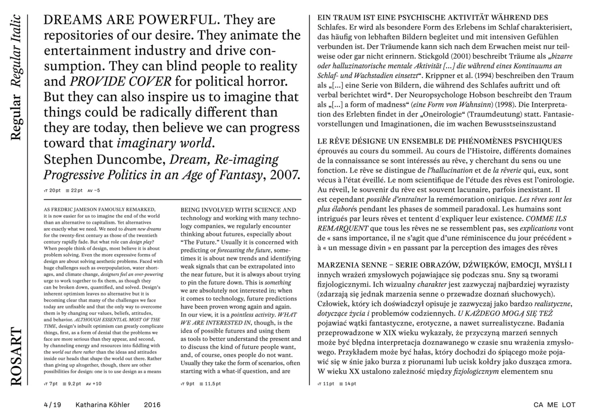
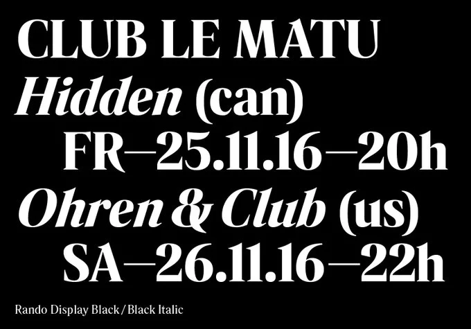
A text typeface baed on the specimen Jacques-François Rosart, Camelot’s digitally rendered, contemporary typeface, Rosart similarly pays homage to past; ‘Originally cut in steel – Rosart is an interpretation from a printed specimen for today’s digital era. The glyphs are designed with a modicum of Bezier points as a phenomenon of contemporary type design,’ Camelot elaborate in their own words. Likewise, Rando reaches into the depths of typographic designs’ rich history, ‘a contemporary image to German romanesque typefaces from the late 19th/early 20th century.’
Camelot’s collective design footprint defines itself through an ability to reach into the past and draw imaginative connections between practices and aesthetics throughout history, and creatively calcify their place in the present. They have a way of moving through the motions of technology and time, without forgetting their fundamental roots and practices; continuing to draw our attention to the treasure troves of the past.