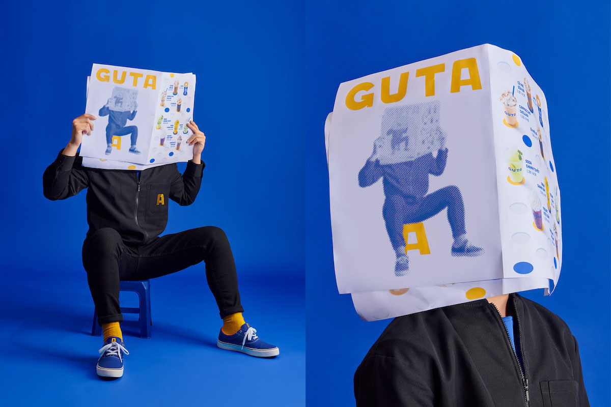
Guta Cafe’s name is derived from Vietnamese slang, in which “gout /gu” in French and “ta” in Vietnamese are pulled together into a term meaning “our style.” The cafe being a hotspot for Ho Chi Minh City (Saigon) city-dwellers, they wanted the new rebrand to capture the diverse hubbub of the city; connecting with the different crowds as they come together for coffee.
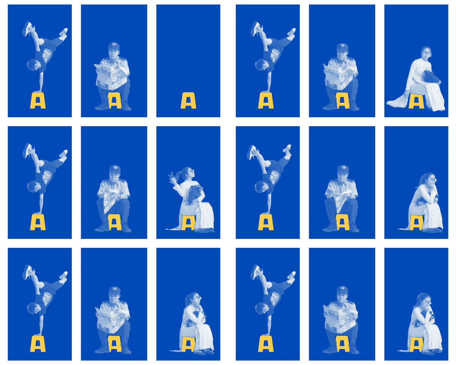
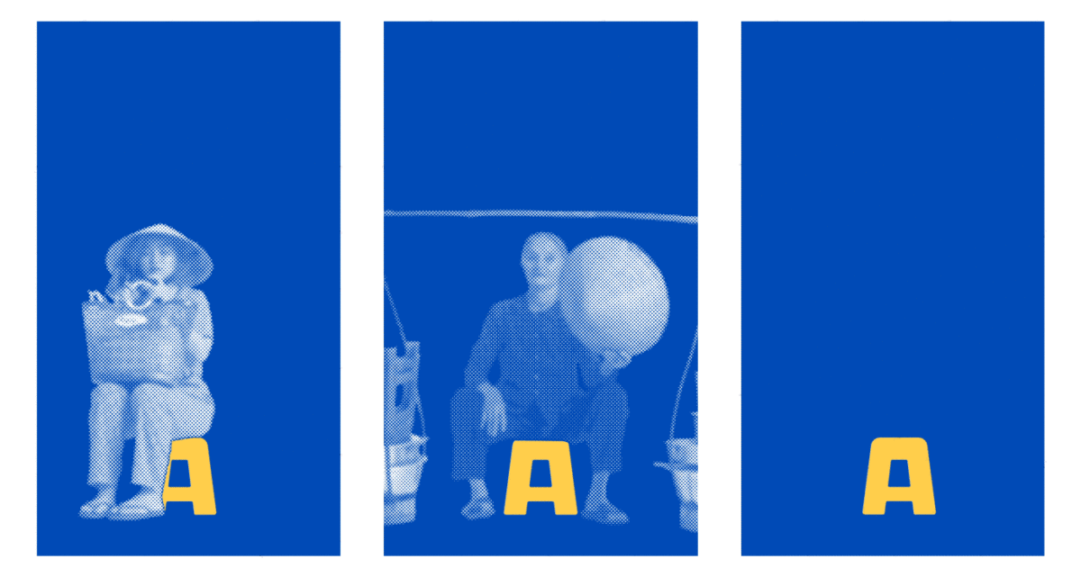
Reflecting the traits of Vietnam’s street-coffee culture, Branding & Design Studio M — Associates built their custom font and visual identity around the letter “A”, which became an icon of the infamous plastic chair. ‘Street-coffee has become a fundamental habit of not just the Saigonese, but the Vietnamese in general,’ M — N Associates say, ‘Beneath the habitual culture, there’s always a “plastic chair”, small and convenient to setup anywhere.’
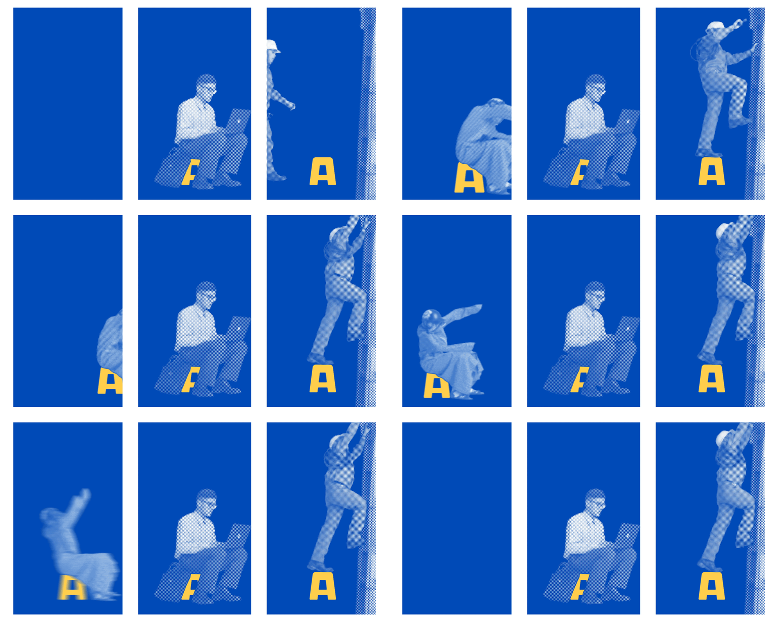
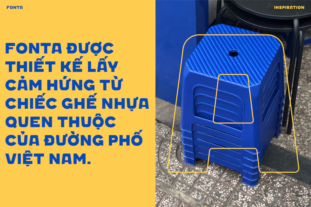
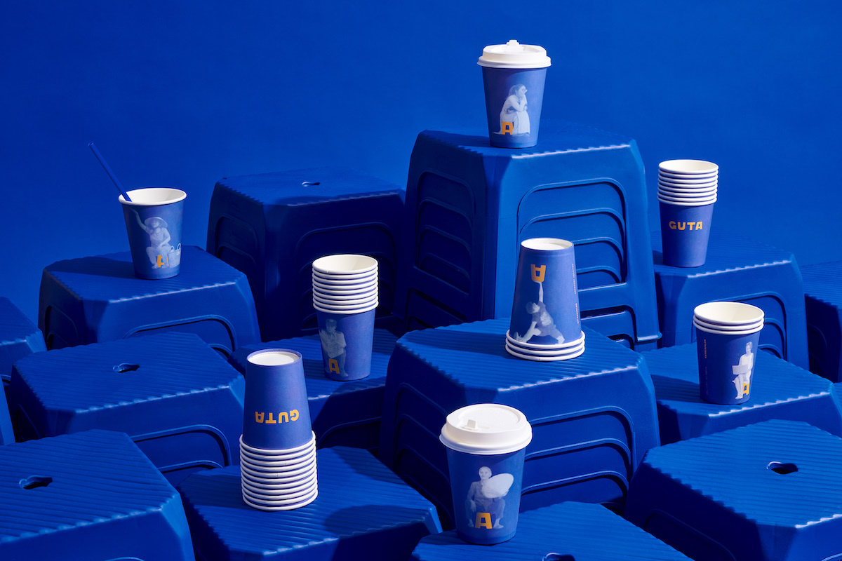
This idea became the locus of the graphic system, forming a playful basis for merchandise, promotional materials and printed matter. However, the strength of this rebrand really lies in connecting with the city’s communities and Guta regulars. The colour palette, M — N Associates say, creates a nod towards the Vietnam Social Security propaganda posters which hang around the city. Featuring a combination of blue and yellow, this was a choice they say ‘played as a principle role to represent the idea of “a friend of every worker.”‘
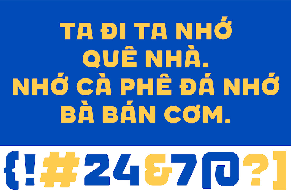
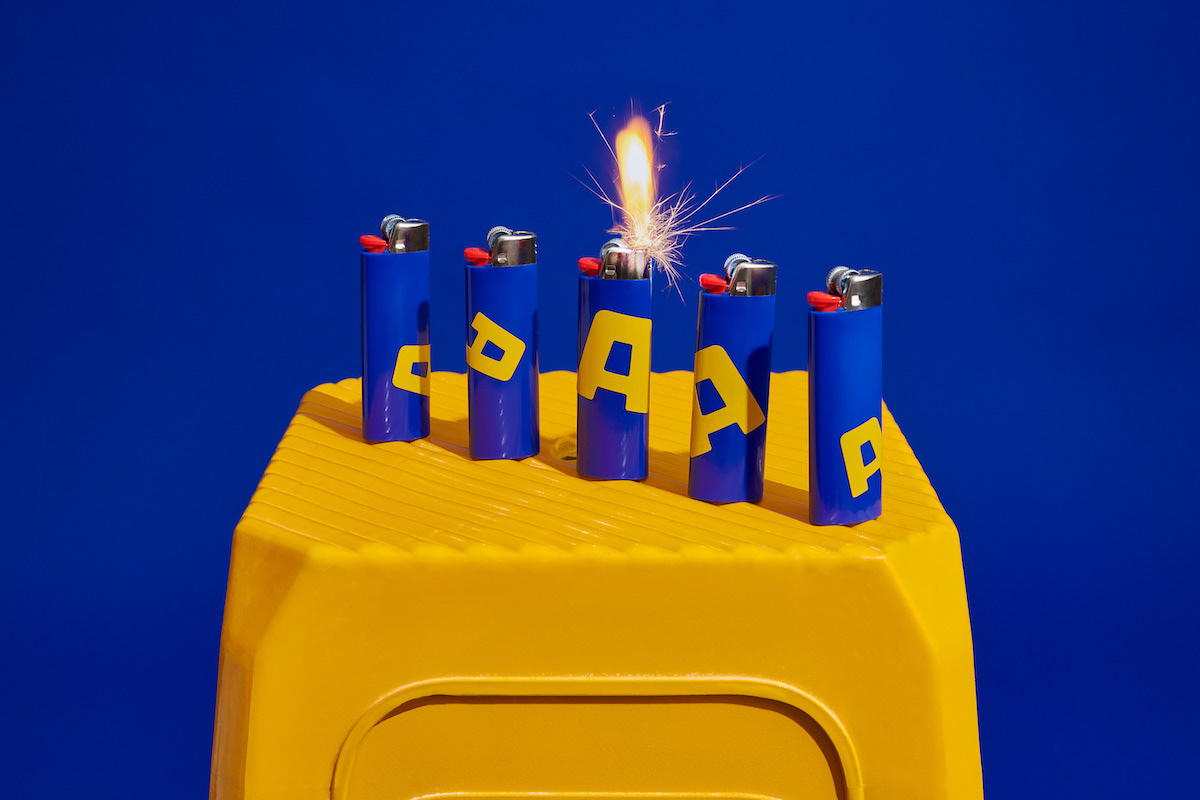
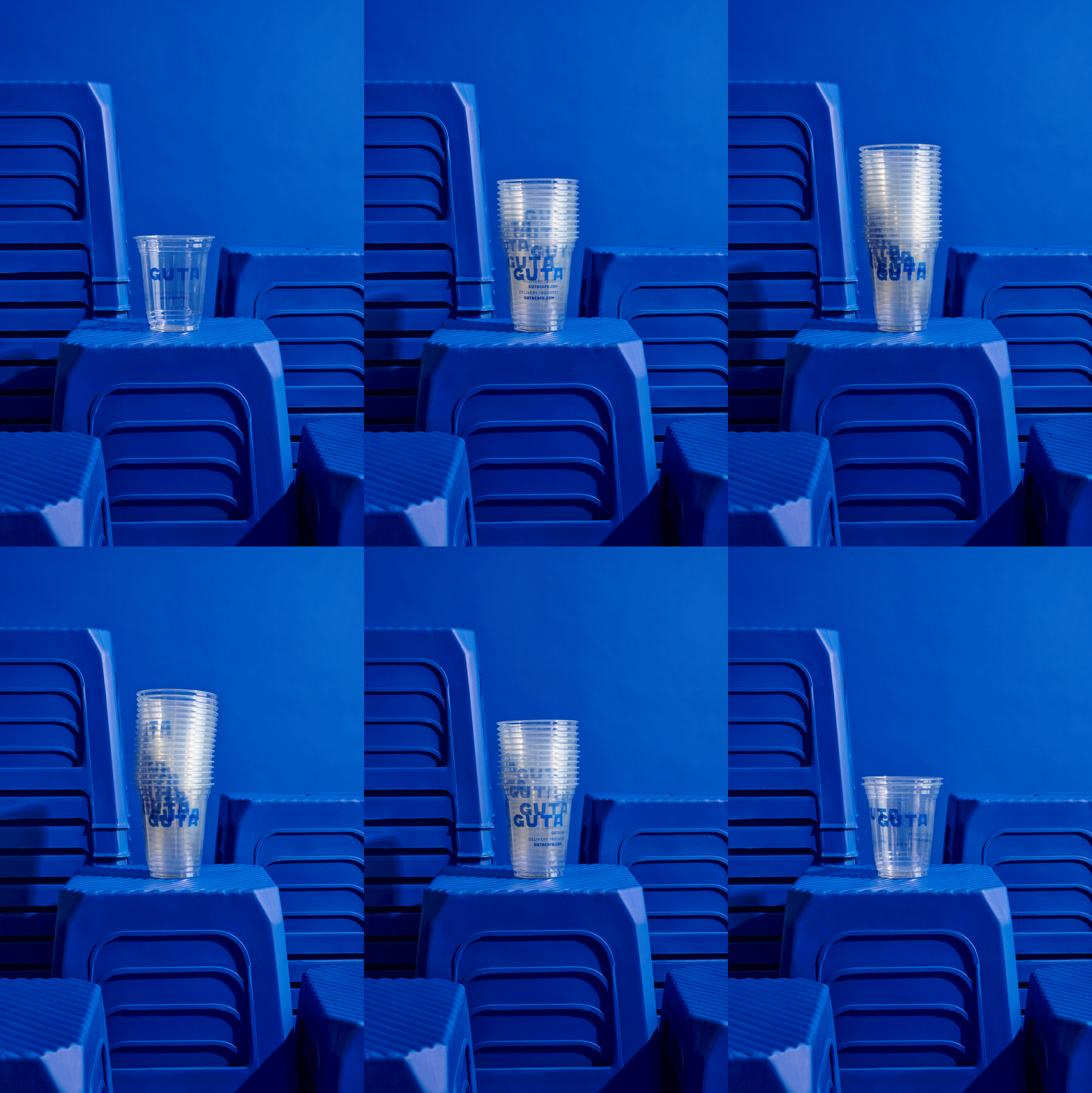
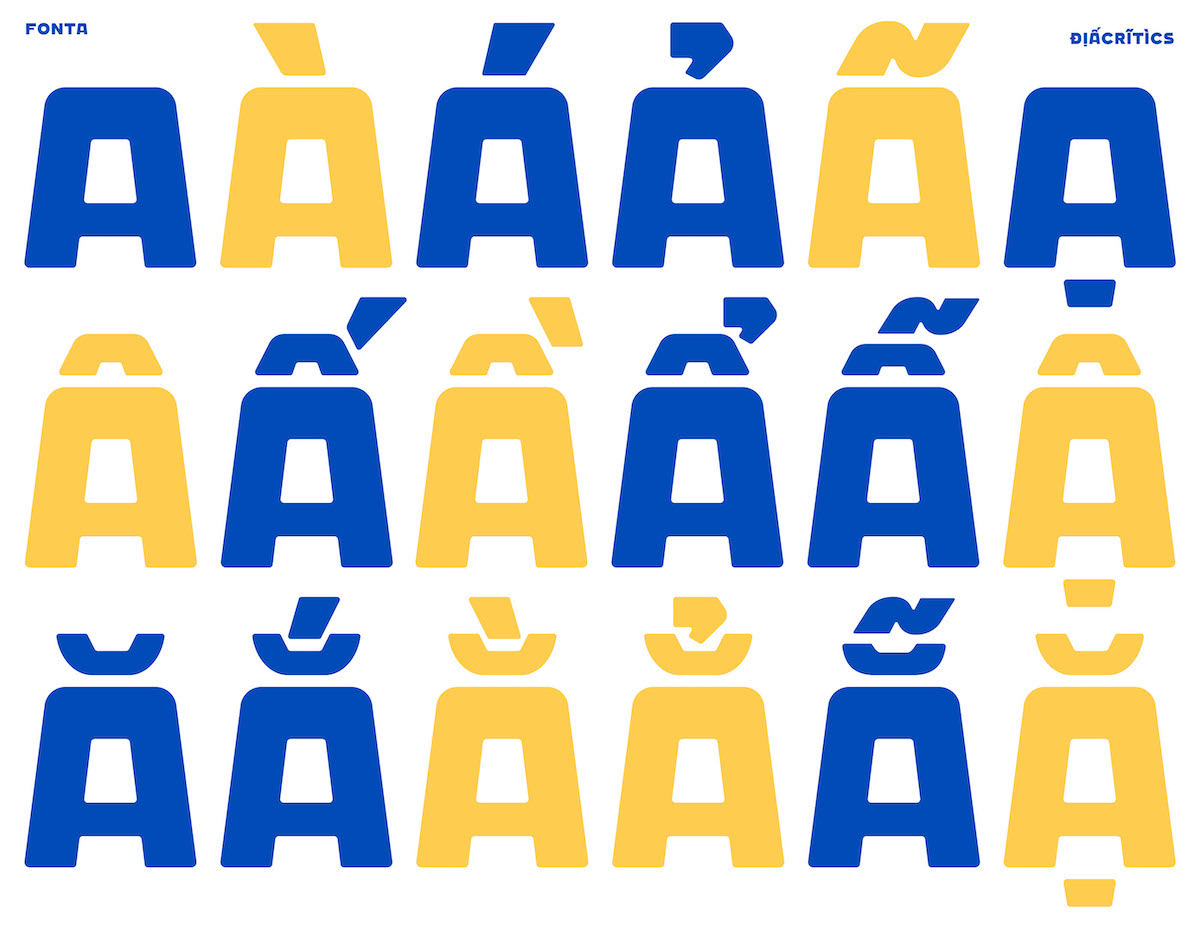
The chunky, all-caps custom font features Vietnamese diacritical marks and follows the visual tone set out by the chair icon, creating an overall bold and fun graphic system which will tie together all of of Guta’s child brands as they grow. Thanks to M — N Associates for sharing more about this playful, dynamic rebrand!

