
Hi! Thanks so much for chatting with us today. First off, could you give us a little overview of Emigre, where it all began, and how it functions today as a digital foundry? What is it you do and what’s the culture and ethos like?
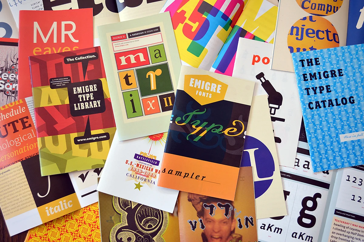
In a nutshell, we started our company in 1984 in Berkeley, California, the same year the Macintosh was released. We were early adopters to the new emerging computer technology which set us apart from mainstream designers and type designers at the time. Currently we are mostly a retail type company, meaning that we make a living selling licenses for the use of our digital typefaces.
I’m super curious about your archive of Emigre magazines, which date back to the eighties, if i’m correct, and are full of interviews, articles, type specimens and experimental typographic art. How did the magazine start out, and what are its main aims/achievements?
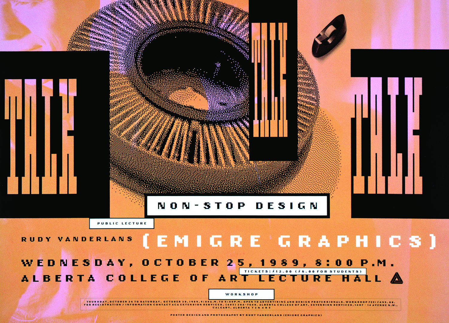
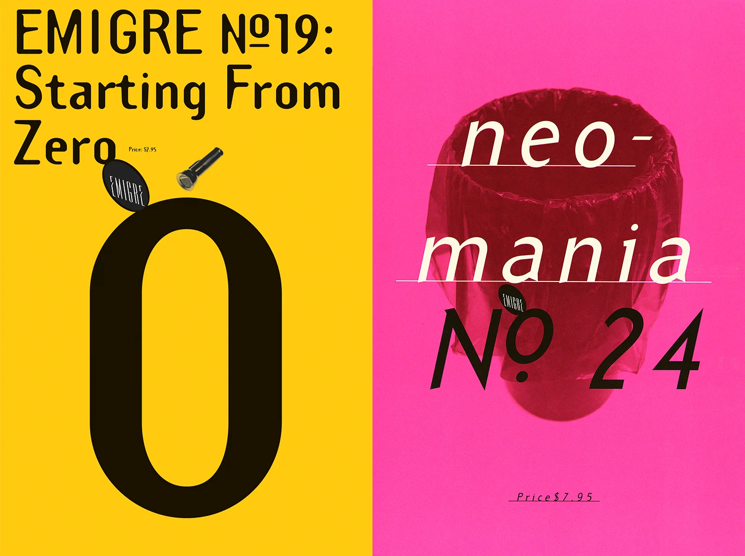
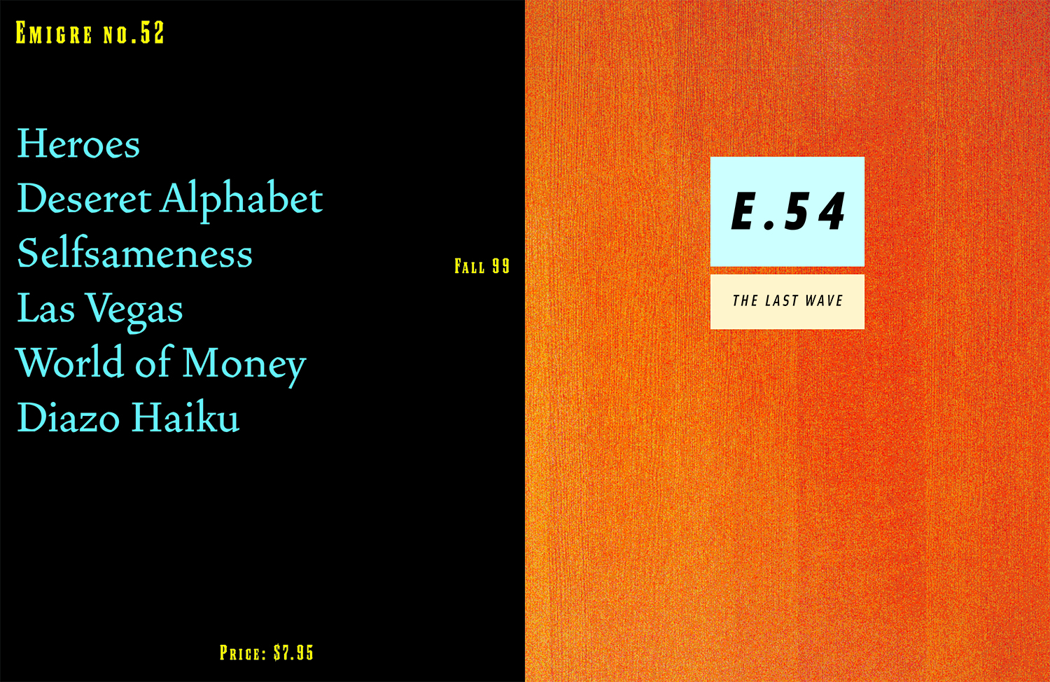
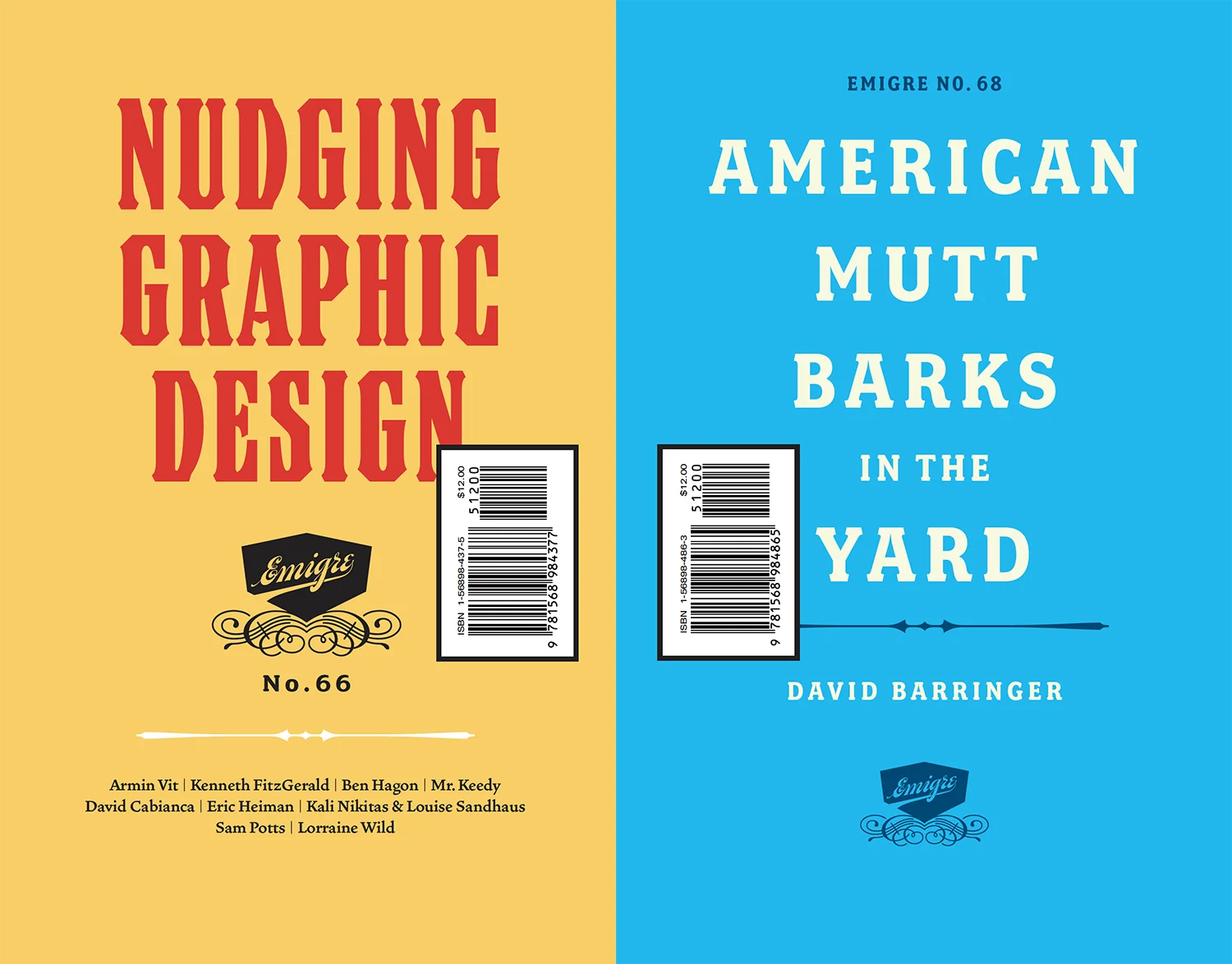
We always considered Emigre a DIY fanzine about graphic design, made by and for graphic designers. We started during a unique and exciting time in design when a lot of things happened all at once: the prevailing approach to design at the time, the Swiss International Style, had become formulaic and predictable; graduate design students started to acquaint themselves with postmodernism; the vernacular was seen as something we could learn from; and then on top of all that, the tools, the way we create and produce design, went through a radical shift because of the Macintosh computer. We found ourselves in the middle of all these major changes and we were willing participants. We decided to ask a million questions and write down and record in our magazine what was going on. We conducted in-depth interviews with designers, particularly the designers who were eager to incorporate all these new ideas and tools, and talked about all the changes that were taking place. Later, as graduate design programs encouraged critical writing, we started publishing essays. We believed that design, as a cultural phenomenon, was worthy of an evaluative look, so we turned an inquisitive eye on our profession. And if you look back on those 69 issues we published, it’s like a documentary of design of the 1990s and early early 2000s. By the way, you can read all the issues in high definition on the Letterform Archive website.
Dating back over 4 decades, do you feel there have been specific magazine issues, or features/spreads, which have stood out of the crowd? Perhaps relating to a monumental event or era, a particular article or interview, or perhaps just because they’re so visually compelling?
There are so many, because so much happened during those 36 years. But if I have to pick one, there was this very short period of about a year, between the introduction of the Macintosh (1984) and the release of Postscript (1985), when everything you made on the Mac was bitmapped at 72 dpi. And what you saw on the screen was exactly what you saw when you printed it out on an ImageWriter. One of the earliest uses of that approach can be seen on the contents page of Emigre #2. While it looks kind of unassuming and funky, it was an incredible breakthrough in terms of production techniques, because, for the first time, we were able to create our own typefaces (made with FontEditor) and use them in a program that allowed us to move type around (MacPaint). Up to that point, people had been able to create their own type, but in order to use type and access it through a keyboard, you relied on very expensive proprietary typesetting equipment run by professionally trained typesetters. So you had to work through somebody else to get your layout started. That work, created during that short period in the mid 80s, still resonates with us.
How do you feel the magazine has changed over time in relation to new styles, eras, aesthetics and technological advances? And how do you feel the foundry as a whole, entwined with these shifts, has evolved throughout these advances over the years?
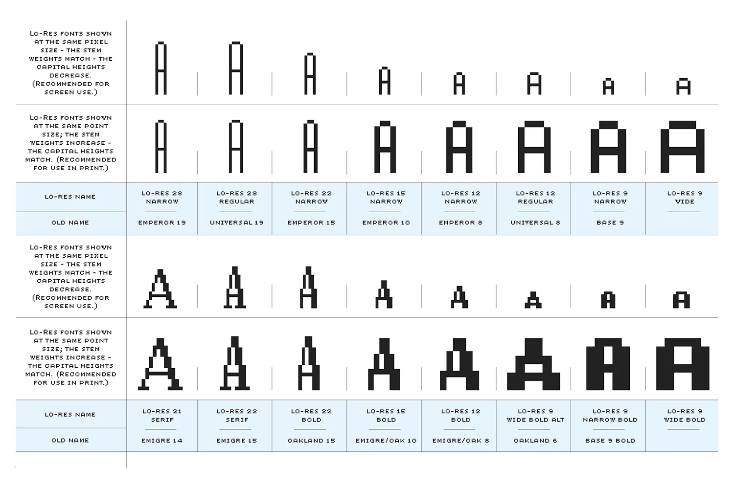
Everything we now take for granted was being developed during the first half of our careers. We often worked with beta versions of programs like ReadySetGo!, Quark, PageMaker, and early versions of Fontastic, Fontographer, and RoboFog etc. So everything was a challenge. And much of the aesthetic of our work was a result of trying to figure out all this new technology.
We were one of the first foundries with a website, and the first to have an automated online ordering system in place. Even before the internet, we used a bulletin board system called FirstClass. We would take the orders on the phone, give the customer an ID and password and move the font files into their account manually. The download could take up to an hour per font.
Looking back, it’s been an enormous investment of time and capital to keep up with the technological changes, and it never seems to let up. By the time you’re done redesigning and launching your website, for instance, it’s technically outdated. We’ve slowed down incorporating the latest technologies. These days we’ve become quite proficient and content using a few basic software programs to do all our work.
As a digital type foundry selling a huge range of fonts, do you feel that the visuality and aesthetics of the magazines – which feel quite experimental – feed into the wider visual culture of Emigre? Are the digital and print sides of Emigre separate entities, or do ideas interchange fluidly between each?
Emigre is a three person company. There are no separate entities. It’s completely synergetic.
What is Emigre’s critical outlook on type design? With so many years of experience examining the world of type, what is the foundry’s stance on the role of type design -culturally, functionally, aesthetically or otherwise?
We never imagined, in our wildest dreams, that type design would become such a popular field. When we started in the mid 80s there were literally only a handful of companies producing digital fonts, and everybody seemed to know each other. The tools were pretty crude, and there was a lot of sharing of information and knowhow. It was a very small community. Today there are over 600 foundries, and thousands of type designers releasing new digital fonts. There are numerous graduate and certificate programs, workshops and conferences, all focussing on type design and lettering. In addition there is a significant number of companies specializing in distributing fonts online. And the tools now are extremely sophisticated. None of this existed when we started. The internet didn’t even exist. Yet, while the design and production methods of type have changed dramatically over the years, and we now have hundreds of thousands of fonts to choose from, other things have hardly changed at all. As always, we have no control over who uses our typefaces and how they are applied, no matter how sophisticated our designs, which can be cringeworthy at times. And as type designers we still remain largely anonymous.
Is there anything exciting to look out for going on at Emigre now? Any specific releases or events to keep an eye out for?
Together with Letterform Archive in San Francisco, which houses the entire Emigre archive, we are working on a major book about the history of Emigre, the magazine and the type foundry. That project will keep us busy for a while.
What do you think the future of Emigre, or even the type industry more broadly, will look like? What are your hopes for the future of Emigre and type design?
I’ve always been wrong about the future. But by the sheer volume of typefaces being designed and commercially released these days, it’s easy to think we’re in a golden age of type design. And I understand the interest. Type design can be an extremely expressive art form, or a very complex technical design challenge, or both.
But again, I’m not sure what the future of the type industry holds. The need for legible fonts has been fulfilled years ago. So today we are largely satisfying aesthetic desires and technical requirements. Type design is primarily a formal exercise reflecting our personal quirks, technological obsessions, and cultural heritage. Mostly we design typefaces to differentiate our communications.
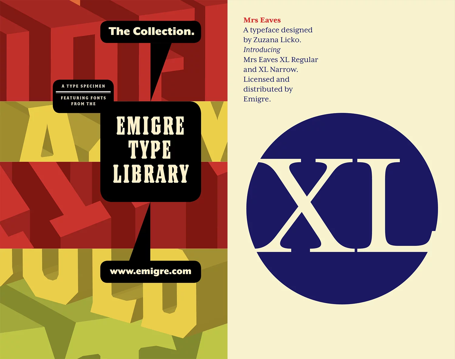
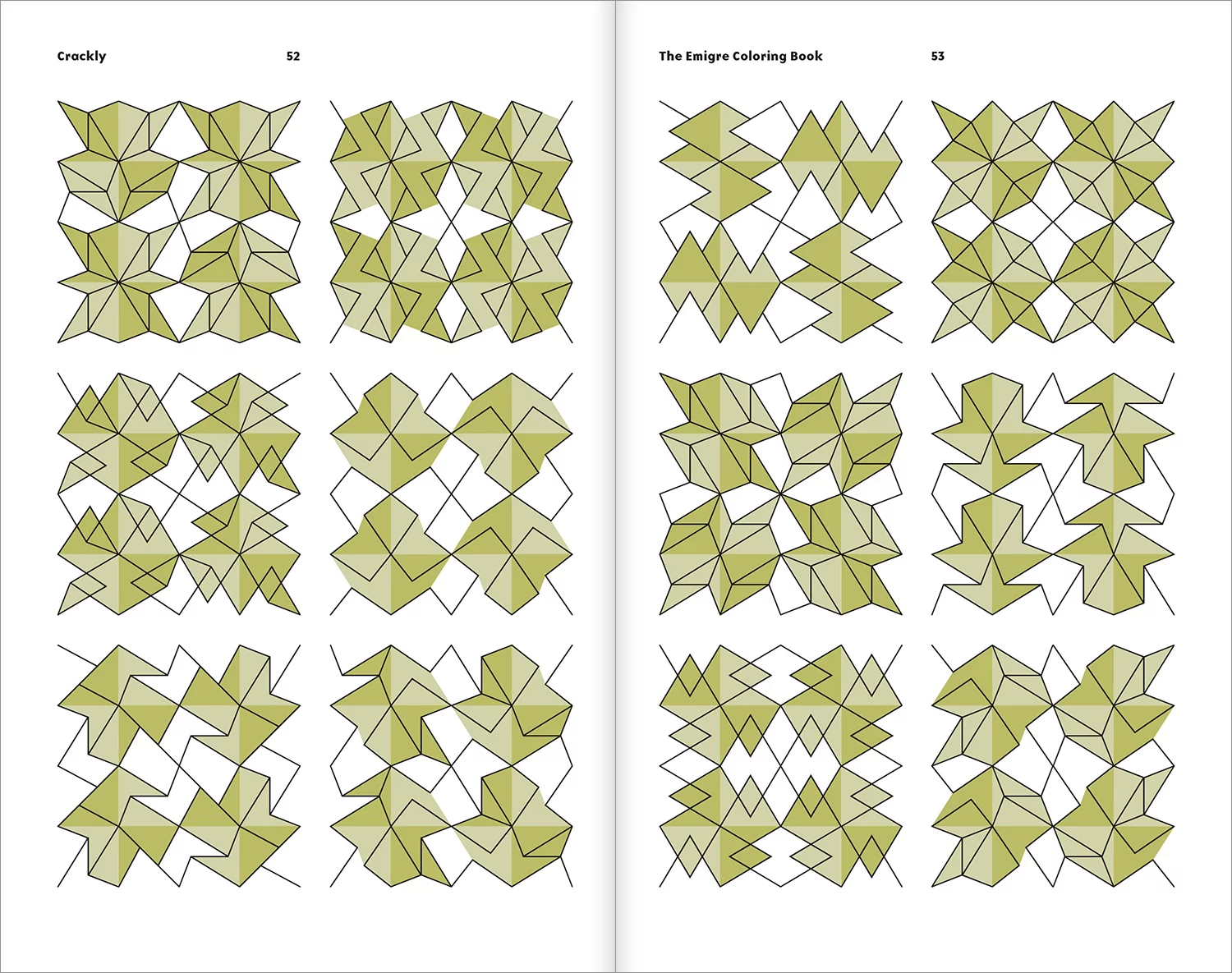
In terms of the future of Emigre, we have a large library of typefaces (over 600 fonts), that we continue to promote through our website, social media, and by publishing actual printed type catalogs. And that sustains us. That large library and the income we derive from it, also allows us to experiment and not be too concerned with the commercial viability of new releases. For instance, our recent releases are two pattern fonts and a picture font, because that’s what interests us at the moment. And these are not all that commercially lucrative. We produce them for our pleasure and to use them in our art projects. In a way we’ve come full circle. When we started, we made type because we could and we enjoyed the process. Then we found use for those typefaces in the magazine we published. Then we noticed people reacted positively to seeing the type in use, and before we knew it we were selling both the magazine and the typefaces. But we never planned any of this. We had generated a perfect synergy by happenstance.
What advice might you give to emerging designers or younger type foundries as they start out in the industry?
Early in our careers, April Greiman told us, and I paraphrase, that there’s nothing you can claim as your own until you have worked at your craft for at least 10 years. I think she tried to tell us that it requires a lot of blood sweat and tears and a lot of perseverance and patience to become successful at what you do. Of course nobody starting out wants to hear this. I know we didn’t. But she was right. There are no shortcuts to success.
And lastly, where do you look for inspiration? What designers are Emigre enjoying following the most at the moment?
I really like the work of type designers like James Edmondson at Ohno Type, and retail sites like Future Fonts. And the work of Underware is really pushing the boundaries of what digital type can do. There’s just an amazing number of very talented people at work within type design right now, and everybody seems to enjoy themselves. We’re happy to still be a part of it.
Thank you again to Emigre! To take a closer look at the work of this incredible foundry, check out their website. In addition, for some stunningly inspiring research and visual nourishment, have a look at the Letterform Archive website.


