
Developed during Fabian’s six month sabbatical in Milan, Sissi Display is newly released display typeface on Type Department – and certainly one deserving of some hype.
The inspiration for this stunning typeface was pulled from a film of the same name; Sissi, made in 1955 with Romy Schneider. Inspired by the furniture and dresses in the film, the typeface is built from initial sketches which grew from playing around with modular shapes which reflected those of the costume and set design in the ’50’s film.
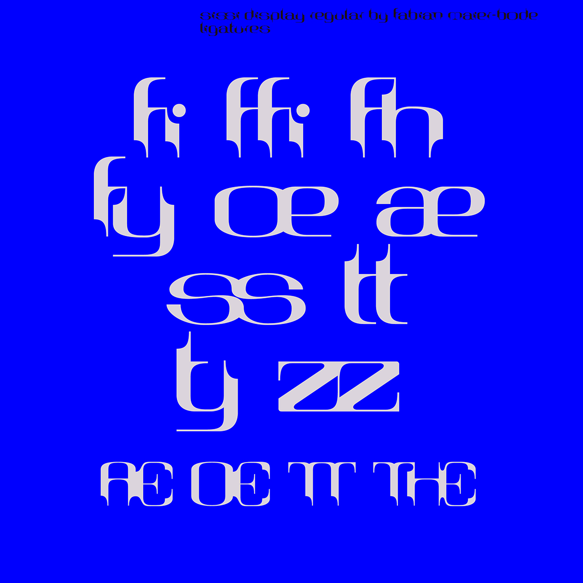
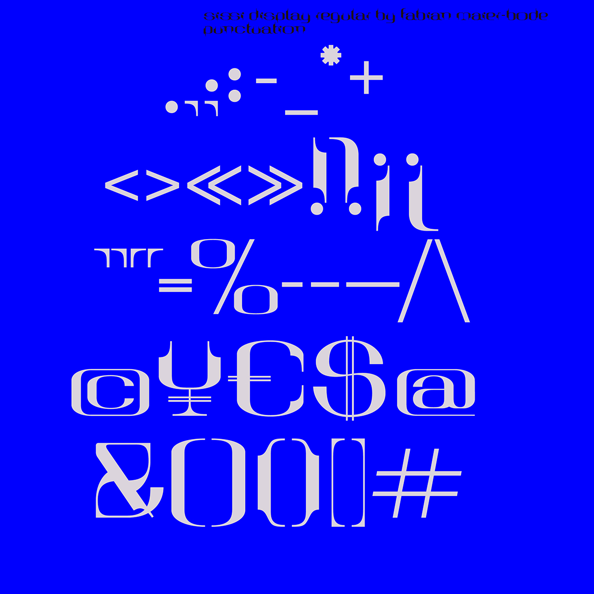
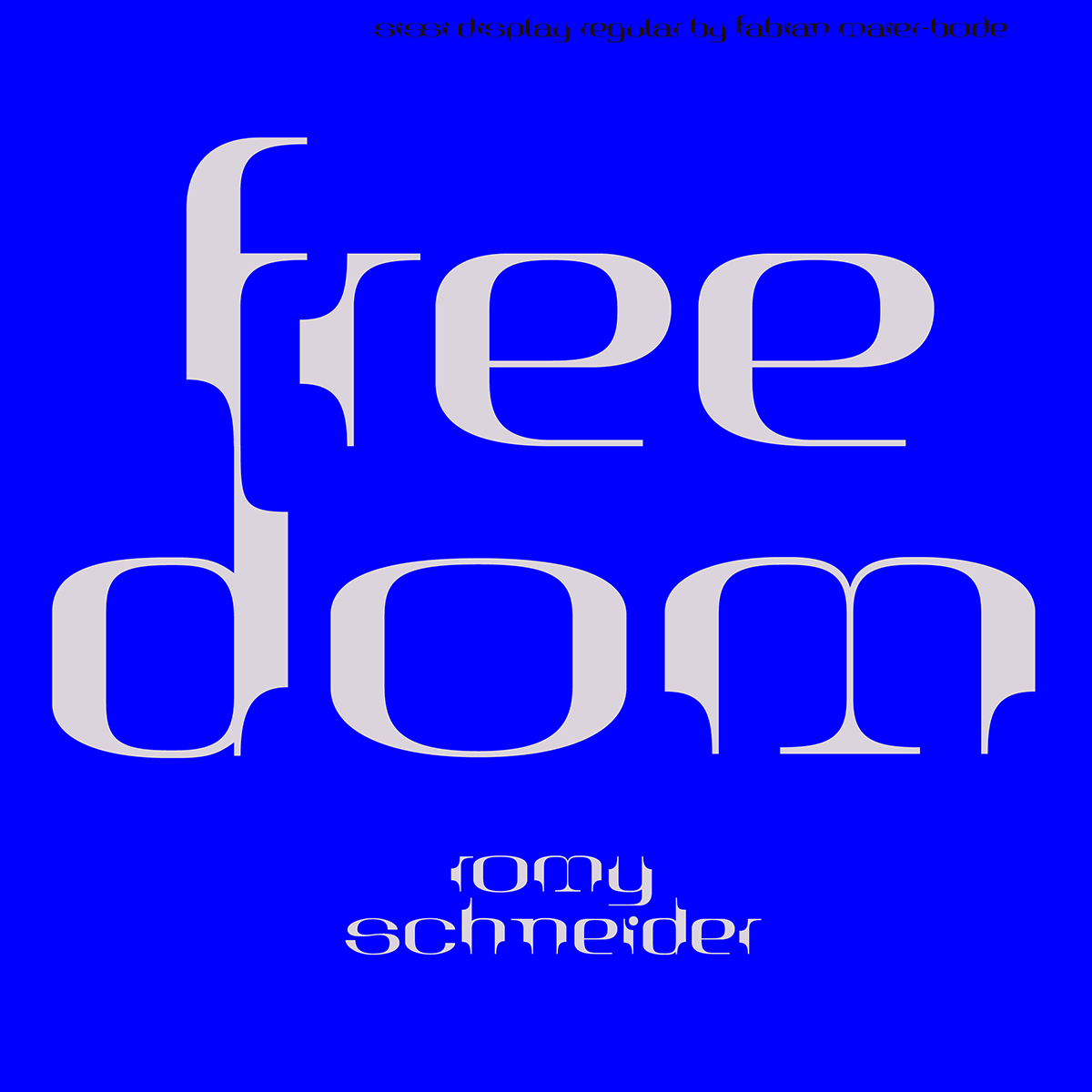
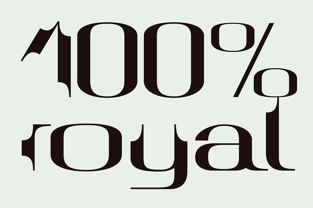
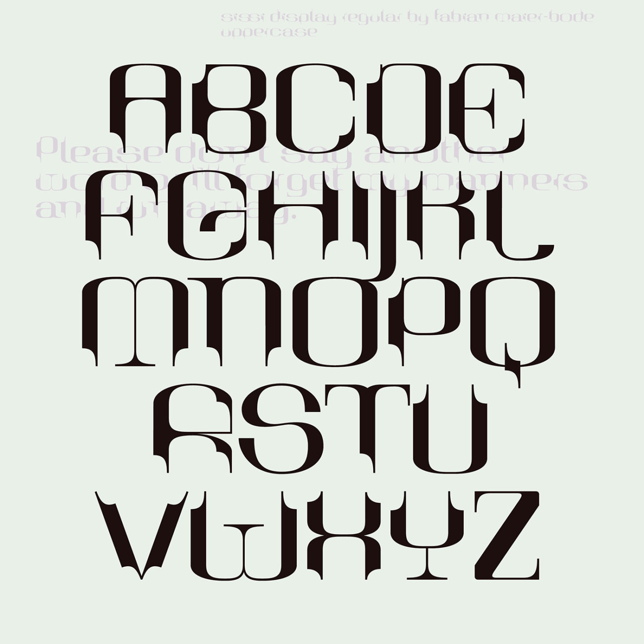
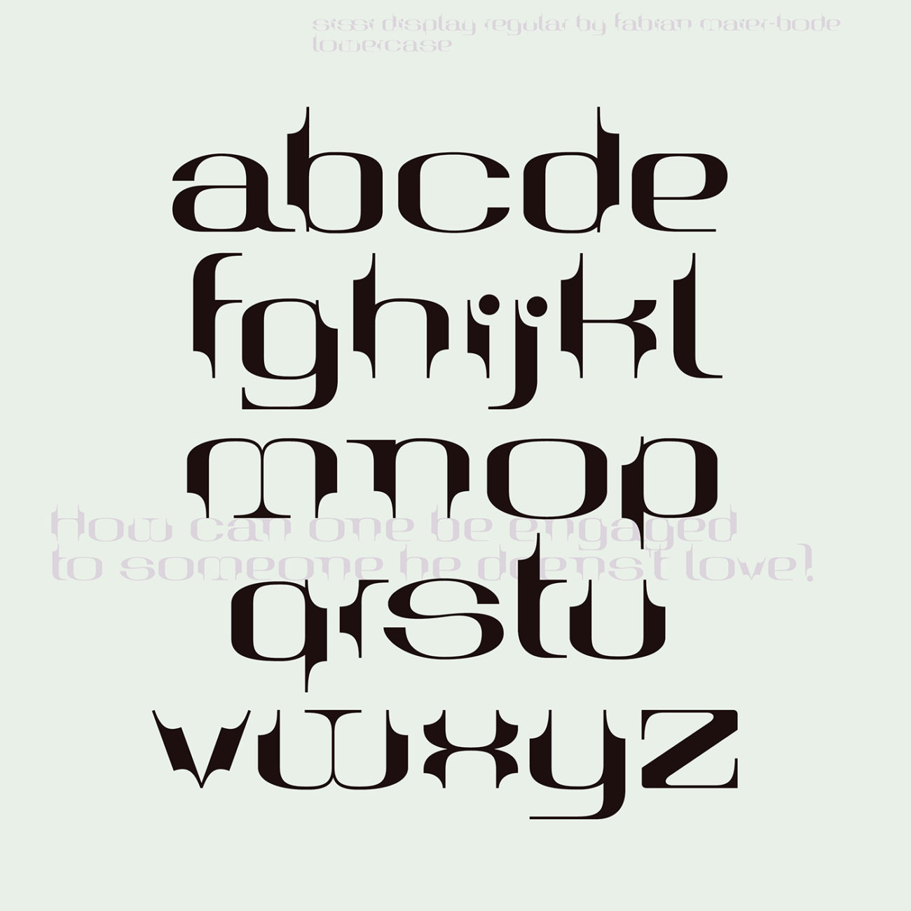
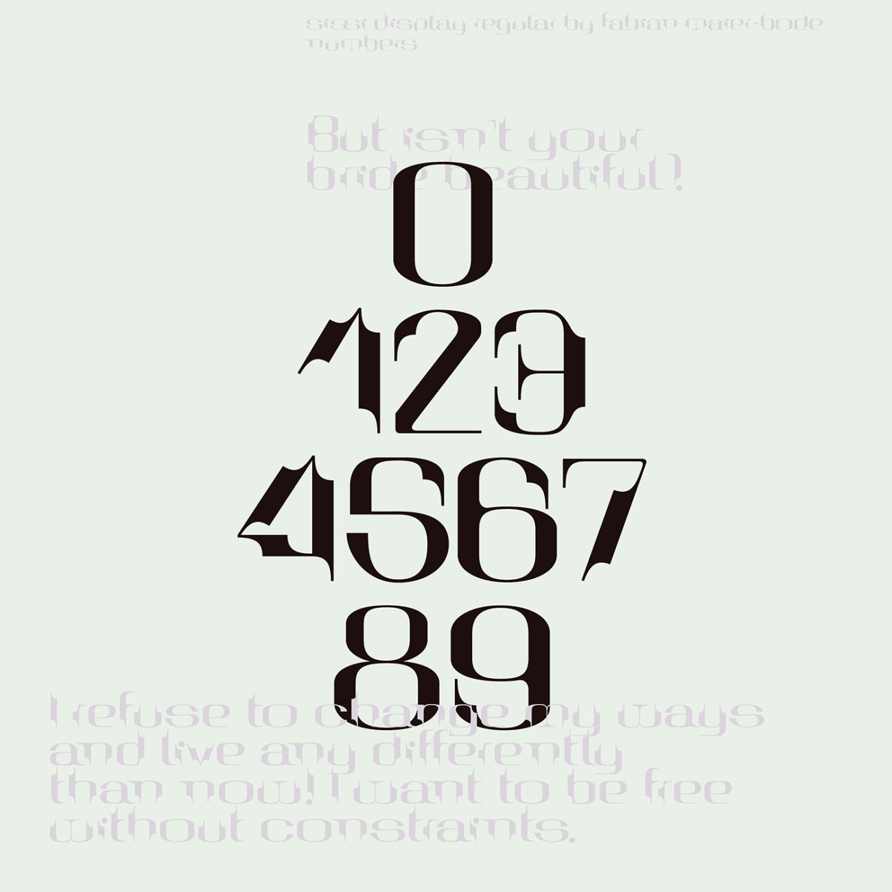
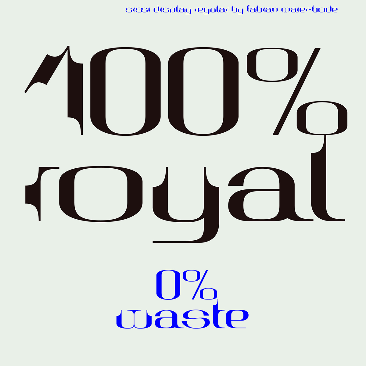
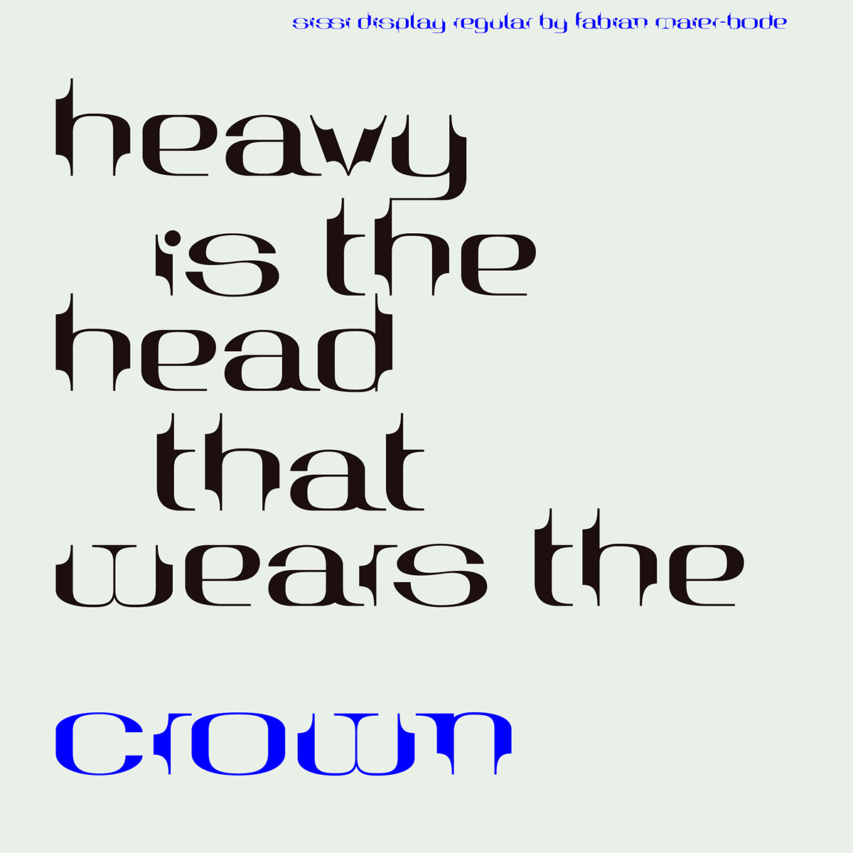
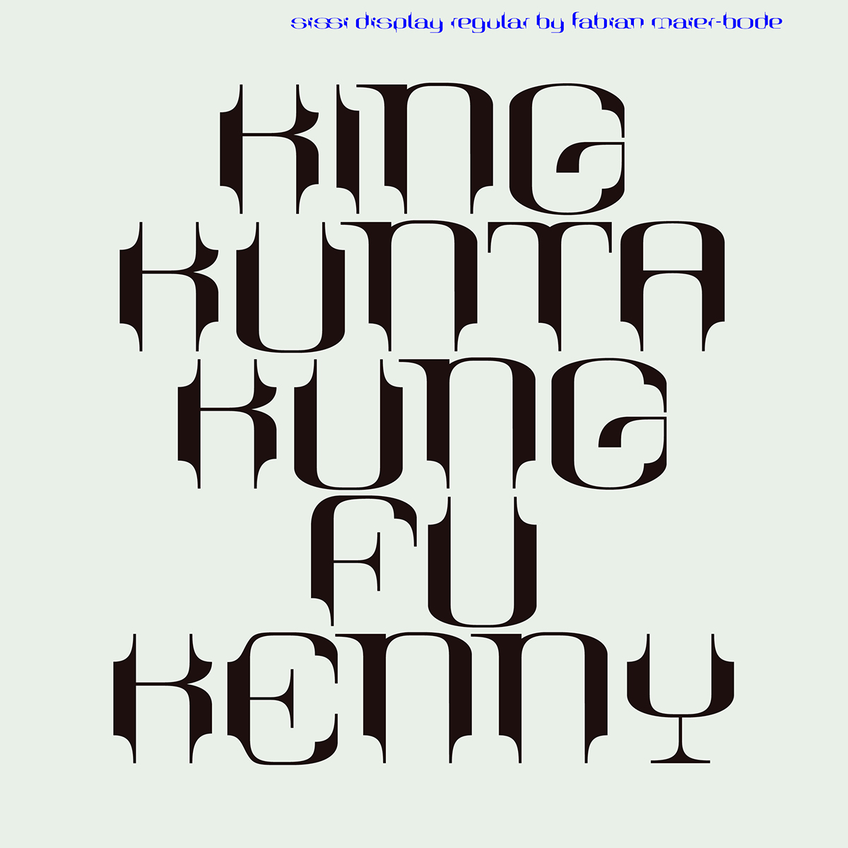
At first glance, you can totally see the sort of clipped, curved, mid-century modernist shapes you’d expect, and you get a real feel of the translation and distillation of a stylistic era into a typeface. ‘At some point,’ the designer recalls, ‘I realized that the first letters I drew had some very interesting details. This kept me motivated to finish Sissi.’

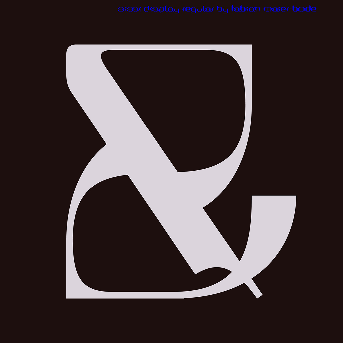
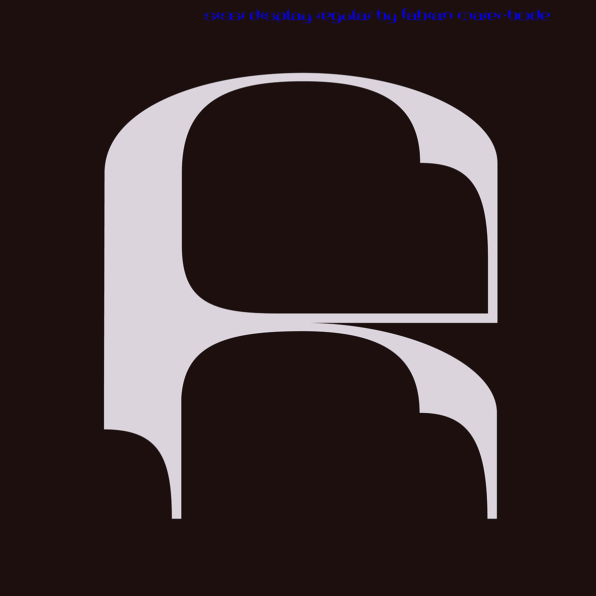
The intricacies throughout the typeface, such as the delicate use of counter-space and finely arched terminals, meets fluidity and decoratively with a certain minimal quality; which feels intuitively aligned with the stylisation of the ’50’s. ‘I think what is interesting about this display typeface,’ the designer continues, ‘is that the shapes are very beautiful and dangerous at the same time. It‘s a typeface which is challenging its readers and surprises with a lot of strange details.’
We cannot get enough of this stunning typeface. For more information and for purchasing options, check it out on Type Department.


