
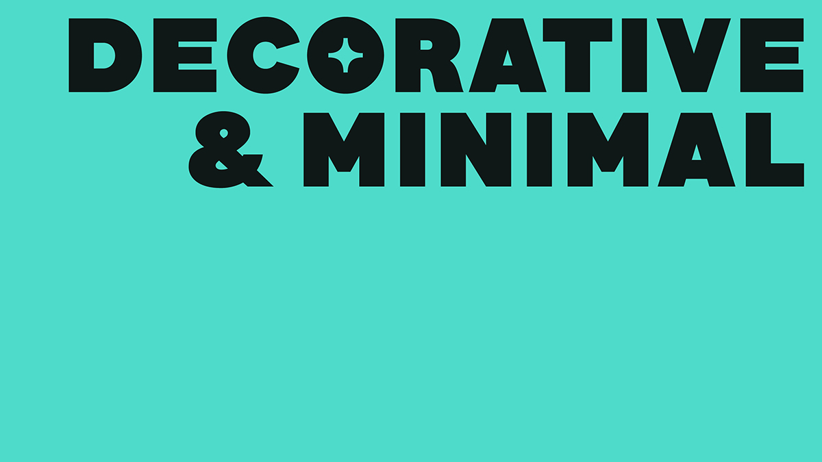
Today, we’re super excited to share the launch of our brand new identity. Designed with the incredible Marion Bisserier, we couldn’t be happier to present our stunning new look (pronounced ‘Type One’) which arrives with a gorgeous custom font and a whole new colour palette. This new identity feels so authentic and representative of the way we have grown as a platform, and with Marion’s unique, conceptually driven approach, we feel so proud and excited about the character and space it creates for our platform.
Working with Marion has been an absolute pleasure! The French designer grew up in Amsterdam and is based in London. Since graduating from London College of Communication, she has moved into freelance work and completed placements at APFEL and Pentagram. ‘My means to design a solution can vary but what is constant in my work is a concept-driven approach.’ The designer explains, ‘I find it difficult to label myself as purely a graphic designer or a type designer for the reason that what actually fascinates me the most is the intersection of graphic practices, that grey area in between rather than these practices independently. I think that’s also why I enjoyed the challenge of this brief so much.’
‘One of the first questions Amber and I asked ourselves when tackling the rebrand was, like on a lot of identity briefs, what makes it stand out from the other styles of design journalisms out there’, Marion continues. ‘I think part of the specificity of Type01 as a creative media platform lives in its focus on the craft of type, and its eagerness to dive into the nitty-gritty typographic details of each creation.’ There’s no doubt that our specifically deep interest in type called for a stunning bespoke font — but finding the right balance between versatility and consistency proved super important, too.
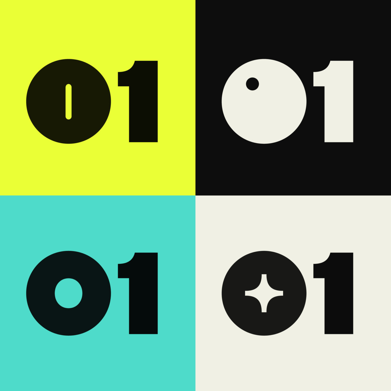
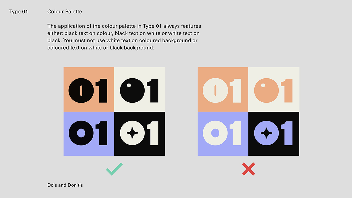
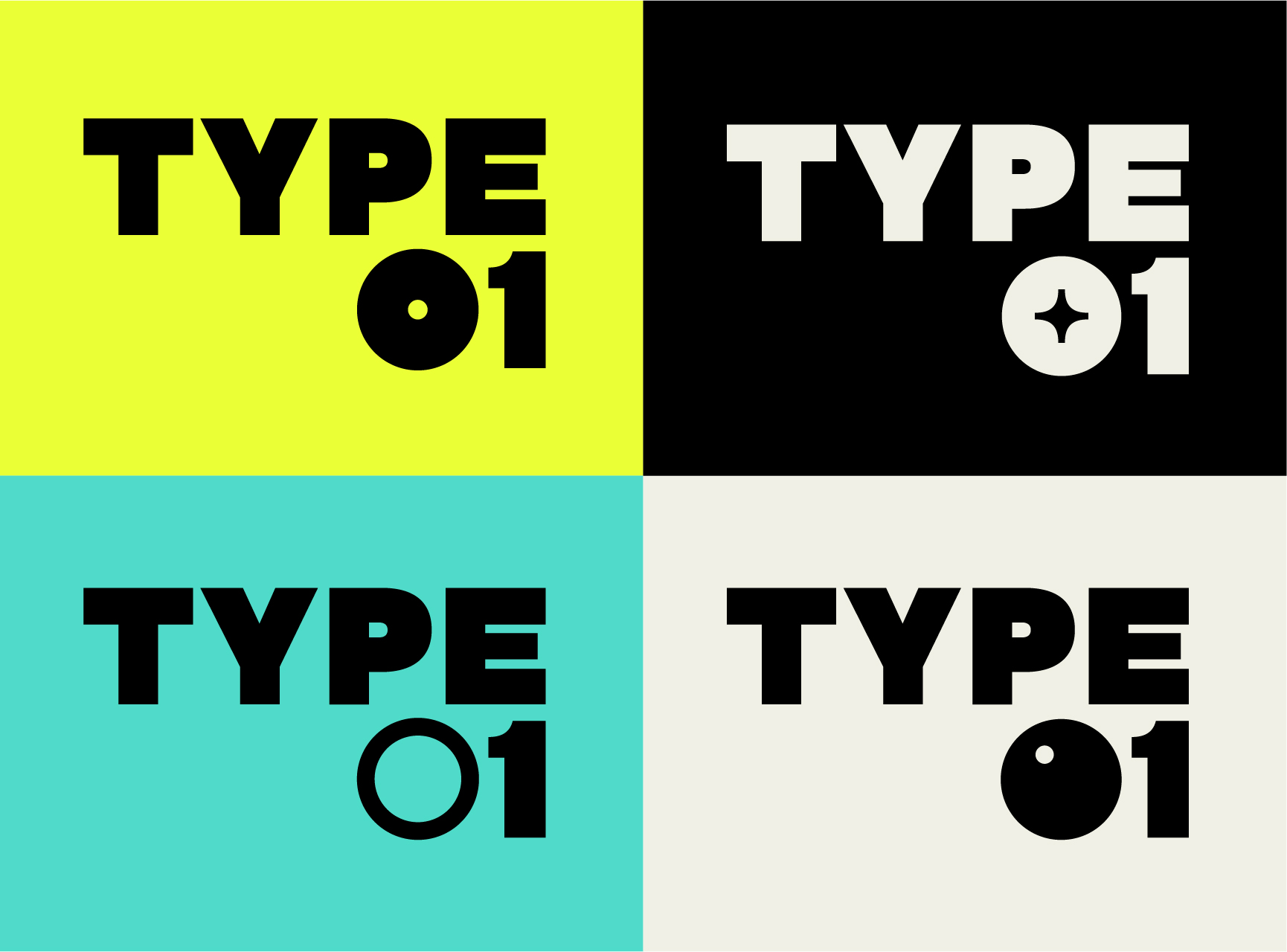
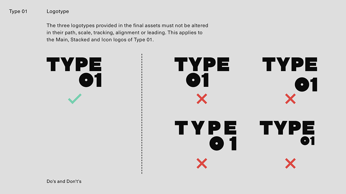
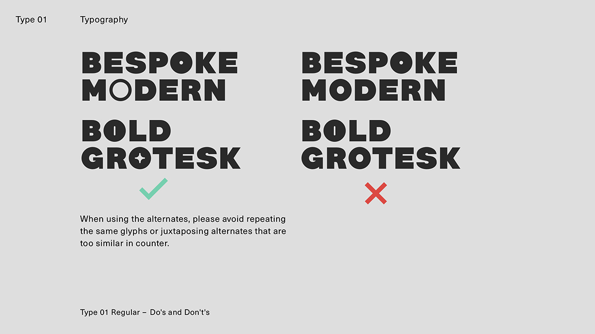
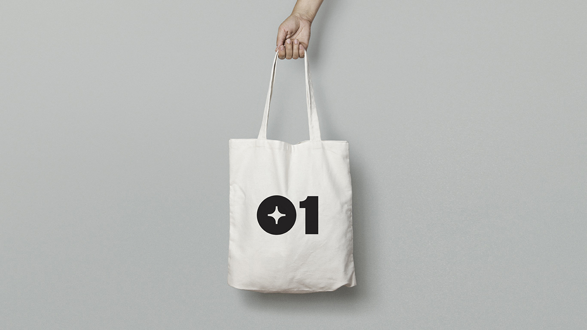
At Type01, we want to connect with and support exciting type projects and talents all across the board, and so our identity needed to convey that. ‘The more we experimented, the more we realised that we didn’t want the identity to speak to one particular type of typographer only —whether that’s a hardcore type designer releasing a multilingual font with six masters, or a 3D artist modelling beautiful bespoke lettering. It was important for us to create a space where these different worlds of type could co-exist and be celebrated, rather implying a hierarchy between them’, Marion elaborates. In this way, the variable counter space in the ‘O’ and ‘0’ pays homage to the variety of project and talent showcased on Type01; as well as the vast scope of possibilities and potential looking forward to the future of type.
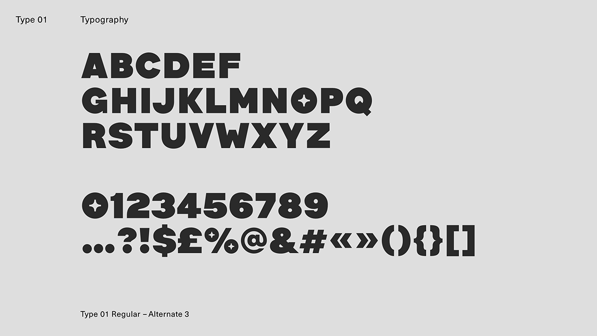
Meeting these unique anomalies with memorability and consistency was perhaps the biggest challenge in creating our bespoke font. As Marion expands, ‘I think what I found most challenging was to design alternates that would be different enough to evoke the different styles of typefaces (which was the core concept) and that at the same time worked well with the rest of the font and its DNA. This involved trying to match the sizes of the O’s different counter spaces to maintain a consistent rhythm while occasionally disrupting it in a subtle way. I think a common misconception about type design is that everything needs to be super consistent within the font’s system to achieve a rhythm. But actually when you start including slight anomalies that’s when the rhythm starts to really come along. It’s about controlling these anomalies and making sure they don’t overpower the rest or diverge too much from the foundations.’
The use of motion was also a central element to finding the right identity for us. ‘The identity wasn’t just about having these different alternates of the ‘O’ and ‘0’ but also how the transitions from one alternate to the other behaved and what that said about Type01. Something I’ve observed in animations of variable type recently is how the motion is quite linear, very much A to B style which can give a very neutral and mechanical feel. By incorporating more anticipation and bounce in the movement, we wanted to move away from this sense of mathematical objectivity and give Type01 a bit more of a persona, with its own character and views on things’ Marion shares.
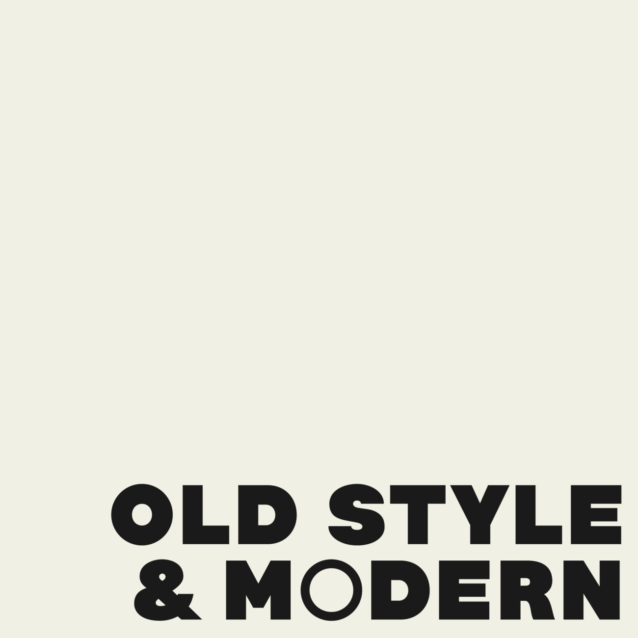
This gorgeous custom font titled Type01 Regular draws from a variety of influences and aims to connect dots across typographic traditions. ‘While subtle, the skeleton of the font definitely holds connections with the late 19th century Latin sans serif wood type that you would have been able to find in foundries like De Little’s in York who specialised in big bespoke signage.’ Marion articulates, ‘Because of the purpose of their work and because of the technology at the time, their wood type was carved by hand which gave birth to beautifully imperfect grotesques that then got hyper rationalised by modernism and standardisation of font mastering to the point of those details sometimes being completely lost. I wanted the Type01’s logo to have that right balance between the influence and heritage of the hand while expressing an outlook on the future, which is a recurring theme in type design in general. To me this style of typeface was a good solution to achieve this middle ground.’
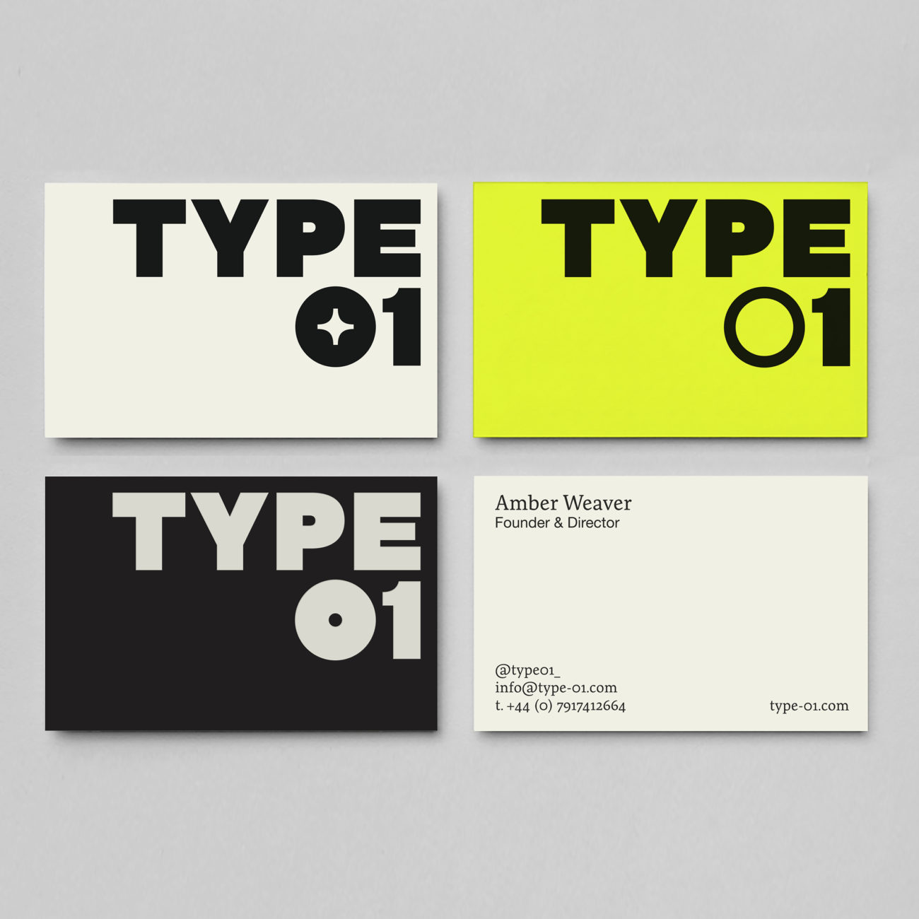
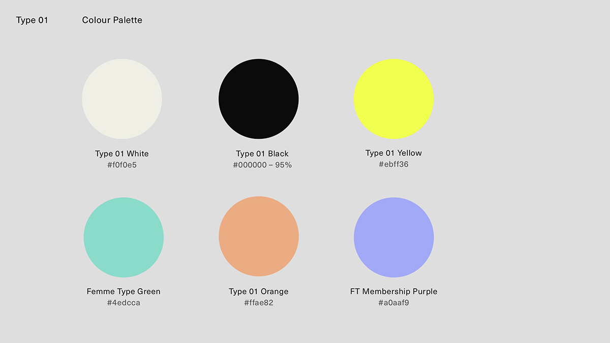
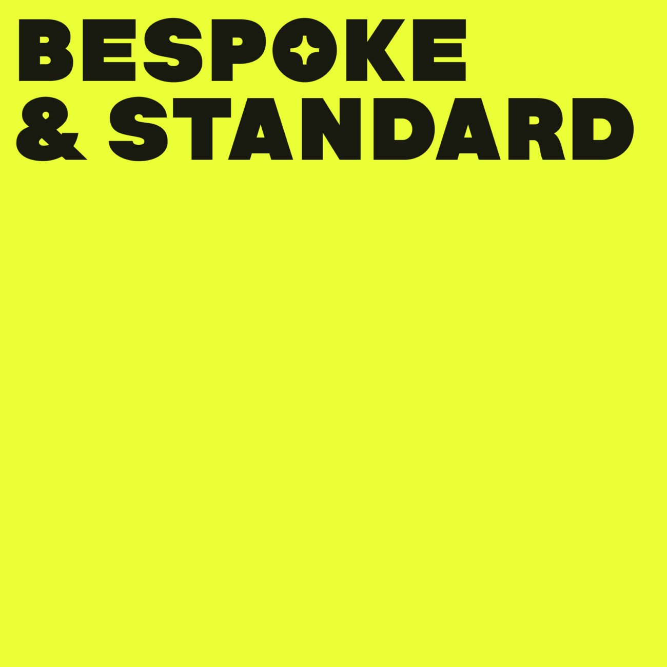
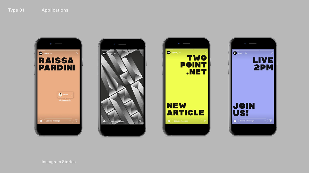
Our new colour palette intends to link Type01’s visuality with its other initiatives such as Femme-Type and Type Department, to create an energetic and charismatic new presence for Type01. ‘With that in mind’, Marion explains, ‘we created uniting the bright spot colour of Femme Type while putting forward a hero colour — the neon yellow. I also think behind an organisation or a brand there’s always the spirit of its creator. In my perspective, the neon yellow also reflects Amber’s eagerness to discover new things outside her comfort zone and not shy away from bolder designs, which is what makes her platforms so rich.’
Thank you so much Marion. You can see more of Marion’s work on her website and Instagram. We hope you all love this new identity as much as we do!


