
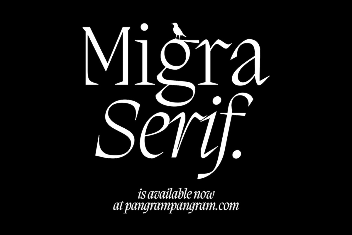
Pangram Pangram Foundry (@pangram.pangram) offer a huge range of stunning fonts with a trend-conscious approach and a refined, decorative-yet-robust aesthetic. Suitable for all kinds of visual endeavours, each of their fonts is free to try out (yay) and finished with impeccable attention to detail. Having created some stunning stand-out fonts, such as Hatton, Editorial New and Grafier, the foundry’s latest release, Migra, is a stunning new addition.
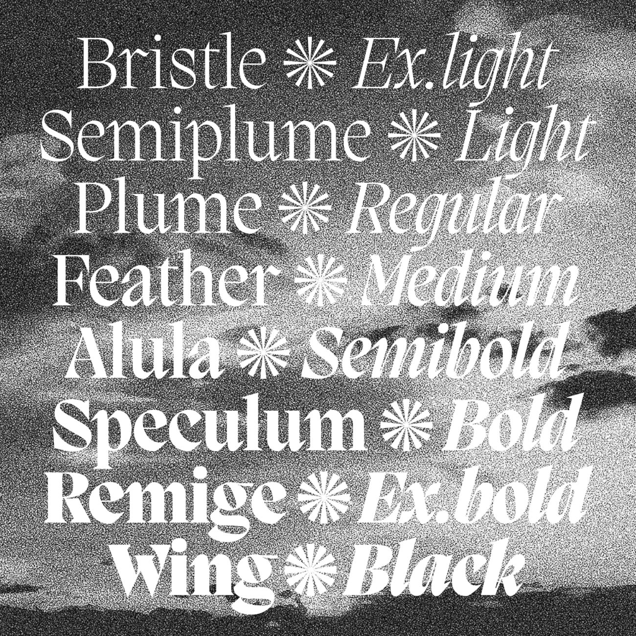
Inspired by the features of migratory birds, Migra is a spiky serif filled with movement and rhythm. As the foundry describes, ‘its weights span from an austere and elegant light cut to a hawkish and powerful black one’, and the gracious treatment of its bird-like features creates a palpable sense of movement and character.
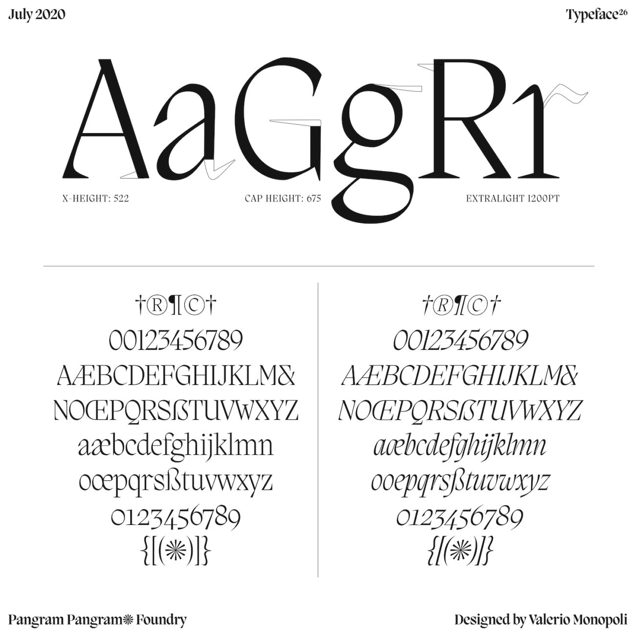
With some humanist features, Migra’s character exists as one of contrast: gentle and fluid, yet sharp and pointed. As a typeface inspired through creative visual characterisation, these juxtaposing qualities feel suited to the characters of migratory birds; their beauty in flight contrasted with their tough will to move and survive.
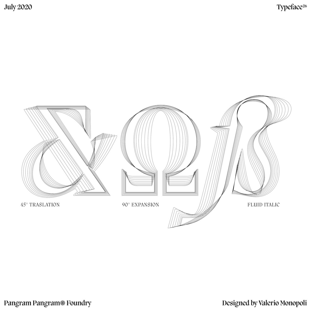
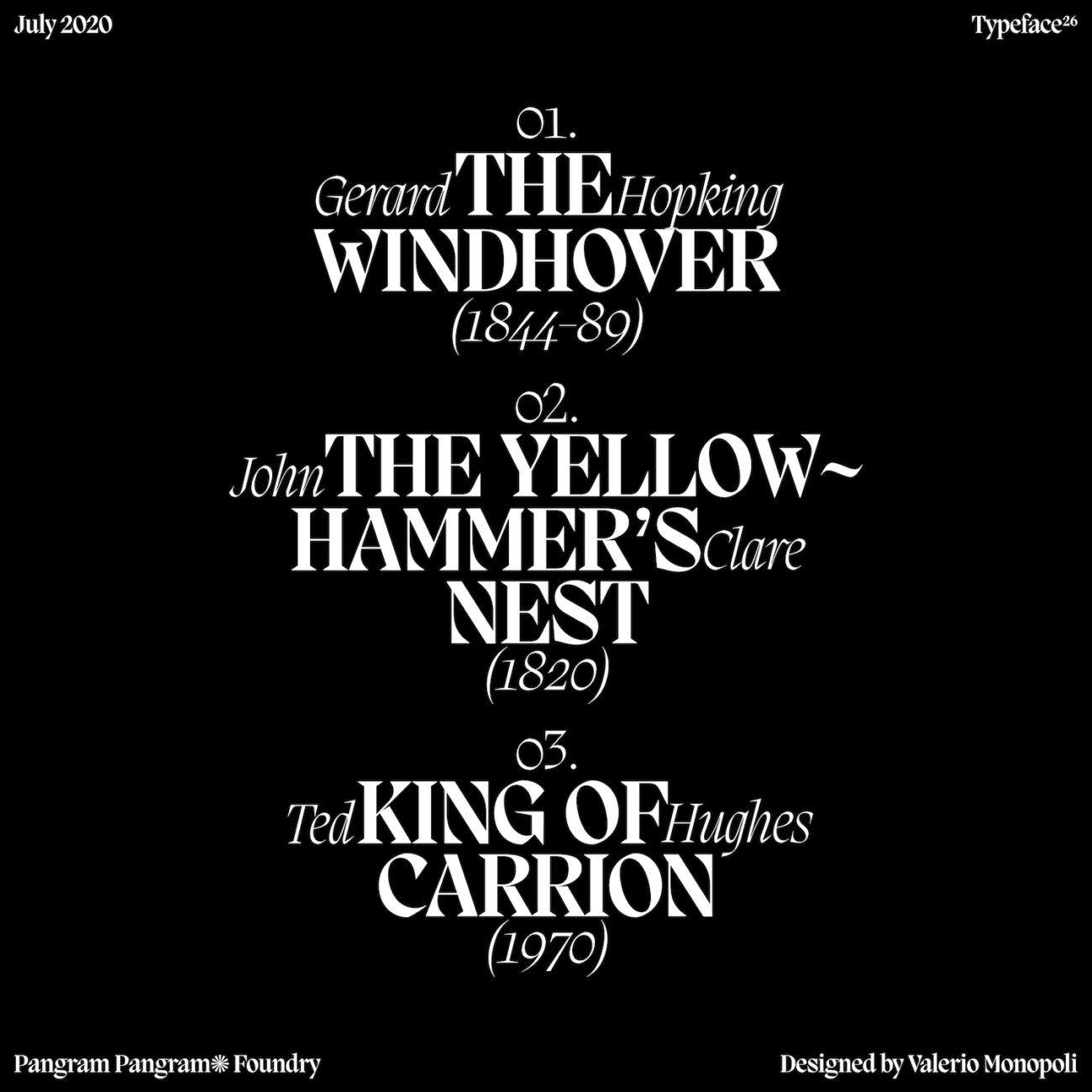
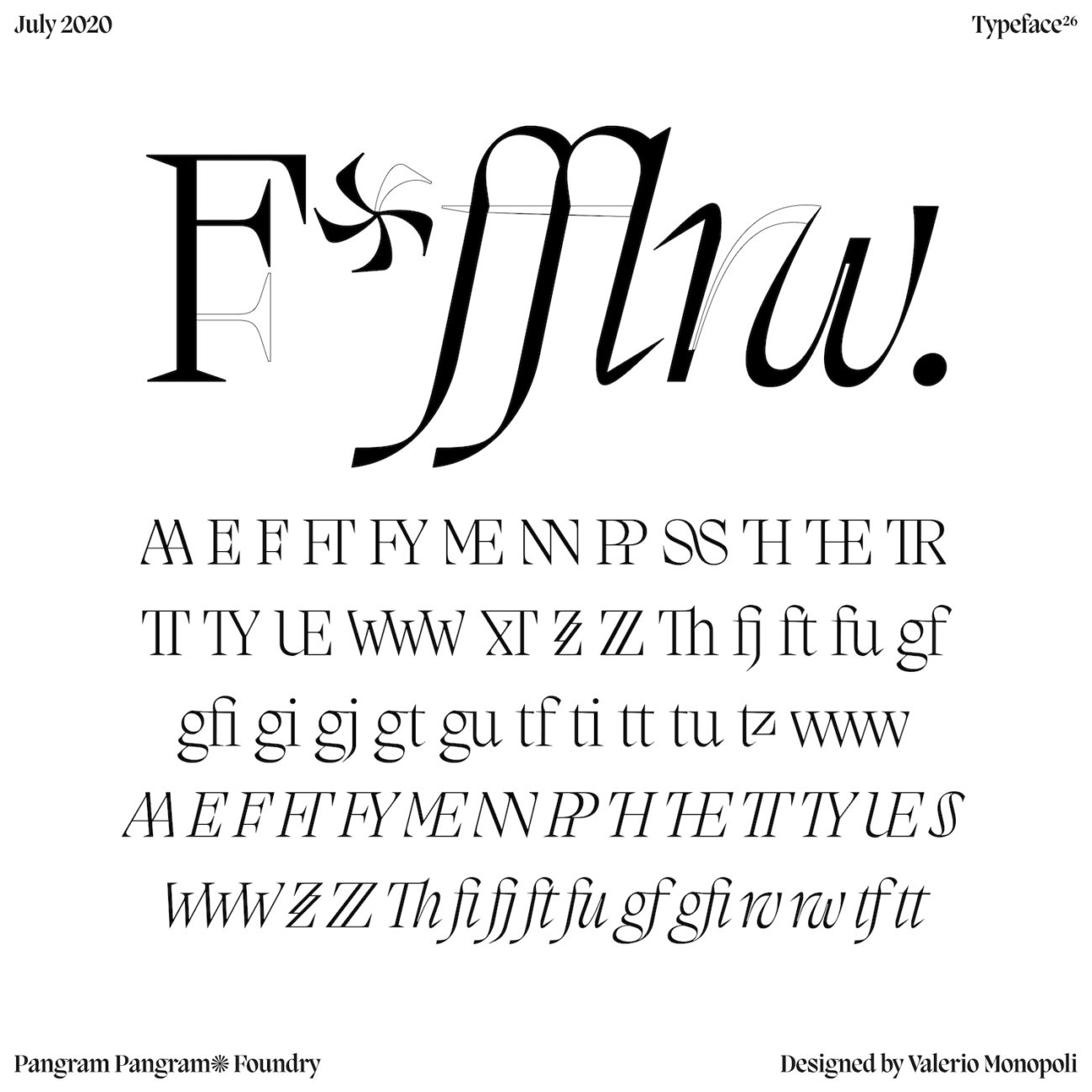
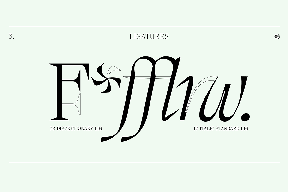
Alongside even more dramatically gestural italics, the typeface comes with a stunning set of ligatures, which create bursts of fluidity between the thorny characters. Likewise, the sharpness of the brackets is countered by gentle, humanist stroke weights, to create an organic sense of balance. And, there’s also some really sweet detailing on the lower case ‘r’ — if you look out for it — which mirrors the wings of birds in flight, which is a beautiful addition.

All these details come together so harmoniously and beautifully in Migra, meaning it feels really sensitive and well thought out as a finished typeface. You can find out more about Migra — or even try it out for free(!) — on Pangram Pangram’s website. Be sure to check out their Instagram, too, to see more of their gorgeous fonts in use.


