
Here, she tells us more about her work for the exhibition.
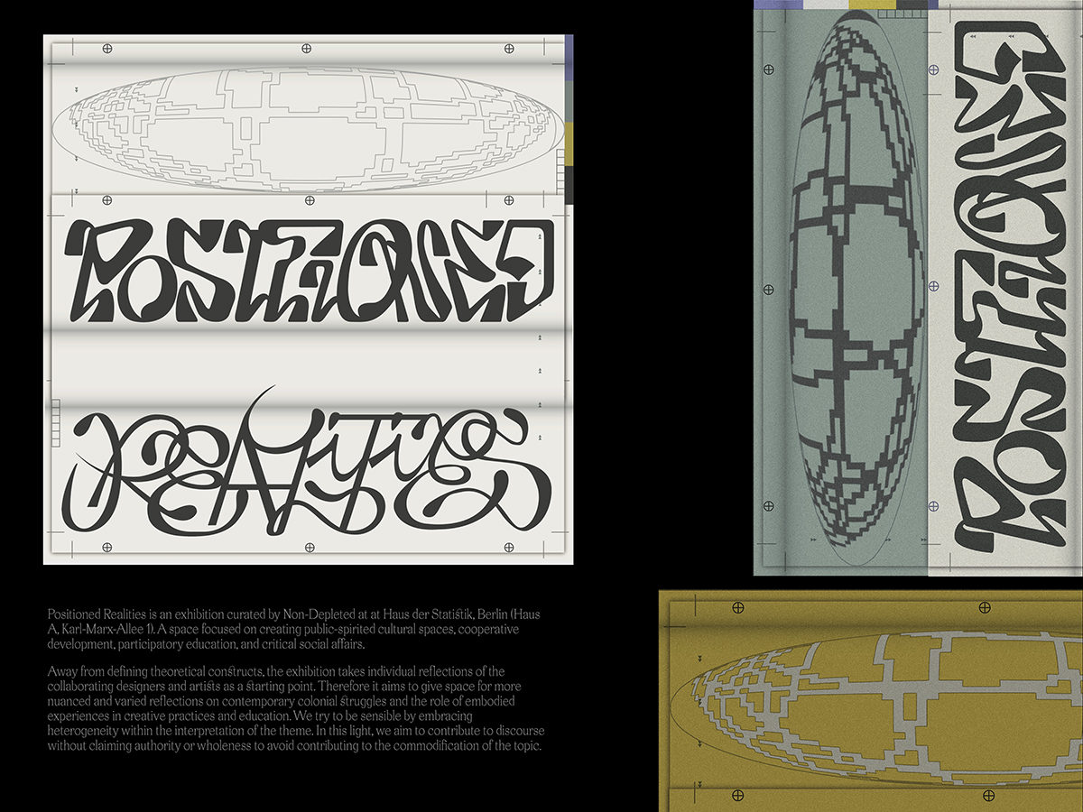
Curated in early 2022 by Non-Depleted at Berlin’s Haus der Statistik, Positioned Realities is an exhibition dedicated to creating public-spirited cultural spaces, cooperative development, participatory education, and critical social affairs. “This project has been developed into an ongoing, complex and collaborative visual research on what role might transnational visual and spatial practitioners take within decoloniality awareness, in order to question the monocultural disciplines and education,” Can Yang explains. Having designed the exhibition’s identity, the London-based lecturer, visual art researcher, and freelance graphic designer, takes us on a tour to understand the design system and how it was created.
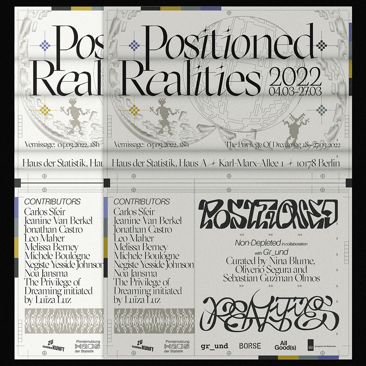
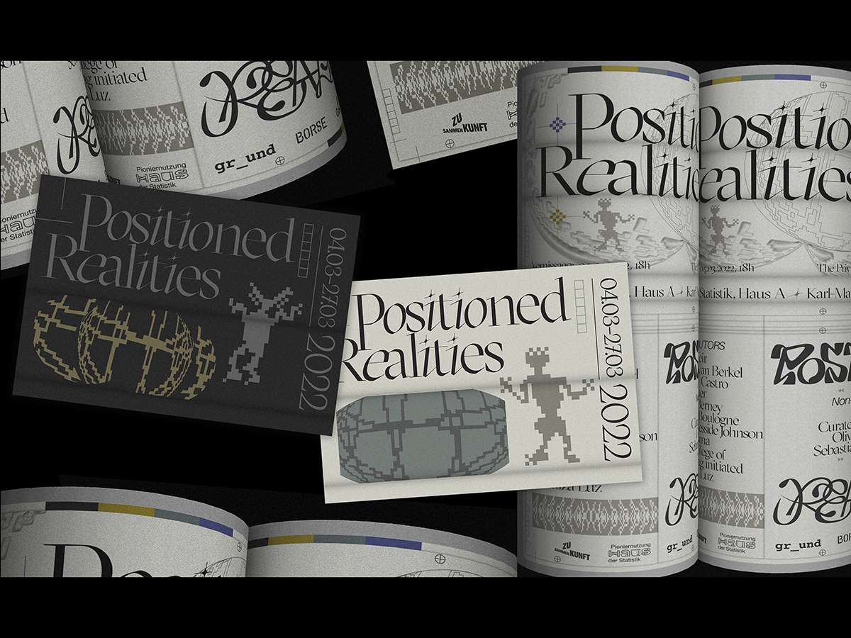
The Visual Identity
A “transnational assemblage of visual and spatial projects,” the exhibition takes the thoughts and reflections of the exhibition collaborators as the starting point. In line with this broad and diverse approach, when Yang began work on the event’s identity, there was little in the way of parameters – allowing her to work openly and intuitively. “The graphic design / typographic visual system of an art exhibition used to be considered as a container, or a vessel (i.e. Beatrice Warde’s ‘Crystal Goblet’) for the right amount of information that needs to be exposed,” she explains.
The exciting thing about this project, Yang believes, is the discussion of how design and visual culture can create spaces for alternative or parallel courses of action. In the case of Positioned Realities, graphic design has become a part of the research material and the critical display of the show. She considered the balance of using the graphic identity as her voice contributing to the discourse, “while dissolving itself into the subtle and generous gesture.” The result is a design system that subverts the traditional idea of a group exhibition identity.
The Art Direction
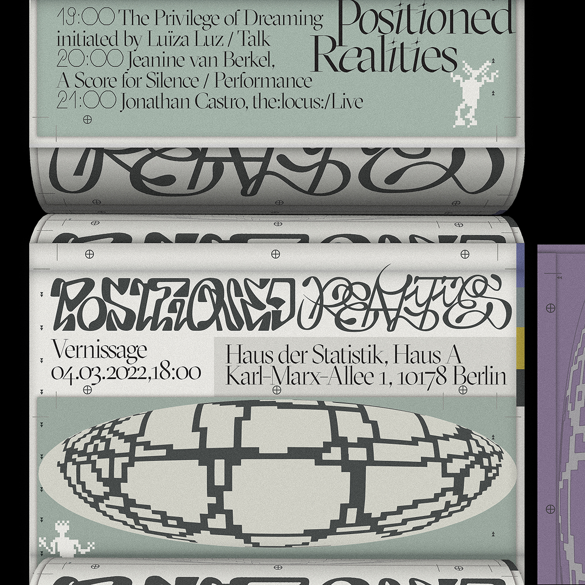
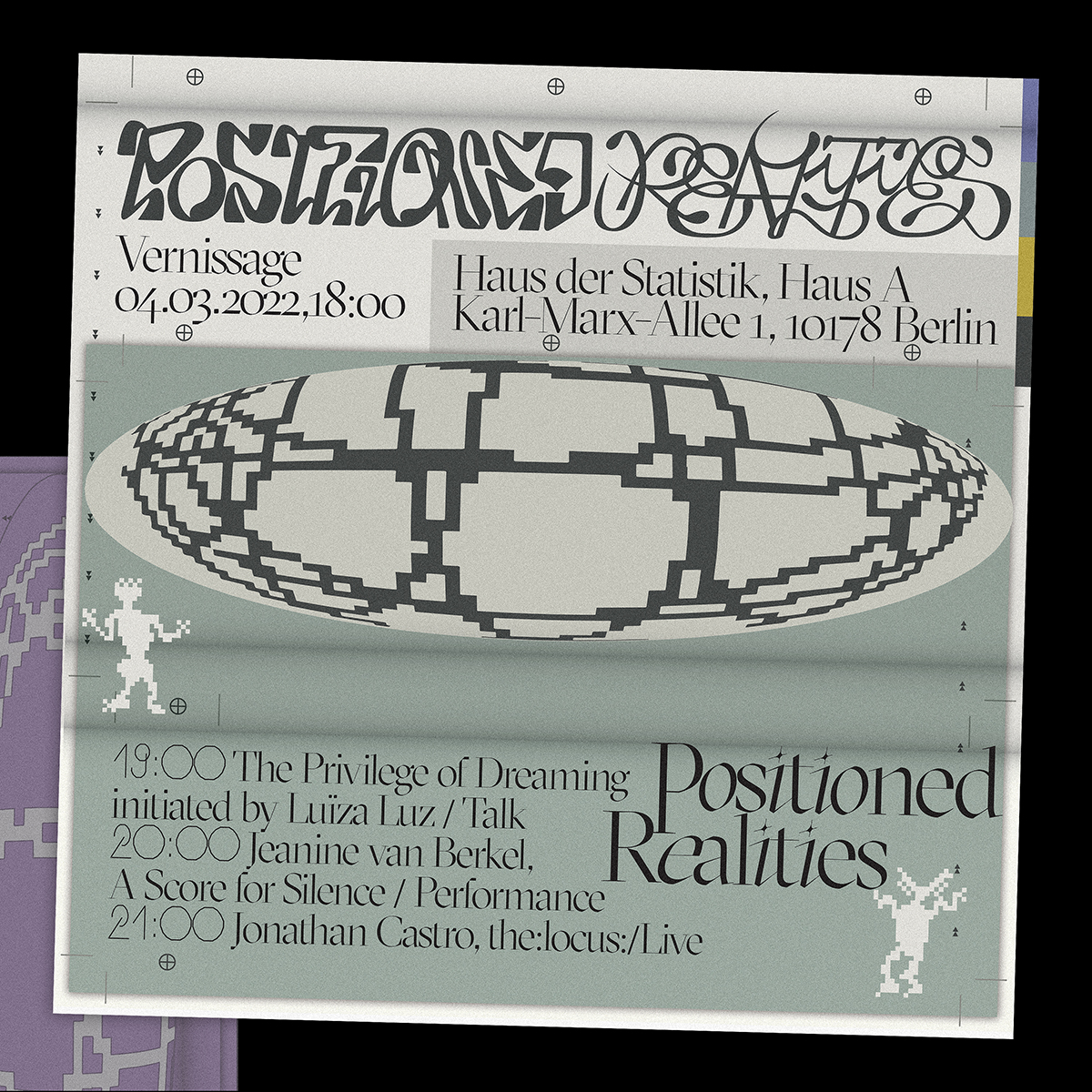
The art direction aims to give more space to the exhibition’s themes, and hones in on the idea of heterogeneity, which Yang reinforces through type and colour. “The art direction has been focused on firstly, creating a cooperative development and participatory perspectives on developing critical social affairs: the design assets and elements are very flexible and reciprocative,” She reveals. “Secondly, a diverse intra-acting concept based on transgression against rules, hierarchy and meta-narrative.”
Colour and Type
“When designing the layout and typographic system for the identity, I was looking for some exciting new combination of typefaces existing on the market and something more fluid and unique,” Yang reflects. “The motivation of assembling multiple different typefaces to create a clear information display is the same as the exhibition’s intention in a certain way that design criticism and design writing are also important elements.”
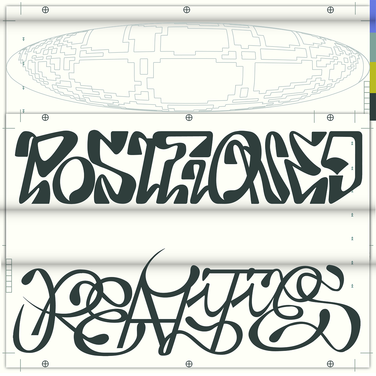
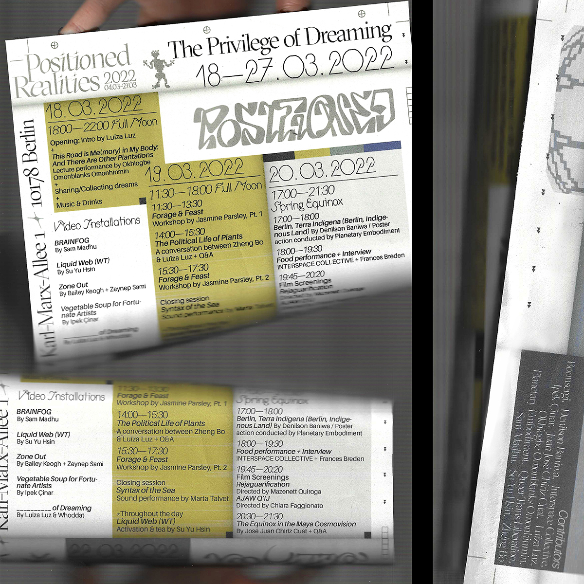
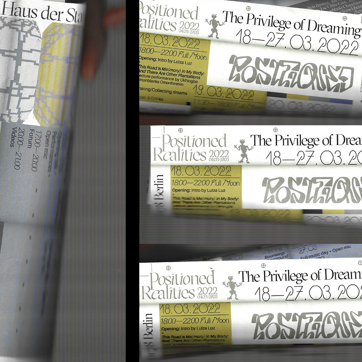
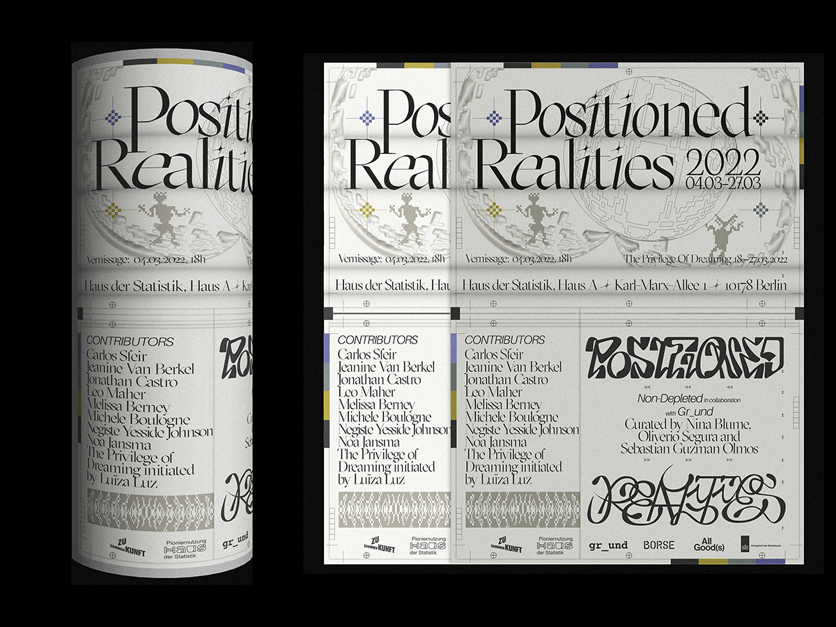
They’re a diverse and expressive selection, providing plenty of legibility and personality in equal measure: Cirrus Cumulus regular by Clara Sambot; Grilli Type’s GT Sectra Display light; Aileron light, regular and bold, designed by Sora Sagano; Yang created a custom logotype for the title. “Since the exhibition involves multiple units, dialogues and events,” Yang adds, “I wanted to present a logical, readable and comfortable reading space for the audience while providing an intuitive and schematic mediating space for generating dialogue and engagement with pictorial thinking.”
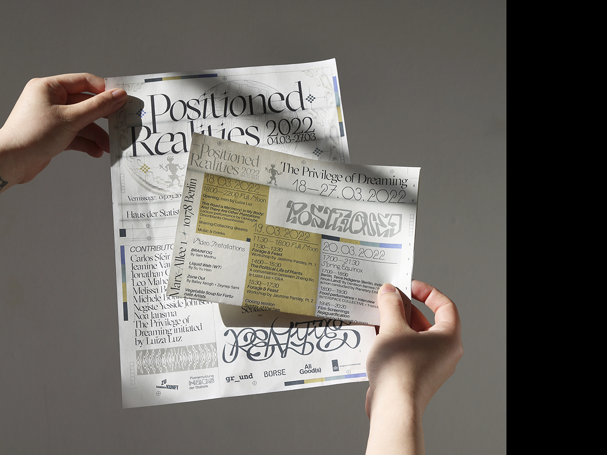
To complement, and not overwhelm the design, Yang opted for a subtle colour palette of muted and metallic hues. “It was designed to be printed in CMYK,” she adds, “thus the saturation level is adjusted to be the same on both digital devices and physical prints.”
Digital versus Tangible
From analogue to digital, both the identity’s colours and illustrations reflect Yang’s design process and bring our attention to the relationship between digital and tangible creative work – contrasted through pixelated mythological figures alongside the swooping forms of hand-drawn lettering. “The wave of digitalisation has homogenised the design industry,” she points out. “It seems that the tactility of paper and the smell of ink are getting further away from us.”
She therefore celebrates the motions of drawing manually, with the belief that direct body gestures are an important source of inspiration. “Drawing with a pen, the most direct and original mark-making tool,” she reflects, “could be as powerful as the aura that exists within the work itself. Draw, trace, digitalise the form and stylise within the context, the transformation vividly captures my pursuit for creative sparks and nostalgia for primitive culture,” Yang concludes.
Thank you, Can, for this fantastic insight! You can follow Can on socials.
Browse more industry interviews here.


