
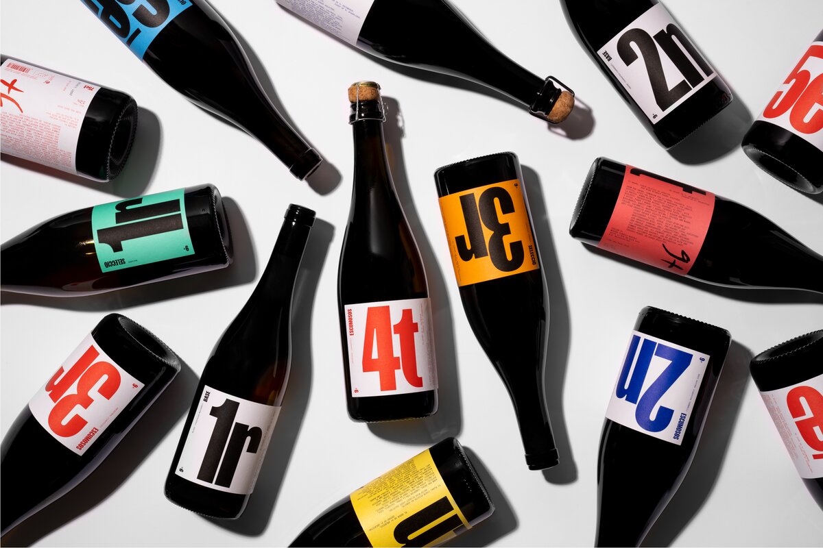
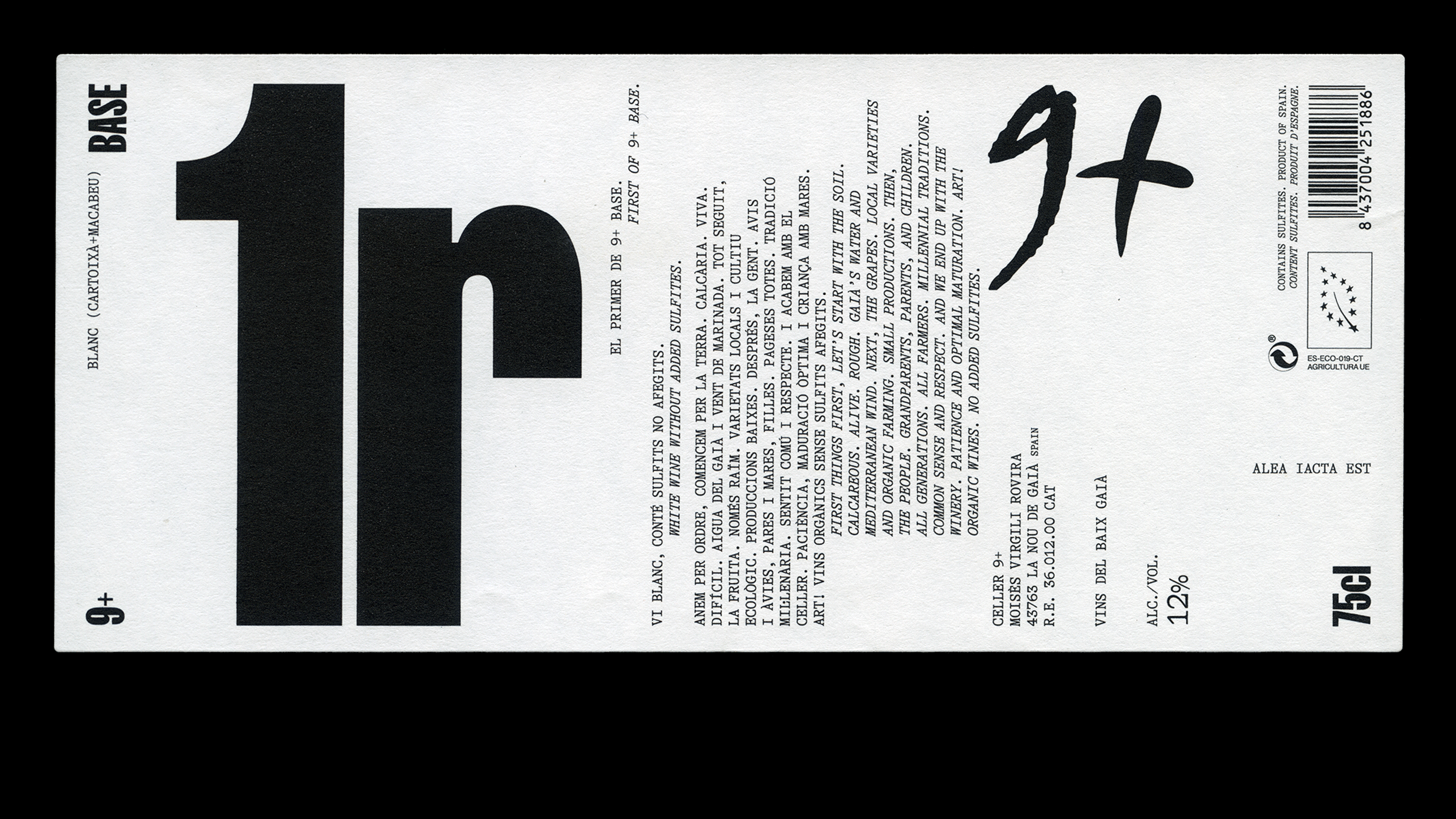
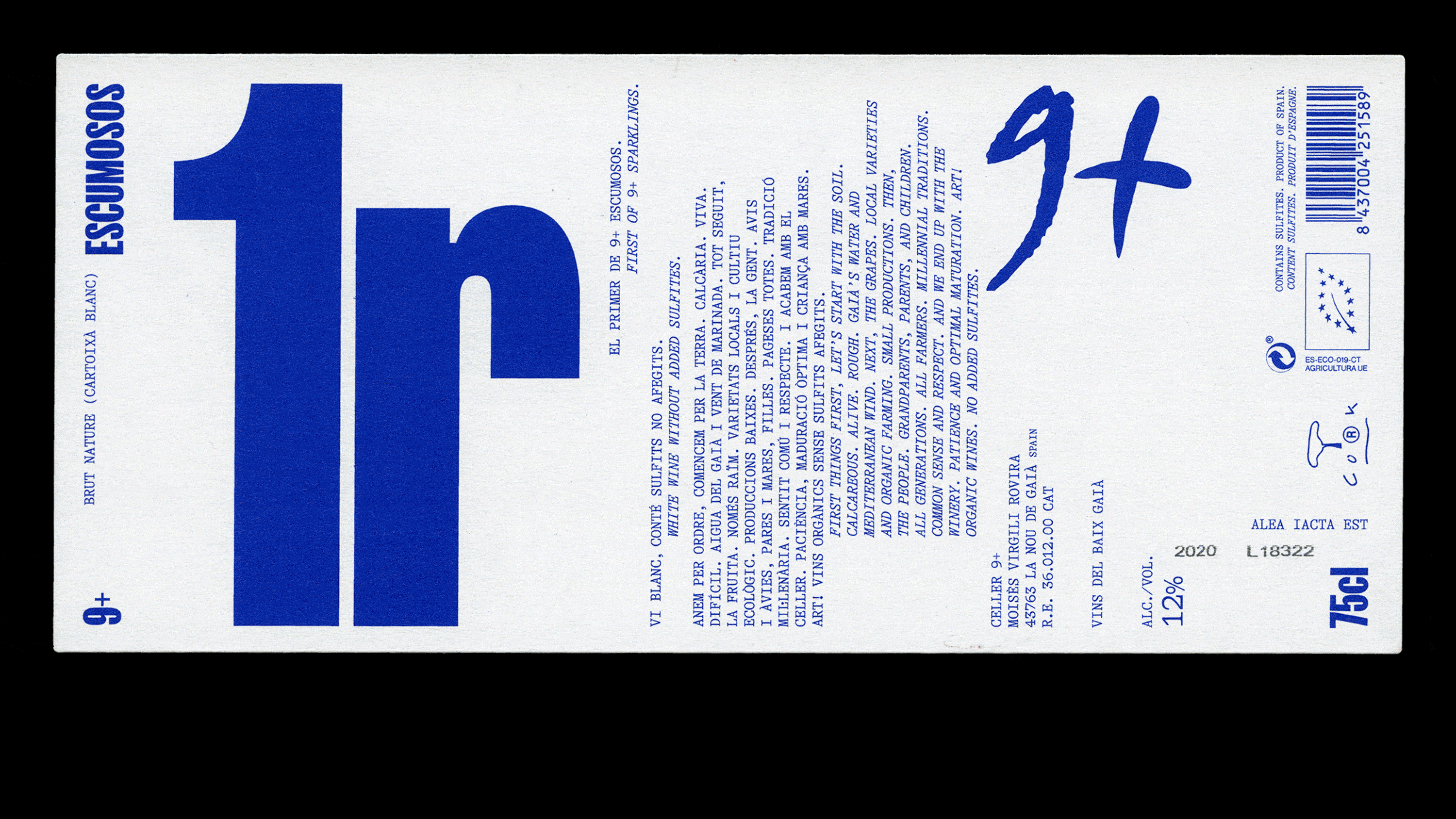
At the end of 2022, the full-service design studio Pràctica released the grand campaign of redesigning the Wine label 9+ a wine label whose name is a number, not a word.
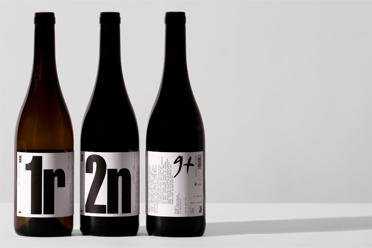
The Winery, based in Catalonia, Spain, had 15 labels redesigned by Pràctica, all under a global image but with different wine families: Base, Selection, and Sparkling. “This need led us to create a naming and graphic system that orders and enumerates the wine bottles, not only to rationalize the wide range of products but to strengthen the winery’s identity as well as to make it stand out from the natural wine sector”, tells us one of Pràctica’s partner, Anna Berbiela.
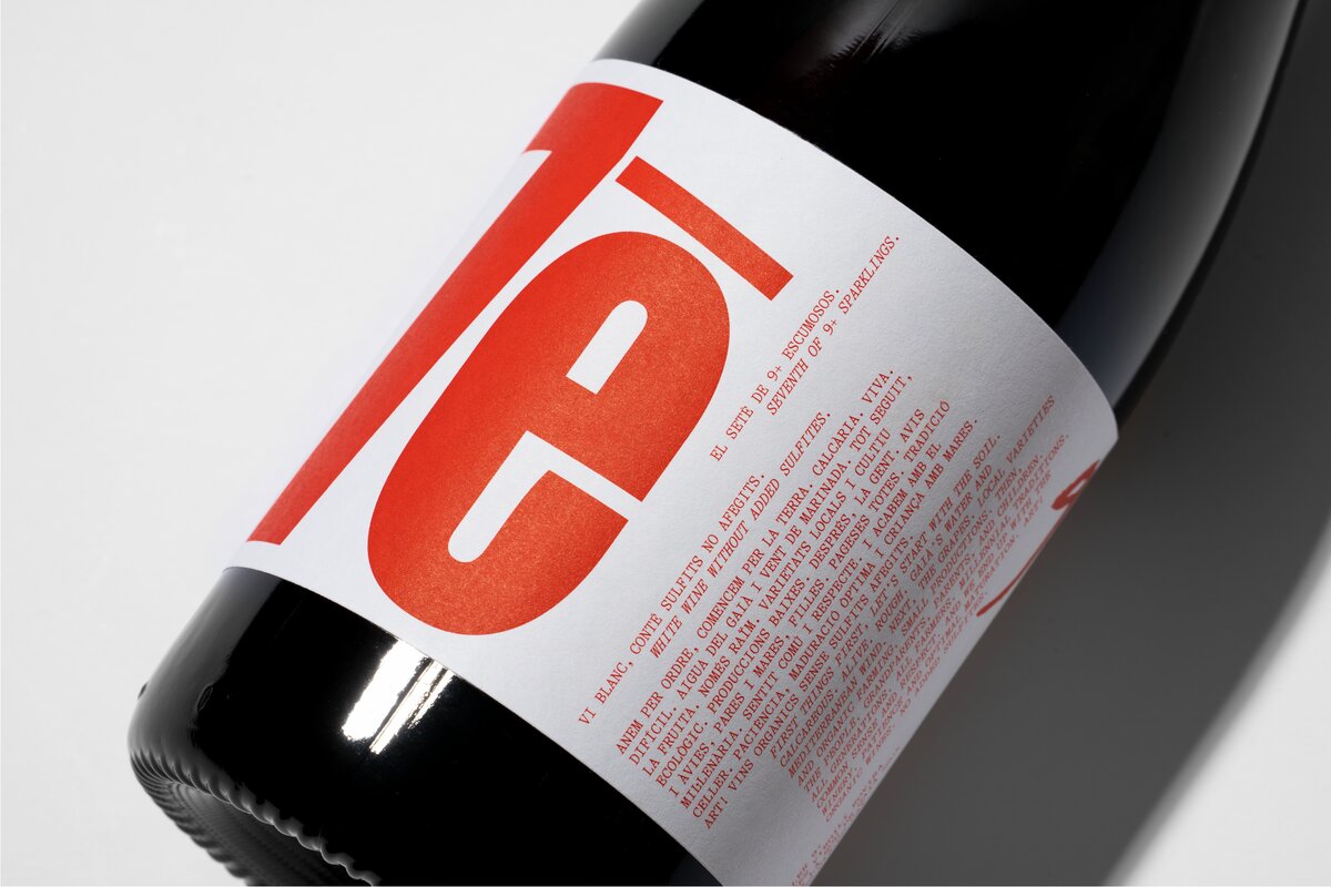
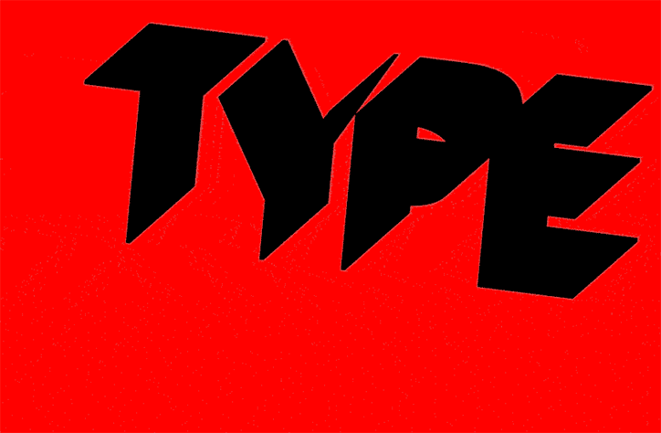
The fonts used on this project were FK Screamer by Florian Karsten, and GT Alpina by Grilli Type. As a commercial project, depending on the wine, the labels are printed from 3 to 20 thousand units. All prints are done by Chalaguier. The campaign photographer is Enric Badrinas.
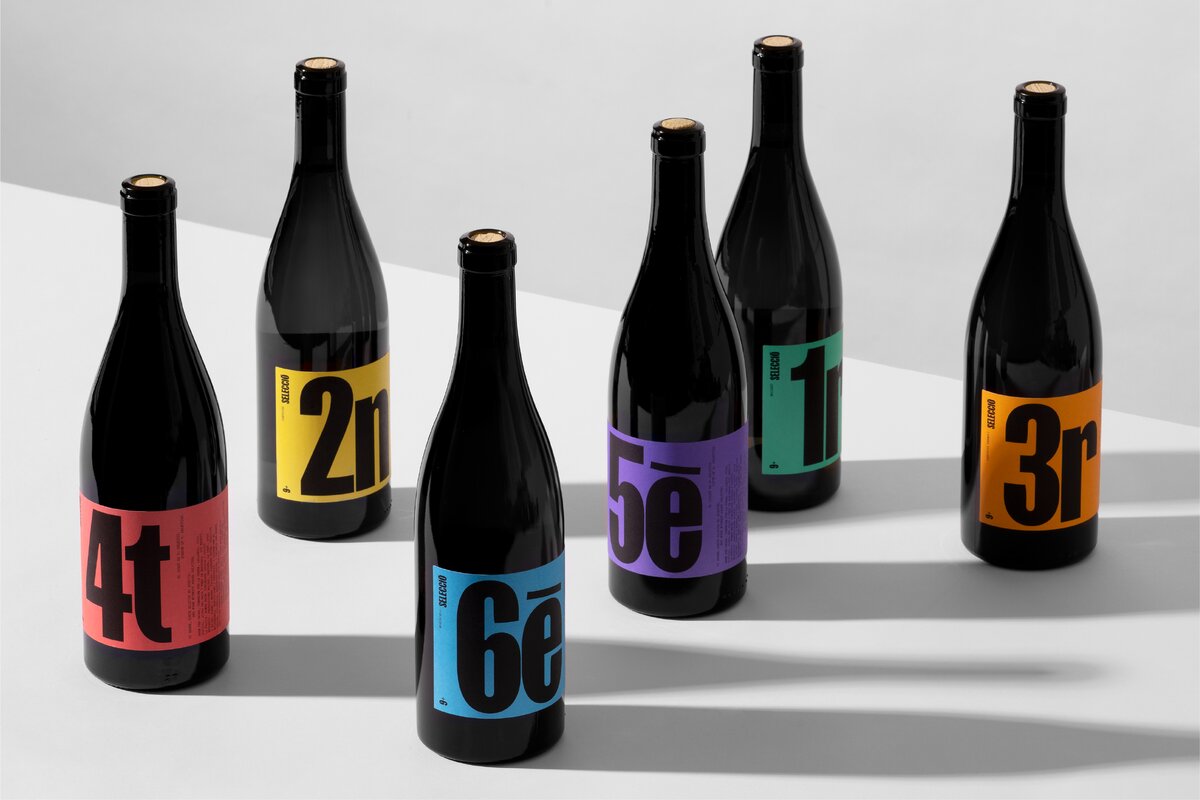
When it comes to the families, Base, Selection, and Sparkling, Anna explained that for a long time, the winery had had a range of wines that in a way have defined its visual identity. These are ecological wines, with a strong mindset focusing on the current environmental world context.
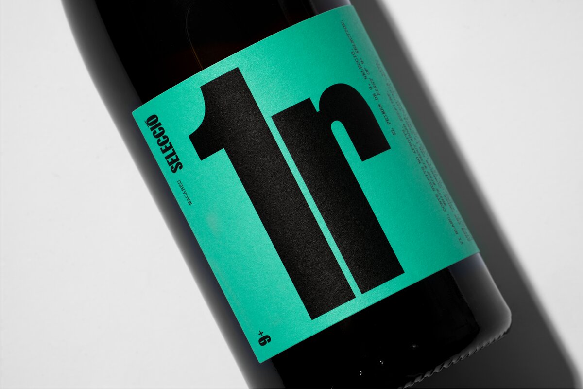
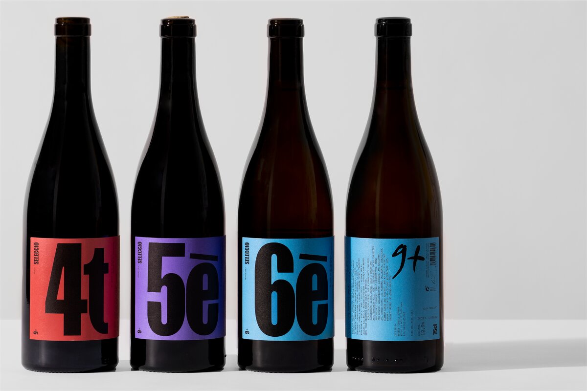
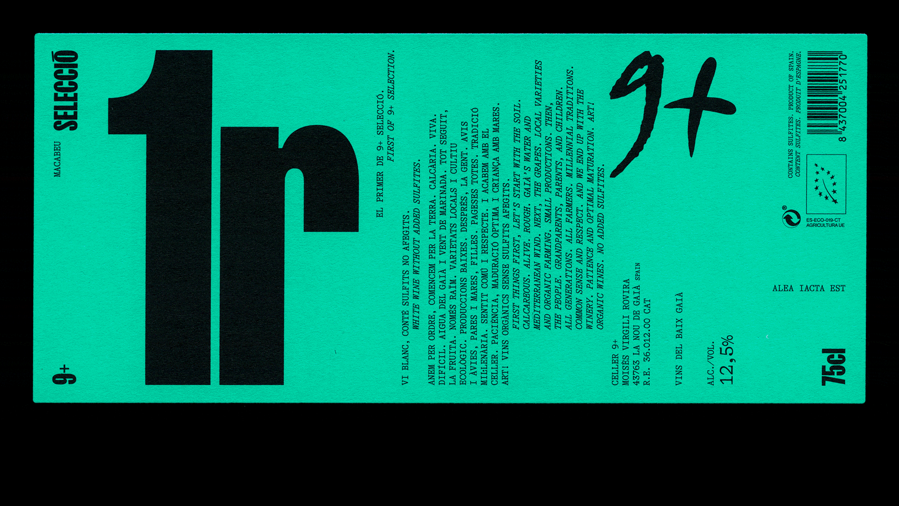
Base refers to wines that are easier and more affordable both in terms of taste and price. “It is for this reason that, despite following the global image, we opted for a more humble and sober treatment in terms of colour”, explains Anna. As for Selection, these are a range of more special and unique wines, some with local varieties that are difficult to find and in smaller productions.
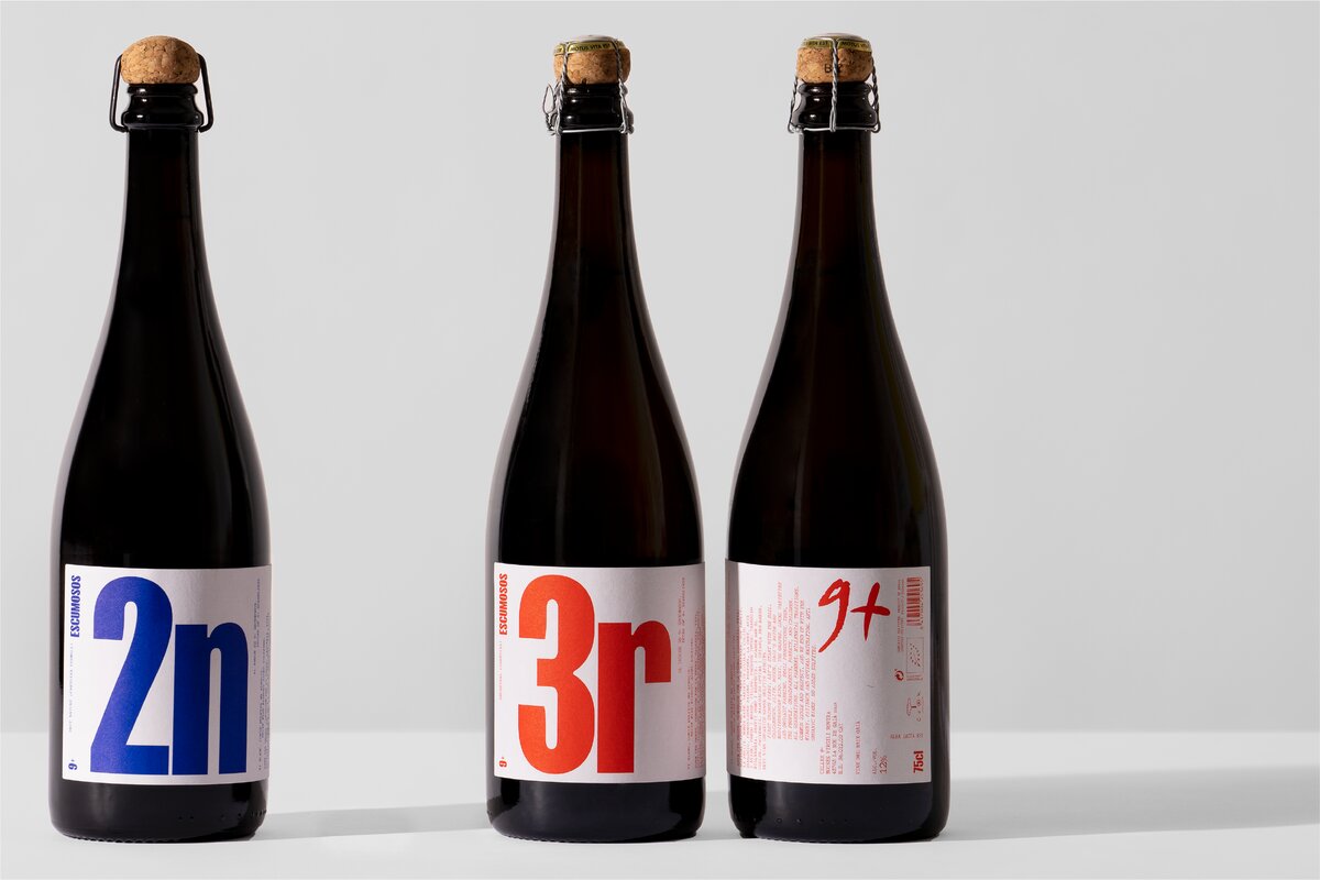
“In short, they have an extra plus over the previous ones. It is for this reason that we added a different background colour to each of the bottles that make up the family. Last but not least, we have the Escumosos, fun and festive sparkling wines. For such reason, we’ve opted for red fluorescent for the sparkling wine, and blue fluorescent for the cava. The contrast between the white background and the fluorescent colours gave us that funky character we were looking for in these wines.”
La Pràctica
The design and identity Studio has offices in both Barcelona and New York and describes themselves as creators who seek design to reveal the particular truth of each brand. “By simplifying complexity and shaping concepts, we create work that makes sense”, completes Anna.
Pràctica is all about making things – especially graphic design and identity. “There are many different ways to do our job but we believe it’s a process involving researching, thinking, sharing, challenging… then giving all this a definitive shape.”
Winner of the series of gold, silver, and bronze Laus Awards from ADG FAD, awards with D&AD and TDC, with a Certificate of Ty[ographic Excellence, Pràctica strives to craft compelling visual stories for all projects and media, from art direction, creative direction, visual identity, digital platforms, printed matters, and packaging, to environmental graphics.
As a final note from the Studio, they would like to address the credits to the 9+ resign campaign as shared through every studio partner. Still, they would like to personally thank Jaume Jordà and Moisès Virgili (and family) for their trust.
See the full Behance page on the 9+ design campaign here. Keep up with Pràctica’s projects on their official web page, and Instagram.


