
A group of graduates from the University of Reading MA Typeface Design class of 2019/20 have just launched a new website to showcase their final projects. Presenting typefaces spanning a wide range of languages and scripts, the (then) students created the website almost entirely remotely via Zoom, resulting in an incredible collection of work which serves to highlight an exciting new generation of type designers.
‘After a strange year of study, we are excited to announce the launch of our webpage showcasing our final projects’, says type designer Jeremy Johnson (@formetype). ‘Working from an independently developed brief and research questions, each of us created a multi-script typeface over the course of the year, which contains specimens of our work along with our reflections on the design process.’
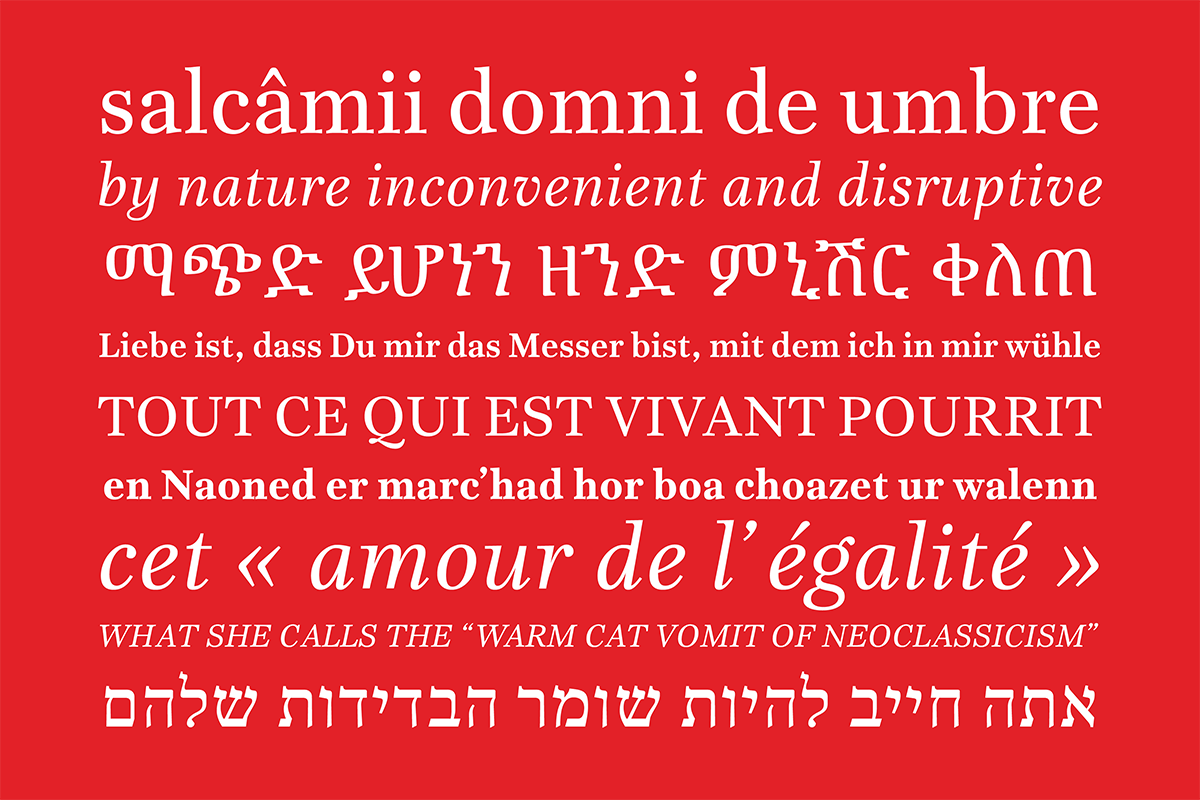
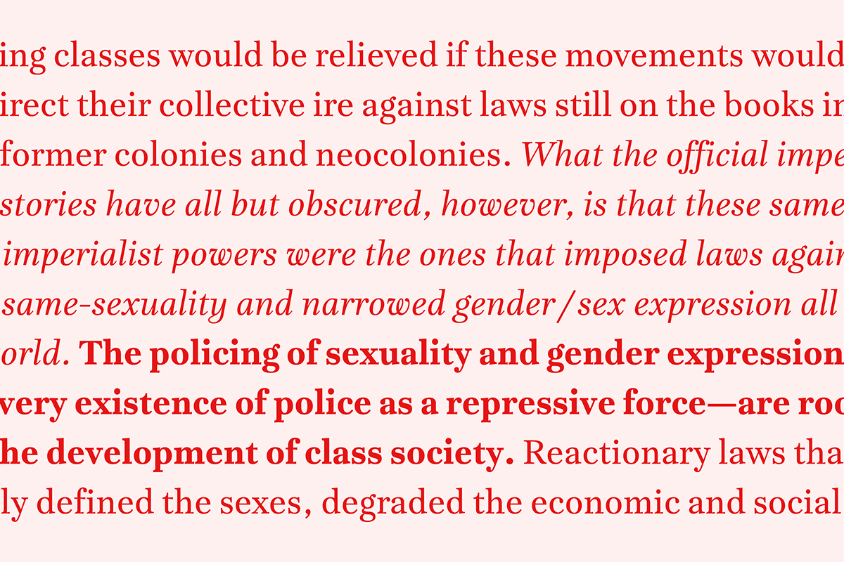
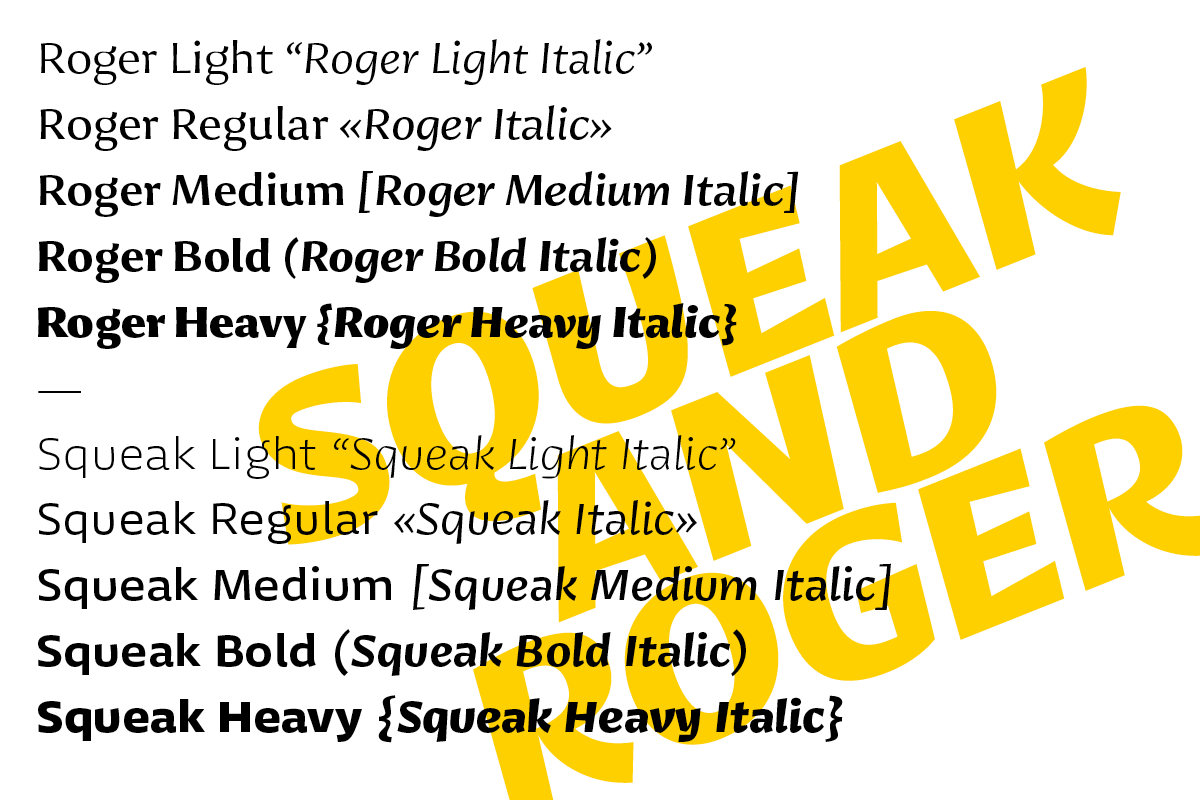
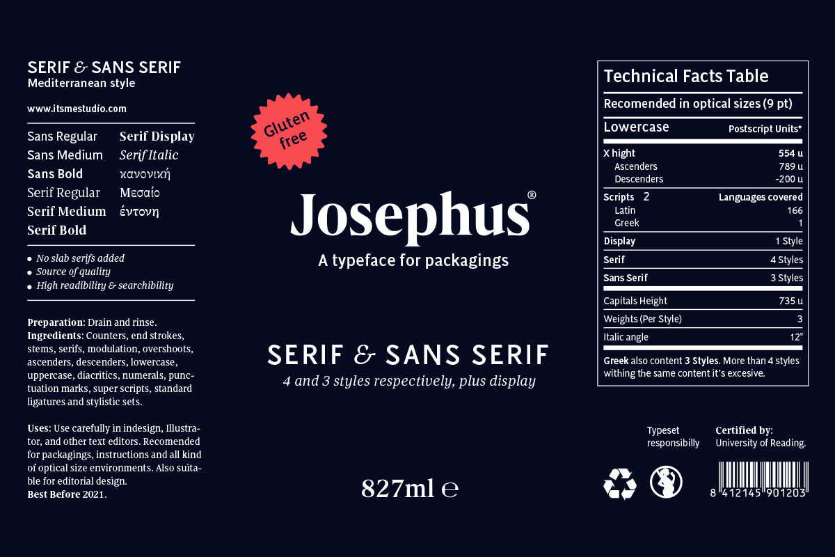
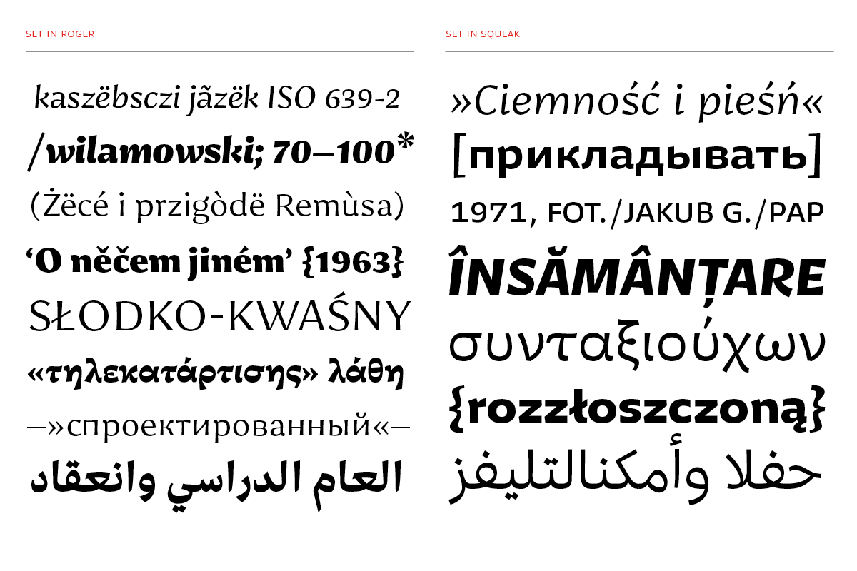
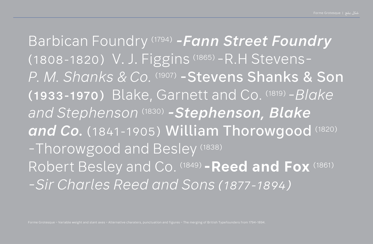
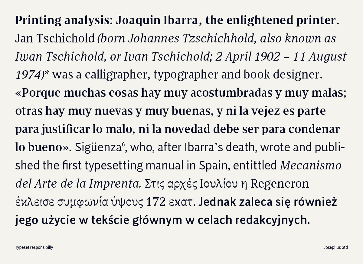
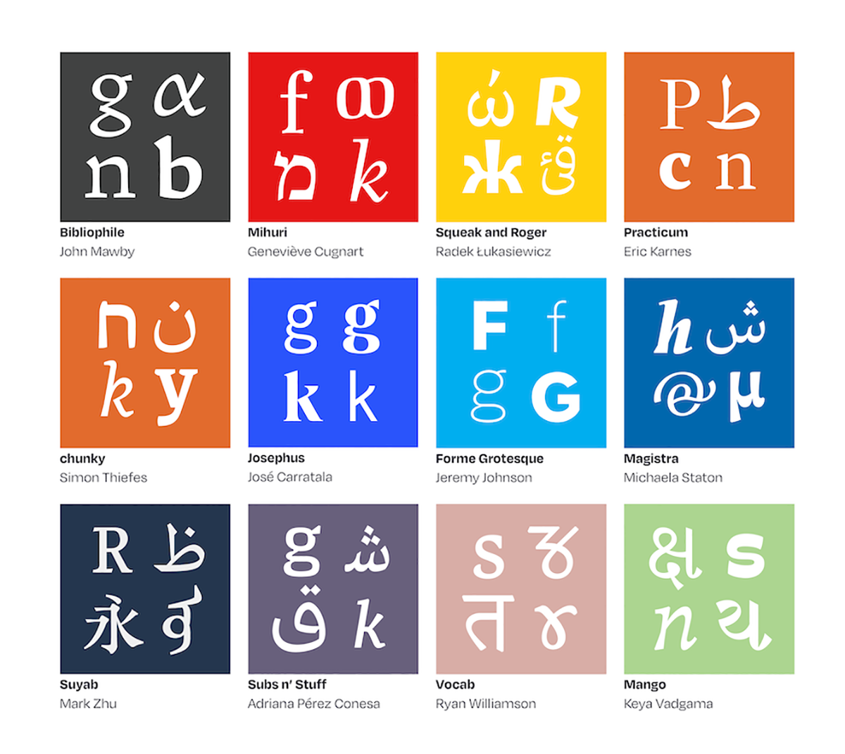
The webpage allows viewers to navigate through the visuals and stories of each extensive typeface, all of which cater to a wide range of scripts. Each typeface is incredibly unique in its own way, developed with a purpose-oriented outlook. From Jeremy’s multi-purpose variable typeface Forme Grotesque, to Mark Zhu’s multi-script typeface family Suyab—intended for ‘language-learning textbooks and other complex multi-script typesetting environments’—the typefaces in this collection are thoughtful, practical and meticulously designed.
Asked whether he feels universities currently teach multi-script design enough, Jeremy says: ‘No I don’t think so, and certainly yes I think designers should be trying to design for more than one script. Being able to design one or two more scripts can only improve your design work and how you approach a project. Collectively we all thought it to be quite challenging at first, particularly with the drawing process, but with regular one-on-one tutorials it slowly becomes easier and once you have a few letters drawn you can start to see the flow of the characters and how they relate to each other. Except for designing Greek: just when you think you’ve got it, you realise you haven’t!’
‘We were all in the privileged position of having extensive workshops in Arabic, Greek, Devanagari, Chinese, and Cyrillic, all of which were either taught by Gerry Leonidas, Fiona Ross, Victor Gaultney and/or a PhD student native to that writing system, so the history of each script and how to correctly draw the characters were very much central to our design thinking’, he continues. ‘I think it’s easy to fall into the trap of Latinising an unfamiliar writing system, so it’s important to look at what has been done before to get a sense of the conventions of the script.’
It’s such a joy to journey through the work of these incredible type designers, and this collection marks a direction which will hopefully proliferate. You can check out the website now.


