
The integration of motion and kinetic typography into the world of branding and visual identity creation continues to be ever-growing in popularity. Particularly when creating an identity for an event, it seems motion is becoming a must for bringing that event alive; a tool to immerse viewers into its atmosphere before it has even begun. And with much of the world still dipping between lockdowns, hosting immersive experiences in digital spaces (or at least relying on those digital spaces to create a sense of immersion) is not only the sole sustainable choice, but actually a pretty interesting one.
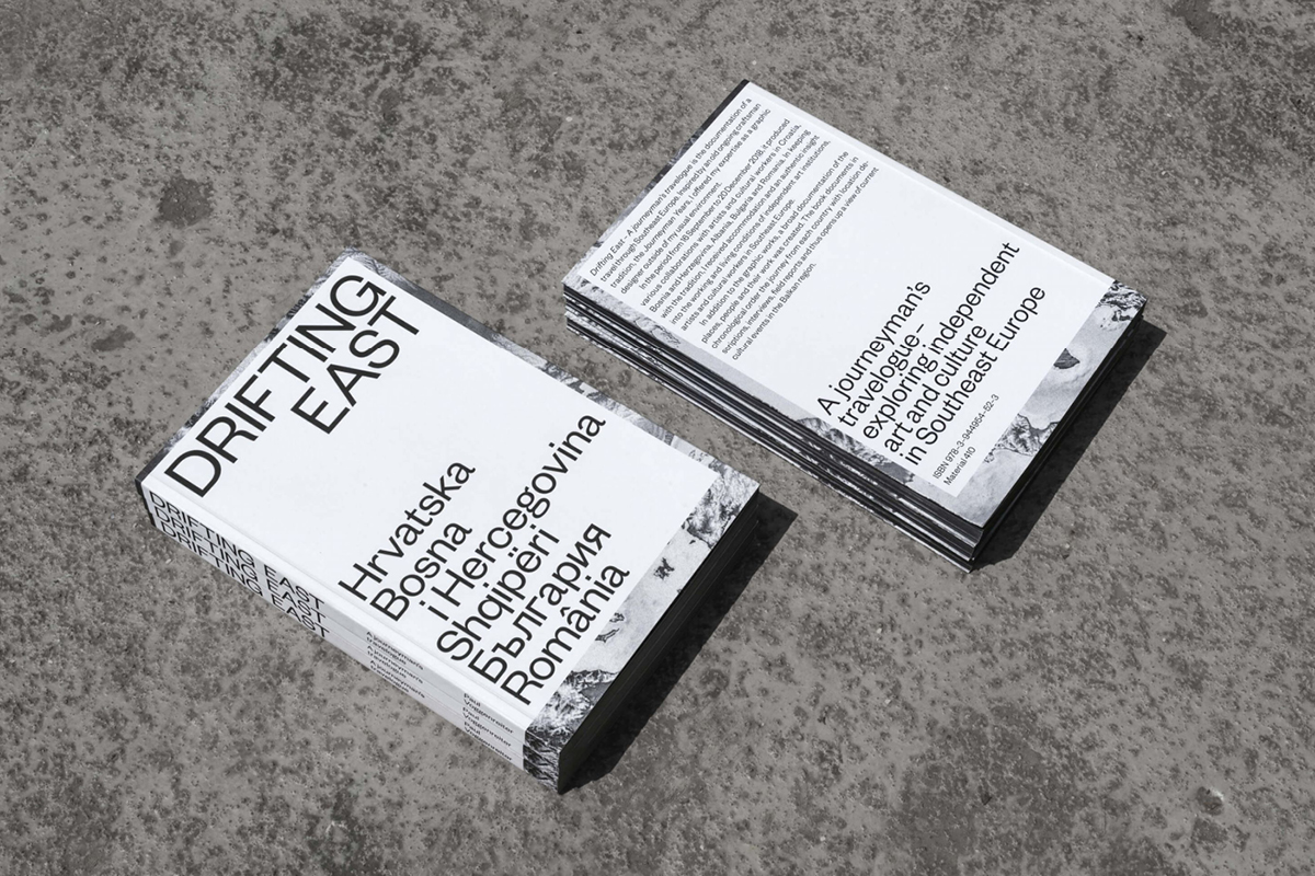
Here to chat about this more with us is freelance Graphic Designer, Paul Voggenreiter. Paul is currently based in Veliko Tarnovo, Bulgaria. With much of his inspiration coming from his love of travel, he’s collaborated with creative folk from all over Europe – from Croatia, Bosnia and Herzegovina, to Albania, Bulgaria and Romania. Currently, he mainly works with clients from Germany, but continues to collaborate frequently with artists and cultural institutions in the Balkans. ‘I approach most new projects on a typographic basis first’, says Paul. ‘I don’t want to limit myself to a certain style, but type and typography is fundamental. The more you dig into it, the more you find.’
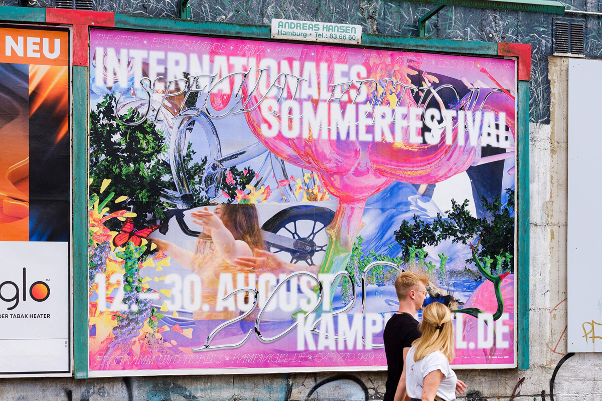
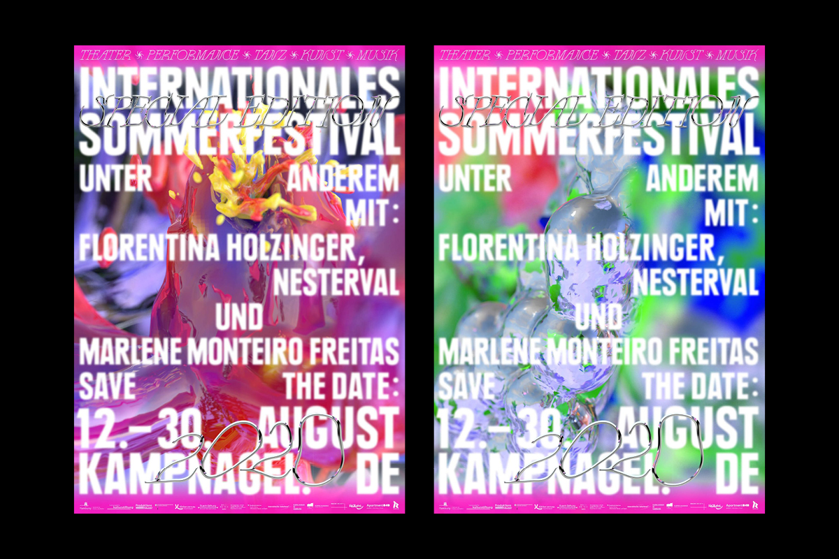
Paul’s visual identity work for Kampnagel’s Internationales Sommerfestival 2020 is a prime example of the addition of motion being a total power move. Collaborating with Art Director and Graphic Designer Hanna Osen, Paul created a vibrant, layered, psychedelic identity for the festival’s special 2020 edition, which incorporated a combination of contrasting, interlacing fonts to create an otherworldly atmosphere. ‘Because of strict safety and hygiene regulations, and a reduced program of events in the halls, the venues were expanded to include urban and digital spaces as well as the centrepiece of the festival: an enlarged garden area as the main venue on the Kampnagel festival grounds’, Paul elaborates. ‘After a long lockdown and the longing for “outside”, we planned a utopian and optimistic refuge that would allow visitors to immerse themselves in a fantastic world after a period of isolation. For the realisation, we were able to get 3D and CGI artist Jonas Liebermann.’
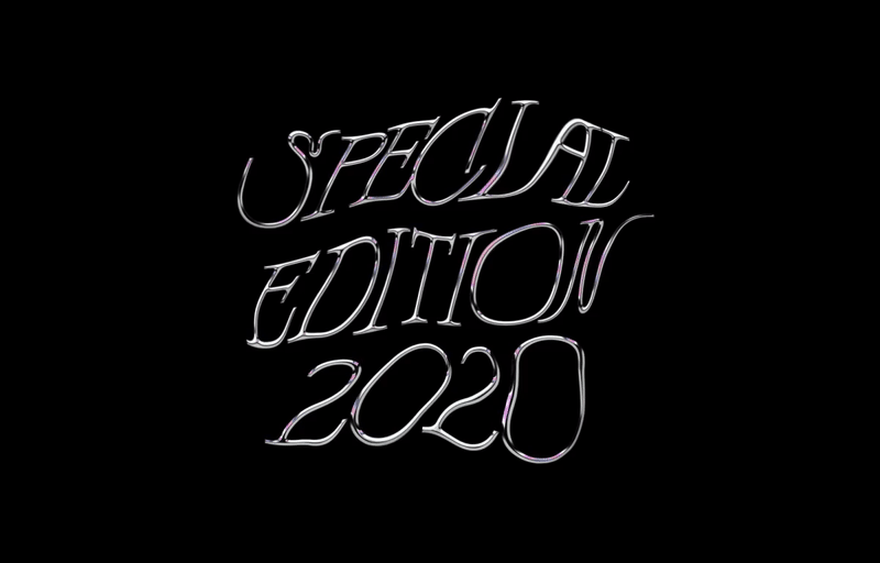

Featuring the Zephyr typeface by Sophia Brinkgerd and Leonhard Laupichler, the development for the festival’s visual concept was fundamentally based on movement. ‘Here, the whole concept with the interwoven layers only really comes into its own through movement’, says Paul. ‘But in the same way, a beautiful and unique print campaign or merchandise was created which benefits from the stills of the 3D world.’
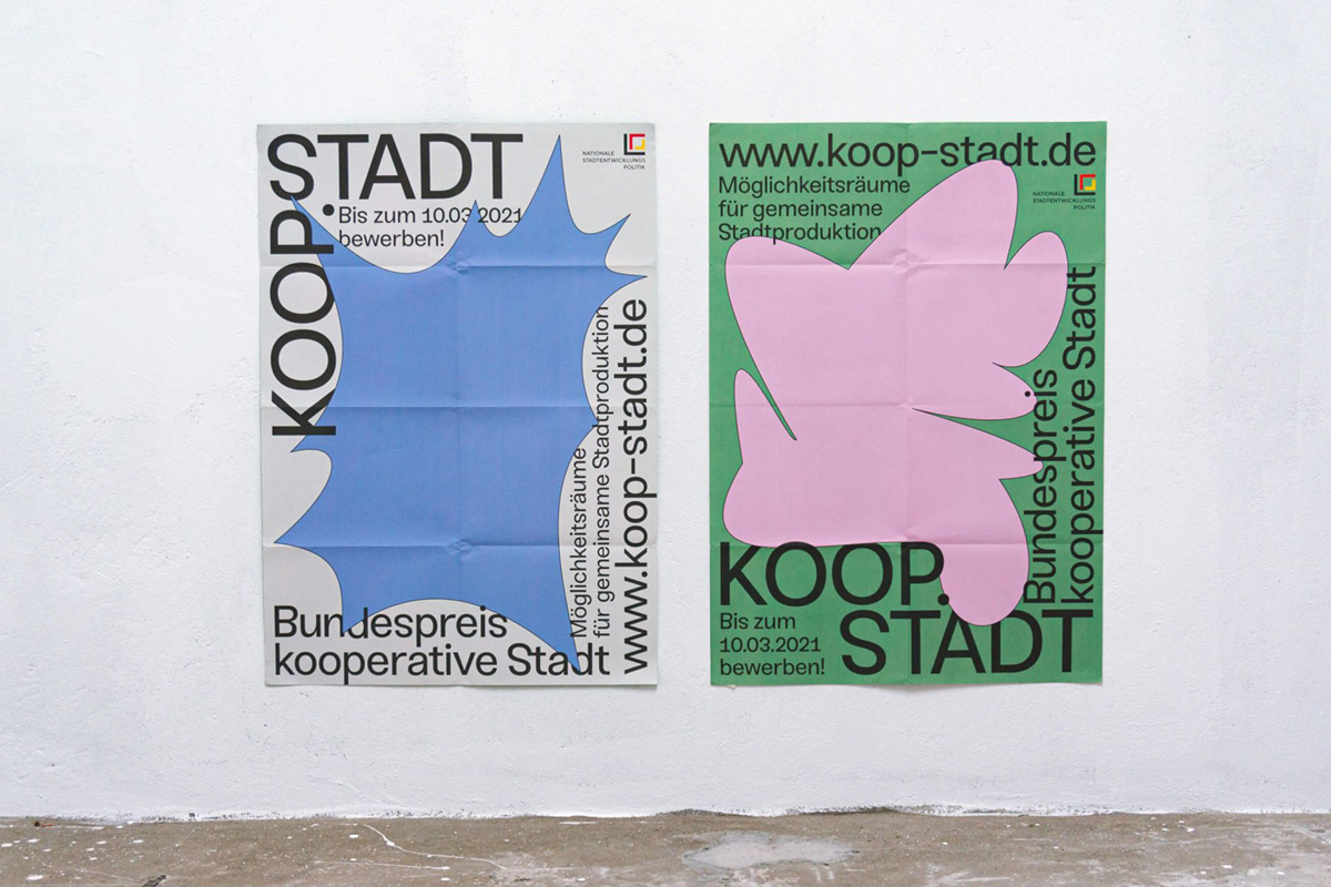
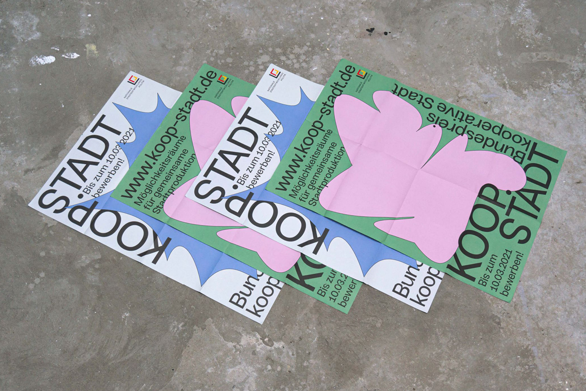
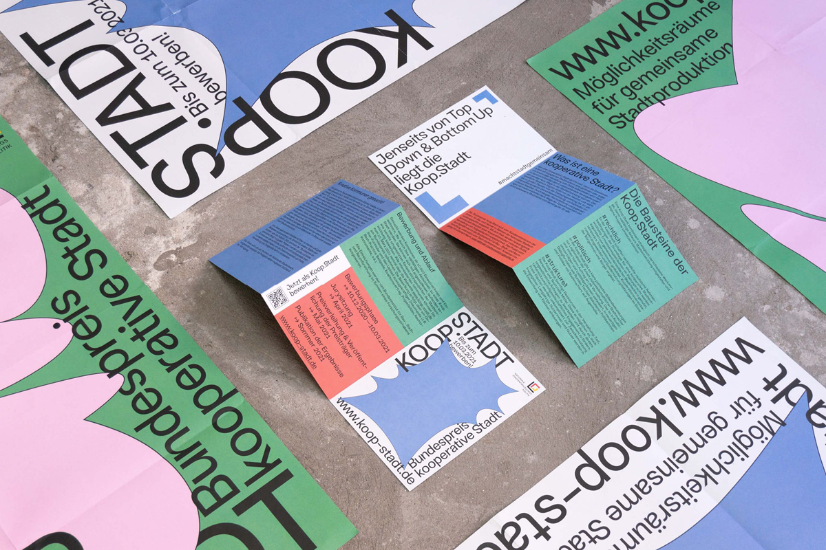
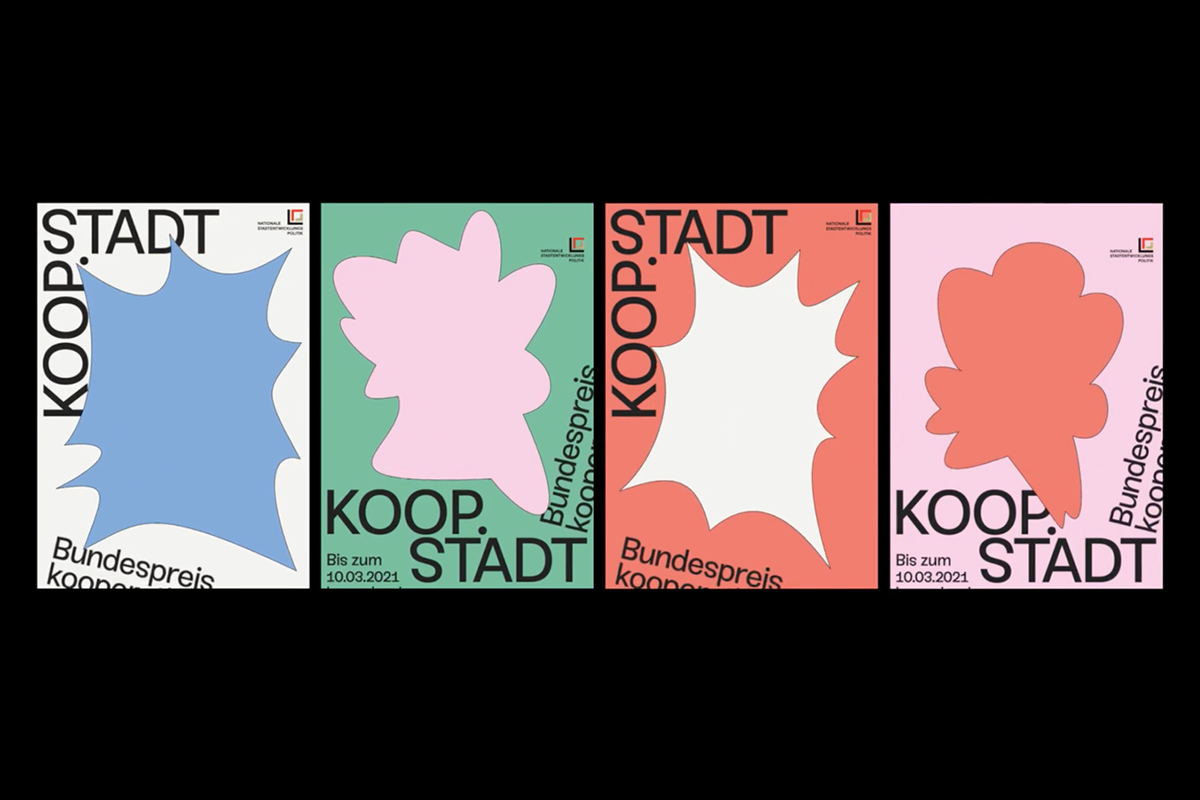
However, another incredibly dynamic project from Paul is his visual identity design for KOOP.STADT (Bundespreis kooperative Stadt), an award which honours ‘outstanding municipal examples of cooperation between urban society, politics and the city municipality’, with the aim of supporting ‘alternative city planning projects like urban gardening, container cities or socio-cultural activities.’ Paul’s identity design was built off the idea of hidden spots in the city and the effects of ‘spontaneous interventions by residents.’
‘In today’s increasingly globalised cities, such approaches are becoming more and more important as they contribute to the patina and character of a city’, Paul adds. With a typographic framework that builds on a visualisation of ‘the free space where those ideas take place’, Paul says the ‘idiosyncratic forms fill this space in different ways and are also intended to convey the spontaneity and creativity that these alternative urban development projects have.’ Already finished and ready for print by the motion came into the picture, the addition of motion came along as a way to make the web design more interactive an intriguing. ‘This made the posters for the digital space even more attractive and added more meaning to the free forms that stand for the creative use of space in our urban environments’, Paul adds.
‘I think motion in visual identities will play a big role in the future, and become even more integrated’, he tells us. ‘On the one hand, there are countless new digital forms of presentation, and on the other hand, the programmes and the technology will become more accessible and easier to handle. Personally, I really enjoy the additional layer of motion and the associated tools for creation. For me the spontaneous and intuitive process leads sometimes to some unexpected solutions I couldn’t achieve on a static base, and it often happens that the first idea for a new visual identity emerges from a particular movement or transformation.’ Like Paul, we hope to continue to see new spaces of potential in adding motion to visual identities and that we’ll soon be seeing even more innovative applications of the practice…Thanks, Paul!


