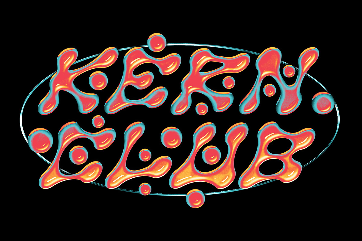
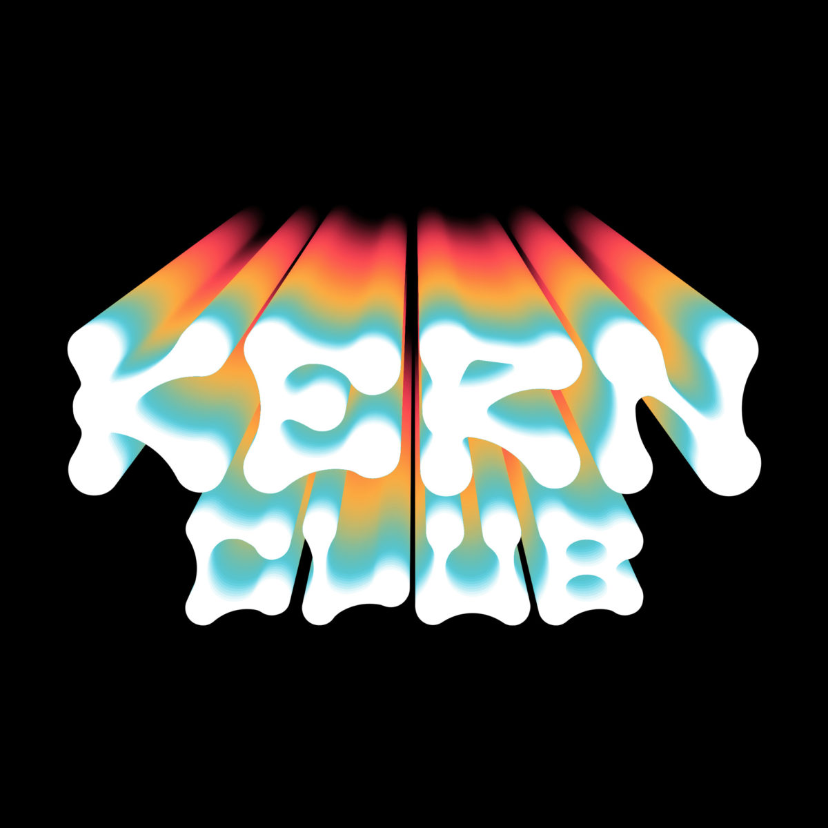
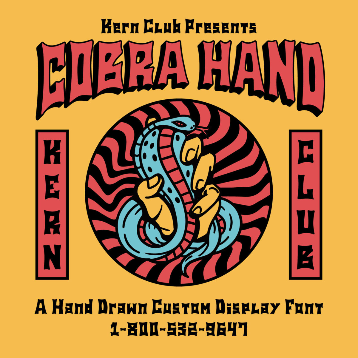
Earth Alien is one of the latest in a string of fresh new fonts from Kern Club. The foundry, under their trademark light-hearted vibes and high-energy designs, distributes carefully selected fonts from designers all over the world.
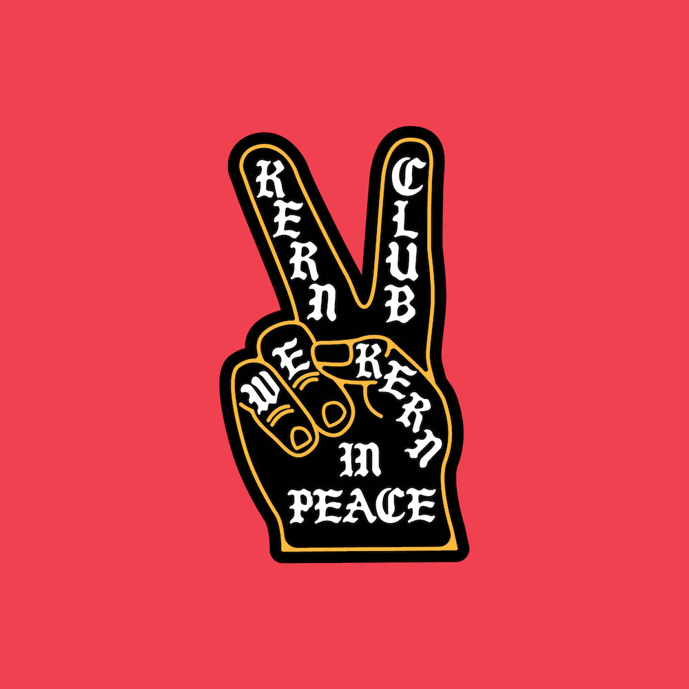
Kern Club started as a proposal from Sam Bledsoe (Samborghini) to his internet friend at the time, Dustin Noden. ‘I didn’t really even know know him, but told him I was gonna call him, because I had an idea’, Sam tells us. ‘I called him and said let’s start a font foundry and call it “Kern Club.” To my surprise he was super down. We started cranking out a few fonts that we wanted to use in our everyday work.’
With a ton of addictive new fonts being published monthly by Kern Club, Sam explains that now, as they receive so many submissions, they’re able to be ‘pretty picky’ about what they choose to take on. ‘We really want each font to make sense and fit our whole funky vibe’, Sam explains. Kern Club is always going to be a collaborative feat – ‘it is after all a club’ Sam adds, ‘and we wanted to build a font community with like minded designers.’
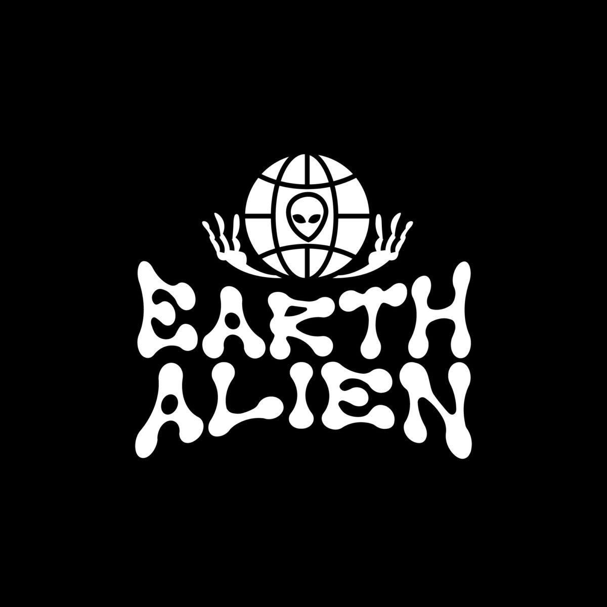
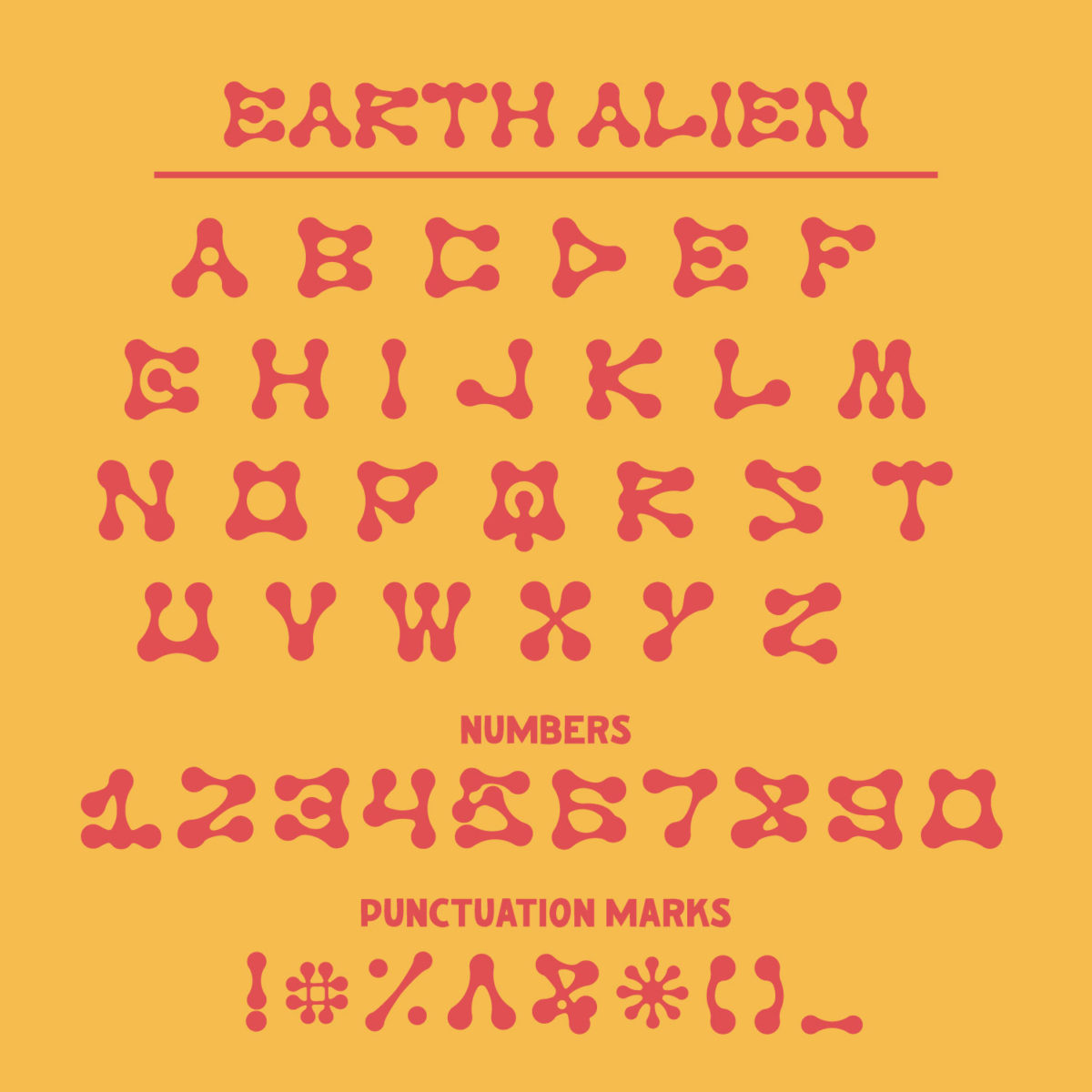
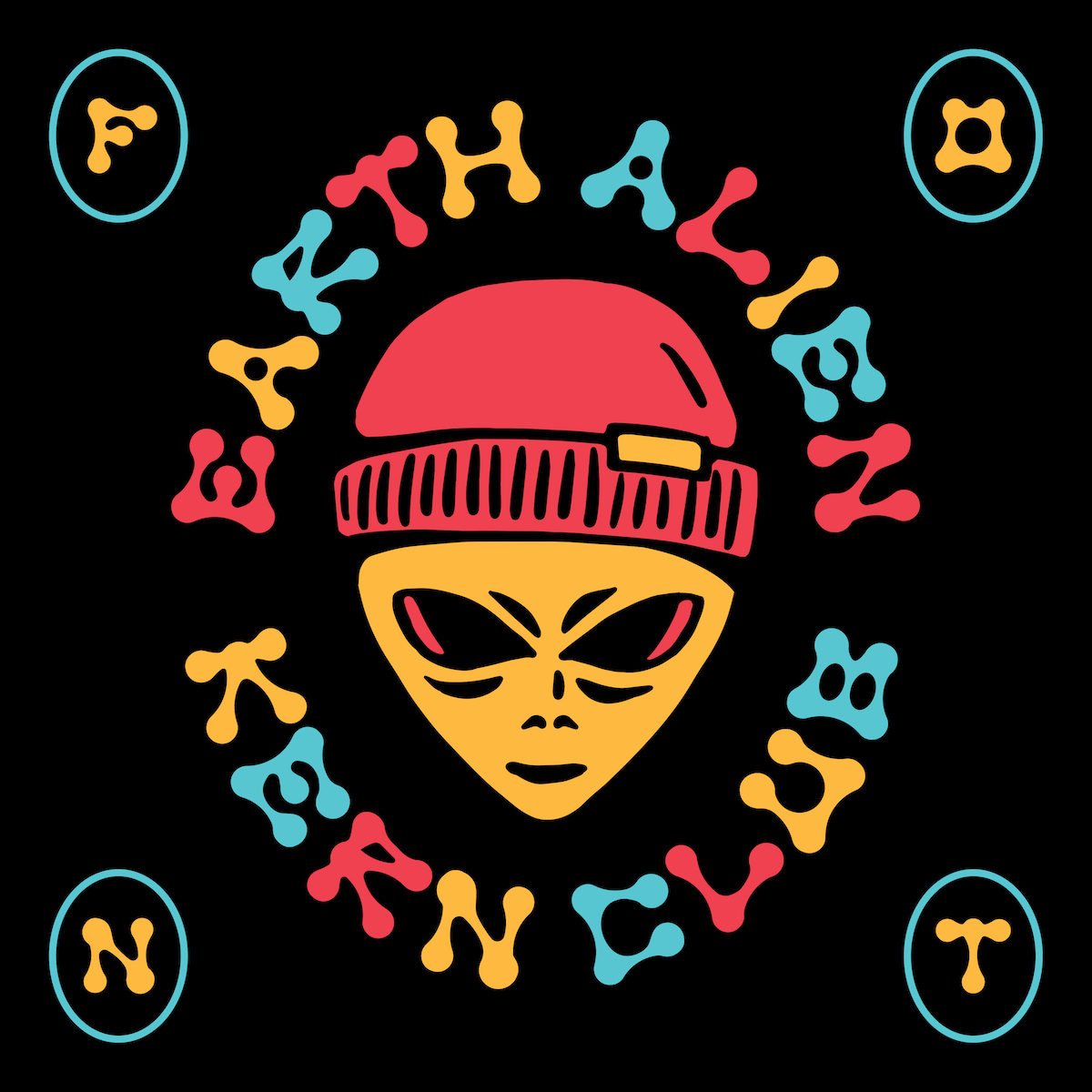
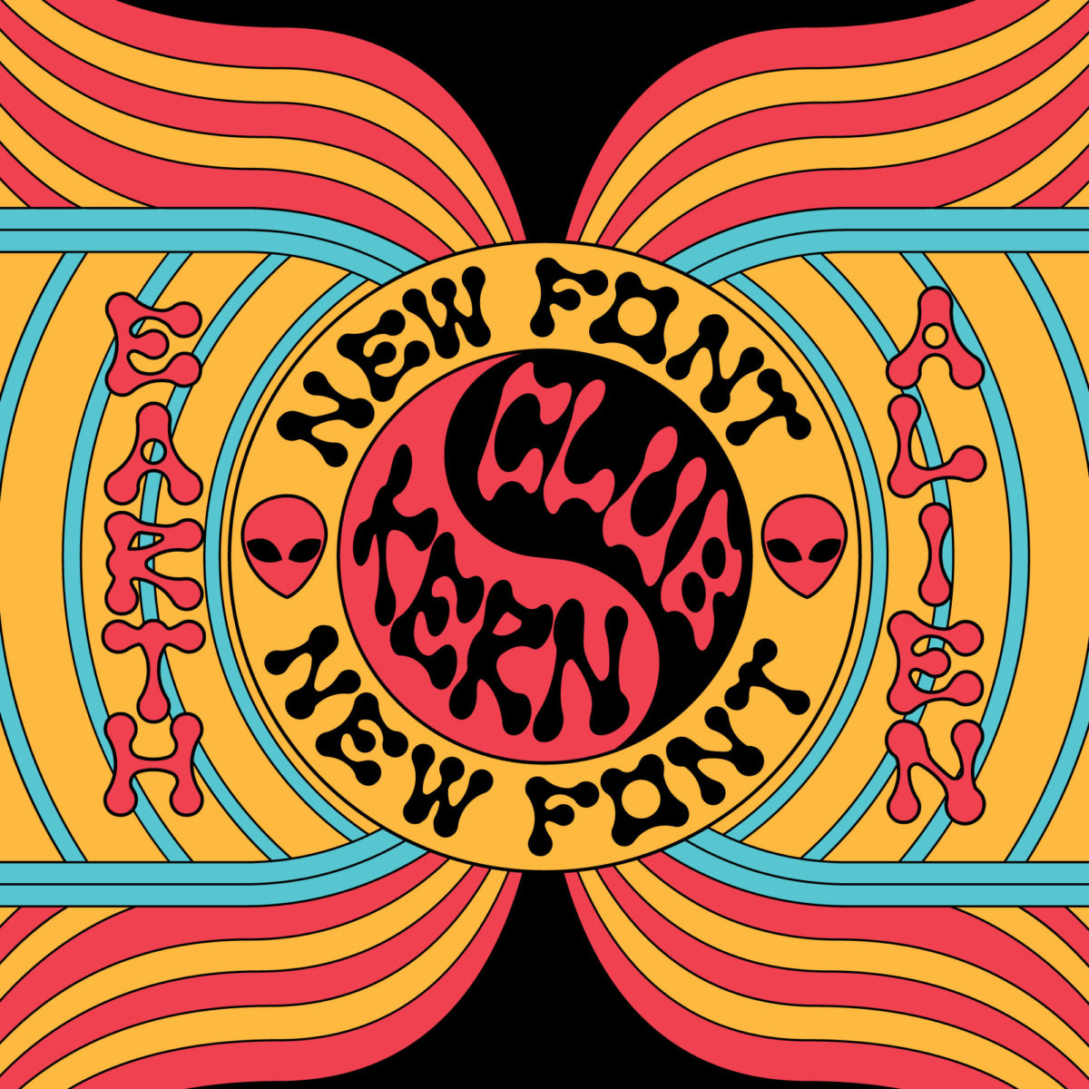
Digging into 90s rave flyers and the ‘the whole futuristic vibe that’s happening’, Sam tells us with Earth Alien he wanted to create an experimental font with alien vibes which would come out both retro and futuristic. ‘Circles that connect in a funky way just seemed to make sense’, he explains. ‘The letters kinda look like crop circles, or alien fingers. It is a romanticised idea of a font that would fit right in on a crazy 90’s rave flyer. I think it fits well with that vibe, but also with this new movement that’s happening; I think people are calling it “Post Rudnick Era” or “Neo Brutalism”. Those were the types of designs I had intended it for. But also, it can totally work on like a funky 70’s or 80’s inspired t shirt design.’
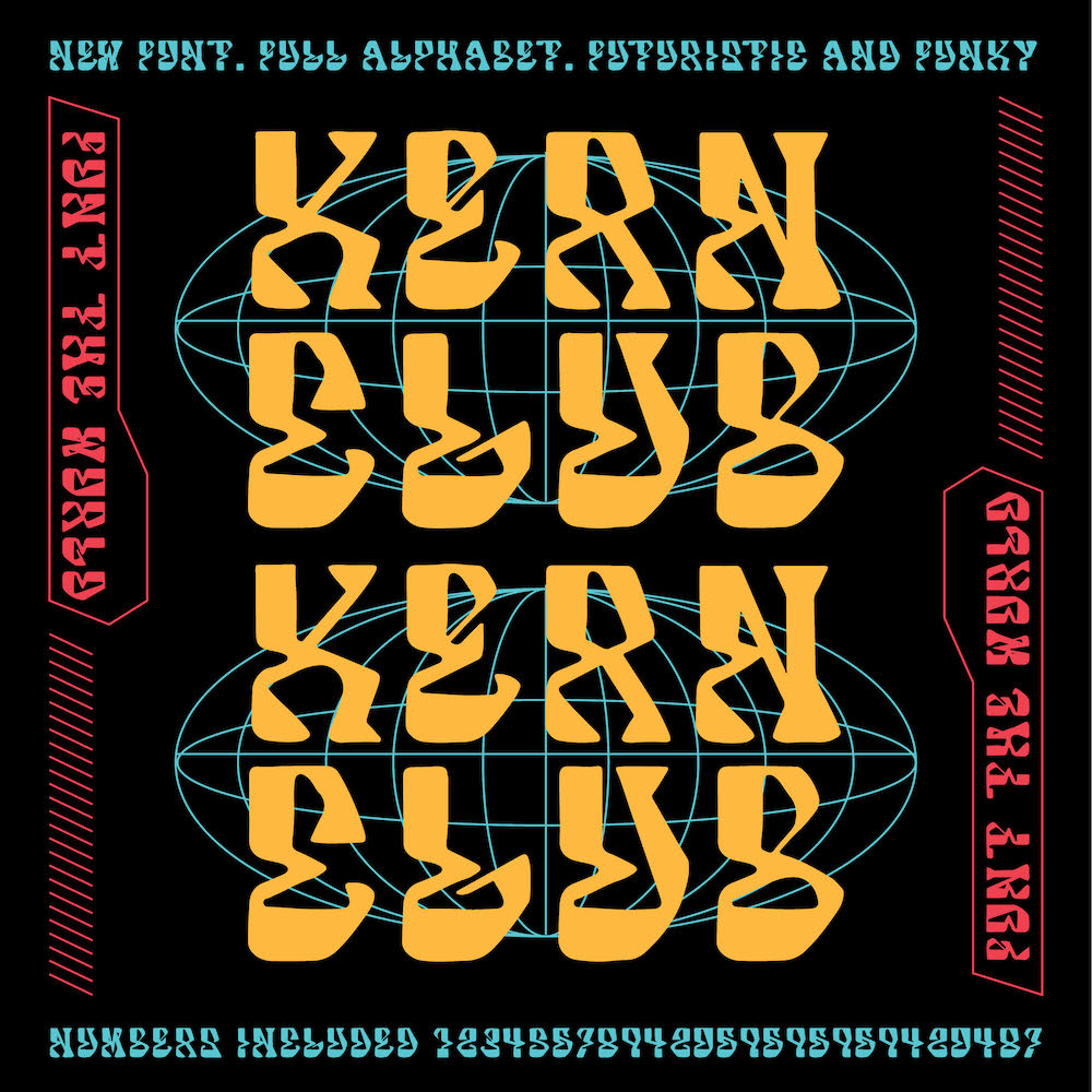
Asking the pair what they believe makes an experiential font work best, Dustin tell us ‘Anything other than a straight boring line. Add some bubbles, add some triangles, make that shit funky. Don’t be as worried about legibility, this wont be on a freeway exit sign’. While Sam adds, ‘Experimental fonts that work well are the ones that have some interest, some flair, something to elevate it, but also that have a nice shape so that there aren’t weird gaps when you type them out. They need good letter structure so they are still legible, even though they might have a unique form.’
The feeling between the Kern Club creators now is that 2021 marks a time to get even more experimental and have fun with new fonts. ‘There is a place for Helvetica and Futura, but we don’t always need to use them’ says Dustin. ‘Its 2021 – let’s start getting out of the box of legible freeway sign fonts’.
Big thanks to Sam and Dustin for chatting with us today! Be sure to check out Kern Club’s Earth Alien font, and keep an eye out for 2021’s new drops.