From Diana Ovezea, lead type designer at CoType Foundry.
If you’re passionate about type design, you’re no stranger to its time-consuming nature. One minute, you’re in the creative flow, and the next, you’re second-guessing and endlessly refining every detail, sometimes even spending hours perfecting a single character. You’ve likely pondered ways to tackle type design more effectively, searching for that elusive magic trick to rescue you from the time-sucking vortex and guide you back on the path to completing your project.
I’ve been a type designer for over a decade now and I’ve encountered hundreds of type projects, from developing original designs into large font families, to collaborations, and more often than not I’ve even donned the cape of the ‘Typeface Finisher’ – the one who expands, polishes, and buffs fonts to perfection.
I’ve made many mistakes, and learned from ineffective processes. I’ve also been around the block long enough to tell you that there is no one-size-fits-all solution to having an efficient workflow in type design. Each individual’s type design journey unfolds slightly differently, with the weak points in the process usually defined by their own personality.
In this article, I will focus on the process of designing a typeface from scratch, setting up your project, and defining the pillars that will help hold up your workflow, so that you can work smarter, faster, and with fewer blunders.
The Quest for Typeface Greatness: What Defines Quality?
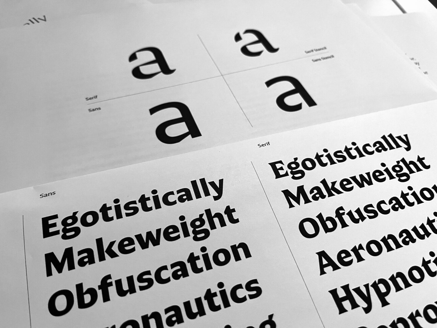
It’s safe to assume that all type designers — perfectionists at heart — want to output quality typefaces. But what defines a good quality typeface? The first things that come to mind are consistency, legibility, and usability. Notice I am not mentioning beauty as a factor affecting — that is in the eye of the beholder and cannot be judged, optimized, or planned.
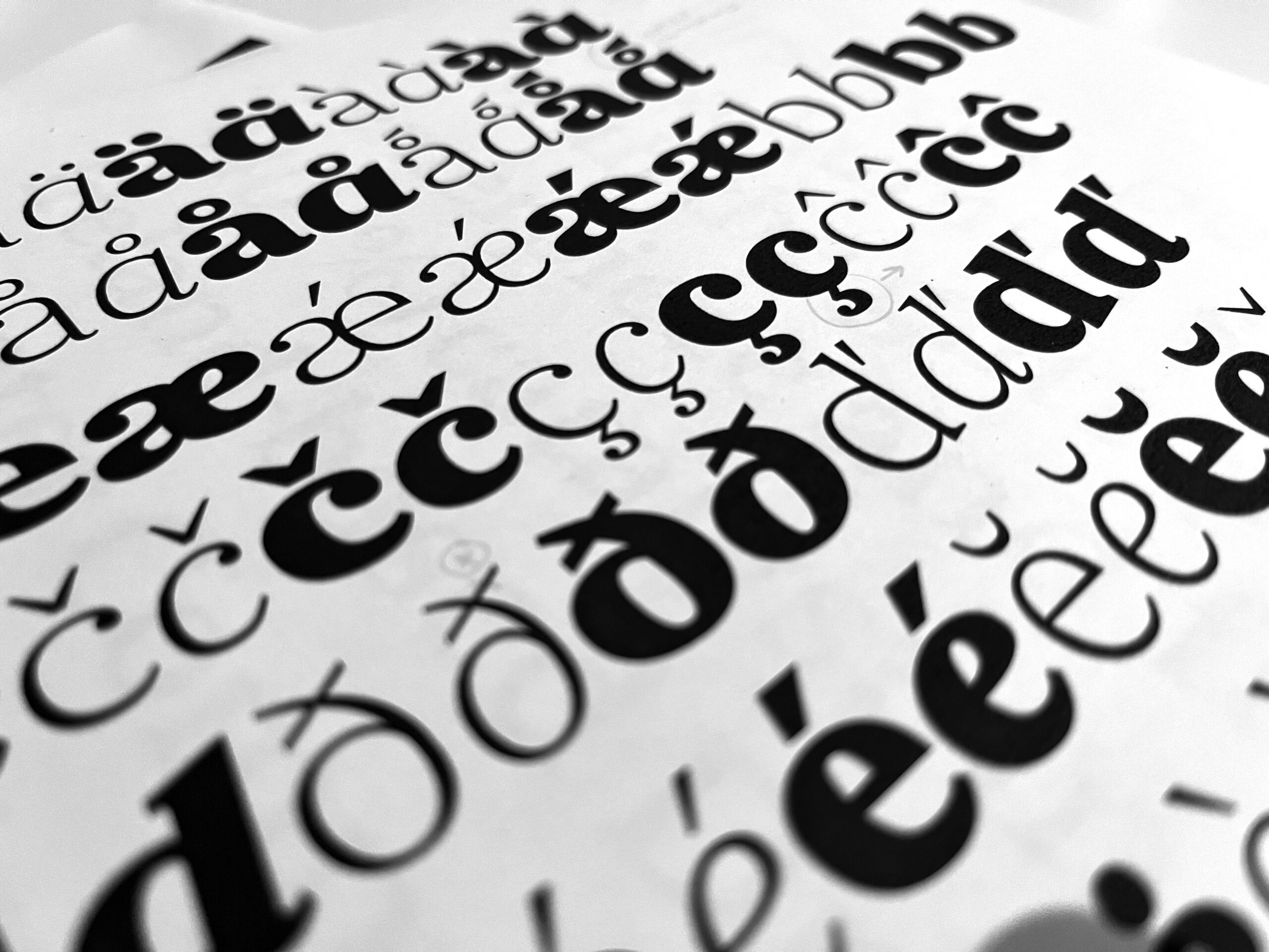
When I mention consistency, I am referring to uniformity in the design choices and harmony among characters. These may be small and obvious things like using the same type of serif on all glyphs, measuring that all stems have the same thickness where necessary, even spacing, having uniform height amongst letters, consistent proportions, and overall similarity in all curves drawn. Legibility, which is already greatly influenced by consistency, also refers to choices in the design of individual characters and how they relate to alphabet design norms. You’ll be surprised how the most beautiful font will become insufferable if it’s not pleasant to read.
Usability relates back to the reliability of the font. As users, we expect the typeface to perform well and error-free. You expect that a certain amount of characters are present, that the OpenType features work, that the letters will look the same on-screen and when printed on paper, and that the font will generally perform well in the particular use case it was advertised to work for, such as book text, giant headlines, or low-resolution screens. It sounds like an obvious thing, but, believe me, there are many ways to “break” a font.
Keeping these three factors in mind, I will share some practices you can adopt to make the type design workflow more efficient, to help contain your doubts, to keep your decisions more informed, and to help you output functional fonts.
1. Pre-design Prep: Charting Your Type Journey
Imagine you’re about to embark on a journey. Would you just wing it without a map or any idea of your destination? Of course not! Typeface design is no different. Before you hit the software, pause and plan. This first step can save you endless hours of frustration. Define the purpose and audience for your design.
Understand where your typeface will shine. Is it for web design, a branding project, or maybe a book? Each context has its unique demands. Who’s going to use your font? By understanding your target users, you’ll tailor your design to their preferences.
If you have a graphic design background, compare designing a typeface with designing a logo. There are a million possibilities, but you need to restrict yourself in order to produce an effective design. You focus your sketches on the client’s needs, values, and voice — you don’t just make something because it’s pretty.*
Footnote: *Mind you, if type design is your hobby and you are not trying to earn money with it, making a typeface just because it’s pretty is a very valid reason to do so and will bring you a lot of satisfaction.
2. First Sketches: The Art of Selecting the Right Word
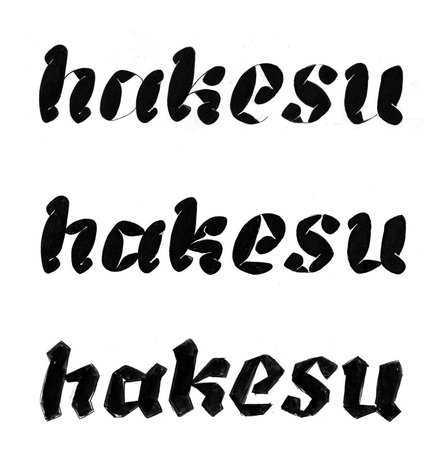
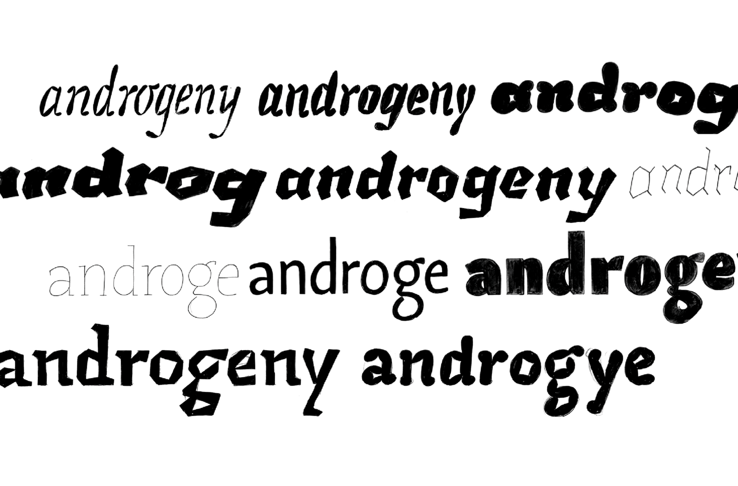
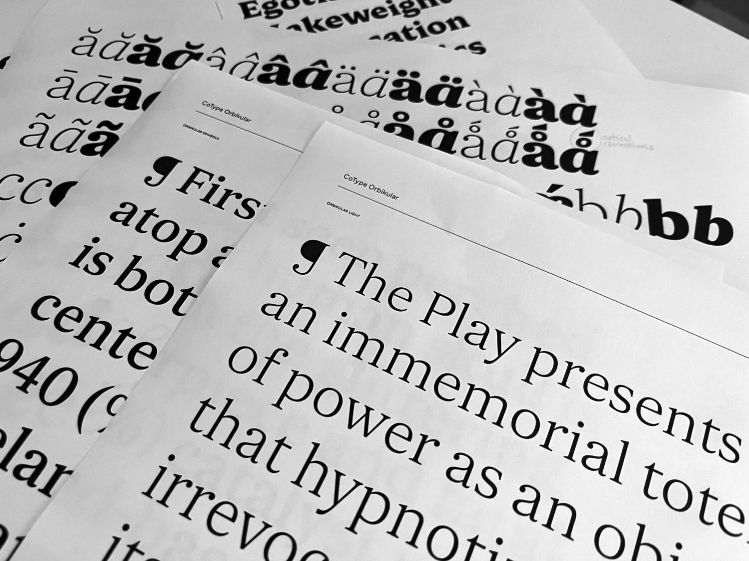
Efficiency in type design starts with choosing the right word for your initial sketches. Rather than embarking on the ambitious task of drawing the entire uppercase and lowercase alphabet right from the get-go, it’s wise to focus on key characters. Why? Well, it not only helps maintain consistency in your final design but also minimizes the risk of errors down the road.
So, what makes for a good word to kickstart your type design project? Opt for one that includes a mix of characters — a round character, one with straight stems, one with diagonals, a capital letter, and a character or two with ascenders or descenders. The reason you often see words like “Hamburgefontsiv,” “Adhesion,” “Rainfrogs,” or “Videospan” being used when type designers showcase their sketches is that they encompass a range of characters that shape the typeface’s DNA.
By ensuring consistency and harmony among these key characters, you lay the foundation for the typeface’s overall look and feel. Another consideration when picking a word is using letters that allow you to create a variety of test words. For instance, in English, the letter “e” is particularly ideal due to its frequency of use.
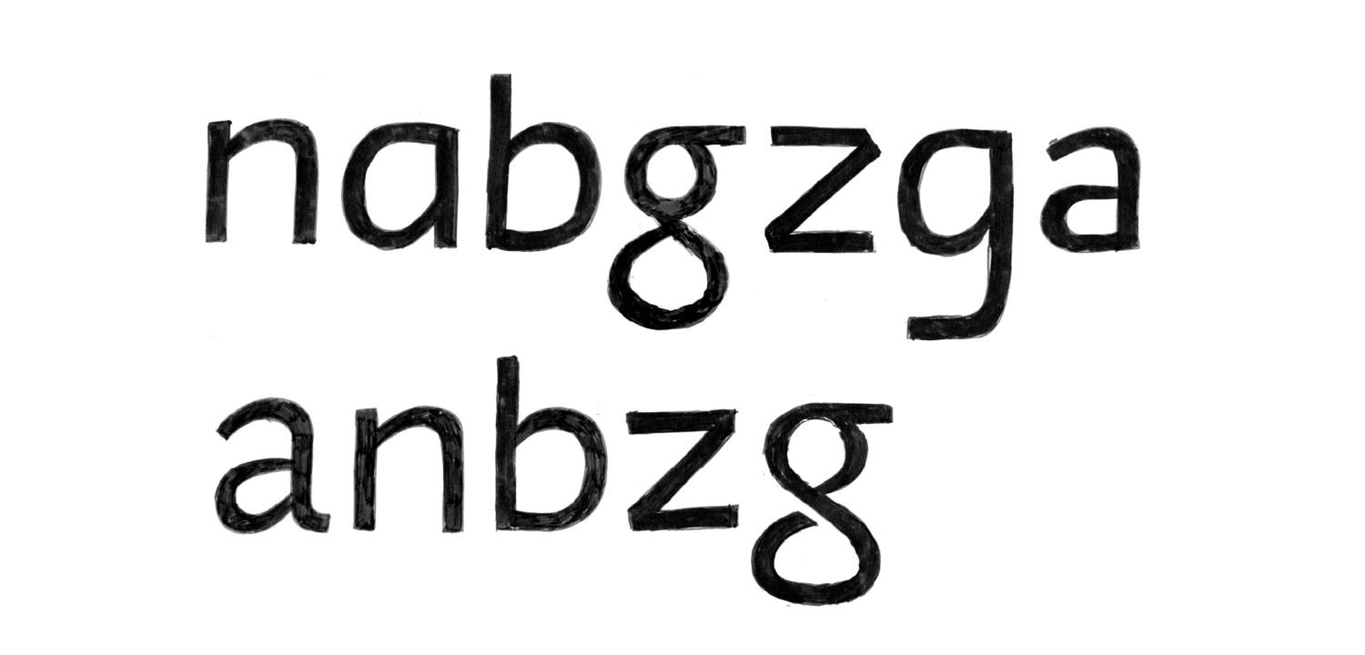
In the beginning, you want to avoid redundancy in your sketches; repeating shapes like ‘d’ and ‘b,’ ‘p,’ and ‘q’ can be inefficient. Similarly, if you have a ‘n,’ there’s little need for an ‘m.’ You may want to steer clear of characters that don’t provide insights into the overall typeface, such as the double-story ‘g’ (though you might enjoy the challenge and I won’t stop you from trying. Just be mindful that this letter is a magical time-eating monster that turns minutes into hours and hours into nights). In essence, this approach ensures that every character you select serves a purpose, contributes to the font’s identity, and minimizes wasted effort in your design process.
3. Prototyping stage: Plotting the Typeface Universe
Though you might have selected the right word and made sure your brand new type design idea can be applied to round, straight, and diagonal letters, there is one more important step to make before starting to expand the design to other letters. Assuming you are creating a type family with multiple weights or styles, you want to make sure that the concept you are prototyping can be applied across the board.
Whether you can “pull off” a particular detail in different weights and styles might influence your design decisions. Some solutions might work best in bold designs, but fall flat when the typeface gets lighter. Some intricate details — like ink traps, swashes, and stencil cuts – might look very beautiful in lighter weights, but be harder to apply to bold weights. How frustrating would it be if you find out that you simply cannot make a particular detail work in the Black weight after the client has already approved your design, and the whole concept relies on that element being there?
Getting in the habit of sketching out across the whole design space from the beginning — especially when working on quirkier designs — will ensure you don’t run into bottlenecks later on and will give you time to react and make decisions accordingly. You might decide to restrict your design space to fewer weights; you might decide to change the design of some letters in order to make your concept function over a larger range of weights; or you might just decide that it’s worth making an exception in particular weights and introduce a different solution for those. Either way, you know where you stand!
4. The First Iterations: The Power of Components
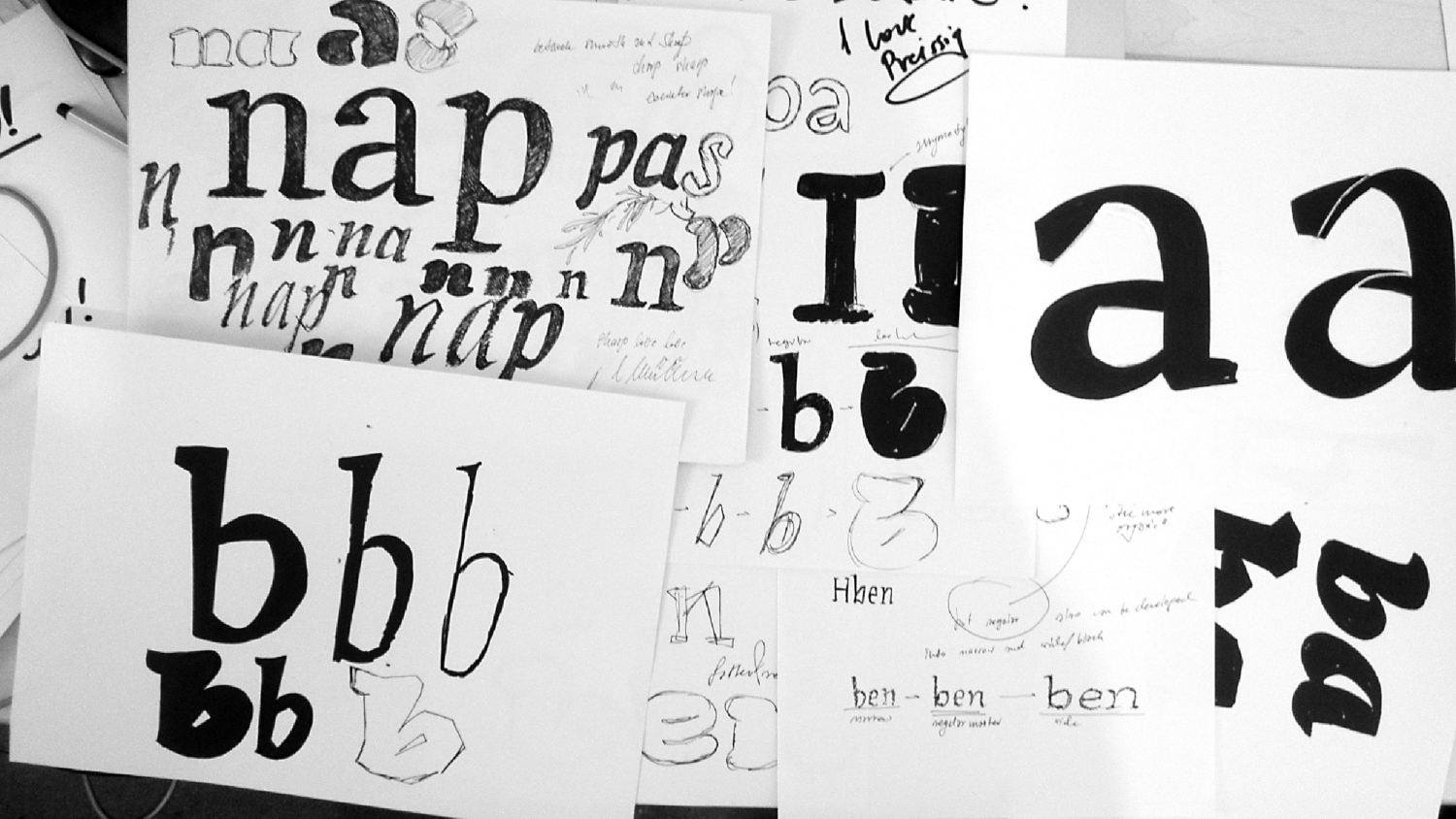
As you reach more advanced prototyping stages in your type design process, you will want to add more letters to your font. Even though you’ve already been testing your handful of letters in different words and different combinations, it’s likely that you will still be making small changes to your letters as you further develop the concept.
As you do so, you’ll have to start keeping track of all other drawn letters. And assuming you’re rapidly prototyping –potentially installing multiple, slightly different, versions of the font at the same time to investigate which one works better in your proofs — having to keep track of 54 other letters every time you decide to change a curve and a serif might make room for omissions and inconsistencies later on.
Using components and repetitive shapes could be a highly efficient approach in these mid-to-late prototyping stages. By creating reusable elements for commonly occurring shapes — such as serifs, stems, or curves — you can save considerable time and ensure visual consistency across characters.
This method allows for swift iterations and easy tweaks as you test out your ideas. Using components, metric keys (in Glyphs App this helps define the side bearing of letters based on key characters) or corner components also helps maintain uniform character spacing, improving overall legibility and aesthetic appeal.
Though reusing shapes can be a very powerful strategy, it has its limitations. Many aspects of type design are optical, even though they look modular. It is not always that a d-bowl is exactly a 180-degree rotation of the b-bowl. It is not always that all serifs need to have exactly the same length. After the design DNA is established, and the prototyping stage is over, you might want to start manually adjusting some shapes in order to help your typeface look mature and optically balanced. This is especially relevant if you are working on non-modular designs such as a humanist sans or serif, a handwritten script typeface, or a more quirky typeface.
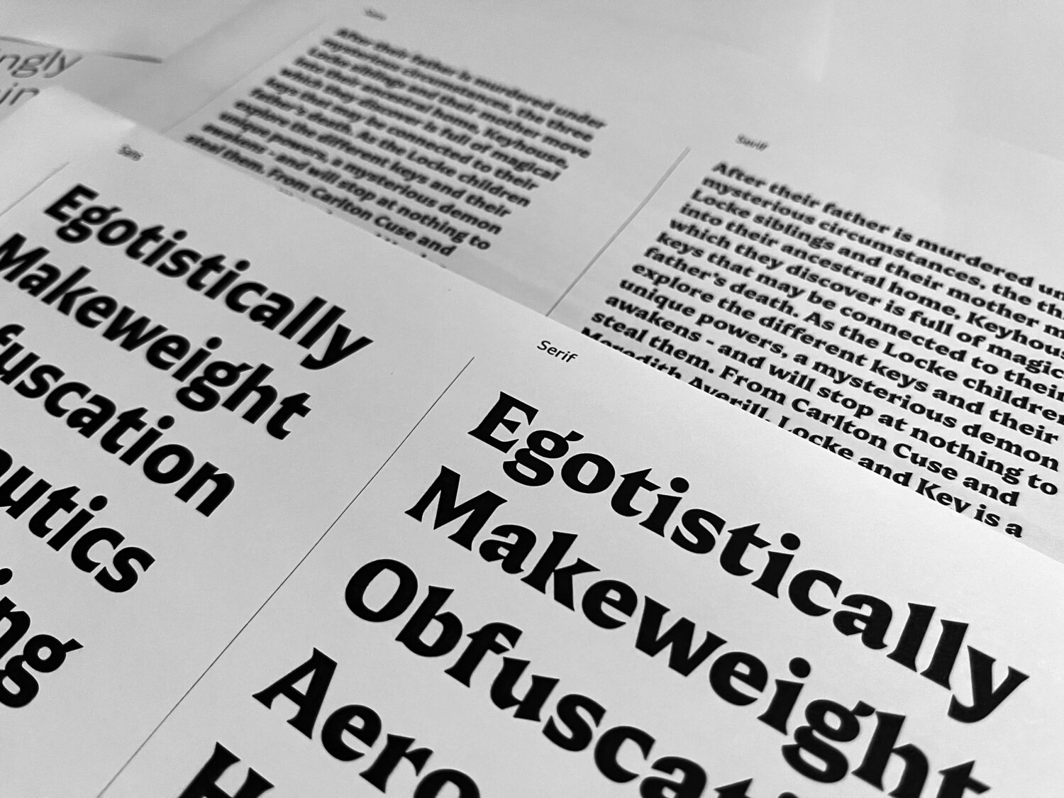
5. From Designer to User: The Type Tester’s Perspective
I saved the most important tip for last. In the world of typeface design, testing and feedback are the secret weapons that help you transform a good font into an outstanding one. By embracing external perspectives and exposing your font to various contexts, you can pinpoint and rectify design flaws, ensuring that your typeface is both visually appealing and highly functional.
We all know it. As you test and iterate, you begin with a vision, sketch out your characters, digitize them, refine their shapes, and make numerous adjustments along the way. However, as you become increasingly immersed in your design, it’s easy to develop a sort of tunnel vision, where you’re so close to the project that you might overlook potential issues.
Switching to the end-user perspective, testing in different environments (print, poster, mobile), and gathering feedback from others is an invaluable resource. It not only provides insights into how your font performs under different circumstances and in the hands of those who will eventually use it but also allows you to gain some much-needed distance from your “baby” so you can focus on the functionality of your design.
If you have no one to ask for feedback, I suggest regularly switching from being the type designer to being the user of the font. Even when your font only has a handful of letters, you will want to start putting these into words, designing a bit with them. As opposed to logo design or lettering, type design doesn’t focus on one single word looking its best, but rather on creating a reliable system of shapes with consistent metrics, where any combination of letters will look great together.
There you have it – five pillars that will help you keep you on track in your type design journey. We’ve cruised through the importance of pre-design prep, handpicked the right characters to kickstart your font, mapped out your design space, harnessed the power of components, and emphasized the critical role of testing and feedback.
So, whether you’re a seasoned pro or just dipping your toes into the world of type design, these tips can help you streamline your workflow, make informed decisions, and ultimately, output fonts that are not just beautiful, but beautifully functional.
Remember, crafting a top-notch typeface is about more than aesthetics. It’s about creating a system that is consistent, legible, and reliable. These tips are here to get you started, but as I learned the hard way, type design is not science. There are best practices, but ultimately, each type designer carves their own path, learns to use different tools and methods, and feels the need for optimization at different stages in the process.
The key to “optimizing” is experience — time in the game. The more projects you work on, the better you’ll be able to figure out how to work better next time around, what techniques work for you, and how to make best use of them. If you stay receptive and aware of tasks that become repetitive or time-consuming, you’ll be in a good place to judge what can and cannot be optimized. Cheers to making your own type journey!
Thank you Diana for this wonderful piece. If you’d like to browse more type foundry features you can do so here.