
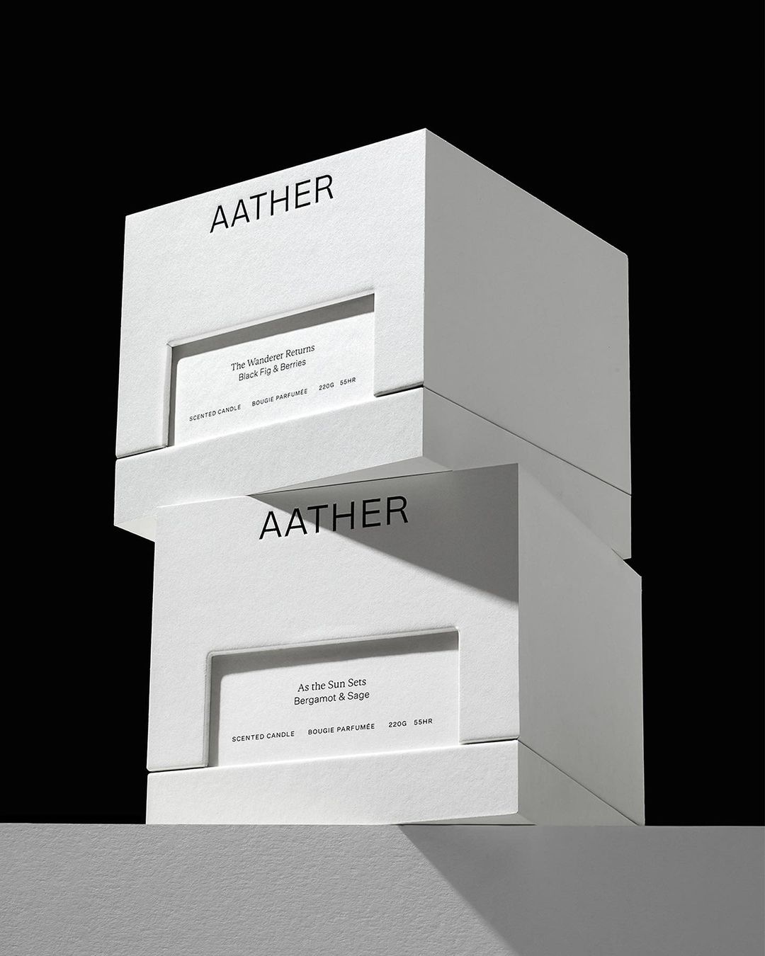
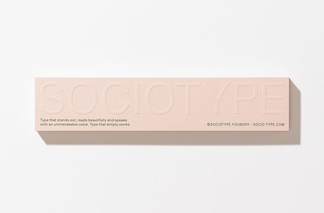
Sociotype is a design-led type foundry from the London-based creative studio Socio. Since the studio’s origin in 2004, Socio has tackled pretty much every creative endeavour you could think of. Typefaces, editorial, candles, you name it. From the bespoke identity design and logotype for luxury candle company Aather, to a redesign of the global packaging for Sonos’ wireless sound system. The same level of care and dedication that Socio is known for is evident in their typeface creations, which are informed by the collective design experience of their creative team.
We had the opportunity to speak with Joe Leadbeater, one of the co-founders of the foundry and a firsthand observer of Socio’s daily operations. In our conversation, he provides insights into the origins of the foundry, its philosophy and creative approach, and the exciting projects that are underway.
How Sociotype started
Leadbeater, during his time at the design studio, specialised in the creation of custom brand typefaces and bespoke logotypes. “My role had become increasingly focussed on type,” he explains, “and my relationship with (at the time: my bosses) James Cramp and Nigel Bates had flourished into more of a friendship.” It sparked the realisation that they could create a unique foundry based on Bates and Cramp’s extensive design expertise and Leadbeater’s passion for typefaces.
Therefore, in early 2019, Sociotype was born, with the core trio remaining throughout the years since its inception. While Leadbeater focuses on the intricate “nitty-gritty” duties at the foundry such as type design, custom logotypes, and overseeing the engineering team, Bates brings his creative expertise as the Creative Director, helping out on photographic shoots, and direction for the promotion of each commercial release. “He also provides endless ideas for future ambitions of the foundry,” Leadbeater adds, “and he’s a fantastic designer when he has the time for it.”
Cramp takes charge of licensing, journal manufacturing, distribution, and studio financing, all while providing a pragmatic voice, “bringing both Nigel and me back to reality when our ideas are unrealistic.”
Outside of the core team, Sociotype also includes the Sociotype Journal’s team, led by Nic Carter who takes on a multidisciplinary role as Creative Director, Editor, and Designer. Alongside him, Editorial designer Indiya Tupe is currently crafting Issue 3, following the design work of Alicia Mundy, a graphic and editorial designer based in Copenhagen, who designed Issues 1 and 2. The team collaborates with a diverse group of writers, illustrators, and photographers to enrich the content of each issue.
Their philosophy and approach as a foundry
Every output of the foundry is tied to the belief that a typeface should be a vessel for creativity rather than a restriction. With each release, their goal is to provide designers with everything they need, offering extensive character sets, multiple subfamilies, and a wide range of opentype features. “Like an electric drill set with every drill bit,” notes Leadbeater, “every scenario covered!”
“When I joined [Socio] as a designer way back in 2016,” he says, “it was apparent that Socio’s approach to design really revolved around meticulous detail and careful deliberation.” A fastidious nature, and eagerness to go above and beyond for clients is a core mindset that Leadbeater believes underpins the work that Socio do, “from the conception of brand systems into the art direction of photography.” What trait could be more fitting for a type foundry? For the designer, it was certainly no surprise that Socio’s “(close to obsessive) detail in all aspects” would transfer into a foundry very well.
Commercial Releases (the creative process behind the work)
Balancing creative freedom with commercial considerations has always been a challenge in typeface design, and Socio is not immune. “To begin with,” Leadbeater reflects, “our enthusiasm was boundless: with ideas of optical sizes, widths, and endless characters for each release.” However, they also recognize the need to avoid overwhelming or confusing customers and diluting the identity of a typeface with too many versions and styles. In every project, whether for a client or a retail release, they enjoy finding a balance between designing typefaces with full creative freedom and knowing where to draw the line. Leadbeater adds, “we particularly enjoy exploring the extremes of our typefaces,” highlighting the contrasting styles of Gestura Text Thin and Gestura Display Black.
“Before the pen has touched paper (or glyphs has been opened),” says the designer, “we’ve got a bunch of ideas for the next release,” mindful of filling gaps in both the type market and within the Sociotype catalogue. “From there, we come up with a statement that marries a broad typeface categorization with a practical element, eg. ‘A minimalist approach to Didone that can be used for titling and text’.” Research and experimentation form an integral part of this creative process.
Thanks to Leadbeater’s bountiful archive of historical references, the team can hit the ground running, starting with the weight that best fits the concept statement. They carefully design each weight and push the basic character set to its limits, always careful to maintain the soul of the typeface.
By conducting rigorous testing and continuously fine-tuning their typefaces, Sociotype ensures a high standard of quality control to guarantee customer satisfaction, whatever the application. “It’s very easy to get seduced by working on a typeface with small samples,” says Leadbeater, “but a typeface should always be tested as a bigger picture. We invest time into creating sample sheets that cover a range of environments and scenarios, so we can pre-empt any clashes or weighting problems.”
Designing the Journal during the final phases of the typefaces’ development helps with this too. “The months spent pushing the typeface to its limits in the Journal gives us a perfect playing ground to fine tune and double check everything is performing how it should.”
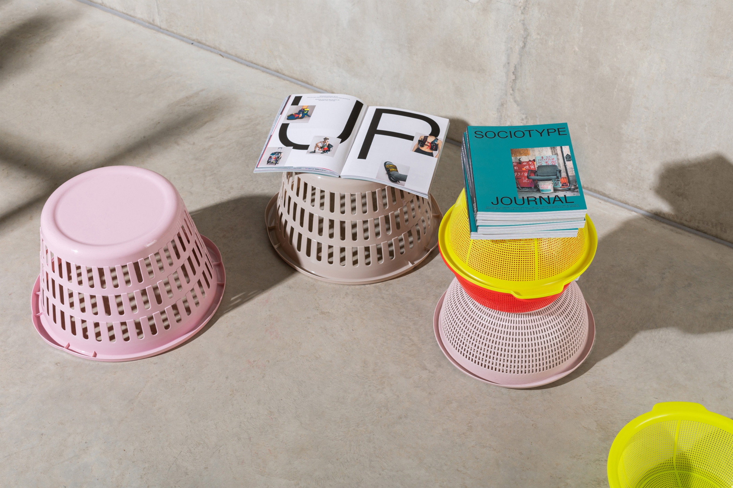
Sociotype Journal
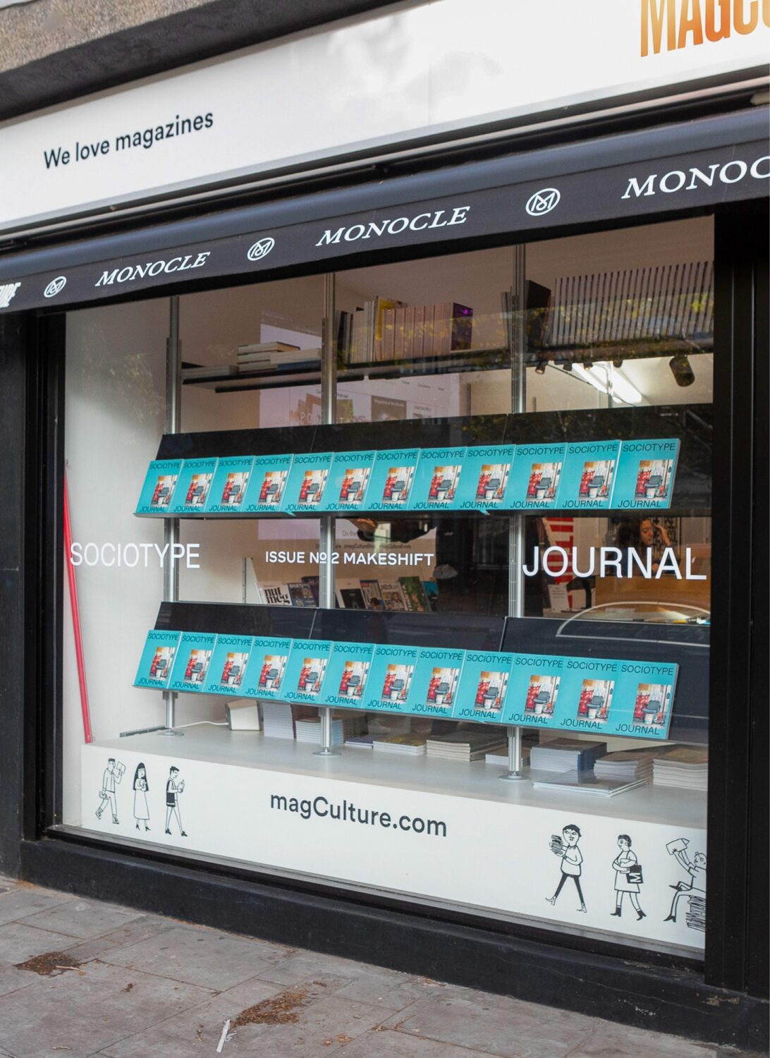
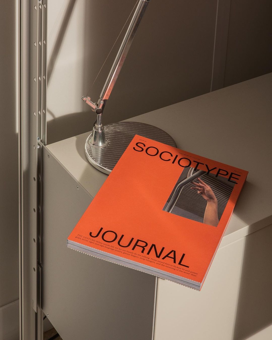
For Sociotype, this specimen is not a page, nor a booklet, but a 200+ page publication! And, significantly, the best creative playground they could ask for. Sociotype Journal, a unique amalgamation of a type specimen and a magazine, serves as a platform to showcase the incredible variety (and 40+ styles) of each typeface family.
The notable success of Issues 1 and 2 – dedicated to the comprehensive families of Gestura and Rework, respectively – reaffirm the need for new ways to challenge the specimen format. “Fundamentally, a typeface sets a tone of voice,” says Leadbeater. “It makes no sense for there to be a disconnect between what is being said and the way in which it’s communicated.”
As such, “the typeface will always inform Sociotype Journal,” he notes. “We only begin working on the Journal when the typeface is 90% complete, and we create a list of criteria of styles and features we want to show in the Journal.” For example, Rework, the sans serif family and contemporary workhorse at the centre of Issue 2, has four optical subfamilies including ‘Rework Micro’, “so we wanted to ensure we would feature Rework Micro being used at a very small point size in areas throughout the Journal.”
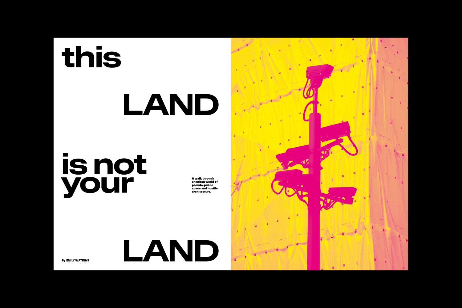
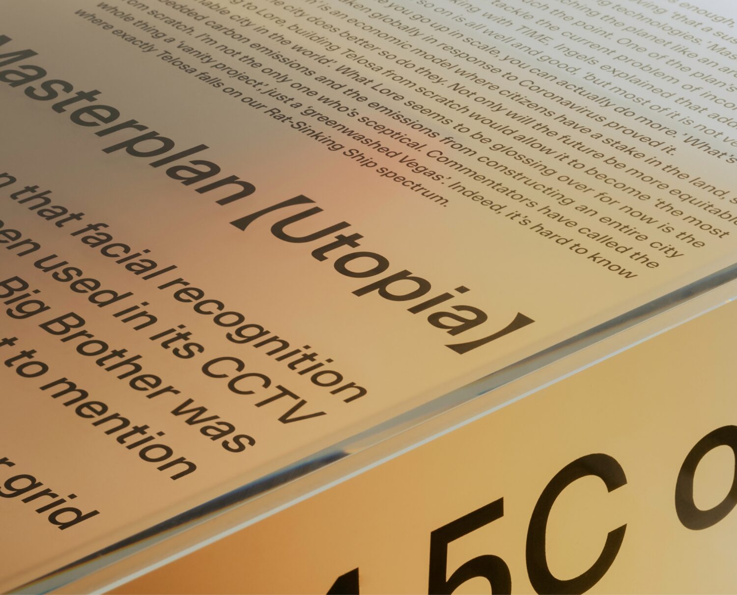
With the release of Issue 3 drawing closer, Leadbeater reveals that Onsite – which initially served as Socio’s ‘house typeface’ – has inspired an assortment of editorial content around the theme of “home.” From secret rooms and towns divided by highways, to abstract visions of utopia, the designer promises that the publication will be filled with diverse visual and ephemeral features. “We’ve put a huge amount of time and resources into research,” he says, reflecting on the project, “so we’re very much excited about the imagery in the forthcoming issue.”
Future Projects
Looking ahead, Sociotype has several other exciting projects in the pipeline. Their next commercial release will be their first family that spans across sans and serif subfamilies: “a humanist skeleton that grows with asymmetric serifs,” reveals Leadbeater. “It challenges historic convention, and has been a real challenge to get right.” Additionally, they have recently completed an extensive bespoke typeface project for a US lifestyle brand. “It’s been an absolute blast to work on, so we’re going to push for more custom and bespoke brand typefaces like this.”
Likewise, the team is eager to not only expand their catalogue with some brand new families, but also continue to tweak and broaden each of the existing families. Outside of the digital realm, there’s discussion of products. “Nigel and I are starting to note ideas of independent makers of all kinds. Our priority will be to collaborate on something with a long life cycle that will be deeply cherished.”
This thought aligns with Sociotype’s position within the design ecosystem: with a dedication to quality and creativity they strive for timeless excellence across their ventures. “We’re in a time where new foundries are forming almost daily”, says Leadbeater, “but we strive to separate ourselves by sticking to our strengths; slow and methodical wins the race!”
Thank you Joe for this insight! Follow Sociotype on Instagram to keep up to date with their latest news and releases.
You can browse more of our studio and foundry features here.


