
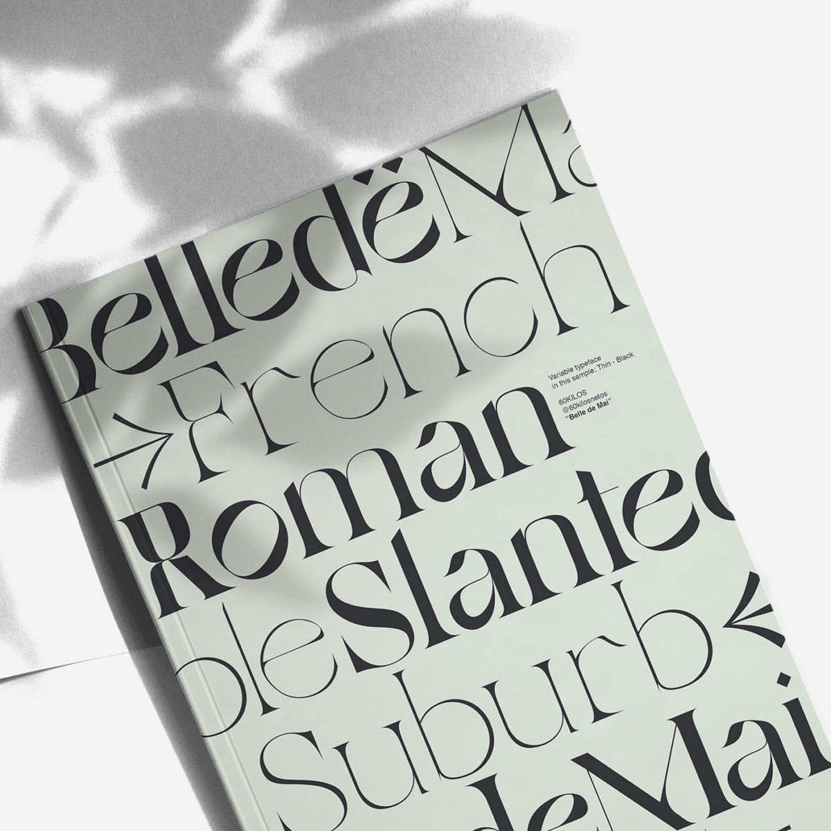
Newly released on Type Department, Belle de Mai is a variable display typeface created by southern Spain-based graphic design student, 60KILOS (also known as Sesenta Kilos).
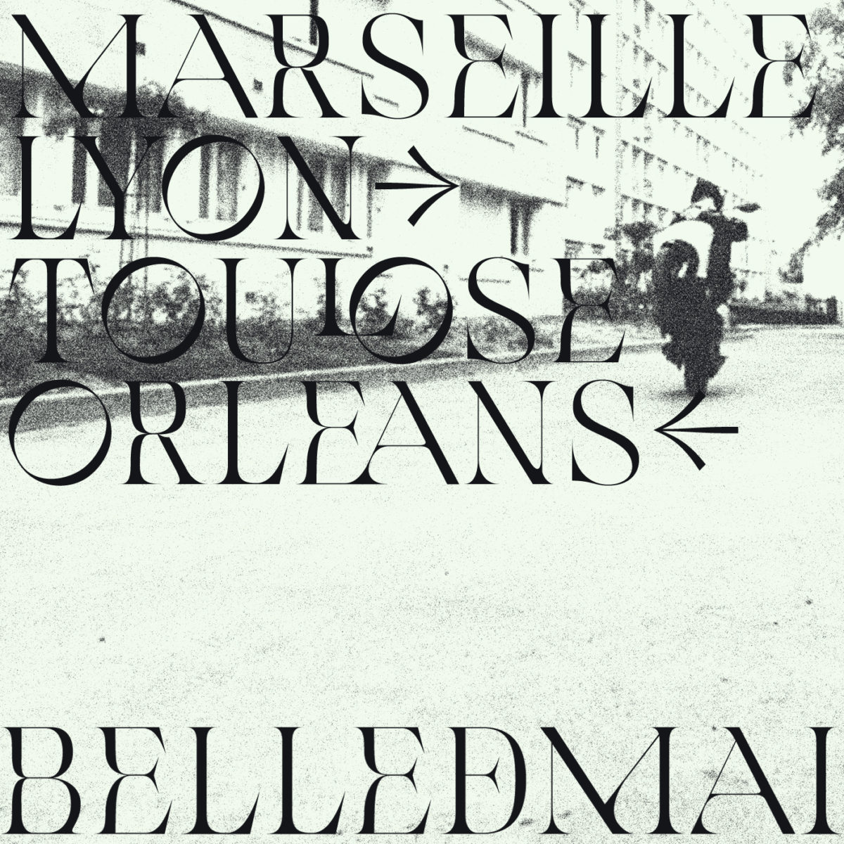
Fascinated by typography, 60KILIOS conceptualised Belle de Mai inspired by culture shocks between expensive, central city zones and their lower cost, suburban counterparts within built-up metropolitan cities. Based particularly on these contrasts in and around Paris, Belle de Mai draws from french culture and city-scape architecture to construct a typeface which embodies two sides of the city.
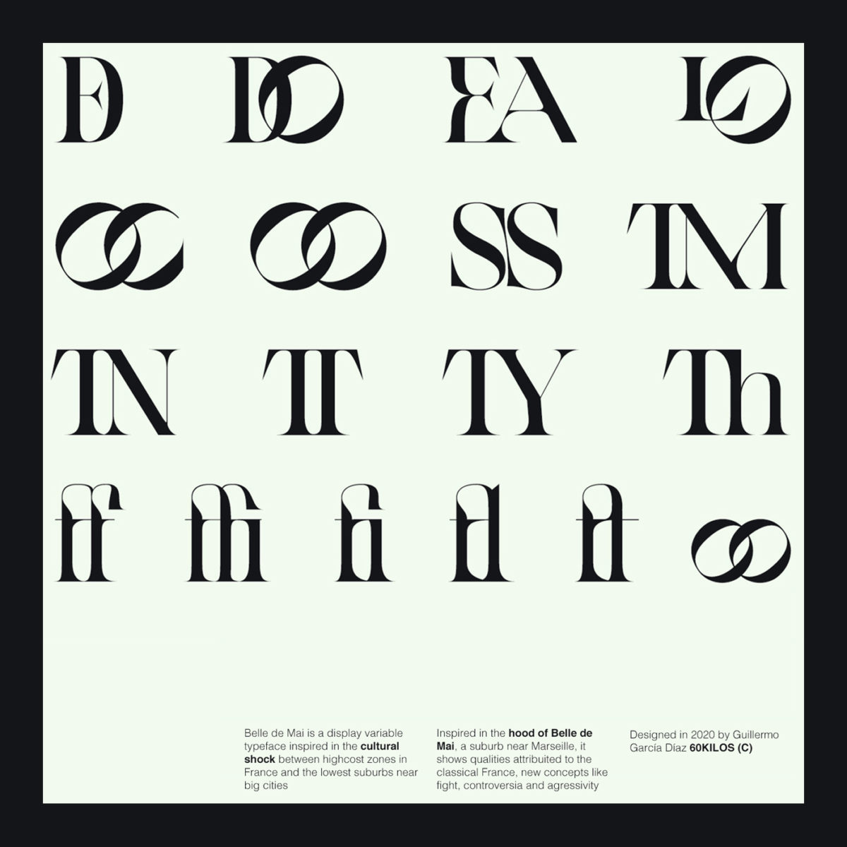
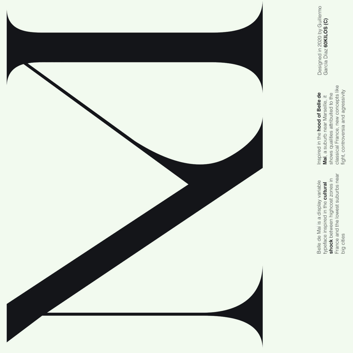
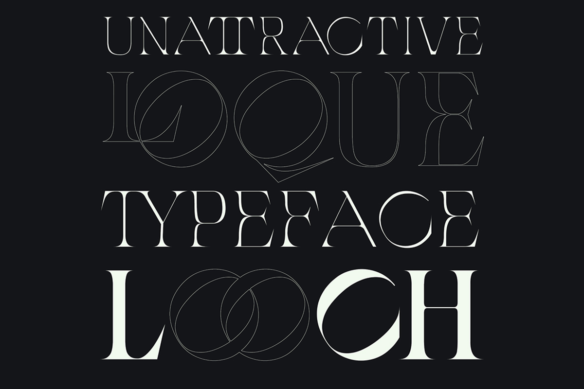
Taking its name from the hood of La Belle de Mai, the typeface draws inspiration from the culture of the area and features a juxtaposition of curving elegance alongside razor-sharp edges, heavy stroke contrasts and a popping tilted axis in ‘o’ and ‘e’. With Open Type features including lowercase and uppercase, ligatures, numbers, symbols and diacritics, there’s plenty of ways to bend Belle de Mai for many individual projects.
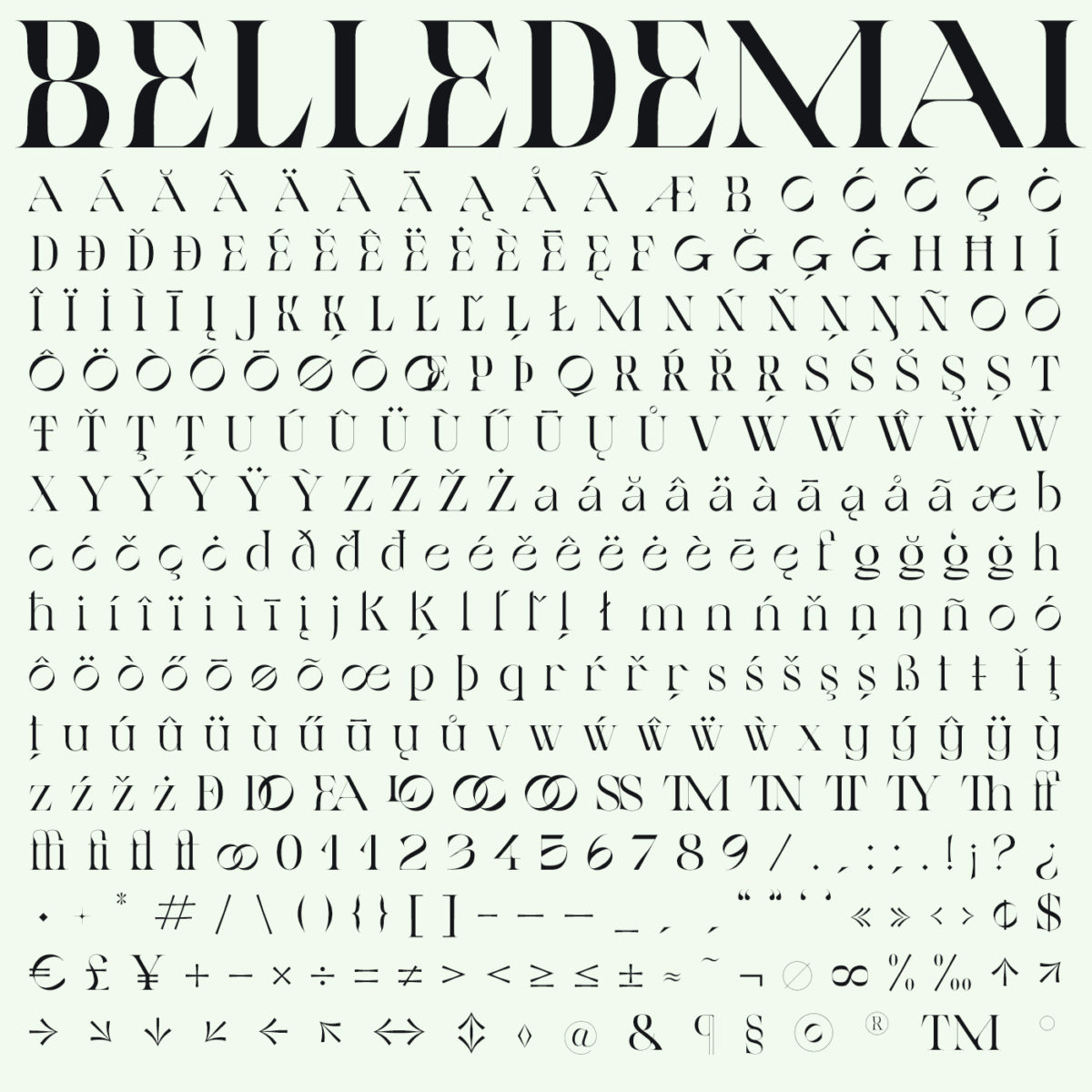
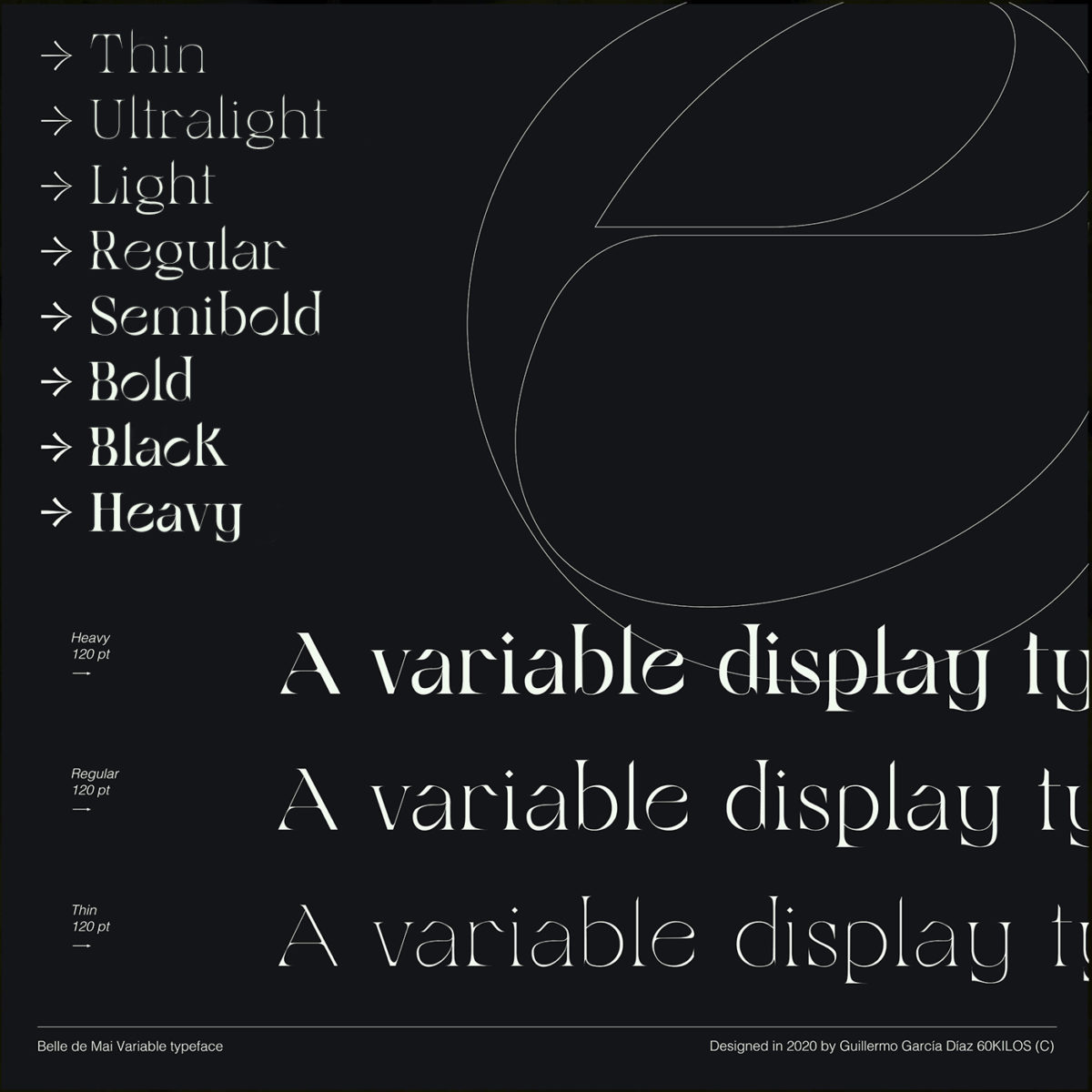
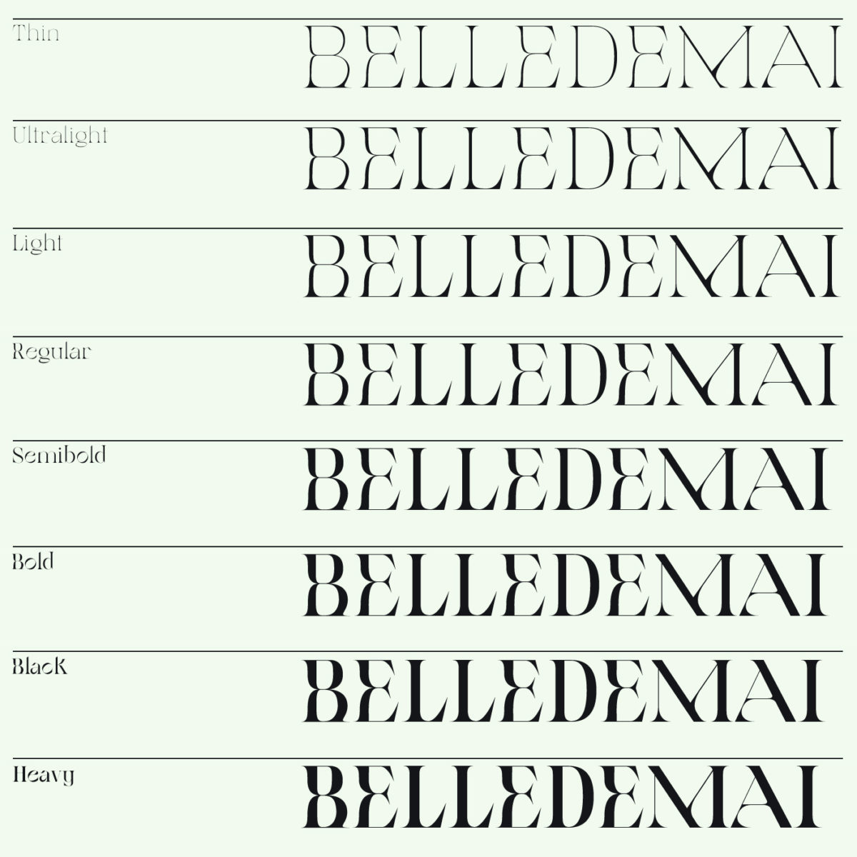
Featuring a total set of 360 glyphs and accommodating 8 weights, Belle de Mai would look stunning in-use in medium to large texts for posters, branding and editorial. Available now on Type Department.


