
Describing himself as a newcomer to type, Peter Roeleveld (@peter_roeleveld) is full to the brim with fascinating reflections on the growth of his work so far. Currently a Graphic Design student at the University of Arts in Utrecht, the designer is occupied with ‘Exploring all the aspects of the medium, willingly breaking the rules of type and striving for unique concepts within the design of Typography’.
‘For me, type is almost more important than images communication wise… Not only because typography directly says what the client wants to communicate, but it’s also possible to translate images in the type itself to help express the tone of voice’, Peter tells us. Fascinated by this, we first landed on chatting about his Gruwel typeface. ‘I’ve just realised that I unconsciously make work that has a very close connection with human behaviour, thinking and emotions’, the designer explains… ‘When I play with type design, I am connecting it closely to my personality’.
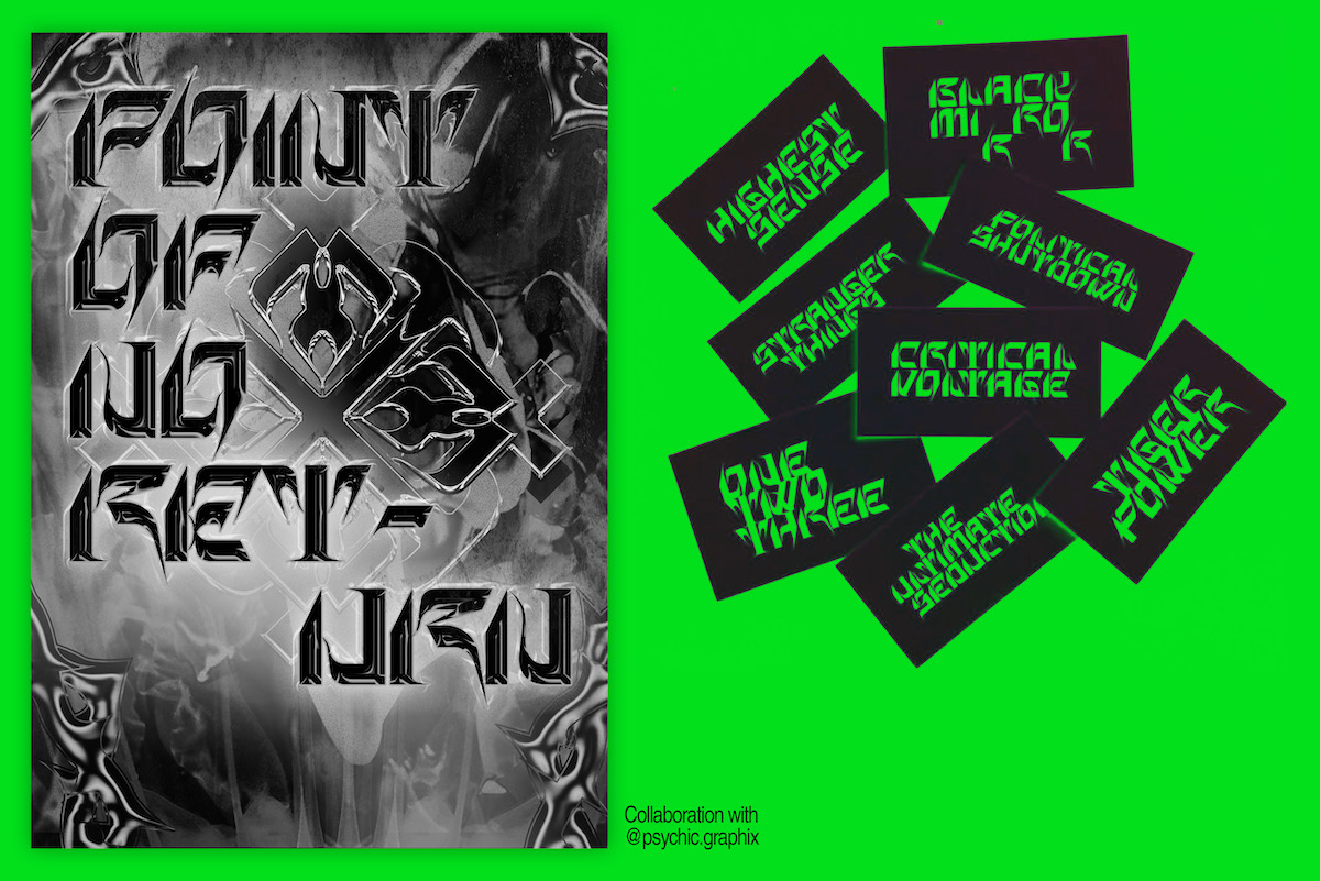
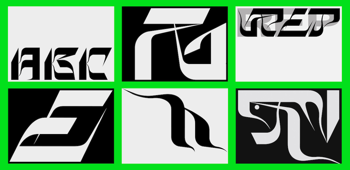
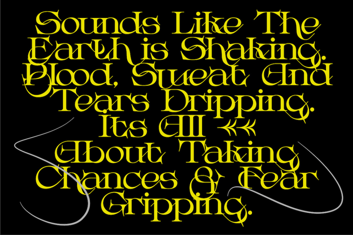
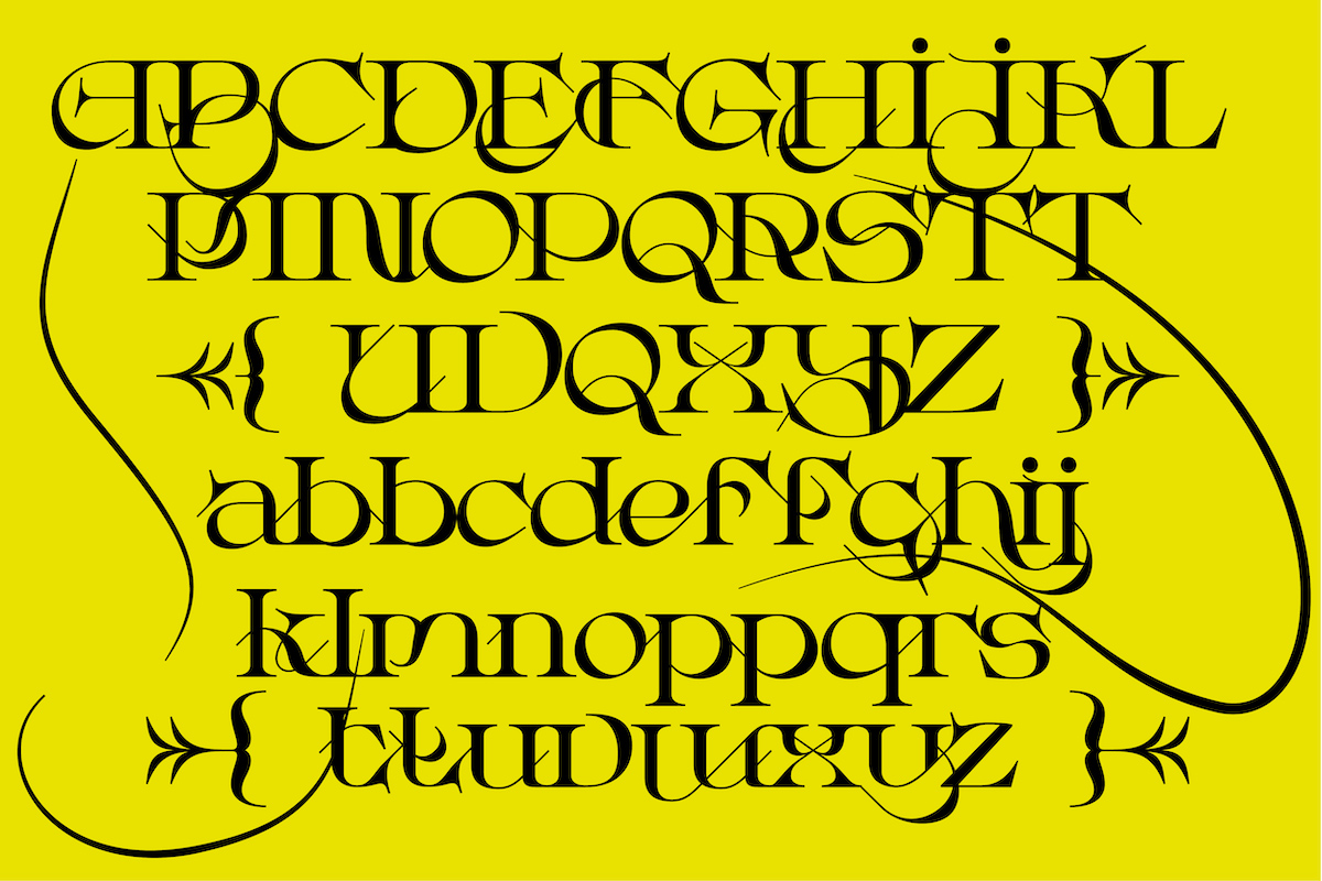
Looking at the connections between human behaviour and characteristics, Gruwel became somewhat of an extension of Peter’s persona the time… ‘‘Gruwel’ means something like ‘horror’ in Dutch’, the designer explains, ‘At the time I was making this font, I had a deep interest in techno-aesthetics vibes in design, where illegible type logos take on a very important role… Those abstract-chrome-type cover proposals people were making were a big source of inspiration for me’. The experimental display typeface definitely exudes techno-aesthetic vibes — and combined with some humanist touches, the glyphs deliver a stunning mix of harshness-meets-fluidity.
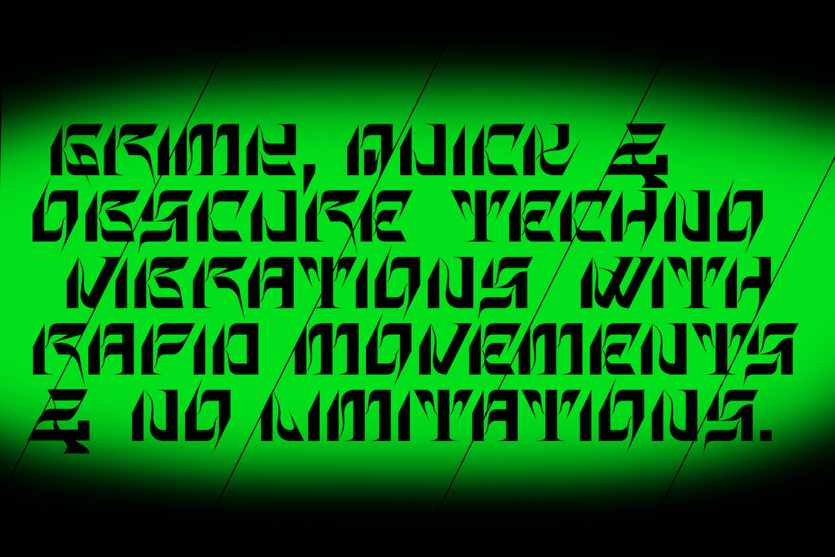
‘I started discovering the most grimy, dark techno music at the time’, Peter continues, ‘So I really created this new personality of mine where I would see myself as a typical techno-punker (even though I’m not that person) and envision this alter-ego personality… I ended up exploring this design scene and eventually created Gruwel type to express my current feelings in that project. I think my typefaces are a combination of experimenting and discovering myself as a person.’
Peter’s newest WIP typeface, Muscular, also holds a strong connection with the designer’s life and body, but with a greater focus on the physicality of human beings (rather than character). ‘I realised that I’m never in a rest-state and stumbled upon a burn-out, so I started to research my own body by filming short clips and editing them in various programs to make the film aesthetically pleasing, did some sketching, and eventually translated this concept into my first variable typeface… My plan for it is that it will behave like the muscles in our body’.
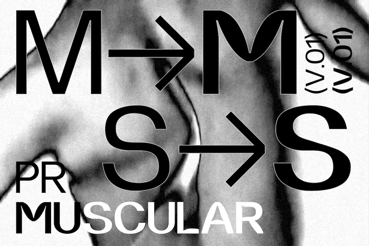
This project sounds super exciting to us and Peter’s innovative approach to the potential of creating a narrative through variable typefaces is fascinating. As the designer continues, ‘Going from thin to bold, you’ll see some intense muscle tightening in the stems of the glyphs. This variable animation is meant to simulate the two states of our muscles going from relaxation to tension’ — Wow.
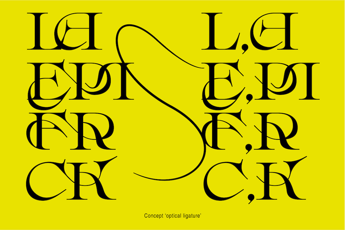
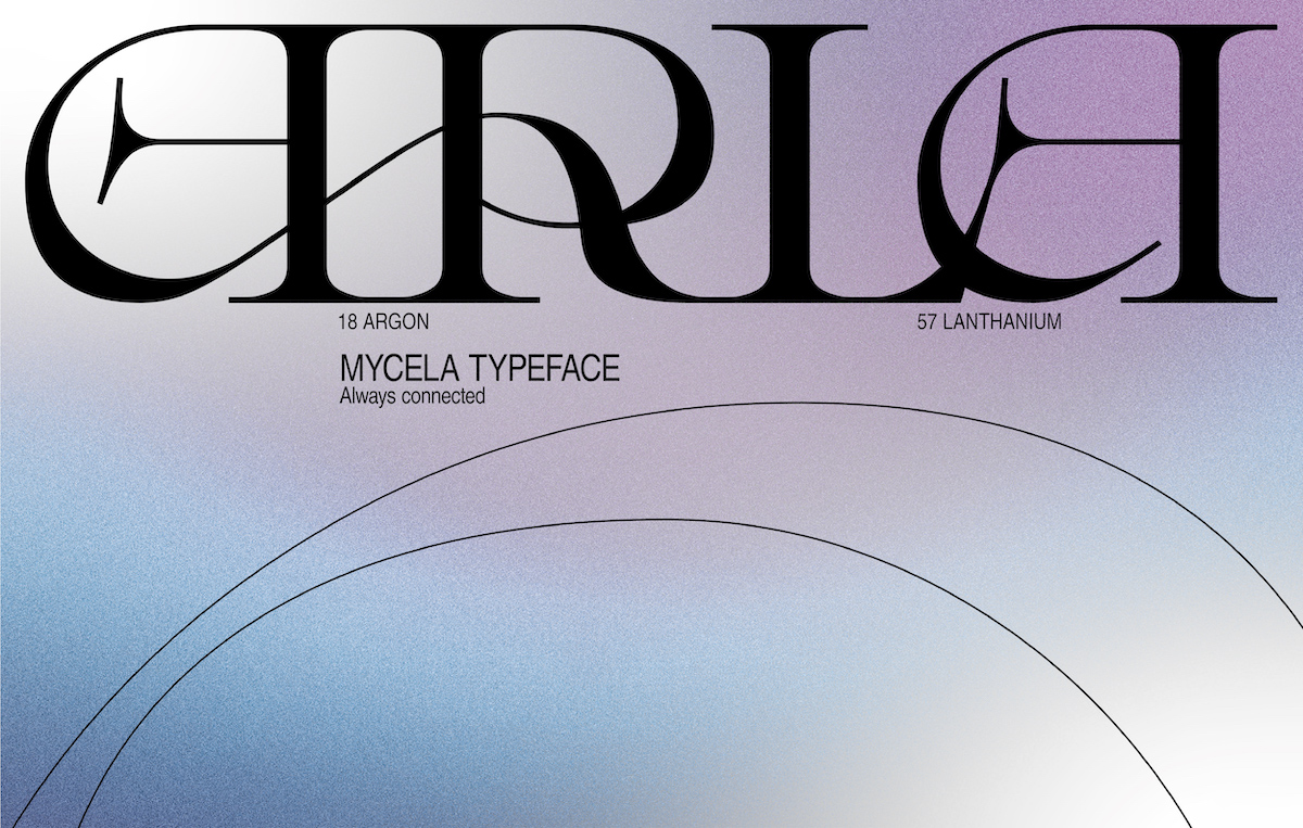
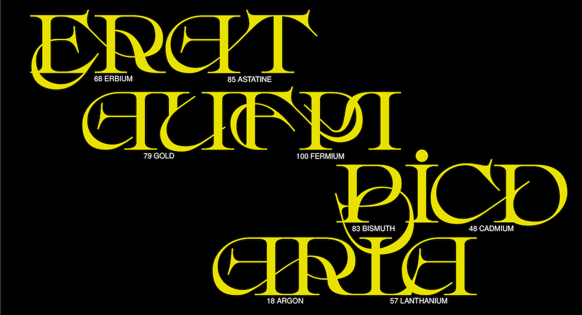
On the other hand, Mycela has been more of a technical challenge for Peter, through which he’s been experimenting with creating a system of optical ligatures. ‘In Mycela, the notion of beautiful doesn’t lie on a single character as an individual, but more on a combination of characters that make it beautiful by supporting each other’, the designer says. ‘Mycela gets her name from Mycelium, which is the vegetative part of a fungus or fungus-like bacterial colony, consisting of branching, thread-like hyphae. It can either appear so tiny that it can’t be seen or grow thousands of acres big. Similar to this fungus, in this typeface you can make words grow in an infinite amount of characters and still have it connected’ . The typeface is built not so much using official ligatures, but with a system Peter developed to connect glyphs visually, to create optical ligatures.
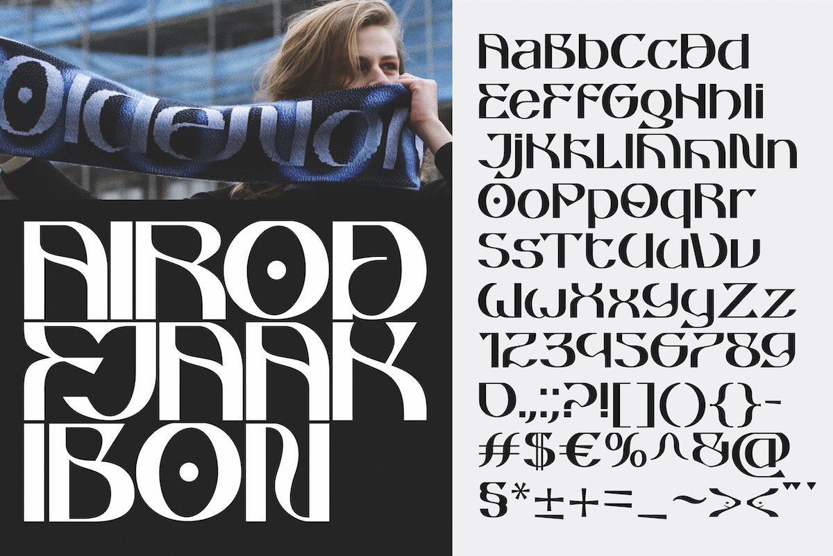
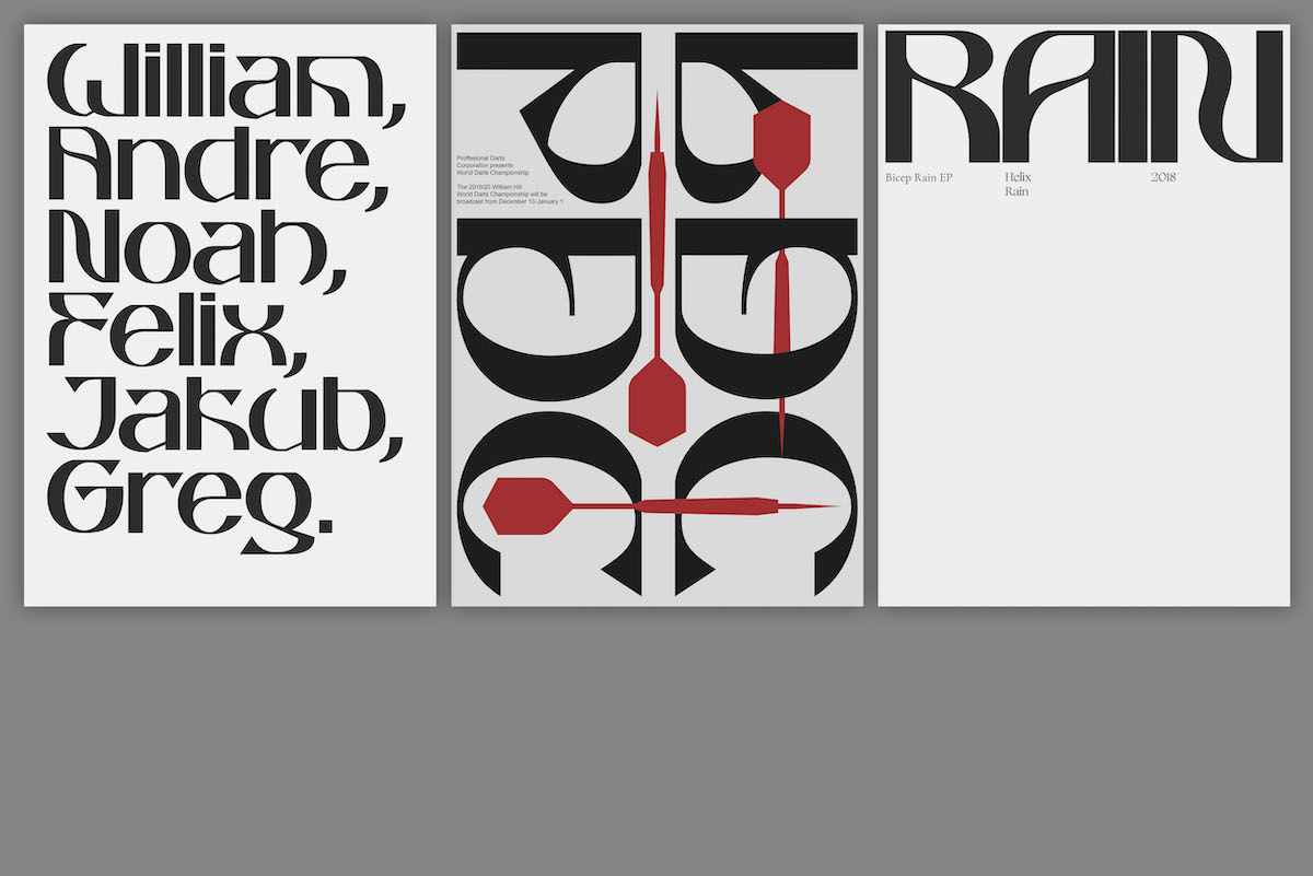
We also think Peter’s typeface, Oldenorth, is worth checking out too… ‘Oldenorth is a typeface that focusses on legibility from a mid-distance while also adding a unique decorative character: Low Cap-Height, flat surfaces and a few unique glyph approaches (m,k,g). Oldenorth also combines soft round shapes with sharp strokes and endings, making it both dangerous yet elegant its totality’, the designer tells us. ‘The name Oldenorth originates from the place where the font has been crafted, literally translated back from English to Dutch, Oldenorth means: ‘Oudenoord’, which is a street name in The Netherlands, Utrecht’.
We cannot wait to see what Peter’s design future holds, and we’re especially excited to see Muscular in action when it’s finished! To see more from Peter, be sure to follow his Instagram and check out his website. Thanks, Peter!


