
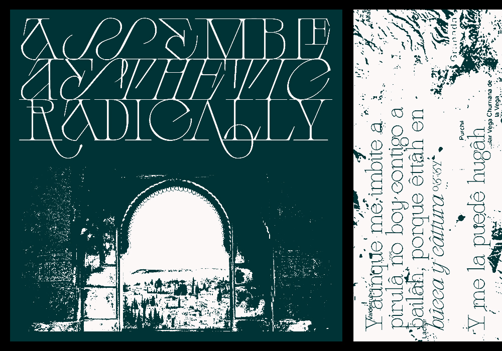
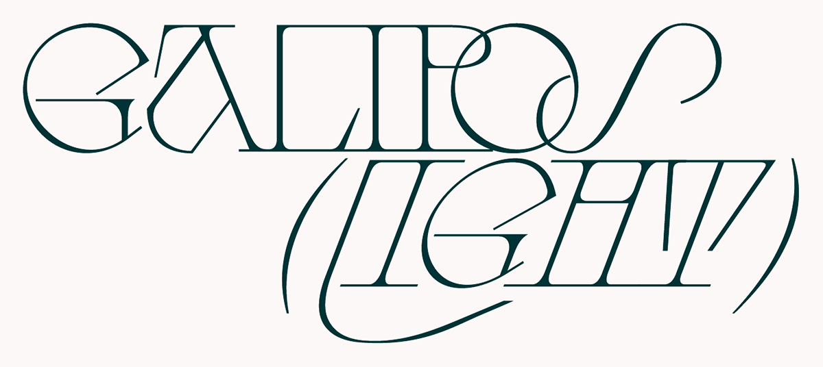
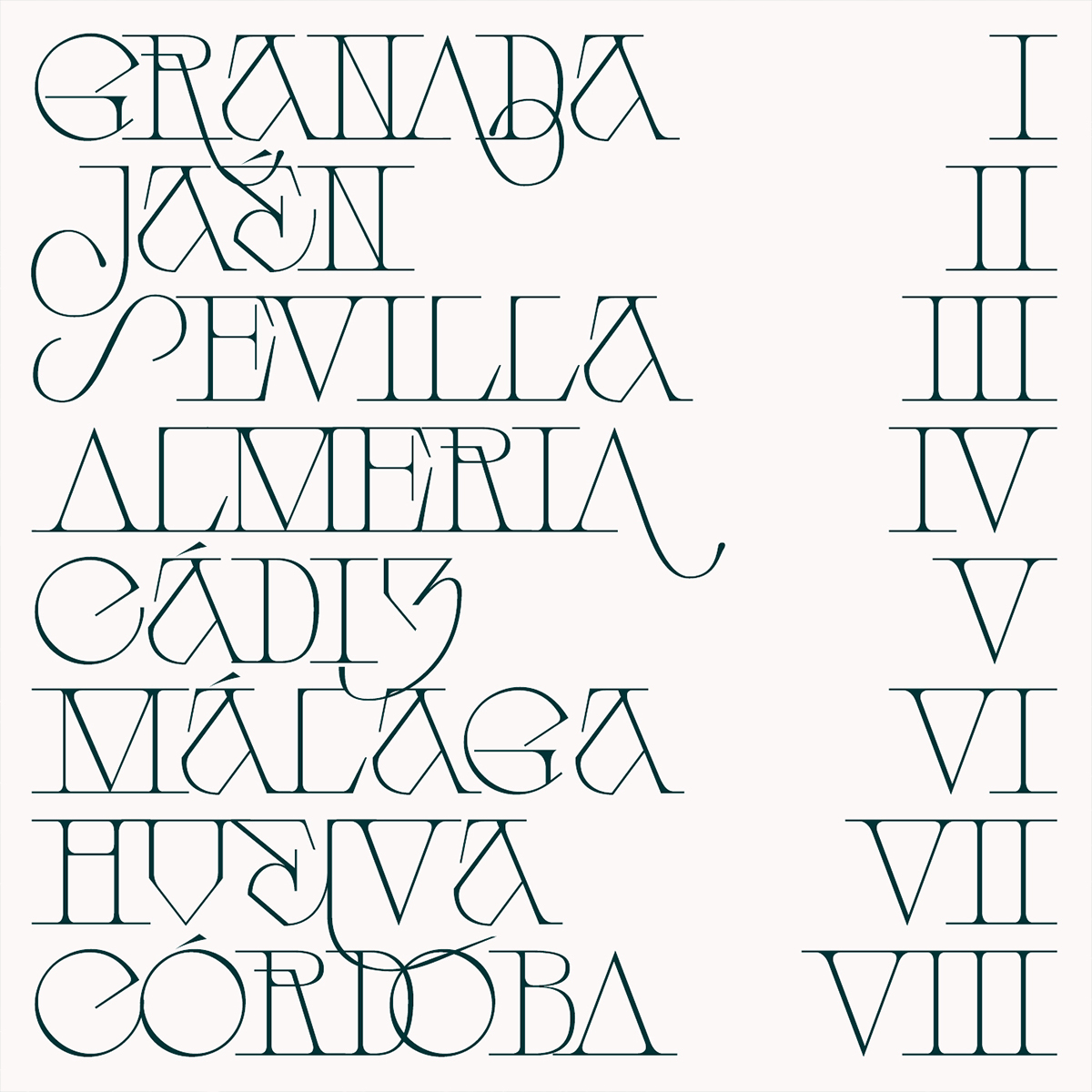
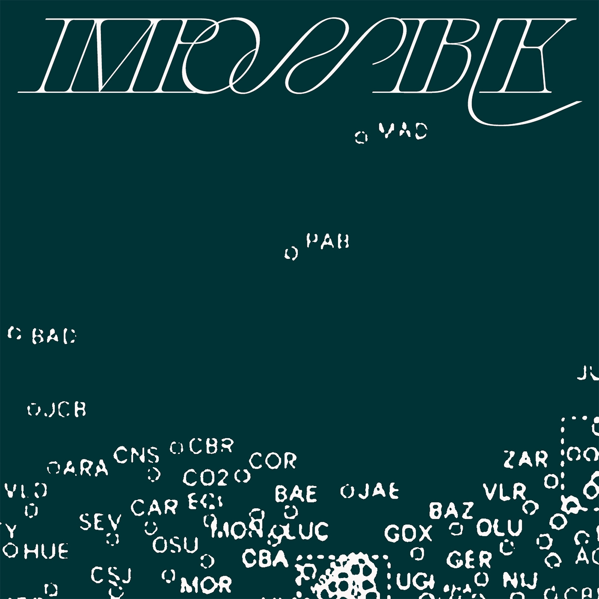
The concept for Galipos, the latest typeface from Spanish type designer 60Kilos, emerged while the creative was spending time researching the history of small cities and towns around Andalusia – a region in southern Spain. Uncovering stories of its past and culture – exploring the region’s forgotten places – 60Kilos says, “Andalusia has always been considered a land of vagrants, thugs and partiers; Galipos comes to reflect the tough, fighting, hardworking side of the Andalusian people. It seeks to represent the struggle of the people, the union and the brotherhood of a society marked by its historical marginalisation in comparison with the rest of Spain.”
Having been around the graffiti scene since the age of twelve, 60Kilos says that as a graphic design student he “could never think that those worlds could have any thing in common.” But two years ago, while studying typography under Carlos Campos, he began to understand what he now sees as an interwoven relationship between type and graffiti. It was this realisation, he says, that caused him to “fall in love with shapes and communication again,” and “understand the possibilities that emerge every time you design a single glyph or a concept-based family.”

Also the designer of the hugely popular Belle de Mai, 60Kilos’ collection of typefaces are set apart by their infusion with references to places and their histories. His typefaces are marked with expressive, powerful atmospheres, and it’s this storytelling quality that makes them some of the most exciting faces to work with right now – particularly when you’re looking for unique, artful display fonts.

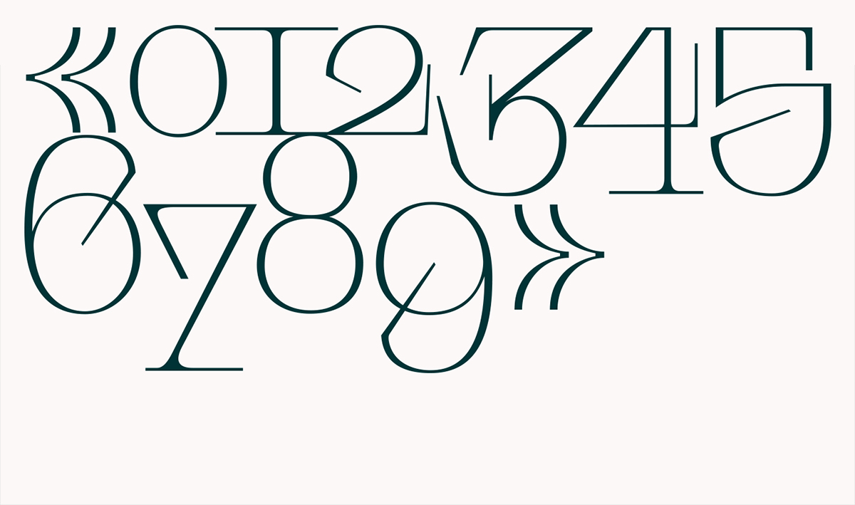
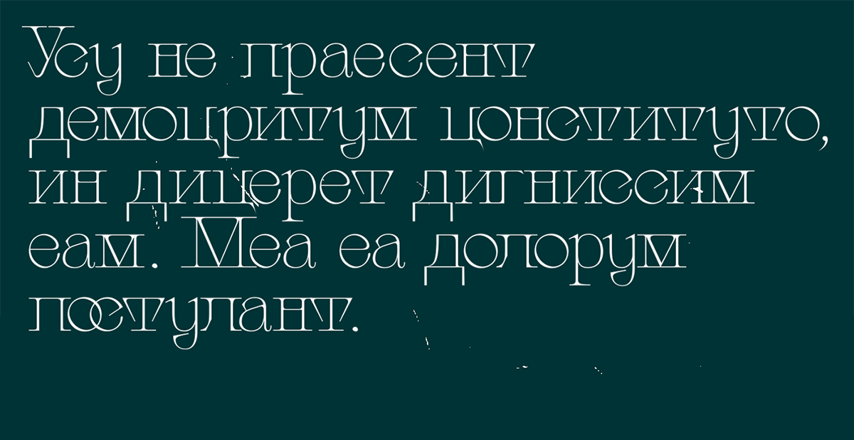
“Some of the main features of Galipos are the impactful and distinctive character designs,” 60Kilos says. “They try to express the roughness of this place, taking inspiration from the people who lived here before us: our ancestors from Al-Andalus. Maybe the most impressive feature is the uppercase character design and how it fits together, with plenty of OpenType features that let you be more creative…But in my opinion, one of the best things about Galipos is the lowercase, which stands somewhere between aggressiveness and classic roman styles.”
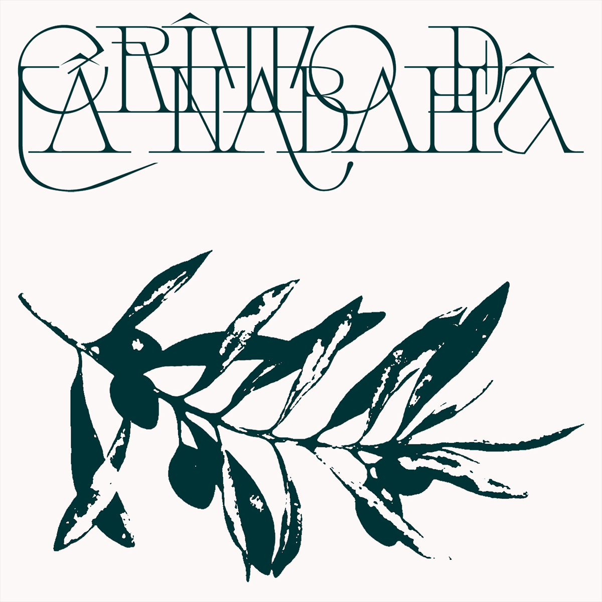
It goes without saying that there are plenty of exciting design opportunities to be had with Galipos. It fits perfectly with new trends, bringing some classical touches alongside features that make each project more personal. The typeface is perfect for branding, impactful poster designs, editorial layouts and creative materials for print, and will also create impressive impact in websites and digital design.
You can see more of Galipos and Belle de Mai over on Type Department now.


