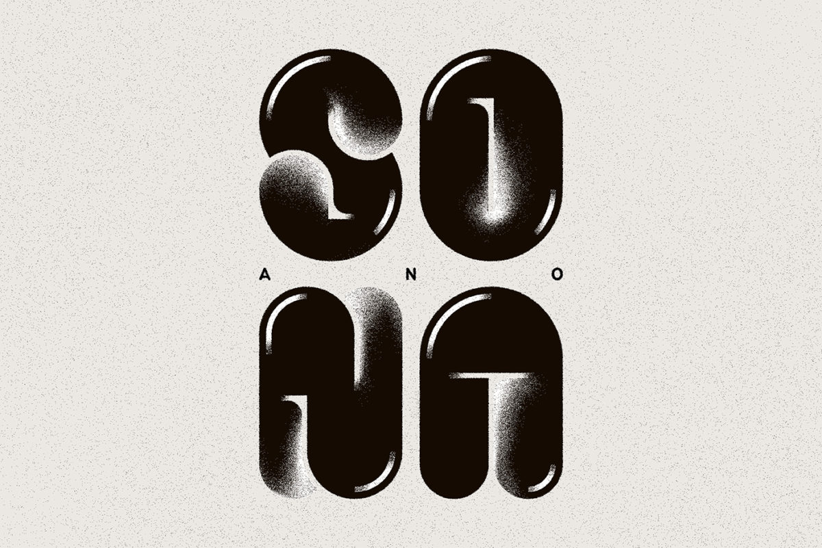
“Hello Type01 community! I worked on this graphic as a response to the State of the Nation Address by our president last July. It reads as ‘SONA’ at first glance, but you’ll notice the word “ANO” in the middle if you look closely. By adding this, the graphic reads as “SO ano NA”, which means “So what now?” in the Filipino language. Here is a quick tutorial on how to recreate it”:
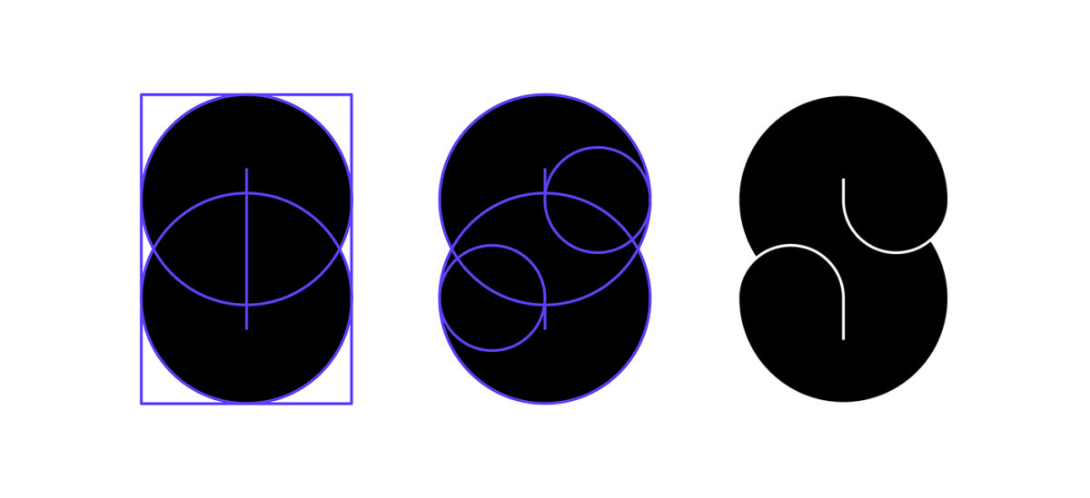
1.) Start by deciding on the proportion of your letters. You can do this manually via sketching, which is what I usually do before jumping into Adobe Illustrator or you can go straight into to digital, your choice. Focus on one letter first and use it as your main guide. I keep my proportions consistent by following a grid set by combined shapes.
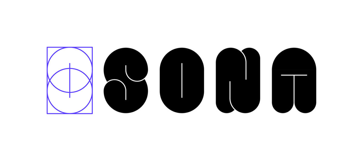
2.) Work on your other letters while keeping in mind the proportions that you set for your control letter and adjust the forms as needed.
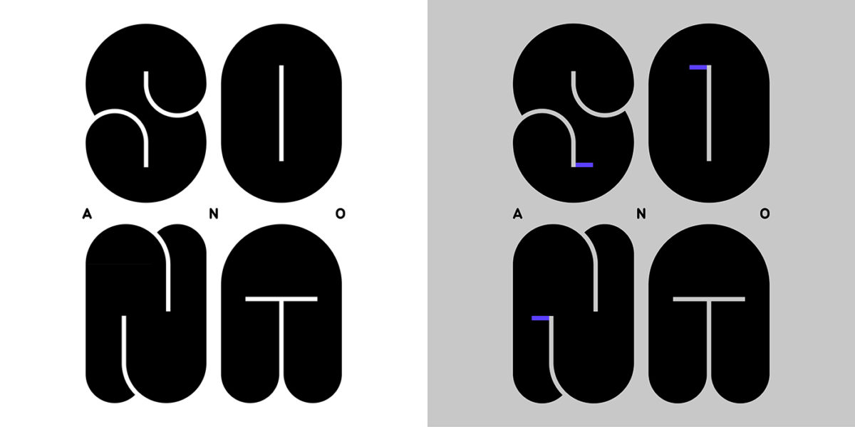
3.) Decide on a layout and add any additional characters before outlining all of your forms. The base forms for this graphic we’re pretty okay, but I wanted to add some extra oomph by introducing notches that mimic ink traps.
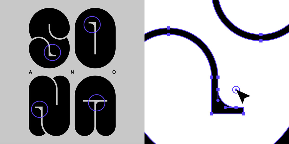
4.) You can explore how to make your design interesting by adding or subtracting curves from your forms. I liked the contrast of the sharp edges of the holes with the overall roundness of the letters, but I wanted to soften some areas. In order to do this, I clicked on the node in the corner by using my direct selection tool and dragged the cursor to create the curve.
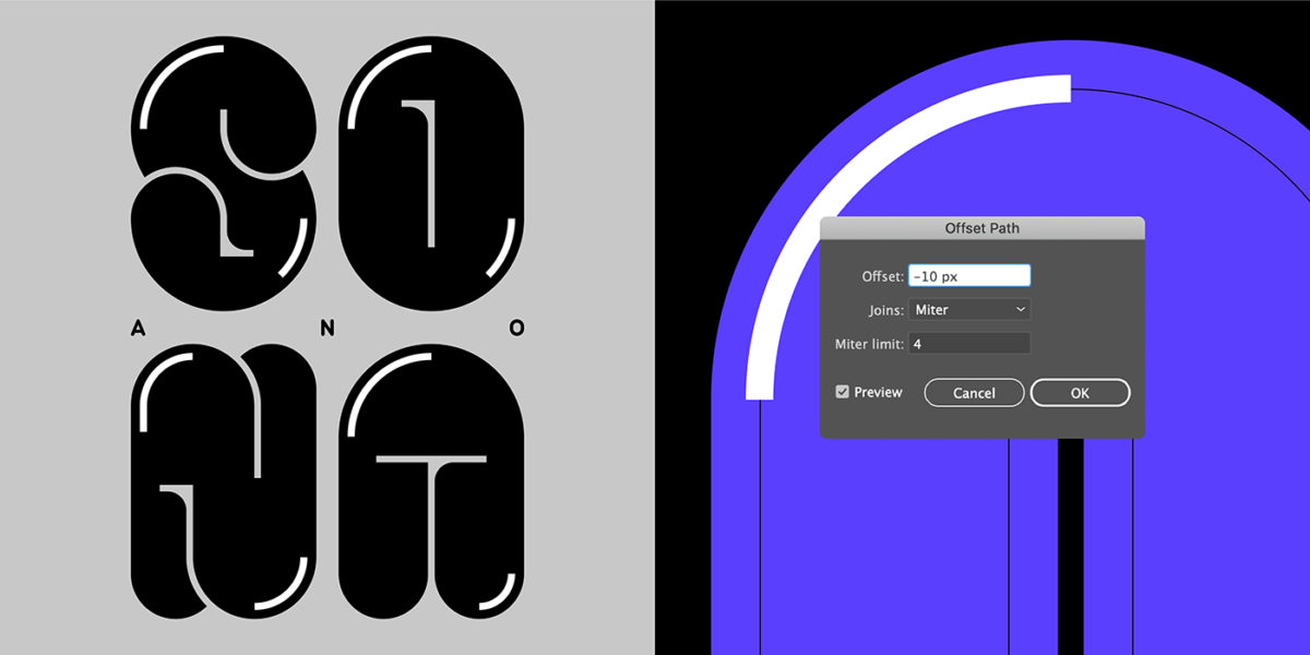
5.) I added shine to the letters by using the offset path tool and setting it to -10 px. I then used a white stroke all-around before deleting some of the nodes. This left white lines on areas that I imagined would look best with some highlights. After that, I outlined all of my strokes so that I was left with shapes to work with.
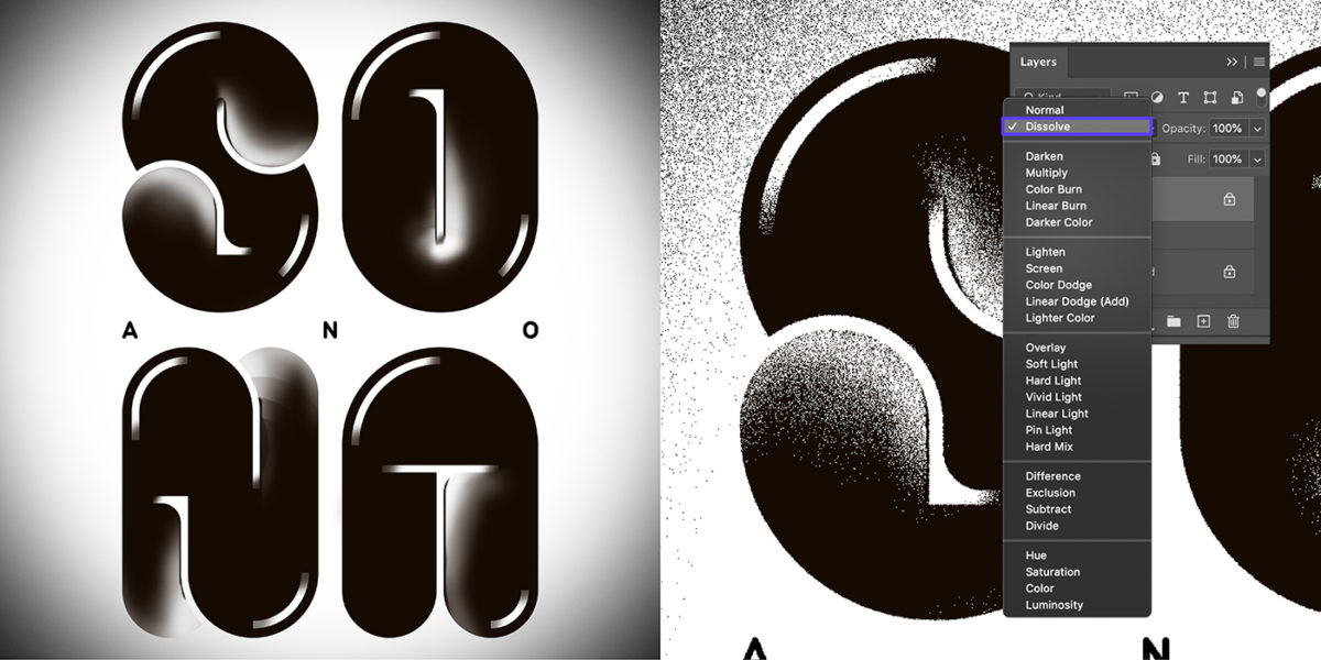
6.) To add texture to your work, export your files to Adobe Photoshop and play with the brushes. I usually go with the trusty soft round brush (a Photoshop default brush) and click & hold on the areas that I want to add texture to. Once I’m okay with the shading, I then go to my layers and change the blending mode from normal to dissolve. This gives me a nice, grainy texture that feathers out as the opacity of the brushwork decreases. (I also hit the dissolve mode on the layers that contain my letters to give that grainy-outlined effect.)
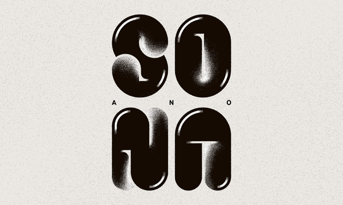
7.) Decide on the final colors/tone and adjust your brushwork before saving your final file.
Ta-dah! I hope you have fun trying this out. Feel free to tag me and @type01_ if you do! I’d love to see your work.