As a lover of collaborative projects, Porto-based Ana Resende’s long, somewhat winding path into graphic design means it’s difficult to sum up her profession in any definitive way. She’s an independent creative who focusses on editorial and book/magazine design; she has a degree in architecture, and occasionally works on independent architecture films; she organises talks discussing new projects developing across Porto (that is, in the absence of lockdowns); and she dabbles in curatorial work as well. ‘I don’t like to close my practice to one single discipline, but to let the different subjects contaminate each other’, she says. ‘That’s why, sometimes, it is so hard to define it.’
Graduating firstly from Architecture, her final work focused on Architecture and Film. From there, she joined a research project on the same subject, where she explains she was in charge of the editorial side of things – a series of books and a magazine. ‘I got very enthusiastic about that and finally decided to study Graphic Design and Editorial Projects’, she tells us. Her architecture films, such as The Construction of Villa Além, Secluded Stillness and Three Patios for the Sun, are eerie and compelling, and all her work feels enriched by every tangent of her practice…Fascinated by Ana’s magazine design for Future Perfect we got in touch to get a deeper scoop on the concepts behind the publication.
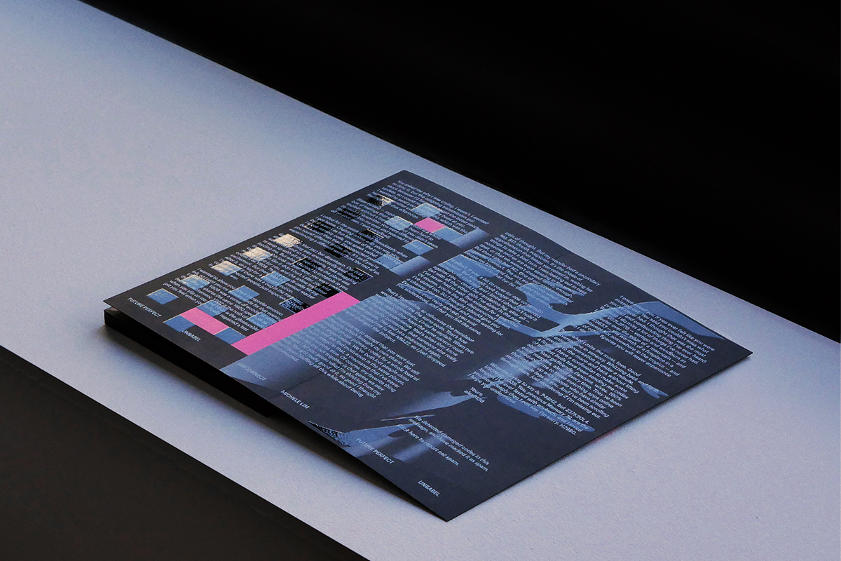
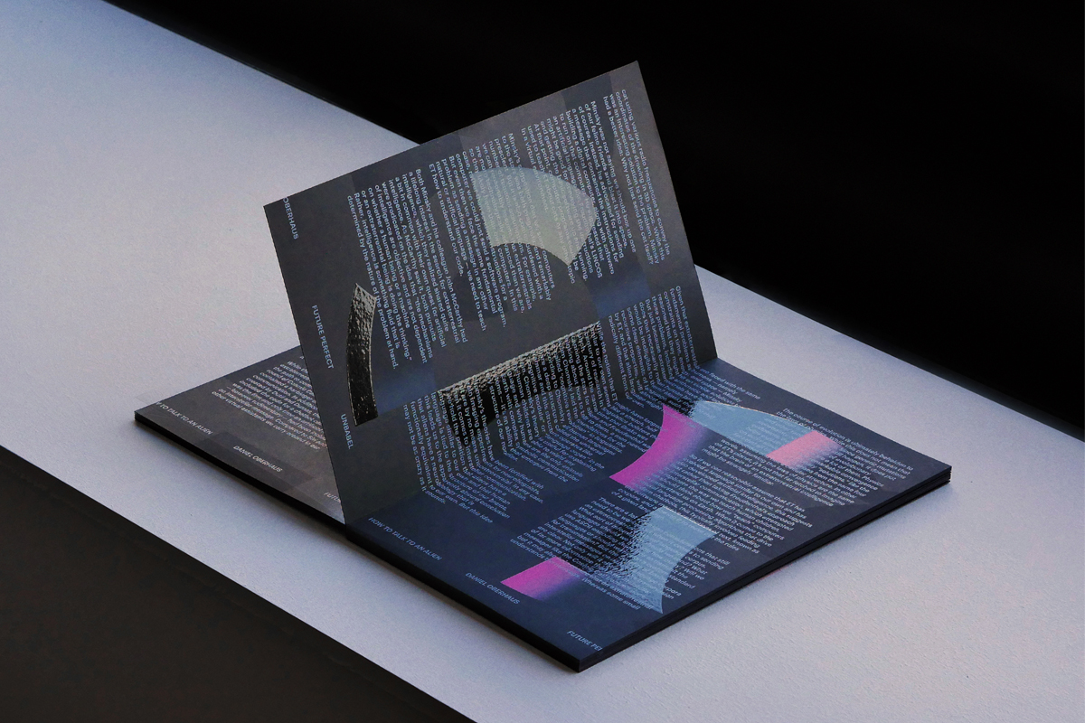
Final object — view © Ana Resende
You trained in architecture, which is really interesting. Do you feel this affects the way you work with type/typography in your editorial and magazine design?
I believe working with typography demands a very trained eye. You have to look at type all the time, study its forms, pay attention to its details, know its contexts. It’s a combination of sensibility and geekiness. I would say my architecture background helps me with the first one. When designing an architecture project, you have to deal with concepts such as scale, proportion, form and counter form, balance, symmetry, etc. Those tools made me feel more comfortable when I first started to work as a graphic designer. I still lack a bit of geekiness – as I said, it’s hard of me to focus on one single thing.
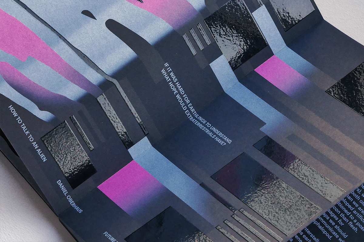
Final object — spine detail © Ana Resende
Can you tell us a bit about what the Future Perfect project explored?
Future Perfect is a very interesting project that gives me a lot of pleasure to talk about, because its purpose was compromised right after it was done. It was a publication to celebrate 2020 – a year that, after 2001, always lived in our minds as something in the distant future. It should have been the starting point of a reflection and discussion on language. But only a few copies were printed in the end of January, and its distribution was interrupted because of the coronavirus. I only have one copy.
The client was Unbabel, a Portuguese startup developing an artificial intelligence-powered human translation platform, by combining Neural Machine Translation with machine learning and a crowdsourced model. The brief was to design the first issue of a print magazine exploring literature, visual art, and social commentary, with the purpose of offering a complex portrait of language as it evolves alongside society. This issue was composed by three texts: (1) a non-fiction essay on the genesis and evolution of “lingua cosmica”, the first extraterrestrial language; (2) a short story that is a dialogue between humankind and nature; (3) a short story that transforms a humble email into a meditation on emotional connection in the digital age. The only condition imposed by the client was that illustration should have an important role on the project, as it has in all their communication.
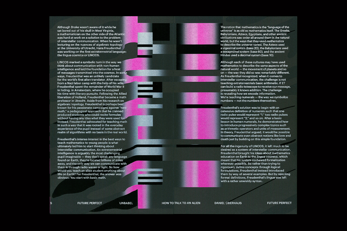
Final object — interior © Ana Resende
That’s so interesting. And how did that translate into the visual magazine design?
Regarding the physical aspect of the magazine, together with designer João Novais (a great designer and a typo geek with whom I love to work), we thought about an object that, within the physical limitations of a book, could reproduce the experience of an endless space; the cosmic space. We wanted to play with a certain representation of the future as taking place in another galaxy – eternalised in literature and films, such as 2001: A Space Odyssey – but with a contemporary look. We wanted the object to have no spine, to allow text to start on a page and continue on the next one, without compromising the reading and comprehension of each essay. So we used only the same black paper, and each spread was folded and glued to the next one.
Regarding the content, we also wanted the illustration to be continuous, like a video timeline. We didn’t want a figurative approach directly related to the content of each text, but one that could express complex ideas with simple forms and limited means. An illustrative narrative, parallel to the essays, plays with idea that language is something organic, with certain nuances, and that translation is always a process of systematising it. So we decided to invite João Castro (The Royal Studio) to join us because we believed he was the right person to this difficult task. And he totally nailed it!
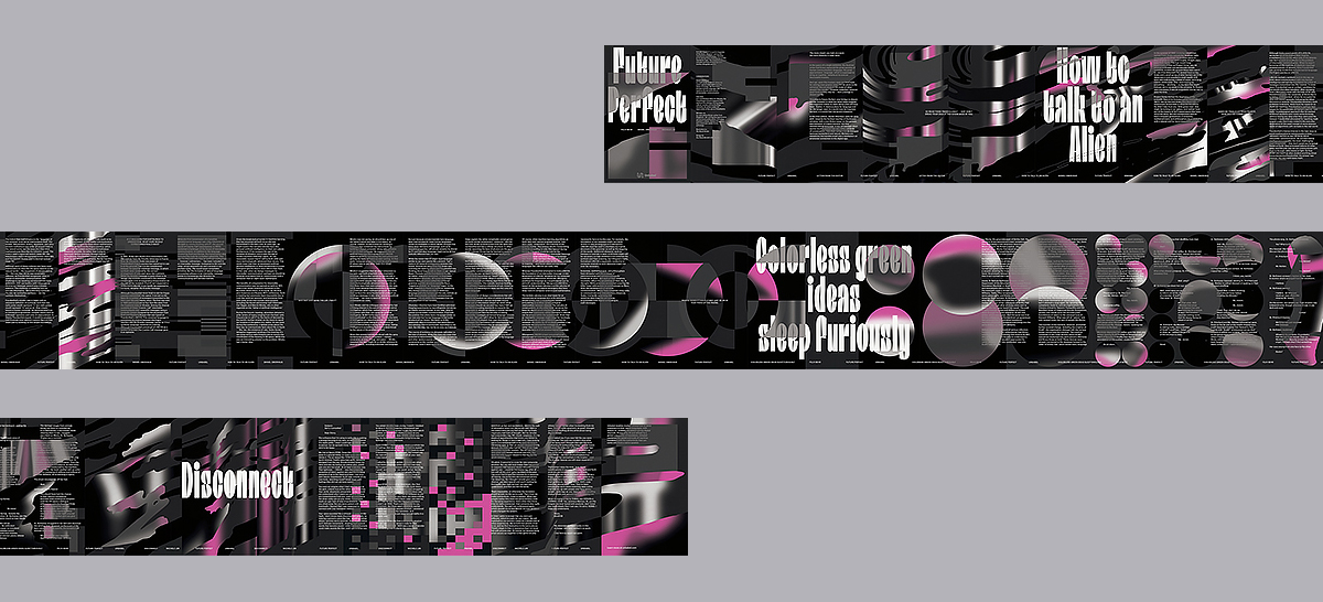
Studies for the final layout © Ana Resende
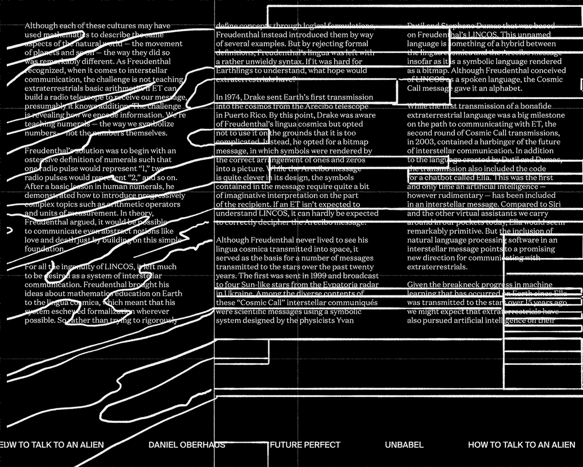
Skecthes for illustrative elements © The Royal Studio
The interaction between the body typesetting and illustration elements in this magazine design is amazing – the illustrations feel very much built around typographic shapes. Can you run us through these collaborative elements and why you & your collaborators took this angle? Did you work together closely to decide on the visuals?
When we approached João to design the illustrative elements, we had already decided on the shape of the object. We had an abstract idea of what the illustration should be, and we had already designed the grid. The only thing we haven’t decided was the fonts, as we wanted them to respond to the illustration.
We discussed all this with João and challenged him to design with only four tools: black, white, magenta and varnish. These were chosen to imprint the contemporary and sophisticated feeling we were seeking (and to feel a bit tech-y too). He firstly did a beautiful sketch, only using white lines, where we were able to explore the way it would relate with the text grid; sometimes respecting it, sometimes defying it. At that point we understood that the font should be very neutral, always the same size, and that rhythm should be drawn only through moments of pause – isolating sentences or deconstructing columns. As an exception, we decided the titles should use another font, which we wanted to be warmer and more friendly, in order to contradict the impression of encryption that the other elements might have.
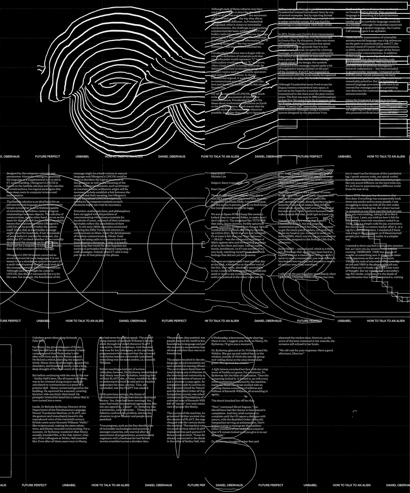
Skecthes for illustrative elements © The Royal Studio
How do you feel typography as a whole impacts the way we share and synthesise information? Do you think it can be used as a tool to imagine a better future, or shape social commentary?
Typography always carries a message. Not only the content of the text itself, but its design communicates a specific attitude or intention, a tone of voice, which shapes the way one interprets that content. In that sense, typography is a very powerful tool, especially because it is an invisible one. Most of the people don’t actually see it, or rationalise it. I believe typography is successful when it preserves and reinforces the values of its content. Maybe it cannot change people’s lives profoundly, but it sure can change the communicative capacity of graphic objects. Especially in a time when we are constantly consuming information, a good use of typography can make a difference by getting people’s attention, keeping them focussed on a specific topic and increasing the impact of the message or call to action. Will it lead us to a better future? Not sure about that.
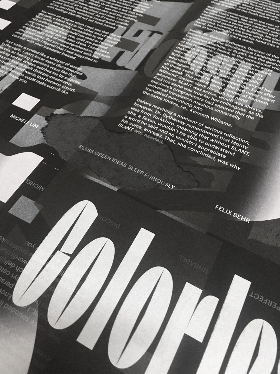
Printing tests © Ana Resende
You also used UV Offset printing for the magazine, could you run us through this choice? Do you have any additional comments on how choices in inks and printing processes can affect the way a printed work is received and can it play a part in upholding the values/themes of a publication?
The choice of the UV Offset printing had different reasons: (1) because it was a magazine that intended to celebrate a new era, we wanted to use something relatively new in the printing market; (2) it was essential for the whole concept to use black paper, so we were searching for alternatives to silkscreen, which was very expensive and would’ve been unviable for the project; (3) personally, we (and the printer) wanted to try it for a long time and explore its limits; (4) UV printing inks contain no harmful toxins, so it is supposedly more environmentally-friendly. UV printing relies on ultraviolet technology to almost instantly cure ink, which means it dries almost instantly. That allows us to overprint several layers of different colours at the same time. That’s how we were able to get those vibrant results, which were fundamental to deliver the message as we wished.
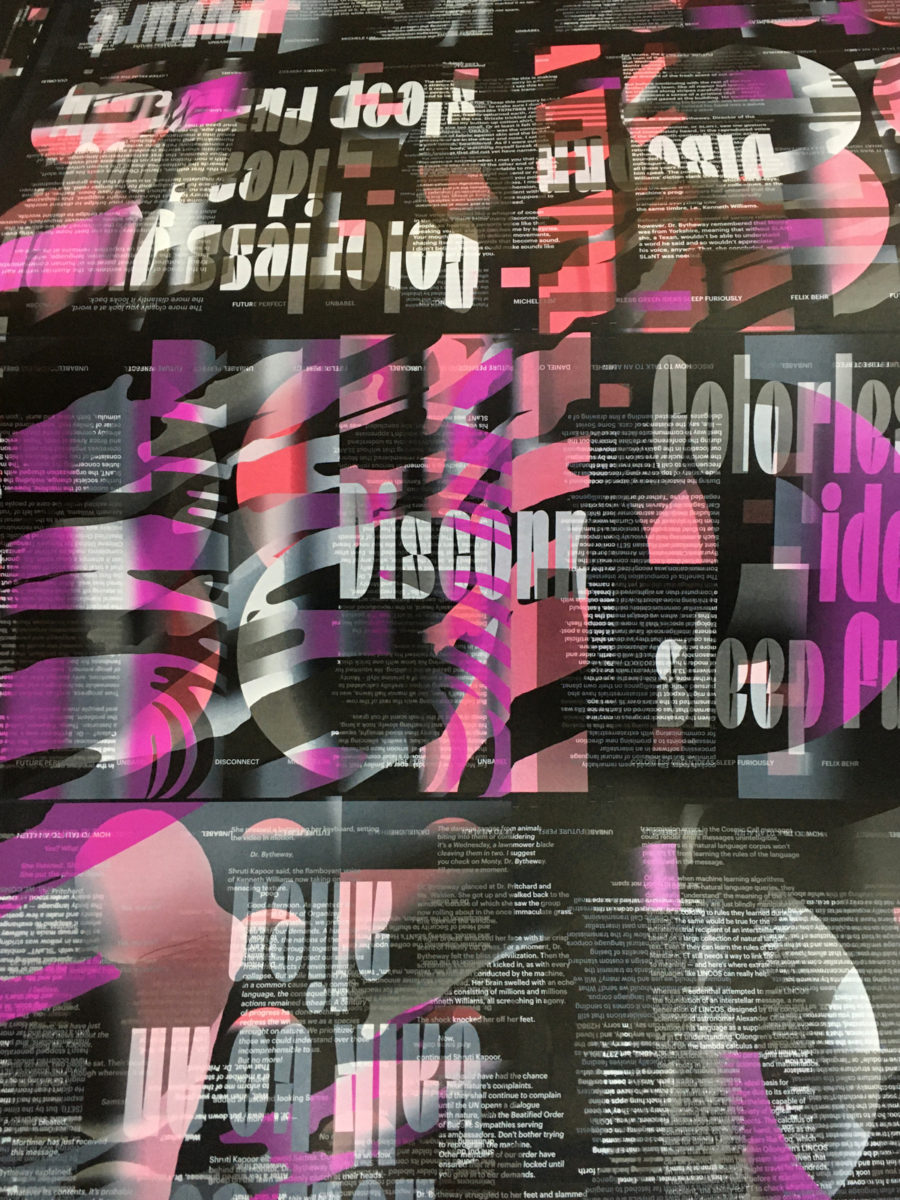
Printing tests © Ana Resende
People tend to have a very emotional experience with a printed work because it’s physical, it has shape, scale, volume, weight and surface. So I believe the first contact someone has with the printed object plays a relevant role on how they will read the content. And that’s why the choice of materials, inks and printing processes should be in harmony with the publication values.
I try to think and design my books as a coherent whole. The way we print, bind and fold, for me, is as important as the format or layout. Everything should work together to reaffirm the purpose of the publication.

Final object — view © Ana Resende
Thank you so much, Ana!

