Monospaced typefaces are firmly rooted in the design world of today. Originally produced for typewriters, their widespread usage in early computing led them to become synonymous with the aesthetics of tech and source code. Functional and computer-friendly thanks to their machine-readability, mono typefaces remain a popular choice for writing code. You could argue that their tech-oriented characteristics — each letter occupying the same width, no stroke contrast — would make them less favourable with designers compared to their proportional font counterparts. But it can’t be denied that there is something so timelessly appealing about them.
Call it nostalgia or a rediscovery of Y2K aesthetics, monospaced typefaces have had a resurgence among the design community. “Monospaced fonts certainly have their own charm besides their raw looks,” says CoType Foundry’s Mark Bloom. “They embrace the technicality and purity of the form. In a way they are an ode to functionality and that might be very appealing to graphic designers of nowadays.” And from a pragmatic point of view, he believes monospaced fonts have a fantastic advantage when used in all sorts of typographic layouts, tables or even posters. When designing RM Mono, CoType’s newest typeface, Bloom was keen to create a mono that thrives within graphic design.
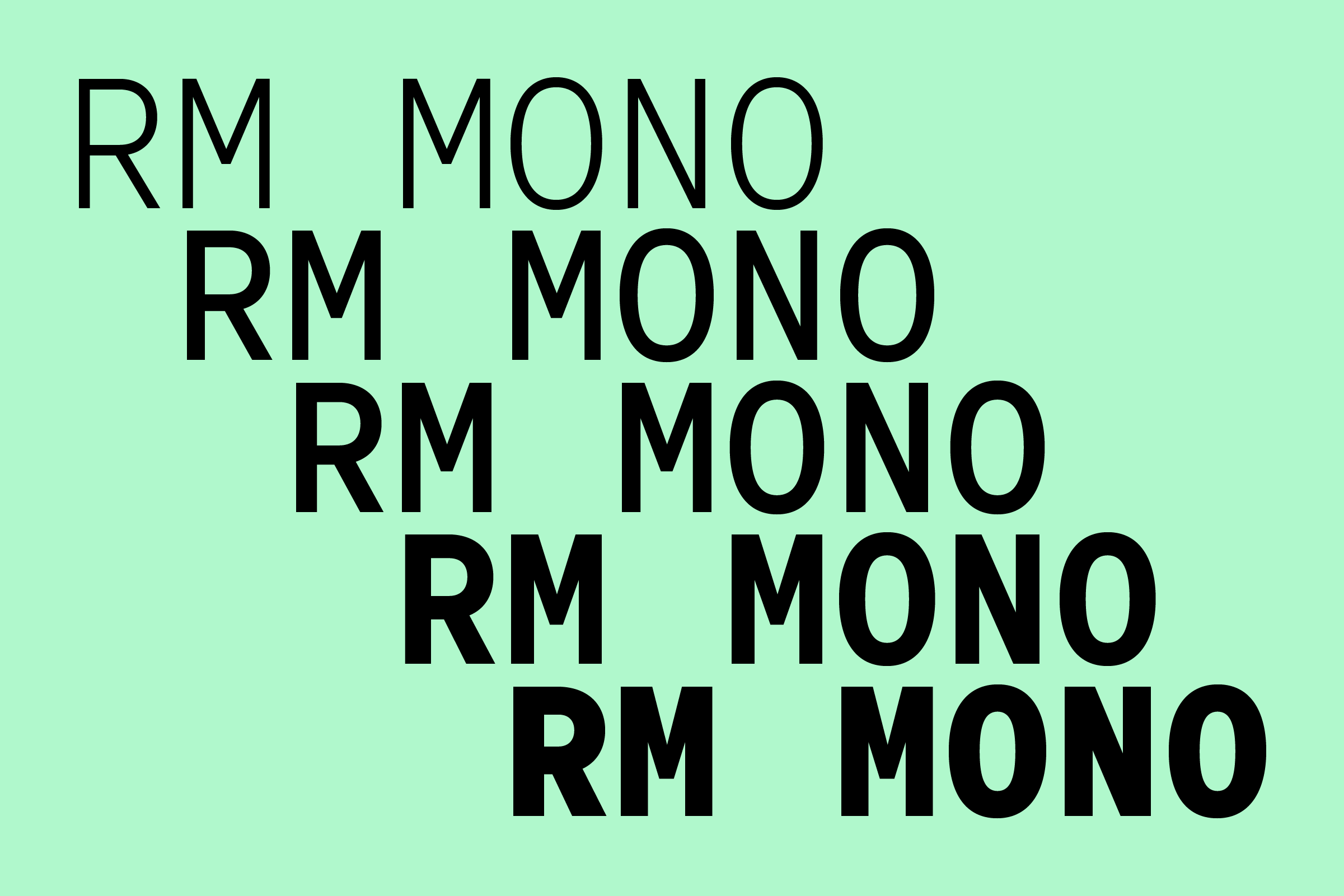
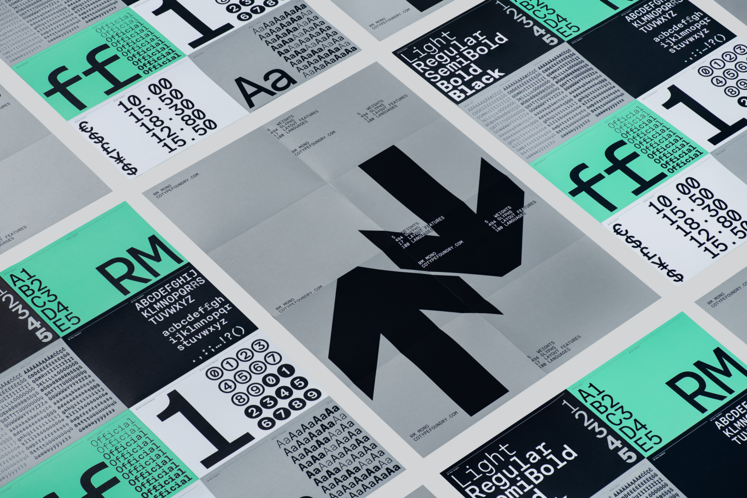
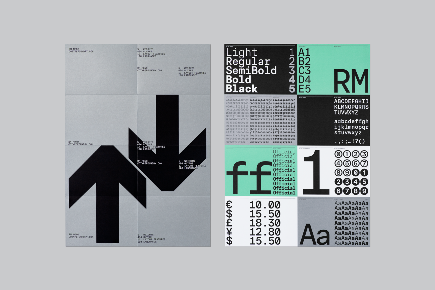
INTRODUCING RM MONO
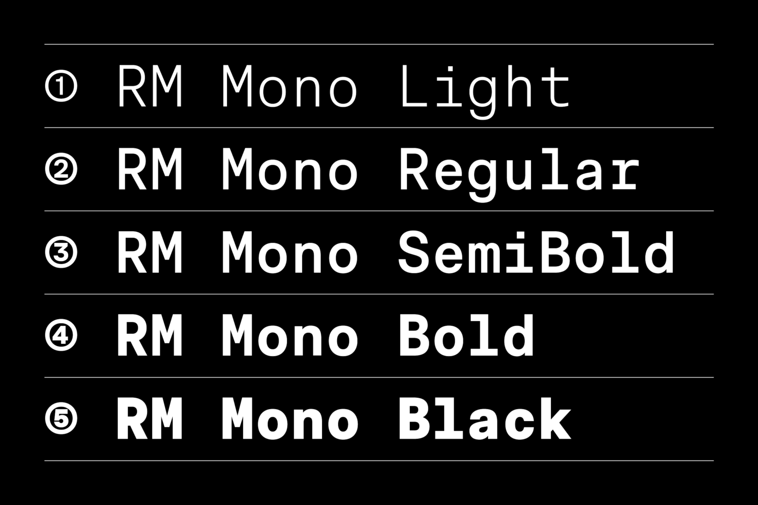
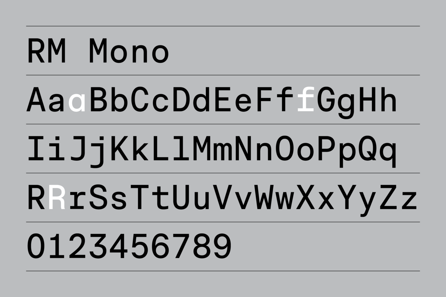
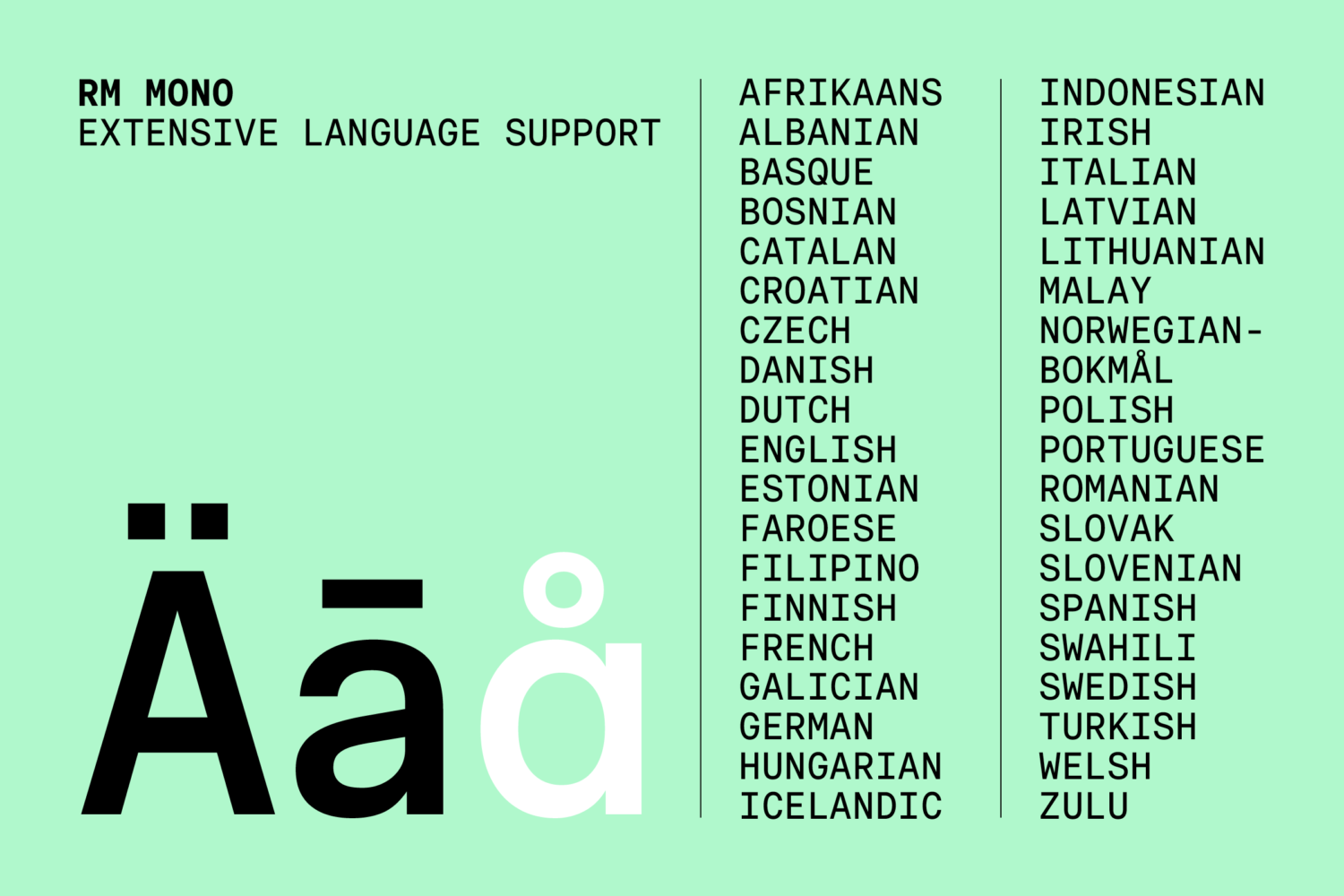
RM Mono is the newest member of the RM Neue family, and as such closely follows the original design of RM Neue — its properties following from the striking, utilitarian roots of the sans-serif but fitting within a 600-unit box. Because of this, Bloom points out, many recognisable characters can be seen, “which allows for harmonious coexistence of RM Neue and RM Mono next to each other within one layout.” Whether used independently or paired together in a house style, they’re guaranteed to provide clean, low-contrast, and legible qualities. As an added bonuses, the set includes an alternate single-storey ‘a’, an ‘f’ with a bottom serif, and a new alternate ‘R’.
This relationship with RM Neue guaranteed that RM Mono’s design process had a solid starting point. Here, Bloom details the typeface’s development and the challenges and triumphs that come with creating a mono.
THE DESIGN PROCESS
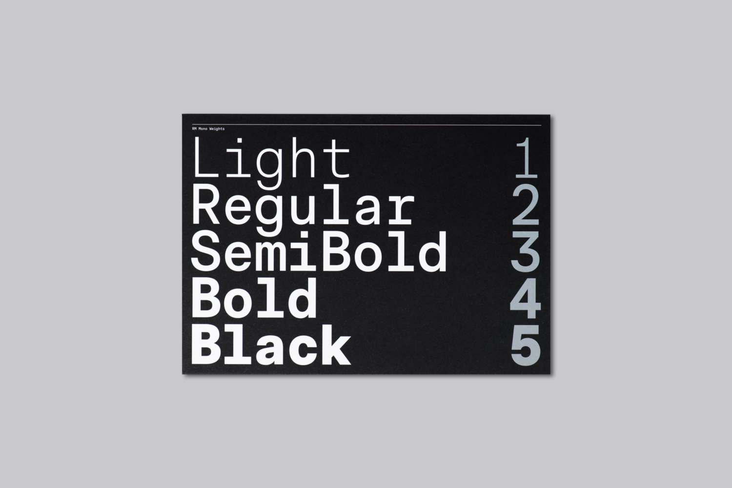
“The design process of RM Mono can probably be best described as giving answers to a list of questions that we always define when starting any project,” Bloom explains. “In short it can be summarised to: idea, rapid prototyping + sketching, polishing, production and mastering.” When designing a mono version of an existing typeface, CoType first has to decide if it needs the same range of styles as its proportional counterpart. “That allows us to explore different solutions for the same letter in the extreme weights such as Light and Bold,” Bloom notes. “It is an essential step as the design solutions that work for lighter weights might not perform as well in bolder weights.”
Texture is another key question that needs answering, too. This stage involves rapid prototyping on the limited set of characters available. “One of the biggest challenges in creating a monospaced typeface is maintaining the texture as even as possible despite the fixed width of each letter,” Bloom explains. “We pay close attention to achieve an even “colour” in running text by proofing the font in many different scenarios.”
Here, CoType are also looking closely, making comparisons to RM Neue. Not only do the two typefaces need to look like a natural match together, but their lower cases and upper cases need to all feel harmonious. “It’s particularly interesting when dealing with wide letters like an upper case ‘M’, ‘W’, ‘AE’ or ‘OE’ as well as on relatively narrow characters such as ‘I’, ‘J’, lower case ‘r’, ‘l’ or numeral one (1),” Bloom says. Within a mono alphabet, an ‘I’ will typically feature a longer serif whilst an ‘M’ will look more narrow and squished. “Our goal,” he continues, “is to find the visual solution for the extreme situations: the widest letters that become the most compressed and the narrowest ones that easily might look too airy and empty in the context of others.”
So when it comes to texture, a narrower design will have a more even texture when used in lower-case. In upper-case however, the letters will feel narrow. And wider designs experience this problem in reverse – wider designs will lead to very airy lower cases. Here’s the conundrum, according to Bloom: should the lighter styles become wider or bolder styles narrower? “We can only answer these questions by extensive testing, covering multiple versions and options of the font,” he responds. “Initially we create multiple different versions of the font. That way we test the performance in real usage of the font and in many different situations: from coding to editorial design.”
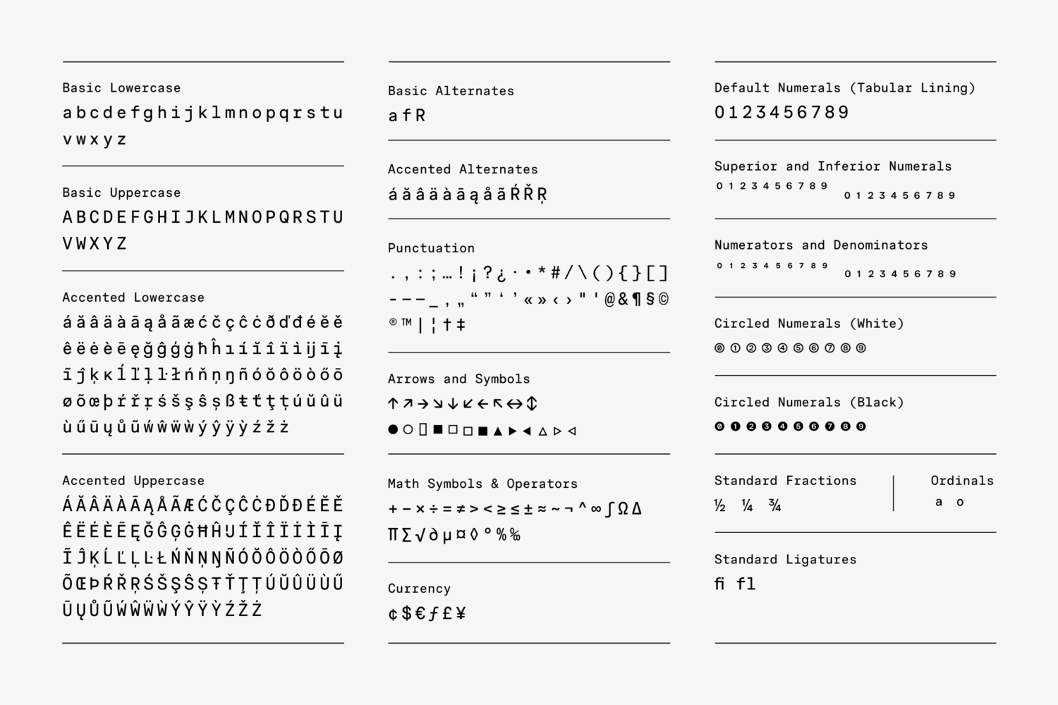
After settling on the optimal width that best preserves the curves and peculiarities of the original grotesque (in this case, RM Neue), CoType develops the rest of the character set, going into much more detail with each letter to improve the textures. The size of punctuation and smaller characters (such as an asterisk or ‘registered’) are reconsidered, becoming more prominent. “We decide on the size of the serifs, reconsider the openness of aperture and deal with necessary weight adjustments,” Bloom continues. And once again, this process involves rigorous testing and several iterations are needed before the desired visual balance is there.
In the case of developing a mono typeface entirely from scratch, there’s a tad more to consider. “We need to decide not only on the style and personality of the family but also on the purpose and range of styles. That only opens up a whole new chapter of exploration. In the case of RM Mono we already had a solid starting point — an existing typeface, RM Neue. One key focus is preserving the DNA of the original family, despite the tweaks and changes we make to some letters in order to fit them into their boxes. This means retaining the angle of terminals, the shape of the bowls, the contrast, and any individual peculiarities that make a particular typeface recognizable.”
It’s by no means straightforward, but CoType is always up to the challenge. “Working around the strict boundaries can actually be extremely rewarding and is definitely something we enjoy doing,” Bloom says, reflecting on the project. “We think that restrictions in fact stimulate imagination and are a drive behind interesting outcomes.”
DESIGNING A MONOSPACED TYPEFACE: THINGS TO LOOK OUT FOR
Let’s say you’re thinking of working on your own monospaced typeface. Aside from the obvious, keeping a fixed width among the alphabet, what factors do designers need to keep in mind?
As a font initially created for practical purposes, how do you balance contemporary aesthetics with function? “Certainly the functionality is a key value of technical typefaces in general and aesthetics might come as a second,” Bloom says. That being said, all of the letters must work in harmony altogether and result in a uniform look. “When dealing with monospaced, it is very important to rely on the actual experience with the typeface and not to get into a trap of over-correcting — for example not to add ink-traps where they’re not needed as one might derive too much from the original for no reason.”
Despite the unique personality, mono typefaces can bring to a design, their rigid rules means there is also a risk that the typefaces themselves can become repetitive. To avoid this sameness, Bloom believes that the design process needs to incorporate plenty of observation of the type family’s core characteristics. “When making mono we might choose to exaggerate certain features and make other ones less striking,” he says. “For example we make punctuation marks bigger (period, comma, asterisk) — however the specific decision on how much bigger, is yet to be taken.” Through active drawing and rigorous testing, CoType guarantee that their fonts maintain their own personality while remaining as uniform as possible.
“We live in the era of a huge technological shift,” Bloom observes. “In the last few decades technology has been only advancing in favour of graphic design and making the process of creation easier and faster. As monospaced fonts reflect that reality, we can only anticipate more need for them.” As we move into web3, does Bloom see mono typefaces becoming more popular? “Yes,” he responds. “We hope so as we believe that there is much more to discover and design within this genre.”
To explore RM Mono and trial the typeface, head over to CoType’s website.
Browse more of our Resource features here.