

Hey! It’s so great to meet you, thanks for chatting with us today. Firstly, could you introduce yourself to our readers and tell us a little more about what it is you do?
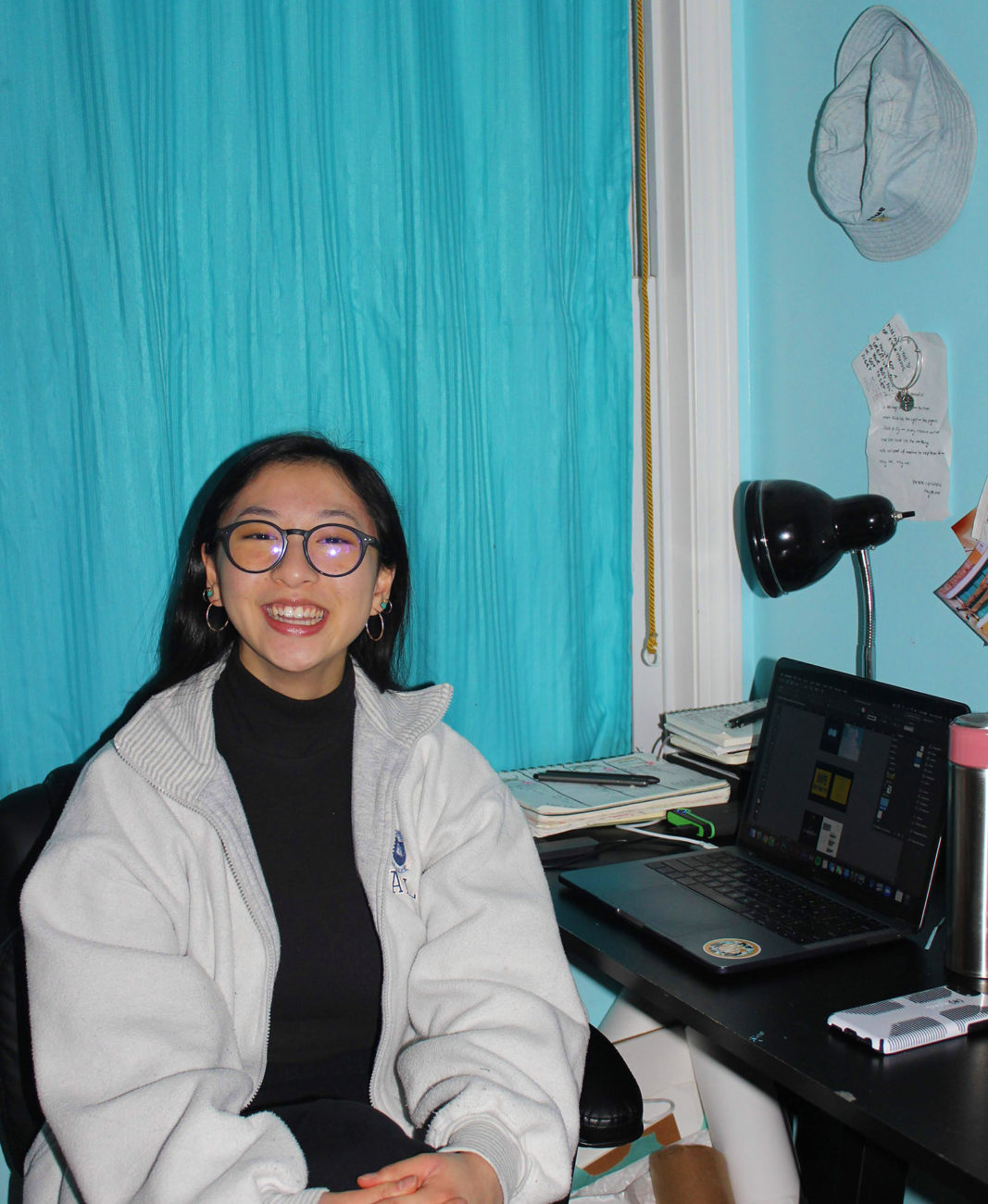
My name is Angela Lian (@alian_archives) and I’m a 4th-year graphic design student at Boston University. Play is at the heart of my process, and I enjoy exercising it through a multidisciplinary approach of both digital and analogue processes, such as graphic design, dance, and photography. My work seeks to reflect my aspiring balance between digital and physical disciplines.
We really wanted to speak about your [AL]MAN{i}AC project. Where/when did the idea for this come about, and what were your initial intentions for the project?
During my junior year, in February 2020, my professor (Nick Rock) assigned us a project titled, Catalog of Influences, which we worked on until April. The idea was to collect things that influenced or inspired us and to create a book out of them. My initial intention was to take the form of an almanac, which documents events from the past and present to foreshadow the future. I was very ambitious at first. I wanted to include anything that inspired me and then refine it into a manifesto of sorts, describing my creative process. I wanted to create a reference book that documented how and where my passion for graphic design came to be.
Did your ideas change or evolve over the course of putting the catalogue together? If so, how?
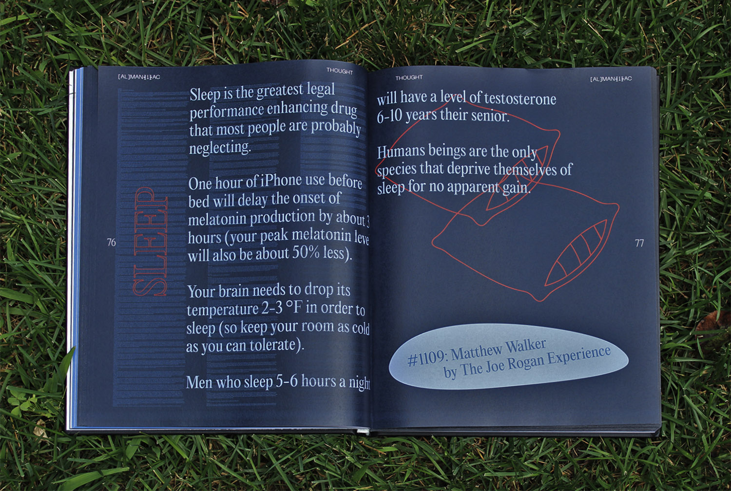
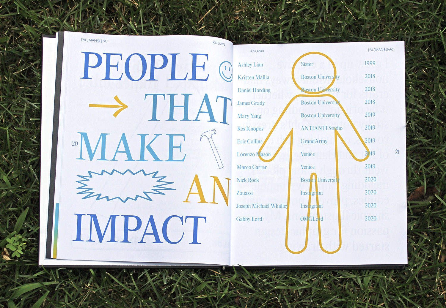
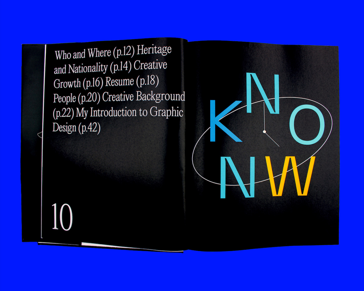
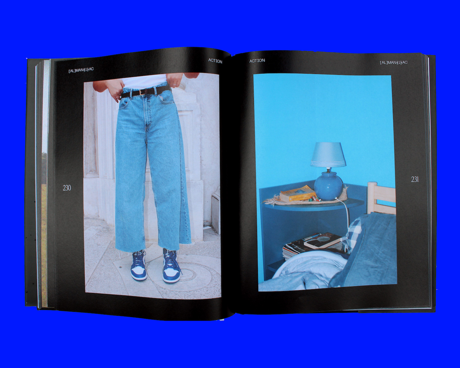
My ideas definitely evolved throughout the process. I maintained the initial idea of an almanac, but had to refine my topics of interest to match the structure, being past, present, and future. I applied the model with three themes: known, thoughts, actions. Known included my creative background (past); Thoughts included philosophies of thinking and making (present); Actions included people and media that influenced me, along with what I make as a result of these inputs (present). I decided that the manifesto would reflect these three themes as a potential way of working as I grow (future).
This is a pretty impressive project – 300 pages! We love the type treatment in the book – which is super varied. Can you walk us through your thoughts on developing the aesthetic for the book and your creative process?
At the beginning of this project, my professor had us come up with three words that the aesthetic of our book would follow. Naturally, I thought to attribute each word to each of the three sections. I chose documentation for Known, curiosity for Thoughts, and movement for Actions. I wanted the type treatment to reflect a balance but also contrast of archival and futuristic tones. I chose two typefaces from PangramPangram Foundry, Editorial New and Neue Machina. [AL]MAN{i}AC was/is a time capsule to me, so I wanted it to look refined and introspective. During the process of iterating ideas, I drew out a diagram reminiscent of a cell with different compartments for each section. I ended up color-coding it as well to help me visualize the organization of content. This diagram and color scheme was directly translated to the book, with each section maintaining the colors they had in the original drawing. The visual language also included a series of icons and symbols to express the ideas throughout.
Do you have any favourite aspects of the type treatment yourself? Or any favourite spreads?
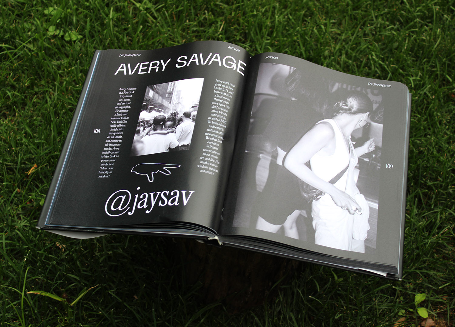
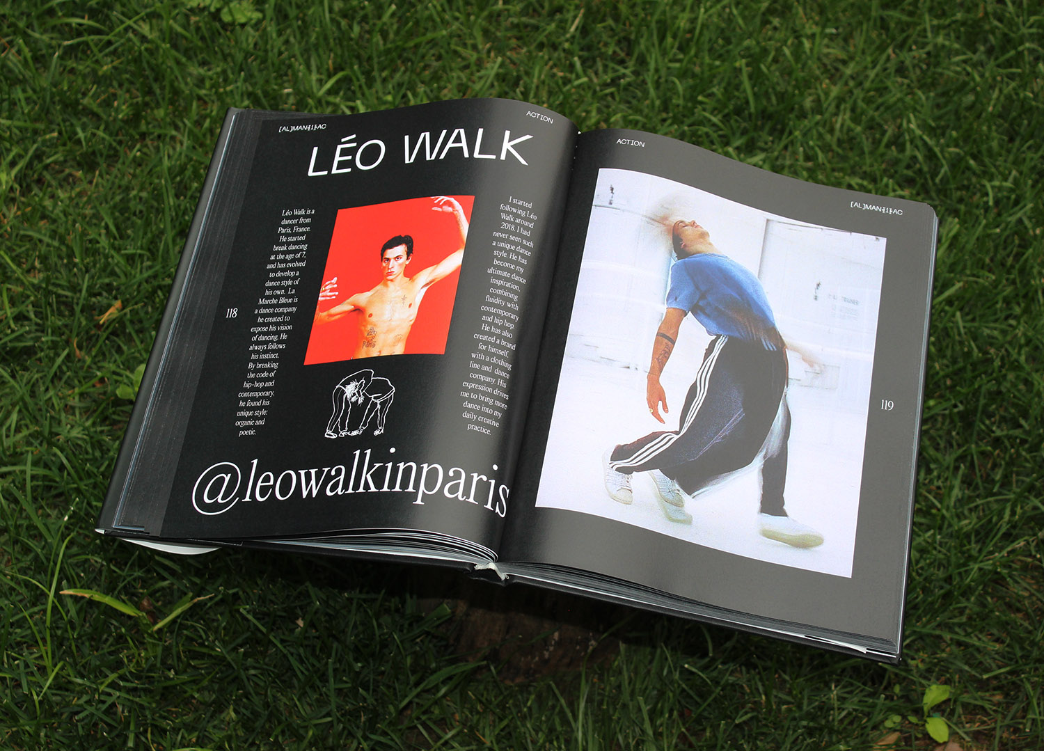
My favorite aspect of the type treatment is when it is interacting and dancing with the symbols and icons. As a dancer, I look for manipulation of space that creates impact. Those instances of collision and avoidance are most exciting to me. My favorite spreads are those in the Actions section, which introduce a form of media using icons and big body text. I also love the spreads that say, ‘There are so many more, but I don’t have enough time,’ which explains my sentiment throughout the entire making of this book.
Were there any elements of creating the catalogue which were particularly challenging, or especially rewarding? Why so?
The most challenging part of making [AL]MAN{i}AC was that soon after the project was assigned, we had to return home and take all of our classes remotely due to the pandemic. It was such a hard shift of engagement and workflow that I had to adapt to. Despite the difficulties of not having in-person instruction, I became deeply invested in this project to a point where I was putting more effort into it than my other classes. The process of refining my content was also challenging, but the fact that I managed to keep it at only 300 pages is an accomplishment for me. Obviously, I’m quite maximalist in my creative process. Thus, the manifestation of this project itself was rewarding.
As a creative, I get the impression that you like to take playful, experimental and multidisciplinary approaches – namely, photography, dance and, of course, design! What role do you feel type takes for you in your creative work? And how do you feel other areas of your practice feed into each other?
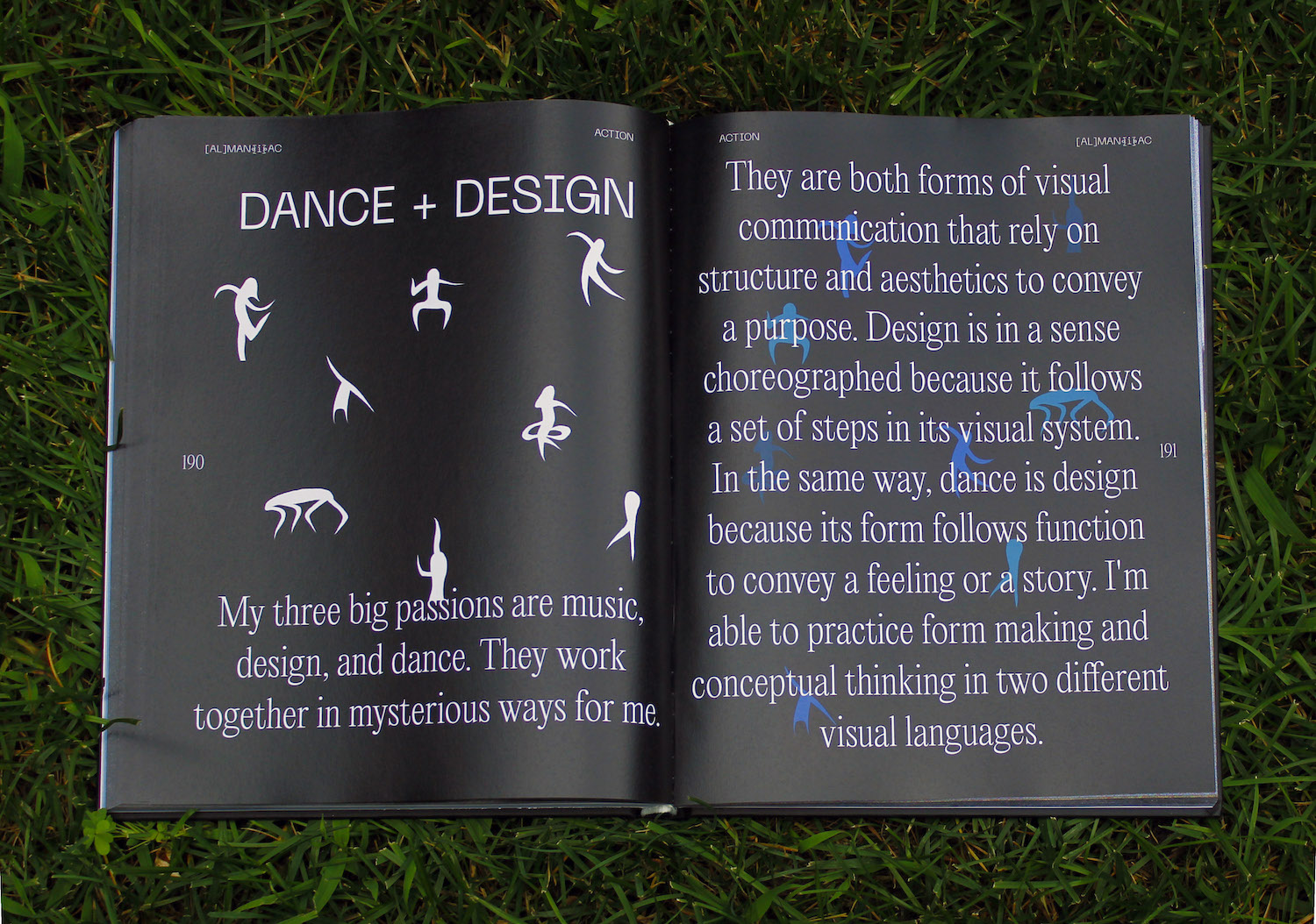
I see each discipline as an ingredient that could work both alone and in combination with others. Type is exciting because it is a visual language that can convey things that an image cannot, such as tone of voice, volume, and direct information. I find it effective to combine it with images, whether it be moving or static, because it expands the dimension of meaning. I see my workspace as a multidimensional playground, which makes it possible to weave my passion for dance into type and design. Dance shares a similar function to design and type, which is to manipulate form in space and communicate meaning as a result. I think that each creative discipline starts with a similar approach, and that allows me to combine them to find new solutions.
Retrospectively, what do you think the catalogue has done for you creatively? Has creating it made you look differently at your own practice or at the potential of type?
The catalogue has allowed me to zoom out and reflect on myself as a graphic designer thus far, even though I’m still in school. I see value in creating a snapshot of my current process as a young, eager, and somewhat naive design student. I’m the type of person that enjoys excessive documentation, so this project gave me the freedom to do what I love while giving me more confidence in manifesting projects into physical reality. This catalogue has also given me more confidence in utilizing type in my practice because before this, I heavily relied on images. It’s exciting how much of a voice type can give.
You describe [AL]MAN{i}AC as being a kind of manifesto. What is it you hope people will take from it looking forward? Or what how do you see the future of type? What excites you about where we might be going?
The [AL]MAN{i}AC manifesto emphasizes the idea of process measuring potential, defining process as documentation, curiosity, and action. My hope is that this maximalist approach to researching one’s process inspires others to collect and reflect on their own creative influences. Because to build a house, you must have a solid foundation. As expressed before, the dimensionality of type is growing rapidly. Since creating this book, I have begun investigating the construction of type in a sketchbook, and exploring kinetic typography as well. I think the playground analogy applies to the field of type design, expanding as it cross-fertilizes with other disciplines including those outside of design. I see a positive relationship blossoming between this evolution and a growing appreciation for type among people!

What kind of work do you see yourself doing in the coming years? Any new ambitions or projects to expand on the cards?
Once I graduate next year, I see myself working in the realm of art, culture, and music. I want to do more with editorial, print, identity, and possibly motion design, all while deepening my understanding in type. My goal is to work all over the world, I’m so inspired by Na Kim‘s multi-faceted, global nature. I also want to research and gain confidence in design theory and the decolonization of it. This summer, I ordered a textbook, The Design Reader, and began reading it. It made me want to buy more books, and I ended up becoming extremely interested in magazine publications. I think I’ve bought 12-13 in the last two months (don’t worry, I’m reading them, not just collecting). I don’t think my work will ever escape the approach I have now and have demonstrated in [AL]MAN{i}AC. I think it will only build as I practice each skill. As for new ambition, I’m actually looking for at least one mentor that is invested in helping me grow as a designer. I’ve also recently been interested in the possibility of applying/attending Fabrica Research Centre after I graduate, because the program aligns with my current values and goals to be multidisciplinary. As I mentioned, I’m currently designing the print issue of Pilot Magazine, so look out for its release sometime this winter! I’m excited to look back on this interview when I graduate. Who knows where I’ll be in a year?
[AL]MAN{i}AC is not formally for sale, but if you’re interested in buying a copy, please email me (my email is linked on my website).
Thank you so much for chatting with us today, Angela! It’s been a pleasure. To see more of Angela’s stunning work, visit her website and Instagram. Here’s to the future!


