Supernulla Creative Studio (@supernulla) is formed from friendships between Marcello Raffo, Nicolò Tromben and Marco Venturi. After meeting in Ferrara, Italy, the three became product design graduates from their local university. After gathering a few years of graphic design experience between Porto, Venezia and Ravenna, they decided to run their own graphic design studio in January 2020 – and thus, Supernulla was born. They’ve been working flexibility from their homes in Thiene, Vicenza and Lugo on the creative studio ever since.
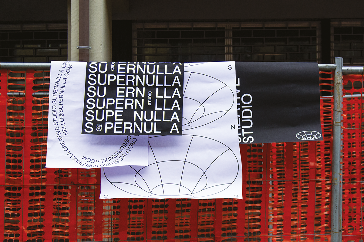
The overarching visual language of Supernulla is distinctive and lives at the core of the studio. ‘The studio took the name Supernulla (literally supernothing, in english) after the members’ fascination for the contrast between everything and nothing, absolute and relative’, the studio explains.
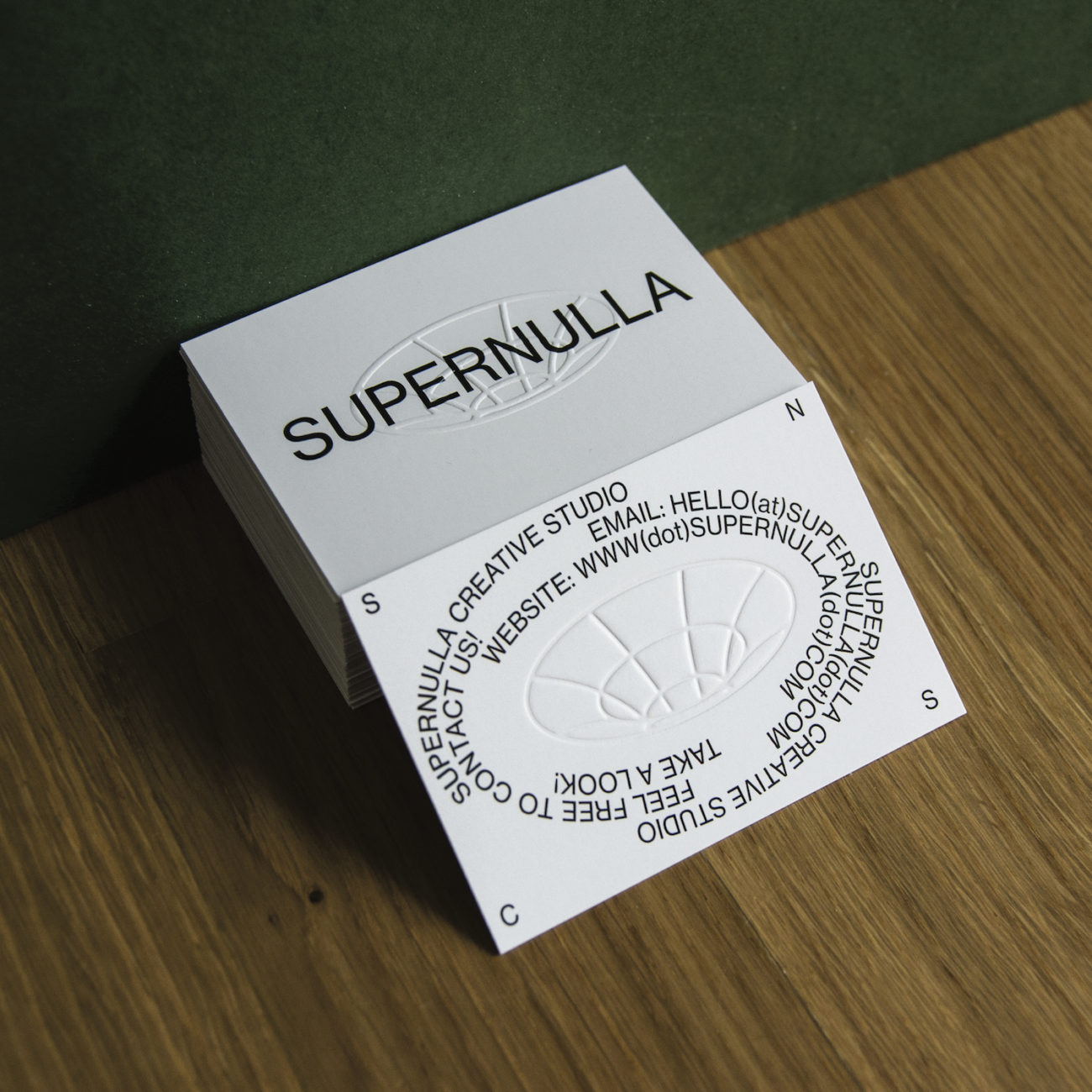
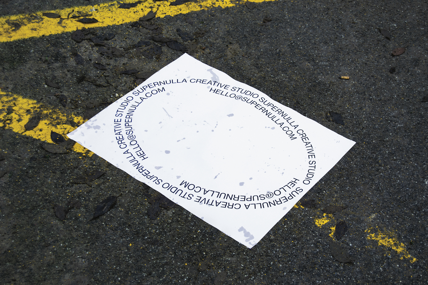
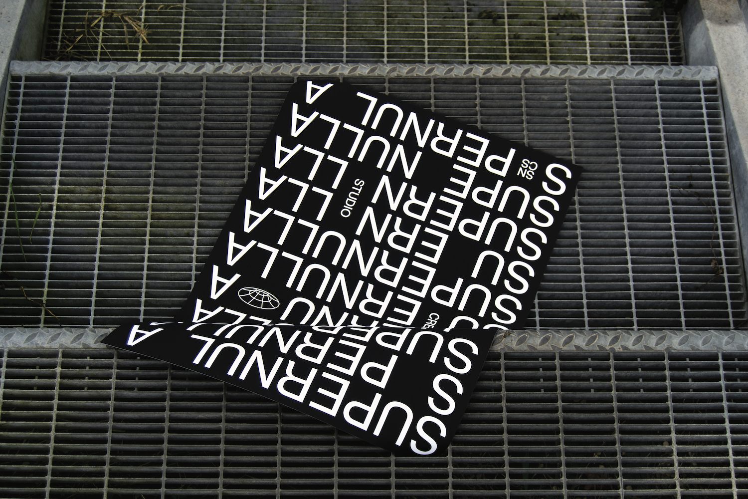
This outlook certainly bleeds into the studio’s typographic sensibilities and visual identity designs for Supernulla. As the studio elaborates, ‘The concept of the studio’s [visual] identity couldn’t step away from these ideas – Typography with minimal attitude and flat surfaces in black or white, [signalling the ideas of] all and nothing, contrast and harmony… And finally, a wireframe black hole, as an icon of the meaning of the name. The apparent simplicity of the project transmits a strong message and visual identity which can be adapted in many different ways.’
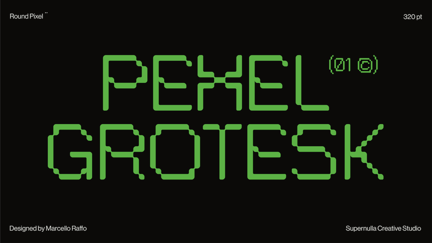
Supernulla also shared with us some details about a couple of their fonts; the first of which being Pexel Grotesk. ‘On the internet it’s hard to find a pixel typeface with the right proportions, and with that thing that distinguishes it from the sea of pixel and block shapes’, the studio explains, highlighting the gap they saw in successful and distinctive pixel fonts. ‘Pexel Grotesk aims to imitate the letter dimensions and proportions of a grotesque typeface, while remaining inside a strict grid.’
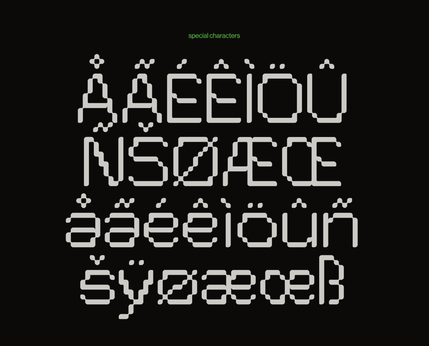
‘Some of the letters are not designed the way we think they should be constructed as a pixel font, which helps the type to be different but consistent at the same time… The roundness of the edges, which could sound like an oxymoron for a pixel type, gives at an interesting shape; especially if it is used in large format.’ And we couldn’t agree more that this innovative amalgamation of grotesk forms with pixel type is massively successful and visually stunning.
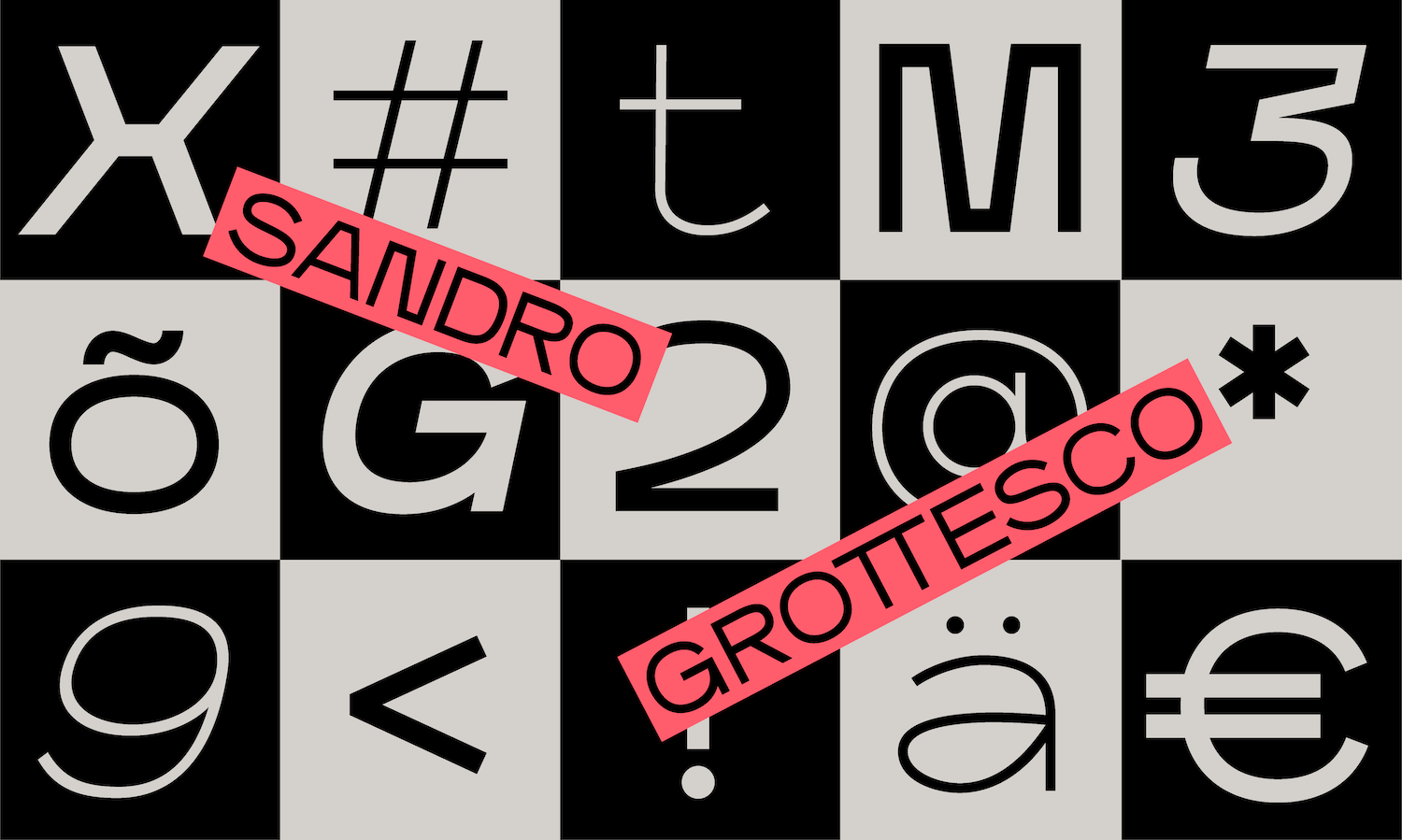
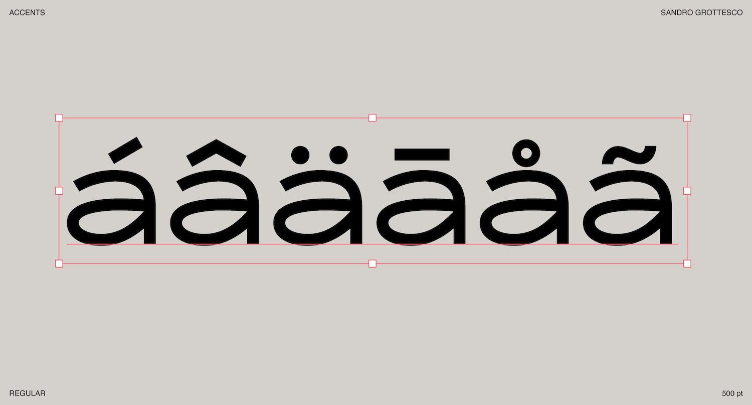
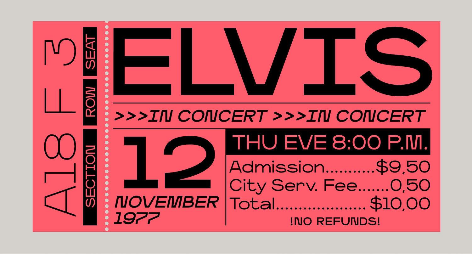
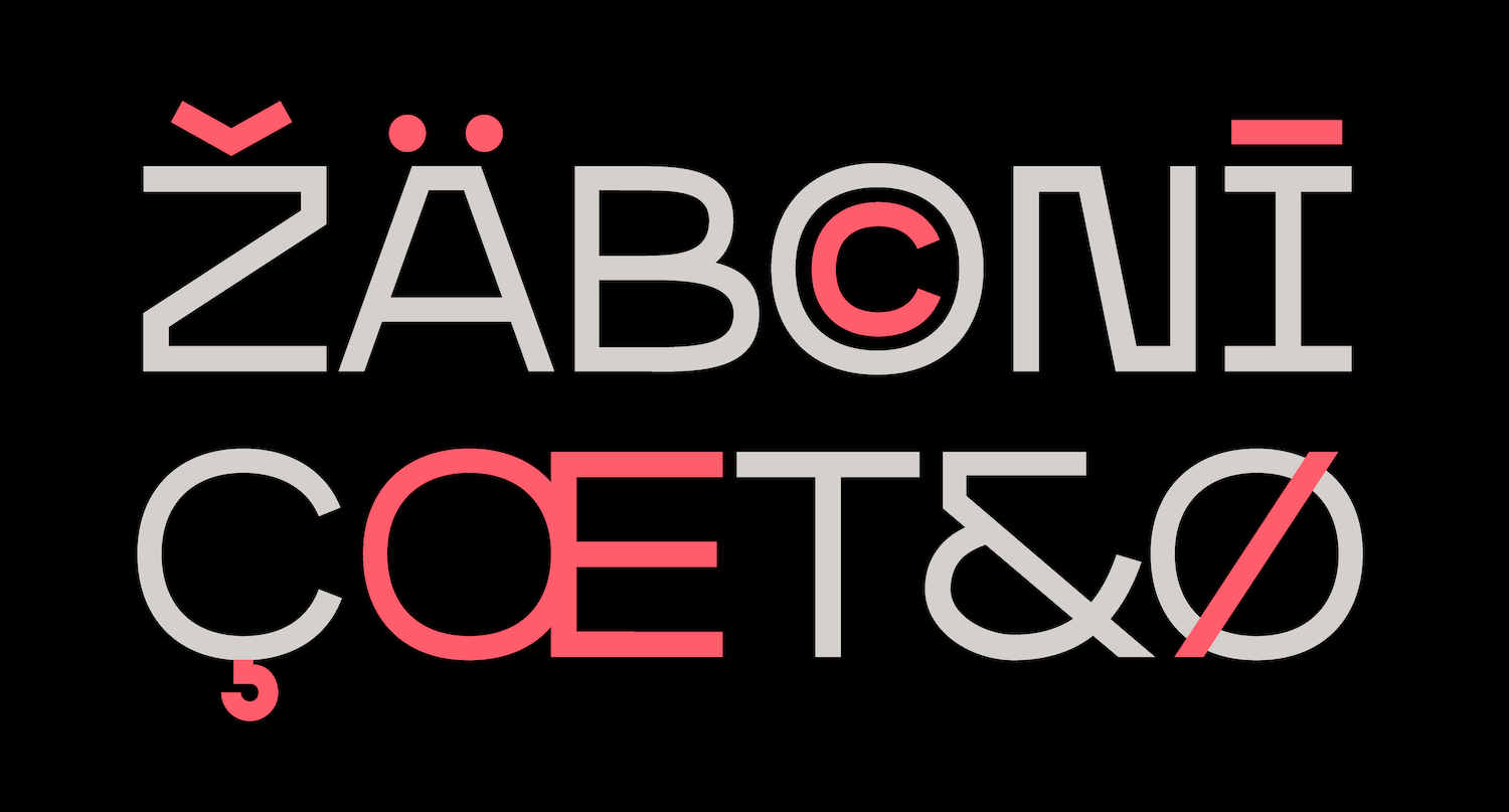
On another note, Sandro Grottesco is a semi extended typeface family built in three different weights; Light, Regular and Bold, and their corresponding italics. ‘All the glyphs are designed with a big contrast between rigid and soft shapes to obtain a funny and dynamic personality,’ the studio articulates. With extended width and unusual, exaggerated apertures (such as in the lower case ‘f’ and ‘g’) Sando Grottesco has a distinctive and unique identity. ‘And as with other sans serif typefaces, Sandro is perfect to create artworks with big titles and strong hierarchy’, the studio adds.
To see more of Supernulla’s all and nothing, absolute and relative work, head over to their website, Instagram and Behance. Thanks, Supernulla!