
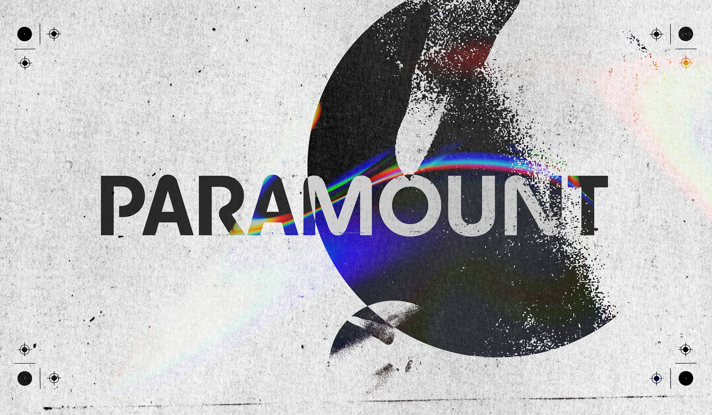
Samuel Sapin-Blacher from Production Type chats to Chi-Long Trieu on the release of Paramount, and the twisting journey it took to get there.
Over a year ago, Type Designer, Founder, and Creative Director of Office for Typography Chi-Long Trieu caught up with us to discuss his work with Production Type. He gave us an exciting sneak preview of his extensive and versatile geometric typeface Paramount; detailing the families’ characteristics, influences, and overall development. To correspond with the release of the font, we felt it fitting to reunite with Trieu as he reflects on the project.
From the initial bakery-based starting point nearly six years ago, through to the release [this month], he shares his honest thoughts on the ambitious undertaking. In addition, the Creative Director shares some of his feelings towards the wider type design industry and how his own practice is evolving.
Samuel Sapin-Blacher: Hello Chi-Long, thank you for taking the time to answer these questions! Last Year in May 2022, you gave an interview for TYPE01 about the first stages of the Paramount creation. A year later, as the release is about to happen, we’d love to revisit some of the answers you gave.
In three words, how would you describe the Paramount font’s main influences?
Chi-Long Trieu: Geometric Optimistic Rhythm
SSB: How did the work of AM Cassandre influence the creation of the Paramount Typeface?
CTL: I always liked Cassandre’s work and very distinctive style. That being said, Paramount wasn’t based on a specific poster or model but more on Cassandre’s sense of construction and visual harmony.
SSB: Any other references found their way into your work?
CTL: Nowadays, creating an innovative geometric typeface is quite complex. From the beginning, I tried to avoid looking at contemporary typefaces too much. I always liked the work of Herbert Bayer, Herb Lubalin, and Ed Benguiat. There’s a bit of them in Paramount.
SSB: How can that font have both an Art Deco and a Sci-Fi feel? What was the trick according to you?
CTL: We’ve seen a countless number of new geometric typefaces in the past years and I didn’t want to create something with a too specific usage. When it’s released, a font can be a lot of things and I’m super excited to see how designers will use Paramount.
SSB: How did you work to create Paramount? By hand first? Directly within the software? How was that process important to the final result? Can you spot a drawn font or a digital font?
CTL: I won’t lie to you, I never sketch letters by hand. I feel like hand drawing is not precise enough to be a useful tool. Every time I introduced myself to someone who is not a type designer they always believed that type designers have a little sketchbook and a little pen and they draw and then they have amazing ideas that came out of their own hands. It’s not like that, at least not for me. I usually have a clear idea of the tone or feeling I want to create and this feeling is translated by the shapes, contrast, width, and weight I use.
To answer your last question, I can’t tell if a typeface has been hand drawn before being digitalized but somehow I can tell the designer’s experience, background, and sometimes personality through their typeface (haha).
SSB: What makes a good font according to you?
CTL: This is a tough question as any attempt to answer objectively would sound arrogant. In the past ten years, I have designed around 20 complete typefaces (ranging from 1 to 72 styles) but only released two so far… I would say that usability and desirability matter and typeface is great when it has “something” without being “too much”.
SSB: Tell us a bit about what’s coming: a Rounded version of both families, Paramount and Paramount Neo.
CTL: To enhance the project’s geometry, I wanted to create a rounded version of Paramount. The rounded version was actually finished right after the non-rounded version but for marketing reasons, they will be released separately. We have seen a few rounded typefaces being released lately, so I’m quite intrigued to see how Paramount Rounded will be received and used.
SSB: According to you, what are the best uses for a rounded font?
CTL: Maybe for objects like balloons? Pasta? or even ice cubes?!
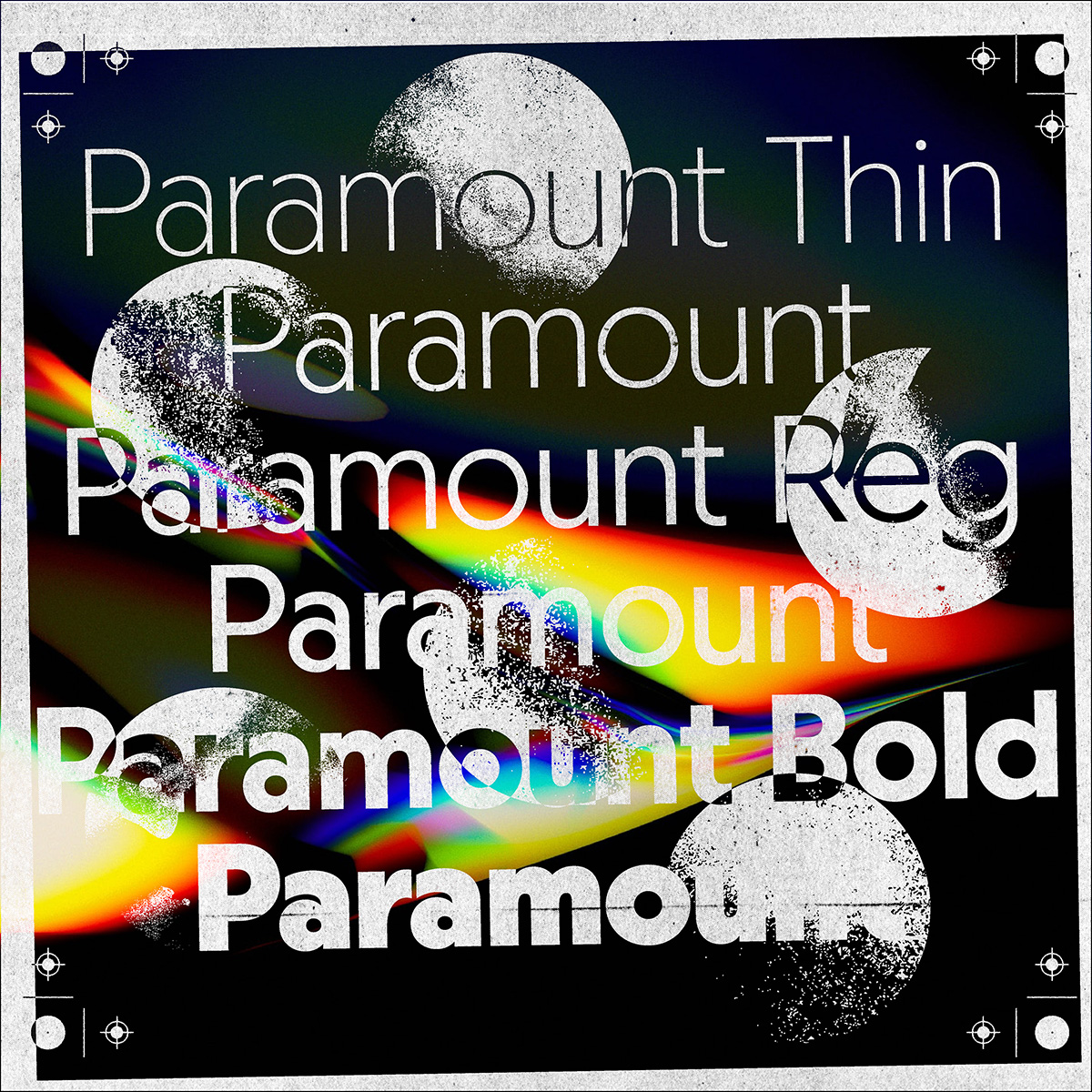
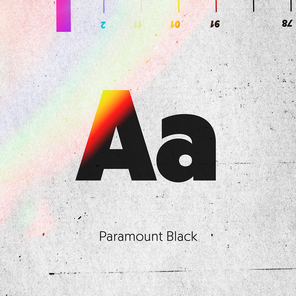
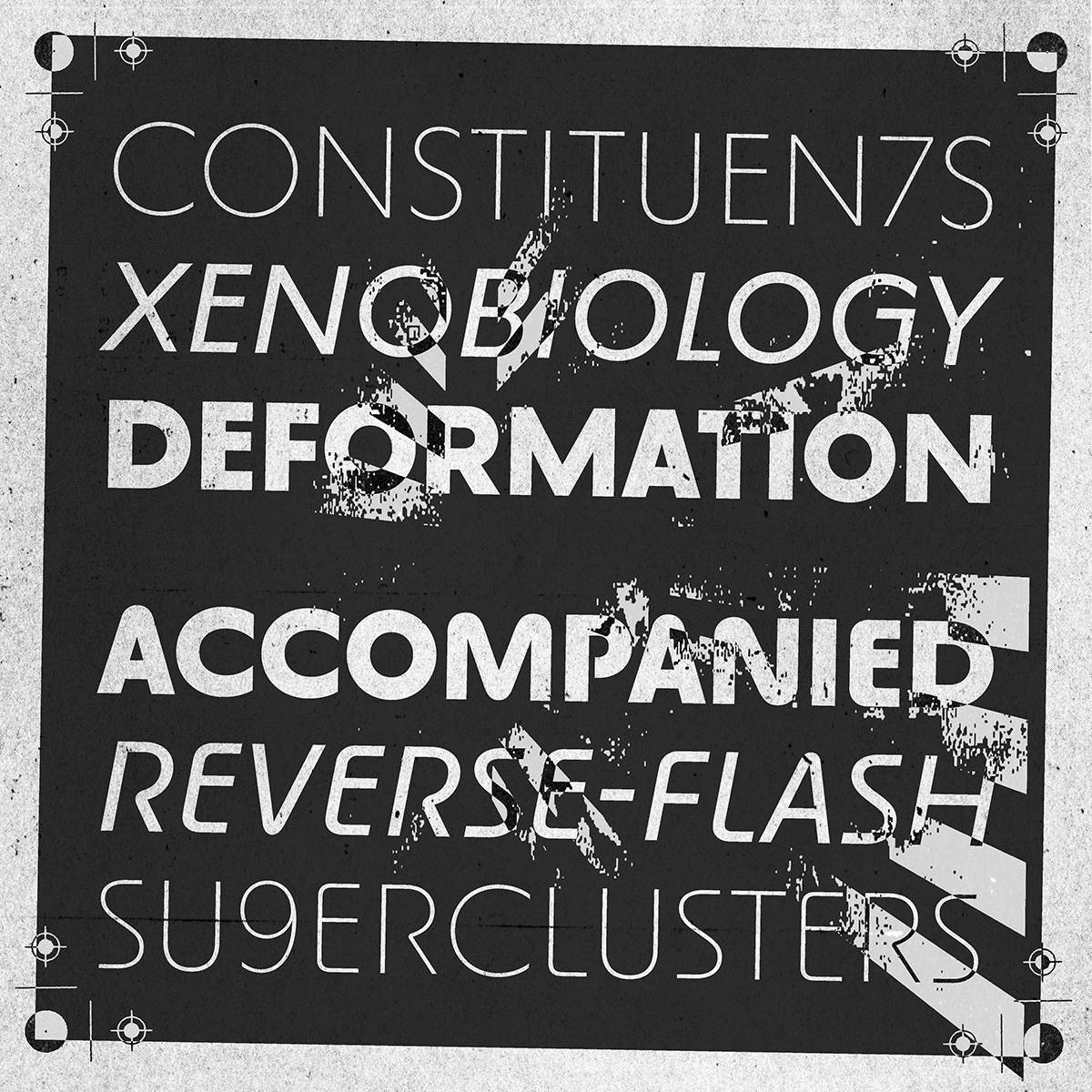
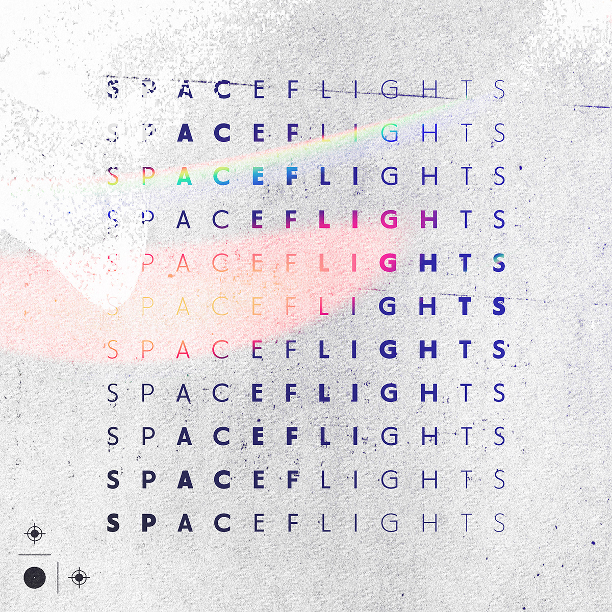
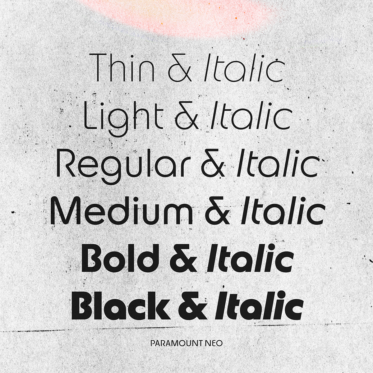
SSB: As a whole, Paramount has 4 families, each with six weights with matching italics for a total of 48 styles + different stylistic sets. It is an ambitious and extensive project indeed. How long did it take you to design it?
CTL: The project was initiated in September 2017, and it took almost 6 years from the beginning to its release. Of course, I didn’t work full-time on it but it took time and energy. As I’m also running a graphic design studio, working as a type director, and teaching, I can only develop typefaces when I have time. Luckily, I received precious help from Guillaume Besson who developed a good percentage of the project since he joined my studio in 2020.
SSB: How did you collaborate with Production Type on the project?
CTL: In 2019, Jean-Baptiste invited me to Paris to talk about a potential release and since then we exchanged emails with him and the whole team at Production. They trusted me with the design and gave insightful feedback. We met on different occasions and they were a great support in every step!
SSB: Did you know from the start the project would be that ambitious?
CTL: I knew it would be ambitious but I didn’t know “how” ambitious. People know me from my type of work and most of them think I design type every day… I actually run a graphic design studio, I teach and I freelance. Given the multidisciplinarity of my practice, it’s sometimes hard to find time or the head space to develop typefaces.
SSB: What about the Neo style? How would you describe it in general?
CTL: In the beginning, Paramount was supposed to be a single typeface with lots of alternates but it made more sense to have two separate families as each design is really distinct. Formally, the Neo style is an homage to Bauhaus typography, it is sharp and soft with a bit of nostalgia.
SSB: What was your biggest challenge in the entire design process?
CTL: When designing a multi-family, a change in a single glyph will influence the rest of the collection. Making the right decisions was probably the biggest challenge.
More generally,
SSB: In your opinion, what makes for a great typeface?
CTL: I will sound a bit conservative but timelessness is important. We always talk about sustainability in saving trees, turning off electronic devices, etc. but what about designing typefaces that will last?
SSB: Be honest, do you have a favourite typeface?
CTL: Not really. It’s too much of a statement to have a favourite typeface.
SSB: As a type designer, what is your proudest achievement?
CTL: I’m always thrilled every time I see a typeface I created being realised. Lately, it was Aigle’s rebrand by Études for which I worked on with Zak Group.
SSB: What are you working on right now, and what’s coming up next?
CTL: The studio is working on a lot of projects at the moment. We are doing a custom typeface for Harper’s Bazaar Italy, a visual identity for a cultural center here in Lausanne, a visual identity for a German sports equipment company, an artist book, a book about the influence of colonialism in Vietnamese design, language and culture and last but not least I’m developing a new multi-widths/multi-weights family.
Thank you Chi-Long for your time and insights, we can’t wait to see what’s next!
Follow Chi-Long > @chillllllllll
Discover more industry interviews here.


